. 2023 Jun;29(6):1550-1562.
doi: 10.1038/s41591-023-02371-y. Epub 2023 May 29.

Pan-cancer T cell atlas links a cellular stress response state to immunotherapy resistance

Affiliations

Pan-cancer T cell atlas links a cellular stress response state to immunotherapy resistance

Yanshuo Chu et al. Nat Med. 2023 Jun.

Abstract

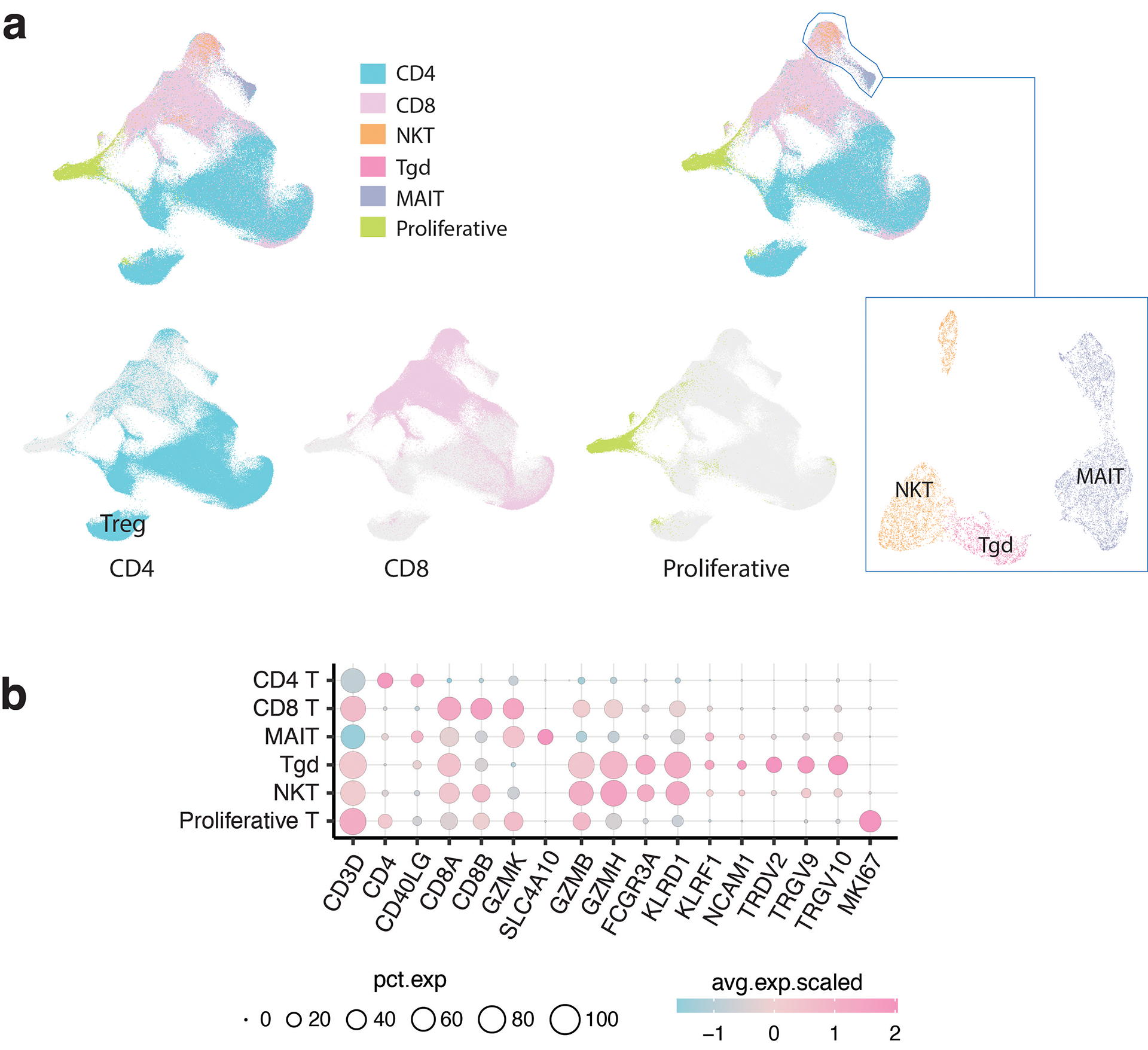
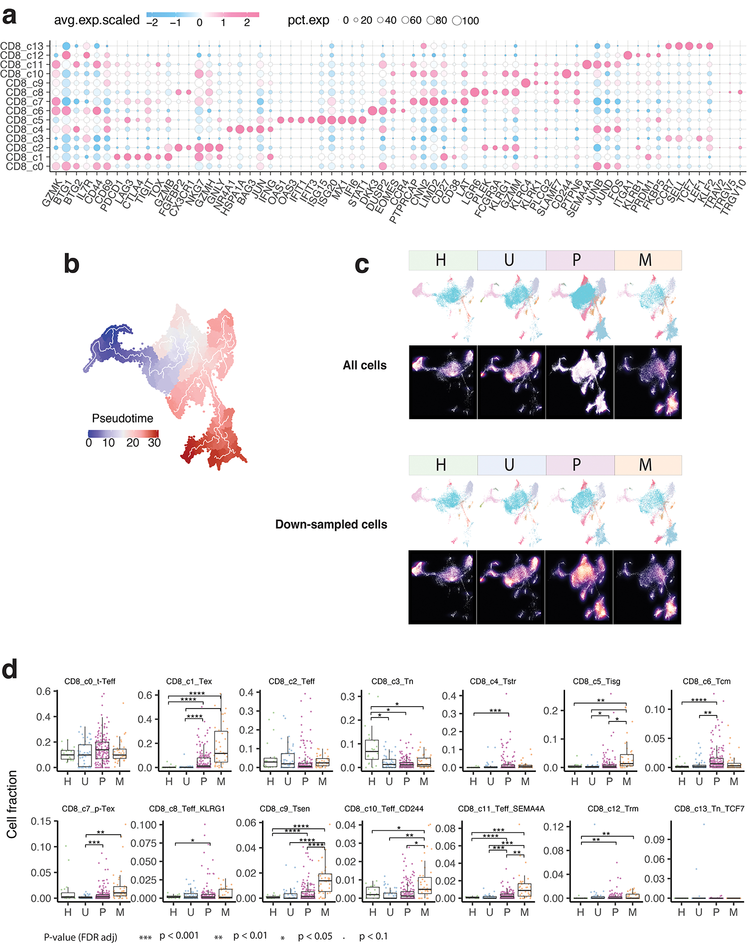
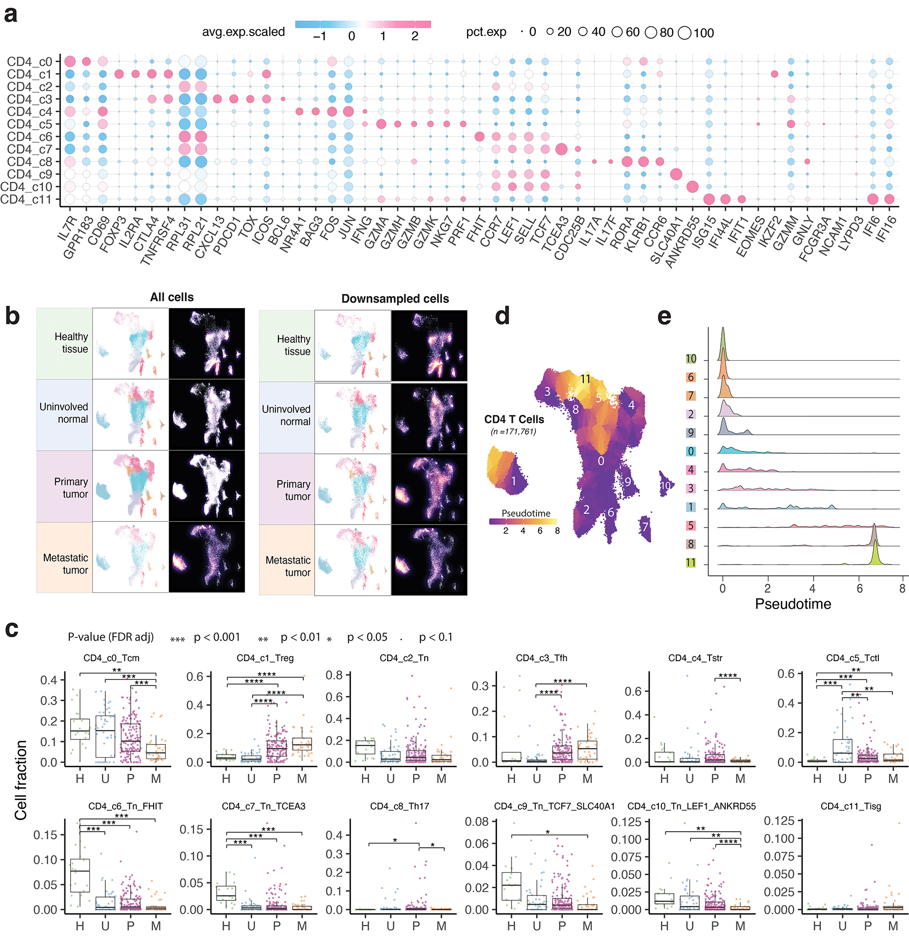
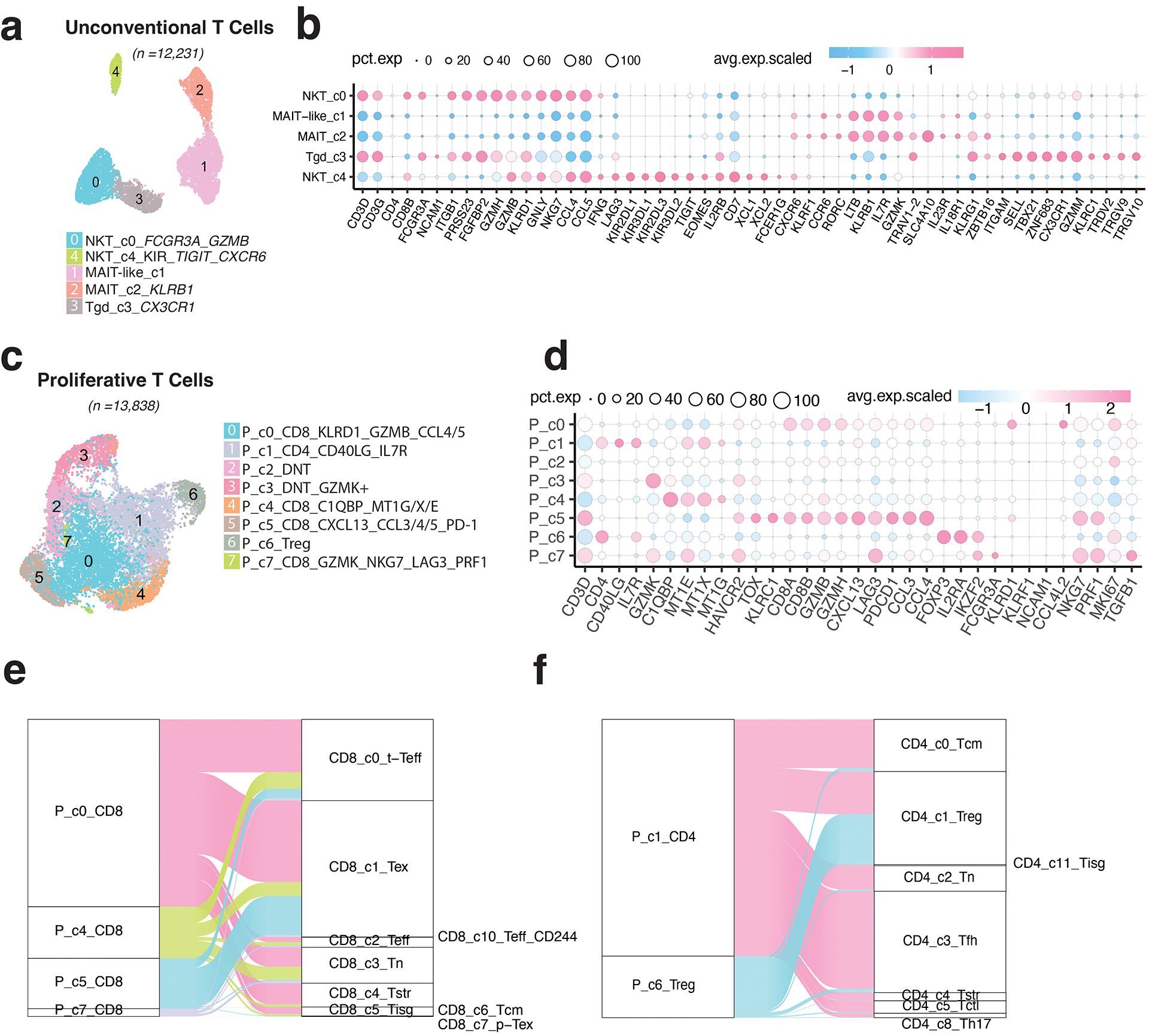
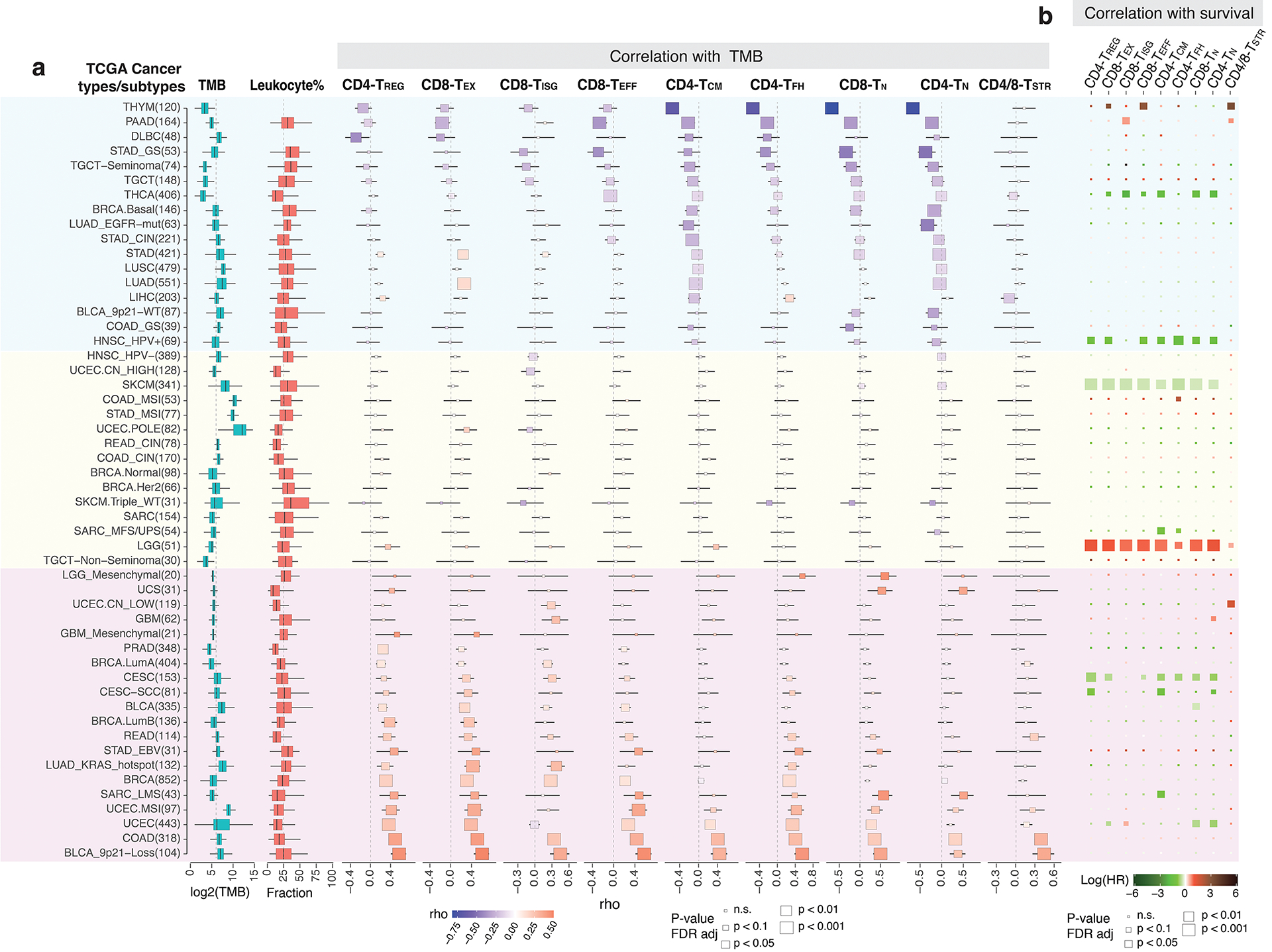
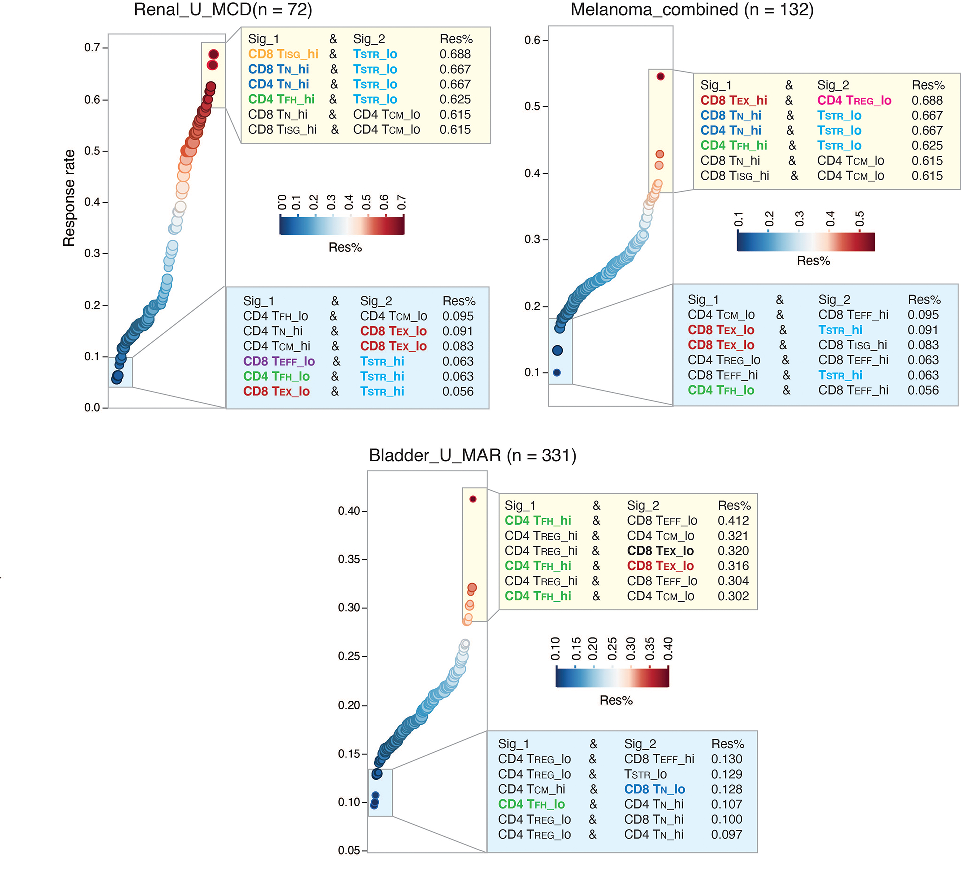
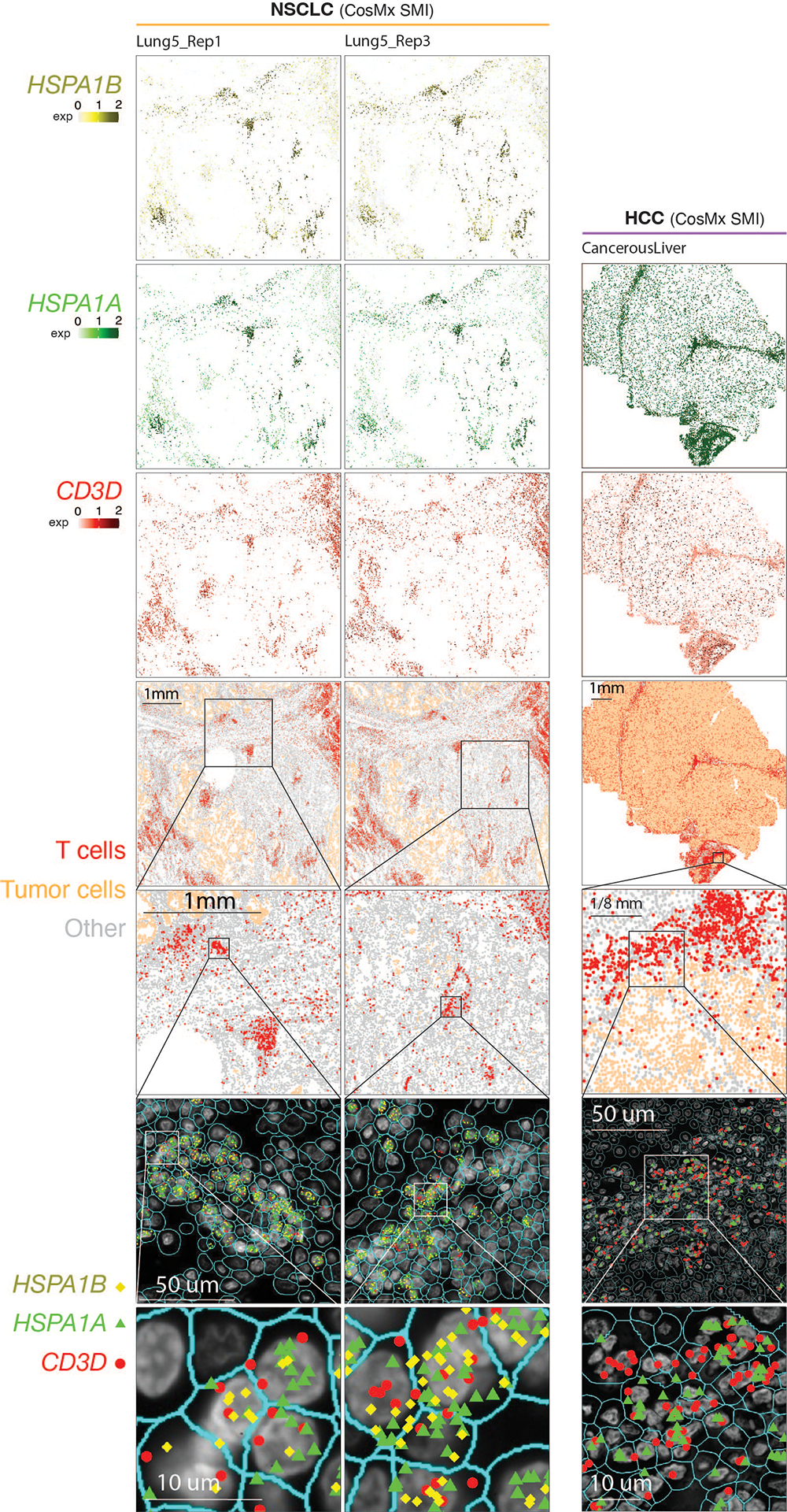
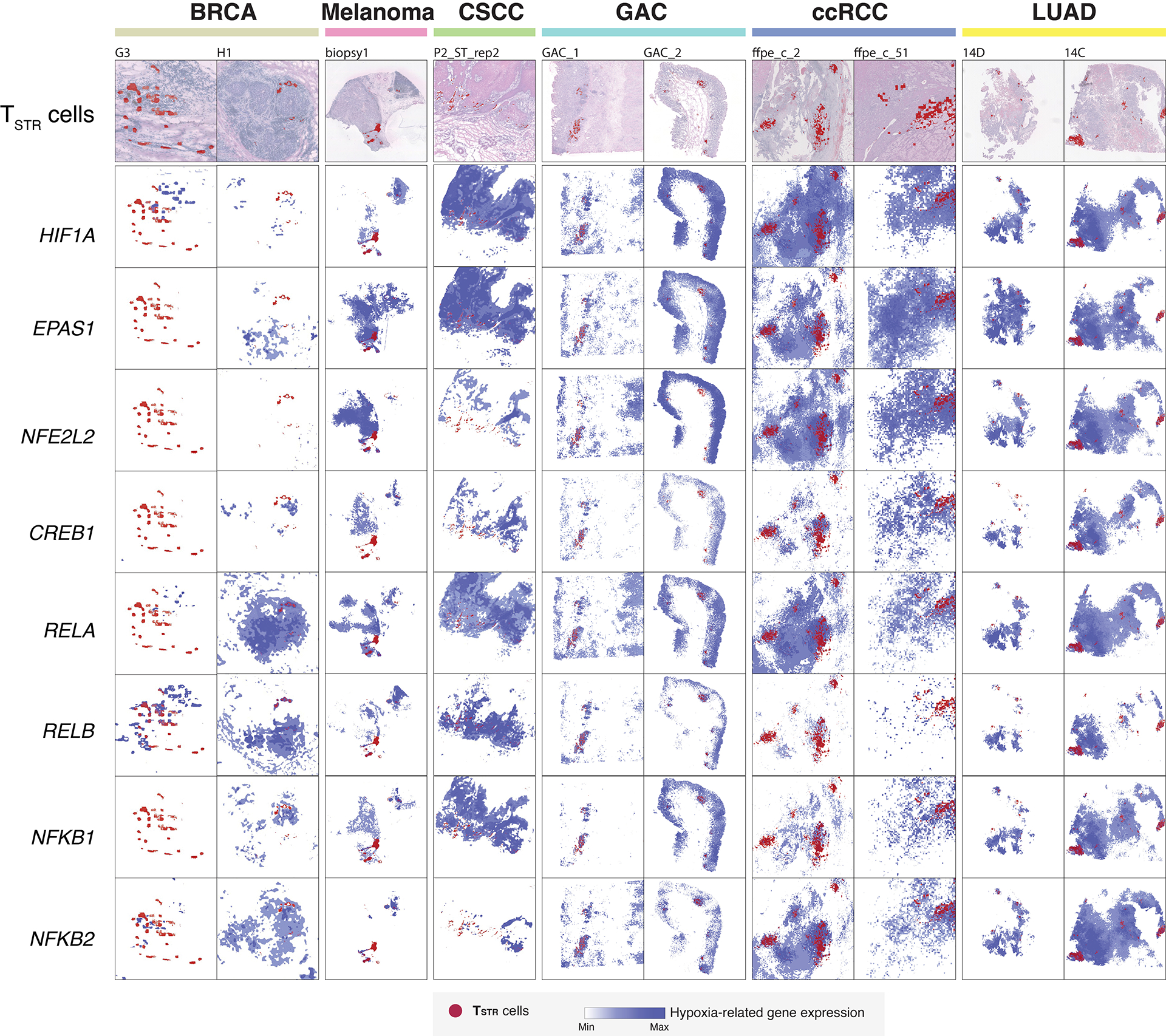
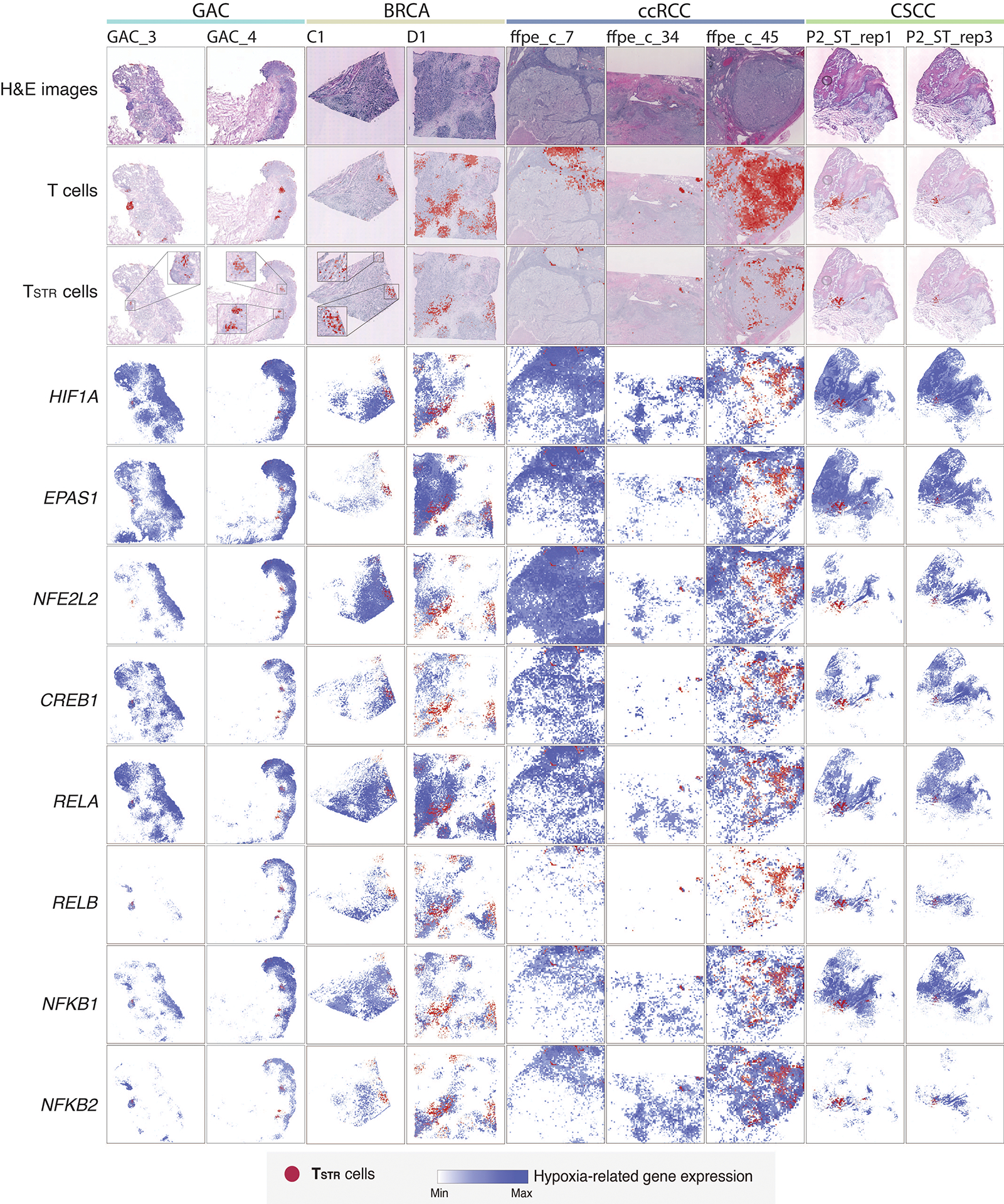
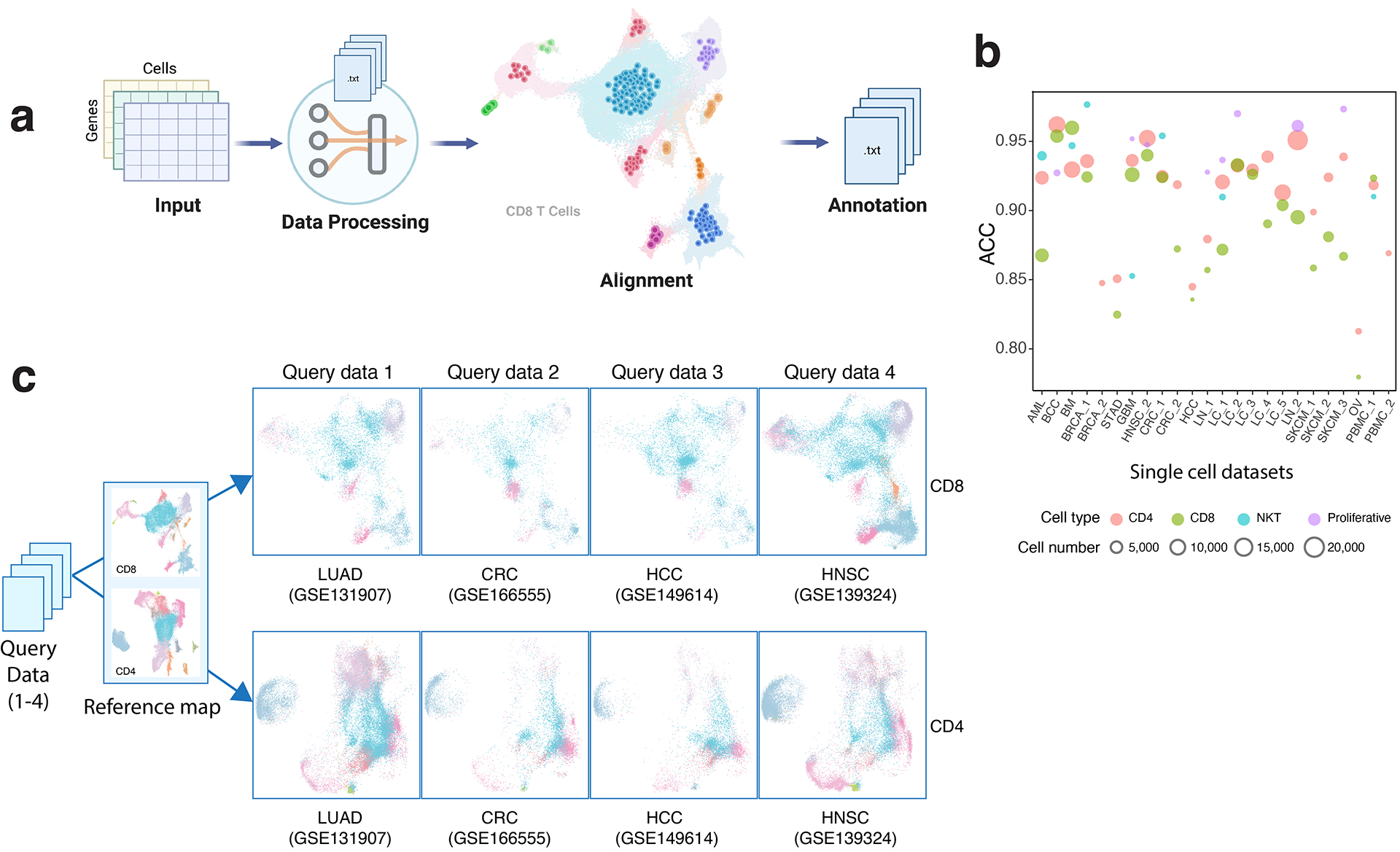
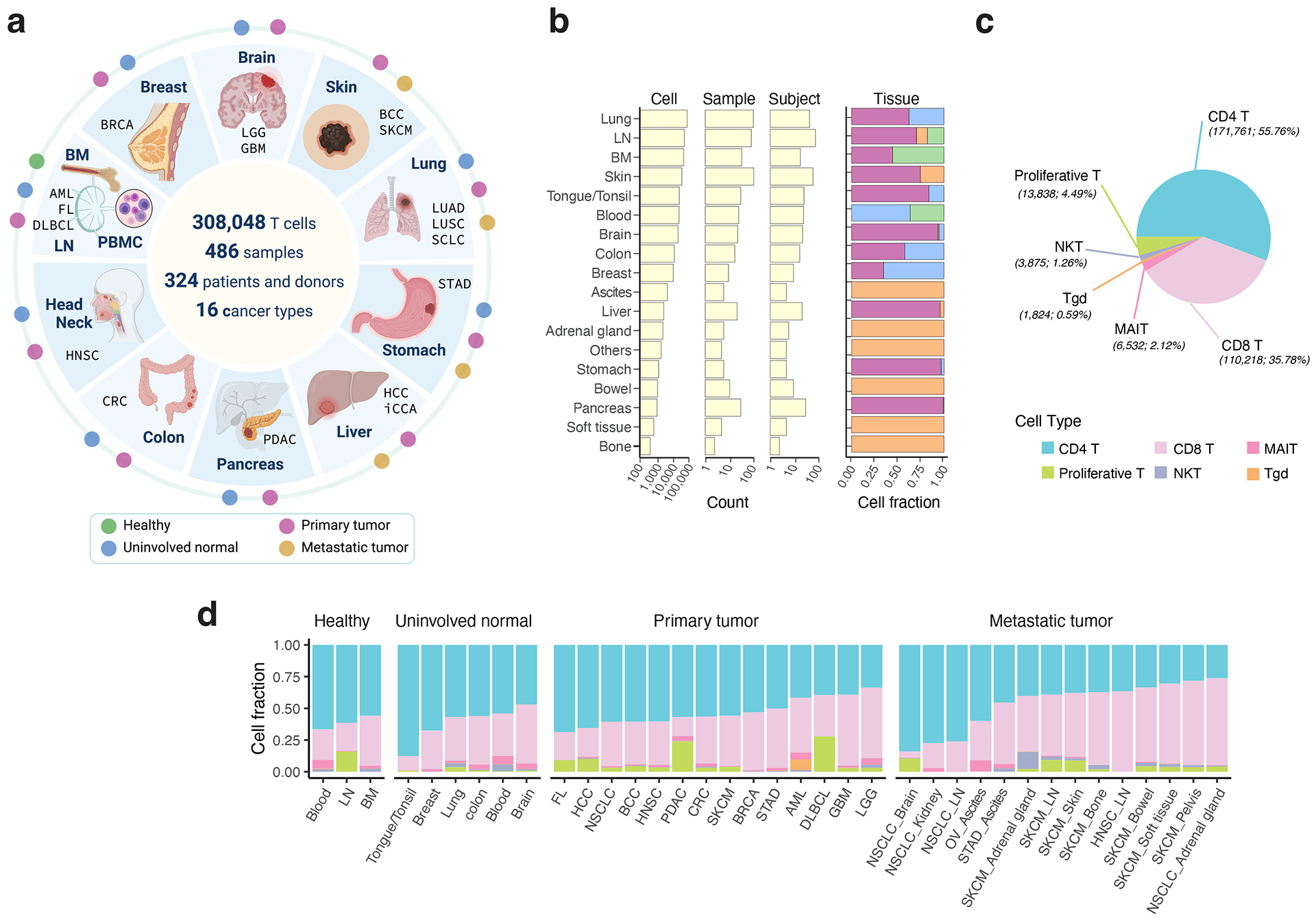
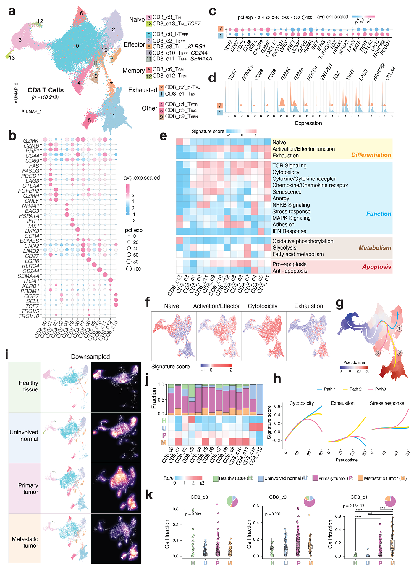
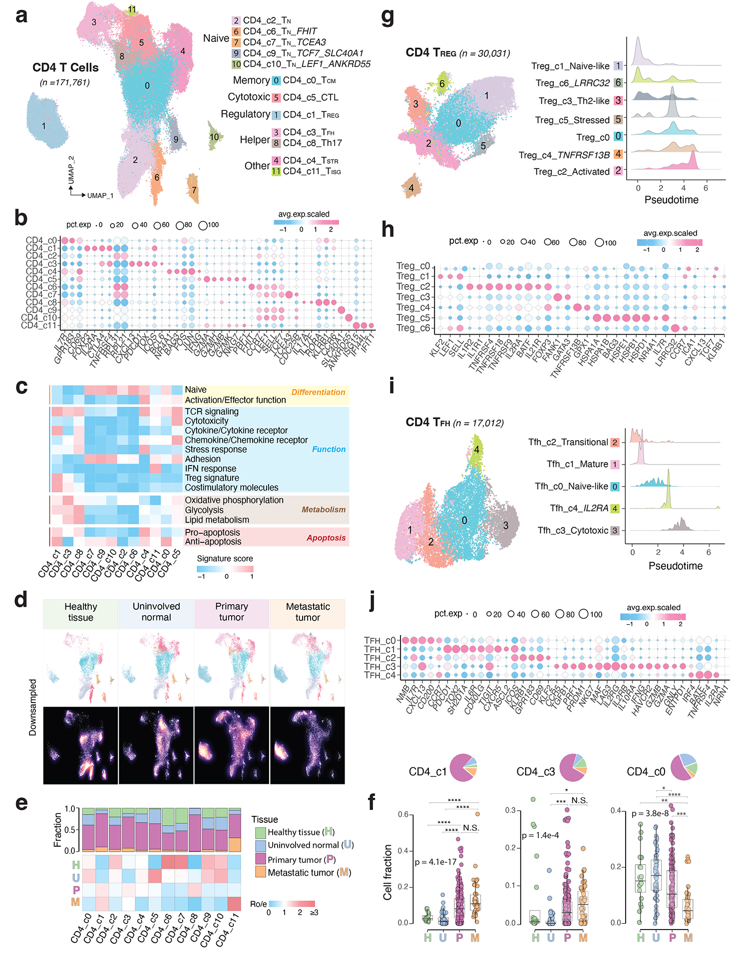
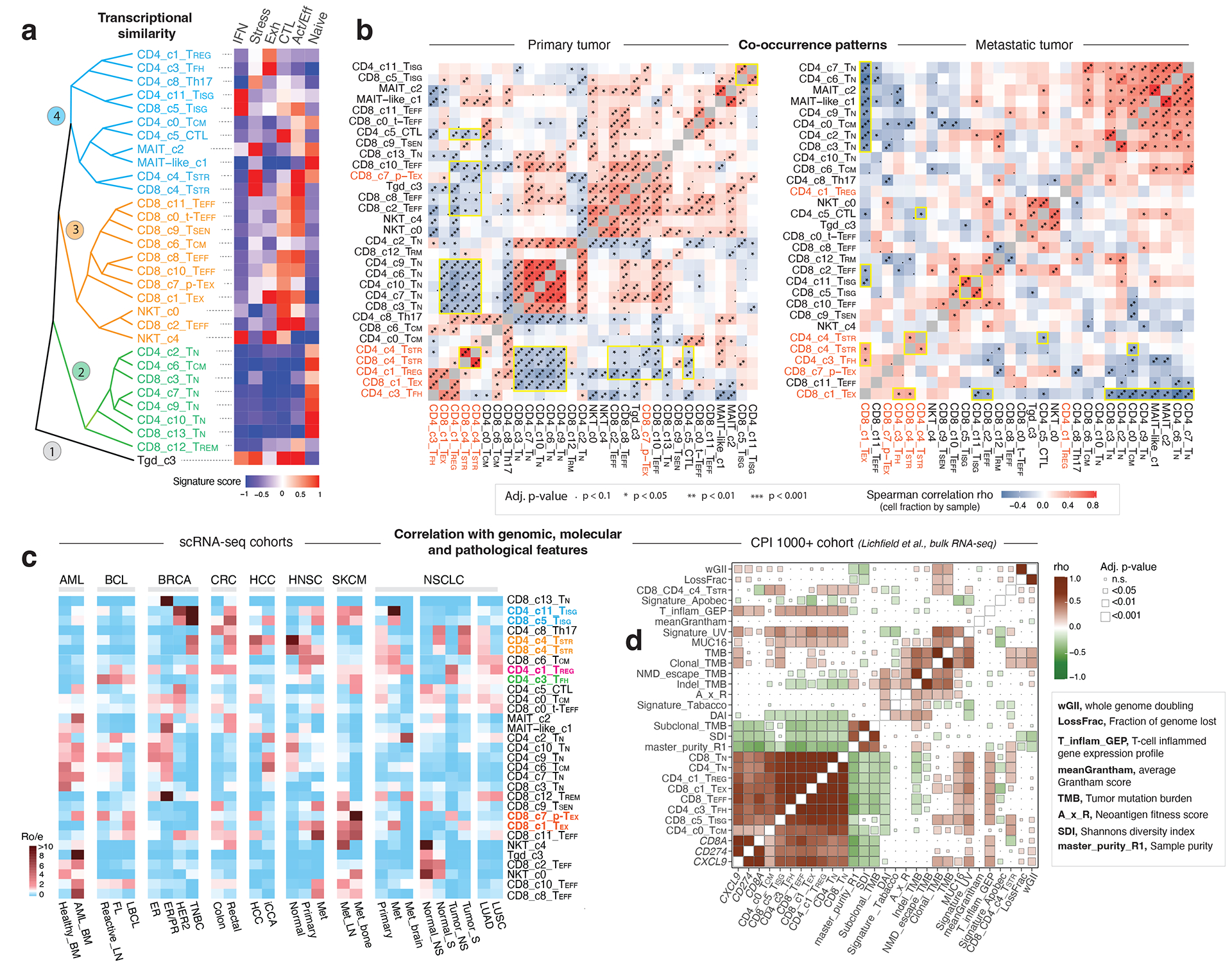
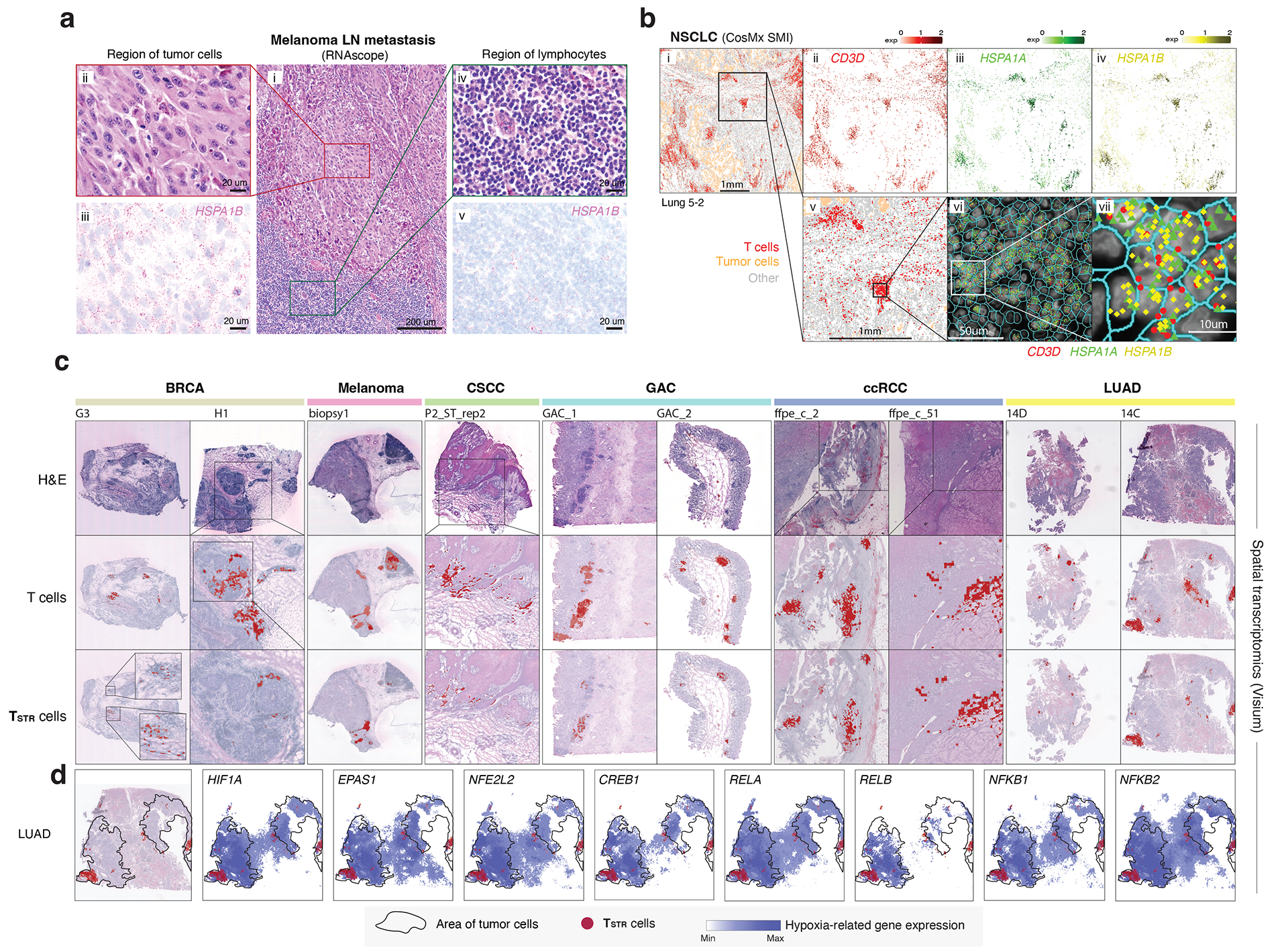
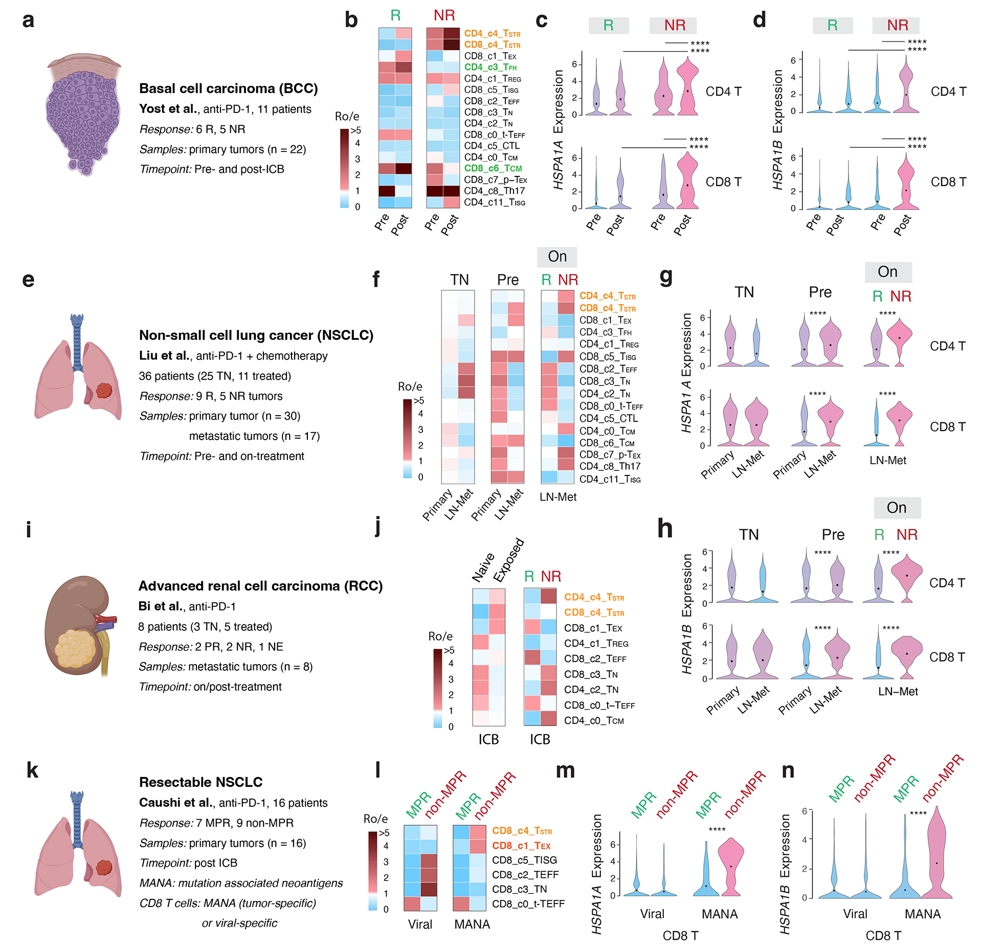
Tumor-infiltrating T cells offer a promising avenue for cancer treatment, yet their states remain to be fully characterized. Here we present a single-cell atlas of T cells from 308,048 transcriptomes across 16 cancer types, uncovering previously undescribed T cell states and heterogeneous subpopulations of follicular helper, regulatory and proliferative T cells. We identified a unique stress response state, TSTR, characterized by heat shock gene expression. TSTR cells are detectable in situ in the tumor microenvironment across various cancer types, mostly within lymphocyte aggregates or potential tertiary lymphoid structures in tumor beds or surrounding tumor edges. T cell states/compositions correlated with genomic, pathological and clinical features in 375 patients from 23 cohorts, including 171 patients who received immune checkpoint blockade therapy. We also found significantly upregulated heat shock gene expression in intratumoral CD4/CD8+ cells following immune checkpoint blockade treatment, particularly in nonresponsive tumors, suggesting a potential role of TSTR cells in immunotherapy resistance. Our well-annotated T cell reference maps, web portal and automatic alignment/annotation tool could provide valuable resources for T cell therapy optimization and biomarker discovery.


Figures

Extended Data Fig. 1
Extended Data Fig. 1. Major T cell types.
a) Global UMAP of all T cells and major T cell types. The subpopulations of CD4, CD8, proliferative, and unconventional T cells were further separated and defined by subsequent clustering analysis. b) Bubble plot showing the average expression levels and cellular fractions of representative marker genes across six major T cell types.
Extended Data Fig. 2
Extended Data Fig. 2. Characterization of CD8 T cell clusters.
a) Bubble plot showing the average expression levels and cellular fractions of selected marker genes in 14 defined CD8 T cell clusters. The complete list of the top 50 most significant differentially expressed genes (DEGs) is provided in Supplementary Table 3. b) Monocle 3 trajectory analysis of CD8 T cell differentiation demonstrating multiple possible routes. c) The UMAP and density plots before and after downsampling analysis. UMAP (top) and density plots (bottom) of CD8 T cells demonstrating T cell distribution across four main tissue groups. High relative cell density is shown as bright magma. For CD8 T cells, the downsampled cell number is 11,592 cells for each tissue group. d) Box plot showing cell fractions of CD8 T cell subsets across four tissue groups. Each dot represents a sample. H, normal tissues from healthy donors; U, tumor-adjacent uninvolved tissues; P, primary tumor tissues; M, metastatic tumor tissues. The one-sided Games-Howell test was applied to calculate the p values between those four tissue groups (n = 20, 51, 156, 39), followed by FDR (false discovery rate) correction. FDR-adjusted p value: *≤0.05; **≤0.01; ***≤0.001; ****≤0.0001. Boxes, median ± the interquartile range; whiskers, 1.5× interquartile range.
Extended Data Fig. 3
Extended Data Fig. 3. Characterization of CD4 T cell clusters.
a) Bubble plot showing marker gene expression across 12 defined CD4 T cell clusters. The complete list of the top 50 most significant DEGs is provided in the Supplementary Table 5. b) The UMAP and density plots before and after downsampling analysis. UMAP (left) and density plots (right) of CD4 T cells demonstrating T cell distribution across four main tissue groups. High relative cell density is shown as bright magma. For CD4 T cells, the downsampled cell number is 10,703 cells for each tissue group. c) Box plot showing cell fractions of 12 CD4 T cell subsets across four tissue groups. Each dot represents a sample. H, normal tissues from healthy donors; U, tumor-adjacent uninvolved tissues; P, primary tumor tissues; and M, metastatic tumor tissues. The one-sided Games-Howell test was applied to calculate the p values between those four tissue groups (n = 20, 53, 158, 39), followed by FDR (false discovery rate) correction. FDR-adjusted p value: *≤0.05; **≤0.01; ***≤0.001; ****≤0.0001. Boxes, median ± the interquartile range; whiskers, 1.5× interquartile range. d) Monocle 3 trajectory analysis of CD4 T cells. Cells are color coded for their corresponding pseudotime. e) Ridge plots show the distribution of inferred pseudotime across CD4 T cell clusters.
Extended Data Fig. 4
Extended Data Fig. 4. Characterization of unconventional T cells and proliferative T cells.
a) UMAP view of 5 innate T cell clusters. b) Bubble plot showing marker gene expression across 5 innate T cell clusters. The complete list of top 50 most significant DEGs is provided in the Supplementary Table 9. c) UMAP view of 8 proliferative T cell clusters. d) Bubble plot showing marker gene expression across 8 proliferative T cell clusters. The complete list of top 50 most significant DEGs is provided in the Supplementary Table 10. e) Sankey diagram showing the mapping of four proliferative CD8 subsets to the rest of CD8 T cell clusters after regressing out cell proliferative markers. f) Sankey diagram showing the mapping of two proliferative CD4 subsets (P_c6_Treg and P_c1) to the rest of CD4 T cell clusters after regressing out cell proliferative markers.
Extended Data Fig. 5
Extended Data Fig. 5. Correlations with tumor mutational burden (TMB) and patient survival in TCGA cohorts.
a) Correlation between the abundance of 9 T cell states (estimated via T cell deconvolution analysis using unique gene signatures in Supplementary Table 12) and TMB across 52 cancer types and their genotypic/molecular subtypes (labeled on the left with numbers indicating sample size). A total of 11,051 TCGA tumors with bulk RNA-seq data available were included and samples with low abundance of T cells (the bottom 25% of the ranked data) as estimated using MCP-counter were excluded (Supplementary Table 13). TMB and leukocyte fractions were from TCGA pan-cancer study by Thorsson et al.77. The annotation of cancer types and their genotypic/molecular subtypes was adopted from our recent study by Han et al. (Nature Communication, 12, 5606, 2021). The size of the rectangle is proportional to statistical significance (p-value, two-sided spearman correlation test, FDR-adjusted) and the color intensity is proportional to Spearman correlation coefficient (rho). Boxes, median ± interquartile range; whiskers, 1.5× interquartile range. b) Correlation with patient overall survival (OS). The size of the rectangle is proportional to statistical significance (FDR-adjusted p-value) and the color intensity is proportional to log scaled hazard ratio (HR).
Extended Data Fig. 6
Extended Data Fig. 6. Correlation with patient survival in the CPI1000+ cohorts.
Association with ICT response in three large cohorts of cancer patients from the CPI1000+ cohort with both RNA sequencing and clinical response data available are shown. Samples predominantly represented baseline pretreatment specimens, treated with single-agent immune checkpoint inhibitor (CPI) and without prior CPI treatment. Patients of the bladder cancer cohort (Bladder_U_MAR) and renal cancer cohort (Renal_U_MCD) received single-agent anti-PD-L1 therapy and patients of the combined melanoma cohort received either single-agent anti-CTLA-4 or anti-PD-1 therapy. More details on the clinical data (for example, drug treatment and biopsy timepoint, radiological response) of these patients can be found in the Supplementary Table 1 of the original study by Litchfield et al.56. Immune deconvolution was performed on normalized gene expression data from the original study using the 9 gene signatures included in the Supplementary Table 12. For each cohort, we assessed the radiological response rates in patient groups with all the different possible combinations of T cell state gene signature expression. Patient groups showing the highest ICT radiological response rates (among top 6) or the lowest response rates (among bottom 6) are shown. Sig_1, T cell state 1; Sig_2, T cell state 2; Res%, response rate. Hi, high expression group; lo, low expression group. Hi and lo groups were split based on the group median value of gene signature expression. Recurrently presented gene signatures are highlighted in color.
Extended Data Fig. 7
Extended Data Fig. 7. Detection of in situ HSPA1A and HSPA1B expression in tumor-infiltrating T cells in NSCLC and HCC samples by CosMx.
Two consecutive tissue sections from a NSCLC sample (sections ‘Lung 5_Rep1’ and ‘Lung 5-Rep3’) and one tissue section from a hepatocellular carcinoma (HCC) sample (section ‘CancerousLiver’) were profiled. (Column 1) Cells in physical locations (x, y coordinates). Color denotes cell type. Spatial mapping of CD3D (Column 2), HSPA1A (Column 4, Row 1/3/5), and HSPA1B (Column 3, Row 1/3) expression in T cells (note that, the HCC data does not include HSPA1B). (Column 2, Row 2/4/6) A zoom-in view of a representative area of their corresponding images in Column 1 showing lymphocyte aggregates enriched with T cells. (Column 3, Row 2/4/6) a zoom-in view of their corresponding images in Column 2 showing subcellular localization of CD3D, HSPA1B, and/or HSPA1A transcripts. (Column 4, Row 2/4/6) a further zoom-in view of their corresponding images in Column 3 showing co-localization of CD3D, HSPA1B, and/or HSPA1A transcripts in the same cells. Cell segmentation was done by the original study60. The outlines of cell nuclei were determined based on DAPI staining and the cell boundaries were determined based on morphology markers for membrane (for example, CD298) combined with a machine learning approach60.
Extended Data Fig. 8
Extended Data Fig. 8. Co-mapping of TSTR cells and hypoxia-related gene expression using spatial transcriptomics.
(Top row) Mapping of TSTR cells (in red) on the histology image based on corresponding spatial transcriptomics data generated from the same tissue section. (Rest of the rows) spatial co-mapping of TSTR cells (in red) and hypoxia-related gene expression (in blue, the darker the color, the higher the level of gene expression) in the same regions as shown in the top row. BRCA, breast cancer; CSCC, cutaneous squamous cell carcinoma; GAC, gastric adenocarcinoma; ccRCC, clear cell renal cell carcinoma; LUAD, lung adenocarcinoma.
Extended Data Fig. 9
Extended Data Fig. 9. Pan-cancer detection of TSTR cells and Co-mapping of TSTR cells and hypoxia-related gene expression using spatial transcriptomics.
Extra representative tissue sections of 4 cancer types are shown. (Top row) H&E stained tissue images. (Second row) Mapping of T cells and (third row) the TSTR cells on the same histology images (GAC, BRCA, ccRCC, CSCC) or a high-magnification image (ccRCC). GAC, gastric adenocarcinoma; BRCA, breast cancer; ccRCC, clear cell renal cell carcinoma; CSCC, cutaneous squamous cell carcinoma. (Rest of the rows) spatial co-mapping of TSTR cells (in red) and hypoxia-related gene expression (in blue, the darker the color, the higher the level of gene expression) in the same regions as shown in the top row.
Extended Data Fig. 10
Extended Data Fig. 10. The workflow of TCellMap.
a) Schematic view of the bioinformatic flow of TCellMap, created with BioRender.com. b) Leave-one-out cross-validation of the performance of TCellMap using scRNA-seq datasets included in this study. Scatter plot showing the accuracy (ACC) of T cell state prediction. A total of 24 scRNA-seq datasets with ≥5,000T cells were selected (x axis), and the prediction accuracy was calculated by comparing T cell states automatically assigned for 32 states of the 5 major cell types using the reference maps with that manually annotated by this study. The size of the bubble corresponds to the number of T cells in each scRNA-seq dataset. c) Visualization of the output of TCellMap. Four scRNA-seq datasets that were not included in original data collection of this study were used as the query datasets. UMAP views of CD8 (top) and CD4 (bottom) T cells mapped in each query dataset. Cell clusters are color coded in the same way as in Fig. 2a (CD8 T cells map) and Fig. 3a (CD4 T cell map). LUAD, lung adenocarcinoma; CRC, colorectal carcinoma; HCC, hepatocellular cell carcinoma; HNSC, head and neck cancer. The gene expression count matrices were downloaded from the Gene Expression Omnibus (GEO) database and the accession codes (GSE#) are labeled for each dataset. Further details of each query dataset are provided in the Supplementary Table 16.
Figure 1.
Figure 1.. Pan-cancer analysis of T cells - data collection and major T cell types.
a) Schematic depicting the study design (created with BioRender.com). We used 17 published and 10 in-house datasets. Detailed information on cohorts and samples is provided in Supplementary Tables 1 and 2. b) Bar graphs showing summary statistics for the number of cells, samples, and subjects collected by organ (left) and their tissue compositions (right). Tissue color codes are consistent with panel a. c) Pie chart depicting the cellular frequencies of the 6 major T cell types in all analyzed samples. d) Bar graphs displaying relative cellular fractions of the 6 major T cell types across various cohorts of the four main tissue groups. In our study, the analyzed metastatic tumors were biopsies taken from metastases. BM, bone marrow; LN, lymph node; PBMC, peripheral blood mononuclear cell. For uninvolved normal tissues and metastatic tumors, their corresponding organs/sites of sample collection are labeled. Cancer types are labeled using the TCGA study abbreviations.
Figure 2.
Figure 2.. Transcriptional diversity of CD8 T cells.
a) The UMAP view of 14 CD8 T cell clusters. b) Marker gene expression across defined T cell clusters. Bubble size is proportional to the percentage of cells expressing a gene and color intensity is proportional to average scaled gene expression. c) Bubble plot and d) ridge plot showing key marker gene expression between the two CD8 T cell clusters. e) Heatmap illustrating expression of 19 curated gene signatures across CD8 T cell clusters. Heatmap was generated based on the scaled gene signature scores. f) Expression of 4 representative gene signatures selected from e). g) Monocle 3 trajectory analysis of CD8 T cell differentiation revealing three main divergent trajectories. Cells are color coded for their corresponding pseudotime. h) Two-dimensional plots showing expression scores for 3 representative gene signatures in cells of paths 1 (blue), path 2 (yellow), and path 3 (pink), respectively, along the inferred pseudotime. i) UMAP view of CD8 T cell states (left) and cell density (right) displaying CD8 T cell distribution across 4 main tissue groups. Downsampling was applied, and 11,592 cells were included for each group. High relative cell density is shown as bright magma. j) Distribution of CD8 T cell states across tissue groups. Top bar plot showing the relative proportion of cells from 4 different tissue types for each CD8 T cell subset. Heatmap showing tissue prevalence estimated by Ro/e. k) Box plots showing cellular fractions of three CD8 T cell subsets across tissue groups. Each dot represents a sample. Pie charts displaying tissue composition. H, normal tissues from healthy donors; U, tumour adjacent uninvolved tissues; P, primary tumour tissues; and M, metastatic tumour tissues. The one-sided Games-Howell test was applied to calculate the p values between tissue types (sample number n = 20, 51, 156, 39), followed by FDR (false discovery rate) correction. FDR adjusted p-value: *≤0.05; **≤0.01; ***≤0.001, ****≤0.0001. For CD8_c1, p = 7.27e-10 (H vs. P), p = 4.21e-6 (H vs. M), p = 2.84e-4 (U vs. M), p = 8.38e-4 (P vs. M). Boxes, median ± interquartile range; whiskers, 1.5× interquartile range.
Figure 3.
Figure 3.. The landscape of CD4 T cells.
a) UMAP view of 12 CD4 T cell clusters. b) Bubble plot showing marker gene expression across defined clusters. More marker genes are shown in Extended Data Fig. 3a and a list of the top 50 most significant DEGs are provided in Supplementary Table 5. c) Heatmap displaying expression of 16 curated gene signatures (as listed in Supplementary Table 6) across CD4 T cell clusters. d) UMAP view of CD4 T cell states (top) and cell density (bottom) demonstrating CD4 T cell distribution across 4 tissue groups. Downsampling was applied, and 10,703 cells were included for each group. High relative cell density is shown as bright magma. e) Distribution of CD4 T cell states across different tissues. (Top) bar plot showing the relative proportion of cells from 4 tissue types and (bottom) heatmap showing tissue prevalence estimated by Ro/e. f) Box plots comparing cellular fractions of three CD4 T cell subsets across tissue types. Each dot represents a sample. Pie charts displaying tissue composition. The one-sided Games-Howell test was applied to calculate the p values between those 4 tissue types (sample number n = 20, 53, 158, 39), followed by FDR correction. FDR adjusted p-value: * ≤0.05; **≤0.01; ***≤0.001, ****≤0.0001. For CD4_c1, pHvsP = 4.08e-13, pHvsM = 4.03e-6, pUvsP = 4.08e-13, pUvsM = 4.03e-16. For CD4_c3, pUvsP = 4.05e-4, pUvsM = 0.021. For CD4_c0, pHvsM = 0.002, pUvsP = 0.023, pUvsM = 9e-8, pPvsM = 8.06e-5. Boxes, median ± interquartile range; whiskers, 1.5× interquartile range. g) UMAP plot of seven CD4 Treg subclusters (left) and (right) ridge plots displaying the distribution of inferred pseudotime across Treg subclusters. h) Marker gene expression across Treg subclusters. The complete list of significant DEGs is provided in Supplementary Table 7. i) UMAP plot of five CD4 Tfh subclusters (left) and (right) ridge plots illustrating the distribution of inferred pseudotime across Tfh subclusters. j) Marker gene expression across Tfh subclusters. A list of significant DEGs is provided in Supplementary Table 8.
Figure 4.
Figure 4.. Transcriptional similarity and co-occurrence patterns of T cell subsets and correlations with genomic, molecular, and pathological features.
a) The dendrogram on the left displays transcriptional similarity among 31 T cell subsets. The computed Euclidean distance matrix was used for unsupervised hierarchical clustering analysis, which revealed 4 major “branches” that are colored (from bottom to top) in black, green, orange, and cyan, respectively. The heatmap on the right shows the expression of 6 curated gene signatures across T-cell clusters. The heatmap was generated based on the scaled gene signature scores. IFN, IFN response; stress, stress response; Exh, exhaustion; CTL, cytotoxicity; Act/Eff, activation/effector function. b) T cell state co-occurrence in primary tumours (left) and metastatic tumours (right). Sample-level Spearman correlation analysis was performed based on cluster frequencies of 31 non-proliferative T cell subsets. Positive co-occurrence patterns are in ‘warm’ color, and negative co-occurrence patterns are in ‘cold’ color. Color intensity is proportional to the Spearman correlation coefficient. Asterisks indicate the statistical significance based on FDR-adjusted two-sided p-values. c) Correlation with genomic, molecular, and pathological features in 16 scRNA-seq cohorts across 8 cancer types with corresponding information available, and d) the CPI1000+ cohorts. The heatmap in c) displays the distribution of T cell states across different cancer types and subtypes, as estimated by Ro/e. FL, follicular lymphoma; LBCL, large B cell lymphoma; iCCA, intrahepatic cholangiocarcinoma; NS, never smoker; S, smoker. Cancer types are labeled using the TCGA study abbreviations. The heatmap in d) illustrates correlations with TMB and additional mutation quality characteristics as well as known biomarkers of ICB therapy response (Litchfield et al.). The size of the square is proportional to statistical significance (FDR-adjusted two-sided p-value) and the color intensity is proportional to the Spearman correlation coefficient (rho). An annotation of the abbreviations is listed on the right.
Figure 5.
Figure 5.. Detection of TSTR cells in situ using multiple different spatial profiling approaches.
a) Detection of HSPA1B expression in peritumoral lymphocytes in a melanoma lymph-node (LN) metastasis by RNAscope. (i) H&E of the sample at low magnification (40x, scale bar 200 μm), with high-magnification (400x, scale bar 20 μm) areas showing H&E and RNAscope on melanoma cells (ii & iii) and peritumoral lymphocytes (iv & v) demonstrating that both tumor cells and peritumoral lymphocytes express HSPA1B RNA. No tissue section replicate was available for this sample. b) Detection of TSTR cells in an NSCLC sample by CosMx. A representative tissue section (Lung 5–2) is shown. Two consecutive tissue sections of Lung 5–2 are presented in Extended Data Fig. 7. (i) Cells in physical locations (x, y coordinates). Color denotes cell type. Spatial mapping of CD3D (ii), HSPA1A (iii), and HSPA1B (iv) expression in T cells (the same area as i). (v) A zoom-in view of a representative area of (i) showing two lymphocyte aggregates. (vi) a zoom-in view of (v) showing subcellular localization of CD3D, HSPA1A, and HSPA1B transcripts. (vii) a zoom-in view of (vi) showing co-localization of CD3D, HSPA1A, and HSPA1B transcripts. c) Pan-cancer detection of TSTR cells by spatial transcriptomics. Representative tissue sections of 6 cancer types are shown. (top row) H&E stained tissue image. (middle row) Mapping of T cells and (bottom row) the TSTR cells on the same histology image (Melanoma, GAC, LUAD) or a high-magnification image (BRCA, CSCC, ccRCC). BRCA, breast cancer; CSCC, cutaneous squamous cell carcinoma; GAC, gastric adenocarcinoma; ccRCC, clear cell renal cell carcinoma; LUAD, lung adenocarcinoma. d) Co-mapping of TSTR cells and hypoxia-related gene expression by spatial transcriptomics in a LUAD sample (section 14C) as shown in c). (first on the left) Mapping of TSTR cells (in red) on the same image as shown in c). The black curve outlines the two tumor areas. (the remaining images on the right) Spatial co-mapping of TSTR cells (in red) and hypoxia-related gene expression (in blue, the darker the color, the higher the level of gene expression) on the same capture area.
Figure 6.
Figure 6.. Significant enrichment of CD4/CD8 TSTR cells following ICB therapy across cancer types, primarily, in non-responsive tumors.
a, e, i, k) Description of the cohort, patients, and samples (created with BioRender.com). a-d) The BCC cohort. b) Enriched CD4/CD8 TSTR cells in non-responsive (NR) tumors. c) Significantly higher expression of HSPA1A (all p values < 2.2e-16) and d) HSPA1B in CD4 and CD8 T cells from NR vs. responsive (R) tumors, and at post (vs. pre)-ICB timepoint. Pre, pre-ICB; Post, post-ICB treatment (For CD4 T, pNR_Pre-vs-Post = 1.16e-11, pPost_R-vs-NR = 2.16e-8. For CD8 T, pNR_Pre-vs-Post < 2.2e-16, pPost_R-vs-NR = 1.33e-10). e-h) The NSCLC cohort. f) Enriched CD4/CD8 TSTR cells in NR tumors during ICB treatment. g) Significantly higher expression of HSPA1A and h) HSPA1B in CD4/CD8 T cells from NR vs. R tumors on ICB treatment, and in LN-met vs. primary tumors at pre-ICB timepoint. TN, treatment naïve; On, on-ICB treatment; LN-Met, lymph node metastasis (For CD4 T, pPre_Primary-vs-LN-Met < 2.2e-16, pLN-Met_R-vs-NR = 6.89e-12. For CD8 T, pPre_Primary-vs-LN-Met = 3.07e-10, pPost_R-vs-NR = 8.29e-12). i-j) The advanced RCC cohort from Bi et al. j) Enriched CD4/CD8 TSTR cells from tumors exposed to ICB treatment, and enriched CD4 TSTR cells in NR tumors post-ICB treatment. k-n) The resectable NSCLC cohort. l) Enriched CD8 TSTR cells in tumors from patients with no major pathological response (non-MPR) post-ICB treatment among MANA-specific CD8 T cells. (m) Significantly higher expression of HSPA1A (all p values < 2.2e-16) and n) HSPA1B in CD8 T cells in tumors from non-MPR patients compared to those from MPR patients post-ICB treatment, among MANA-specific CD8 T cells (all p values < 2.2e-16). MPR, defined as < 10% viable tumor at the time of surgery; MANA, mutation-associated neoantigens. MANA-specific CD8 T cells were identified using the MANA functional expansion of specific T cells (MANAFEST) assay. Viral (EBV and influenza)-specific T cells were identified using the viral functional expansion of specific T cells (ViralFEST) assay, as described in the original study. For c), d), g), h), m), and n), two-sided Welch’s t-test was applied to calculate p values: (****p≤0.0001), followed by FDR correction.

References

    1. Zhang Y & Zhang Z The history and advances in cancer immunotherapy: understanding the characteristics of tumor-infiltrating immune cells and their therapeutic implications. Cellular & molecular immunology 17, 807–821 (2020). - PMC - PubMed
    1. Ostroumov D, Fekete-Drimusz N, Saborowski M, Kühnel F & Woller N CD4 and CD8 T lymphocyte interplay in controlling tumor growth. Cellular and Molecular Life Sciences 75, 689–713 (2018). - PMC - PubMed
    1. Russell JH & Ley TJ Lymphocyte-mediated cytotoxicity. Annual review of immunology 20, 323–370 (2002). - PubMed
    1. Fridman WH, Pagès F, Sautès-Fridman C & Galon J The immune contexture in human tumours: impact on clinical outcome. Nature Reviews Cancer 12, 298–306 (2012). - PubMed
    1. Janssen EM, et al. CD4+ T-cell help controls CD8+ T-cell memory via TRAIL-mediated activation-induced cell death. Nature 434, 88–93 (2005). - PubMed

Substances