Single-cell dissection of cervical cancer reveals key subsets of the tumor immune microenvironment
- PMID: 37427448
- PMCID: PMC10425846
- DOI: 10.15252/embj.2022110757
Single-cell dissection of cervical cancer reveals key subsets of the tumor immune microenvironment
Abstract
The tumor microenvironment (TME) directly determines patients' outcomes and therapeutic efficiencies. An in-depth understanding of the TME is required to improve the prognosis of patients with cervical cancer (CC). This study conducted single-cell RNA and TCR sequencing of six-paired tumors and adjacent normal tissues to map the CC immune landscape. T and NK cells were highly enriched in the tumor area and transitioned from cytotoxic to exhaustion phenotypes. Our analyses suggest that cytotoxic large-clone T cells are critical effectors in the antitumor response. This study also revealed tumor-specific germinal center B cells associated with tertiary lymphoid structures. A high-germinal center B cell proportion in patients with CC is predictive of improved clinical outcomes and is associated with elevated hormonal immune responses. We depicted an immune-excluded stromal landscape and established a joint model of tumor and stromal cells to predict CC patients' prognosis. The study revealed tumor ecosystem subsets linked to antitumor response or prognosis in the TME and provides information for future combinational immunotherapy.
Keywords: cervical cancer; heterogeneity; single-cell RNA sequencing; tumor microenvironment.
© 2023 The Authors.
Conflict of interest statement
The authors declare that they have no conflict of interest.
Figures
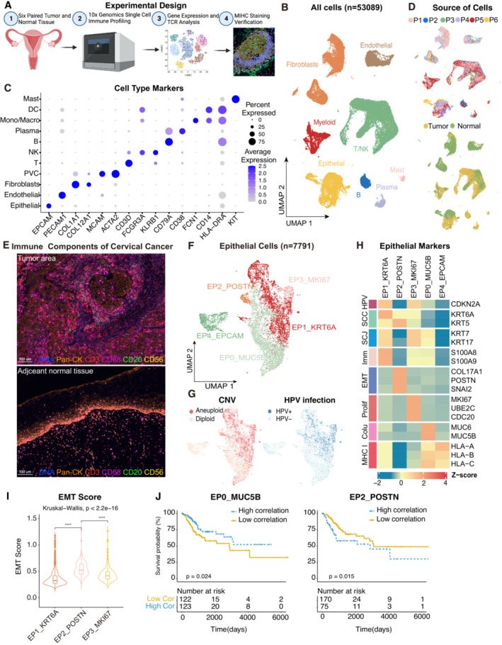
Experimental design of primary cervix tumor collection, processing, sequencing and data analysis; Created with
BioRender.com .UMAP plot of all the 53,089 single cells from 6 cervical cancer patients. Cells were annotated based on known lineage‐specific marker genes (denoted by colors).
Dot plot showing the lineage‐specific marker genes of T and NK cells (T/NK), B cells, Plasma, Myeloid cells, Mast cells, Fibroblasts, Perivascular cells (PVC), Endothelial and Epithelial cells. The shade of color denotes the average gene expression level, the dot size denotes the percentage of gene expression in the corresponding lineage.
UMAP plot of single cells profiled in the presenting work colored by patient (upper panel) and sample source (lower panel).
Representative mIHC of immune components in CC tumors and adjacent normal tissues. T cells: CD3 (red), B cells: CD20 (green), macrophages: CD68 (pink), NK cells: CD56 (yellow), epithelial cells: Pan‐CK (orange). Scale bar = 100 μm.
UMAP plot showing the subtypes of 7,791 epithelial cells. Cluster annotations are denoted and colored corresponding to the cell type in the figure.
UMAP plot showing the distribution of CNV and HPV infection status (indicated by colors).
Heatmap showing the expression of marker genes in each subtype of epithelial cells. SCC, squamous cell carcinoma; SCJ, squamocolumnar junction; Imm, immune‐related genes; Prolif, hyperproliferation; Colu, columnar epithelium; EMT, epithelial‐mesenchymal transition.
Violin plot indicating the EMT Score of three malignant cell clusters; Differences between group were examined by Kruskal‐Wallis test. ****P < 0.0001 by pairwise Wilcoxon tests with the Benjamini‐Hochberg correction.
Comparison of Overall survival (OS) rates for the high‐correlation and low‐correlation groups, stratified using the EP0_MUC5B (left panel) and EP2_POSTN (right panel) signatures in TCGA. P‐values are calculated using the log‐rank test (N = 255).
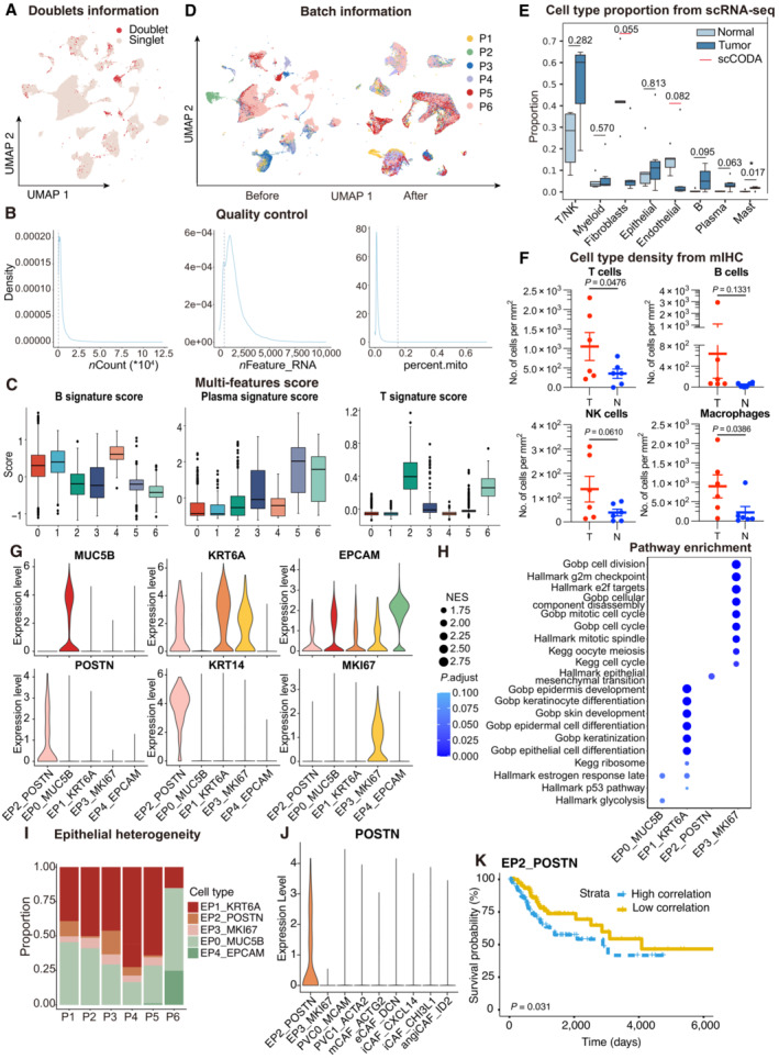
UMAP plot showing the distribution of singlets (pink) and doublets (red) in CESC as evaluated using by R packages “DoubletFinder”.
Density plots showing the distribution of UMIs (left panel), genes (middle panel), and mitochondrial percents (right panel) of all single cells. The light gray dotted line denotes the cut‐offs of quality control.
Boxplots showing the T, Plasma and B cell three signature scores of B cell subtypes.
UMAP plot showing the information of Batch from patients. Before (left panel) and after (right panel) batch effect removal.
Boxplots showing the cell‐type proportions of six patients for matched tumor and normal samples. P < 0.05 was considered statistical significance; The scCODA model and the ALDEx2 model were used to examine the differences in cell‐type composition. Red bars indicate credible and significant results of scCODA. Stars indicate the significance calculated by ALDEx2 model (* P < 0.05).
Scatter plots showing the quantification of T cells (CD3+), B cells (CD20+), macrophages (CD68+) and NK cells (CD56+) in tumor area (T) and adjacent normal tissue (N, n = 6). Represented Mean ± SEM. P‐value was measured by paired Student's t‐test.
Violin plot showing the expression of marker genes in epithelial subclusters.
Dot plot showing the selected signaling pathways (rows) with significant enrichment of GO, KEGG and Hallmark terms for four epithelial cell clusters.
Stacked bar plot showing the epithelial cell clusters distribution among patients.
Violin plot showing the expression of POSTN in EP2 and fibroblasts.
OS rates for the high‐correlation and low‐correlation groups in TCGA, stratified using the EP2_POSTN signatures removed overlapped genes with fibroblasts. P‐values are calculated using the log‐rank test (N = 255).
- A
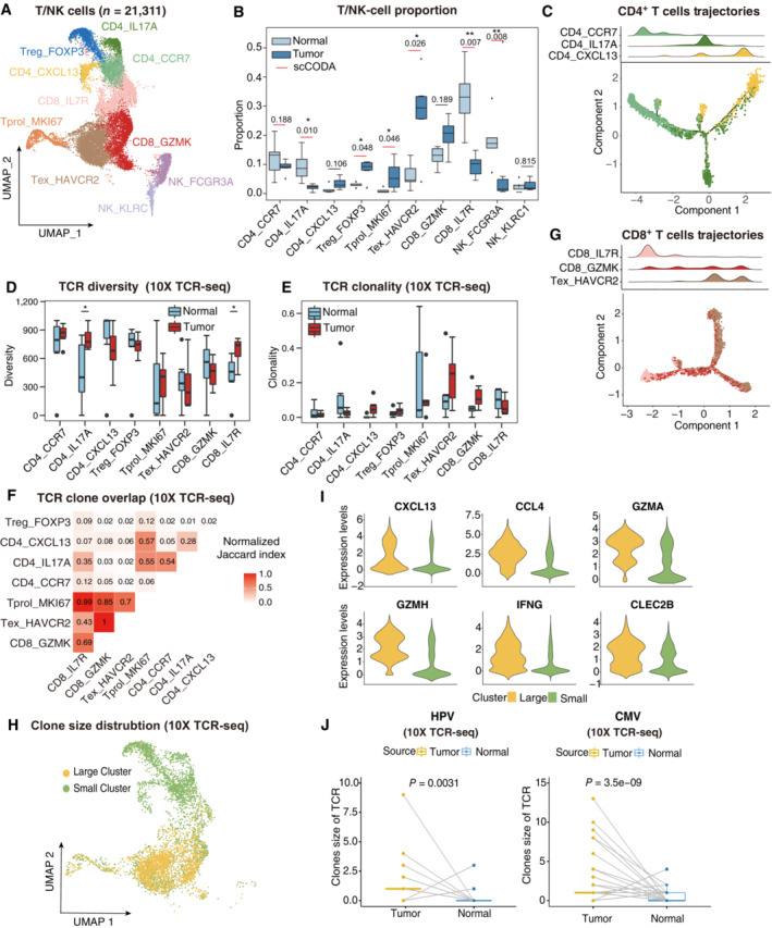
UMAP plot showing the subtypes of 21,311 T/NK cells. Cluster annotations are denoted and colored corresponding to cell types in the figure.
- B
Boxplots showing the cell‐type proportions of T/NK cells for matched tumor and normal samples (n = 5). The scCODA model and the ALDEx2 model were used to examine the differences in T/NK cells' composition. Red bars indicate credible and significant results of scCODA. Stars indicate the significance calculated by ALDEx2 model (*P < 0.05, **P < 0.01).
- C
2D graph of T cells trajectories, from CD4+ T cell subsets. The cell density distribution, by the pseudo‐time, is shown at the top of the figure and colored corresponding to cell types, respectively.
- D, E
Boxplots showing each cell type TCR Diversity (D) and Clonality (E) level for matched tumor and normal samples (n = 5) by using 10× TCR data. Student's t‐test. *P < 0.05.
- F
Triangle heatmap showing the overlap of expanded TCR clonotypes across all possible combinations of T cell clusters. Data were aggregated for each of the indicated patient groups from 10× TCR data. Numbers indicate the normalized Jaccard index number of shared expanded TCR clonotypes for each cluster pair.
- G
2D graph of T cells trajectories, from CD8+ T cell subsets. The cell density distribution, by the pseudo‐time, is shown at the top of the figure and coloured corresponding to cell types, respectively.
- H
UMAP as in (A), but cells are colored corresponding to clone sizes, large (yellow) or small (green). Clones from 10× TCR data.
- I
Violin plots showing the differentially expressed genes between large and small clone (color‐coded as in H).
- J
Boxplots showing the clone size of HPV (left panel) and CMV (right panel) antigen‐specific TCR for matched tumor and normal samples by using 10× TCR data. Student's t‐test.
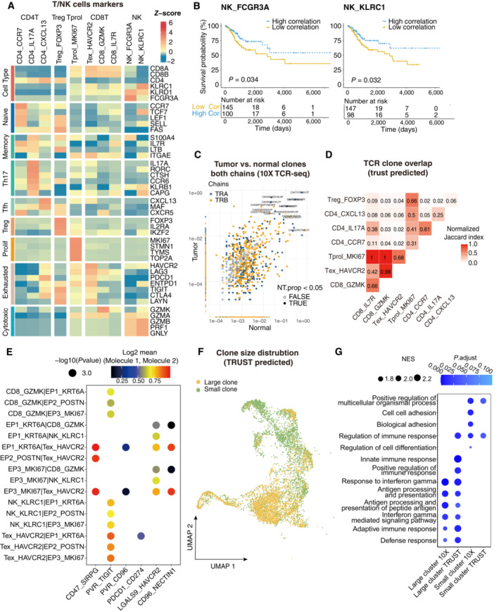
Heatmap showing the expression of marker genes in each subtype of T/NK cells.
Comparison of Overall survival (OS) rates for the high‐correlation and low‐correlation groups, stratified using the NK_FCGR3A (left panel) and NK_KLRC1 (right panel) signatures in TCGA. P‐values are calculated using the log‐rank test (N = 255).
Representative example of tumor versus normal clones from 10× TCR data, showing both chains, with filled points representing clones suggesting a significant change in frequency.
Triangle heatmap showing the overlap of expanded TCR clonotypes across all possible combinations of T cell clusters. Data were aggregated for each of the indicated patient groups from TRUST predicted TCR data. Numbers indicate the normalized Jaccard index number of shared expanded TCR clonotypes for each cluster pair.
Bubble plots showing the interactions between epithelial cells and T/NK cell populations using CellPhoneDB.
UMAP as in Fig 2A, but clones from TRUST predicted TCR data.
Dot plot showing the selected signaling pathways (rows) with significant enrichment of GO terms for large clones and small clones identified by 10× or predicted by TRUST (Related to Fig 2).
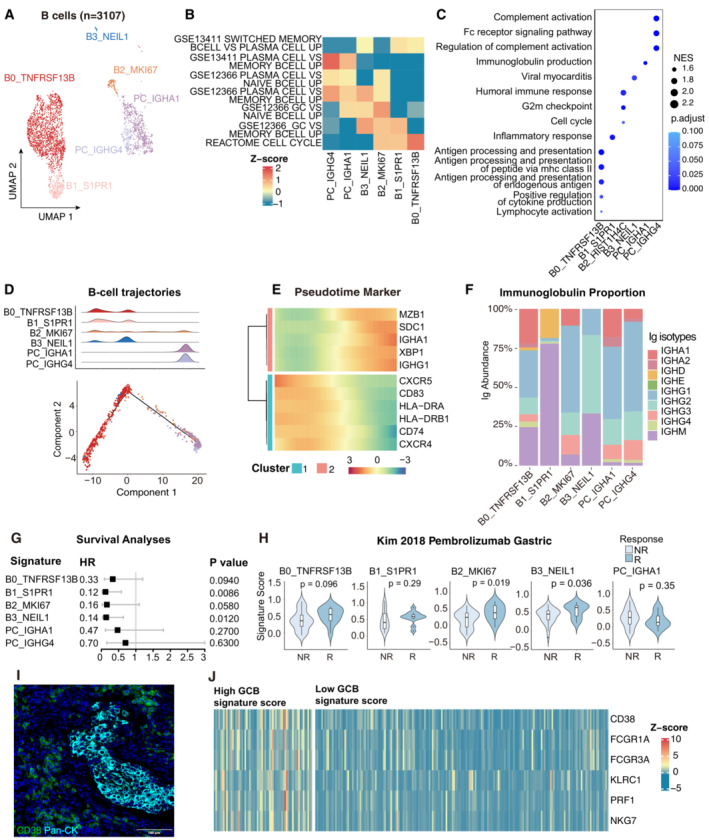
UMAP plot showing the subtypes of 3,107 B cells. Cluster annotations are denoted and coloured corresponding to cell types in the figure.
Heatmap showing the characterization of different B‐cell populations with B‐cell‐related pathways.
Dot plot showing the selected signaling pathways (rows) with significant enrichment of GO terms for B‐cell and plasma clusters.
2D graph of B cells trajectories. The cell density distribution, by the pseudo‐time, is shown at the top of the figure and colored corresponding to cell types.
Heatmap showing immune‐associated genes in the differentiation process.
Stacked bar plot showing immunoglobulin (Ig) abundance of each B cell sub‐cluster.
A forest plot showing the association of different B‐cell signatures with survival across the TCGA SCC cohort. Squares and lines indicate hazard ratios (HRs) and 95% confidence intervals (CIs), respectively. HRs were calculated using univariable Cox regression; P‐values were calculated using log‐rank test.
Violin plots showing the association of different B‐cell signatures with the response (R, N = 15) and no response (NR, N = 42) to Pembrolizumab in the Kim cohort. P‐values calculated using the student's t‐test.
Representative mIHC of plasma cells in CC tumor area. plasma cells: CD38+Pan‐CK−, scale bar = 100 μm.
Expression of the genes that comprise the plasma cell and ADCC signatures in TCGA cohort.
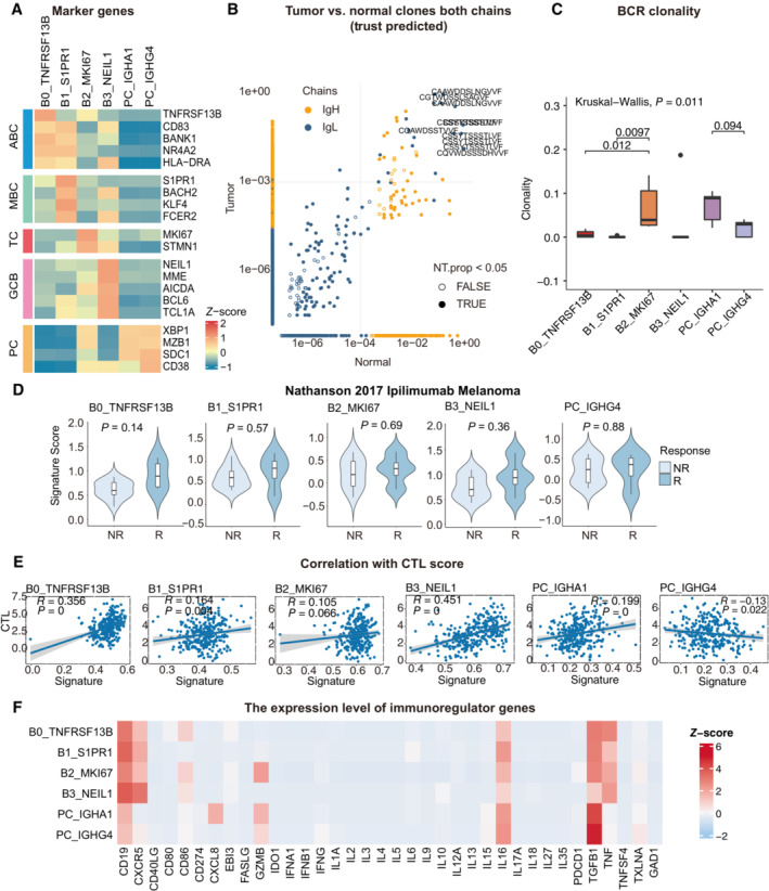
Heatmap showing the expression of marker genes in each subtype of B cells.
Representative example of tumor versus normal clones from TRUST predicted BCR data, showing both chains, with filled points representing clones suggesting a significant change in frequency.
Boxplots showing each cell type BCR Clonality level for matched tumor and normal samples by using TRUST predicted BCR data. Student's t‐test, P < 0.05 was considered statistical significance.
Violin plots showing the association of different B‐cell signatures with the response (R, N = 4) and no response (NR, N = 11) to Ipilimumab in the Nathanson 15 cohort. P‐values calculated using the student's t‐test.
Scatter plot showing the correlation between the bulk sample with CTL score and the single‐cell B cell clusters.
Heatmap showing the expression level of immunoregulator genes in B‐cell populations.
- A, B
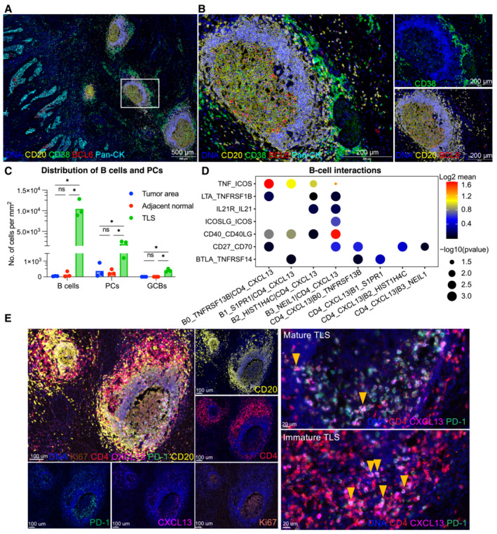
B cell subsets localization in CC tissues are exhibited by mIHC via differential markers as follow: total B cell: CD20+, GCB: CD20+BCL6‐, PC: CD20‐CD38+; with scale =500 μm for (A), scale = 200 μm for (B).
- C
Quantification of B‐cell density in Pan‐CK+ tumor area, adjacent stroma and TLS. *P < 0.05, two‐way ANOVA following Tukey post‐hoc test.
- D
Bubble plots showing the interactions between Tfh (CD4_CXCL13) and B‐cell populations using CellPhoneDB.
- E
Representative mIHC of CC tumor with CD4+PD‐1+CXCL13+ Tfh cells located in TLS (yellow arrows). scale bars = 100 μm for left panel, scale bars = 20 μm for right panel.
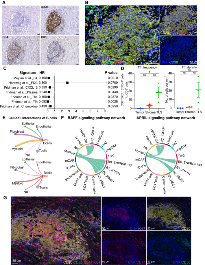
Cellular compositions of TLS are exhibited by immunohistochemistry. Scale = 100 μm.
B‐cell subsets are exhibited by mIHC via differential markers as follows: total B cell: CD20+, GCB: CD20+BCL6−, PC: CD20−CD38+. Scale = 100 μm.
A forest plot showing the association of TLSs‐associated signatures with survival across the TCGA SCC cohort (n = 255). Squares and lines indicate hazard ratios (HRs) and 95% confidence intervals (CIs), respectively. HRs calculated using univariable Cox regression; P‐values calculated using log‐rank test; ST, spatial transcriptomics.
Scatter plots showing the frequency and density of Tfh cells (CD4+PD‐1+CXCL13+) in TLSs, tumor and stroma (n = 3). Represented Mean ± SEM. P‐value was measured by the Holm–Sidak's multiple comparisons test, *P < 0.05.
Circle plots showing the number of interaction weights between B cell groups and other cell groups. Edge colors are consistent with the sources as the sender, and edge weights are proportional to the interaction strength. A thicker edge line indicates a stronger signal.
Chord diagram showing the communication networks of APRIL (left panel) and BAFF (right panel) signaling pathways. Arrows indicate the interactions (signaling pathways) from some cell groups to other cell groups.
Representative mIHC of CD14+ cell localization in TLS. Scale bars are 50 μm (Related to Fig 4).
- A
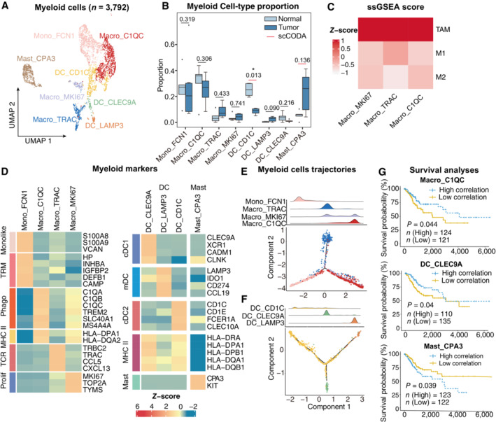
UMAP plot showing the subtypes of 3,792 Myeloid cells. Cluster annotations are denoted and colored corresponding to cell types in the figure.
- B
Boxplots showing the cell‐type proportions of myeloid cells for matched tumor and normal samples (n = 5). The scCODA model and the ALDEx2 model were used to examine the differences in myeloid cells' composition. Red bars indicate credible and significant results of scCODA. Stars indicate the significance calculated by ALDEx2 model (*P < 0.05).
- C
Heatmap showing the characterization of different macrophage cell populations with M1, M2 and TAM scores.
- D
Heatmap showing the expression of marker genes in each subtype of myeloid cells; TRM, tissue‐resident macrophage; Phago, phagocytosis.
- E, F
2D graph of myeloid cells trajectories, from monocyte/macrophage cell (E) and Dendritic cell (F) subsets. The cell density distribution, by the pseudo‐time, is shown at the top of the figure and colored corresponding to cell types, respectively.
- G
Comparison of Overall survival (OS) rates for the high‐correlation and low‐correlation groups, stratified using the Macro_C1QC (upper panel), and Mast_CPA3 (lower panel) signatures in TCGA (N = 255). P‐values are calculated using the log‐rank test.
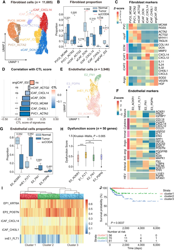
UMAP plot showing the subtypes of 11,685 fibroblast cells. Cluster annotations are denoted and colored corresponding to cell types in the figure.
Boxplots showing the cell‐type proportions of fibroblast cells for matched tumor and normal samples (n = 5).
Heatmap showing the expression of marker genes in each subtype of fibroblasts; PVC, perivascular cells; myoF, myofibroblasts; ECM, extracellular matrix Angio, angiogenesis.
Bar plot showing fibroblast signature associated with CTL exclusion. The bar width indicates the correlation between the bulk sample and the single‐cell fibroblast cluster. P‐values were computed using a two‐sided t‐test for correlation and were adjusted using the Benjamini–Hochberg procedure.
UMAP plot showing the subtypes of 3,946 endothelial cells. Cluster annotations are denoted and coloured corresponding to cell types in the figure.
Heatmap showing the expression of marker genes in each subtype of endothelial cells; Anti‐angi, anti‐angiogenic drug targets.
Boxplots showing the cell‐type proportions of endothelial cells for matched tumor and normal samples.
Boxplot showing the T‐cell dysfunction score of marker genes (n = 50) in endothelial cell populations; P‐values were caculated by Wilcox rank‐sum test with the Benjamini‐Hochberg correction.
Unsupervised hierarchical clustering for patients from the TCGA dataset based on the correlation to EP1, EP2, iCAF_CXCL14, iCAF_CHI3L1 and imE1_FLT1.
Comparison of Overall survival (OS) rates for three clusters identified in (I). P‐values are calculated using the log‐rank test (n = 255).
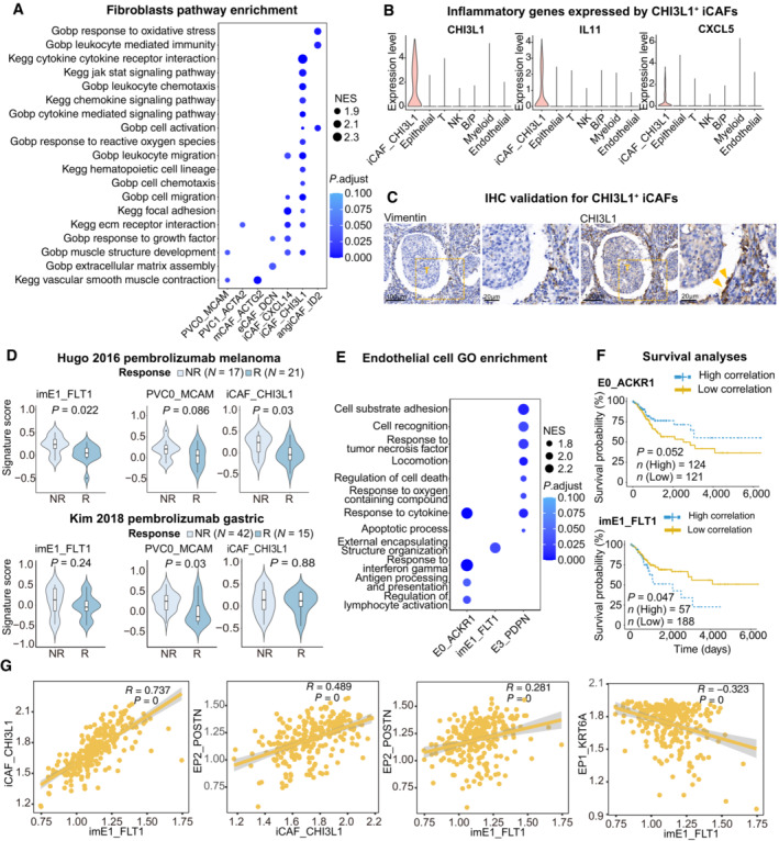
Dot plot showing the selected signaling pathways (rows) with significant enrichment of GO, and KEGG terms for fibroblasts.
Violin plot showing the expression of immune regulator genes in iCAF_CHI3L1 and other cell lineages.
IHC staining of representative tumor section showing the expression of CHI3L1 in CAFs (yellow arrows) close to cancer cells; The scale bars for the left slide of each marker are 100 μm, and the scale bars for the right slide are 20 μm.
Violin plots showing the association of different stromal cell signatures with the response (R) and no response (NR) to Pembrolizumab across on Hugo 26 cohort (upper panel) and Kim 45 cohort (lower panel). P‐values calculated using student's t‐test. Sample sizes are indicated in figure.
Dot plot showing the selected signaling pathways (rows) with significant enrichment of GO, and endothelial cell clusters.
Comparison of Overall survival (OS) rates for the high‐correlation and low‐correlation groups, stratified using the E0_ACKR1 (left panel) and imE1_FLT1 (right panel) signatures in TCGA (N = 255). P‐values are calculated using the log‐rank test.
Scatter plot showing the correlation among imE1, EP1, EP2 and iCAF_CHI3L1 subsets.
References
-
- Ashrafi GH, Haghshenas MR, Marchetti B, O'Brien PM, Campo MS (2005) E5 protein of human papillomavirus type 16 selectively downregulates surface HLA class I. Int J Cancer 113: 276–283 - PubMed
Publication types
MeSH terms
Associated data
- Actions
Grants and funding
LinkOut - more resources
Full Text Sources
Medical