. 2023 Sep;20(9):1355-1367.
doi: 10.1038/s41592-023-01938-4. Epub 2023 Jul 13.

SCENIC+: single-cell multiomic inference of enhancers and gene regulatory networks

Affiliations

SCENIC+: single-cell multiomic inference of enhancers and gene regulatory networks

Carmen Bravo González-Blas et al. Nat Methods. 2023 Sep.

Abstract

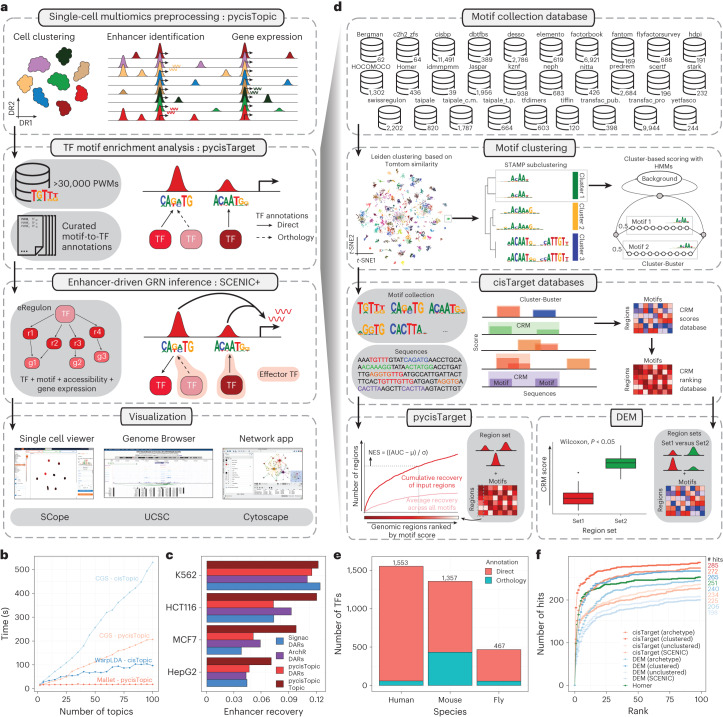
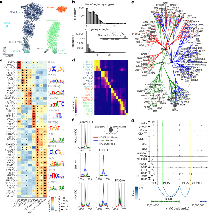
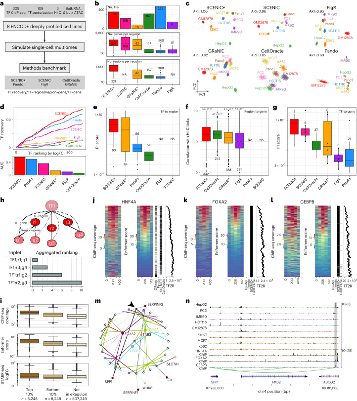
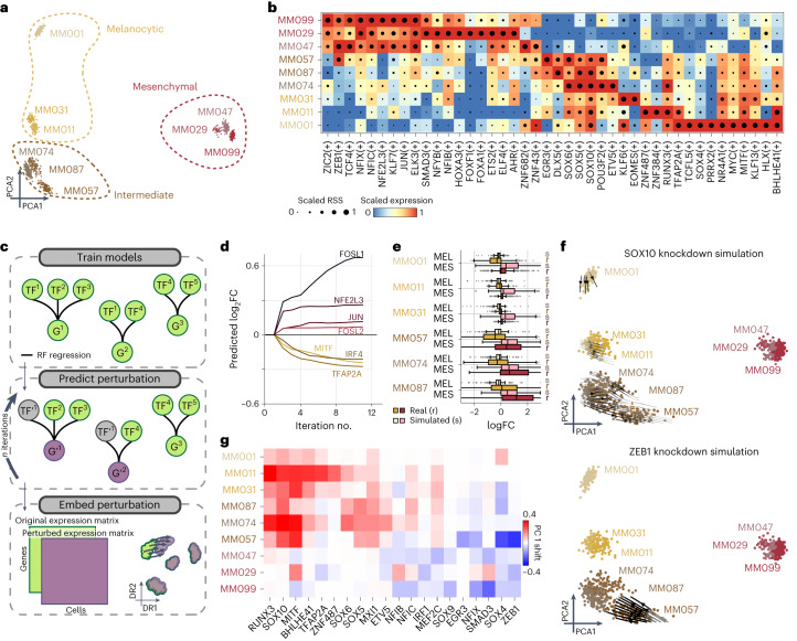
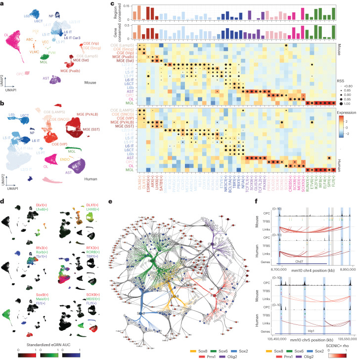
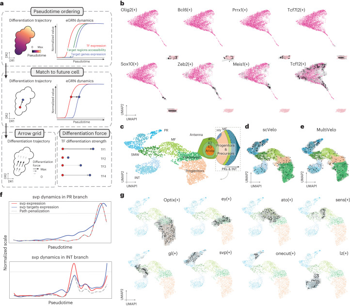
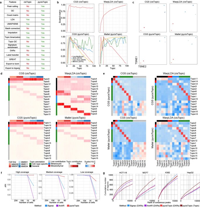
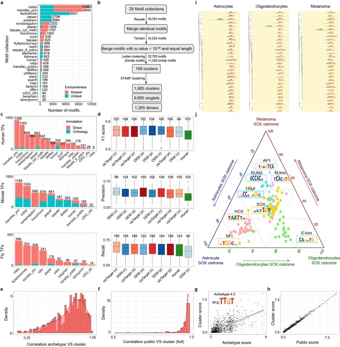
Joint profiling of chromatin accessibility and gene expression in individual cells provides an opportunity to decipher enhancer-driven gene regulatory networks (GRNs). Here we present a method for the inference of enhancer-driven GRNs, called SCENIC+. SCENIC+ predicts genomic enhancers along with candidate upstream transcription factors (TFs) and links these enhancers to candidate target genes. To improve both recall and precision of TF identification, we curated and clustered a motif collection with more than 30,000 motifs. We benchmarked SCENIC+ on diverse datasets from different species, including human peripheral blood mononuclear cells, ENCODE cell lines, melanoma cell states and Drosophila retinal development. Next, we exploit SCENIC+ predictions to study conserved TFs, enhancers and GRNs between human and mouse cell types in the cerebral cortex. Finally, we use SCENIC+ to study the dynamics of gene regulation along differentiation trajectories and the effect of TF perturbations on cell state. SCENIC+ is available at scenicplus.readthedocs.io .


Conflict of interest statement

The authors declare no competing interests.

Figures

Fig. 1
Fig. 1. The SCENIC+ workflow and motif collection.
a, SCENIC+ workflow. Topics and DARs inferred with pycisTopic are transformed into cistromes of directly bound regions by identifying modules that present significant enrichment of the regulator’s binding motif using pycisTarget. SCENIC+ integrates region accessibility, TF and target gene expression and cistromes to infer eGRNs, in which TFs are linked to their target regions and these to their target genes. PWM, position weight matrix; UCSC, University of California, Santa Cruz. b, Running-time comparison per topic model using cisTopic with Collapsed Gibbs Sampling or WarpLDA (blue) and pycisTopic with Collapsed Gibbs Sampling or MALLET (red) for parameter optimization. c, Bar-plots showing the area under the recovery curve (AUC; enhancer recovery) on the top 10% of the ranking based on STARR-seq signal, for the top 5,000 DARs identified by Signac, pycisTopic and ArchR and top 5,000 regions from the cell-line-specific topics identified by pycisTopic. The AUC value is scaled by dividing by the maximum possible AUC at 10% of the ranking. Promoter regions were excluded from the analysis. d, Workflow to create motif databases for SCENIC+. The SCENIC+ motif collection includes 34,524 unique motifs gathered from 29 motif collections, which were clustered with a two-step strategy. Input regions are scored for each cluster of motifs using hidden Markov models (HMMs), where each motif of the cluster is used as a hidden state. The score-based motif database is used in the DEM algorithm, whereas the ranking-based database is used for cisTarget. NES, normalized enrichment score. e, Number of TFs in the SCENIC+ motif collection annotated by direct evidence or orthology. f, Recovery of TFs from 309 ENCODE ChIP-seq datasets using different databases and motif enrichment methods, namely Homer, pycisTarget and DEM. The unclustered databases include all annotated motifs before clustering (singlets), the archetype databases use the consensus motifs of the clusters based on STAMP and the clustered databases use the motif clusters, scoring regions using all motifs in the cluster. The x axis shows the positions in which the TFs targeted in the ChIP-seq experiment can be found and the y axis shows the cumulative number of TFs that are found at that position.
Fig. 2
Fig. 2. SCENIC+ analysis on peripheral blood mononuclear cells.
a, t-SNE dimensionality reduction of 9,409 cells based on target gene and target region enrichment scores of eRegulons. pDC, plasmacytoid dendritic cell; cDC, conventional dendritic cell. b, Top: distribution of the number of regions linked to each gene. Bottom: distribution showing whether the nth closest region to the target gene has the highest region-to-gene importance score. c, Heat map/dot-plot showing TF expression of the eRegulon on a color scale and cell-type specificity (RSS) of the eRegulon on a size scale. Cell types are ordered on the basis of their gene expression similarity. d, Overlap of target regions of eRegulons. The overlap is divided by the number of target regions of the eRegulon in each row. fr., fraction. e, Visualization of the eGRN formed by EBF1, PAX5, POU2AF1 and POU2F2. TF target nodes are restricted to highly variable genes and regions. f, Aggregated ChIP-seq signal of EBF1, PAX5 and POU2F2 in GM12878 on target regions of either EBF1, PAX5 or POU2AF1 and combinations of two of these factors. g, Chromatin-accessibility profiles across cell types and ChIP-seq signal together with peak calls of EBF1, PAX5 and POU2F2 in GM12878 on chr10:96226082–96316945. Region–gene links are shown as arcs. Region–gene gradient-boosting machine feature importance scores are encoded as colors (from light to dark blue). Predicted target sites of eRegulons are shown using colored ticks and semi-transparent boxes.
Fig. 3
Fig. 3. Benchmark of SCENIC+ and other single-cell multiomics GRN inference methods using ENCODE deeply profiled cell lines.
a, Diagram of benchmarking strategy. b, Number of TFs identified per method and distributions of the number of target genes and regions per regulon and method. c, PCA based on target gene and region enrichments and ARI quantification (4,000 cells). d, Cumulative recovery, per method, of TFs ranked in descending order by maximum logFC based on differential gene expression between all cell lines. e, F1 score distributions from the comparison of regulon target regions, per method and UniBind. f, Correlation between Hi-C links for top 100 marker genes and region–gene scores per method. Two-sided Wilcoxon rank-sum test comparing mean correlation of links versus shuffled links. The Holm method was used to correct for multiple testing. g, F1 score distributions from the comparison of regulon target genes, per method and TF perturbation data. h, Diagram of triplet ranking. i, Distributions of experimental and predicted TF ChIP-seq coverage and STARR-seq logFC target regions and other consensus peaks (not in eRegulon). jl, Heat maps showing experimental and predicted ChIP-seq coverage on the union of predicted target regions per method with binary heat map indicating regions found per method and scatter-plot showing TF-to-region (TF2R) ranking of SCENIC+ target regions, for the TFs HNF4A (j), FOXA2 (k) and CEBPB (l). m, Network for top ten edges, targeted by any of FOXA2, HNF4A or CEBPB. Open and closed circles represent regions and genes and their color is proportional to the accessibility/gene expression logFC, respectively. Region-to-gene edges width and color represent importance scores. Arrow indicates the highlighted SPP1 enhancer (chr4:88107462–88107963). n, Chromatin-accessibility profiles across cell lines and HNF4A, FOXA2 and CEBPB ChIP-seq coverage on the SPP1 locus, with region-to-gene links and the SPP1 enhancer highlighted. For box-plots in b, eg and i, the top/lower hinge represents the upper/lower quartile and whiskers extend from the hinge to the largest/smallest value no further than 1.5 × interquartile range from the hinge, respectively. The median is used as the center. NA, data are not available for the method. GRaNIE* was run with simulated single-cell data instead of bulk.
Fig. 4
Fig. 4. SCENIC+ analysis using separate scATAC-seq and scRNA-seq data on a mix of human melanoma lines.
a, PCA of 936 pseudo-multiome cells based on target gene and target region enrichment scores. b, Heat map/dot-plot showing TF expression of the eRegulon on a color scale and cell-type specificity (RSS) of the eRegulon on a size scale. c, Illustration of how predictions from SCENIC+ can be used to simulate TF perturbations. Top: SCENIC+ is used as a feature selection method and RF regression models are fitted for each gene using TF expressions as predictors for gene expression. Middle: the expression of TF(s) is altered in silico and the effect on gene expression is predicted using the regression models, which is repeated for several iterations to simulate indirect effects. Bottom: the original and simulated gene expression matrices are co-embedded in the same dimensionality reduction to visualize the predicted effect of the perturbation on cell states. d, Predicted logFC of mesenchymal (red shades) and melanocytic (yellow shades) marker genes over several iterations of SOX10 knockdown simulation. e, Simulated (s) and actual (r) distribution of logFCs of melanocytic (n = 523) and mesenchymal (n = 722) marker genes after SOX10 knockdown across several melanoma lines. Upper/lower hinge represents upper/lower quartile, whiskers extend from the hinge to the largest/smallest value no further than 1.5 × interquartile range from the hinge respectively. The median is used as the center. f, Simulated shift after SOX10 and ZEB1 knockdown represented using arrows. Arrows are shaded based on the distance traveled by each cell after knockdown simulation. g, Heat map representing the shift along the first principal component of each melanoma line after simulated knockdown of several TFs.
Fig. 5
Fig. 5. SCENIC+ reveals regulatory lexicon conservation across mammalian brains.
a, Uniform Manifold Approximation and Projection (UMAP) dimensionality reduction of 19,485 mouse cortex cells based on target gene and region enrichment scores. b, UMAP dimensionality reduction of 84,159 human motor cortex cells based on target gene and region enrichment scores. c, Heat map/dot-plot showing TF expression of the eRegulon on a color scale and cell-type specificity (RSS) of the eRegulon on a size scale. The bar-plot above indicates the percentage of the regulon that is conserved in the other species, for predicted target regions (top) and target genes (bottom). d, Mouse and human UMAPs colored by enrichment scores for selected regulons using RGB encoding. e, Mouse-based OPC eGRNs with conserved TFs. Regions are shown as a diamond shape and their size represents the logFC of the region accessibility in OPCs compared to the rest of the cells. Regions conserved in the human brain are shown in blue and regions only found in the mouse analysis are shown in gray. Genes are shown as a circular shape and their color and size represent the logFC of the gene expression in OPCs compared to the rest of the cells. TF–region links are colored by TF and region–gene links are colored by region–gene correlation coefficients. f, OPC coverage, TFBSs and region–gene links in two loci, Chd7 and Hip1. Data are shown in the mouse genome (mm10) and human data have been lifted over (mm10). Peaks found in both human and mouse are highlighted in blue, whereas peaks only accessible in one of the species are highlighted in gray. ABC/VLMC, vascular leptomeningeal cell; AST, astrocyte; CT, cortico-thalamic; ENDO, endothelial cell; IT, intratelencephalic; MGL, microglia; NP, near-projecting; PER, pericyte; PVM, perivascular macrophage; PT, pyramidal-tract; OL, oligodendrocyte; VEC, vascular endothelial cell.
Fig. 6
Fig. 6. Identification of differentiation drivers from SCENIC+ eGRNs.
a, Computational approach to infer differentiation drivers from a SCENIC+ analysis. First, differentiating cells are ordered by pseudotime. Second, for each eRegulon, a standardized GAM is fitted along the pseudotime axis for its expression and its target genes (or regions) enrichment scores and each cell in a certain quantile of the GAM TF expression curve is mapped to its future cells in the same quantile in the GAM regulon enrichment curve. Finally, the differentiation force of a cell and regulon is defined as the distance from the TF expression curve to its future cell in the regulon enrichment curve. b, Arrow grid representation along the differentiation of OPCs to mature oligodendrocytes in the mouse cortex (4,435 cells). ce, UMAP dimensionality reduction of 3,104 pseudocells from the fly eye based on target gene and region enrichment scores, with a schematic representation of the fly eye-antennal disc (c), scVelo velocity arrows (d) and MultiVelo velocity arrows (e). f, Representation of svp dynamics along the two paths in eye disc differentiation. The gray horizontal line represents the TF expression threshold for arrows to be drawn. For cells below this threshold, the GRN velocity values are set to 0. The gray dashed line represents the penalization curve, which is the GAM fitted curve drawn using the standardized data across all possible paths for the cells in that path. Those points where the penalization and the TF expression curve disagree are considered artifacts (the TF gene seems to be expressed even if there is low expression, due to the standardization of the TF curve in that specific path). The red curve represents the GAM fitted curve using the standardized TF expression data (along the path) and the blue curve represents the GAM fitted curve using the standardized gene enrichment scores (along the path). g, Arrow grid representation along the eye disc differentiation.
Extended Data Fig. 1
Extended Data Fig. 1. Cell type and enhancer discovery benchmark with pycisTopic, cisTopic, Signac and ArchR.
a. Feature comparison between cisTopic and pycisTopic. b. Model selection for models (for 100 cells simulated from melanoma cells lines) with different parameter optimization methods, namely Collapsed Gibbs Sampler (CGS) and WarpLDA with cisTopic and CGS and Mallet with pycisTopic. cisTopic relies on the log-likelihood per model; while pycisTopic incorporates additional measurements including coherence (Minmo (2010)), a density-based metric (Cao Juan (2009) and a divergence-based metrics (Arun (2010)). c. Cell-topic dimensionality reduction for each of the models (100 cells). Red clusters denote the 2 mesenchymal cell lines, blue clusters depict the 3 melanocytic cell lines. d. Cell-topic enrichment heat map for each of the models. General topics are shown in black; mesenchymal, in red; melanocytic, in blue; cell line specific in green; and low contributing in gray. e. AUCell enrichment of topics between different models. f. Adjusted Rand Index (ARI) for pycisTopic, Signac and ArchR in simulated datasets with different coverage per cell (3 K, 10 K, or 20 K fragments per cell) and number of cells, using as ground truth the bulk label from which cells were simulated. Data was simulated from bulk ATAC-seq and bulk RNA-seq data from ENCODE’s Deeply Profiled Cell Lines. g. Recovery curves for top 5 K Differentially Accessible Regions (DARs) identified by Signac, pycisTopic and ArchR and top 5 K regions in the cell line specific topics identified by pycisTopic. Genome-wide STARR-seq in HCT116, MCF7, K562 and HepG2 is ranked in descending order (x axis) when a region of the ranking is found in a region set an increasing step along the y axis is taken. Dashed line represents the top 10% of the ranking.
Extended Data Fig. 2
Extended Data Fig. 2. The SCENIC+ motif collection.
a. Number of motifs per motif collection that are shared or unique for one collection. b. Workflow depicting the motif collection cluster strategy. c. Number of motifs annotated directly or by orthology per motif collection. d. F1 score (top), precision (middle) and recall (bottom) distributions of TF cistromes from motif enrichment on 309 TF ChIP-seq data sets from ENCODE, using different databases and motif enrichment methods, namely Homer, pycisTarget and DEM. The unclustered databases (u) include all annotated motifs before clustering (singlets), the archetype databases (a) use the consensus motifs of the clusters based on STAMP and the clustered databases uses the motif clusters (c), scoring regions using all motifs in the cluster and the public databases (p) is the clustered database without licensed Transfac Pro motifs. Upper/lower hinge represent upper/lower quartile, whiskers extend from the hinge to the largest/smallest value no further than 1.5 times the interquartile range from the hinge respectively. Median is used as center. e. Distribution of the correlation between scores (on chr19) using archetypes or all motifs in a cluster. f. Distribution of the correlation between scores (on chr19) using all motifs in a cluster or all motifs except for Transfac Pro motifs. g. Correlation between scores (on chr19) for cluster 4.3 using the archetype or all motifs. h. Correlation between scores (on chr19) for cluster 4.3 using all motifs or all motifs except for Transfac Pro motifs. i. Top 30 motifs identified by cisTarget using regions in the SOX cistromes from melanoma, oligodendrocytes and astrocytes clustered using motifStack. Colors indicate the TF family of the motifs (in this case, SOX). j. Ternary plot showing enrichment scores of motifs found in melanoma, oligodendrocyte and astrocyte SOX regions. Each corner represents a cell-type-specific SOX topic, dots represent enriched motifs and axes represent average enrichment scores for each topic. The colors of the dots are used to indicate the TF family to which the motifs belong.
Extended Data Fig. 3
Extended Data Fig. 3. Time and memory complexity analysis of the SCENIC+ workflow using simulated datasets with different coverage per cell (3 K, 10 K, or 20 K fragments per cell) and number of cells.
a. Running times for the minimal preprocessing steps with pycisTopic, pycisTarget and SCENIC+. The times specified for topic modeling correspond to the average running time for one model. The running times specified for pycisTarget correspond to the average running time for one region set. b. Maximum memory used for the minimal preprocessing steps with pycisTopic, pycisTarget and SCENIC+.
Extended Data Fig. 4
Extended Data Fig. 4. TF, target region and region-to-gene relationships recovery performance by single-cell multiomics methods.
a. Cumulative TF recovery, TFs are ranked based on the number of Unibind peaks in descending order (top) and Area Under the Curve (AUC) per method on top 40 TFs (bottom). b-c. Precision-recall curves of TFs found per method using different thresholds on the TF ChIP-seq based ranking (b, top) and LogFC of TF expression (c, top) and AUC values (b, c, bottom). d. Overlap between identified TFs per method (top), GAM fitted Tau values for the TFs (middle) and distribution of Tau values per method. e-g. Violin plots of F1 score (f, g), precision and recall (e’, e’) distributions from the comparison of regulon target regions, per method and Unibind (e), ChIP-seq peaks (f) and Enformer predicted ChIP-seq (g). The numbers indicate the number of regulons. h. Violin plot showing distribution of maximum enhancer activity as measured using STARR-seq data from ENCODE on K562, HepG2, HCT116 and MCF7 regions. i. Barplots showing the number of region-gene links found per method. Non-transparent bars show the number of links in the eGRN, transparent bars show the number region-gene links before eGRN construction. Pando and SCENIC are excluded from the comparison since they do not report (unique) region-gene relationships. j. Correlation between Hi-C links for the top 100 markers genes for each of the cell lines where Hi-C is available (IMR90, GM12878, HCT116, HepG2 and K562) and region-gene scores from different region-gene inference models (Spearman correlation, Random Forest (RF), GBM (Gradient Boosting Machine), ENET (Elastic Net), Lasso, Support Vector Machine (SVM) with linear kernel, Ridge, Least-Angle Regression (LARS) and Stochastic Gradient Descent (SGD)). For boxplots in panels d and j: Upper/lower hinge represent upper/lower quartile, whiskers extend from the hinge to the largest/smallest value no further than 1.5 times the interquartile range from the hinge respectively. Median is used as center. Difference in mean between methods (e-h) and shuffled links (i) assessed using two-sided Wilcoxon rank-sum test, correction for multiple testing using Benjamini–Hochberg procedure. GRaNIE* was run with simulated single-cell data instead of bulk.
Extended Data Fig. 5
Extended Data Fig. 5. Target gene recovery performance by single-cell multiomics methods.
a. Boxplot depicting the correlation between observed and predicted gene expression values using the eGRNs inferred from each method, together with scatter plots showing the correlation between the predictions by each method and the observed expression values for SPI1 (a’). b. NES distribution based on GSEA analysis using TF knockdown data as ranking and target genes derived by each method as gene set, with examples on K562 upon STAT5A (b’) and HOXB9 (b’) knockdowns showing GSEA -log10 adjusted p value and NES for different eGRNs found by SCENIC+. c. Boxplots represent the F1 score (c), precision (c’) and recall (c’) distributions of the predicted target genes per TF compared to TF perturbation data. d. Network showing TF-target gene interactions for selected genes. e. Heat map showing the overlap between the regions of the regulons indicated by the rows and columns, divided by the size of the regulons in the columns. f. Spearman correlation between predicted LogFC with in silico TF perturbation for each method versus the observed LogFC changes upon TF perturbation, together with the comparison between predicted and observed LogFC changes upon GATA1 KD (f’) and ARID3A KD (f’). Dots in red indicate genes in the GATA1 or ARID3A regulons, respectively. In boxplots, upper/lower hinge represent upper/lower quartile, whiskers extend from the hinge to the largest/smallest value no further than 1.5 times the interquartile range from the hinge respectively. Median is used as center.
Extended Data Fig. 6
Extended Data Fig. 6. Performance of SCENIC+ upon variations in coverage and sample size.
a. Number of TFs identified per analysis. b. Number of genes per regulon per analysis. c. Number of regions per regulon per analysis. d. Cumulative TF recovery for each method using as x axis TFs ranked based on the number of ChIP-seq peaks and AUC values per method using the top 40 TFs. e. Cumulative TF recovery for each method using as x axis TFs ranked based on the maximum LogFC across the cell lines and AUC values per method. f. Number of region-gene links inferred (non-transparent links indicate that the links are included in the final eGRN). g. Boxplot showing the correlation with the Hi-C links for the top 100 marker genes for each of the cell line where Hi-C is available (IMR90, GM12878, HCT116, HepG2 and K562). h. F1 score (h), precision (h’) and recall (h’) distributions of the predicted regions per TF using Unibind regions as standard. i. Boxplots representing the F1 score (i), precision (i’) and recall (i’) distributions of the predicted target genes per TF compared to TF perturbation data. In boxplots, upper/lower hinge represent upper/lower quartile, whiskers extend from the hinge to the largest/smallest value no further than 1.5 times the interquartile range from the hinge respectively. Median is used as center.
Extended Data Fig. 7
Extended Data Fig. 7. Benchmark of SCENIC+ and other methods on PBMC single-cell multiomics data.
a. Scatter plot showing number of target regions versus TF expression-to-region AUC Pearson correlation coefficients for each eRegulon inferred in the PBMC data set. eRegulons are selected based on a threshold on the correlation coefficient, indicated by dotted line. b. Distribution of the number of regions linked to each gene based on Hi-C in GM12878 (using a minimum score of 1) and the rank, based on absolute distance, for each region and the gene with the highest Hi-C score in GM12878. c. Boxplots showing the distribution of Spearman correlation coefficients between Hi-C scores in GM12878 and region-to-gene importance score and region-to-gene correlation coefficients (rho) as calculated by SCENIC+ for B-cell marker genes. Upper/lower hinge represent upper/lower quartile, whiskers extend from the hinge to the largest/smallest value no further than 1.5 times the interquartile range from the hinge respectively. Median is used as center. Random controls are obtained by shuffling the gradient boost importance scores (GBM_rnd) and correlation coefficients (rho_rnd). Difference in the mean to the random control is assessed using the Mann-Whitney U test. d. Adjusted Rand Index (ARI) quantifying how well cell types are separated based on the AUC scores for the PBMC data set. e. Heat maps showing whether a TF is found across different methods comparing SCENIC+ to Signac and ArchR. Signac and ArchR were run using different options. (1) DEM: Differentially Enriched Motifs or ChIP-seq tracks in differentially accessible regions and (2) ChromVAR deviations. f. Scatter plot showing enrichment of top 10 Human Protein Atlas and Human Phenotype GO terms for TFs found exclusively by Signac, Archr or all methods including SCENIC+. g. Heat maps showing whether a TF is found across different methods. GRaNIE is not included because the analysis ran out of memory (tested on a machine with 72 cores Intel(R) Xeon(R) Platinum 8360Y CPU @ 2.40 GHz and 2 TB of memory). h. Scatter plot showing enrichment of top 10 Human Protein Atlas and Human Phenotype GO terms for TFs found exclusively by Pando, CellOracle or all methods including SCENIC+.
Extended Data Fig. 8
Extended Data Fig. 8. Benchmark of SCENIC+ and other methods on the melanoma cell lines data set.
a. Boolean networks were generated from gene regulatory networks inferred from SCENIC+, CellOracle, FigR and GRaNIE. For SCENIC+ the top 10%, 25% and 50% of edges based on the triplet score were used. 500 cells were simulated using the boolODE method using a simulation time of 20 and the hill activation function. Simulated cells were co-embedded in PCA space with real cells after Harmony batch effect correction. b. Violin and jitter plot of the average distance of each simulated cell to its three nearest neighbors in the first 2 principal components of PCA space. Difference in mean is assessed using two-tailed Mann-Whitney U test and p values are adjusted using the Benjamini–Hochberg procedure. y axis is sorted by the median average distance. c. ChIP-seq enrichment of SOX10, MITF and TFAP2A in target regions of SOX10, MITF and TFAP2A and all combinations of two. Signal is scaled across all comparisons between 0 and 1. d. -log10 p value (t-test) and average log2 fold change of target genes of eRegulons after SOX10 knockdown in MM001. Color scale encodes log2 fold change of the expression of the TF corresponding to each eRegulon after SOX10 knockdown. e. Scatter and jitter plot showing enhancer activity as measured by the STARR-seq method in regions targeted by any of the regulons and regions targeted by None. f. Scatter plot comparing enhancer activity as measure by the STARR-seq method (y axis) to the minimum of the triplet score over all TFs targeting and genes targeted by the region (x axis). Labels of the regions are according to the labels in Mauduit et al.. Difference in mean is assessed using two-tailed Mann-Whitney U test and p values are adjusted using the Benjamini–Hochberg procedure. x axis is sorted by the median average distance. g. Heat map showing whether a TF is found across different e(GRN) inference methods (present: green; absent: red). Only TFs found by SCENIC+ are shown.
Extended Data Fig. 9
Extended Data Fig. 9. Conservation and spatial visualization of enhancer-GRNs in the mammalian brain.
a. Heat map showing the scaled correlation between the RSS values for each regulon in each cell type. b. Human cortex UMAP (84,159) showing TF expression (red) and AUC enrichment of the mouse regulon (converted to human genes). c. Barplot showing the number of conserved genes between the matching human and mouse regulons. d. Barplot showing the number of conserved regulons between the matching mouse and human regulons. e. Mapping of cell types in the mouse cortex into our smFISH map using Tangram. f. Visualization of regulons AUC enrichment in our smFISH map of the mouse cortex. g. Representative layer-specific gene regulatory network. The network depicted from L2/3 to L6 corresponds to excitatory neurons, while in the white matter corresponds to oligodendrocytes. h. SCENIC+ UMAP containing 1,736 cells from the human cerebellum. i. Human cerebellum 10x Visium slide annotated with anatomical regions in the cerebellum. j. Visualization of regulons AUC enrichment on the 10x Visium data. AST: Astrocytes, BG: Bergman Glia, CGE: Caudal Ganglionic Eminescence, ENDO: Endothelial cells, GC: Granule Cell, GP: Granule cell Progenitor, MGE: Medial Ganglionic Eminescence, MGL: Microglia, MG: Muller Glia, OL: Oligodendrocyte, OPC: Oligodendrocyte Precursor Cells, PURK: Purkinje cells, WM: White Matter.
Extended Data Fig. 10
Extended Data Fig. 10. Repressor predicitons of SCENIC+ in melanoma and eye-antennal disc.
a. TFs of the same family for which the expression is anti-correlated in a system can cause spurious repressor predictions. Scenario 1 (left): TF1 is a potential repressor which is expressed in cell type A and actively closes chromatin in that cell type. Scenario 2 (right): TF2 is a potential activator of the same TF family as TF1 which is expressed in cell type B and opens the chromatin in that cell type. Both scenarios lead to the same gene expression and chromatin-accessibility measurements and can thus not be disentangled if both TF1 and TF2 are present in the same system. b. Principal-Component Analysis (PCA) projection of 936 pseudo mutli-ome cells based on cellular enrichment (AUC scores) of predicted target genes and regions from SCENIC+ eRegulons colored by gene expression. Shared motif used by the pair of TFs in each plot is shown on the top right. c. Heat map-dotplot showing TF expression of the eRegulon on a color scale and cell type specificity (RSS) of the eRegulon on a size scale. d. Venn diagram showing overlap of predicted target regions of SOX10 and SOX9, MITF and TCF4; and MXI1 and TCF4. e. Principal-Component Analysis (PCA) projection of 936 pseudomutli-ome cells based on cellular enrichment (AUC scores) of predicted target genes and regions from SCENIC+ eRegulons colored by the expression of MITF and HES1. Shared motif used by the pair of TFs in each plot is shown on the top right. f. Log(CPM) expression of HES1 (top, x axis) and MITF (bottom, x axis) versus MITF target region AUC value (y axis). Line fit using linear regression, least squares method. g. Network showing subset of MITF and HES1 target regions. Diamonds represent regions circles represent genes and are color-coded by the average accessibility LogFC of corresponding regions in the melanocytic state. h. Virtual eye-antennal disc with 5,058 pseudocells colored by Ct expression and AUC values of the repressive Ct regulon. i. Targets of the Ct repressive regulon, showing in red targets that are transcription factors.

Similar articles

Cited by

References

    1. Davidson EH, et al. A genomic regulatory network for development. Science. 2002;295:1669–1678. doi: 10.1126/science.1069883. - DOI - PubMed
    1. Janssens J, et al. Decoding gene regulation in the fly brain. Nature. 2022;601:630–636. doi: 10.1038/s41586-021-04262-z. - DOI - PubMed
    1. Long HK, Prescott SL, Wysocka J. Ever-changing landscapes: transcriptional enhancers in development and evolution. Cell. 2016;167:1170–1187. doi: 10.1016/j.cell.2016.09.018. - DOI - PMC - PubMed
    1. Erwin DH. The origin of animal body plans: a view from fossil evidence and the regulatory genome. Development. 2020;147:dev182899. doi: 10.1242/dev.182899. - DOI - PubMed
    1. Rickels R, Shilatifard A. Enhancer logic and mechanics in development and disease. Trends Cell Biol. 2018;28:608–630. doi: 10.1016/j.tcb.2018.04.003. - DOI - PubMed

Publication types