. 2023 Jul 14;13(1):11409.
doi: 10.1038/s41598-023-38395-0.

Epidemic thresholds and human mobility

Affiliations

Epidemic thresholds and human mobility

Marta Pardo-Araujo et al. Sci Rep. .

Abstract

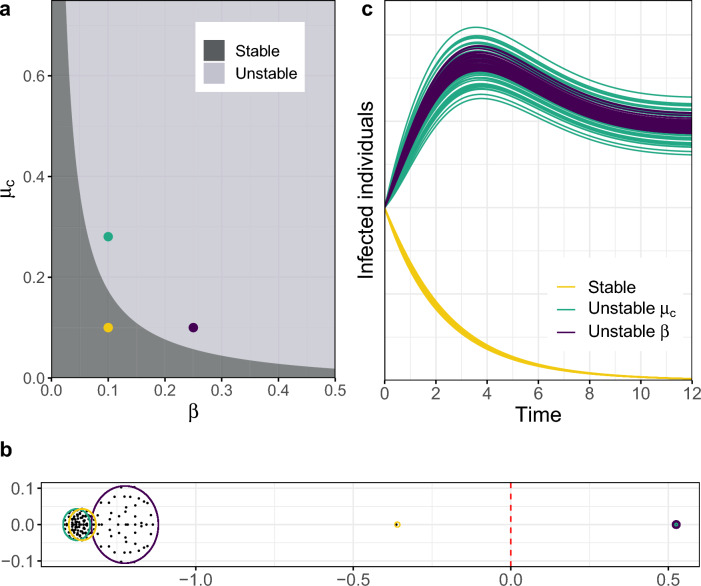
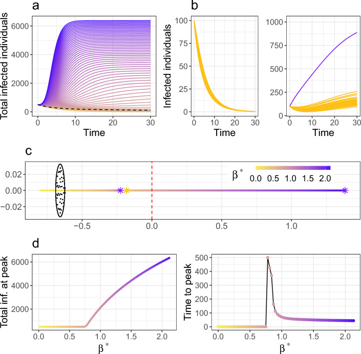
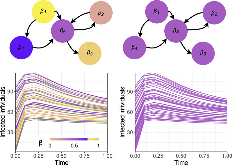
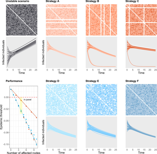
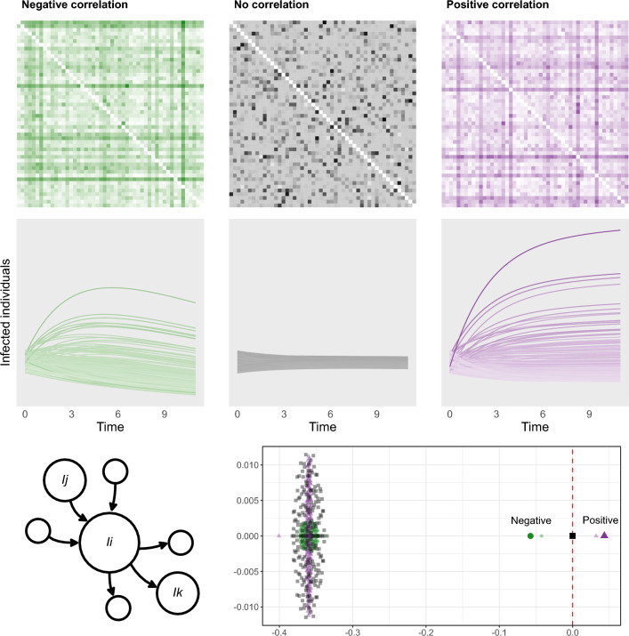
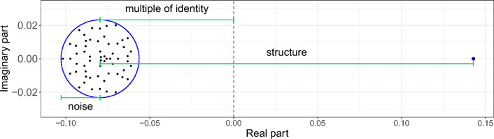
A comprehensive view of disease epidemics demands a deep understanding of the complex interplay between human behaviour and infectious diseases. Here, we propose a flexible modelling framework that brings conclusions about the influence of human mobility and disease transmission on early epidemic growth, with applicability in outbreak preparedness. We use random matrix theory to compute an epidemic threshold, equivalent to the basic reproduction number [Formula: see text], for a SIR metapopulation model. The model includes both systematic and random features of human mobility. Variations in disease transmission rates, mobility modes (i.e. commuting and migration), and connectivity strengths determine the threshold value and whether or not a disease may potentially establish in the population, as well as the local incidence distribution.


Conflict of interest statement

The authors declare no competing interests.

Figures

Figure 1
Figure 1
Epidemic spread induced by disease transmission and human connectivity. The epidemic threshold Eq. (2) depends on the transmission and recovery rate of the disease, as well as the average commuting flow of the network. We show examples, for a system with N=50 and γ=0.95, of three different scenarios in terms of these parameters: a stable scenario where the outbreak dies out (yellow), an epidemic scenario caused by the transmission of the disease (purple), an epidemic scenario for a disease with low transmission, caused by the high connectivity between the nodes of the network (green). (a) Phase diagram of the stability of the system in terms of the transmission rate β and the average commuting flow μc. (b) Eigenvalue distribution of the Jacobian matrix of the infected subsystem Eq. (1) for the three scenarios. The corresponding epidemic thresholds are given by the three outlier eigenvalues lying on the right of the circle distributions; the outlier of the stable system has negative real part and those of the unstable scenarios have positive real parts. The bulk distribution of the increased transmission scenario is modified due to the resulting increase in the variance of the network (see Eq. (8)). (c) Evolution of the number of infected individuals over time across the patches of the network. Both unstable systems show the same qualitative behaviour, as their epidemic thresholds coincide, and the one with higher commuting displays higher variability of infected individuals across the nodes of the network.
Figure 2
Figure 2
Epidemic spread due to a variation of disease transmission in one patch. Modifying the transmission rate at one patch changes the epidemic threshold Eq. (2) to the more complicated expression Eq. (9). Transmission changes from β to β, ranging from no transmission at the perturbed patch (yellow) to an increased transmission (purple). Disease transmission occurs at a rate β=0.15 and the network has N=50 patches. (a) Sum of infected individuals across all patches over time for different values of β. A change of regime is represented by the dashed line defined by the threshold value of β. (b) Infected individuals over time for a system with equal transmission rates (left) and a system with an increased transmission rate at one node (right, perturbed node in purple). Even though the perturbation in transmission only affects one patch the system switches from stable to unstable. (c) Eigenvalue distribution for the system with different transmission rate in one patch. As the perturbation increases the epidemic threshold given by the rightmost eigenvalue increases. The stars correspond to the examples presented in (b), yellow for the left plot and purple for the right one. One more outlier arises for the perturbed case due to the specific form of the structure matrix (see “Methods” section). (d) Maximum number of infected individuals at one patch (left) and time to reach the epidemic peak (right) in terms of β. The maximum increases nonlinearly as the perturbation in transmission increases, while the time to reach this maximum decreases since the initial growth is steeper for higher β.
Figure 3
Figure 3
Transmission does not necessarily shape the distribution of infected individuals. Two systems, one with random transmission (left), where the transmission rate at each node is drawn from a probability distribution, and one with the same transmission at all patches (right), equal to the mean of this distribution. The network has N=50 nodes and the βi are drawn from a random distribution of mean μβ=0.6 and standard deviation σβ=0.6. We present a schematic representation for the network (top) and the evolution of the number of infected individuals at the patches over time (bottom), colored according to the local transmission rate. Even though the transmission landscape is very different for both examples the distribution of infected individuals over the network is quite similar. In particular, the case with random transmission shows a network with zero transmission in some nodes (in yellow) in which there is an initial increase of infected individuals.
Figure 4
Figure 4
Restrictions in commuting and their impact on disease spread. We consider a base network of size N=40 and average migration rate μc=0.12, a scenario of uncontrolled disease spread (grey). We test the six mobility restriction strategies described in this section, which all result in successfully controlling the expansion of the disease by perturbing 10% of the commuting flows of the network to μc=0. For each scenario, the top graph displays the strength of the commuting flow from patch i to patch j in its (ij)-th cell. The brightness of the color represents the strength of the interaction, with white representing absence of interaction. Each line in the bottom graph shows the evolution of the infected population at each patch, colored according to its average incoming and outgoing commuting flow. The three targeted strategies (in shades of orange) consist of A: restricting all outgoing flows at 4 nodes, B: restricting all incoming flows at the same set of nodes as in A, C: restricting both incoming and outgoing flows at half of the nodes selected in the previous scenarios. The three random strategies (in shades of blue) consist of D: restricting randomly chosen unidirectional flows, E: restricting half as many randomly chosen flows in both directions, F: uniformly decreasing all the flows in the network. The bottom left graph shows the resulting epidemic threshold in terms of the number of perturbed nodes, as given by the analytical expressions provided by Eqs. (10)–(12) (continuous lines) and empirical computations from synthetic networks (dots).
Figure 5
Figure 5
Correlated flows may determine the growth of the outbreak. Three systems with identical epidemiological parameters and underlying networks (of size N=200) with identical mean and variance are depicted in the same way as described in Fig. 4. The base scenario (grey) displays no correlation between incoming and outgoing flows at its nodes (Γ=0, see Eq. (14)) and shows a negligible variation over time in terms of disease spread. Setting this correlation to a negative value causes the disease to die out in the long term (Γ=-0.3, green), while a positive correlation results in a scenario of epidemic growth (Γ=0.3, purple). The effect of this correlation on the mobility flows can be identified from the networks: positively correlated networks favour the existence of nodes with both high incoming and high outgoing flows (darker horizontal and vertical lines tend to intersect at the diagonal), while in negatively correlated networks nodes with high incoming flows generally do not have high outgoing flows and vice-versa (darker horizontal and vertical lines do not intersect at the diagonal). Bottom plot shows the eigenvalues of the Jacobian matrix of the three systems shown in the scenarios (smaller, faded symbols), together with their predicted outliers as given by Eq. (15) (larger, solid symbols).
Figure 6
Figure 6
Eigenvalue distribution for the Jacobian matrix J. The location of the eigenvalues of J depends on each of the three matrices given in (7): the size of the circle on which the bulk of the eigenvalues is uniformly distributed depends on the noise matrix, the distance between its center and the origin depends on the multiple of the identity, and the distance between its center and the single outlier eigenvalue depends on the structure matrix.

References

    1. Heesterbeek H, Anderson RM, Andreasen V, Bansal S, De Angelis D, Dye C, Eames KTD, Edmunds WJ, Frost SDW, et al. Modeling infectious disease dynamics in the complex landscape of global health. Science. 2015;347(6227):4339. doi: 10.1126/science.aaa4339. - DOI - PMC - PubMed
    1. Pastore y Piontti A, Perra N, Rossi L, Samay N, Vespignani A. Charting the Next Pandemic: Modeling Infectious Disease Spreading in the Data Science Age. Springer; 2019.
    1. Kretzschmar ME, et al. Challenges for modelling interventions for future pandemics. Epidemics. 2022;38:100546. doi: 10.1016/j.epidem.2022.100546. - DOI - PMC - PubMed
    1. Anderson RM, May RM. Infectious Diseases of Humans: Dynamics and Control. Oxford University Press; 1992.
    1. Heffernan JM, Smith RJ, Wahl LM. Perspectives on the basic reproductive ratio. J. R. Soc. Interface. 2005;2(4):281–293. doi: 10.1098/rsif.2005.0042. - DOI - PMC - PubMed

Publication types