. 2023 Jul;619(7970):585-594.
doi: 10.1038/s41586-023-05769-3. Epub 2023 Jul 19.

An atlas of healthy and injured cell states and niches in the human kidney

Collaborators, Affiliations

An atlas of healthy and injured cell states and niches in the human kidney

Blue B Lake et al. Nature. 2023 Jul.

Abstract

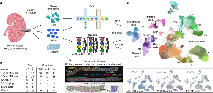
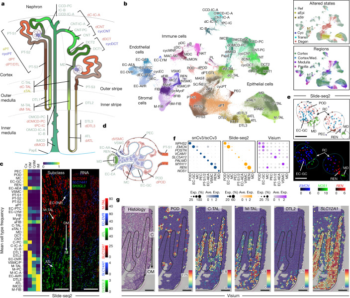
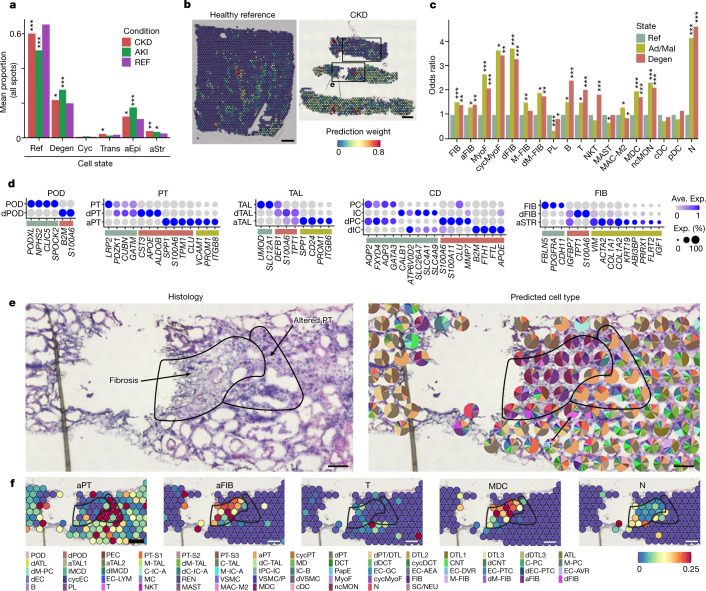
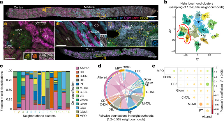
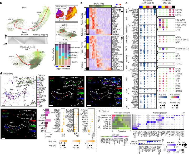
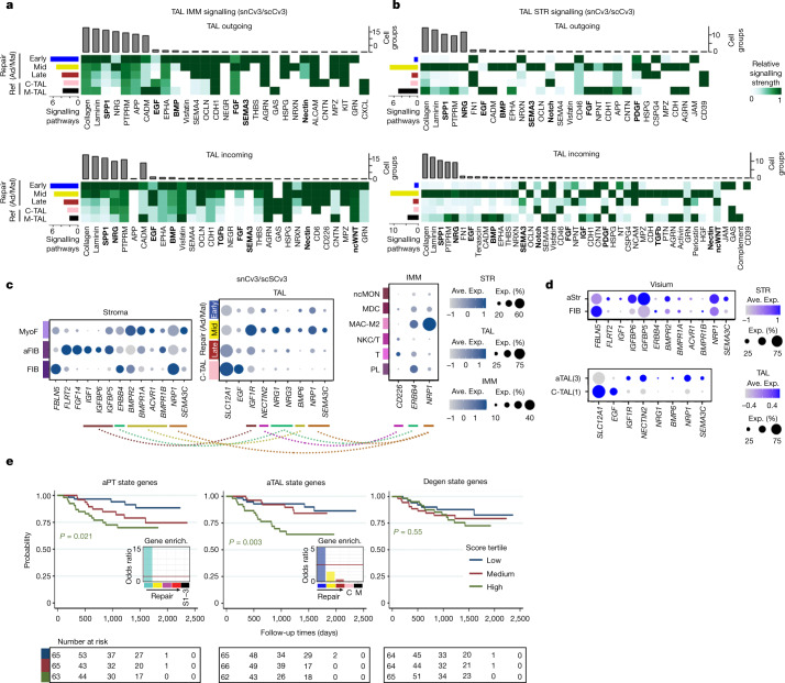
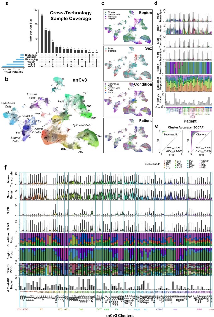
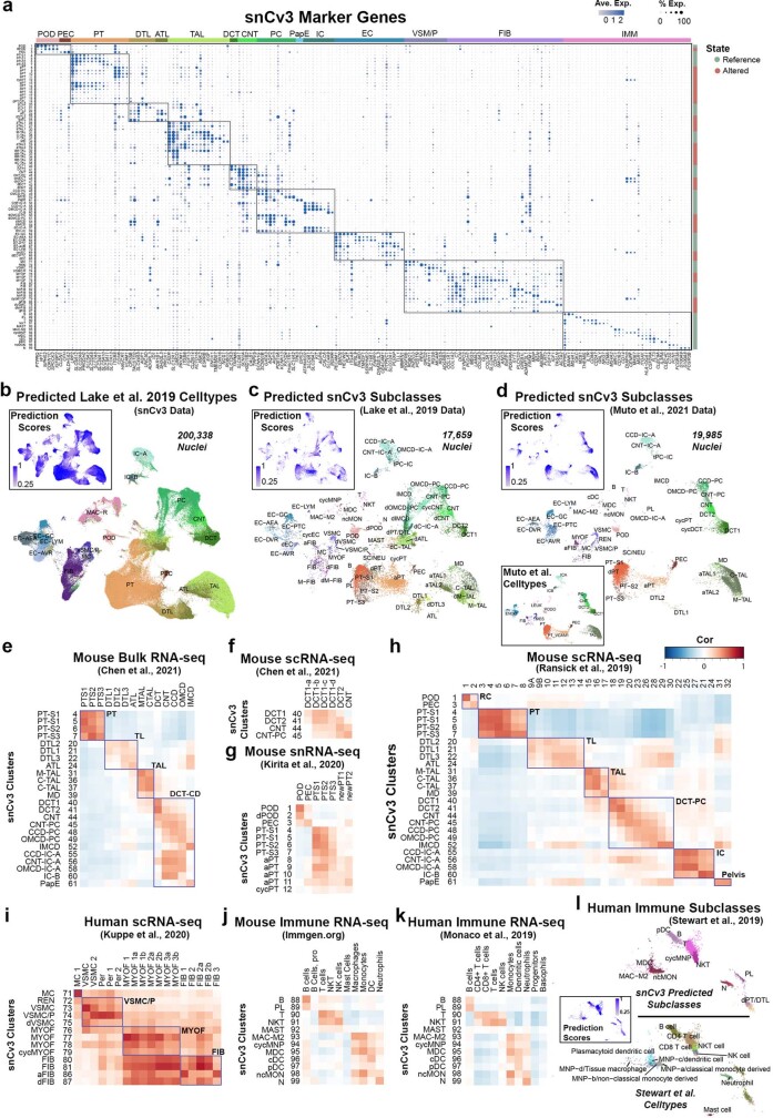
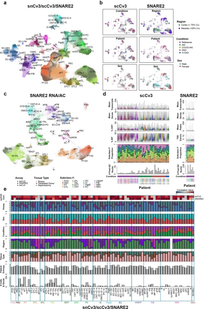
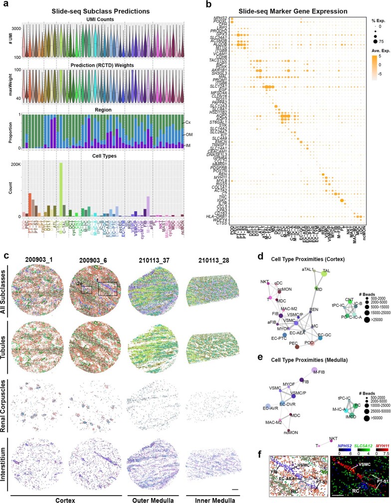
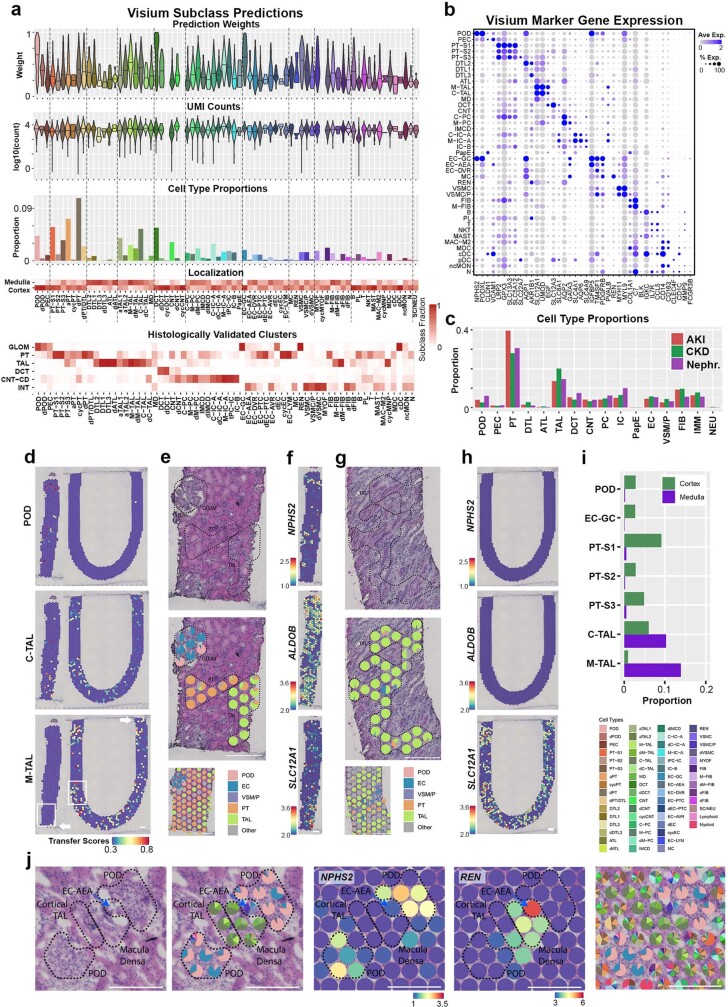
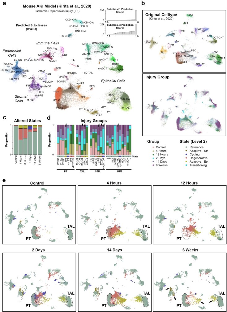
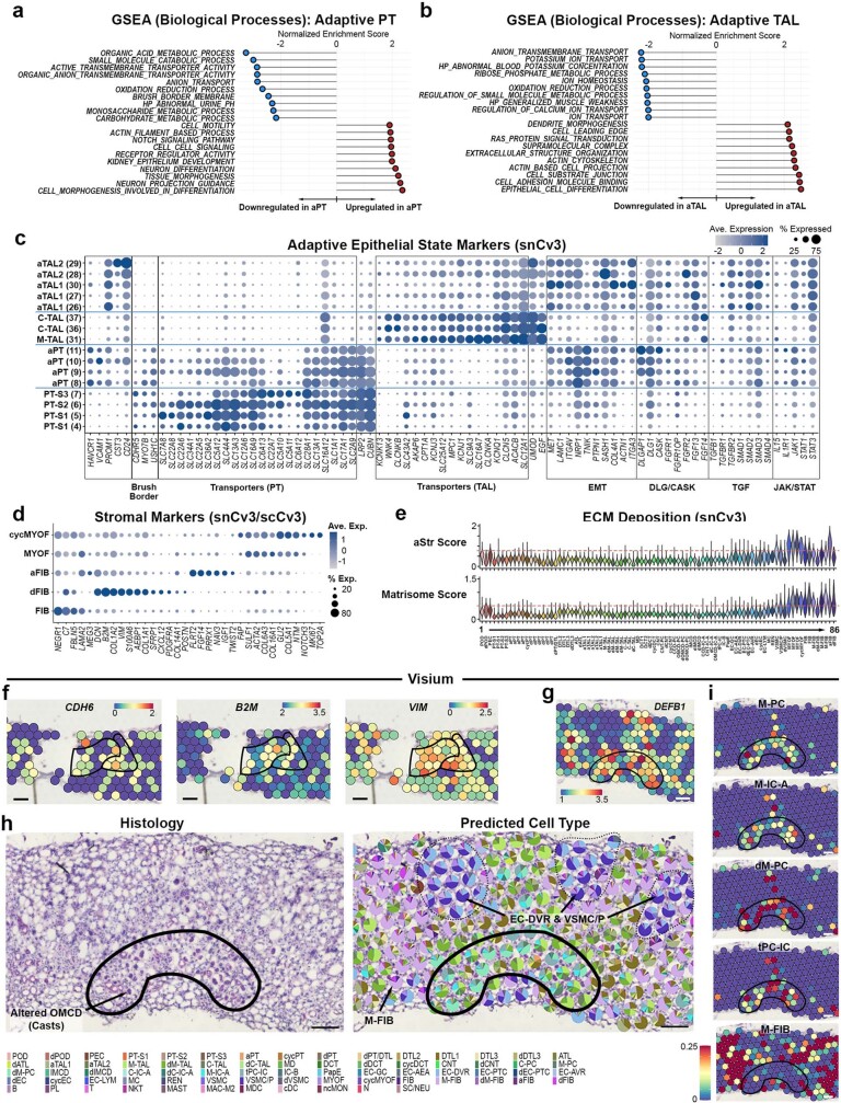
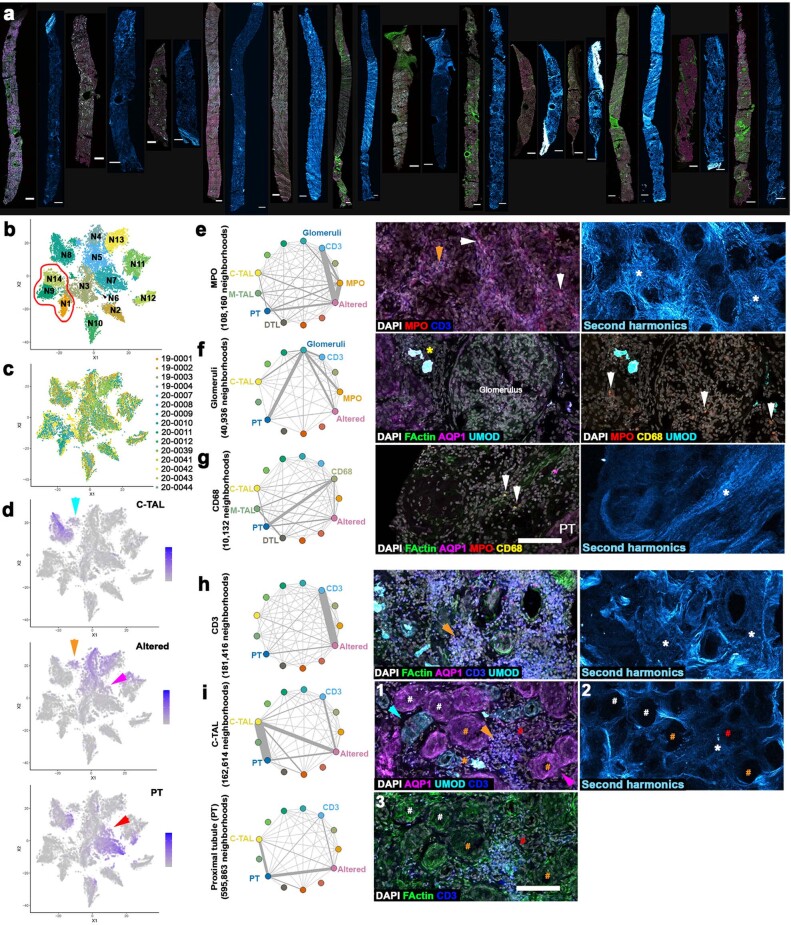
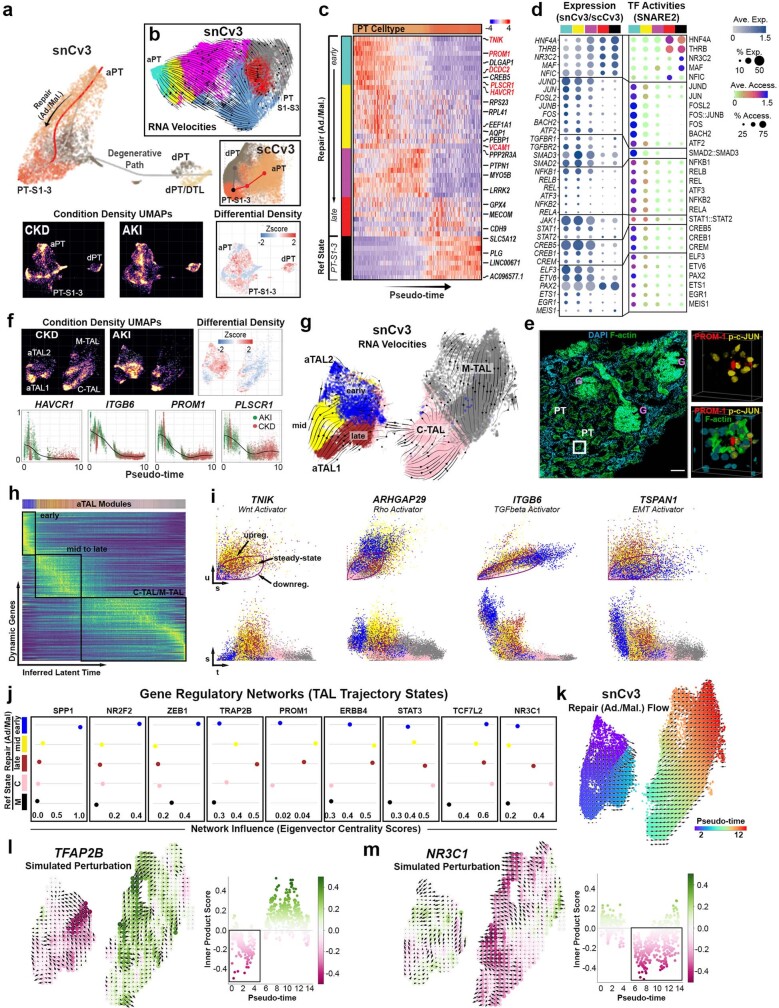
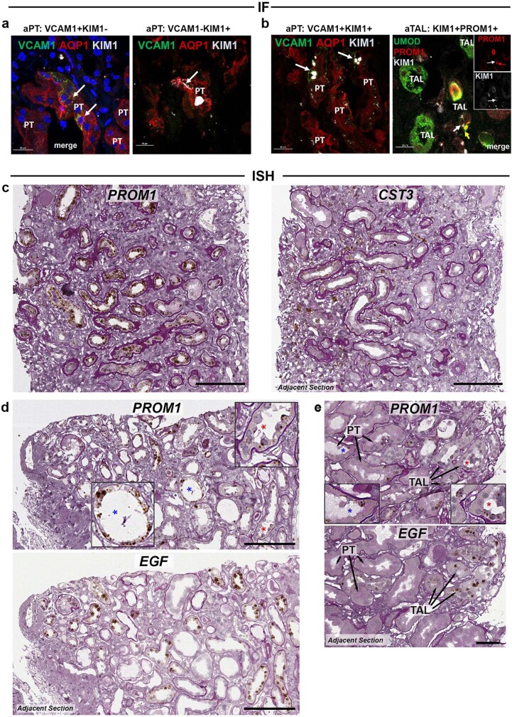
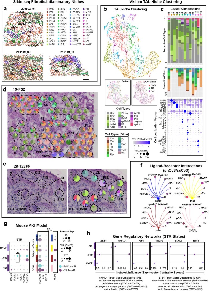
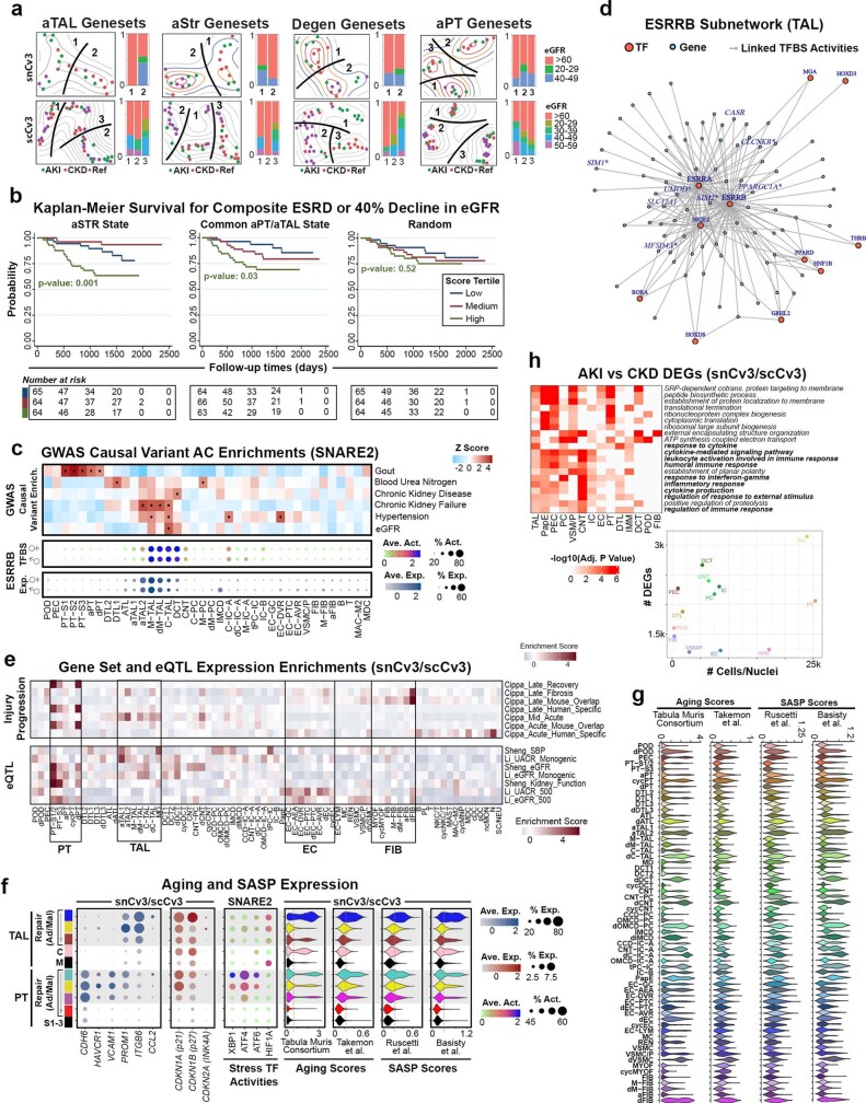
Understanding kidney disease relies on defining the complexity of cell types and states, their associated molecular profiles and interactions within tissue neighbourhoods1. Here we applied multiple single-cell and single-nucleus assays (>400,000 nuclei or cells) and spatial imaging technologies to a broad spectrum of healthy reference kidneys (45 donors) and diseased kidneys (48 patients). This has provided a high-resolution cellular atlas of 51 main cell types, which include rare and previously undescribed cell populations. The multi-omic approach provides detailed transcriptomic profiles, regulatory factors and spatial localizations spanning the entire kidney. We also define 28 cellular states across nephron segments and interstitium that were altered in kidney injury, encompassing cycling, adaptive (successful or maladaptive repair), transitioning and degenerative states. Molecular signatures permitted the localization of these states within injury neighbourhoods using spatial transcriptomics, while large-scale 3D imaging analysis (around 1.2 million neighbourhoods) provided corresponding linkages to active immune responses. These analyses defined biological pathways that are relevant to injury time-course and niches, including signatures underlying epithelial repair that predicted maladaptive states associated with a decline in kidney function. This integrated multimodal spatial cell atlas of healthy and diseased human kidneys represents a comprehensive benchmark of cellular states, neighbourhoods, outcome-associated signatures and publicly available interactive visualizations.


Conflict of interest statement

P.V.K. serves on the scientific advisory board to Celsius Therapeutics and Biomage. A.V. is a consultant for Astute and NxStage. C.R.P. is a member of the advisory board of and owns equity in RenalytixAI, and serves as a consultant for Genfit and Novartis. M.K. has grants from JDRF, Astra-Zeneca, NovoNordisc, Eli Lilly, Gilead, Goldfinch Bio, Janssen, Boehringer-Ingelheim, Moderna, European Union Innovative Medicine Initiative, Chan Zuckerberg Initiative, Certa, Chinook, amfAR, Angion Pharmaceuticals, RenalytixAI, Travere Therapeutics, Regeneron, IONIS Pharmaceuticals, Astellas, Poxel and a patent (PCT/EP2014/073413; ‘Biomarkers and methods for progression prediction for chronic kidney disease’) licensed. F.C. and E.Z.M. are paid consultants for Atlas Bio. F.P.W. receives research support from Astrazeneca, Boeringher-Ingelheim, Vifor Pharma and Whoop. P.M.P. is a consultant for Janssen. S.R. has research funding from AstraZeneca and Bayer Healthcare. S.S.W. is a consultant for GSK, GEHC, JNJ, Strataca, Roth Capital Partners, Venbio, and an expert witness on litigation for Davita and Pfizer. J.R.S. consults for Maze and Goldfinch and receives royalties from Sanfi Genzyme. K.Z. is a co-founder, equity holder and serves on the scientific advisory board of Singlera Genomics. A.S.N. is on the external advisory board for CareDX. L.H.M. is a consultant for Reata Pharmaceuticals, Travere Therapeutics and Calliditas. S.J. is a paid Blue SKy mentor for Meharry Medical College, Nashville and receives royalties from Elsevier. J.L.M. is an employee and shareholder of Solid Biosciences. The other authors declare no competing interests.

Figures

Fig. 1
Fig. 1. Overview of the technologies used to generate a human kidney cell atlas.
a, Human kidney samplesconsisted of healthy reference, AKI or CKD nephrectomies (Nx), deceased donors (DD) or biopsies. Tissues were processed for one or more assays, including snCv3, scCv3, SNARE2, 3D imaging or spatial transcriptomics (Slide-seq2, Visium). Scale bars, 1 mm (top) and 300 µm (bottom). b, Summary of the samples. Ref, reference. c, Omic RNA data were integrated, as shown by joint UMAP embedding, for alignment of cell type annotations across the three different data modalities. IC, intercalated cells; PC, principal cells; VSM/P, vascular smooth muscle cell or pericyte.
Fig. 2
Fig. 2. Spatially resolved atlas of molecular cell types.
a, Schematic of the human nephron showing cell types and states. b, UMAP embedding showing cell types (subclass level 3) for snCv3. Insets: overlays for both regional origin and altered-state status. Cyc, cycling; degen, degenerative; trans, transitioning. See Supplementary Table 4 for cell type definitions. c, Heat map of Slide-seq cell type frequencies along the corticomedullary axis (three individuals) (left). Middle, representative tissue puck region showing the transition of ATL to M-TAL segments. Right, corresponding expression of marker genes (scaled). Scale bar, 300 µm. d, Schematic of the renal corpuscle showing resolved cell types. e, The Slide-seq puck area indicated in Extended Data Fig. 4c and predicted cell types for renal corpuscles (top). Bottom, mapped expression values for corresponding marker genes (scaled). Scale bar, 100 µm. f, The average expression values for renal corpuscle cell types for markers shown in e and Extended Data Fig. 4f for all datasets. Ave., average; Exp., expression. g, Visium data on a healthy reference kidney (cortex, top; medulla, bottom). Left, haematoxylin and eosin (H&E)-stained tissue. Right, the per-bead predicted transfer scores for cell types or transcript expression values. Scale bar, 300 µm. Cx, cortex; OM, outer medulla; IM, inner medulla. The black lines outline histologically confirmed medullary rays leading into medulla. Source Data
Fig. 3
Fig. 3. Transcriptomically defined injury neighbourhoods.
a, The mean proportion of altered-state expression signatures (see Methods, 10x Visium spatial transcriptomics) for all Visium spots (146,460 total spots over 22 individuals). P values were calculated using Fisher’s exact tests over the spot proportions. b, Feature plots of the aEpi cell state. Scale bar, 300 µm. The top bounded region is shown in Extended Data Fig. 7h. c, Colocalization of immune and stromal cells with epithelial cell injury states. The y axis shows the odds ratio of colocalization (40,326 total spots over 22 individuals). P values were calculated using Fisher’s exact tests over the colocalization events. Ad/Mal, adaptive/maladaptive representing successful or maladaptive tubular repair. d, The average expression values for healthy reference and altered-state markers across cell types identified using Visium. e, Histology and predicted cell types in a cortical region (CKD) of interstitial fibrosis and neighbouring PT atrophy (altered PT). The pie charts show the proportions of predicted transfer scores for cell type annotations from snCv3 (Fig. 2b). The area corresponds to the bottom bounded region in b. Scale bar, 100 µm. f, The per-bead predicted transfer scores for cell types for area shown in e. Scale bar, 100 µm. *P < 0.01, **P < 1 × 105, ***P < 1 × 10−10. Exact P values are provided with the Source Data. Source Data
Fig. 4
Fig. 4. Defining cellular niches in renal disease from 3D fluorescence imaging.
a, Maximum-intensity projections of representative biopsies (cortex or medulla) showing classification label examples (insets i–iii). Altered, altered morphology or injury; C-DN, cortical distal nephron; Glom, glomeruli; V, vessels; VB, vascular bundle. Examples of MPO+ and CD68+ are indicated (i). The symbols * and # indicate CD68+ and MPO+ cells, respectively, in (i) and insets.  Arrowhead indicates T cell in (iii) and inset. Scale bars, 1 mm (biopsy images), 100 μm (i and ii) and 5 μm (insets). b, Community-based clustering on cell composition for around 20,000 randomly chosen neighbourhoods (15 individuals). The red outline indicates neighbourhoods including the medulla. c, The cellular composition of the neighbourhoods identified in b. d, Pairwise analysis of cells within 1.2 million neighbourhoods (15 individuals); colours are as indicated in c. e, Pearson’s coefficients for select interactions, the colour indicates both the value and direction of the correlation. P values were generated using two-sided t-tests. Source Data
Fig. 5
Fig. 5. Expression and regulatory signatures of adaptive epithelial cells.
a, Trajectory of TAL cells for snCv3, scCv3 and mouse AKI data, showing mouse to human mapping. Top right, latent time heat map from RNA velocity estimates. Bottom right, bar plot of collection groups after IRI across mouse trajectory modules. b, Heat map of smoothened gene expression (conserved or human specific) along the inferred TAL pseudotime. State modules based on the gene expression profiles are shown. M, M-TAL; C, C-TAL; Ad/Mal, adaptive/maladaptive, representing successful or maladaptive tubular repair. c, SNARE2 average accessibilities (access.) (chromVAR) and the proportion accessible for transcription-factor-binding sites (TFBSs) (right), and the averaged gene expression values (log scale) and the proportion expressed for integrated snCv3/scCv3 modules (left). TF, transcription factor. d, Slide-seq fibrotic regions. Top and bottom right, bead locations for a representative region, coloured by predicted subclasses, prediction weights or scaled gene expression values. Marker genes are ITGB6 (aTAL), EGF and SLC12A1 (TAL), CD14 (MAC-M2/MDC), MYH11 (VSMC/MyoF) and COL1A1 (aStr). The bar plot shows the immune subclass counts and the dot plots show the average expression of marker genes generated from three fibrotic regions (two individuals; Extended Data Fig. 11a). Scale bar, 50 μm. e, Visium TAL niches identified from all Visium spots and defined by colocalized cells (Methods and Extended Data Fig. 11b–e), showing the proportion of component cell type signatures. The dot plots show the niche marker gene average expression values. Source Data
Fig. 6
Fig. 6. Maladaptive repair signatures.
a,b, The ligand–receptor signalling strength between TAL states and IMM subclasses (a) or STR subclasses (b). The coloured bars indicate the total signalling strength of the cell group by summarizing signalling pathways. The grey bars indicate the total signalling strength of a signalling pathway by summarizing cell groups. Members of key signaling pathways described in the main text are in bold. c, The average gene expression values for select ligand–receptor combinations using snCv3/scCv3 integrated data. d, Dot plots validating select markers shown in c in the Visium data. e, Unadjusted Kaplan–Meier curves by cell state scores for composite of end-stage renal disease (ESRD) or for 40% drop in eGFR from time of biopsy in the NEPTUNE adult patient cohort (199 patients; Supplementary Table 30). Patients who reached the end point between screening and biopsy were excluded. Enrich., enrichment. P values calculated using log-rank tests for trend are shown (P = 0.021 (aPT), P = 0.003 (aTAL), P = 0.55 (degenerative)).
Extended Data Fig. 1
Extended Data Fig. 1. snCv3 cell types and quality metrics.
a. Number of samples processed across technologies assessed both individually and in combination. b. UMAP plots for snCv3 clusters. c. UMAP plots as in (b) showing the corresponding tissue regions, sex, patient identities and conditions. d. Bar and violin plots for snCv3 patients shown in (c). Barplots showing the total number of post-QC nuclei used in the snCv3 clustering analysis, and the proportions that were associated with level 1 subclasses, regions sampled or the health or disease conditions. Violin plots show the percentage of transcripts associated with the mitochondria (Mt) or endoplasmic reticulum (ER), as well as mean genes and mean transcripts detected per patient sample. e. Receiver operating characteristic (ROC) curve showing snCv3 clustering quality as assessed by the descrimination between subclasses (level 1) or clusters (b) using the Single Cell Clustering Assessment Framework (SCCAF). f. Bar and violin plots as in (d) for snCv3 clusters shown in (b), including proportion of nuclei contributed by each patient. Source Data
Extended Data Fig. 2
Extended Data Fig. 2. snCv3 marker genes and comparison with reference data.
a. Dot plot showing averaged marker gene expression values (log scale) and proportion expressed for snCv3 clusters. b. Cell type labels predicted from Lake et. al. 2019 mapped on the snCv3 UMAP embedding. Inset shows the corresponding prediction score values. c. UMAP of Lake et. al. 2019 data mapped to snCv3 embeddings showing subclass level 3 predicted labels. Inset shows the corresponding prediction score values. d. UMAP of Muto et al. 2021 data mapped to snCv3 embeddings showing subclass level 3 predicted labels. Inset shows the corresponding prediction score values. e. Heatmap showing correlation of averaged scaled gene expression values for snCv3 epithelial (reference state) clusters and mouse bulk segmental RNA-seq data from Chen et al., 2021. f. Heatmap showing correlation of averaged scaled gene expression values for snCv3 distal tubule clusters (reference states) and mouse scRNA-seq data from Chen et al., 2021. g. Heatmap showing correlation of averaged scaled gene expression values for snCv3 clusters (reference and altered/adaptive states) and mouse snRNA-seq clusters from Kirita et al., 2020. h. Heatmap showing correlation of averaged scaled gene expression values (reference states) for snCv3 clusters and mouse scRNA-seq clusters from Ransick et al., 2019. i. Heatmap showing correlation of averaged scaled gene expression values for snCv3 stromal clusters (reference and altered/adaptive states) against human scRNA-seq clusters from Kuppe et al., 2020. j. Heatmap showing correlation of averaged scaled gene expression values for snCv3 immune cell clusters and mouse immune cell types from Immgen.org. k. Heatmap showing correlation of averaged scaled gene expression values for snCv3 immune cell clusters and human immune cell types from Monaco et al. 2019. l. UMAP of Stewart et al., 2019 immune single-cell RNA-seq data mapped to snCv3 embeddings showing subclass level 3 predicted labels (top) and the prior published cell type annotations (bottom). Inset shows the corresponding prediction score values. Source Data
Extended Data Fig. 3
Extended Data Fig. 3. scCv3 integration and quality metrics.
a. UMAP plot showing integrated snCv3, scCv3 and SNARE2 (RNA) subclass level 3 annotations. scCv3 and SNARE2 (RNA) datasets were projected onto the snCv3 embeddings. b. UMAP plots as in (a) show mapping of the corresponding sex, patient identities and conditions for scCv3 and SNARE2 datasets. c. Joint embedding of SNARE2 RNA and AC modalities. d. Barplots showing the total number of post-QC nuclei and subclass level 1 cell types detected per scCv3 or SNARE2 patient. Violin plots show the percentage of transcripts associated with the mitochondria (Mt) or endoplasmic reticulum (ER), as well as mean genes, mean transcripts, mean accessible peaks or mean TSS enrichment scores detected per patient. e. Barplots showing the total number of post-QC nuclei/cells per subclass (level 3) combined across platforms (snCv3, scCv3, SNARE2). Patient entropy as well as tissue type, region, condition, sex and assay proportions are shown. Heatmap of correlation values for each scCv3 and SNARE2 subclass against the corresponding snCv3 subclass is shown (top panel). Grey values indicate absence of a comparison where subclasses were not covered by one or more of the technologies. Source Data
Extended Data Fig. 4
Extended Data Fig. 4. Slide-seq predicted cell types.
a. UMI counts per bead for classified beads. Normalized RCTD weights for the beads classified at subclass level 2 (Methods). Region of the tissue associated with beads for each subclass. Frequency of cell types predicted across pucks. b. Dot plot showing expression of cell type markers identified by snCv3 in the classified Slide-seq beads. c. Representative pucks showing subclass level 2 classifications. Cell types are grouped into 3 categories and plotted separately for clarity. Scale bar is 300 µm. d-e. Cell proximity networks for Slide-seq cell types associated with cortical or medullary regions. For panels a, b, d and e all pucks (6 individuals) were combined. f. Left panel: Slide-seq puck area indicated in (c) and predicted cell types for the AEAs and surrounding cell types. Right panel: mapped expression values for corresponding marker genes (scaled). AEA mapping over Visium histology is depicted in Extended Data Fig. 5j, colocalized with REN expression. Scale bar is 100 µm. Source Data
Extended Data Fig. 5
Extended Data Fig. 5. 10X Visium predicted cell types.
a. Analysis of subclass (level 2) predictions on 10x Visium spots (23 samples, 22 individuals). The top panel presents the distribution of transfer scores for the subclass (level 2) with the highest score in each spot. The UMI count panel presents the UMI counts associated with these spots. The cell type proportion panel depicts the proportion of transcriptomic signatures for each subclass, corresponding to its transfer score relative to all non-zero transfer scores in that spot. The relative proportion of cell type subclass signatures arising from the cortex or medulla in the 23 samples is shown. The bottom panel reveals the alignment between the predicted cell type subclass and unsupervised clusters that were histologically validated (Methods). b. Dot plot showing gene expression of select cell markers by predicted subclass (level 2) for all 23 Visium samples. c. The proportion of transcriptomic signatures in the 23 samples revealed a similar distribution of cell types across healthy reference nephrectomies, chronic kidney disease (CKD), and acute kidney injury (AKI) samples. d. Cortical (left, I) and medullary (right, U) portions of specimen 21-0063 reveal POD signatures confined to the cortex, while M-TAL signatures were found in the medulla. White arrows denote the connection point between the cortex and medulla portions of the sample. e. A histologic image of the cortex (bounded in d) reveals level 1 cell type mapping of POD, EC-GC, and VSM/P cells to a glomerulus. PT and TAL signatures were seen mapped over distinct regions of tubules. f. Expression of NPHS2 (for glomeruli), ALDOB (for PT), and SLC12A1 (for TAL) in the cortex. g. A histologic image of the medulla (bounded in d) reveals level 1 cell type mapping of a high proportion of TAL cells within the medulla. h. Feature plots showing SLC12A1 but not NPHS2 or ALDOB expression in the medulla. i. Proportion of cortex and medulla cell types for sample 21-0063 (9555 total spots over two sections of the same individual). j. A cortical image in a healthy reference sample (19-M61) showing EC-AEA entering the glomerular corpuscle near the MD. Two glomeruli contain signatures arising predominantly from POD and EC-GC. Two TAL niches are outlined. TAL niche 1 is enriched in healthy cortical TAL signature and TAL niche 8 near the afferent arteriole is enriched for Macula Densa (MD) signature. NPHS2 expression is found within the glomeruli and renin (REN) expression is highest in the EC-AEA. A full level 2 cell type deconvolution is provided in the final panel (right). Scale bars are 300 μm in length. Source Data
Extended Data Fig. 6
Extended Data Fig. 6. Altered states in a mouse model of AKI.
a. UMAP showing mouse AKI (IRI) data with cell types predicted from snCv3. Mouse datasets were projected onto the snCv3 UMAP embeddings (Fig. 2b). Histograms of prediction scores for subclasses (level 1 and 3) are shown. b. UMAP plots as in (a) showing the original cell type annotations and injury groups (time points following IRI) for mouse data. c. Barplot showing the proportion of altered states for each mouse injury group. d. Barplot showing proportion of each injury group for a subset of predicted subclasses. Arrows indicate altered states or immune cells (MAC-M2) that persisted at 6 weeks following injury. e. UMAP as in (a) showing the distribution of reference and altered states over the different injury groups. Source Data
Extended Data Fig. 7
Extended Data Fig. 7. Altered state expression signatures.
a-b. Gene Set Enrichment Analyses (GSEA) for genes upregulated or downregulated in adaptive PT (a) and TAL (b) states compared to reference states. c. Dot plot showing averaged marker gene expression values (log scale) and proportion expressed for snCv3 clusters. d. Dot plot showing averaged marker gene expression values (log scale) and proportion expressed for integrated snCv3/scCv3 reference, degenerative and adaptive stromal clusters. e. Violin plots showing aSTR and ECM (matrisome) scores for snCv3 clusters. f. Visium feature plots of normalized counts for select markers mapped to regions shown in Fig. 3e. Scale bar is 100 µm. g. Visium feature plot of normalized counts for a select marker mapped to region shown in (h). Scale bar is 100 µm. h. Histology and predicted cell types for a medullary region of acute tubular necrosis (cellular cast formation within tubular lumens, loss of brush border, loss of nuclei, and epithelial simplification). Pie charts are proportions of predicted transfer scores. Area corresponds to the upper bounded region in Fig. 3b. Scale bar is 100 µm. i. Predicted transfer scores for area shown in (h). Scale bar is 100 µm.
Extended Data Fig. 8
Extended Data Fig. 8. 3D imaging identifies injury neighbourhoods.
a. Maximum intensity projections of immunofluorescence and second harmonic images for 13 example biopsies, scale bars 500 µm. b. Overview of neighbourhood classes as given in Fig. 4b for reference. c. Distribution of neighbourhoods by specimen in neighbourhood clusters plotted in tSNE space from Fig. 4. d. Feature plots of the number of cells per neighbourhood for cortical TAL (C-TAL), altered morphology and proximal tubule (PT). C-TALs and PTs are found in neighbourhoods with altered morphology, cyan and orange vs. red and magenta arrowheads. e-h. Neighbourhoods with at least one cell for the labels indicated were subsetted and neighbourhood graphs generated to indicate the pairwise interaction between cell labels. At right: maximum Z-projections of 3D confocal fluorescence images with white arrow indicating MPO+ cells (e and f) or CD68+ cells (g), orange arrows indicating CD3+ cells and asterisks highlighting fibrosis (white) or areas of altered morphology/injury (yellow). Scale bar = 100 μm. h and i, pairwise subset analysis of CD3+, PT and TAL (orange, magenta and cyan arrows respectively). CD3+ cells cluster in regions of fibrosis (orange arrowhead and white asterisks). UMOD positive casts associate with regions of injury and CD3+ cells (orange asterisk), the tubular epithelium is intact with brush borders (white #), has evidence of epithelial simplification (orange #) or less AQP1 marker and epithelial simplification (red #). Scale bar = 100 µm. Source Data
Extended Data Fig. 9
Extended Data Fig. 9. PT and TAL repair trajectories.
a. Trajectory of PT cells for snCv3 and scCv3 datasets. Bottom UMAPs are coloured by cell density for each condition (AKI/CKD), including the cell density difference between AKI and CKD. b. UMAP of PT subclasses (PT-S1-S3, aPT) with projected RNA velocities, derived from a dynamical model of PT repair modules, visualized as streamlines (Methods). c. Heatmap of smoothed gene expression profiles along the inferred pseudo-time for PT cells. Colour blocks on the left show different repair states or modules identified based on the gene expression profiles. d. Right panel: dot plot of SNARE2 average accessibilities (chromVAR) and proportion accessible for TFBSs showing differential activity in aPT modules. Left panel: dot plot of averaged gene expression values (log scale) and proportion expressed for integrated snCv3/scCv3 modules. e. 3D confocal imaging of a reference kidney tissue section stained for PROM-1 (red), Phopho-c-Jun (p-c-JUN, yellow), F-actin (with FITC phalloidin, green) and DNA with DAPI (cyan) (scale bar 100 µm). Regions of PROM-1 within a glomerulus (G) and a proximal tubule (PT) are indicated and enlarged in the right panels (rendered 3D volumes, scale bar 10 μm). This area shows the association of PROM-1 expression with p-c-Jun+ cells in the tubules. 3D rendering was performed using the Voxx software from the Indiana Center for Biological Microscopy (voxx.sitehost.iu.edu/). f. Top panels: TAL UMAPs as in Fig. 5a (snCv3) showing condition densities as in (a). Bottom panels: changes of smoothed gene expression (snCv3) for representative genes as a function of inferred pseudotime coloured by disease conditions. g. TAL UMAP as in Fig. 5a (snCv3) with projected RNA velocities, derived from a dynamical model for TAL repair modules, visualized as streamlines (Methods). h. Heatmap showing expression value dynamics (snCv3) along latent time inferred from RNA velocities for the top 300 likelihood-ranked genes. Top colour bar indicates aTAL repair modules. i. Scatter plots (u, unspliced; s, spliced; t, latent time) for putative driver genes (snCv3) identified by high likelihoods in the dynamical model. j. Gene regulatory networks associated with TAL repair modules (Methods, see Supplementary Table 23). Eigenvector centrality scores were plotted for select factors with high influence on different states. k. UMAP embedding (snCv3) showing pseudotime gradient and the derived vector field associated with TAL repair. l-m. UMAP embedding showing simulated vector fields following TFAP2B (l) or NR3C1 (m) perturbation. Barplots show inner product calculations (perturbation scores) comparing directionality and size of TAL repair flow vectors and the simulated perturbation vectors. Negative perturbation scores indicate a block in differentiation.
Extended Data Fig. 10
Extended Data Fig. 10. Adaptive epithelia localized to areas of injury.
a. Immunofluorescent (IF) staining of VCAM1, AQP1, KIM1 (HAVCR1) in the aPT (performed on replicate sections from 3 individuals). Scale bars represent 20 µm. b. IF staining of UMOD, PROM1 and KIM1 in the TAL (performed on replicate sections from 3 individuals). Scale bars represent 20 µm. c-e. RNA in situ hybridization (ISH) for PROM1, CST3 or EGF (performed on adjacent sections from 6 individuals). c. ISH for PROM1 and CST3 in adjacent sections. PROM1 is localized to an area showing interstitial fibrosis and tubular atrophy. Scale bar is 100 μm. d. RNA ISH for PROM1 (left panel) and EGF (right panel) in adjacent corticomedullary sections. PROM1 positive epithelial cells seen in injured tubules (epithelial simplification, loss of nuclei) that are EGF negative (blue asterisks, upper inset image) and EGF positive healthy TAL (red asterisks, lower inset image). Scale bar is 100 μm. e. ISH for PROM1 and EGF (healthy TAL) showing PROM1 localization to PT (blue asterisks, left inset) and TAL (red asterisks, right inset) showing histological evidence of injury (epithelial thinning, nuclei loss, brush border loss in PT). Adjacent section (lower panel) shows EGF positivity in healthy TAL cells. Scale bar is 50 μm.
Extended Data Fig. 11
Extended Data Fig. 11. TAL adaptive or maladaptive repair niches.
a. Slide-seq fibrotic/inflammatory niches from Fig. 5d showing full predicted subclass level 3 cell type distributions. Scale bar is 100 μm. b. Visium TAL niches were identified by clustering TAL dominant spots according to Seurat label transfer scores. The UMAP denotes 13 TAL niches which were distributed across the 23 samples (patient inset) and across disease state conditions (condition inset). c. Visium niche cluster compositions. Signature proportions of TAL cell types, injury cell states, stromal cells, and immune cells. Niche 5 contained significant stromal, niche 7 contained lymphoid, and niche 11 contained myeloid cell signatures. Some niches (e.g. 9) had significant contributions from neighbouring non-TAL epithelial cells (“Proportion Other” bar plot). The colocalization score (Methods) for cell types within each niche is based on Seurat label transfer scores and provided as a dot plot. d. A subset of TAL niches (1, 3, 5, 7) were overlaid upon a histologic image of the cortex in sample M19-F52_3, with each niche often represented by multiple contiguous spots. Scale bar is 300 μm in length. e. Representative region (patient 28-12265) showing niche 5 (STR) localized in proximity to interstitial fibrosis, and niche 3 (aTAL) localized adjacent to myeloid cell infiltration. Scale bar is 300 μm. f. Circle plot of ligand-receptor cell cell communications between TAL repair modules or states and immune cell subclasses. Dot size indicates relative proportion of the subclasses and TAL module, edge width represents strength of the communication. g. Dotplots showing expression level and percent expressed for select ligands or receptors within the mouse AKI data. Data were grouped into injury groups less than or equal to 2 days (including control cells) and groups greater than 2 days post-injury. The asterix highlights an IGF1 expression difference found between early and late injury groups of the aFIB population. h. Gene regulatory networks associated with STR cell types (see Supplementary Table 27). Eigenvector centrality scores were plotted for select factors with high influence on different subclasses. Ontologies for target genes downstream of select transcription factors are shown. Source Data
Extended Data Fig. 12
Extended Data Fig. 12. Association of cell state scores with clinical phenotypes.
a. Embedding plots: grouping of patient-level expression profiles for the aTAL, aStr, Degen, and aPT genesets used for clinical outcome association (Supplementary Table 27) for snCv3 (Top) and scCv3 (Bottom). Barplots: the distribution of eGFR among the identified groups. b. Unadjusted Kaplan Meier curves by aStr (P = 0.001) and common aPT and aTAL (P = 0.03) state scores for composite of ESRD or 40% drop in eGFR from time of biopsy in Neptune adult patient cohort (see Supplementary Table 30). A score generated using 100 randomly selected genes failed to show any correlation (P = 0.52) with disease survival. c. Heatmap of causal variants (z-scores) that were enriched in SNARE2 cell-type specific accessible chromatin. Dots represent Z-scores > 2 (or P value < 0.05). Dotplots show averaged ESRRB binding site accessibility or gene expression (log values) and percent accessible or expressed. d. ESRRB subnetwork of TF connections to target genes generated using SNARE2 RNA and AC data, demonstrating a central role for ESRRB in regulating TAL marker genes. Inset shows the ESRRB motif. Boxes represent ESRRB target genes showing causal variant enrichment (c) within linked regulatory regions (AC peaks). e. Heatmap showing enrichment scores (scaled -log10(p values)) for the RNA expression (snCv3/scCv3) of gene sets associated with eQTL linked to kidney function or disease, or associated with progression of acute to chronic injury. f. Dot plots of averaged gene expression values (snCv3/scCv3) or TF binding site accessibilities (SNARE) and proportion expressed/accessible. Violin plots show gene expression scores for gene sets associated with aging (Tabula Muris Consortium and Takemon et al.) or SASP (Ruscetti et al. or Basisty et al.). g. Violin plots showing expression scores for gene sets shown in (f) for all non-immune subclasses. h. Bottom: Number of differentially expressed genes between AKI and CKD cases for each major cell type in snCv3 and scCv3 datasets. Top: enrichment of functional gene ontology terms for each major cell type. Colour indicates -log adjusted p-value (derived from GSEA and calculated based on permutation). Source Data

Similar articles

Cited by

References

    1. Schreibing F, Kramann R. Mapping the human kidney using single-cell genomics. Nat. Rev. Nephrol. 2022;18:347–360. doi: 10.1038/s41581-022-00553-4. - DOI - PubMed
    1. Park J, et al. Single-cell transcriptomics of the mouse kidney reveals potential cellular targets of kidney disease. Science. 2018;360:758–763. doi: 10.1126/science.aar2131. - DOI - PMC - PubMed
    1. Sheng L, Zhuang S. New insights into the role and mechanism of partial epithelial-mesenchymal transition in kidney fibrosis. Front. Physiol. 2020;11:569322. doi: 10.3389/fphys.2020.569322. - DOI - PMC - PubMed
    1. Kirita Y, Wu H, Uchimura K, Wilson PC, Humphreys BD. Cell profiling of mouse acute kidney injury reveals conserved cellular responses to injury. Proc. Natl Acad. Sci. USA. 2020;117:15874–15883. doi: 10.1073/pnas.2005477117. - DOI - PMC - PubMed
    1. Docherty M-H, O’Sullivan ED, Bonventre JV, Ferenbach DA. Cellular senescence in the kidney. J. Am. Soc. Nephrol. 2019;30:726–736. doi: 10.1681/ASN.2018121251. - DOI - PMC - PubMed