. 2023 Aug 22;122(16):3340-3353.
doi: 10.1016/j.bpj.2023.07.010. Epub 2023 Jul 20.

Force generation in human blood platelets by filamentous actomyosin structures

Affiliations

Force generation in human blood platelets by filamentous actomyosin structures

Anna Zelená et al. Biophys J. .

Abstract

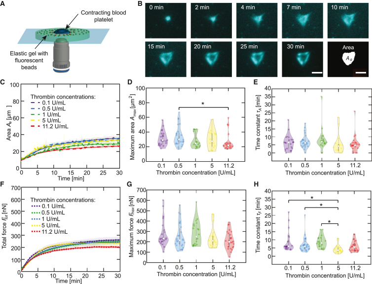
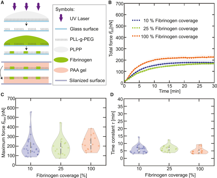
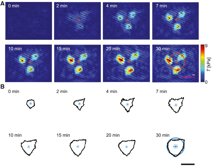
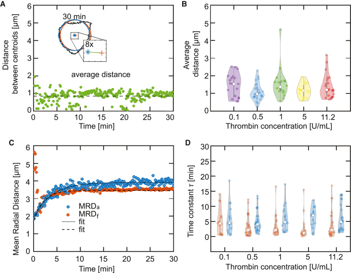
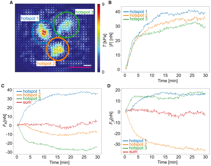
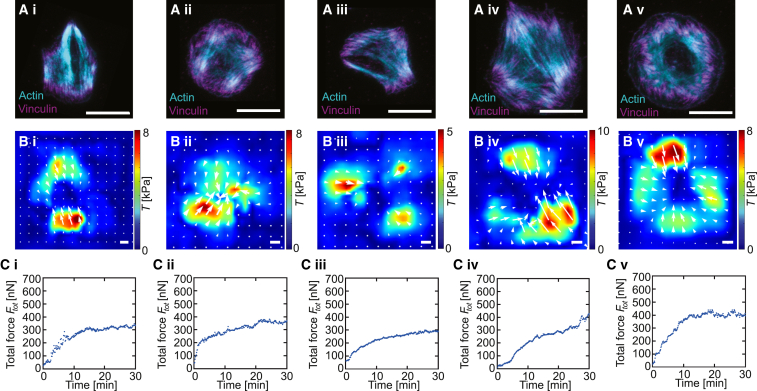
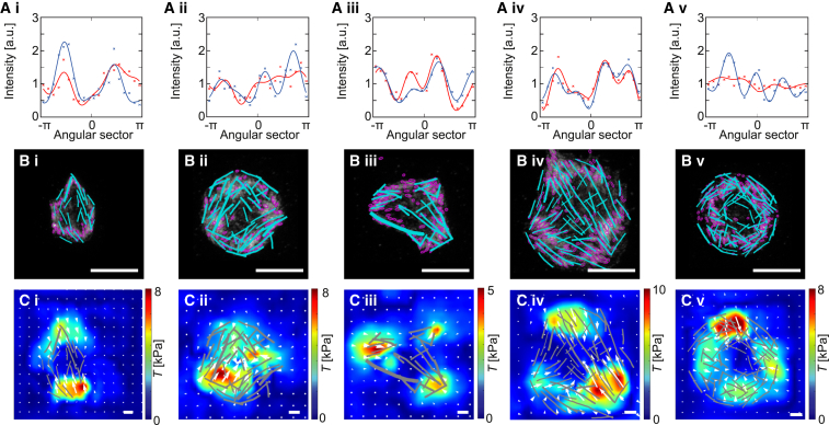
Blood platelets are central elements of the blood clotting response after wounding. Upon vessel damage, they bind to the surrounding matrix and contract the forming thrombus, thus helping to restore normal blood circulation. The hemostatic function of platelets is directly connected to their mechanics and cytoskeletal organization. The reorganization of the platelet cytoskeleton during spreading occurs within minutes and leads to the formation of contractile actomyosin bundles, but it is not known if there is a direct correlation between the emerging actin structures and the force field that is exerted to the environment. In this study, we combine fluorescence imaging of the actin structures with simultaneous traction force measurements in a time-resolved manner. In addition, we image the final states with superresolution microscopy. We find that both the force fields and the cell shapes have clear geometrical patterns defined by stress fibers. Force generation is localized in a few hotspots, which appear early during spreading, and, in the mature state, anchor stress fibers in focal adhesions. Moreover, we show that, for a gel stiffness in the physiological range, force generation is a very robust mechanism and we observe no systematic dependence on the amount of added thrombin in solution or fibrinogen coverage on the substrate, suggesting that force generation after platelet activation is a threshold phenomenon that ensures reliable thrombus contraction in diverse environments.


Conflict of interest statement

Declaration of interests The authors declare no competing interests.

Figures

Figure 1
Figure 1
Above a threshold, thrombin concentration has no systematic effect on platelet spreading and force generation. (A) Schematic representation of the experimental setup. A contracting platelet (blue) on top an elastic gel (light green) displaces the fluorescent beads (green). The deformation of the gel due to the contraction is visualized as orange beads. (B) Epifluorescence micrographs of a blood platelet stained for actin and spreading on an elastic gel after stimulation by thrombin. The last image shows a binarized version of the t=30 min micrograph. The scale bars correspond to 5 μm and refer to all sub-panels. The example platelet shown here is also shown in Figs. 3, 4A, and 5. (C) The average time-dependent total area covered by actin structures Aa(t) upon stimulation by different concentrations of thrombin. Each averaged curve contains a minimum of 18 datasets and the SEs are shown as the transparent areas. Averaged exponential fits are shown as solid lines. (D) Maximum areas for each dataset determined from the averaged total Aa(t) curves shown in (C). (E) Time constants for each dataset determined from the averaged total Aa(t) curves shown in (C). (F) Average total force curves for blood platelets (n 18) upon stimulation by different concentrations of thrombin are shown as dotted lines, and the SEs are included as the transparent areas. Averaged exponential fits are shown as solid lines. (G) Maximum forces for each dataset comprising the averaged total force curves shown in (F). (H) Time constants for each dataset comprising the averaged total force curves shown in (F). The violin plot outlines illustrate the kernel probability density; the width of the shaded area represents the proportion of the data points located there. In each violin plot, the white circle indicates the median, the thick gray bar indicates interquartile range, and the thin gray line indicates the full range of distribution without outliers. Experimental conditions with a statistical difference below a 5% significance level are marked by asterisks (). To see this figure in color, go online.
Figure 2
Figure 2
Fibrinogen coverage has no effect on force generation. (A) Schematic representation of the preparation of micro-patterned gel surfaces with varying fibrinogen coverage (100%, 25%, 10%) by photo patterning (LIMAP). (B) Average total force curves for blood platelets (n 15) upon stimulation by thrombin (0.1 U/mL) on gels covered by various concentrations of fibrinogen (dotted lines); the SEs are included as the transparent areas. Averaged exponential fits are shown as solid lines. Each dataset comprising the averaged curves is fitted and the maximum forces and time constants are determined. (C) Maximum forces for each dataset determined from the averaged total force curves shown in (B). (D) Time constants for each dataset determined the averaged total force curves shown in (B). The violin plot outlines illustrate the kernel probability density; the width of the shaded area represents the proportion of the data points located there. In each violin plot, the white circle indicates the median, the thick gray bar indicates interquartile range, and the thin gray line indicates the full range of distribution without outliers. To see this figure in color, go online.
Figure 3
Figure 3
Time-resolved traction forces reveal emergence of force hotspots and show same geometry as cell shape. (A) Image sequence showing the temporal evolution of the force distribution. Black crosses represent the centers of the force hotspots and white arrows indicate the direction of the force field. For each image, the centroid of the hotspots is calculated and is represented as an orange cross. As an example, the orange circle shown on the t=30 min image has a radius equal to the mean radial distance of the force (MRDf) between the centroid and the black crosses. Corresponding MRDf are calculated for each time point of the video and each individual platelet. The magenta scale bar corresponds to 5 μm, the white scale bar corresponds to 5 kPa, and they refer to all sub-panels. (B) Image sequence showing the time evolution of the actin boundary corresponding to the same time points shown in (A). For each image, the centroid is represented by a blue star. As an example, the blue circle shown in the t=30 min image has a radius equal to the mean radial distance (MRDa) between the centroid and the actin boundary. Corresponding MRDa are calculated for each time point of the video and each individual platelet. The scale bar corresponds to 5 μm and refers to all sub-panels. The example platelet shown here is also shown in Figs. 1B, 4A, and 5. To see this figure in color, go online.
Figure 4
Figure 4
The centroids of the force hotspots and the actin boundary collapse with time. (A) The inset shows an overlay of the actin boundary (black), the MRDa circle (blue), and the MRDf circle (orange) for the t=30 min image. The distance between the centroids of the two circles is shown in the zoom-in and is represented by the green line. The distance between the centroids is calculated for each time point and is plotted in a time-resolved manner. The average distance is represented as the dashed black line. This analysis is repeated for every platelet used in the experiments with differing thrombin concentrations. The example platelet shown here is also shown in Figs. 1B, 3A, and 5. (B) Distribution of the average distance between MRDa and MRDf circles for each thrombin concentration. (C) Temporal evolution of the MRDa (blue) and MRDf (orange) for the example shown in Fig. 3 and (A). (D) Distribution of the time constant for the radial evolution for each MRDa circle (blue violin plots) and MRDf circle (orange violin plots). See axis labels for different conditions. The violin plot outlines illustrate the kernel probability density; the width of the shaded area represents the proportion of the data points located there. In each violin plot, the white circle indicates the median, the thick gray bar indicates interquartile range, and the thin gray line indicates the full range of distribution without outliers. To see this figure in color, go online.
Figure 5
Figure 5
The force hotspots form a balanced system of strongly localized forces. (A) Reconstructed tangential traction forces at the final time point of spreading for the cell presented in Fig. 3 with three manually defined adhesion hotspot areas indicated by blue, green, and orange circles. The color coding is valid for all subfigures. The magenta scale bar corresponds to 5 μm and white scale bar corresponds to 5 kPa. (B) Time evolution of the magnitude of the traction force vectors obtained by integrating the traction vector field in each individually marked adhesion area. (C) Time evolution of the x components of the traction force vectors for the each individually marked adhesion area. The red curve shows sum of all three components. (D) The time evolution of the y components of the traction force vectors for each individually marked adhesion area. The red curve shows sum of all three components. The example platelet shown here is also shown in Figs. 1B, 3, and 4A. To see this figure in color, go online.
Figure 6
Figure 6
STED imaging of fixed and stained cells reveals details of cell organization during force generation. Typical examples of i) spindle-like, ii) square, iii) triangular, iv) polygonal, and v) circular platelets. (A) Superresolution STED imaging; actin in cyan and vinculin in magenta; the white scale bars correspond to 5 μm. (B) Traction forces before fixation with the white arrows indicating the direction of the force fields; the white scale bars correspond to 5 kPa. (C) Time evolution of the total force produced by the cell before fixation. See Fig. S10 in the supporting material for five additional examples. To see this figure in color, go online.
Figure 7
Figure 7
Actin structures, vinculin patterns, and force fields are correlated. The same cells (i–v) as in Fig. 6 are shown. (A) Circumferential profiles of the vinculin signal (red) and force magnitude (blue); the crosses show the data, the solid lines are fits. (B) Overlay of segmented vinculin spots (focal adhesions; magenta) and stress fibers (cyan); the white scale bars correspond to 5 μm. (C) Overlay of the traction forces field and the segmented stress fibers (gray); the white scale bars correspond to 5 kPa. See Fig. S11 in the supporting material for five additional examples. To see this figure in color, go online.

References

    1. Michelson A., Cattaneo M., et al.Newman P., editors. Platelets. Fourth edition. Academic Press; 2019.
    1. Patel-Hett S., Richardson J.L., et al. Italiano J.E. Visualization of microtubule growth in living platelets reveals a dynamic marginal band with multiple microtubules. Blood. 2008;111:4605–4616. doi: 10.1182/blood-2007-10-118844. - DOI - PMC - PubMed
    1. Cerecedo D., Martínez-Vieyra I., et al. Galván I.J. Haemostatic role of intermediate filaments in adhered platelets: Importance of the membranous system stability. J. Cell. Biochem. 2013;114:2050–2060. doi: 10.1002/jcb.24546. - DOI - PubMed
    1. Diagouraga B., Grichine A., et al. Sadoul K. Motor-driven marginal band coiling promotes cell shape change during platelet activation. J. Cell Biol. 2014;204:177–185. doi: 10.1083/jcb.201306085. - DOI - PMC - PubMed
    1. Niederman R., Pollard T.D. Human platelet myosin. II. In vitro assembly and structure of myosin filaments. J. Cell Biol. 1975;67:72–92. doi: 10.1083/jcb.67.1.72. - DOI - PMC - PubMed

Publication types

LinkOut - more resources