. 2022 Dec 28:12:giad060.
doi: 10.1093/gigascience/giad060. Epub 2023 Jul 28.

Health record hiccups-5,526 real-world time series with change points labelled by crowdsourced visual inspection

Affiliations

Health record hiccups-5,526 real-world time series with change points labelled by crowdsourced visual inspection

T Phuong Quan et al. Gigascience. .

Abstract

Background: Large routinely collected data such as electronic health records (EHRs) are increasingly used in research, but the statistical methods and processes used to check such data for temporal data quality issues have not moved beyond manual, ad hoc production and visual inspection of graphs. With the prospect of EHR data being used for disease surveillance via automated pipelines and public-facing dashboards, automation of data quality checks will become increasingly valuable.

Findings: We generated 5,526 time series from 8 different EHR datasets and engaged >2,000 citizen-science volunteers to label the locations of all suspicious-looking change points in the resulting graphs. Consensus labels were produced using density-based clustering with noise, with validation conducted using 956 images containing labels produced by an experienced data scientist. Parameter tuning was done against 670 images and performance calculated against 286 images, resulting in a final sensitivity of 80.4% (95% CI, 77.1%-83.3%), specificity of 99.8% (99.7%-99.8%), positive predictive value of 84.5% (81.4%-87.2%), and negative predictive value of 99.7% (99.6%-99.7%). In total, 12,745 change points were found within 3,687 of the time series.

Conclusions: This large collection of labelled EHR time series can be used to validate automated methods for change point detection in real-world settings, encouraging the development of methods that can successfully be applied in practice. It is particularly valuable since change point detection methods are typically validated using synthetic data, so their performance in real-world settings cannot be assumed to be comparable. While the dataset focusses on EHRs and data quality, it should also be applicable in other fields.

Keywords: anomalies; change point detection; data quality; time series.


Conflict of interest statement

The author(s) declare that they have no competing interests.

Figures
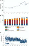
Figure 1:
Figure 1:
Examples of temporal changes in data caused by updates to infrastructure at Oxford University Hospitals. (A) Total number of inpatient admissions containing multiple diagnosis codes. The jump in records in 2008 was caused by the inclusion of dialysis day-case patients, which were then excluded again in 2012. (B) Emergency department attendances by referral source. A change in computer systems in 2011 noticeably affected the data recorded, with the “Other” category temporarily being overrepresented in 2012, and a new, undefined category of “30” appearing thereafter. (C) Lowest creatinine blood test result each day. The bimodal distribution up to 1997 was due to a mixture of units being used, and the drop in values in 2009 was due to a change in testing method and reference range.
Figure 2:
Figure 2:
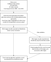
Overview of the dataset creation workflow.
Figure 3:
Figure 3:
Examples of graphs generated for visual inspection of change points.
Figure 4:
Figure 4:
Screenshot of Zooniverse project interface.
Figure 5:
Figure 5:
Example of 2 lines drawn 7px apart. Any lines drawn closer together than this were considered to represent the same change point.
Figure 6:
Figure 6:
Examples of the locations of crowdsourced consensus labels for change points.
Figure 7:
Figure 7:
Minimum distances between 2 lines drawn on an image by the same volunteer. Shown up to a maximum of 10px. Intervals are closed on the left and open on the right (i.e., when the minimum distance is an integer, this is included in the bar to the right).
Figure 8:
Figure 8:
Examples of change points identified by the volunteers but not by the expert. Vertical lines denote positions of volunteer clusters and expert labels; those with numbers above indicate the number of volunteers contributing to the cluster, and those with inverted triangles indicate lines drawn by the expert. (A) The 2 false-positive change points at 2012 and 2015 could arguably be changes in variability. (B) The false-positive change point at 2010 potentially just comprised border points for the 2 adjacent clusters, while the 4 on the far right are likely only related to discretisation.
Figure 9:
Figure 9:
Examples of change points identified by the expert but not by the volunteers. Vertical lines denote positions of volunteer clusters and expert labels; those with numbers above indicate the number of volunteers contributing to the cluster, and those with inverted triangles indicate lines drawn by the expert. (A) The 2 false-negative change points in 2010 and 2017 could arguably be changes in trend or variability. (B) The false-negative change point around 2018 is an outlier that was small in magnitude.

References

    1. Kass RE, Caffo BS, Davidian M, et al. Ten simple rules for effective statistical practice. PLoS Comput Biol. 2016;12(6):e1004961. - PMC - PubMed
    1. Hemkens LG, Benchimol EI, Langan SM, et al. The reporting of studies using routinely collected health data was often insufficient. J Clin Epidemiol. 2016;79:104–11. - PMC - PubMed
    1. Huebner M, Vach W, le Cessie S. A systematic approach to initial data analysis is good research practice. J Thorac Cardiovasc Surg. 2016;151(1):25–7. - PubMed
    1. Aminikhanghahi S, Cook DJ. A survey of methods for time series change point detection. Knowl Inf Syst. 2017;51(2):339–67. - PMC - PubMed
    1. Kahn MG, Callahan TJ, Barnard J, et al. A harmonized data quality assessment terminology and framework for the secondary use of electronic health record data. EGEMS (Wash DC). 2016;4(1):1244. - PMC - PubMed

Publication types