Review
. 2024 Aug;37(4):418-433.
doi: 10.1177/19714009231193158. Epub 2023 Aug 2.

Statistical plots in oncologic imaging, a primer for neuroradiologists

Affiliations
Review

Statistical plots in oncologic imaging, a primer for neuroradiologists

Sina Bagheri et al. Neuroradiol J. 2024 Aug.

Abstract

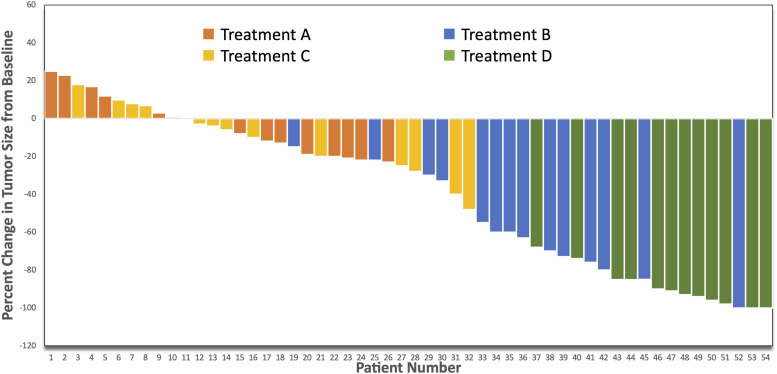
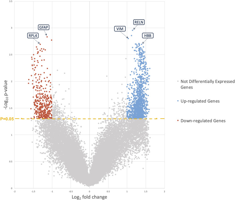
The simplest approach to convey the results of scientific analysis, which can include complex comparisons, is typically through the use of visual items, including figures and plots. These statistical plots play a critical role in scientific studies, making data more accessible, engaging, and informative. A growing number of visual representations have been utilized recently to graphically display the results of oncologic imaging, including radiomic and radiogenomic studies. Here, we review the applications, distinct properties, benefits, and drawbacks of various statistical plots. Furthermore, we provide neuroradiologists with a comprehensive understanding of how to use these plots to effectively communicate analytical results based on imaging data.

Keywords: Statistical plot; heatmap; principal component; spider plot; t-SNE; volcano plot; waterfall plot.


Conflict of interest statement

Declaration of conflicting interestsThe author(s) declared no potential conflicts of interest with respect to the research, authorship, and/or publication of this article.

Figures

Figure 1.
Figure 1.
Waterfall plot showing response to different kinds of treatments: percent change in tumor burden.
Figure 2.
Figure 2.
Waterfall plot of the radiomics signature for each patient in the radiomics validation subset. Based on the radiomics signature cutoff of −4.0, patients were divided into a high-risk group (≥−4.0) and a low-risk group (<−4.0). The status of dead or censorship was marked with different colors. Reproduced from Sun et al., Radiology, Copyright 2021, Vol. 301, Pages 654–663, with permission from the Radiological Society of North America (RSNA®).
Figure 3.
Figure 3.
Waterfall plots show statistics for MRI factor 1 (tumor size) used to select gene sets for display in heat map and table, for all gene sets in MsigDB c2.cgp, with selected gene sets in green. Waterfall plots show three types of association statistics on y-axis calculated for all gene sets, which are ordered in increasing level of association along x-axis: normalized enrichment statistic (NES), maximum enrichment statistic at (Max. ES at), and leading edge. Fill of maximum enrichment statistic waterfall plot is zero at middle, such that enrichment at top is shown downward and enrichment at bottom upwards. Reproduced from Bismeijer et al., Radiology, Copyright 2020, Vol. 296, Pages 277–287, with permission from the Radiological Society of North America (RSNA®)
Figure 4.
Figure 4.
Spider plot displaying response to therapy over time in 7 subjects with low-grade glioma based on the Response Assessment in Neuro-Oncology (RANO) criteria by utilizing percent change in T2/FLAIR signal volume.
Figure 5.
Figure 5.
Swimmer plot of 30 patients with glioma at relapse treated with regorafenib sorted by overall survival after initiation of therapy. Time to progression ranged from 0.8 to 8.2 months. Patients with oligodendroglioma (#2, 4) were alive after 13.8 and 20.7 months, respectively. Most patients with glioblastoma (96%) and astrocytoma (75%) had died. Reproduced from Werner et al
Figure 6.
Figure 6.
Feature weight matrix. This heatmap demonstrates the relative influence of each feature on the overall clustering attempt. Darker cells depict higher values of influence as calculated by the scalar product between the feature vector and the principal component vector multiplied by the explained variance of the respective principal component. By performing this operation, the relative importance of certain types of features and imaging sequences can be understood. Feature names describe the attribute that they measure in the following way: ImagingSequence_FeatureType_Metric. Reprinted from Neoplasia, Vol. 36, Haldar et al., Unsupervised machine learning using K-means identifies radiomic subgroups of pediatric low-grade gliomas that correlate with key molecular markers, Pages 100869, Copyright 2023, with permission from Elsevier.
Figure 7.
Figure 7.
Radiogenomics maps resolve the regional intratumoral heterogeneity of EGFR amplification status in GBM. Shown are two different image-localized biopsies (Biopsy #1, Biopsy #2) from the same GBM tumor in a single patient. For each biopsy, T1+C images (left) demonstrate the enhancing tumor segment (dark green outline, T1W+Contrast) and the peripheral non-enhancing tumor segment (light green outline, T2W lesion). Radiogenomics color maps for each biopsy (right) also show regions of predicted EGFR amplification (amp, red) and EGFR wildtype (wt, blue) status overlaid on the T1+C images. For biopsy #1 (green square), the radiogenomics map correctly predicted low EGFR copy number variant (CNV) and wildtype status with high predictive certainty (p < 0.05). Conversely for biopsy #2 (green circle), the maps correctly predicted high EGFR CNV and amplification status, also with high predictive certainty (p < 0.05). Note that both biopsies originated from the non-enhancing tumor segment, suggesting the feasibility for quantifying EGFR drug target status for residual subpopulations that are typically left unresected followed gross total resection. Reproduced from Hu et al.
Figure 8.
Figure 8.
Radiogenomic associations in TCGA-TCIA GBM. Molecular omic features are represented on the top of the image, while imaging features are represented on the bottom. The arcs represent relations. (–) indicates a negative relation, (+) a positive relation, (m) mutation of the corresponding gene, (l) a low value of the corresponding feature, and (h) a high value. CER: Contrast-enhancing ratio, CEV: Contrast-enhancing volume, TCGA: The Cancer Genome Atlas, TCIA: The Cancer Imaging Archive, GBM: glioblastoma multiforme. Reproduced from Zanfardino et al.
Figure 9.
Figure 9.
Volcano plot visualizing fold-changes of RNA-seq data (log2 fold change, x-axis) vs statistical significance (-log10 of p-value, y-axis). The plot is colored such that those points having a fold-change<2 (log2 2= 1) or points having a “-log10 p-value<1.3” (log10 0.05=-1.3) are shown in gray.
Figure 10.
Figure 10.
Kaplan–Meier survival curves of 126 patients with diffuse gliomas. Survival curves are plotted according to the classification based on median rCBV values. Relative cerebral blood volume has a significant influence on overall survival, with a median survival of 11 months for tumors with perfusion values lower than the median rCBV. Used with permission of American Society of Neuroradiology, from AJNR, American journal of neuroradiology, Hilario et al., Vol. 35, Issue 6, Copyright 2014; permission conveyed through Copyright Clearance Center, Inc.
Figure 11.
Figure 11.
Forest-plot of the area under the curve (AUC) of the receiver operator curve (ROC) of the different perfusion metrics in predicting IDH mutation status. IDH, isocitrate dehydrogenase, ktrans, volume transfer coefficient; rCBV, relative cerebral blood volume; Ve, fractional volume of the extravascular extracellular space; Vp, fractional blood plasma volume; 95%-CI, 95%-confidence interval. Reproduced from Van Santwijk et al.
Figure 12.
Figure 12.
Funnel plot of 28 included studies (n = 727 patients) illustrated by open circles with the effect estimate mean difference (MD) of rCBVmax plotted on the horizontal axis, the standard error (SE) of the MD plotted on the vertical axis, and a triangular 95% confidence region. The study distribution is symmetric without apparent publication bias. Used with permission of American Society of Neuroradiology, from AJNR, American journal of neuroradiology, Delgado et al., Vol. 38, Issue 7, Copyright 2017; permission conveyed through Copyright Clearance Center, Inc.
Figure 13.
Figure 13.
Violin plots showing changes in perfusion metrics across time points for all patients’ brain regions. The horizontal line within the plot indicates the median. Darker data points indicate patients with CMS. A, CBF derived from single-PLD ASL. B, BAT derived from multi-TI ASL. C, CBF derived from multi-TI ASL. Horizontal significance bars show false discovery rate–adjusted P values from t test pair-wise comparisons (degree sign indicates P < .1; asterisk, P < .05). Pre-op indicates preoperative; Post-op, postoperative. Used with permission of American Society of Neuroradiology, from AJNR, American journal of neuroradiology, Toescu et al., Vol. 43, Issue 10, Copyright 2022; permission conveyed through Copyright Clearance Center, Inc.
Figure 14.
Figure 14.
An illustration of the perfusion time-series in tumorous subregions, that is, ET, NC, and ED (A); and the clustering of each tissue type using PC analysis (B), signifying the potential of the PCs in capturing tissue characteristics. PC1, PC2, and PC3 represent the first, second, and third principal components, respectively. ET Enhancing tumor, NC Necrotic core, ED paeritumoral edema. Reproduced from Akbari et al.
Figure 15.
Figure 15.
Clustering projection and illustrative images. In the top chart, the final imaging-based clustering results are depicted here with each point representing a unique subject plotted against the first two principal components (PCs). Each color represents a cluster group (Cluster 1: Blue; Cluster 2: Orange; Cluster 3: Red). In this analysis, the first two PCs explain only 25 percent of the variance in the feature set which may explain the proximity of the clusters on this projection. Although the true clustering is done on 48 dimensions, separation of the subjects can be appreciated even on this two-dimensional projection of the data. Below the chart, representative images were selected from the T2 Axial MR images from 4 patients in each cluster. These patients were picked from the center-most regions of each cluster and can thus be presumed to be most representative of their groups. Although the full volume of tumor from all 4 modalities (T1 pre-contrast, T1 post-contrast, T2, and FLAIR) was utilized for this work, for illustrative purposes only the axial T2 slice demonstrating the largest diameter of tumor was selected for this figure. Reprinted from Neoplasia, Vol. 36, Haldar et al., Unsupervised machine learning using K-means identifies radiomic subgroups of pediatric low-grade gliomas that correlate with key molecular markers, Pages 100869, Copyright 2023, with permission from Elsevier.
Figure 16.
Figure 16.
t-Distributed stochastic neighbor embedding (t-SNE) analysis of DNA methylation profiles of the investigated tumors alongside selected reference samples. Reference DNA methylation classes: high-grade astrocytoma with piloid features (ANA PA); diffuse high-grade glioma, H3.3 G34 mutant (DHG H3 G34); diffuse midline glioma H3 K27M mutant (DMG H3 K27); pediatric glioblastoma, IDH wildtype, subclass MYCN (GB pedMYCN); pediatric glioblastoma, IDH wildtype, subclass not otherwise specified sutbype A (GB pedNOS A); pediatric glioblastoma, IDH wildtype, subclass not otherwise specified sutbype B (GB pedNOS B); pediatric glioblastoma, IDH wildtype, subclass RTK1a (GB pedRTK1a); pediatric glioblastoma, IDH wildtype, subclass RTK1b (GB pedRTK1b); pediatric glioblastoma, IDH wildtype, subclass RTK1c (GB pedRTK1c); pediatric glioblastoma, IDH wildtype, subclass RTK2a (GB pedRTK2a); pediatric glioblastoma, IDH wildtype, subclass RTK2b (GB pedRTK2b); infant-type hemispheric glioma (IHG); hemispheric pilocytic astrocytoma (PA CORT); infratentorial pilocytic astrocytoma (PA INF); midline pilocytic astrocytoma (PA MID); pleomorphic xanthoastrocytoma (PXA). Reproduced from Guerrini-Rousseau et al.
Figure 17.
Figure 17.
(a) UMAP of pediatric tumors and adult glioma subtypes from TCGA. Coloring in UMAP of pediatric tumors and adult glioma subtypes from TCGA by (b) number of point mutations and (c) number of gene fusions per tumor (d) number of genes with copies gained per tumor and (e) number of genes with copies deleted per tumor. Reproduced from Arora et al.

Similar articles

References

    1. Schriger DL, Sinha R, Schroter S. and et al. From submission to publication: a retrospective review of the tables and figures in a cohort of randomized controlled trials submitted to the British Medical Journal. Ann Emerg Med 2006; 48(6): 750–756. DOI: 10.1016/j.annemergmed.2006.06.017. - DOI - PubMed
    1. Tufte ER. The visual display of quantitative information. Graphics Press, 1983.
    1. Polepalli Ramesh B, Sethi RJ, Yu H. Figure-Associated Text Summarization and Evaluation. PLoS One 2015; 10: e0115671. DOI: 10.1371/journal.pone.0115671. - DOI - PMC - PubMed
    1. Pocock SJ, Travison TG, Wruck LM. Figures in clinical trial reports: current practice & scope for improvement. Trials 2007; 8: 36. DOI: 10.1186/1745-6215-8-36. - DOI - PMC - PubMed
    1. Franzblau LE, Chung KC. Graphs, tables, and figures in scientific publications: the good, the bad, and how not to be the latter. J Hand Surg Am 2012; 37: 591–596. DOI: 10.1016/j.jhsa.2011.12.041. - DOI - PubMed

LinkOut - more resources