Review
. 2024 Feb 19;7(2):657-684.
doi: 10.1021/acsabm.3c00054. Epub 2023 Aug 3.

The Experimentalist's Guide to Machine Learning for Small Molecule Design

Affiliations
Review

The Experimentalist's Guide to Machine Learning for Small Molecule Design

Sarah E Lindley et al. ACS Appl Bio Mater. .

Abstract

Initially part of the field of artificial intelligence, machine learning (ML) has become a booming research area since branching out into its own field in the 1990s. After three decades of refinement, ML algorithms have accelerated scientific developments across a variety of research topics. The field of small molecule design is no exception, and an increasing number of researchers are applying ML techniques in their pursuit of discovering, generating, and optimizing small molecule compounds. The goal of this review is to provide simple, yet descriptive, explanations of some of the most commonly utilized ML algorithms in the field of small molecule design along with those that are highly applicable to an experimentally focused audience. The algorithms discussed here span across three ML paradigms: supervised learning, unsupervised learning, and ensemble methods. Examples from the published literature will be provided for each algorithm. Some common pitfalls of applying ML to biological and chemical data sets will also be explained, alongside a brief summary of a few more advanced paradigms, including reinforcement learning and semi-supervised learning.

Keywords: QSAR; data analysis; drug design; experimentalist friendly; machine learning; small molecule design.


Conflict of interest statement

The authors declare no competing financial interest.

Figures

Figure 1
Figure 1
Amount of new molecular entities (NMEs) and new biologics approved by US Food and Drug Administration each year, 1980–2021. Blue dots represent raw data, and the black line represents the best linear fit to the data. The resulting linear fit shows a gradual increase in number of approved NMEs and new biologicals every year, but with low statistical significance (r2 = 0.2071). Data obtained from US Food and Drug Administration.
Figure 2
Figure 2
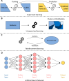
Four widely applicable types of machine learning algorithms. (A) Supervised learning attempt to learn the relationship between existing features and labels by training a model (left). After training, the model is used to predict labels for a new set of unlabeled features. (B) Unsupervised learning aims to infer useful information from features only. The output of unsupervised learning is usually in the form of grouping/clusters or distributions. (C) Reinforcement learning, instead of attempting to directly learn from existing data sets, aims to explore a well-defined environment. It takes iterative actions in the environment, and in turn the environment provides feedback about if the action is desirable or not. The algorithm then adjusts its next action according to past feedback, and the cycle continues. (D) An artificial neural network (ANN) is structured in a layered fashion. Each layer contains a number of basic calculation units called neurons (circles), which calculates a weighted sum of all the outputs from the neurons in the previous layer, and sends the sum as its own output to the neurons in the next layer. A typical ANN consists of an input layer, a number of hidden layers (3 pictured), and an output layer.
Figure 3
Figure 3
A general guideline to what type of machine learning algorithm to choose. Two things need to be considered: if the data set is labeled, and how complex is the data set. For complex data sets, advanced methods are usually preferable. For data sets with low complexity, if the data set is labeled, then supervised learning can be applied. If the data set is unlabeled, then unsupervised learning is applicable. Finally, each of the algorithms within the three categories has its own most suitable case, and the details can be found at the bottom of the figure.
Figure 4
Figure 4
An example of data normalization using the standard score method. (A) For chemical and biological data, it is common when two features span across completely different numerical values. For example, a set of molecules may span across 150–850 Da in molecular weights, but only spanning 5–150 nM when their binding affinity to a target of interest is considered. ML algorithms do not inherently take units into consideration, which results in increased difficulty in discerning differences in binding affinities compared to molecular weights. (B) By using the standard score method, both binding affinity and molecular weight are normalized to a mean of 0 and a standard deviation of 1. Thus, the normalized values for both features now fall in between −2–2. By applying ML algorithms to the normalized values, both features will be equally prioritized.
Figure 5
Figure 5
A simple application of the kernel method. (A) The raw data set consists of a binary label of melatonin level over a period of 24 h, corresponding to the amount of time spent in a day. The best singular straight cut of the data set to separate high melatonin points from low melatonin points is shown as a dashed vertical line, which results in a total of 7 mistakes (1 blue, 6 red). (B) A new 2D representation of the data set after the kernel method is applied. Combining the prior knowledge that blood melatonin level varies over the course of the day according to the circadian rhythm, and that melatonin level peaks around 3 AM, an artificial feature can be added by constructing a sinusoidal function with a period of 24 h and a peak at t = 3 h, and plugging the time values into the function. The new feature is plotted on the Y axis. With the new representation, the best singular straight cut to separate high melatonin levels from low levels is shown as the slanted dashed line. In this scenario, the best cut resulted in only 1 mistake (1 blue), which is a sharp decrease from the 7 mistakes in the previous panel.
Figure 6
Figure 6
Decision tree model created for high-throughput drug discovery. The circular nodes are those that lead to a subsequent node, while the square nodes are those that end in a terminal decision. This model utilizes common molecular dimensions such as molecular weight (MolWt) and melting point (MeltPt). The decision for this model is binary, resulting in either inactive (0) or active (1), which is displayed in the top row of each node. The total number of samples is displayed in the second row of each node to the left of the colons, with the number of active compounds yet to be detected on the other side of the colons. Those that are labeled as nodes 1, 2, or 3 are the only nodes that result in the classification of the molecules as active. Reproduced from ref (69). Copyright 2012 American Chemical Society.
Figure 7
Figure 7
Visualization of the k-nearest neighbor (k-NN) algorithm. (A) A labeled data set with 2 features and 3 categories (orange circles, green squares, pink triangles). An additional unlabeled data point is located at the center (black diamond outline). (B) The k-NN algorithm is applied to determine the category of the unlabeled data point. With k = 1, only the nearest labeled point to the unlabeled point is considered, indicated by a line between the two points. In this case, the nearest labeled point belongs to category 2, and thus the unlabeled point is assigned to category 2 as well (green diamond). (C) With k = 4, there are a total of 1 point in category 2 and 3 points in category 3 near the unlabeled point. By applying plurality voting (3 > 1), the unlabeled point is assigned to category 3 (pink diamond). (D) With k = 9, there are a total of 4 points in category 1, 2 points in category 2, and 3 points in category 3 near the unlabeled point. Through plurality voting (4 > 3 > 2), the unlabeled point is assigned to category 1 (orange diamond).
Figure 8
Figure 8
A simple diagram for determining what supervised learning algorithms to use. In this review, a total of 6 supervised learning algorithms are introduced, each with its own strength and weaknesses. To determine which algorithm suits your needs, first the type of label needs to be considered. For continuous labels, there are 5 algorithms suitable for such predictions. Linear regression and logistic regression predict continuous labels by performing a curve fitting on the full input data set, while decision trees, random forest, and k-nearest neighbors achieve this through averaging a subset of input data points. For discrete labels, including qualitative and categorical labels, there are 6 algorithms to choose from. Support vector machine, decision trees, random forest, and k-nearest neighbors will make a single prediction on the most suitable label, while logistic regression and naïve Bayes generate a comprehensive list of possible labels, each with a probability or weight attached to it. Of note, logistic regression, decision trees, and k-nearest neighbors are capable of predicting both continuous and discrete labels.
Figure 9
Figure 9
Visualization of the principal component analysis (PCA) algorithm. (A) PCA attempts to fit an ellipsoid over a given data set. Here PCA is applied to a randomly generated 3D data set (red dots), and the fitted ellipsoid is visualized (pale red ellipsoid). The principal components generated by PCA are represented by the direction of the axes, in descending order of their lengths. They are represented as blue arrows, and labeled as PC1, PC2, and PC3 according to their lengths. (B) By only keeping the first few PCs and discarding the rest, a lower-dimensional representation can be obtained without significant loss in the variance represented with the original data. Here, PC1 and PC2 are picked, and the dimensionality of the data set is reduced from 3 to 2.
Figure 10
Figure 10
Illustration of the independent component analysis (ICA) algorithm. The task ICA is designed to handle is to infer independent source signals from linear mixtures. The source signals (left, red and blue) are mixed to produce mixture signals (middle, black), and the exact mixing is unknown to ICA. By assuming the source signals are non-Gaussian and attempting to maximize non-Gaussianity, ICA is able to infer the source signals (right, pale red and blue).
Figure 11
Figure 11
Visualization of the k-means clustering algorithm. (A) To initialize the algorithm, the number of clusters are determined (4 in this example) and the centroids of the clusters are randomly generated (colored triangle, diamond, circle, and square). Data points are represented as black dots. (B) The first step of k-means clustering is to assign each data point to a cluster. This is done by iterating through all data points, calculating their distances to all cluster centroids, and assigning them to the cluster whose centroid is the closest to them. Here, the cluster assignment is visualized with the color and shape of each data point to match its assigned cluster. (C) The second step is to recalculate the centroid of each cluster. This is done by simply averaging the coordinates of all data points assigned to a cluster. The new centroids are visualized as large colored shapes with black outlines, while the initial centroids are rendered as empty gray outlines. (D, E) The process detailed in panels (B) and (C) are repeated, and the resulting clusters and centroids are visualized in (D) for iteration 2 and (E) for iteration 3. (F) After 6 iterations, the centroids converge, and the algorithm finishes.
Figure 12
Figure 12
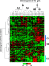
An example of a two-dimensional hierarchical clustering analysis. The data set clustered is a proteomic data pertaining to rat age-related sarcopenia, obtained through 2-D PAGE gels and measured in triplicate. Rows represent proteins, and columns represent gels. Each cell represents the log-ratio transformed amount of protein according to the color bar at the bottom. The dendrogram to the left represents the clustering of the proteins, while the one on the top represents the clustering of the gels. The markers to the right (C1, C2, C3) denote three clusters of proteins that showed similar behaviors across all gels. Reproduced from ref (95). Copyright 2007 American Chemical Society.
Figure 13
Figure 13
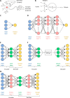
Basics of artificial neural networks (ANNs). (A) A biological neuron receives inputs through its dendrites, processes the inputs, and transmits its output through synaptic terminals. (B) A basic calculation unit, in an ANN. It receives inputs from upstream units, perform a weighted sum of all the inputs plus a bias term, passes the sum through a function called the activation function, and finally outputs the result to downstream units. The calculation units are termed “neurons” due to their similarity to biological neurons. (C) The basic architecture of ANNs consists of an input layer, a hidden layer, and an output layer. Each layer consists of many neurons, and neurons in one layer can only receive inputs from the layer immediately before them. The neurons in the input layer pass the features of the training data set to the hidden layers without calculations. During training, the weights and bias of each neuron are tuned iteratively to improve the accuracy of the output. (D) The architecture of deep learning ANNs. In contrast to basic ANNs, deep learning introduces multiple hidden layers (3 pictured) in between the input layer and the output layer. The training process of deep learning ANNs is the same as basic ANNs. Due to the additional hidden layers, deep learning ANNs are more time-consuming to train, but also perform better on complex tasks. (E) The architecture of a basic autoencoder. It consists of the input layer, the code layer, and the output layer. The input layer and the output layer always have the same number of neurons, while the code layer has fewer neurons than the other two layers. The connections between the input layer and the code layer encodes the input into a low-dimensional representation into the code layer, and the connections between the code layer and the output layer extrapolates the low-dimensional representation into its native form in the output layer. The first two layers are termed the encoder, while the last two layers are termed the decoder. (F) A typical application of an autoencoder. After training the autoencoder, the encoder and the decoder are separated. The encoder is used to generate a low-dimensional representation, and then pass it through a downstream ML task for further processing. After the downstream ML task finishes and generates its output in the low-dimensional representation, the decoder is used to extrapolate back into its native form. (G) The architecture of a deep autoencoder. Instead of a simple 3-layer configuration, additional hidden layers are added within the encoder and the decoder portion of the algorithm (1 layer in the encoder and the decoder illustrated). There is no limit to how many hidden layers can be added, but similar to deep learning, the computational cost increases as the number of hidden layers increases. Panel A created by Jonathan Haas under the CC BY-SA 3.0 license.

References

    1. DiMasi J. A.; Feldman L.; Seckler A.; Wilson A. Trends in risks associated with new drug development: success rates for investigational drugs. Clin Pharmacol Ther 2010, 87 (3), 272–277. 10.1038/clpt.2009.295. - DOI - PubMed
    1. DiMasi J. A.; Seibring M. A.; Lasagna L. New drug development in the United States from 1963 to 1992. Clin Pharmacol Ther 1994, 55 (6), 609–622. 10.1038/clpt.1994.78. - DOI - PubMed
    1. Dimasi J. A. Risks in new drug development: approval success rates for investigational drugs. Clin Pharmacol Ther 2001, 69 (5), 297–307. 10.1067/mcp.2001.115446. - DOI - PubMed
    1. Sundstrom M.; Pelander A.; Angerer V.; Hutter M.; Kneisel S.; Ojanpera I. A high-sensitivity ultra-high performance liquid chromatography/high-resolution time-of-flight mass spectrometry (UHPLC-HR-TOFMS) method for screening synthetic cannabinoids and other drugs of abuse in urine. Anal Bioanal Chem. 2013, 405 (26), 8463–8474. 10.1007/s00216-013-7272-8. - DOI - PubMed
    1. Kondo J.; Ekawa T.; Endo H.; Yamazaki K.; Tanaka N.; Kukita Y.; Okuyama H.; Okami J.; Imamura F.; Ohue M.; et al. High-throughput screening in colorectal cancer tissue-originated spheroids. Cancer Sci. 2019, 110 (1), 345–355. 10.1111/cas.13843. - DOI - PMC - PubMed

Publication types

LinkOut - more resources