. 2023 Sep 11;41(9):1586-1605.e15.
doi: 10.1016/j.ccell.2023.07.007. Epub 2023 Aug 10.

Proteogenomic insights suggest druggable pathways in endometrial carcinoma

Yongchao Dou  1 Lizabeth Katsnelson  2 Marina A Gritsenko  3 Yingwei Hu  4 Boris Reva  5 Runyu Hong  2 Yi-Ting Wang  3 Iga Kolodziejczak  6 Rita Jui-Hsien Lu  7 Chia-Feng Tsai  3 Wen Bu  8 Wenke Liu  2 Xiaofang Guo  9 Eunkyung An  10 Rebecca C Arend  11 Jasmin Bavarva  10 Lijun Chen  4 Rosalie K Chu  12 Andrzej Czekański  13 Teresa Davoli  2 Elizabeth G Demicco  14 Deborah DeLair  15 Kelly Devereaux  15 Saravana M Dhanasekaran  16 Peter Dottino  17 Bailee Dover  11 Thomas L Fillmore  12 McKenzie Foxall  11 Catherine E Hermann  18 Tara Hiltke  10 Galen Hostetter  19 Marcin Jędryka  13 Scott D Jewell  19 Isabelle Johnson  2 Andrea G Kahn  20 Amy T Ku  21 Chandan Kumar-Sinha  16 Paweł Kurzawa  22 Alexander J Lazar  23 Rossana Lazcano  24 Jonathan T Lei  1 Yi Li  25 Yuxing Liao  1 Tung-Shing M Lih  4 Tai-Tu Lin  3 John A Martignetti  5 Ramya P Masand  26 Rafał Matkowski  13 Wilson McKerrow  2 Mehdi Mesri  10 Matthew E Monroe  3 Jamie Moon  3 Ronald J Moore  3 Michael D Nestor  3 Chelsea Newton  19 Tatiana Omelchenko  27 Gilbert S Omenn  28 Samuel H Payne  29 Vladislav A Petyuk  3 Ana I Robles  10 Henry Rodriguez  10 Kelly V Ruggles  30 Dmitry Rykunov  5 Sara R Savage  1 Athena A Schepmoes  3 Tujin Shi  3 Zhiao Shi  1 Jimin Tan  2 Mason Taylor  29 Mathangi Thiagarajan  31 Joshua M Wang  2 Karl K Weitz  3 Bo Wen  1 C M Williams  32 Yige Wu  7 Matthew A Wyczalkowski  7 Xinpei Yi  1 Xu Zhang  10 Rui Zhao  12 David Mutch  33 Arul M Chinnaiyan  34 Richard D Smith  3 Alexey I Nesvizhskii  34 Pei Wang  5 Maciej Wiznerowicz  35 Li Ding  7 D R Mani  32 Hui Zhang  4 Matthew L Anderson  36 Karin D Rodland  37 Bing Zhang  38 Tao Liu  39 David Fenyö  40 Clinical Proteomic Tumor Analysis Consortium
Collaborators, Affiliations

Proteogenomic insights suggest druggable pathways in endometrial carcinoma

Yongchao Dou et al. Cancer Cell. .

Abstract

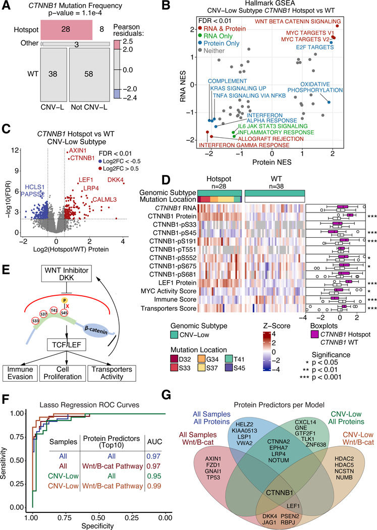
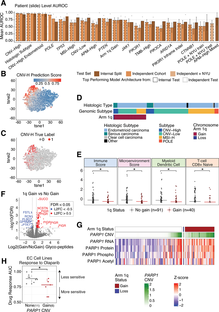
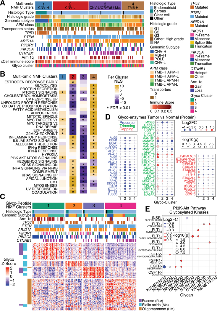
We characterized a prospective endometrial carcinoma (EC) cohort containing 138 tumors and 20 enriched normal tissues using 10 different omics platforms. Targeted quantitation of two peptides can predict antigen processing and presentation machinery activity, and may inform patient selection for immunotherapy. Association analysis between MYC activity and metformin treatment in both patients and cell lines suggests a potential role for metformin treatment in non-diabetic patients with elevated MYC activity. PIK3R1 in-frame indels are associated with elevated AKT phosphorylation and increased sensitivity to AKT inhibitors. CTNNB1 hotspot mutations are concentrated near phosphorylation sites mediating pS45-induced degradation of β-catenin, which may render Wnt-FZD antagonists ineffective. Deep learning accurately predicts EC subtypes and mutations from histopathology images, which may be useful for rapid diagnosis. Overall, this study identified molecular and imaging markers that can be further investigated to guide patient stratification for more precise treatment of EC.

Keywords: CPTAC; CTNNB1; PIK3R1; deep learning; endometrial cancer; metformin; proteogenomics; target assays.


Conflict of interest statement

Declaration of interests The authors declare no competing interests.

Figures

Figure 1:
Figure 1:. Proteogenomic landscape of the independent EC cohort
(A) Multi-omic data availability in the independent EC cohort. The main heatmap shows each patient per column and the side heatmap (right) shows each enriched normal sample per column. (B) Identified and quantified proteomic features across the exploratory (Exp) and independent (Ind) cohorts. (C) Oncoplot showing the most frequently mutated genes in the independent cohort identified by whole genome sequencing. Each column is a patient. Side table (right) compares mutation frequencies per gene for the two CPTAC cohorts and TCGA cohort. (D) Focal-level copy number variations (CNVs) across the genome (x-axis) versus G-score (y-axis), which is the Frequency x Amplitude of the CNV. Significant amplifications are shown in red and deletions are shown in blue, with annotated peaks containing known tumor drivers. (E) Prioritization of CNV drivers across the two CPTAC cohorts. (F) Barplot showing pathways enriched from CNV drivers analysis (E). (G) Scatter plot of protein level tumor/normal between the two CPTAC cohorts. (H) Cis/trans effects of somatic mutations (y-axis) on protein expression (x-axis). See also Figure S1 and Tables S1 and S2.
Figure 2:
Figure 2:. PIK3R1 in-frame indels show induction of activating AKT phosphosites
(A) PTEN, PIK3CA, and PIK3R1 mutations across independent (Ind), exploratory (Exp), and TCGA cohorts. P-values derived from Fisher’s exact test. (B) 3D structure of PI3K complex. PIK3CA protein is colored in green, PIK3R1 protein is colored in blue, and location of PIK3R1 in-frame variants is shown in red. (C-D) Boxplots comparing PIK3R1 mRNA (C) and protein levels (D) between PIK3R1 variants across the independent (Ind), exploratory (Exp), and TCGA cohorts. P-values derived from Student’s t-test (E) Survival analysis of TCGA PTEN mutated EC patients harboring PIK3R1 and PIK3CA variants. P-values derived from log-rank test. (F) Boxplots comparing AKT1-pT308 levels between PIK3R1 and PIK3CA variants in the independent cohort. P-values derived from Student’s t-test. (G-H) Boxplots comparing TCGA RPPA data for AKT-pT308 (G) and AKT-pS473 (H) levels between PIK3R1 and PIK3CA variants. P-values derived from Student’s t-test. (I) Western blot for AKT pT308 and pS473 in HEC-151 cells with CRISPR-Cas9 created T576 deletion. (J) Boxplots comparing DepMap EC cell lines’ response to MK-2206. P-values derived from Student’s t-test. (K) Schematic showing consequences of PIK3R1 in-frame variants. Boxplots: Box portion represents Interquartile range (IQR), midline corresponds to the median, and whiskers range from the minimum (bottom) and maximum (top) variability outside the first and third quartiles (Q1 and Q3). Outliers are shown as points above whiskers. See also Figure S2 and Table S3.
Figure 3:
Figure 3:. Selective reaction monitoring (SRM) assay for antigen presentation machinery (APM) status
(A) Heatmap of immune subgroups and related pathways derived from ssGSEA pathway scores using protein level as input for the independent cohort. Each column corresponds to individual samples in the main heatmap and the mean score for each immune subgroup in the side (right) panel. Each row represents a pathway. (B-C) Histograms showing the frequency of correlations between SRM peptides from the same genes (B) and SRM peptides with TMT-based protein levels (C) for the independent cohort. (D-E) Heatmaps showing SRM-based peptide quantitation of JAK-STAT and selected APM proteins in the exploratory (D) and independent (E) cohorts. Columns correspond to individual samples and rows represent peptides. JAK1 mutations enriched for TMB-H/APM-L groups indicated by asterisks (* p < 0.05, ** p < 0.01). P-values determined by Fisher’s exact test. (F) ROC curves showing model performances of classifiers using two peptides, PSMB10-LPFTALGSGQDAALAVLEDR and PSMB9-VSAGEAVVNR. (G) ROC curves showing model performances of the ORFlog classifier on the independent cohort, comparing top N peptides used per model. See also Figure S3 and Table S4.
Figure 4:
Figure 4:. Metformin may target MYC in EC
(A) MYC Targets V2 enrichment plots from pathway analysis comparing metformin-treated versus untreated patients with Type2 Diabetes (T2D) in the independent cohort. (B) MYC Targets V2 enrichment plot from pathway analysis comparing metformin-sensitive versus insensitive EC cell lines from DepMap. (C) Volcano plot of MYC Targets V2 pathway scores (x-axis) versus -log10(FDR) (y-axis) for CMAP metformin treatment signatures. (D) Western blot showing MYC expression in four EC cell lines. (E) Dose-response curves of EC cell lines treated with metformin at increasing concentrations (x-axis). (F-G) Survival analysis of TCGA MSI-H (F) and CNV-L (G) tumors with high and low MYC activity. (H) Scatter plot of MYC activity (y-axis) versus MYC IHC score (x-axis). P-values derived from log-rank test. (I) Heatmap of all endometrioid tumors in the independent cohort, sorted by MYC activity (top panel) and grouped by diabetes and metformin treatment status. Side boxplots (right) compare MYC activity (top) and BMI (bottom) across the diabetes/treatment groups. MYC IHC scores (third panel from top) are shown from samples with IHC data available. P-values derived from Student’s t-test (boxplots) and Spearman correlation (left panel). Boxplots: Box portion represents Interquartile range (IQR), midline corresponds to the median, and whiskers range from the minimum (bottom) and maximum (top) variability outside the first and third quartiles (Q1 and Q3). Outliers are shown as points above whiskers. See also Figure S4 and Table S5.
Figure 5:
Figure 5:. CTNNB1 hotspot mutations block DKK induced degradation
(A) Mosaic plot showing distribution of CTNNB1 mutations across CNV-L tumors versus all other tumors in the independent cohort. P-value determined from Chi-Square Test. (B) Scatter plot of pathway Normalized Enrichment Scores (NES) comparing CTNNB1 hotspot mutant versus WT CNV-L tumors at the protein (x-axis) and RNA (y-axis) levels in the independent cohort. Points with FDR < 0.01 at both protein and RNA levels are colored in red, RNA only are in green, protein only are in blue, and neither are in gray. (C) Volcano plot of protein log2 fold change (x-axis) between CTNNB1 hotspot and WT CNV-L tumors versus −log10 FDR (y-axis) determined by Student’s T-test. Points with FDR < 0.01 and log2 fold change < −0.5 or > 0.5 are shown in blue and red, respectively. (D) Heatmap showing mRNA, protein, and phosphoprotein values for CTNNB1, LEF1 protein, MYC activity score, Immune Score, and Transporters Score across CNV-L tumors with and without CTNNB1 hotspot mutations. Side panel showing boxplots (right) compares mutants versus WT tumors. P-values determined by Wilcoxon Rank Sum Test. (E) Schematic depicting proposed downstream implications of hotspot mutations in CTNNB1. (F) ROC curves of Lasso regression models predicting CTNNB1 hotspot mutation status using exploratory protein data as training and independent protein data as testing. Models vary by which samples (all tumors or just CNV-L tumors) and which proteins (all proteins or only Wnt- β-catenin pathway proteins) were used. (G) Venn diagram showing top 10 proteins selected by regression analysis per model. Boxplots: Box portion represents Interquartile range (IQR), midline corresponds to the median, and whiskers range from the minimum (bottom) and maximum (top) variability outside the first and third quartiles (Q1 and Q3). Outliers are shown as points above whiskers. See also Figure S5 and Table S6.
Figure 6:
Figure 6:. Deep learning models successfully classify molecular features
(A) Barplots showing the mean AUROC per model from internal training data split tests (trained on TCGA and exploratory cohorts) and independent tests (tested on independent cohort plus NYU cohort for POLE predictions). Bar color is determined by AUROC value coming from internal or independent tests, and outlines denote if the top performing model architecture comes from the internal or independent test. (B-C) tSNE plots where each point is a tile, colored by predicted CNV-H score (B) and true CNV-H label (C). (D) Distribution of chromosome 1q copy number status across all tumors in the independent cohort, grouped by genomic and histologic subtypes. (E) Boxplots of xCell immune scores (y-axis) comparing tumors with 1q gain versus no gain (xaxis). P-values determined by Wilcoxon Rank Sum Test. (F) Volcano plot of differentially expressed glycopeptides in tumors with 1q gain versus no gain. X-axis shows log2 fold change and the y-axis shows -log10 FDR, determined by Student’s T-test. (G) Heatmap of PARP1 multi-omic levels in samples with and without 1q gain. (H) Boxplots of olaparib (PARP-inhibitor) response in DepMap EC cell lines with and without PARP1 amplification. P-values determined by Wilcoxon Rank Sum Test. Boxplots: Box portion represents Interquartile range (IQR), midline corresponds to the median, and whiskers range from the minimum (bottom) and maximum (top) variability outside the first and third quartiles (Q1 and Q3). Outliers are shown as points above whiskers. See also Figure S6 and Table S7.
Figure 7:
Figure 7:. Multi-omic and glycoproteomic NMF clustering separates samples into 4 clusters
(A) Heatmap of all tumors in the independent cohort, separated by multi-omic NMF clusters. Panels show histologic subtypes, histologic grade, genomic subtypes, APM class, transporter status, mutation status of selected genes, 1q copy number status, immune score, and corresponding glyco-NMF cluster assignment. (B) Heatmap of mean ssGSEA pathway enrichments per cluster. (C) Heatmap of glycopeptide levels for all independent cohort tumors, separated by glyco-peptide derived NMF clusters. Side panel (left) annotates types of glycans. (D) Dot plots of glyco-enzyme levels between tumor versus normal across glyco-clusters, separated by glyco-enzyme function: Precursor (left), Trimming (middle), and Capping (right). Red denotes positive log2 fold change (higher in tumor) while blue indicates negative log2 fold change (higher in normal). Size of dots is determined by -log10 p-value, which comes from Student’s T-test. (E) Dot plot comparing tumor and normal samples’ glycosylated kinases in the PI3K-AKT pathway by glycans (x-axis) and corresponding peptide (y-axis). Red denotes positive log2 fold change (higher in tumor) while blue indicates negative log2 fold change (higher in normal). Size of dots is determined by -log10 p-value, which comes from Student’s T-test. See also Figure S7.

Similar articles

Cited by

References

    1. Minihan AK, Patel AV, Flanders WD, Sauer AG, Jemal A, and Islami F. (2022). Proportion of Cancer Cases Attributable to Physical Inactivity by US State, 2013–2016. Med. Sci. Sports Exerc. 54, 417–423. - PubMed
    1. Crosbie EJ, Kitson SJ, McAlpine JN, Mukhopadhyay A, Powell ME, and Singh N. (2022). Endometrial cancer. Lancet 399, 1412–1428. - PubMed
    1. Zhang S, Gong T-T, Liu F-H, Jiang Y-T, Sun H, Ma X-X, Zhao Y-H, and Wu Q-J (2019). Global, Regional, and National Burden of Endometrial Cancer, 1990–2017: Results From the Global Burden of Disease Study, 2017. Front. Oncol. 9, 1440. - PMC - PubMed
    1. Temkin SM, Kohn EC, Penberthy L, Cronin KA, Rubinsak L, Dickie LA, Minasian L, and Noone A-M (2018). Hysterectomy-corrected rates of endometrial cancer among women younger than age 50 in the United States. Cancer Causes Control 29, 427–433. - PubMed
    1. Clarke MA, Devesa SS, Hammer A, and Wentzensen N. (2022). Racial and Ethnic Differences in Hysterectomy-Corrected Uterine Corpus Cancer Mortality by Stage and Histologic Subtype. JAMA Oncol 8, 895–903. - PMC - PubMed

Publication types

LinkOut - more resources