. 2023 Aug 12;14(1):4883.
doi: 10.1038/s41467-023-40457-w.

Characterizing cancer metabolism from bulk and single-cell RNA-seq data using METAFlux

Affiliations

Characterizing cancer metabolism from bulk and single-cell RNA-seq data using METAFlux

Yuefan Huang et al. Nat Commun. .

Abstract

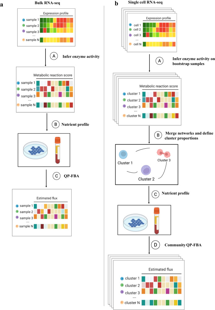
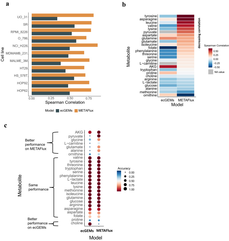
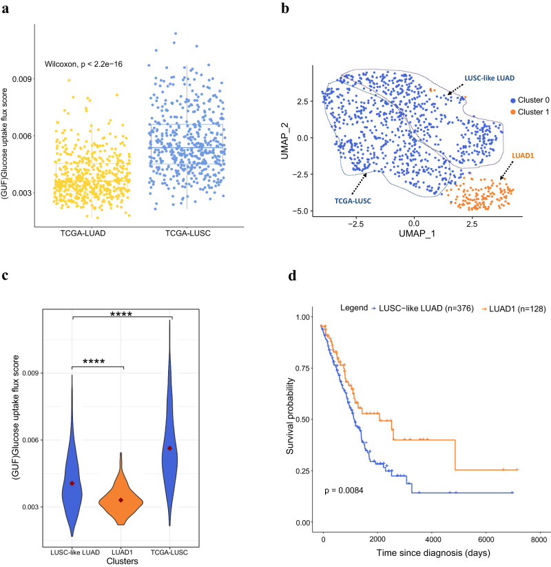
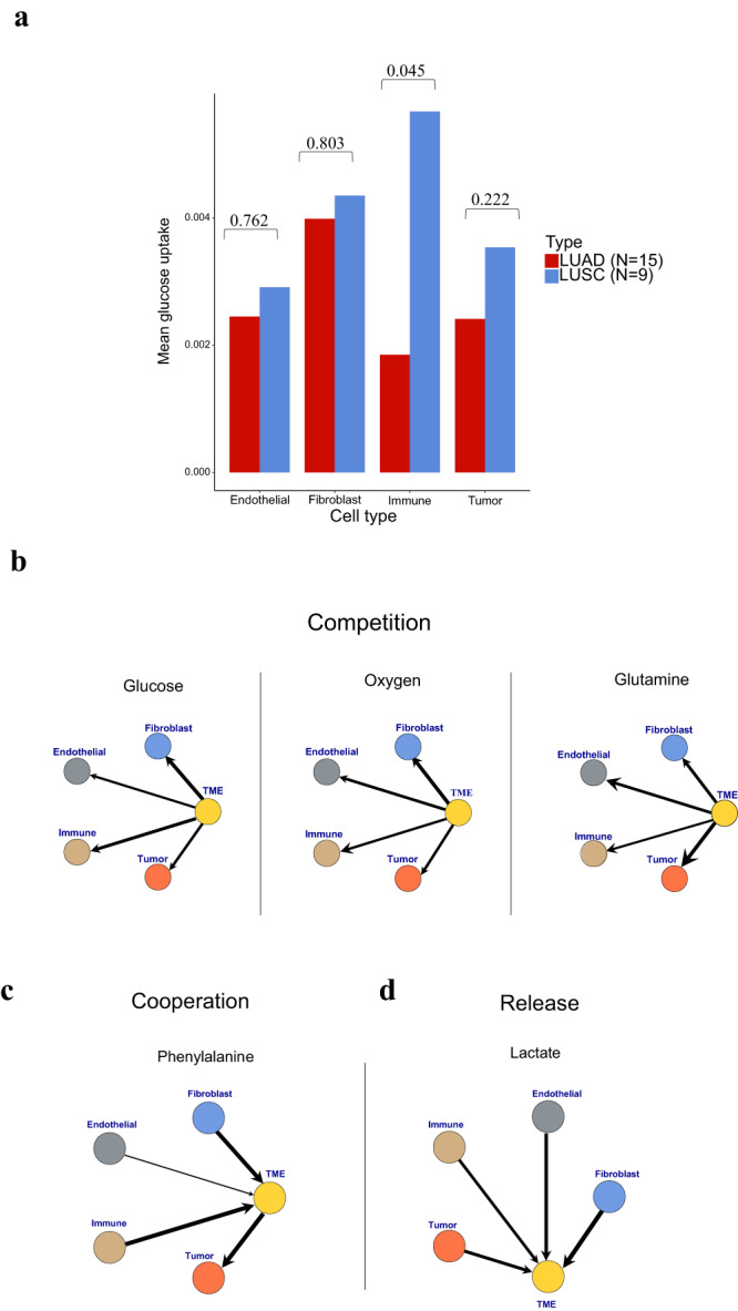
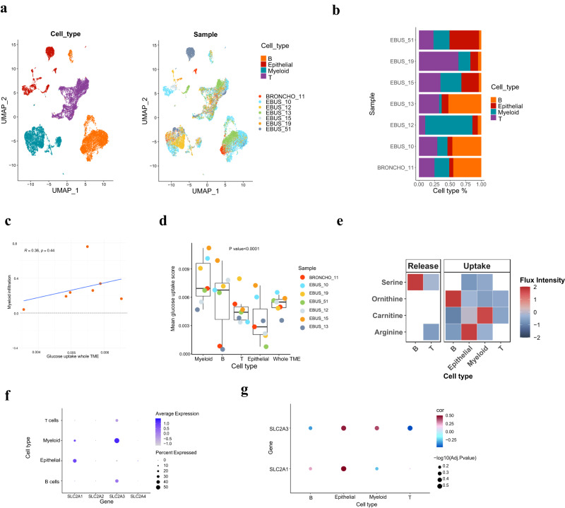
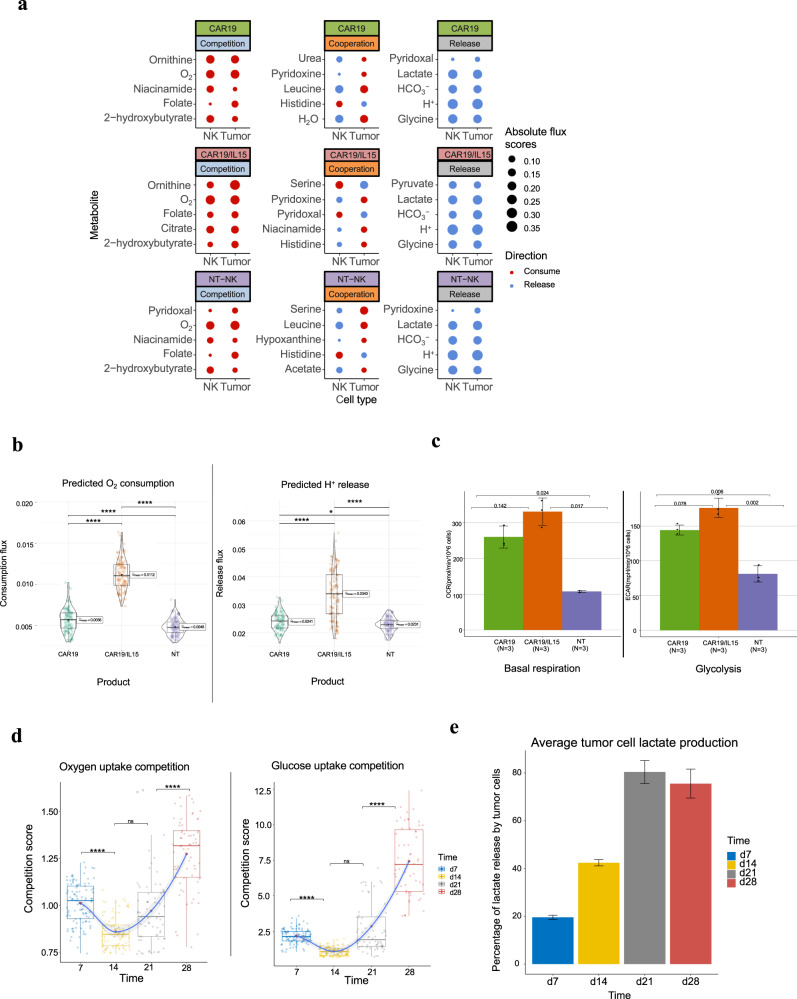
Cells often alter metabolic strategies under nutrient-deprived conditions to support their survival and growth. Characterizing metabolic reprogramming in the tumor microenvironment (TME) is of emerging importance in cancer research and patient care. However, recent technologies only measure a subset of metabolites and cannot provide in situ measurements. Computational methods such as flux balance analysis (FBA) have been developed to estimate metabolic flux from bulk RNA-seq data and can potentially be extended to single-cell RNA-seq (scRNA-seq) data. However, it is unclear how reliable current methods are, particularly in TME characterization. Here, we present a computational framework METAFlux (METAbolic Flux balance analysis) to infer metabolic fluxes from bulk or single-cell transcriptomic data. Large-scale experiments using cell-lines, the cancer genome atlas (TCGA), and scRNA-seq data obtained from diverse cancer and immunotherapeutic contexts, including CAR-NK cell therapy, have validated METAFlux's capability to characterize metabolic heterogeneity and metabolic interaction amongst cell types.


Conflict of interest statement

The authors declare no competing interests.

Figures

Fig. 1
Fig. 1. The workflow of METAFlux.
a The workflow of METAFlux in bulk RNA-seq setting. In step A, metabolic reaction activity scores (MRAS) are estimated from RNA-seq data. In step B, a nutrient profile is defined so only certain nutrients can be uptaken. In step C, quadratic programming-based FBA (flux balance analysis) is performed to estimate metabolic fluxes for each sample. The figure was created with BioRender.com. b The workflow of METAFlux in single-cell RNA-seq setting. In step A, metabolic reaction activity scores (MRAS) are estimated for each stratified bootstrap sampled single-cell dataset. In step B, metabolic networks for different clusters are merged to form one community, and proportions of clusters should be defined during this step. In step C, nutrient profile is defined so only specific metabolites can be uptaken by TME. In step D, community-based quadratic programming FBA is constructed to estimate per cell average metabolic fluxes for each cluster and total average metabolic fluxes for overall TME. The figure was created with BioRender.com.
Fig. 2
Fig. 2. Benchmark results of METAFlux on NCI-60 cell lines.
a A Spearman correlation bar plot across each cell line for METAFlux and ecGEMs. The spearman correlations between predicted fluxes and experimental fluxes were calculated for 11 cell lines. b A Spearman correlation heatmap across each metabolite for METAFlux and ecGEMs. The spearman correlations between predicted fluxes and experimental fluxes were calculated for 26 metabolites. For metabolites like L-carnitine and pyruvate, ecGEMs predicted their fluxes to be zero. Therefore, the correlations of these metabolites to ground truth were not calculated. c Uptake and secretion direction accuracies of 26 metabolites for METAFlux and ecGEMs. The accuracies were defined by the ratio of the number of direction-aligned fluxes to the total number of fluxes for each metabolite. The accuracies are shown by color and dot size.
Fig. 3
Fig. 3. Metabolic characterization of TCGA LUAD and LUSC using METAFlux.
a A boxplot of predicted glucose uptake activity in LUAD and LUSC. The box represents the interquartile range (IQR), the line within shows the median, and the whiskers extend up to 1.5IQR. Min and max values correspond to the smallest and largest mean predicted glucose flux. P-values were calculated using the two-sided Wilcoxon Rank Sum test. b A UMAP of TCGA LUAD and LUSC samples using predicted metabolic fluxes. Two clusters were identified within those samples. Cluster 1 was enriched with LUADs, while cluster 0 contained both LUADs and LUSCs. c A violin plot of glucose uptake for LUSC-like LUAD, LUAD1, and LUSC. P values were calculated by the two-sided Wilcoxon Rank Sum test. P-values are denoted as follows: ns (p > 0.05), *(p ≤ 0.05), **(p ≤ 0.01), ***(p ≤ 0.001), ****(p ≤ 0.0001). P-value = 7.0×10⁸ for LUSC-like LUAD and LUAD1 comparison. P-value = 2.1×10⁵ for LUSC-like LUAD and TCGA-LUSC comparison. The mean glucose uptake for each cluster was denoted as a red circle. d Overall Kaplan-Meier survival curves for cluster 0 (LUSC-like LUAD) and cluster 1 (LUAD1) in TCGA LUADs. Clusters were generated using metabolic fluxes.
Fig. 4
Fig. 4. Cell type metabolic fluxes and architypes identified by METAFlux.
a Average per-cell glucose uptake fluxes by cell-type in LUAD and LUSC. Two sample T test P-values are labeled at the top. bd Graph-based representation of three different metabolic architypes found in the average profile of LUAD and LUSC. Each node represents one cell type (Immune, endothelial, tumor, or fibroblast) or shared TME. The edge width represents the absolute magnitude of flux, calculated by averaging the per-cell LUAD and LUSC flux. The arrow shows the direction of flux. Arrow coming from cells to TME means the nutrient of interest is released to TME. Arrow coming from TME to cells means the nutrient of interest is absorbed by cells. b Competition. The three examples shown are immune, endothelial, tumor and fibroblast cells competing respectively for glucose, oxygen, and glutamine uptake in the TME. c Cooperation. The example shows that immune, endothelial, and fibroblast cells released phenylalanine into the TME while tumor cells uptook phenylalanine from the TME. d Release. The example shows that lactate was being released into TME by all the cell types.
Fig. 5
Fig. 5. Metabolic characterization of metastatic LUAD from single-cell RNA-seq data.
a A UMAP embedding of scRNA-seq data from seven metastatic LUAD patients. b A bar plot of cell type percentages in each patient. c A scatter plot showing the relationship between mean glucose uptake of the whole TME and myeloid infiltration score. The blue line represents the linear regression line, and the grey band shows a 95% confidence interval. The Spearman correlation coefficient with two-sided P-value is shown on the top left. d A box plot of mean glucose uptake flux of each cell type and the whole TME for the seven patients. The box represents the interquartile range (IQR), the line within shows the median, and the whiskers extend up to 1.5IQR. Min and max values correspond to the smallest and largest mean predicted glucose flux. Test: Cuzick trend test. P-value = 2.0×10⁵. e The release and uptake profile of selected metabolites for each cell type. The color represents the absolute flux intensity. f A dot plot showing the mean glucose transporter genes expression levels for each cell type. The dot size represents the percentage of cells in that cell type expressing a given gene, and the color gradient means the average expression value for that cell type. g A dot plot showing the Spearman correlations between the observed glucose transporter gene expression levels and the predicted mean glucose uptake flux for a given cell type across seven patients. The color in a dot corresponds to the coefficient of a correlation, and the size represents the FDR-corrected two-sided P-value of the correlation.
Fig. 6
Fig. 6. CAR-NK single-cell RNA-seq METAFlux analysis.
a Top five nutrients profile of NK and tumor cells for each product under each metabolism architype. The top five nutrients were selected by the most significant P-values from ANOVA analysis of NK cell fluxes. Dot size represents the mean absolute cubic root normalized flux scores, and color represents the direction of flux. b Violin plots of predicted oxygen consumption flux and H+ release flux for the day 7 product of CAR19/IL15, CAR19, NT-NK. Each group includes n = 100 bootstrap samples. The box within represents the interquartile range (IQR), the line within shows the median and the whiskers extend up to 1.5IQR. Min and max values correspond to the smallest and largest mean predicted flux after removing data points that fall more than three times the IQR beyond the quartiles (Q1 and Q3). Statistical test: two-sided Games-Howell test. P-values are Holm corrected. P-values are denoted as follows: ns (p > 0.05), *(p ≤ 0.05), **(p ≤ 0.01), ***(p ≤ 0.001), ****(p ≤ 0.0001). Oxygen consumption: Adjusted P-value = 1.0×10¹³ for CAR19 vs CAR19/IL15. Adjusted P-value = 1.0×10⁵ for CAR19 vs NT-NK. Adjusted P-value = 0 for CAR19/IL15 vs NT-NK.H+ release: Adjusted P-value = 0 for CAR19 vs CAR19/IL15. Adjusted P-value = 0.03 for CAR19 vs NT-NK. Adjusted P-value = 6.7×10¹⁴ for CAR19/IL15 vs NT-NK. c Bar graphs of mean basal respiration and glycolysis obtained respectively from the Seahorse assays. Error bar: mean ± sd. Pairwise test: two-sided Games-Howell test. d Per cell competition score (PCCS) between cancer and NK cells in TME from day 7 to day 28 for oxygen and glucose uptake, respectively for CAR19/IL15. Test: T-test. PCCS is defined as the ratio of the per cell nutrient uptake flux in the tumor cells over that in the NK cells. Each group includes n = 100 bootstrap samples. The box represents the interquartile range (IQR), the line within shows the median, and the whiskers extend up to 1.5IQR. Min and max values correspond to the smallest and largest mean predicted flux after removing data points that fall more than three times the IQR beyond the quartiles (Q1 and Q3). The grey band represents the 95% confidence interval for the loess (locally weighted scatterplot smoothing) curve. P-values were calculated using the two-sided Wilcoxon Rank Sum test and corrected by FDR. P-values are denoted as follows: ns (p > 0.05), *(p ≤ 0.05), **(p ≤ 0.01), ***(p ≤ 0.001), ****(p ≤ 0.0001). Oxygen consumption competition: Adjusted P-value = 2.3×10⁶ for time point 7 vs time point 14. Adjusted P-value = 0.06 for time point 14 vs time point 21. Adjusted P-value = 1.6×10⁹ for time point 21 vs time point 28. Glucose uptake competition: Adjusted P-value = 1.5×10⁷ for time point 7 vs time point 14. Adjusted P-value = 0.05 for time point 14 vs time point 21. Adjusted P-value = 6.3×10¹⁰ for time point 21 vs time point 28. e A bar plot of tumor cells’ contribution to total lactate release in TME over time. The Y-axis denotes the percentage of lactate released by the tumor cells. Test: T-Test. Error bar: mean ± sd. Each time point includes n = 100 bootstrap samples.

References

    1. Sinkala M, Mulder N, Patrick Martin D. Metabolic gene alterations impact the clinical aggressiveness and drug responses of 32 human cancers. Commun. Biol. 2019;2:414. - PMC - PubMed
    1. DeBerardinis RJ, Chandel NS. Fundamentals of cancer metabolism. Sci. Adv. 2016;2:e1600200. - PMC - PubMed
    1. Hanahan D. Hallmarks of cancer: new dimensions. Cancer Discov. 2022;12:31–46. - PubMed
    1. Faubert, B., Solmonson, A. & DeBerardinis, R. J. Metabolic reprogramming and cancer progression. Science368, 10.1126/science.aaw5473 (2020). - PMC - PubMed
    1. Stevens BM, et al. Fatty acid metabolism underlies venetoclax resistance in acute myeloid leukemia stem cells. Nat. Cancer. 2020;1:1176–1187. - PMC - PubMed

Publication types