. 2023 Sep 19;4(9):101166.
doi: 10.1016/j.xcrm.2023.101166. Epub 2023 Aug 25.

Plasma proteomic profiling discovers molecular features associated with upper tract urothelial carcinoma

Affiliations

Plasma proteomic profiling discovers molecular features associated with upper tract urothelial carcinoma

Yuanyuan Qu et al. Cell Rep Med. .

Abstract

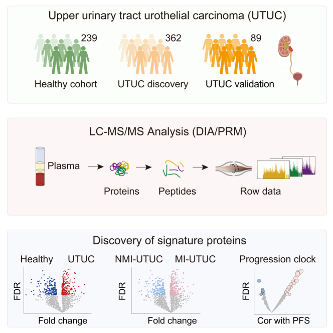
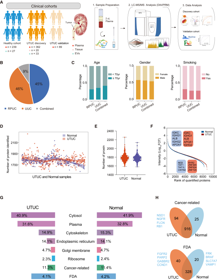
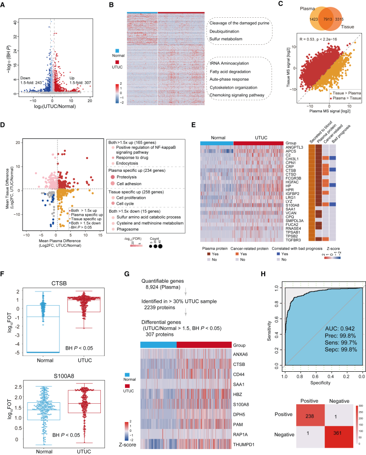
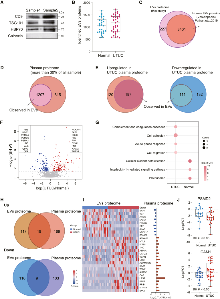
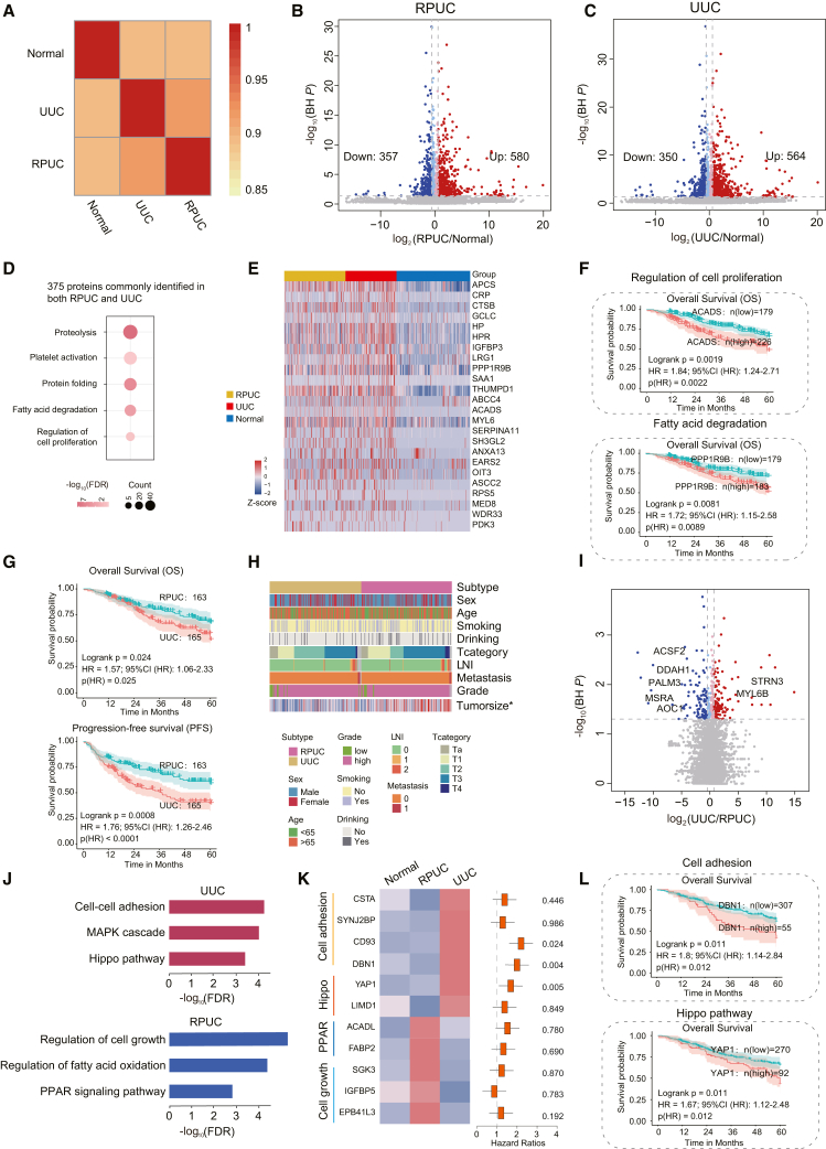
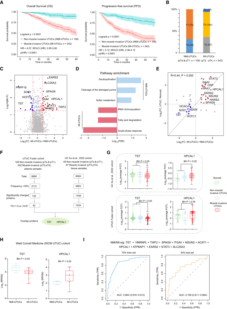
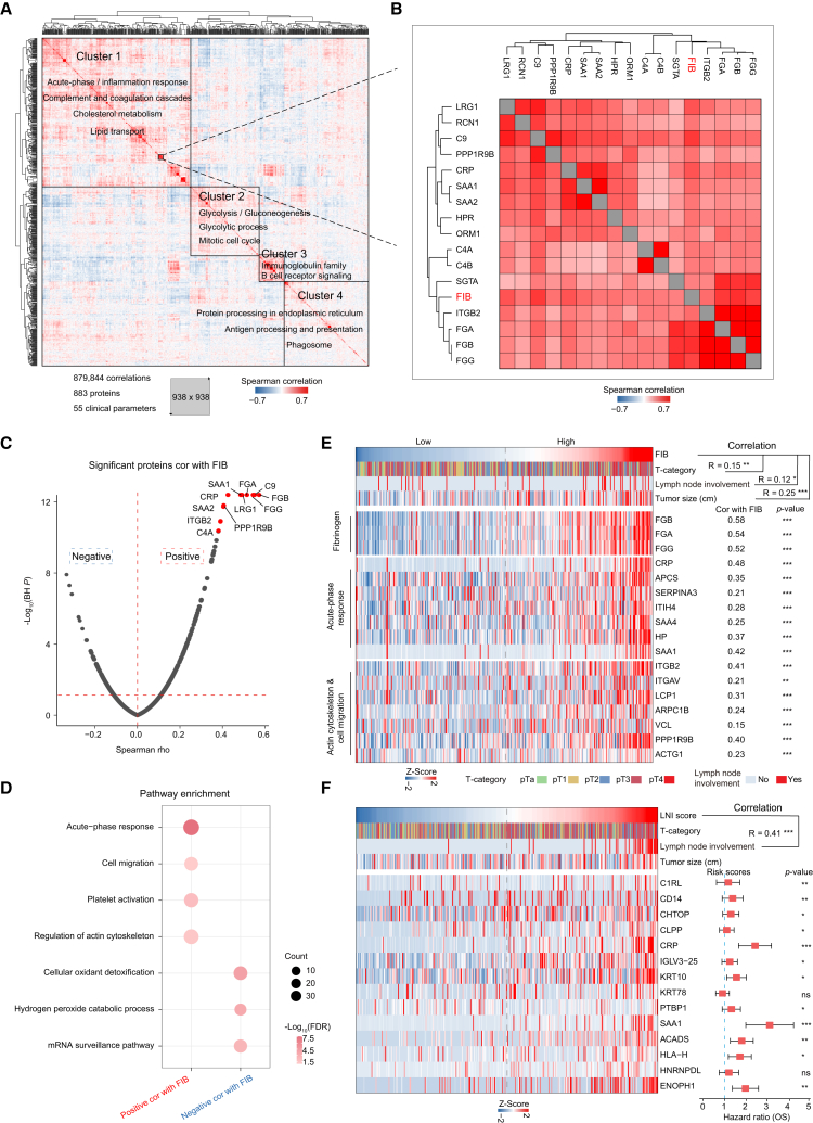
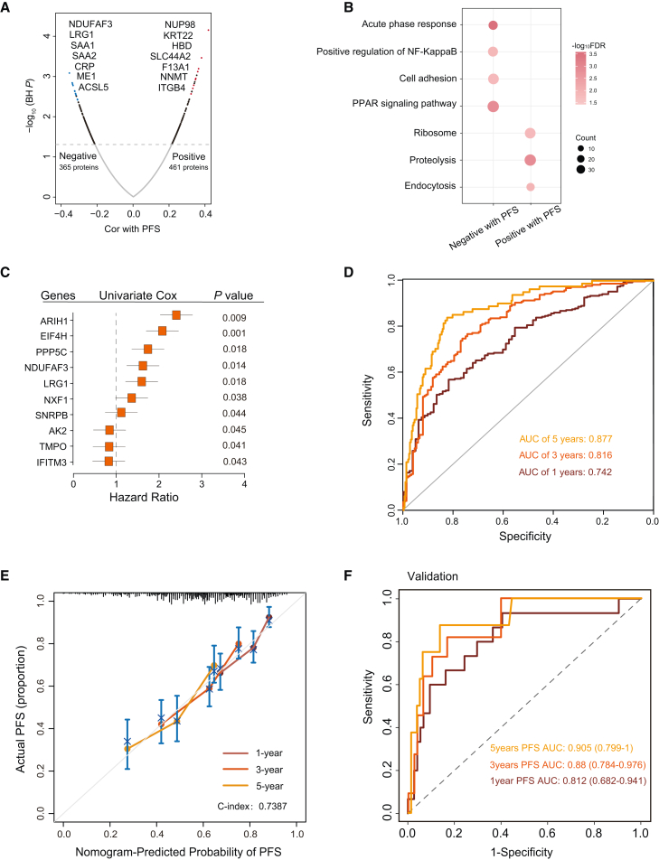
Upper tract urothelial carcinoma (UTUC) is often diagnosed late and exhibits poor prognosis. Limited data are available on potential non-invasive biomarkers for disease monitoring. Here, we investigate the proteomic profile of plasma in 362 UTUC patients and 239 healthy controls. We present an integrated tissue-plasma proteomic approach to infer the signature proteins for identifying patients with muscle-invasive UTUC. We discover a protein panel that reflects lymph node metastasis, which is of interest in identifying UTUC patients with high risk and poor prognosis. We also identify a ten-protein classifier and establish a progression clock predicting progression-free survival of UTUC patients. Finally, we further validate the signature proteins by parallel reaction monitoring assay in an independent cohort. Collectively, this study portrays the plasma proteomic landscape of a UTUC cohort and provides a valuable resource for further biological and diagnostic research in UTUC.

Keywords: DIA; mass spectrometry; plasma proteomics; prognosis; upper tract urothelial carcinoma.


Conflict of interest statement

Declaration of interests The authors declare no competing interests.

Figures

None
Graphical abstract
Figure 1
Figure 1
Overall synopsis of the plasma proteome profiling of UTUC patients (A) The proteomics workflow involved three modules: cohort construction (discovery cohort and validation cohort), proteomic profiling, and data analysis. (B) Pie chart showing the component proportion of UTUC discovery cohort. (C) Clinical data of UTUC discovery cohort. (D) Proteins identified in UTUC and normal plasma samples of UTUC discovery cohort. (E) Number of proteins identified in UTUC and normal plasma samples of UTUC discovery cohort. Boxplots show median (central line), upper and lower quartiles (box limits), 1.5× interquartile range (whiskers). (F) Dynamic range of the protein identification of each sample according to the descending sort of protein abundance in UTUC and normal plasma samples of UTUC discovery cohort. (G) Components identified in plasma proteome. (H) Cancer-related proteins and proteins associated with drugs approved by the FDA identified in UTUC discovery cohort.
Figure 2
Figure 2
Plasma proteome profiles differed between UTUC and normal samples (A) Protein abundance differences between UTUC and normal plasma samples. (B) Different pathways between UTUC and normal plasma samples. (C) Spearman correlation between plasma and tissue proteomes. (D) Fold changes of plasma and tissue proteins in UTUC and normal samples (left), and pathways enriched for respective specifically changed proteins (right). (E) Heatmap showing the proteins that meet the screening criteria. Their presence in blood was annotated from HPA. (F) Box plot showing plasma protein abundance of CTSB (BH P = 4.27E-7) and S100A8 (BH P = 8.25E-15). Boxplots show median (central line), upper and lower quartiles (box limits), 1.5× interquartile range (whiskers). (G) (Top) Strategy for plasma signature proteins to distinguish between UTUC and normal samples. (Bottom) Heatmap of the selected proteins expressed in UTUC and normal plasma samples. (H) ROC curve of plasma signature proteins in UTUC discovery cohort.
Figure 3
Figure 3
Difference between plasma proteome profiles and EV proteome profiles (A) Western blot of EVs isolated from plasma for conventional identified EV markers. (B) Box plot showing the proteins identified in normal and UTUC EV samples. Boxplots show median (central line), upper and lower quartiles (box limits), 1.5× interquartile range (whiskers). (C) Venn diagram showing proteins identified in EVs herein and belonging to human EV proteins in the Vesiclepedia dataset. (D) Venn diagram showing proteins identified in more than 30% of UTUC plasma observed in EVs. (E) Venn diagram showing proteins upregulated in UTUC plasma (left) or downregulated in UTUC plasma (right) observed in EVs. (F) Volcano plot showing the EV protein abundance differences between UTUC and normal plasma samples. (G) Bubble plot showing pathways enriched in normal and UTUC samples. (H) Venn diagram of upregulated or downregulated proteins identified in both EVs and plasma. (I) Heatmap of EV proteins abundance differences between normal and UTUC samples. (J) Box plot showing EV protein abundance of PSMD2 (BH P = 0.028) and ICAM1 (BH P = 0.040).
Figure 4
Figure 4
Similarities and differences between RPUC and UUC (A) Spearman correlation of plasma proteins among RPUC, UUC, and normal samples. (B) Volcano plot showing protein abundance differences between RPUC and normal plasma samples. (C) Volcano plot showing protein abundance differences between UUC and normal plasma samples. (D) Pathway analysis of proteins commonly identified in both renal pelvis and ureter samples. (E) Heatmap showing protein abundance differences between normal and UTUC samples. (F) Overall survival (OS) analyses of UTUC patients with high or low levels of ACADS (top) or PPP1R9B (bottom) protein abundance in UTUC discovery cohort. (G) OS and progression-free survival (PFS) analyses of RPUC versus UUC patients. (H) The association of RPUC with UUC in terms of clinical information. (I) Volcano plot showing protein abundances between RPUC and UUC. (J) Pathway analysis of RPUC (blue) and UUC (red). (K) (Left) Heatmap showing the protein abundance among normal, RPUC, and UUC. (Right) The hazard ratio of each protein. (L) OS analyses of UTUC patients with high or low levels of DBN1 (top) or YAP1 (bottom) protein abundance in UTUC discovery cohort.
Figure 5
Figure 5
Plasma proteomic profiles identify patients with muscle-invasive UTUC (A) Kaplan-Meier curves for OS and PFS of NMI-UTUCs versus MI-UTUCs. (B) Bar plot for T category in NMI-UTUCs and MI-UTUCs. (C) Difference in protein abundance between NMI-UTUCs and MI-UTUCs. (D) Pathways enriched for DEPs in NMI-UTUCs and MI-UTUCs. (E) Fold changes of DEPs from comparison of NMI-UTUCs and MI-UTUCs in UTUC and normal plasma samples. (F) Strategy for screen diagnosis plasma signature proteins. (G) Protein abundance of TST and HPCAL1 among normal, NMI-UTUCs, and MI-UTUCs in tissue (top) and plasma (bottom) cohorts. Boxplots show median (central line), upper and lower quartiles (box limits), 1.5× interquartile range (whiskers). (H) RNA expression level of TST and HPCAL1 in NMI-UTUC and MI-UTUC tissues in WCM UTUC cohort. (I) ROC curves of classifier model in predicting NMI-UTUCs and MI-UTUCs in 70% training and 30% test set.
Figure 6
Figure 6
Clinical features associated with proteomic profiles (A) Pairwise Spearman correlation of proteins and clinical variables for UTUC plasma discovery cohort, resulting in matrix of correlation coefficients where each variable is compared to all others. Main clusters are functionally annotated with keywords. (B) Magnified area highlights fibrinogen (FIB) (red) and 16 proteins, quantified using plasma proteome profiling (black). (C) Volcano plot shows correlation between plasma FIB and protein abundance. (D) Pathways enriched for proteins significantly positively or negatively correlated with FIB. (E) Heatmap of plasma FIB level and protein abundance significantly positively correlated with FIB. (F) (Left) Heatmap of lymph node involvement (LNI) score and abundance of 14 proteins highly positively associated with LNI. (Right) The prognostic risk scores (hazard ratios) of each protein.
Figure 7
Figure 7
Progression-related protein classifier of UTUC patients (A) Volcano plot of proteins correlated with PFS. (B) Pathways enriched for proteins significantly positively or negatively correlated with PFS. (C) Forest plots of the univariate Cox hazard model for PFS. (D) AUC was 0.742, 0.816, and 0.877 at 1, 3, and 5 years, respectively, in UTUC discovery cohort. (E) Calibration curves of nomograms between predicted and observed 1-, 3-, and 5-year PFS in discovery UTUC cohort. (F) AUC was 0.812, 0.88, and 0.905 at 1, 3, and 5 years, respectively, in validation cohort using PRM assays.

References

    1. Rouprêt M., Babjuk M., Burger M., Capoun O., Cohen D., Compérat E.M., Cowan N.C., Dominguez-Escrig J.L., Gontero P., Hugh Mostafid A., et al. European association of Urology guidelines on upper urinary tract urothelial carcinoma: 2020 update. Eur. Urol. 2021;79:62–79. doi: 10.1016/j.eururo.2020.05.042. - DOI - PubMed
    1. Xu N., Yao Z., Shang G., Ye D., Wang H., Zhang H., Qu Y., Xu F., Wang Y., Qin Z., et al. Integrated proteogenomic characterization of urothelial carcinoma of the bladder. J. Hematol. Oncol. 2022;15:76. doi: 10.1186/s13045-022-01291-7. - DOI - PMC - PubMed
    1. Baard J., de Bruin D.M., Zondervan P.J., Kamphuis G., de la Rosette J., Laguna M.P. Diagnostic dilemmas in patients with upper tract urothelial carcinoma. Nat. Rev. Urol. 2017;14:181–191. doi: 10.1038/nrurol.2016.252. - DOI - PubMed
    1. Hanash S.M., Pitteri S.J., Faca V.M. Mining the plasma proteome for cancer biomarkers. Nature. 2008;452:571–579. doi: 10.1038/nature06916. - DOI - PubMed
    1. Yates D.R., Catto J.W.F. Distinct patterns and behaviour of urothelial carcinoma with respect to anatomical location: how molecular biomarkers can augment clinico-pathological predictors in upper urinary tract tumours. World J. Urol. 2013;31:21–29. doi: 10.1007/s00345-012-0946-6. - DOI - PubMed

Publication types