. 2023 Jun 20;8(1):bpad010.
doi: 10.1093/biomethods/bpad010. eCollection 2023.

The spread of infectious diseases from a physics perspective

The spread of infectious diseases from a physics perspective

J H V J Brabers. Biol Methods Protoc. .

Abstract

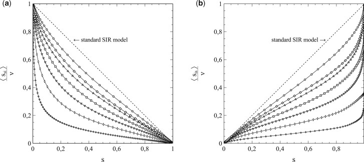
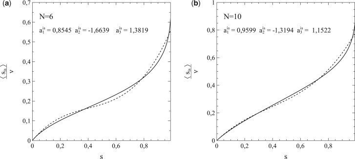
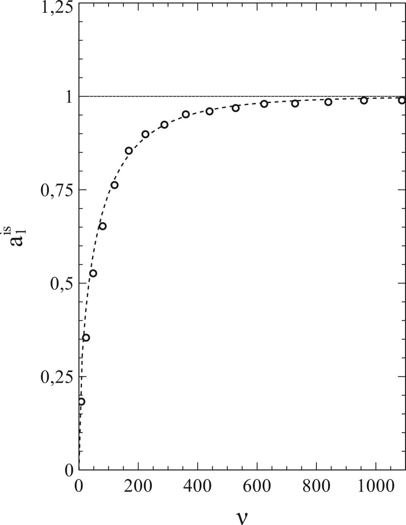
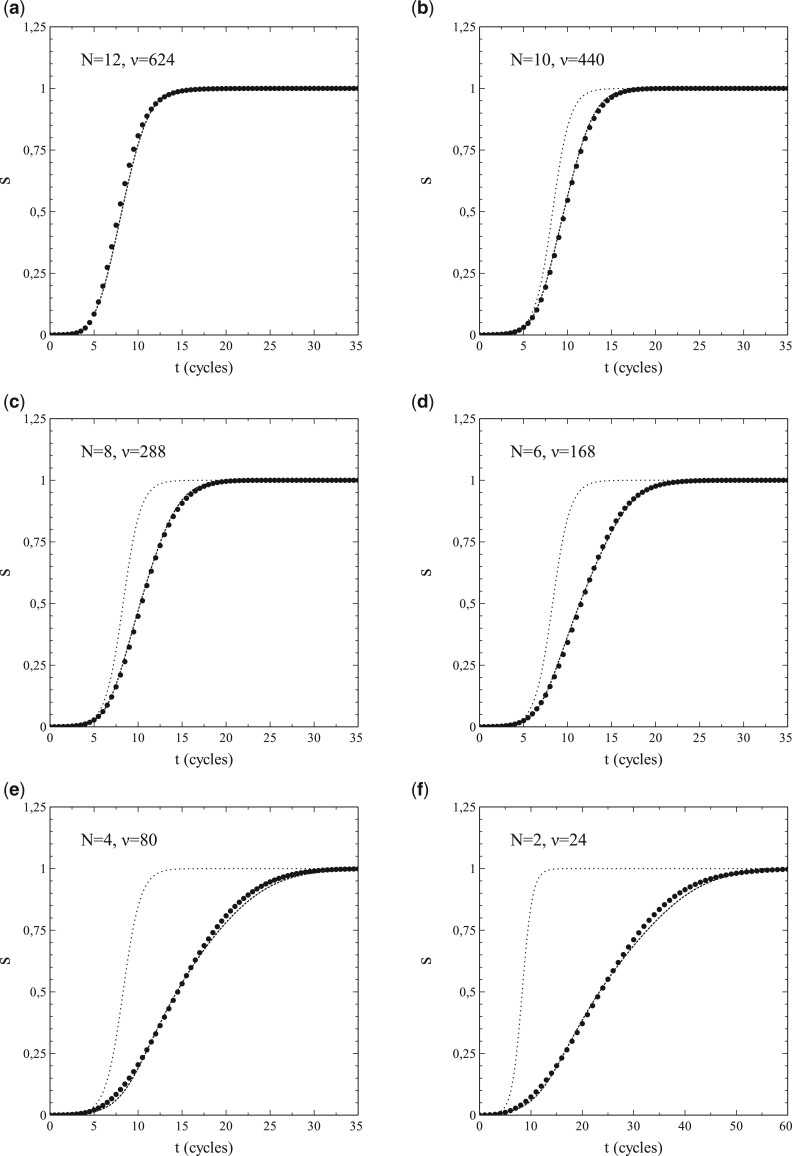
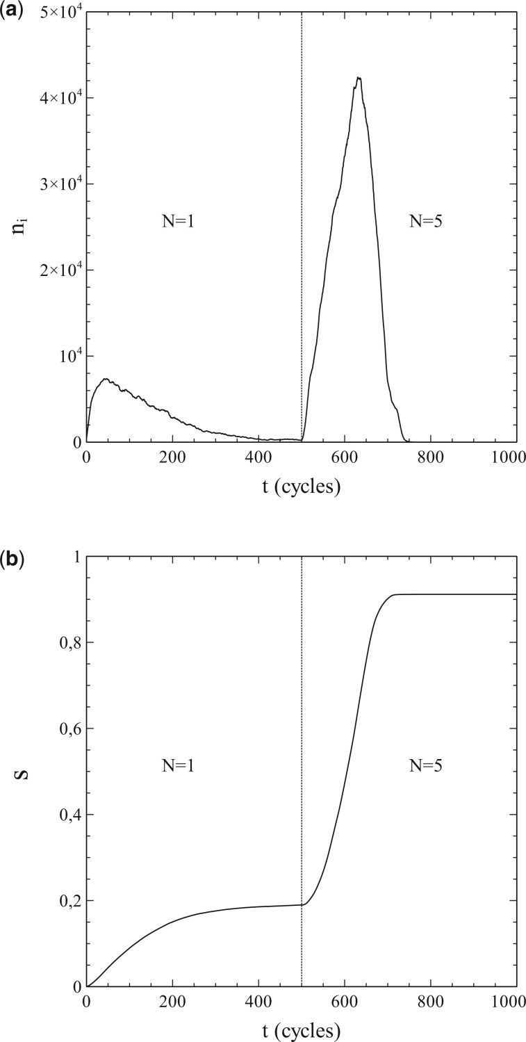
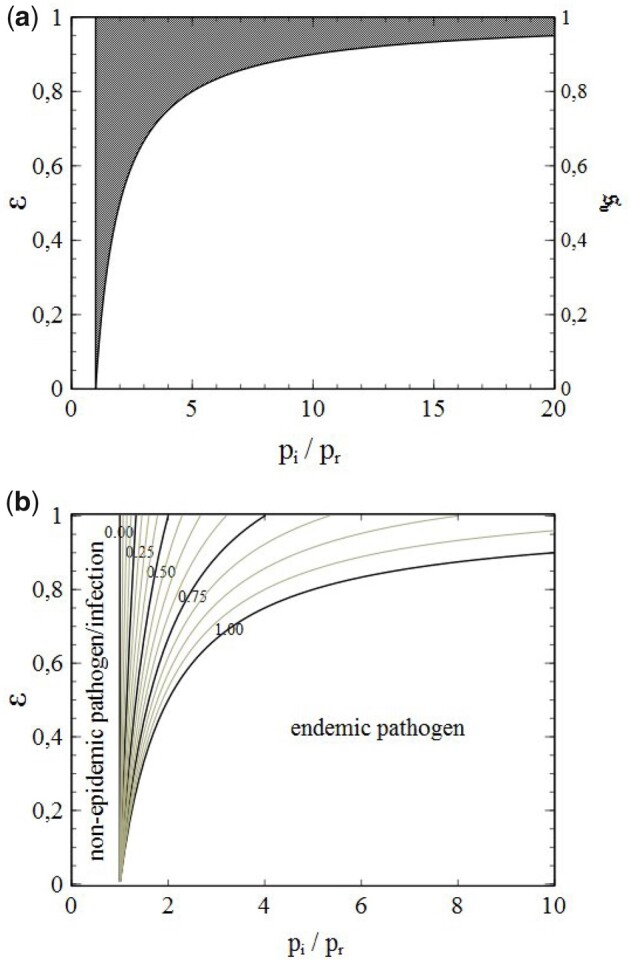
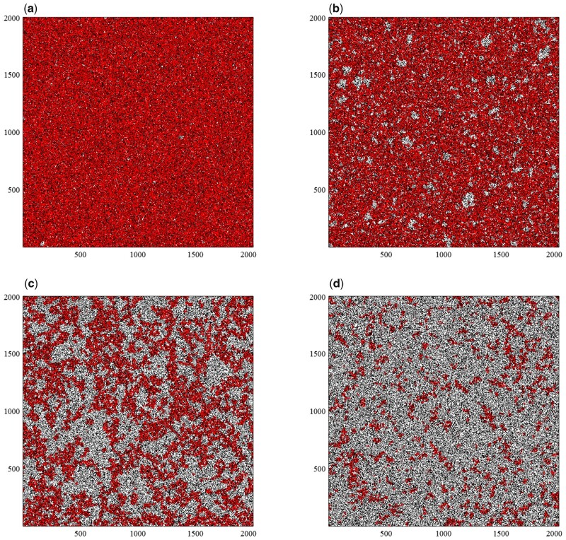
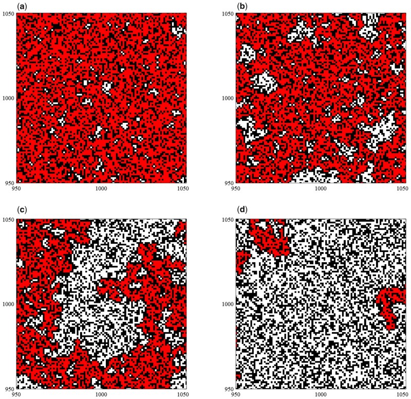
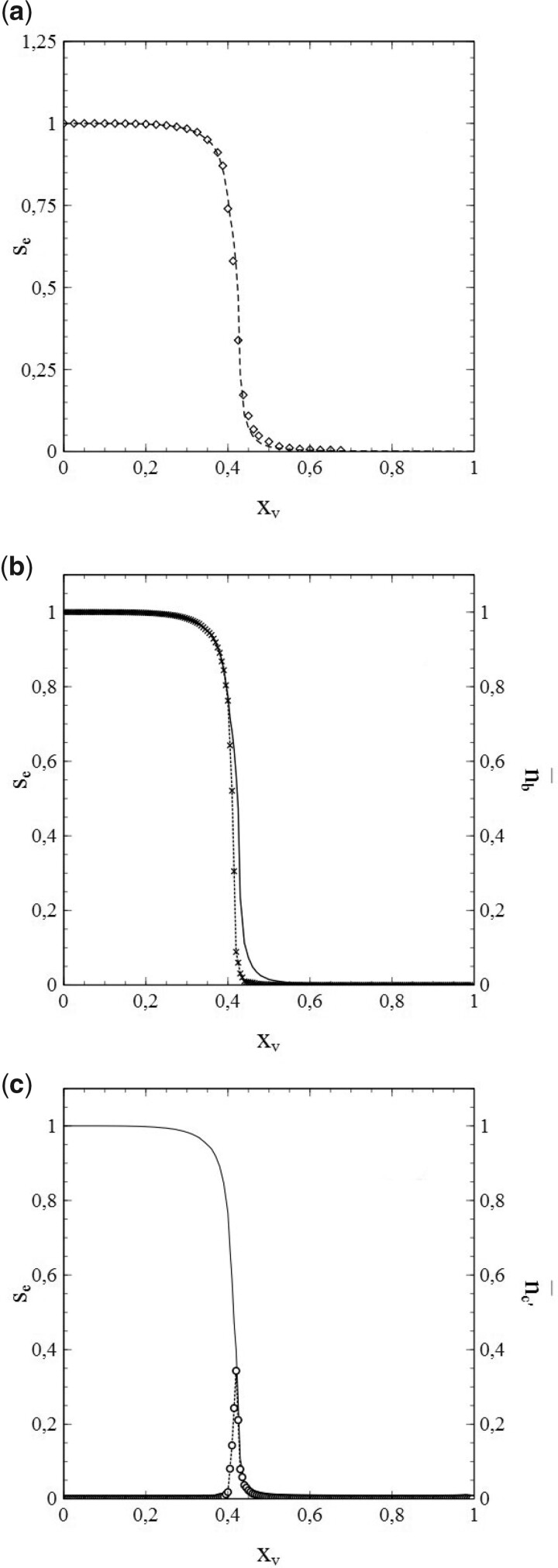
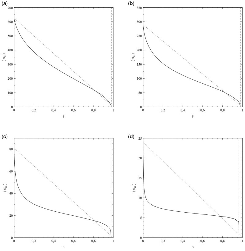
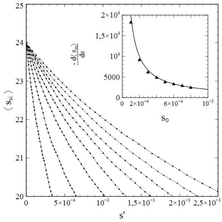
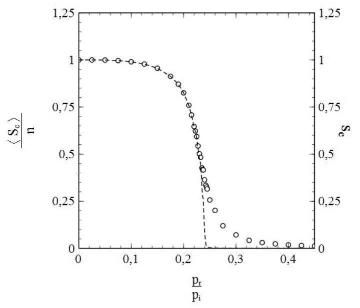
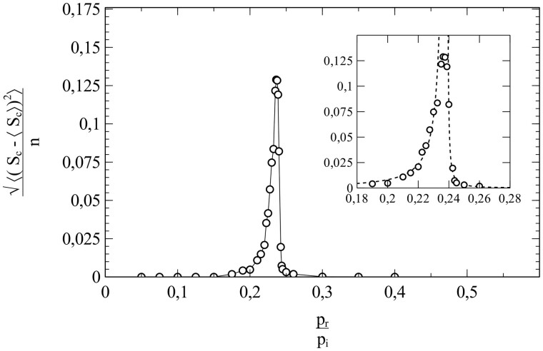
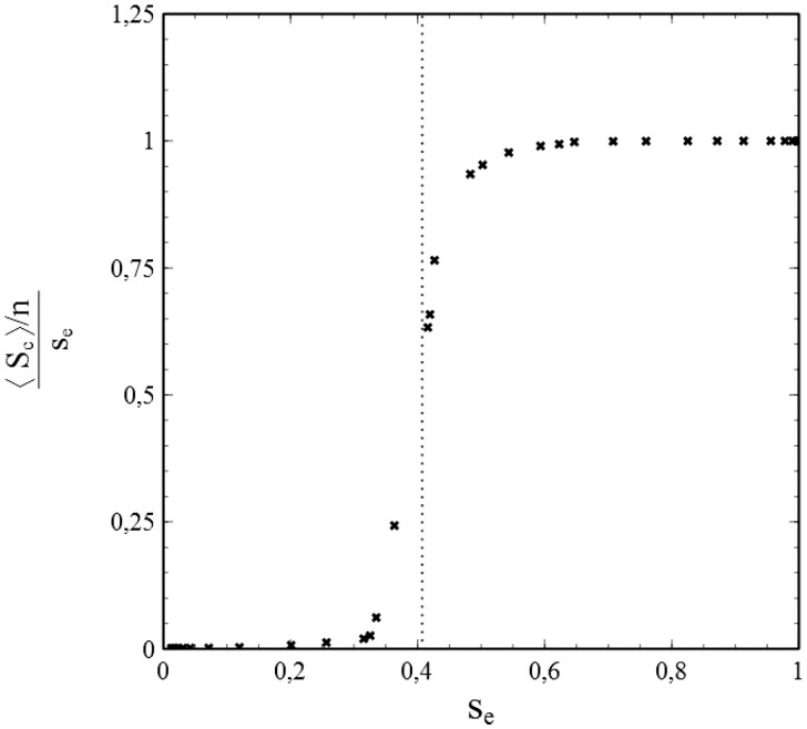
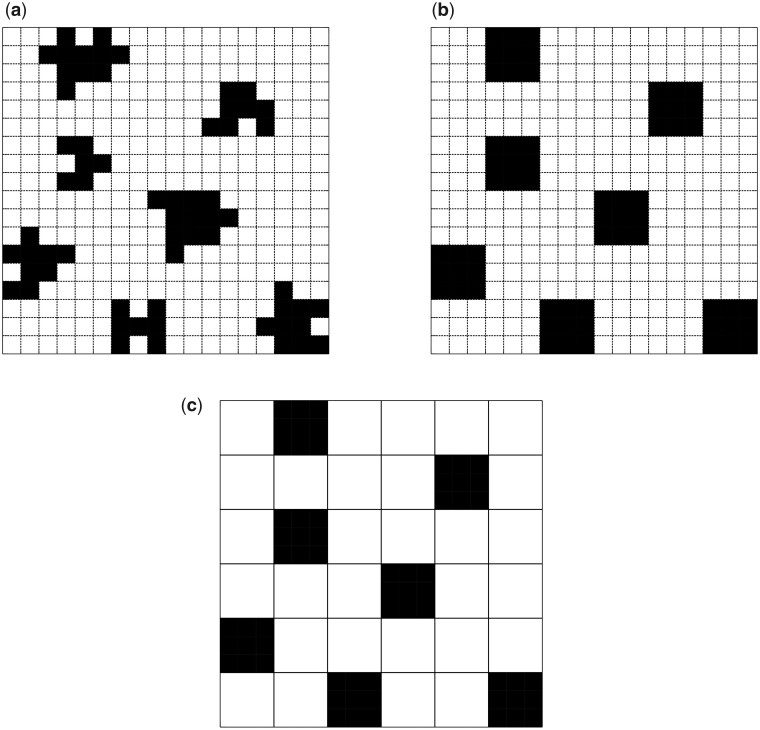
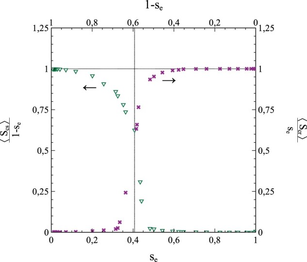
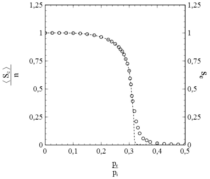
This article deals with the spread of infectious diseases from a physics perspective. It considers a population as a network of nodes representing the population members, linked by network edges representing the (social) contacts of the individual population members. Infections spread along these edges from one node (member) to another. This article presents a novel, modified version of the SIR compartmental model, able to account for typical network effects and percolation phenomena. The model is successfully tested against the results of simulations based on Monte-Carlo methods. Expressions for the (basic) reproduction numbers in terms of the model parameters are presented, and justify some mild criticisms on the widely spread interpretation of reproduction numbers as being the number of secondary infections due to a single active infection. Throughout the article, special emphasis is laid on understanding, and on the interpretation of phenomena in terms of concepts borrowed from condensed-matter and statistical physics, which reveals some interesting analogies. Percolation effects are of particular interest in this respect and they are the subject of a detailed investigation. The concept of herd immunity (its definition and nature) is intensively dealt with as well, also in the context of large-scale vaccination campaigns and waning immunity. This article elucidates how the onset of herd-immunity can be considered as a second-order phase transition in which percolation effects play a crucial role, thus corroborating, in a more pictorial/intuitive way, earlier viewpoints on this matter. An exact criterium for the most relevant form of herd-immunity to occur can be derived in terms of the model parameters. The analyses presented in this article provide insight in how various measures to prevent an epidemic spread of an infection work, how they can be optimized and what potentially deceptive issues have to be considered when such measures are either implemented or scaled down.

Keywords: Covid-19; SIR-Model; mathematical epidemiology; percolation; phase transitions; renormalization.


Figures

Figure 1:
Figure 1:
Schematic representation of a population network. There are three types of nodes: susceptibles (○), active infections () and removed infections (). The dashed square symbolizes the social network of the node in the centre (central grey dot).
Figure 2:
Figure 2:
Number of cumulative infections nc as a function of time (main figure) and s˙(s) (inset) obtained from a simulation with node contacts selected throughout the entire population network (2D square lattice). Dashed/dotted curves: standard SIR-model. Parameters: population size n=20012, transmission probability wi=pi/2=0.5, decay/removal constant pr = 0, number of initial infections n0=999.
Figure 3:
Figure 3:
Data obtained from a simulation with pr0 and node contacts selected throughout the entire population network (2D square lattice) for (a) the number of cumulative infections nc as a function of time and (b) the number of active infections as a function of time. Dotted curves: standard SIR-model. Parameters: population size Np=20012, transmission probability wi=pi/2=0.5, decay/removal constant pr=0.5, and number of initial infections n0=999.
Figure 4:
Figure 4:
Simulated data for s˙/si (left vertical axis) and s˙i/si (right vertical axis), obtained from the same simulations as the data in Fig. 3. Dotted lines: standard SIR-model [i.e. s˙/si=pi(1s) and s˙i/si=pi(1s)=pr (extrapolated to s =1)]. Dashed vertical line s = se: maximum s reached during the epidemic. Parameters: the same as for Fig. 3.
Figure 5:
Figure 5:
ssi (a) and sis (b) as a function of s, for a series of simulations with social bubbles consisting of (2N+1)×(2N+1) squares with N=16 (°),N=12 (),N=10 (),N=8 (),N=6 (),N=4 (),N=2 (+). Parameters: population size n=20012, transmission probability wi=pi/2=0.5, decay/removal constant pr = 0, and number of initial infections n0=999.
Figure 6:
Figure 6:
Third-order polynomial fits (dashed curves) of data (solid curves) for sis vs. s from simulations with pr = 0 and N=6, ν=168 (a) and N=10, ν=440 (b). Other parameters: the same as for Fig. 3. Best-fitting values for a1is,a2is and a3is indicated in each figure.
Figure 7:
Figure 7:
Variation of a1is with ν.
Figure 8:
Figure 8:
s vs. t for pr = 0 and N=2,4,6,8,10,12. Dashed curves: fit. Dotted curves: standard SIR-model (not indicated for N =12).
Figure 9:
Figure 9:
Variation of ssi and sis with s for wi=pi/2=0.5,pr=0.25 and N =10.
Figure 10:
Figure 10:
si vs. t for pr=0.25 and N =8, 10, 12. Left column: simulated data (markers) and standard SIR-model (solid curve). Right column: simulated data (markers) and model based on series expansion of ssi. Other parameters: same as in Fig. 3.
Figure 11:
Figure 11:
s vs. t for pr=0.25 and N =12, 10, 8 (other parameters: same as in Fig. 3). Simulated data (markers) and solutions of (1.42a,b) (solid curves). Dotted curve in upper figure: standard SIR-model (as indicated in grey).
Figure 12:
Figure 12:
f1(s) vs. s for pr/pi=0.01,0.10,0.25,0.50,0.75,1 (solid curves) and the straight line y = s (dotted). Values of parameters: ν = 8, a1=7.2,a2=0.8. Solutions of (5.10) correspond to the intersections of the relevant graph of f1(s) vs. s and the line y = s. s =0 is always a solution. For pr/pi<1, a second solution s >0 exists. With increasing pr/pi, the second solution gradually moves towards s =0. For pr/pi=1, both solutions converge into a single solution s =0, the line y = s being the tangent of the corresponding graph of f1(s). For pr/pi>1, only s =0 remains as a solution.
Figure 13:
Figure 13:
Simulated sequence of infection waves under two different regimes of social measures (see main text). (a) Number of active infections ni as a function of time [time measured in simulation cycles, i.e. the time in which (on average) each member of the population (node) makes exactly 1 contact]. (b) Cumulative infection rate s as a function of time. Dotted lines represent the cross-over of social regimes. Parameters: pi=0.5, pr=0.325,N0=500, population size N=15012.
Figure 14:
Figure 14:
(a) Combined pi/prϵ and pi/prs ‘phase-diagrams’. Points (pi/pr,s) (right vertical axis) in the grey-shaded area correspond to vaccine-acquired herd-immunity, points (pi/pr,ϵ) (left vertical axis) to the possibility of vaccine-acquired herd-immunity (via a sufficiently high vaccination rate, the minimum value of which can be read from the diagram in Fig 14b). (b) Contour lines of the vaccination rates necessary for vaccine-acquired herd-immunity as a function of pi/pr and ϵ.
Figure 15:
Figure 15:
End-status (after fade-out of the epidemic) of the nodes in a model-population consisting of a 2D square lattice with nearest-neighbour contacts for different rates (xv) of random vaccination. The different nodes types are distinguished by the colour of the square unit cell that surrounds them (red: infected nodes, black: vaccinated nodes and white: susceptible nodes). (a) xv=0.35. (b) xv=0.40. (c) xv=0.425. (d) xv=0.45.
Figure 16:
Figure 16:
Close-up of the model populations shown in Fig. 15a and d (red: infected nodes, black: vaccinated nodes and white: susceptible nodes). (a) xv=0.35. (b) xv=0.40. (c) xv=0.425. (d) xv=0.45.
Figure 17:
Figure 17:
Average relative cluster size (a) and its standard deviation (b) vs. xv for a 2D square lattice with nearest-neighbour contacts. (a) Sc/ns vs. xv. (b) (ScSc)2/ns vs. xv.
Figure 18:
Figure 18:
(a) Relative rate of cumulative infections ne/ns=se/(1x) vs. xv and (b) relative rate of cumulative infections ne/ns=se/(1x) vs. xv (black triangles/solid line) compared with the relative average cluster size Sc/ns vs. xv (open circles/dashed line). (a) ne/Ns vs. xv. (b) Sc/Ns and ne/Ns vs. xv.
Figure 19:
Figure 19:
Average of the fluctuations in the size of the clusters of cumulative infections after fade-out of the epidemic vs. vaccination rate xv. Dotted curves are guides to the eye.
Figure 20:
Figure 20:
Variation of nb (a) and nc (b) with xv as obtained from simulations for a 751 × 751 square lattice with nearest neighbour interactions. Dotted lines represent the total number of susceptibles. Panels (c) and (d): resulting variations of n¯b (c) and n¯c (d) with xv obtained from the data represented in (a) and (b), respectively.
Figure 21:
Figure 21:
(a) End-value se of cumulative infection rate obtained from ODE vs. xv ( dashed curve) compared with data from simulations (markers) for pr = 0 and n0=125. (b) End-value se represented by dashed curve in (a) (solid curve, left vertical axis) compared with n¯b from simulations (dotted curve with markers, right vertical axis). (c) End-value se represented by dashed curve in (a) (solid curve, left vertical axis) compared with n¯c from simulations (dotted curve with markers, right vertical axis).
Figure 22:
Figure 22:
ssi for different social-bubble sizes [(2N+1)×(2N+1) square], dashed lines represent the percolation-free case N= which is covered by the standard SIR-model. (a) N = 12. (b) N = 8. (c) N = 4. (d) N = 2.
Figure 23:
Figure 23:
ssi as a function of s for different s0 (main figure) and the corresponding values of sis/s vs. s0 (inset).
Figure 24:
Figure 24:
End-value se of the accumulative infection rate (open circles/right axis) and normalized average cluster size Sc/n (dashed curve/left axis) vs. pr/pi.
Figure 25:
Figure 25:
Main figure: normalized standard deviation (ScSc)2/n of the cluster size as a function of pr/pi. Inset: close-up of the critical region.
Figure 26:
Figure 26:
Plot of Sc/nse vs. se (dotted line marks the inflection point).
Figure 27:
Figure 27:
Construction of block-tiles and renormalization of the 2D square population lattice: (a) actual clusters (cumulative infections) on the original (2D square) lattice, (b) block-tiles effectively replacing the clusters on the original lattice, (c) block-tiles on the renormalized (2D square) lattice.
Figure 28:
Figure 28:
Plots of Scs/n1se [left axis (see arrow)] and Scr/nse [right axis (see arrow)] vs. se (bottom axis) and 1se (top axis).
Figure 29:
Figure 29:
Status of the population after fade-out of the epidemic for different rp=pr/pi values (inherently corresponding to different se values). Black: (cumulative) infections, white: susceptibles. The gradual confluence of the clusters of infections with decreasing rp (increasing se) is obvious. Case (f) represents the crossing of the percolation threshold(s). (a)  pr/pi=0.40, se=0.0184. (b)  pr/pi=0.35, se=0.0304. (c)  pr/pi=0.30, se=0.0714. (d)  pr/pi=0.275, se=0.1197. (e)  pr/pi=0.25, se=0.2566. (f)  pr/pi=0.235, se=0.4267.
Figure 30:
Figure 30:
sis vs. s for pr = 0 (main figure) and sis/s vs. s (inset). Dot and dashed line mark the point of inflection.
Figure 31:
Figure 31:
Definition of cluster area Ac as the largest area that can be fenced-in by straight lines (dotted) connecting elements of the cluster.
Figure 32:
Figure 32:
Status of nodes in a 700 × 700 section of a population (black: cumulative infections, white: susceptibles).
Figure 33:
Figure 33:
End-value se of the accumulative infection rate (open circles/right axis) and normalized average cluster size Sc/n (dashed curve/left axis) vs. pr/pi for a case with nearest- and next-nearest neighbour contacts.
Figure 34:
Figure 34:
Main figure: normalized standard deviation (ScSc)2/n of the cluster size as a function of pr/pi for a case with nearest- and next-nearest neighbour contacts.
Figure 35:
Figure 35:
sis vs. s for pr = 0 (main figure) and sis/s vs. s (inset) for the case with nearest- and next-nearest neighbour contacts. Dot and dashed line mark the point of inflection.
Figure 36:
Figure 36:
(a) Result of a fit of the coefficients a1,a2,a3 in (8.63) to the simulated data for sis vs. s represented in Fig. 35. Solid curve: simulated data. Dashed curve: approximation on the basis of (8.63) with best-fitting a1,a2,a3 (values indicated). (b) s vs. t. Open circles: simulation, solid curve: modified SIR-model [based on Equation (3.16) under substitution of the results for a1,a2,a3 from the fit presented under (a)]. Dashed curve: standard SIR-model.
Figure 37:
Figure 37:
Variation of se for xv = 0 (○), xv=0.0625 (), xv=0.125 (), xv=0.1875 (), xv=0.25 (▽), xv=0.3125 (), xv=0.375 (), xv=0.4375 (+) and xv=0.5 (×).
Figure 38:
Figure 38:
Variation of rc with xv.

Similar articles

Cited by

References

    1. Avila M, Saïd N, Ojcius DM.. The book reopened on infectious diseases. Microbes Infect 2008;10:942–7. - PMC - PubMed
    1. Kermack WO, McKendrick AG.. Contribution to the mathematical theory of epidemics. Proc R Soc A 1927;115:700–21. - PubMed
    1. Ising E. Beiträge zur theorie des ferromagnetismus. Z Physik 1925;31:253–8.
    1. Brauer F. Mathematical epidemiology: past, present, and future. Infect Dis Model 2017;2:113–27. - PMC - PubMed
    1. Stauffer D, Aharony A, Filk T.. Perkolationstheorie (transl.). VCH Verlagsgesellschaft Weinheim, 1995. ISBN 3-527-29334-5.