. 2023 Nov;623(7985):139-148.
doi: 10.1038/s41586-023-06651-y. Epub 2023 Sep 25.

Distinguishing features of long COVID identified through immune profiling

Affiliations

Distinguishing features of long COVID identified through immune profiling

Jon Klein et al. Nature. 2023 Nov.

Abstract

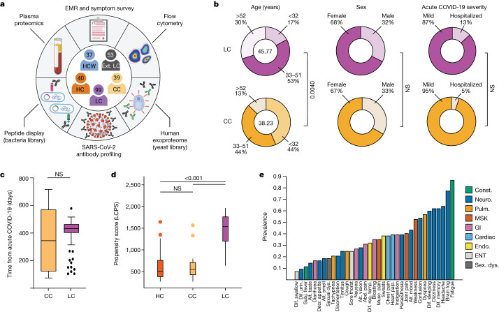
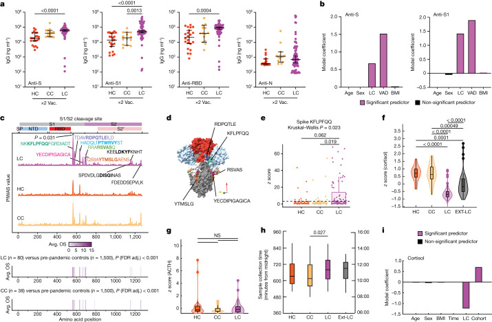
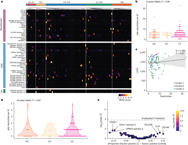
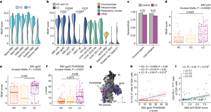
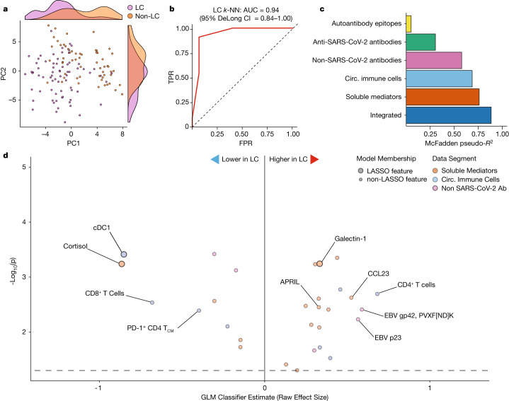
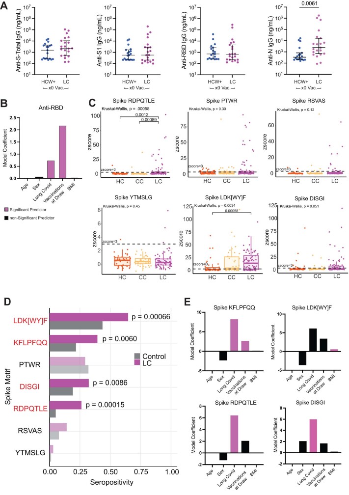
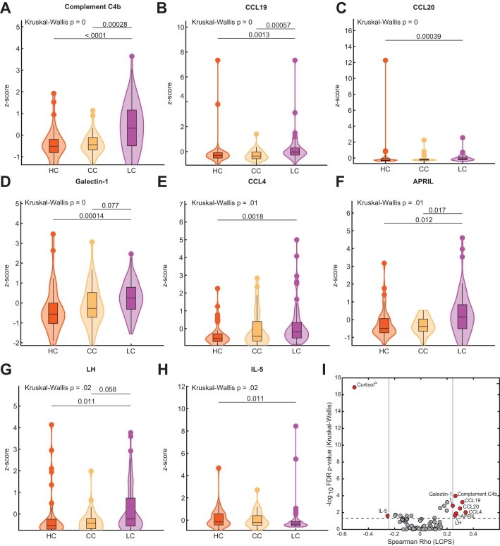
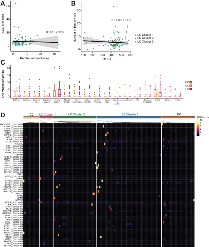
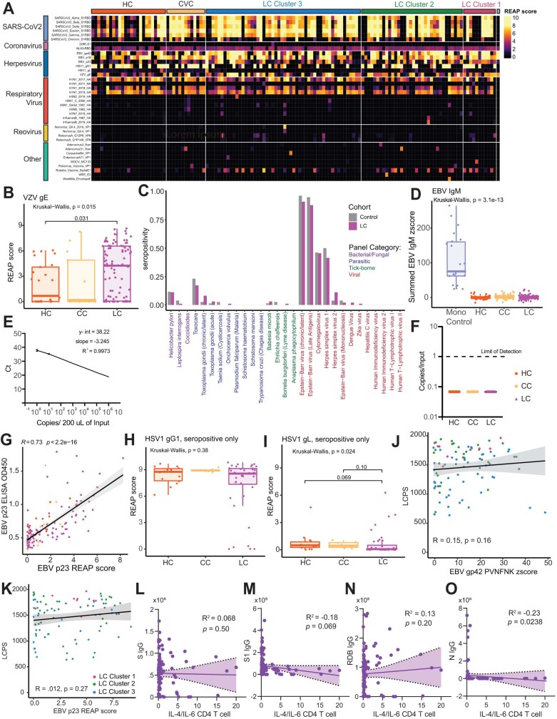
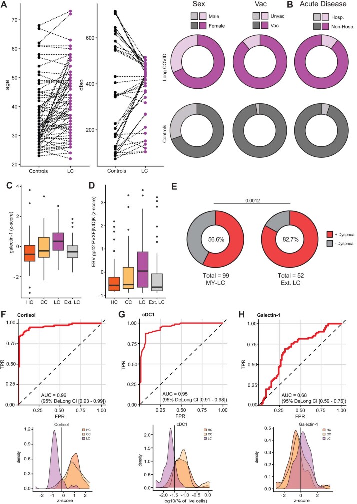
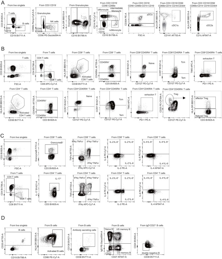
Post-acute infection syndromes may develop after acute viral disease1. Infection with SARS-CoV-2 can result in the development of a post-acute infection syndrome known as long COVID. Individuals with long COVID frequently report unremitting fatigue, post-exertional malaise, and a variety of cognitive and autonomic dysfunctions2-4. However, the biological processes that are associated with the development and persistence of these symptoms are unclear. Here 275 individuals with or without long COVID were enrolled in a cross-sectional study that included multidimensional immune phenotyping and unbiased machine learning methods to identify biological features associated with long COVID. Marked differences were noted in circulating myeloid and lymphocyte populations relative to the matched controls, as well as evidence of exaggerated humoral responses directed against SARS-CoV-2 among participants with long COVID. Furthermore, higher antibody responses directed against non-SARS-CoV-2 viral pathogens were observed among individuals with long COVID, particularly Epstein-Barr virus. Levels of soluble immune mediators and hormones varied among groups, with cortisol levels being lower among participants with long COVID. Integration of immune phenotyping data into unbiased machine learning models identified the key features that are most strongly associated with long COVID status. Collectively, these findings may help to guide future studies into the pathobiology of long COVID and help with developing relevant biomarkers.


Conflict of interest statement

In the past three years, H.M.K. received expenses and/or personal fees from UnitedHealth, Element Science, Eyedentifeye and F-Prime; he is a co-founder of Refactor Health and HugoHealth; and is associated with contracts, through Yale New Haven Hospital, from the Centers for Medicare & Medicaid Services and through Yale University from the Food and Drug Administration, Johnson & Johnson, Google and Pfizer. N.K. is a scientific founder at Thyron; served as a consultant to Boehringer Ingelheim, Pliant, Astra Zeneca, RohBar, Veracyte, Galapagos, Fibrogen and Thyron over the past 3 years; reports equity in Pliant and Thyron; and acknowledges grants from Veracyte, Boehringer Ingelheim and BMS. A.I. co-founded and consults for RIGImmune, Xanadu Bio and PanV; consults for Paratus Sciences and InvisiShield Technologies; and is a member of the Board of Directors of Roche Holding. A.M.R. and Y.D. are listed as inventors on a patent describing the REAP technology. A.M.R. is the founder and director of Seranova Bio. A.M.R. and Y.D. hold equity in Seranova Bio. The other authors declare no competing interests.

Figures

Fig. 1
Fig. 1. Demographic and clinical stratification of participants with LC.
a, Schematic of the MY-LC study. Numbers indicate the number of participants after exclusion (Methods). The diagram was created using BioRender. b, Select demographic information for the LC (top row, purple) and CC (bottom row, yellow) groups. The centre values in the ‘age’ column represent the average group values. n = 39 (CC) and n = 99 (LC). Statistical significance is reported for relevant post hoc comparisons (age) or χ2 tests (sex and acute disease severity). Complete statistical results are shown in Extended Data Table 1. c, The time (days) from acute symptom onset between the LC and CC groups. Significance was assessed using a two-tailed Brown–Mood median test with an alpha of 0.05. NS, not significant. n = 39 (CC) and n = 99 (LC). d, The LCPS for each individual. n = 40 (HC), n = 39 (CC) and n = 98 (LC). Significance was assessed using Kruskal–Wallis tests corrected for multiple comparisons using the Bonferroni method. e, The prevalence of the top 30 self-reported binary symptoms ranked from most prevalent (right) to least prevalent (left). Symptoms are coloured according to common physiological system: constitutional (const., green), neurological (neuro., dark blue), pulmonary (pulm., gold), musculoskeletal (MSK, red), gastrointestinal (GI, pink), cardiac (light blue), endocrine (endo., yellow), ear, nose and throat (ENT, light grey), and sexual dysfunction (sex. dys., dark grey). For the box plots in c and d, the central lines indicate the group median values, the top and bottom lines indicate the 75th and 25th percentiles, respectively, the whiskers represent 1.5× the interquartile range and individual datapoints mark outliers. abd., abdominal; alt., altered; decr., decreased; dif., difficulty; EMR, electronic medical record; IQR, interquartile range; musc., muscle; palp., palpitations; reg., regulating; subj., subjective; temp., body temperature; Urin., urination.
Fig. 2
Fig. 2. Exaggerated SARS-CoV-2-specific humoral responses and altered circulating immune mediators among participants with LC.
a, The SARS-CoV-2 antibody responses were assessed using ELISA. n = 22 (HC), n = 14 (CC) and n = 69 (LC). The vaccination (vac.) status for each cohort is indicated (×2), indicating the number of SARS-CoV-2 vaccine doses at sample collection. Significance for difference in group median values was assessed using Kruskal–Wallis with Benjamini–Hochberg false-discovery rate (FDR) correction for multiple comparisons. The central lines indicate the group median values and the whiskers show the 95% CI estimates. b, Coefficients from linear models are reported. Model predictors are indicated on the x axis. Significant predictors (P ≤ 0.05) are shown in purple. Detailed model results are shown in Extended Data Table 5. c, PIWAS line profiles of IgG binding within participants with more than 1 vaccine dose plotted along the SARS-CoV-2 spike amino acid sequence. Various spike protein domains are indicated by coloured boxes (top). 95th percentile values are arranged by group: LC (purple, n = 80), HC (orange, n = 39) and CC (yellow, n = 38); peaks with a PIWAS value of ≥2.5 are annotated by their consensus linear motif sequence (bold) and surrounding residues. Significantly enriched peaks in the LC group are indicated by an asterisk (*), as calculated using outlier sum (OS) statistics. d, Three-dimensional mapping of LC-enriched motif sequences onto trimeric spike protein. Light grey, S1; light blue, N-terminal domain; red, RBD; dark grey, S2. Various LC-enriched motifs are annotated. e, z-score enrichments for IgG binding to the spike sequence KFLPFQQ among participants who have received at least one vaccine dose. A z score of >3 indicates significant binding relative to the control populations. fh, z-score-transformed cortisol (f) ACTH (g) and sample-collection times (h) by group. Participants with potentially confounding medical comorbidities (such as pre-existing pituitary adenoma, adrenal insufficiency and recent oral steroid use) were removed before analysis. n = 39 (HC), n = 39 (CC), n = 93 (LC). i, Coefficients from linear models of cortisol levels. Significant predictors (P ≤ 0.05) are shown in purple. Detailed model results are reported in Extended Data Table 6. For the box plots in eh, the central lines indicate the group median values, the top and bottom lines indicate the 75th and 25th percentiles, respectively, the whiskers represent 1.5× the interquartile range and individual datapoints mark outliers. Significance for differences in group median values was assessed using Kruskal–Wallis tests with Bonferroni’s correction for multiple comparisons. SP, signal peptide.
Fig. 3
Fig. 3. Participants with LC showed limited but selective autoantibodies against the human exoproteome.
a, REAP reactivities across the MY-LC cohort. n = 25 (HC), n = 13 (CC) and n = 98 (LC). Each column is one participant, grouped by cohort (for HC and CC) or by LCPS (for LC). Column clustering within groups was performed by k-means clustering. Each row represents one protein. Proteins were grouped using Human Protein Atlas mRNA expression data for different tissues. Reactivities shown have at least one participant with a REAP score ≥3. Only reactivities enriched in blood/lymph, CNS or pituitary are shown for brevity. b, The number of autoantibody (aAb) reactivities per individual (ID) by group. Significance was assessed using Kruskal–Wallis tests. For the box plots, the central lines indicate the group median values, the top and bottom lines indicate the 75th and 25th percentiles, respectively, the whiskers represent 1.5× the interquartile range. Each dot represents one individual. c, The relationship between number of autoantibody reactivities per individual and LCPS. Correlation was assessed using Spearman’s correlation. The black line shows the linear regression, and the shading shows the 95% CIs. Colours show the LC LCPS group (red, cluster 1; green, cluster 2; blue, cluster 3). Each dot represents one individual. d, The number of GPCR autoantibodies per individual. Significance was assessed using Kruskal–Wallis tests. Each dot represents one individual. e, Assessment of the frequency of individual autoantibody reactivities in participants with LC and control individuals. Significance was assessed using Fisher’s exact tests. The y axis shows −log10-transformed unadjusted P values; the Bonferroni-adjusted significance threshold is indicated by a black dashed line. The x axis shows the difference in the proportion of autoantibody-positive individuals in each group. Each dot represents one autoantibody reactivity. CNS, central nervous system; pit., pituitary.
Fig. 4
Fig. 4. Participants with LC demonstrate elevated levels of antibody responses to herpesviruses.
a, The REAP score distributions for SARS-CoV-2 S1 RBD between participants in the LC (n = 69) and CC (n = 10) groups with two doses of mRNA vaccine. Statistical significance was assessed using Wilcoxon rank-sum tests adjusted for multiple comparisons using the Benjamini–Hochberg method. b, The REAP score distributions for a given viral antigen between participants in the LC (n = 98) and pooled control (HC and CC, n = 38) groups. Statistical significance was assessed using Wilcoxon rank-sum tests adjusted for multiple comparisons using the Benjamini–Hochberg method. Only antigens with ≥2 individuals with LC and ≥2 control individuals with REAP score ≥ 1 were included. c, Seropositivity as assessed by SERA for EBV among participants with LC (n = 99) and control participants (n = 78). Significance was assessed using Fisher’s exact tests adjusted for multiple comparisons using the Benjamini–Hochberg method. d,e, REAP scores among EBV-seropositive individuals only for EBV p23 (d) and gp42 (e) by group. n = 25 (HC), n = 13 (CC), n = 98 (LC). f, SERA-derived z scores for the gp42 motif PVXF[ND]K among EBV-seropositive individuals only, plotted by group. The dashed line represents the z-score threshold for epitope positivity defined by SERA. n = 39 (HC), n = 38 (CC) and n = 80 (LC). g, Three-dimensional mapping of the LC-enriched linear peptide sequence PVXF[ND]K (magenta) onto EBV gp42 (purple) in a complex with gH (light grey) and gL (dark grey) (PDB: 5T1D). h, The relationship between the EBV gp42 PVXF[ND]K z score and the percentage of IL-4/IL-6 double-positive CD4+ T cells (of total CD4+ T cells) for participants. Only EBV-seropositive individuals were included. Correlation was assessed using Spearman’s correlation. The black line shows linear regression, and the shading shows the 95% CIs. n = 39 (HC), n = 38 (CC) and n = 80 (LC). i, The relationship between EBV p23 REAP score and the percentage of CD4+ TEMRA cells (of total CD3+ T cells). Only EBV-seropositive individuals were included. Correlation was assessed using Spearman’s correlation. The black line depicts linear regression, and the shading shows the 95% CIs. Colours depict LCPS clusters as in Fig. 3. For the box plots, the central lines indicate the group median values, the top and bottom lines indicate the 75th and 25th percentiles, respectively, the whiskers represent 1.5× the interquartile range. Each dot represents one individual. Statistical significance of the difference in median values was determined using Kruskal–Wallis tests. Post hoc tests were performed using Dunn’s test with Bonferroni–Holm’s method to adjust for multiple comparisons. TM, transmembrane.
Fig. 5
Fig. 5. Biochemical factors differentiate participants with LC from the matched controls.
All data shown represent a matched subset of participants (n = 40 (HC), n = 39 (CC) and n = 79 (LC)) selected using the Gale–Shapley procedure on demographic factors (Extended Data Fig. 9a). a, PCA projection of participant data comprising cytokine, flow cytometry and various antibody responses (anti-SARS-CoV-2, non-SARS-CoV-2 viral antibodies and autoantibodies (aAb)). Marginal histograms display data density along each principal component dimension. b, Receiver operating characteristic curve analysis from unsupervised k-NN classification. AUC and 95% CI intervals (DeLong’s method) are reported. c, McFadden’s pseudo-R2 values are reported as a bar plot for each data segment. An integrated, parsimonious McFadden’s pseudo-R2 is reported for the final classification model (all). d, LASSO regression identifies a minimal set of immunological features differentiating participants with LC from others. Unlabelled dots are significant predictive features that were not included in the final LASSO regression model. Dots are coloured according to individual data segments: orange, flow; blue, plasma cytokines; pink, viral epitopes; green, anti-SARS-CoV-2; yellow, autoantibodies. Flow, flow cytometry; FPR, false-positive rate; TCM, T central memory cells; TPR, true-positive rate.
Extended Data Fig. 1
Extended Data Fig. 1. Additional demographic and clinical analysis of Long COVID cohort.
(A) Box plots of Min-Max normalized survey responses (n = 40 HC, 38 CC, 91 LC). Only participants who completed all surveys were included. Individual survey instruments are arranged in columns with corresponding health dimensions below. Surveys in red were aggregated to generate Long COVID Propensity Scores (LCPS). Significance was assessed using Kruskal-Wallis tests corrected for multiple comparisons using Bonferroni’s method. (B) Receiver-Operator Curve (ROC) analysis of LCPS scores. Area under the curve (AUC) is reported with Bootstrap Bias-corrected 95% confidence intervals (CI) of AUC. (C) Ring plots of prevalence of Postural Orthostatic Tachycardia Syndrome (POTS) among Long COVID cohort (n = 99). “No diagnosis” is represented by grey regions, “positive diagnosis” is represented by shaded purple regions. Purple regions are further stratified by diagnostic modality: clinical = diagnosed through clinical evaluation (light purple); Tilt-table = diagnosed by Tilt-table (middle purple); Stand / Lean = diagnosed by Stand / LEAN test (dark purple). (D) Ring plots of prevalence of self-reported negative impacts on employments status among individuals with Long COVID (n = 99). Negative responses are represented by grey region, positive responses are indicated by purple region. (E) Heatmap of self-reported binary symptoms clustered by Hamming distances (rows and columns) and coloured according to physiological system as previous. Columns are annotated by LCPS scores with bootstrapped cluster reproducibility scores reported in parentheses (bootstrapped Jaccard similarity) (F) Boxplots of Long Covid Propensity Score (LCPS) plotted by group (HC = healthy control; CC = convalescent control; LC = Long COVID) and cluster. Central lines represent group medians, bottom and top lines represent 25th and 75th percentiles, respectively. Whiskers represent 1.5× inter-quartile range (IQR). Significance for difference in median LCPS was assessed using Kruskal-Wallis with correction for multiple comparisons using Bonferroni-Holm.
Extended Data Fig. 2
Extended Data Fig. 2. Immunological differences in myeloid and lymphocyte effectors among participants with Long COVID.
(A-B) Violin plots of myeloid peripheral blood mononuclear populations (PBMCs) plotted by group as percentages of respective parent populations (gating schemes detailed in Extended Data Fig. 10). (B, right) Coefficients from linear model are shown. Model predictors are indicated on x-axis. Significant predictors (p ≤ 0.05) are plotted in purple. Detailed model results are reported in Extended Data Table 4. (C) Violin plots of B lymphocyte subsets from PBMCs plotted as percentages of respective parent populations (gating schemes detailed in Extended Data Fig. 10). (D,E) Violin plots of various CD4+ (top row) and CD8+ (bottom row) populations. (F) Violin plots of IL-4 and IL-6 double-positive CD4+ (left) and CD8+ (right) T cells plotted as percentages of total CD4+ or CD8+ T cells. (G) A PERMANOVA test of the association between all cell populations shown and participant age, sex, LC status, and body mass index (BMI). For all violin plots (AF), significance was assessed using Kruskal-Wallis corrected for multiple comparisons using Bonferroni-Holm. Each dot represents a single patient (n = 40 HC, 33 CC, 99 LC). Central bars indicate the median value of each group. Only significant differences between group medians are shown.
Extended Data Fig. 3
Extended Data Fig. 3. Circulating myeloid, B cell, and cytokine producing immune cell populations among MY-LC participants.
(AI) Violin plots of various myeloid, B, and T cell PBMC populations stratified by healthy (HC), convalescent (CC), and Long COVID (LC) groups. Significance for differences in group medians was assessed using Kruskal-Wallis tests with correction for multiple comparisons using Bonferroni-Holm. Each dot represents a single patient (n = 40 HC, 33 CC, 99 LC) (JK) Coefficients from linear models for various PBMC populations. Bars in purple indicate significant predictors of specific PBMC populations (p ≤ 0.05).
Extended Data Fig. 4
Extended Data Fig. 4. Absolute Counts of in myeloid and lymphocyte effectors among participants with Long COVID.
(A-B) Violin plots of myeloid peripheral blood mononuclear populations (PBMCs) plotted by group (HC, healthy control; CC, convalescent control; LC, Long COVID) as absolute cell counts (gating schemes detailed in Extended Data Fig. 10a). Significance for differences in group medians was assessed using Kruskal-Wallis tests with correction for multiple comparisons using Bonferroni-Holm. (C) Violin plots of B lymphocyte subsets from peripheral blood mononuclear populations (PBMCs) plotted as absolute cell counts (gating schemes detailed in Extended Data Fig. 10d). Significance was assessed using Kruskal-Wallis with correction for multiple comparison using Bonferroni-Holm. (D, E) Violin plots of various CD4 (top row) and CD8 (bottom row) populations. Significance was assessed using Kruskal-Wallis with correction for multiple comparison using Bonferroni-Holm. (F) Violin plots of IL-4 and IL-6 double positive CD4+ (left) and CD8+ (right) T cells plotted as absolute cell counts. Significance was assessed using Kruskal-Wallis with correction for multiple comparison using Bonferroni-Holm. For all plots (AF), central bar in the violin plot indicated the median value of each group. Each dot represents a single patient (n = 37 HC, 28 CC, 94 LC).
Extended Data Fig. 5
Extended Data Fig. 5. Humoral Analysis of SARS-CoV-2 specific antibodies.
(A) Dot plots of IgG concentrations from historical, unvaccinated SARS-CoV-2 exposed controls (HCW+) and unvaccinated Long COVID participants. Central lines indicate median group values with bars representing 95% CI estimates. Vaccination status for each cohort is indicated by the form “x0” where the digit indicates the number of SARS-CoV-2 vaccine doses. Significance for differences in group medians were assessed using the Mann-Whitney test. Each dot represents a single patient (n = 19 HCW, 19 LC). (B) Coefficients from linear models are reported for anti-RBD antibody responses. Model predictors are reported along the x-axis and included age, sex (categorical), Long COVID status (categorical), body mass index (BMI), and number of vaccinations at blood draw. Significant predictors (p ≤ 0.05) are plotted in purple. Detailed model results are reported in Extended Data Table 5. (C) Boxplots of antibody binding to various SARS-CoV-2 linear peptide sequences plotted by group (HC = healthy control; CC = convalescent control; LC = Long COVID) amongst participants who have received 1 or more vaccine doses. Each dot represents one individual. Central bars represent groups medians, with bottom and top bars representing 25th and 75th percentiles, respectively. Dashed line represents z-score threshold for epitope positivity defined by SERA. Statistical significance determined by Kruskal-Wallis with correction for multiple comparisons using Bonferroni-Holm. Each dot represents an individual patient: LC (purple, n = 80), HC (orange, n = 39) and CC (yellow, n = 38). (D) Proportion of each group amongst participants who have received 1 or more vaccine doses (LC: n = 80, control: n = 77) that is seropositive (z-score ≥ 3) for each of 7 linear Spike motifs mapping to outlier peaks. Motifs with significantly different seropositivity between groups are highlighted in red, as determined by Fisher’s exact test corrected for multiple comparisons by FDR (Benjamini-Hochberg). (E) Coefficients from linear models are reported for anti-RBD antibody responses. Model predictors are reported along the x-axis and included age, sex (categorical), Long COVID status (categorical), body mass index (BMI), and number of vaccinations at blood draw. Significant predictors (p ≤ 0.05) are plotted in purple. Detailed model results are reported in Extended Data Table 5. Abbreviation: HCW+, previously SARS-CoV-2 infected healthcare worker.
Extended Data Fig. 6
Extended Data Fig. 6. Significantly different soluble plasma factors across MY-LC cohorts.
(AH) Violin plots of various z-score transformed circulating plasma factors across healthy (HC), convalescent (CC), and Long COVID (LC) cohorts. Significance of difference in group medians was assessed using Kruskal-Wallis corrected for multiple comparisons using Bonferroni’s method. P-values from multiple Kruskal-Wallis testing were adjusted using the Benjamini-Hochberg procedure. (I) Negative Log10 transformed p-values from Kruskal-Wallis tests plotted against Spearman correlations with LCPS for various plasma factors. Reported p-values are adjusted for multiple comparisons using FDR (Benjamini-Hochberg). Horizontal line represents significance threshold for a difference in group medians. Vertical lines represent the minimum correlation values for plasma factors significantly correlating with LCPS scores. Red depicts factors with significant differences in group medians and significant correlations with LCPS.
Extended Data Fig. 7
Extended Data Fig. 7. Analysis of private autoantibodies within the MY-LC cohort.
(AB) Correlation plots depicting relationships between number of autoantibody reactivities and %DN of B cells (A) or days from symptom onset (DFSO) and number of autoantibody reactivities (B). For all panels, correlation was assessed using Spearman’s method. Black line depicts linear regression with 95% CI shaded. Colours depict Long COVID cluster (cluster 3, blue; cluster 2, green; cluster 1, red). Each dot represents one individual. (C) Grouped box plot depicting reactivity magnitude per individual in the listed GO Process domain. Reactivity magnitude is calculated as the sum of REAP scores for all reactivities per individual in a given GO Process domain. Statistical significance assessed by Kruskal-Wallis and adjusted for multiple comparisons using FDR (Benjamini-Hochberg) correction. Boxplot coloured box depicts 25th to 75th percentile of the data, with the middle line representing the median, the whiskers representing 1.5× the interquartile range, and outliers depicted as points. (D) Heatmap depicting autoantibody reactivity for GPCRs included in the REAP library. Each column is one participant, grouped by control or LCPS cluster. HC = healthy control, CC = convalescent control, LC = Long COVID. Abbreviations: GPCR = G-protein coupled receptor.
Extended Data Fig. 8
Extended Data Fig. 8. Non-SARS-CoV-2 humoral responses among participants with Long COVID.
(A) Heatmap depicting REAP reactivities to viral antigens across the MY-LC cohort. Each column is one participant, grouped by control or LCPS cluster. Column clustering within groups performed by K-means clustering. Each row is one viral protein. Reactivities depicted have at least one participant with a REAP score >= 2. (B) REAP scores for VZV gE by group (HC = healthy control; CC = convalescent control; LC = Long COVID). Statistical significance determined by Kruskal Wallis with correction for multiple comparison using Bonferroni-Holm. Each dot represents one individual (n = 25 HC, n = 13 CC, n = 98 LC). Bottom and top lines depict 25th to 75th percentile of the data, with the middle line representing the median. Whiskers represent 1.5x the inter-quartile range (IQR). (C) Proportion of each group (LC: n = 99, control: n = 78) seropositive for each of 30 common pathogen panels as determined by SERA, grouped by pathogen-type (LC = Long COVID). Statistical significance determined by Fisher’s exact test corrected with FDR (Benjamini Hochberg). (D) Sum of SERA-derived z-scores for IgM reactivity to EBV antigens plotted by group. Statistical significance determined by Kruskal-Wallis with correction for multiple comparison using Bonferroni-Holm. Each dot represents one individual (n = 22 Mono-control, n = 40 HC, n = 38 CC, n = 98 LC). Boxplot coloured box depicts 25th to 75th percentile of the data, with the middle line representing the median. Whiskers represent 1.5× the inter-quartile range (IQR). (E) Standard curve for Taqman PCR of EBV BNRF1. Serial dilutions of EBV standard ranging from 1 to 106 copies per 200 μL input material were made. Ct values are plotted against standard copy number, demonstrating ability to detect 1 genome copy. (F) Copies of EBV genome detected in participant serum by Taqman PCR for EBV BNRF1 plotted by group. All samples were below the limit of detection. (G) Correlation plot depicting the relationship between EBV p23 REAP score and EBV p23 ELISA O.D. 450 nm. Correlation assessed by Spearman. Black line depicts linear regression with 95% CI shaded. Colours depict group (purple, LC; yellow, CC; orange, HC). Each dot represents one individual. (H,I) REAP scores for HSV1 gD1 (H) and HSV1 gL (I) amongst HSV1 seropositive individuals only, separated by group (HC = healthy control; CC = convalescent control; LC = Long COVID). Statistical significance determined by Kruskal Wallis with correction for multiple comparison using Bonferroni-Holm. Each dot represents one individual. Boxplot coloured box depicts 25th to 75th percentile of the data, with the middle line representing the median. Whiskers represent 1.5× the inter-quartile range (IQR). Each dot represents one individual. (J,K) Correlation plot depicting the relationship between Long COVID Propensity Score (LCPS) and EBV gp42 PVXF[ND]K (J) or EBV p23 REAP score (K). Correlation assessed by Spearman. Each dot represents one individual. Colours depict Long COVID cluster (cluster 1, blue; cluster 2, green; cluster 3, red). Black line depicts the linear regression, with the 95% CI shaded. (L-O) Linear regressions of various SARS-CoV-2 antigens and IL-4/IL-6 double positive CD4 T cells. Spearman’s correlation were calculated for each pair of variables, with corresponding p-values reported. Black lines depict linear regressions with the shaded area representing the 95% CI.
Extended Data Fig. 9
Extended Data Fig. 9. Gale-Shapley matching of Long COVID group and controls harmonizes samples by disease and demographics characteristics.
(A) Features used in the preference list construction for Gale-Shapley matching are shown. Individual paired samples are shown for participant age and days from initial acute COVID-19 infection (dfso). Paired plots for sex and vaccination status are shown. (B) Additionally, differences between populations in the severity of initial acute COVID-19 infection are shown. No differences between groups are significant by a Chi-square test. (C,D) Box plots of selected features assessed in the Ext. LC group. Centre lines represent median values with error bars representing 1.5 standard deviation. (E) Distribution of respiratory symptoms (“dyspnea” or “shortness of breath”) between individuals with Long COVID in the MY-LC study and the Ext. LC group. Significance was assessed using Fisher’s exact test. (FH) ROC curve analysis using cortisol, cDC1, and galectin-1 levels as an individual classifier of Long COVID status. AUC and 95% CI intervals (DeLong’s Method) for each feature are displayed (top). Kernel-density smoothed histograms for HC, CC and LC cohorts for selected model predictors. Vertical lines depict threshold values for each feature with maximal discriminatory accuracy (bottom).
Extended Data Fig. 10
Extended Data Fig. 10. Flow Cytometry gating schematics.
(AD). Various gating strategies for granulocyte and myeloid populations (A), T lymphocytes (B), intracellular cytokine staining (C), and B lymphocytes (D).

Update of

Similar articles

Cited by

References

    1. Choutka, J., Jansari, V., Hornig, M. & Iwasaki, A. Unexplained post-acute infection syndromes. Nat. Med.28, 911–923 (2022). 10.1038/s41591-022-01810-6 - DOI - PubMed
    1. Thaweethai, T. et al. Development of a definition of postacute sequelae of SARS-CoV-2 Infection. JAMA329, 1934–1946 (2023). 10.1001/jama.2023.8823 - DOI - PMC - PubMed
    1. Nalbandian, A. et al. Post-acute COVID-19 syndrome. Nat. Med.27, 601–615 (2021). 10.1038/s41591-021-01283-z - DOI - PMC - PubMed
    1. Michelen, M. et al. Characterising long COVID: a living systematic review. BMJ Glob. Health6, e005427 (2021). 10.1136/bmjgh-2021-005427 - DOI - PMC - PubMed
    1. Wiedemann, A. et al. Long-lasting severe immune dysfunction in Ebola virus disease survivors. Nat. Commun.11, 3730 (2020). 10.1038/s41467-020-17489-7 - DOI - PMC - PubMed

MeSH terms