. 2023 Nov;20(11):1759-1768.
doi: 10.1038/s41592-023-01969-x. Epub 2023 Sep 28.

Learning single-cell perturbation responses using neural optimal transport

Affiliations

Learning single-cell perturbation responses using neural optimal transport

Charlotte Bunne et al. Nat Methods. 2023 Nov.

Erratum in

Abstract

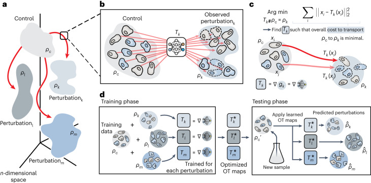
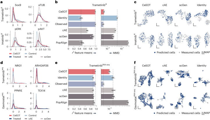
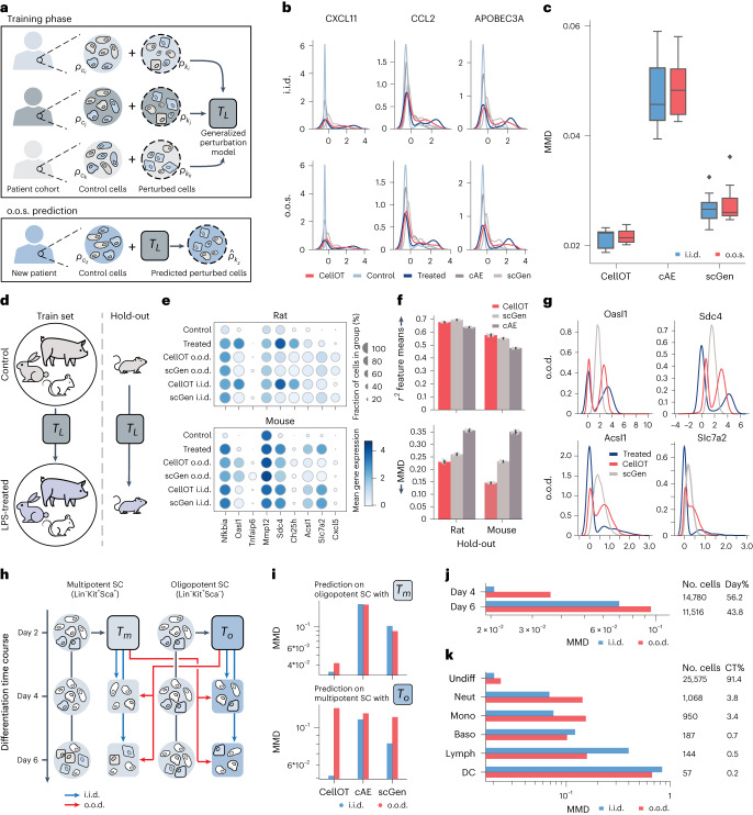
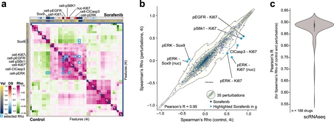
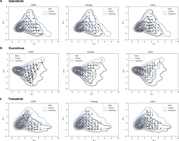
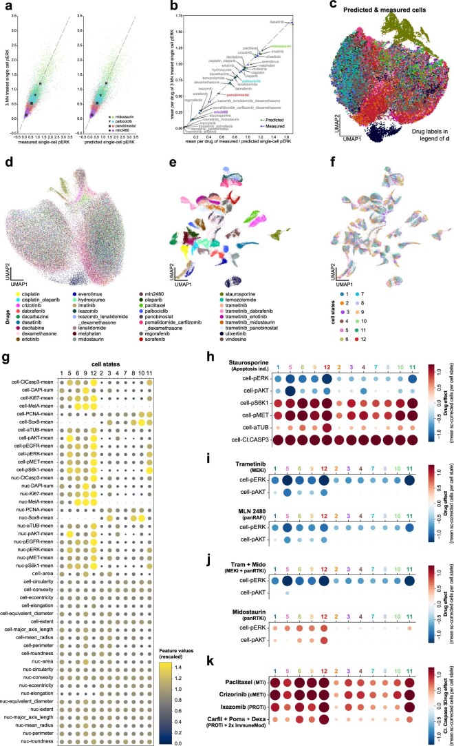
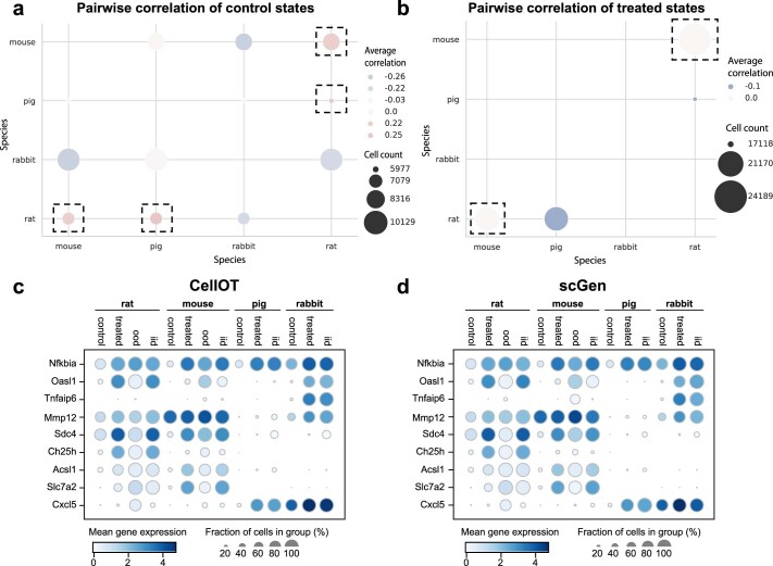
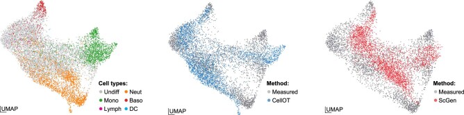
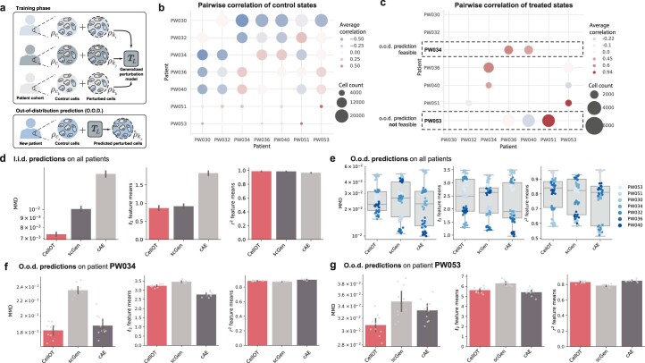
Understanding and predicting molecular responses in single cells upon chemical, genetic or mechanical perturbations is a core question in biology. Obtaining single-cell measurements typically requires the cells to be destroyed. This makes learning heterogeneous perturbation responses challenging as we only observe unpaired distributions of perturbed or non-perturbed cells. Here we leverage the theory of optimal transport and the recent advent of input convex neural architectures to present CellOT, a framework for learning the response of individual cells to a given perturbation by mapping these unpaired distributions. CellOT outperforms current methods at predicting single-cell drug responses, as profiled by scRNA-seq and a multiplexed protein-imaging technology. Further, we illustrate that CellOT generalizes well on unseen settings by (1) predicting the scRNA-seq responses of holdout patients with lupus exposed to interferon-β and patients with glioblastoma to panobinostat; (2) inferring lipopolysaccharide responses across different species; and (3) modeling the hematopoietic developmental trajectories of different subpopulations.


Conflict of interest statement

G.G. and L.P. have filed a patent on the 4i technology (patent WO2019207004A1). The other authors declare no competing interests.

Figures

Fig. 1
Fig. 1. Overview of the CellOT model.
a, Distributions of single cells were measured in either an untreated control state (ρc) or in one of several perturbed states (ρk, ρl, ρm, …). These distributions lie in a high-dimensional space of profiled features. b, For a perturbation k, we aim to model it with a function Tk that maps untreated cells in ρc to their treated counterparts in ρk. c, Lacking paired measurements, we assume that the perturbation transforms ρc into ρk under a principle of minimal effort. In particular, we learn Tk using optimal transport theory to directly estimate this distributional mapping as the gradient of the optimal transport dual potential ∇ gθ. d, OT maps are learned for all perturbations independently. Because these maps are fully parameterized, CellOT can be trained, for example, on a set of initially provided samples to then make predictions on untreated cells originating from new, previously unseen samples.
Fig. 2
Fig. 2. CellOT outperforms current state-of-the-art methods on different data modalities.
af, Marginal distribution of marker gene expression (x axis) of cells profiled by 4i (a) and scRNA (d). Observed control and treated states are shown in light and dark blue. CellOT predictions are shown in red and baseline predictions (scGen, cAE and PopAlign) are shown in gray. We compare models based on the distributional distance MMD as well as average correlation coefficient r2 between observed perturbed and predicted perturbed cells, for 4i (b) and scRNA (e) data. Error bars refer to the standard deviation over ten bootstraps of the test set and the dashed lines correspond to the median of the identity and observed performances. Joint UMAPs of observed treated cells and cells predicted by each model for 4i (c) and scRNA (f) data. Projections are computed on a joint set of cells, downsampled such that the number of observed perturbed (gray) and predicted perturbed cells (blue) are equal. An identity map compares treated cells to untreated cells. The analysis is conducted for drugs trametinib, imatinib and gavinostat. 4i data were generated using cell lines M130219 and M130429 (Online Methods).
Fig. 3
Fig. 3. CellOT facilitates the multiplexed single-cell characterization of cancer drugs.
a, CellOT training and prediction setup. The 34 CellOT models were trained, one for each drug perturbation. Subsequently, each model was used to predict perturbed cells from a common set of unseen control cells. b, UMAP projection constructed with equal numbers of predicted and measured cells from 34 perturbations. Dots correspond to cells, color-coded for measured or predicted pERK intensity. AU, arbitrary unit. c, UMAP projection of single-cell perturbation effects using predicted cells. Dots correspond to cells, color-coded for drug treatment (Extended Data Fig. 3 provides the full legend and Online Methods provides the single-cell perturbation effect calculation). d, Cell states identified in control cells (Online Methods). Each column represents a cell state. Horizontal axis, cell states sorted based on their association to the cell lines M130219 and M130429. Vertical axis, cellular features (Extended Data Fig. 3 provides the full feature set). The size and hue of the circles are scaled on the feature values. e, Clustergram of transport cost (TC) of drug treatments for each cell state (main heat map, blue-yellow color scheme), the sum of TCs (sum) of all states per drug (first column left of the heat map, purple), the coefficient of variation (CV) of TCs per drug (second column left of the heat map, green) and the dendrogram based on the hierarchical clustering the drug’s cell state TCs. Cell states are sorted as in d. f, Cell-state-specific responses to drug treatments. (i) Dasatinib (top). (ii) Trametinib + dabrafenib (bottom). Condition-focused enlargement of UMAP projection from c (top left). Same as top left but color-coded for cell-state assignment (top right). Columns represent cell state (cs) and rows show highlighted features (bottom). ‘cell-’ represents mean cell intensity. Circles are scaled based on drug effect size and the stronger the effect the larger the circles. Negative values are encoded in hues of blue and positive values in red are hues of the respective circles.
Fig. 4
Fig. 4. CellOT generalizes to unseen patients and cell subpopulations.
ak, The o.o.s. (ac) and o.o.d. (dk) setting. a, Cells from eight patients with lupus are measured in an untreated and IFN-β-treated state. For each sample, we train two models, an o.o.s. model trained on cells from all other samples and an i.i.d. model trained with additional access to half of the cells in the holdout sample (not shown). b, Marginals of predicted cells from the holdout sample in the i.i.d. (top) and o.o.s. (bottom) setting. Predictions for both models are made on the same test set (not used for training the two models). c, MMD scores between the predicted distribution and the observed treated distribution across all holdout samples in the i.i.d. and o.o.s. settings. Box plots indicate the median and quartiles. d, As an o.o.d. task, we trained CellOT and baselines to predict the response to LPS across different species and test on rat (or mouse) as a holdout species. e, Mean gene expression for i.i.d. and o.o.d. predictions for CellOT and scGEN for selected marker genes. f, Comparison of o.o.d. performance for r2 correlation feature means and MMD of CellOT and baselines. Data are depicted as the mean ± s.d. across n = 10 bootstraps of the test set. g, Marginals of the o.o.d. predictions for marker genes showing bimodal expression profiles when using rat as a holdout. h, Cells from multipotent and oligopotent subpopulations are measured after 2, 4 and 6 days. We apply CellOT to predict how cells from day 2 develop into the combined set of day 4 and 6, when trained on only multipotent cells (Tm) or oligopotent cells (To). We then apply Tm to predict the o.o.d. oligopotent cells and To to predict the o.o.d. multipotent cells. Similar to the o.o.s. setting, i.i.d. models are trained, which includes half of the holdout subpopulation. i, MMD scores between the predicted and (observed) developed distributions for all models in both o.o.d. and i.i.d. prediction tasks (jointly for day 4 and 6). Performance of CellOT, when predicting day 4 states (j) and day 6 states (k) for different cell types in each setting using Tm.
Extended Data Fig. 1
Extended Data Fig. 1. Analysis of dataset structures for the 4i and SciPlex 3 dataset.
Analysis of dataset structures for the 4i dataset (a, b) and the SciPlex 3 dataset (c). a, Spearman correlations between all feature pairs computed in 4i control cells (bottom) and Sorafenib-treated cells (top). Row colors show the mean value of each feature in control cells and column colors show the effect of the drug on each feature as computed by the difference in means between control and treatment. Correlations that changed the most under the perturbation are highlighted in blue. b, Density plot of feature correlations in the control setting vs. treated setting for all 35 4i treatments. Sorafenib values (corresponding to elements in b are scattered above and light blue points correspond to blue boxes in b. c, Feature correlation between in the control setting vs. treated setting for all cancer drugs of the SciPlex 3 dataset. Source data
Extended Data Fig. 2
Extended Data Fig. 2. Visualization of the learned vector field.
The perturbation response on the single-cell level is described for a, Dabrafenib, b, Everolimus and c, Trametinib of the 4i dataset for CellOT, the average effect and scGen on the first two principal components. Cellular responses are computed as the predicted treated state minus the observed control state for each individual cell. Arrow tails are placed in a grid within PC space and arrowheads correspond to the average response of cells within each neighborhood, projected into PC space. Source data
Extended Data Fig. 3
Extended Data Fig. 3. Extended analysis of CellOT-predicted responses to 34 cancer treatments.
a, High similarity of measured and CellOT-predicted single-cell pERK (phosphor ERK1/2) values at the single-cell level. Scatter plots compare the relationship between measured pERK values of cells (left) treated with Midostaurin (green dots), Palbociclib (blue dots), Panobinostat (red dots) and MLN2480 (purple dots) or (right) predicted for those drugs along the horizontal axis to their corresponding 3NN cells on the vertical axis. For details on the generation of 3NN data, see Online Methods. X mark, square, inverted triangle and circle represent the mean of the respective measurements per drug. The dashed gray line indicates the diagonal along which the measurements would correlate perfectly. b, The high similarity of measured and CellOT-predicted single-cell pERK (phosphor ERK1/2) values at the population level across all drug perturbations. Drug average of measured (blue dots) and predicted (green dots) pERK values compared to their respective 3NN measurement (see Online Methods). Drug treatments highlighted in color correspond the those presented in panel a. The dashed gray line indicates the diagonal along which the measurements would correlate perfectly. c, Projection of measured perturbed and predicted perturbed cells in a shared UMAP space. Each cell is color-coded according to the perturbation from which it originates. d, Projection of mean-corrected measured perturbed cells in a UMAP space. Each cell is color-coded according to the perturbation from which it originates. Mean correction was achieved by subtracting calculating the mean of every feature for all cells in the control condition and subtracting the calculated feature means from the feature values of individual cells. e, Projection of single-cell corrected, predicted perturbed cells in a UMAP space. Each cell is color-coded according to the perturbation model with which it was predicted. See Online Methods for details on the single-cell correction. f, Projection of single-cell corrected, predicted perturbed cells in a UMAP space. Each cell is color-coded according to its assignment to one of the 12 cell states. See Online Methods for details on cell state assignment. g, Feature value overview of the 12 identified cell states in DMSO-treated (Control) cells. Each column represents a cell state and each row a feature. Circles are colored and scaled based on feature value, from small size in blue for low feature values, to large circles in yellow for high feature values. h-j, Drug effect overview of the 12 identified cell states in h, Staurosporine (apoptosis ind.m apoptosis inducer, i, Trametinib (MEKi, MEK inhibitor), MLN2480 (panRAFi, panRAF inhibitor), j, Trametinib + Midostaurin (Tram + Mido, MEK inhibitor + pan Receptor Tyrosine Kinase inhibitor (panRTK)), Midostaurin (panRTK). Each column represents a cell state and rows represent features. ‘cell-’ stands for mean cell intensity. Circles are scaled based on drug effect, the larger the ± effect the larger the circles. Negative values are encoded in hues of blue and positive values in red hues of the respective circles. k, Effect of drug treatments on levels of cleaved Caspase 3 (cleaved Caspase 3) in the 12 identified cell states. Each column represents a cell state, each row a drug treatment. Circles are scaled based on drug effect, the larger the ± effect the larger the circles. Negative values are encoded in hues of blue, positive values in red hues of the respective circles. Source data
Extended Data Fig. 4
Extended Data Fig. 4. Extended analysis of the cross species dataset.
a, Pairwise average correlation of the PCA embeddings of the control states between species. b, Pairwise average correlation of the PCA embeddings of the treated states between patients, masked to only those patient pairs that showed a positive correlation in the control states. Only rat and mouse show consistent responses, that is, a positive correlation of the control states and non-negative correlation of the respective target cells and are thus chosen for the o.o.d. analysis. I.i.d. and o.o.d. results measured in the average gene expression for both c, CellOT and d, scGen. Source data
Extended Data Fig. 5
Extended Data Fig. 5. Integration of predicted and observed perturbed state in the statefate dataset.
Joint UMAP projections are computed for observed, CellOT and scGen predictions. In each axis, projections are colored by cell type (left), CellOT predictions (middle) and scGen predictions (right). For both our method, CellOT and the baseline scGen, the UMAP highlights the observed and predicted perturbed cell states. Source data
Extended Data Fig. 6
Extended Data Fig. 6. Analysis and results of the glioblastoma dataset consisting of seven patients.
a, Cells from seven glioblastoma patients are measured in an untreated and Panobinostat-treated state. For each sample, we train two models, an o.o.d. model trained on cells from all other samples but the holdout patient we test on and an i.i.d. model trained with additional access to half of the cells in the holdout sample. b, Pairwise average correlation of the PCA embeddings of the control states between patients. c, Pairwise average correlation of the PCA embeddings of the treated states between patients, masked to only those patient pairs that showed a positive correlation in the control states. Only patient PW034 positively correlates with all other patients. Other patients, such as PW053, correlate and anti-correlate with other patients in the treated state. Performance comparison between CellOT and baselines for different metrics in the d, i.i.d. setting (mean standard deviation across 7 samples, 10 bootstraps of the test set per sample), e, o.o.d. setting for all patients (box plots show median, minima and maxima), f, o.o.d. setting for a patient positively correlating with all patients that are also similar in the control state, g, o.o.d. setting for a patient where similar patients in the control state show different responses (correlation and anti-correlation) in the treated states. Data in f and g are presented as the mean +/- standard deviation across n=10 bootstraps of the test set.

References

    1. Frangieh CJ, et al. Multimodal pooled Perturb-CITE-seq screens in patient models define mechanisms of cancer immune evasion. Nat. Genet. 2021;53:332–341. doi: 10.1038/s41588-021-00779-1. - DOI - PMC - PubMed
    1. Liberali P, Snijder B, Pelkmans L. A hierarchical map of regulatory genetic interactions in membrane trafficking. Cell. 2014;157:1473–1487. doi: 10.1016/j.cell.2014.04.029. - DOI - PubMed
    1. Battich N, Stoeger T, Pelkmans L. Image-based transcriptomics in thousands of single human cells at single-molecule resolution. Nat. Methods. 2013;10:1127–1133. doi: 10.1038/nmeth.2657. - DOI - PubMed
    1. Battich N, Stoeger T, Pelkmans L. Control of transcript variability in single mammalian cells. Cell. 2015;163:1596–1610. doi: 10.1016/j.cell.2015.11.018. - DOI - PubMed
    1. Gut G, Herrmann MD, Pelkmans L. Multiplexed protein maps link subcellular organization to cellular states. Science. 2018;361:eaar7042. doi: 10.1126/science.aar7042. - DOI - PubMed

MeSH terms