. 2023 Dec;24(12):2150-2163.
doi: 10.1038/s41590-023-01654-3. Epub 2023 Oct 23.

Global and cell type-specific immunological hallmarks of severe dengue progression identified via a systems immunology approach

Affiliations

Global and cell type-specific immunological hallmarks of severe dengue progression identified via a systems immunology approach

Luca Ghita et al. Nat Immunol. 2023 Dec.

Abstract

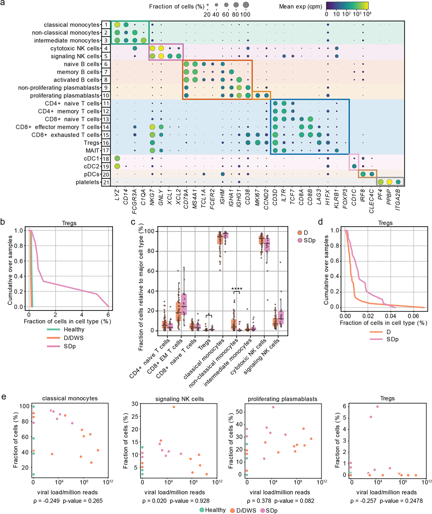
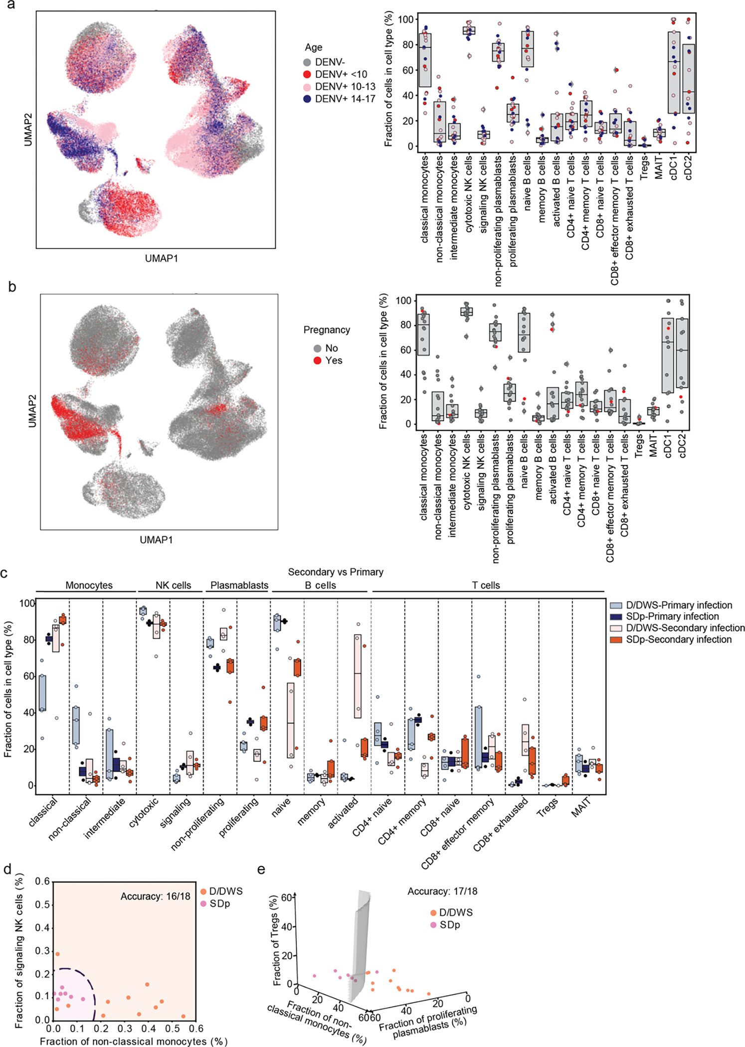
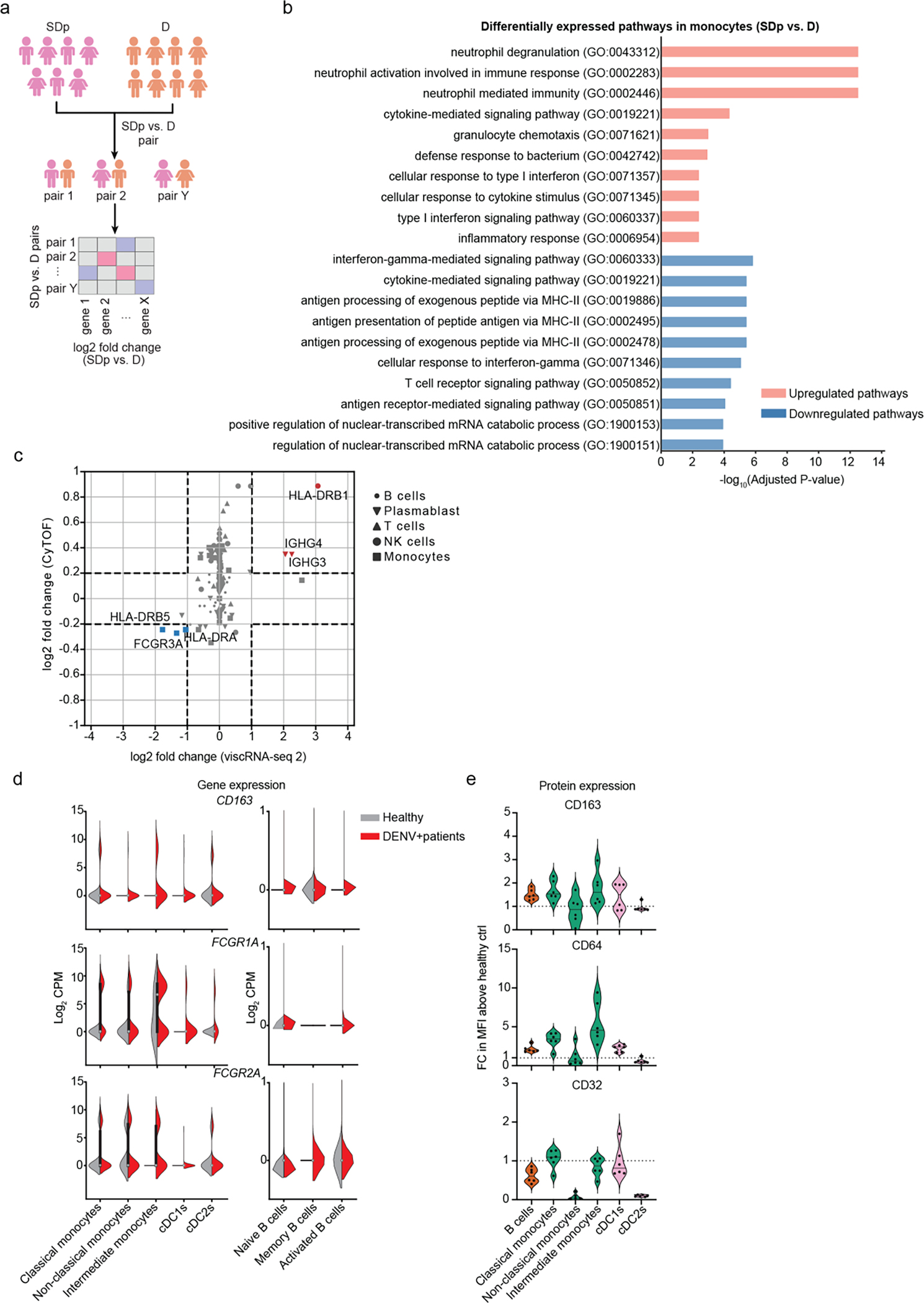
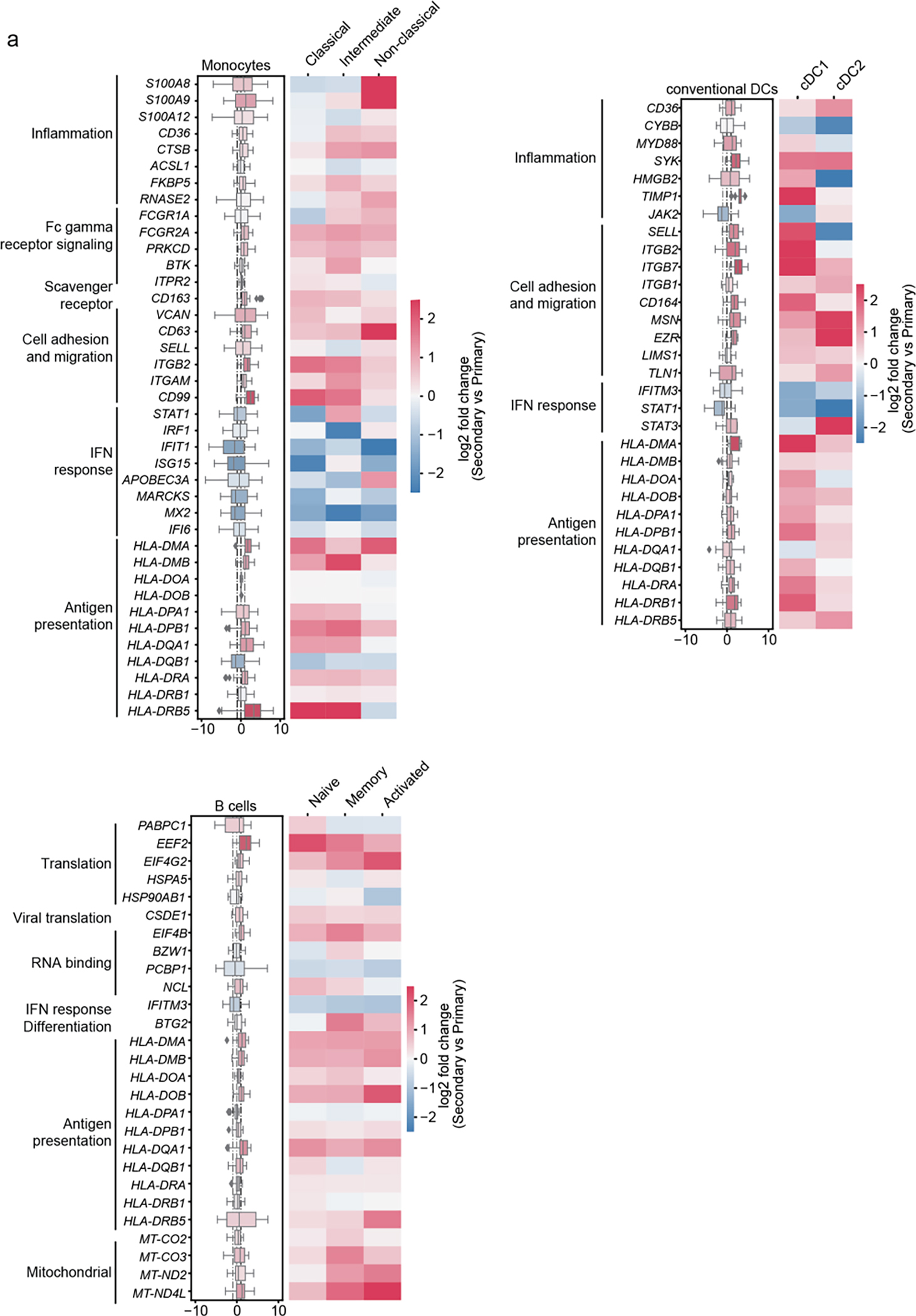
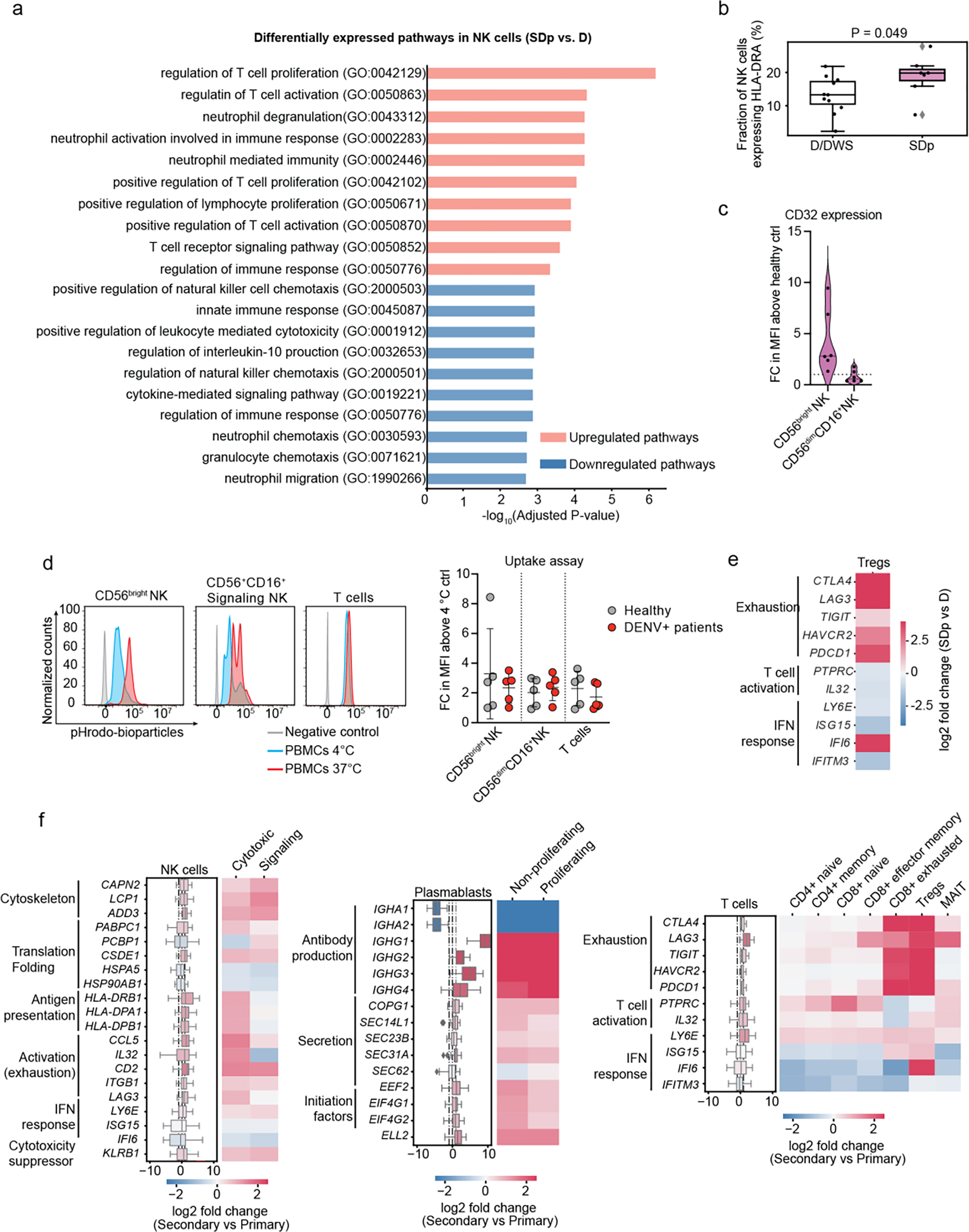
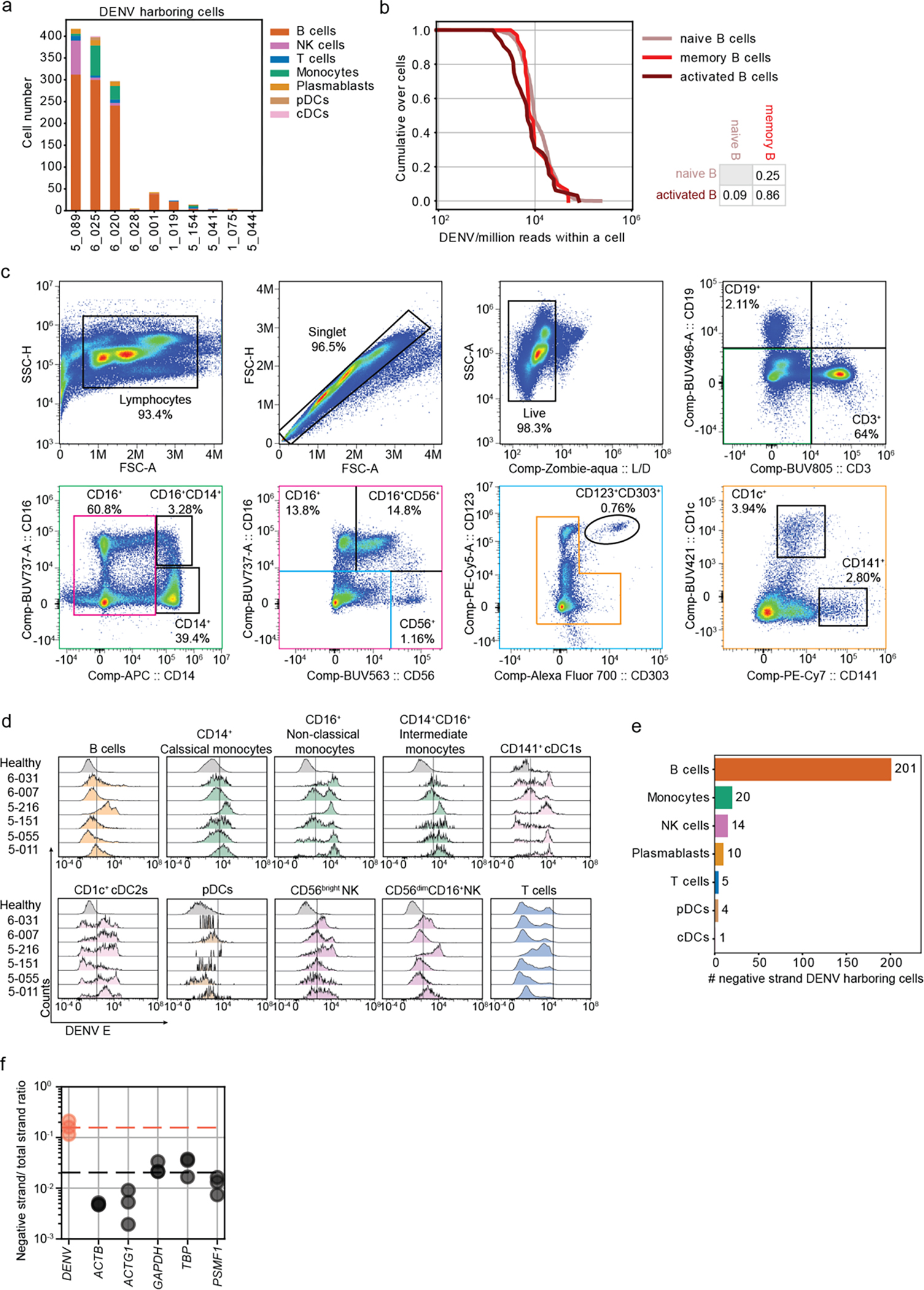
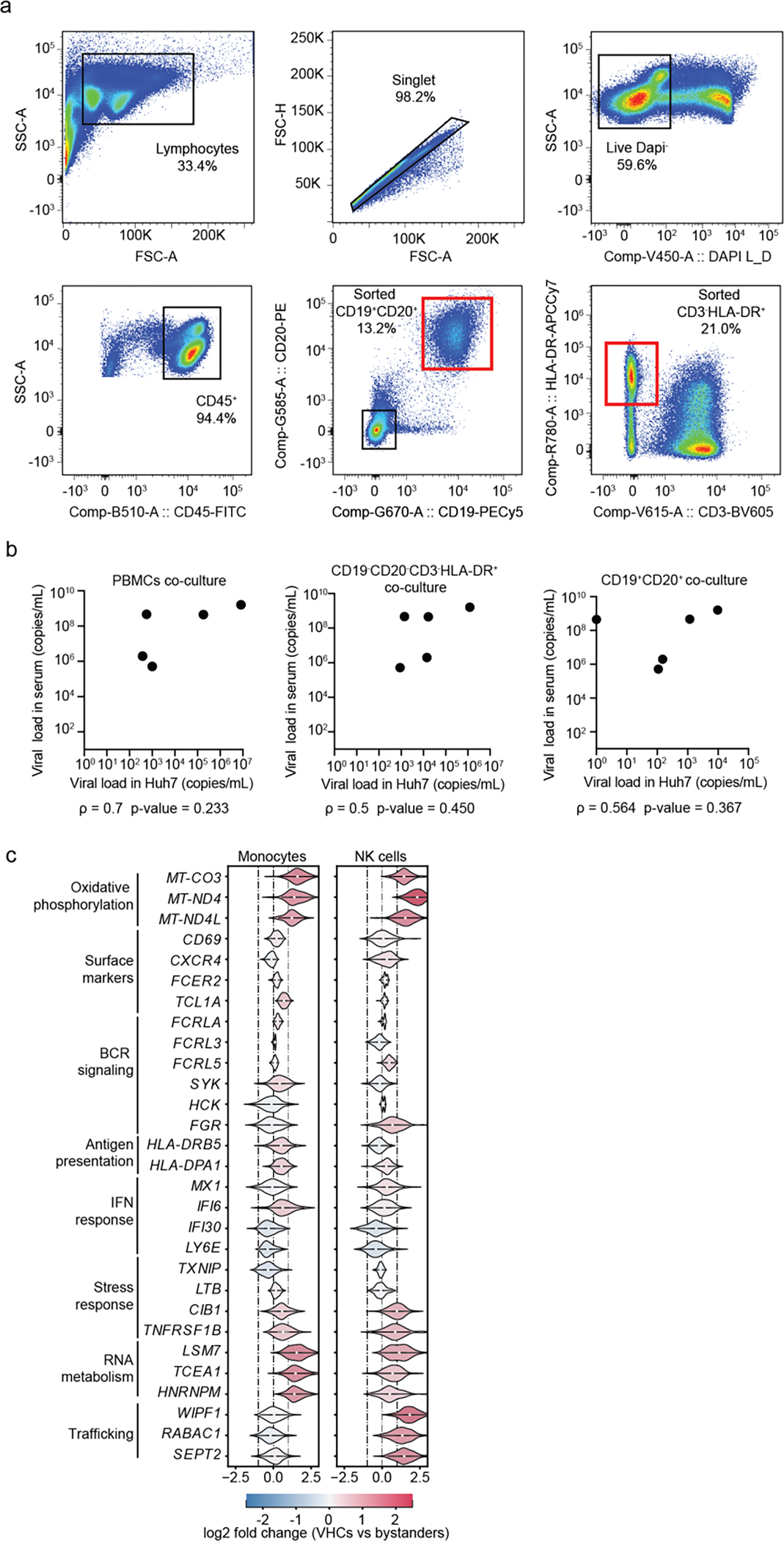
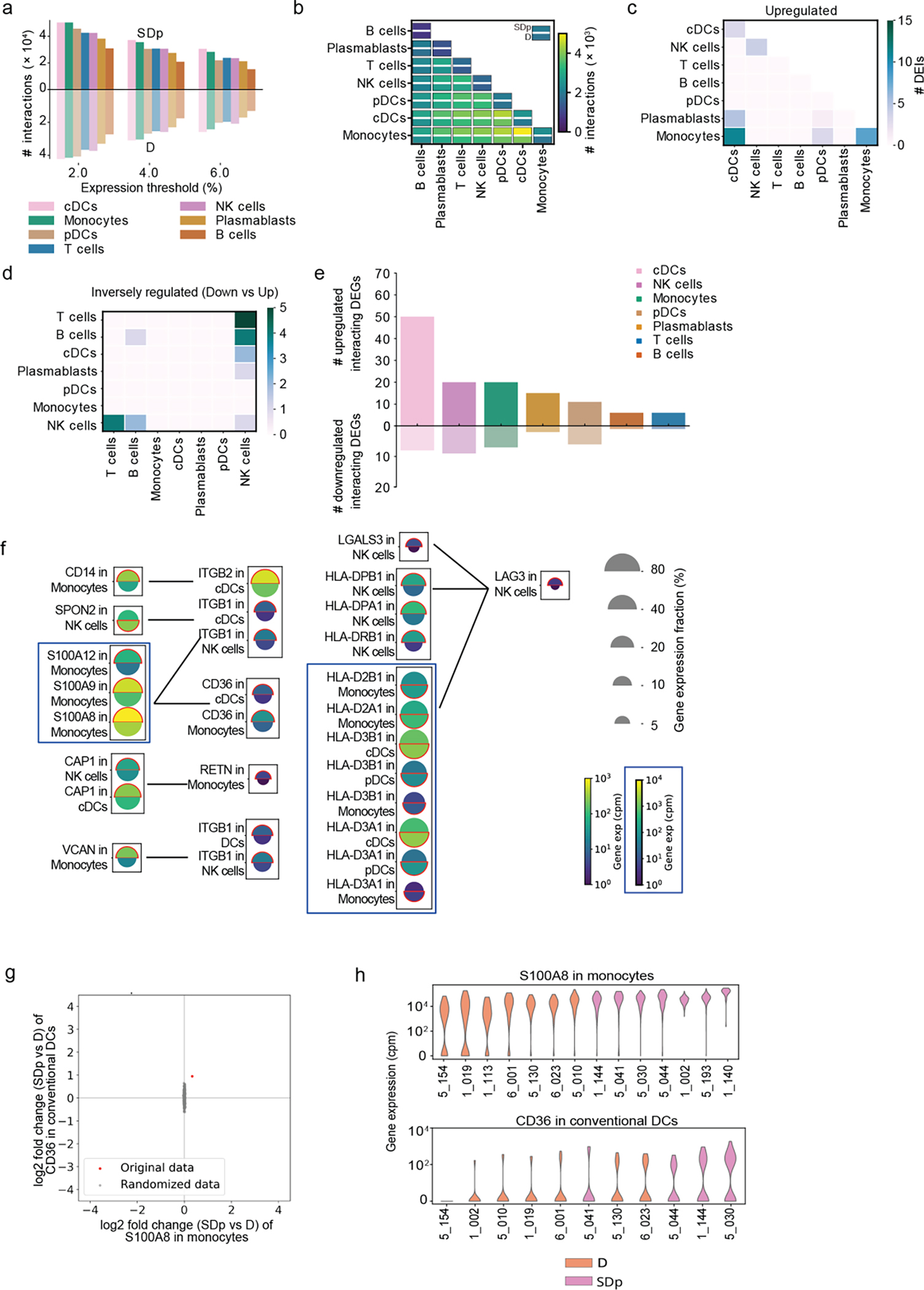
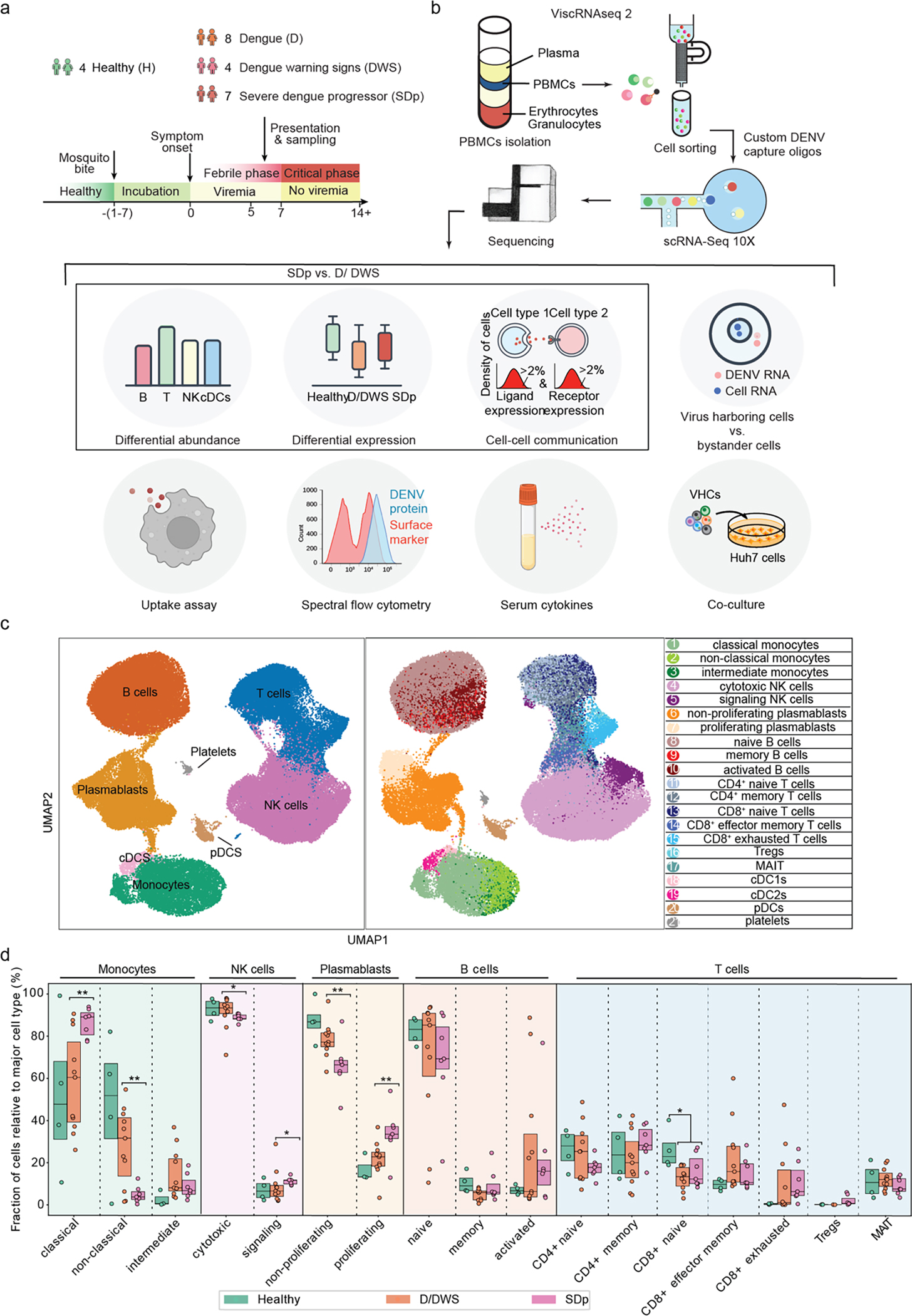
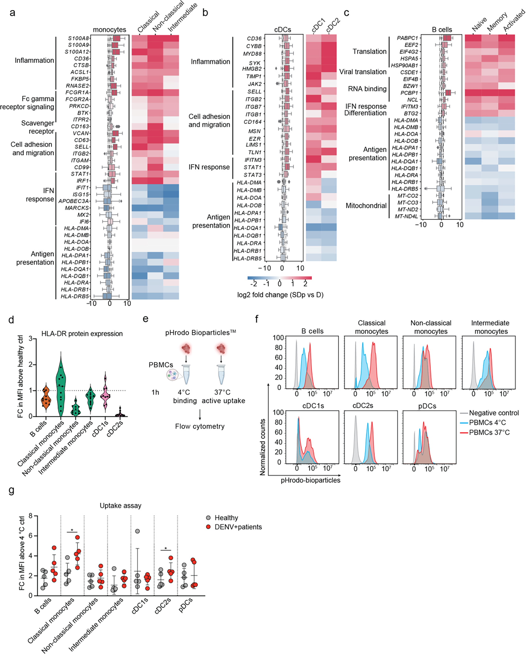
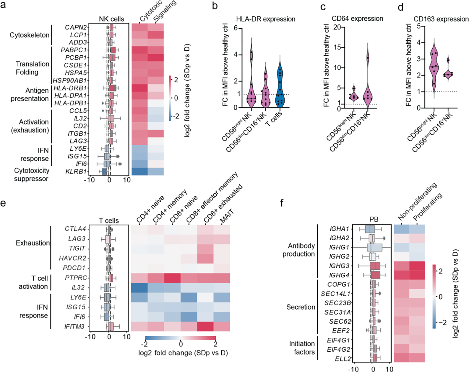
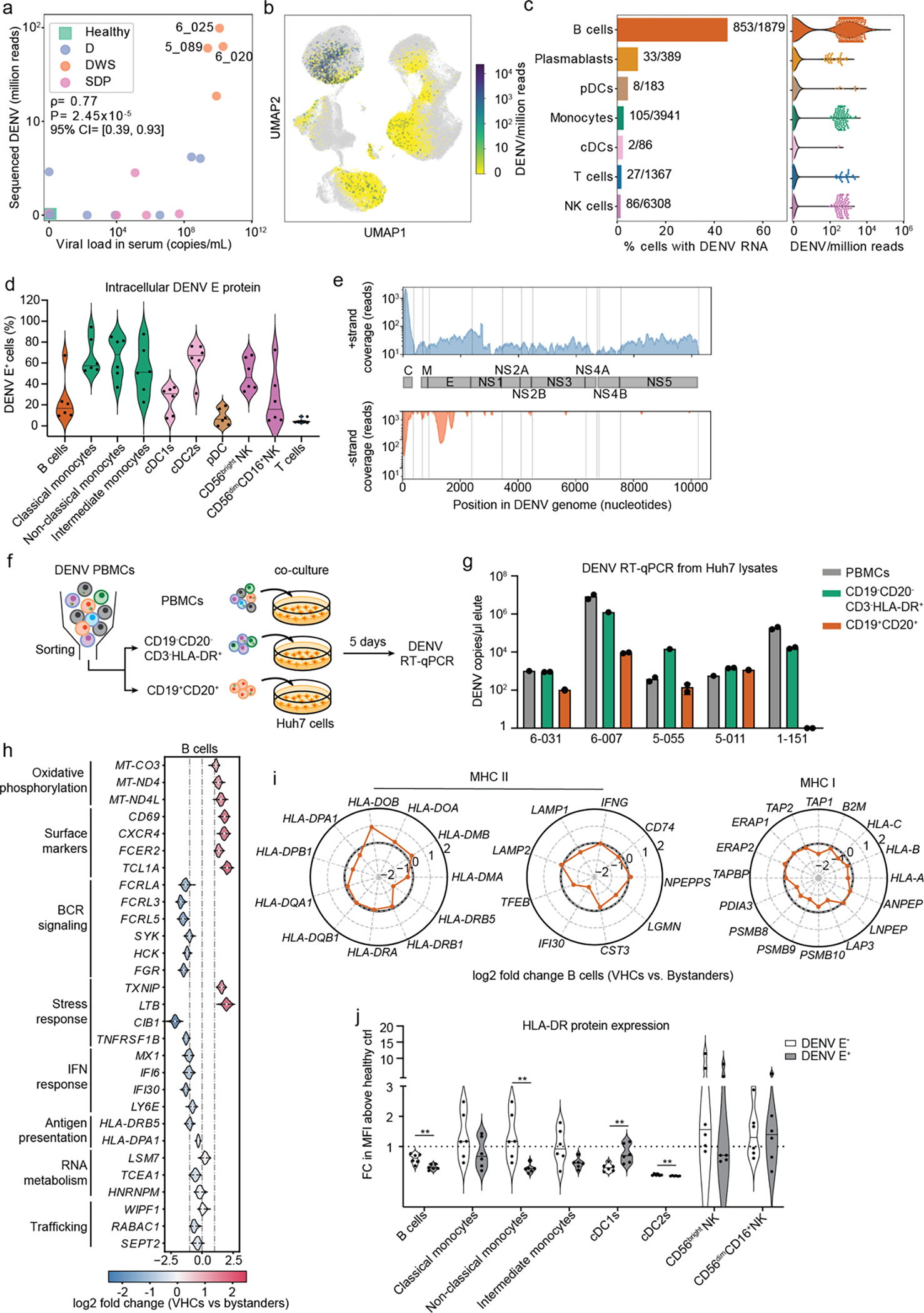
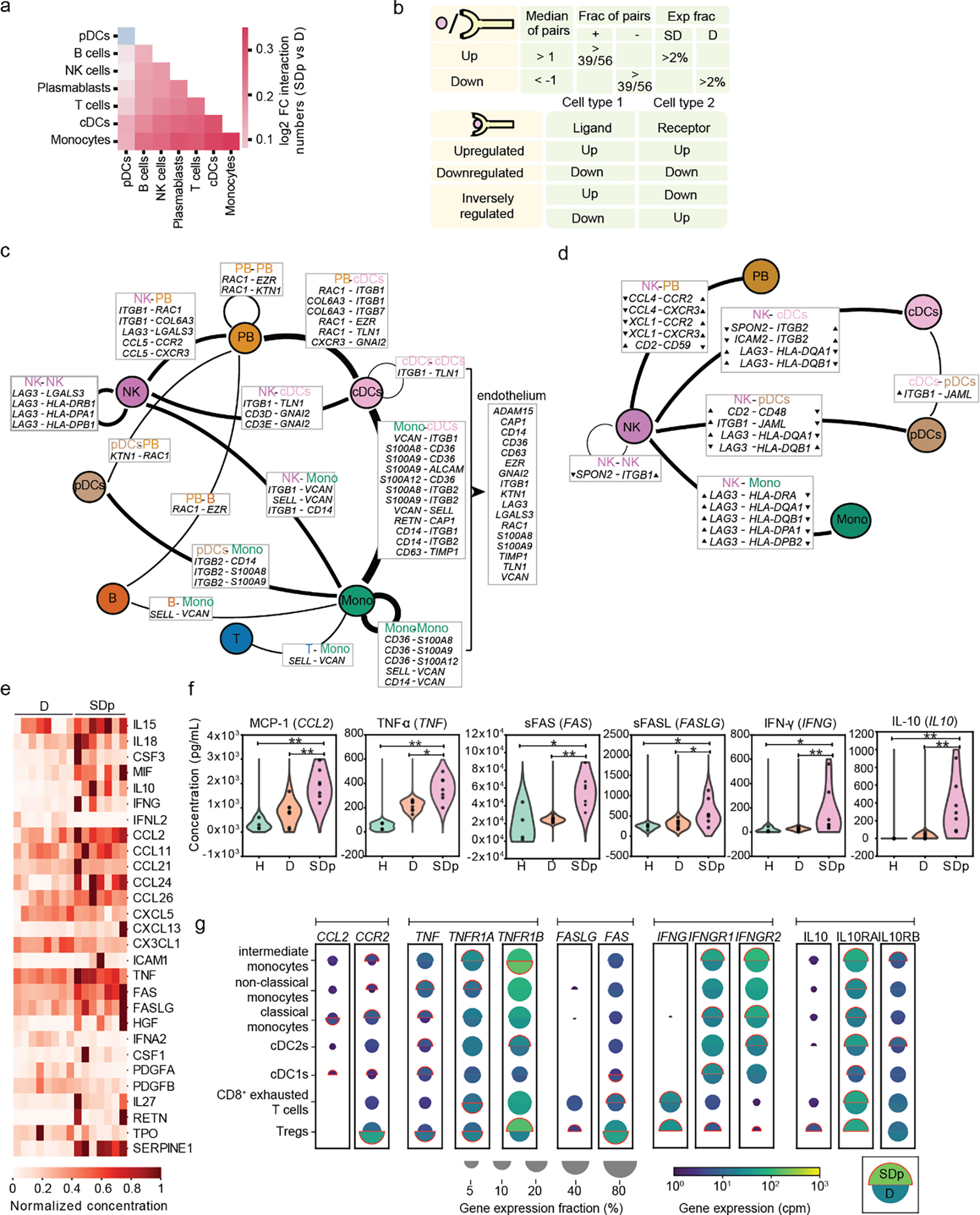
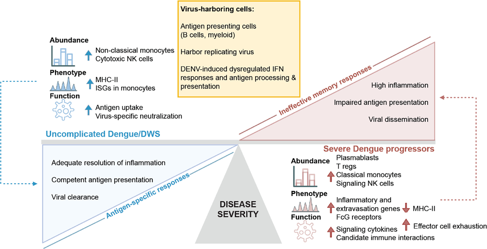
Severe dengue (SD) is a major cause of morbidity and mortality. To define dengue virus (DENV) target cells and immunological hallmarks of SD progression in children's blood, we integrated two single-cell approaches capturing cellular and viral elements: virus-inclusive single-cell RNA sequencing (viscRNA-Seq 2) and targeted proteomics with secretome analysis and functional assays. Beyond myeloid cells, in natural infection, B cells harbor replicating DENV capable of infecting permissive cells. Alterations in cell type abundance, gene and protein expression and secretion as well as cell-cell communications point towards increased immune cell migration and inflammation in SD progressors. Concurrently, antigen-presenting cells from SD progressors demonstrate intact uptake yet impaired interferon response and antigen processing and presentation signatures, which are partly modulated by DENV. Increased activation, regulation and exhaustion of effector responses and expansion of HLA-DR-expressing adaptive-like NK cells also characterize SD progressors. These findings reveal DENV target cells in human blood and provide insight into SD pathogenesis beyond antibody-mediated enhancement.


Figures

Fig.1:
Fig.1:. Differences in cell subtype abundance in the viscRNA-seq 2 and CyTOF datasets are comparable and do not correlate with serum viral load.
a, Dot plot depicting examples of marker genes used to annotate the indicated 21 immune cell subpopulations in the viscRNAseq 2 dataset (Fig.1). Dot size indicates the fraction of cells expressing the marker gene; color indicates expression level of the marker gene in cpm; and identification numbers of distinct cell populations refer to the UMAP in Fig.1a. b, Cumulative distribution of Treg fractions within T cells from all patients across disease severity in the viscRNAseq 2 dataset. c, Box plots showing the fractions of cell subtypes within T cells, monocytes, and NK cell populations in 21 SDp and 47 D patients computed from the (publicly available) CyTOF dataset of samples obtained from the same Colombia dengue cohort. Notably, in this reanalysis, samples from patients who presented with SD upon enrollment were excluded from the dataset, leaving only those from SD patients who progressed to SD within several days following enrollment. *p-value<0.05, ****p-value<0.0001 by Mann-Whitney-Wilcoxon test two-sided with Bonferroni correction. Each dot represents an individual patient, color-coded by disease severity. Horizontal lines signify the first, second (median) and third quartiles. d, Cumulative distribution of Treg fractions within T cells from all patients across disease severity measured via CyTOF. e, Scatter plots showing correlations between fractions of classical monocytes, signaling NK cells, proliferating plasmablasts, and Tregs and serum viral load measured by RT-qPCR. Each dot represents a single patient colored by disease severity (H= green; D/DWS= orange; SDp= pink). Spearman correlation coefficients and p-values are shown below each panel.
Fig.2:
Fig.2:. Alterations in cell type abundance are independent of age and pregnancy status and are partially associated with prior DENV exposure.
a, UMAP of the entire dataset (left panel) and box plots showing the fractions (%) of cell subtypes within each major immune cell type (right panel) color-coded by patients’ age (in years): <10 =red; 10–14 =pink; 14–17 =blue years old. Box plots’ horizontal lines indicate the first, second (median) and third quartiles, each dot Each dot represents an individual. b, UMAP (left panel) and box plots (right panel) showing distribution and fraction of cells (%) color-coded by pregnancy status, pregnant= red, non-pregnant= gray. c, Box plots showing the fractions (%) of cell subtypes within each major immune cell type by disease severity (SDp and D/DWS) and DENV exposure (primary and secondary). Each dot represents an individual, color-coded by disease severity and DENV exposure (D/DWS-primary =light blue; SDp-primary= dark blue; D/DWS-secondary= light orange; SDp-secondary= dark orange). Box plots’ horizontal lines indicate the first, second (median) and third quartiles. d,e Two (c)- and three (d) dimensional Support Vector Machine (SVM) classifiers for SDp versus D/DWS using the fraction of cells indicated on the axes. Accuracy is evaluated using leave-one-out cross-validation. For this prediction, we trained a support vector machine (SVM) regression model with a third-degree polynomial kernel using the class NuSVC in scikit-learn. We chose SVMs partly because they have a straightforward geometrical interpretation as one can directly plot the hypersurface with the nullcline of the decision function (black dashed curve in d and gray surface in e).
Fig.3:
Fig.3:. APCs from SDp show signatures of increased activation but decreased antigen presentation.
a, Schematic illustrating the pairwise comparison strategy used to identify DEGs between SDp and D patients. Pairs were generated considering only patients that showed n≥5 cells in a cell type or n≥3 in a cell subtype. For each gene, we calculated the geometric mean expression in various cell subtypes for each patient in the pair and the log2 fold change in expression between the two patients in the pair. A median log2 fold change was then obtained for each gene by analyzing all pair combinations. DEGs were defined as those with a median log2 fold change greater than 1 or smaller than −1. b, Pathway analysis showing top 10 upregulated and downregulated gene ontology (GO) terms between SDp and D in monocytes. DEGs for downstream pathway analysis were identified by a 2-sample Kolmogorov-Smirnov test using anndataks 0.1.3. Genes with >1 log2 fold change between the two groups and a p-value <=0.05 (after FDR correction for multiple hypotheses). Metascape58 and GSEAPY59 open source software. were used for pathway analysis of groups of up- or downregulated genes. c, Scatter plots depicting log2 fold change in expression between SDp and D measured at the transcript level via viscRNAseq 2 (x axis) and at the protein level via CyTOF (y axis). Dashed lines depict the log2 fold change cutoffs (|log2 fold change| <1 in the viscRNA-seq dataset; |log2 fold change| < 0.2 in the CyTOF dataset). Shapes represent specific cell types. Each symbol represents a single cellular factor color coded based on the expression pattern (red – upregulated in both datasets; blue – downregulated in both datasets; gray – unaltered in the two datasets). Notably, in this reanalysis of the CyTOF dataset, samples from patients who presented with SD upon enrollment were excluded. d, Violin plots showing expression (Log2 CPM) of CD163, FCGR1A and FCGR2A in monocytes, cDCs and B cell subtypes in healthy (gray) and DENV+ patients including SD and D (red). e, Violin plots showing expression of CD163, CD64 and CD32 proteins on B cells (CD19+), classical monocytes (CD14+CD16), non-classical monocytes (CD14CD16+), intermediate monocytes (CD14+CD16+), cDC1s (CD141+) and cDC2s (CD1c+) measured via spectral flow cytometry in DWS patient-derived PBMCs. Data are shown as fold change (FC) of mean fluorescence intensity (MFI) above healthy control (n=6, N=2). Dotted line represents mean value of healthy controls normalized at value 1, horizontal line in each violin plot represents median value.
Fig.4
Fig.4. DEGS between SDp and D in APCs are only partially associated with prior DENV exposure.
a, Differentially expressed genes (DEGs) between D and SDp (Fig. 2a-c) were analyzed based on DENV exposure (Secondary vs. Primary) in monocyte, cDC, and B cell populations (Box plots, left) and the corresponding distinct cell subtypes (heatmaps, right). Data are color-coded based on the median log2 fold change of pairwise comparisons. Box plots’ horizontal lines indicate the first, second (median) and third quartiles
Fig.5:
Fig.5:. NK cells in SDp show activation and adaptive-like signatures that may be linked to a prior DENV exposure.
a, Pathway analysis showing top 10 upregulated and downregulated gene ontology (GO) terms between SDp and D in NK cells (see supplementary figure 3b for technical details). b, Fraction of NK cells expressing HLA-DRA gene out of the total NK cell population in D/DWS and SDp. c, Violin plots showing CD32 protein expression in CD56bright NK cells and CD56dimCD16+ NK cells measured via spectral flow cytometry in patient-derived PBMCs. Data are shown as fold change (FC) of mean fluorescence intensity (MFI) above healthy control (n=6, N=2). Dotted line represents mean value of healthy controls normalized to 1; horizontal line in each violin plot represents median value. d, Histograms showing the percentage of pHrodo Bioparticles positive cells in distinct cell subtypes derived from healthy (gray) and DENV-infected patients measured at 4 °C (cyan) or 37 °C (red). Dot plot showing bioparticle uptake quantification as FC of mean MFI above 4 °C control. Each dot represents an individual color-coded by disease status: healthy (gray) and DENV-infected (red) (n=5, N>2). e, DEGs between D and SDp detected in regulatory T cells (Tregs). Data are aggregated from all patients and color-coded based on log2 fold change. f, Differentially expressed genes (DEGs) between D and SDp (Fig. 3a–c) were analyzed based on DENV exposure (Secondary vs. Primary) for NK cell, plasmablast and T cell populations (Box plots, left) and the corresponding distinct cell subtypes (heatmaps, right). Data are color-coded based on median log2 fold change of pairwise comparisons. Box plots’ horizontal lines indicate the first, second (median) and third quartiles.
Fig.6:
Fig.6:. B cells from DENV-infected patients harbor replicating virus.
a, Stack bar plots showing the absolute numbers and distribution of VHCs across cell types in each of the 10 patients with detectable vRNA. b, Cumulative distributions of DENV reads/million reads per cell in B cell subtypes. p-values from KS test after Bonferroni correction between distinct B cell subtypes are indicated. c, Flow cytometry gating strategy used to define B cells (CD19+), T cells (CD3+), classical monocytes (CD14+CD16), non-classical monocytes (CD14CD16+), intermediate monocytes (CD14+CD16+), CD56bright NK cells, CD56dimCD16+ NK cells, pDCs (CD123+CD303+), cDC1s (CD141+) and cDC2s (CD1c+). d, Distributions of intracellular expression of DENV envelope (E) protein in B cells (CD19+), classical monocytes (CD14+CD16), non-classical monocytes (CD14CD16+), intermediate monocytes (CD14+CD16+), cDC1s (CD141+), cDC2s (CD1c+), pDCs (CD123+CD303+), CD56bright NK cells, CD56dimCD16+ NK cells, and T cells from the indicated DENV-infected patients with viremia ranging from 105 to 109 viral copies/mL (N=2,n=6 combined data) and healthy controls (N=2, n=6 combined data) measured via spectral flow cytometry. e, Number of negative strand RNA-harboring cells (VHCs) over total number of VHCs across immune cell types in three DWS patients with highest vRNA reads shown in Fig.4a. f, Dot plot showing the average ratio of negative strand over total strand of housekeeping genes (gray) and DENV RNA (orange) reads within the 20 single cells with the largest DENV read counts in 3 DWS patients with highest vRNA reads shown in Fig.4a.
Fig.7:
Fig.7:. Gating strategy and DEGs in VHCs vs. bystander cells.
a, FACS gating strategy used to sort populations of B cells (CD19+, CD20+) and CD19CD20 CD3HLA-DR+ cells for co-culture experiments. b, Scatter plots showing correlations between viral load in serum and viral load in Huh7 cell lysates (DENV copies /mL) following 5-day co-culture either with PBMCs or with CD19CD20 CD3HLA-DR+ and B cell (CD19+, CD20+) fractions from the same patients. Spearman correlation coefficients and p-values are shown below each panel. c, Violin plots showing log2 fold change of DEGs between VHCs and corresponding bystander monocytes and NK cells in 3 DWS patients with highest vRNA reads shown in Fig.4a. DEGs were identified by the median log2 fold change of 100 bootstrapped comparisons between VHCs and equal numbers of subsampled bystander cells. Note large noise driven by the small number of viral reads in these cell subtypes.
Fig.8:
Fig.8:. Cell-cell communications are altered in SDp.
a, Bar plot showing the number of candidate interactions in each cell type in SDp (top) and D (bottom) based on different expression thresholds (2%, 4%, and 6%). b, Heatmap showing the number of candidate interactions between the indicated cell types in SDp (top rectangle) and D (bottom rectangle). c, d, Heatmaps showing the number of upregulated and inversely regulated DEIs shown in fig. 6c and 6d, respectively, across cell types. e, Bar plot showing the number of up- and down-regulated interacting DEGs across cell types in SDp vs. D. f, Split dot plots showing gene expression in representative DEIs. Top half of each spilt dot plot depicts the expression level in SDp; bottom half depicts the expression level in D; spilt dot plot size depicts the percentage of gene expressing cells in the cell types indicated; and color depicts gene expression level in counts per million (cpm). Red outline indicates the condition with the higher gene expression. g, Example of label randomization for the S100A8-CD36 interaction. The red dot indicates the log2 fold change of the expression of either gene in the corresponding cell type in SDp vs D. The 1000 gray dots indicate the log2 fold changes after randomly picking SDp and D cells following cell shuffling. The p-value was calculated as the fraction of randomizations for which the distance from the origin was larger than in the real data. h, Violin plots depicting ligand-receptor expression (S100A8-CD36 interaction) in each patient.
Fig.1:
Fig.1:. viscRNA-Seq 2 analysis of human-derived PBMCs defines 21 immune cell subtypes and alterations in their abundance accompanying SD progression.
a-b, Schematic of the study design. a, PBMC and serum samples were collected from children enrolled in the Colombia dengue cohort upon presentation to the clinic (D, DWS, SD) and from healthy children (H). b, Schematic of the experimental and computational components of viscRNA-Seq 2 and outline of the performed functional and validation assays on patient-derived PBMCs. c, UMAP embedding of the viscRNA-Seq 2 dataset indicating broad cell types (left) and subtypes (right). d, Box plots showing the fractions (%) of cell subtypes within each major immune cell type. The Box horizontal lines indicate the first, second (median) and third quartiles. Each dot represents a participant, color-coded by disease severity: H (green, n = 4); D/DWS (orange, n = 8/3); SDp (pink, n = 7). p values by two-tailed KS test are shown.
Fig.2:
Fig.2:. Immunological determinants of SD progression in patient-derived antigen presenting cells (APCs).
a-c, Differentially expressed genes (DEGs) between D and SDp detected via pairwise comparison of patients’ average (see Methods) in monocyte (a), cDC (b) and B cell (c) populations (Box plots, left) and the corresponding distinct cell subtypes (heatmaps, right). Data are color-coded based on median log2 fold change of pairwise comparisons. Box plots’ horizontal lines indicate the first, second (median) and third quartiles. Whiskers extend to ±1.5 × IQR. n = 15 participants: D (n = 8); SDp (n = 7). d, Violin plot showing HLA-DR cell surface expression measured via spectral flow cytometry in patient-derived PBMCs expressed as fold change (FC) of mean fluorescence intensity (MFI) above healthy control. Dotted line represents mean value of healthy controls normalized at value 1. Horizontal lines in violin plots represent median. n =11 paticipants from 2 independent experiments. e, Schematic of the uptake experiments shown in panels f and g. Patient-derived PBMCs were incubated for 1 hour either at 4 °C or 37 °C with pHrodo Bioparticles followed by fluorescence measurement via spectral flow cytometry. f, Representative histograms showing the percentage of pHrodo Bioparticles positive cells in distinct cell subtypes derived from a healthy individual incubated with no bioparticles (grey) or with bioparticles at 4 °C (cyan) or 37 °C (red). g, Bioparticle uptake quantification in the indicated cell subtypes shown as FC of mean MFI above the corresponding 4 °C control. Each dot represents a participant, color-coded by disease severity: H (gray, n = 5); DENV-infected (red, n = 5), from two independent experiments. Error bars represent mean values ± SD. p values by two-tailed Mann-Whitney test are shown.
Fig.3:
Fig.3:. Phenotypic alterations in effector cells associated with SD progression.
a, e, f, DEGs between D and SDp detected via pairwise comparison of patients average in NK cell (a) T cell (e) and plasmablast (f) populations (Box plots, left) and distinct corresponding cell subtypes (heatmaps, right). Data are color-coded based on median log2 fold change of pairwise comparisons. Box plots’ horizontal lines indicate the first, second (median) and third quartiles. Whiskers extend to ±1.5 × IQR. The heatmap for Tregs (e, starred) was computed using group averages instead of patient averages due to their low abundance. n = 15 participants: D (n = 8); SDp (n = 7). b-d, Violin plots showing cell surface expression of HLA-DR (b) CD64 (c) and CD163 (d) measured in patient-derived NK (b-d) and T cells (b) via spectral flow cytometry expressed as fold change (FC) of mean fluorescence intensity (MFI) above healthy control. Each dot represents a participant [n = 11 (b); n = 6 (c, d)] from two independent experiments. Dotted lines represent mean values of healthy controls normalized at value 1; horizontal lines in violin plots represent median. These measurements were conducted side-by-side with those shown in Fig. 2d.
Fig.4:
Fig.4:. DENV actively replicates in patient-derived B cells and alters their transcriptional profile.
a, Scatter plot of normalized DENV reads measured in PBMCs by viscRNA-Seq 2 vs. serum viral load measured by RT-qPCR (two-tailed Spearman correlation coefficient ρ=0.76, p value=1.86e-5; 95% confidence interval were computed using bootstrapping strategy). Each dot represents a participant, color-coded by disease severity: H - green; D - blue; DWS - orange; SDp - pink. Sample IDs are shown for the three DWS patients with highest DENV read counts. b, UMAP color-coded by DENV reads per million reads (cpm) of the three patients labeled in a. c, Fraction of VHCs from the total (bar plot, left panel) and distribution of DENV read per million reads (violin plots, right panel) in the indicated immune cell types from the three patients labeled in a. d, Violin plot depicting the percentage of DENV E positive cells in B cells (CD19+), classical monocytes (CD14+CD16), non-classical monocytes (CD14CD16+), intermediate monocytes (CD14+CD16+), cDC1s (CD141+), cDC2s (CD1c+), pDCs (CD123+CD303+), CD56bright NK cells, CD56dimCD16+ NK cells, and T cells from the indicated DENV-infected DWS patients with viremia ranging from 105 to 109 viral copies/mL measured via spectral flow cytometry. e, Coverage of detected positive (+ strand) and negative (− strand) vRNA strands along the DENV genome. f, Schematic of the co-culture experiments shown in g. g, Bar plot showing DENV RNA copies per μL measured via RT-qPCR in Huh7 lysates following a 5-day co-culture with patient-derived total PBMCs (gray), or HLA-DR+ (CD19CD20 CD3HLA-DR+ cells, green) and B cell (CD19+CD20+, orange) fractions isolated from the same five DWS patients). Data are combined from two independent experiments (n = 5 participants). Dots represent technical replicates. h, Violin plots showing log2 fold change of DEGs between VHCs and corresponding bystander B cells in three DWS patients with highest vRNA reads shown in Fig.4a. DEGs were identified by the median log2 fold change of 100 comparisons between VHCs and equal numbers of random corresponding bystander cells. i, Radar plot showing log2 fold change of selected genes associated with MHC II and MHC I pathways between VHCs and corresponding bystander cells in B cells. j, Violin plot showing cell surface expression of HLA-DR in DENV+ and DENV− fractions, identified via DENV envelope immunolabelling of B cells, monocytes, DCs and NK cells measured via spectral flow cytometry and displayed as fold change (FC) of mean fluorescence intensity (MFI) above healthy control. Data combined from two independent experiments are shown in panels d [n = 11: DWS (n = 6); healthy controls (n = 5)] and j (n = 6). P values by two-tailed Mann-Whitney test are shown in panel J.
Fig.5:
Fig.5:. Cell-cell communication and cytokine production are increased in SDp.
a, Heat map showing the log2 fold change in number of candidate interactions between SDp and D children defined by expression of both the ligand and receptor in at least 2% of cells within each cell type. b, Schematic showing the parameters for identifying interacting partners and (top), and the classification of DEIs (bottom). c, d, Interaction networks of upregulated (c) and inversely regulated (d) DEIs in SDp vs. D. Circles indicate cell types; lines indicate interaction partners with thickness representing the number of interactions; text boxes specify genes involved in identified candidate interactions and the cell types expressing them, including candidate interactions with endothelium based on Tabula Sapiens data (right panel in c); and arrowheads (in d) depict up- and down-regulation of the indicated genes. e, Heatmap showing serum concentrations of 27 differentially secreted cytokines (out of 80 tested) between SDp vs. D normalized to the highest corresponding concentration. f, Violin plots of serum concentration (pg/mL) of top differentially secreted cytokines in SDp vs. D. g, Split dot plots showing the expression level of transcripts of cytokines (corresponding to those in (f)), and cognate receptors measured via viscRNA-Seq 2. Top half of each split dot plot depicts the expression level in SDp; bottom half depicts the expression level in D; size depicts the percentage of gene expressing cells in the cell types indicated on the left; and color depicts gene expression level in counts per million (cpm). Red outline indicates the condition with the higher gene expression. Data in panels e and f are from n = 19 participants: H (n = 4), f only; D (n = 8); SDp (n = 7). p values by two-tailed Mann-Whitney test are shown in panel f.
Fig. 6:
Fig. 6:. Immune hallmarks of early SD progression.
Schematic representation depicting the differences in cell type abundance, phenotype, and immunological function of distinct cell subtypes in SDp (red) vs. uncomplicated D/DWS (blue), and specific attributes of virus-harboring cells (VHCs) (yellow). We propose that ineffective memory responses, accompanied by defective antigen presentation and inflammation resolution mechanisms, in part mediated by active DENV replication in B cells and myeloid cells in human blood, prevail in SDp, whereas adequate presentation of antigens and effective antigen-specific responses characterize D/DWS patients.

References

    1. Bhatt S et al. The global distribution and burden of dengue. Nature 496, 504–507 (2013). - PMC - PubMed
    1. Khursheed M et al. A comparison of WHO guidelines issued in 1997 and 2009 for dengue fever - single centre experience. JPMA. The Journal of the Pakistan Medical Association 63, 670–674 (2013). - PubMed
    1. WHO Guidelines Approved by the Guidelines Review Committee. Dengue: Guidelines for Diagnosis, Treatment, Prevention and Control: New Edition. World Health Organization Copyright © 2009, World Health Organization.: Geneva, 2009.
    1. Barniol J et al. Usefulness and applicability of the revised dengue case classification by disease: multi-centre study in 18 countries. BMC Infect Dis 11, 106 (2011). - PMC - PubMed
    1. Liu YE et al. An 8-gene machine learning model improves clinical prediction of severe dengue progression. Genome Med 14, 33 (2022). - PMC - PubMed

Methods-only references

    1. Tomashek KM et al. Development of standard clinical endpoints for use in dengue interventional trials. PLoS Negl Trop Dis 12, e0006497 (2018). - PMC - PubMed
    1. Waggoner JJ et al. Comparison of the FDA-approved CDC DENV-1–4 real-time reverse transcription-PCR with a laboratory-developed assay for dengue virus detection and serotyping. J Clin Microbiol 51, 3418–3420 (2013). - PMC - PubMed
    1. Waickman AT et al. Temporally integrated single cell RNA sequencing analysis of PBMC from experimental and natural primary human DENV-1 infections. PLoS Pathog 17, e1009240 (2021). - PMC - PubMed
    1. Harris CR et al. Array programming with NumPy. Nature 585, 357–362 (2020). - PMC - PubMed
    1. pandas-dev/pandas: Pandas 1.4.1. Zenodo; 2022.