[Preprint]. 2023 Oct 11:2023.10.11.560955.
doi: 10.1101/2023.10.11.560955.

Integration of 168,000 samples reveals global patterns of the human gut microbiome

Affiliations

Integration of 168,000 samples reveals global patterns of the human gut microbiome

Richard J Abdill et al. bioRxiv. .

Update in

Abstract

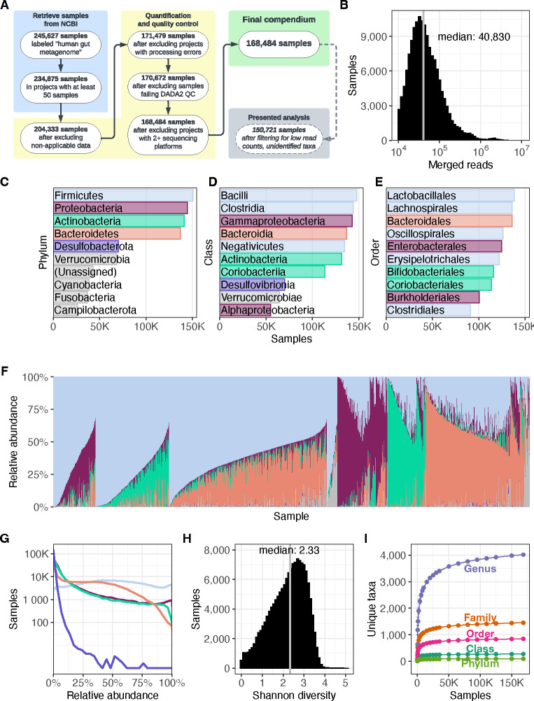
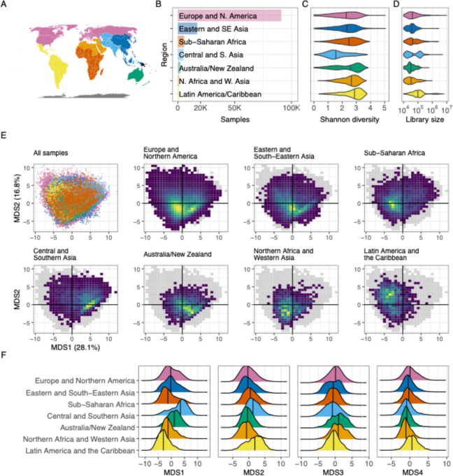
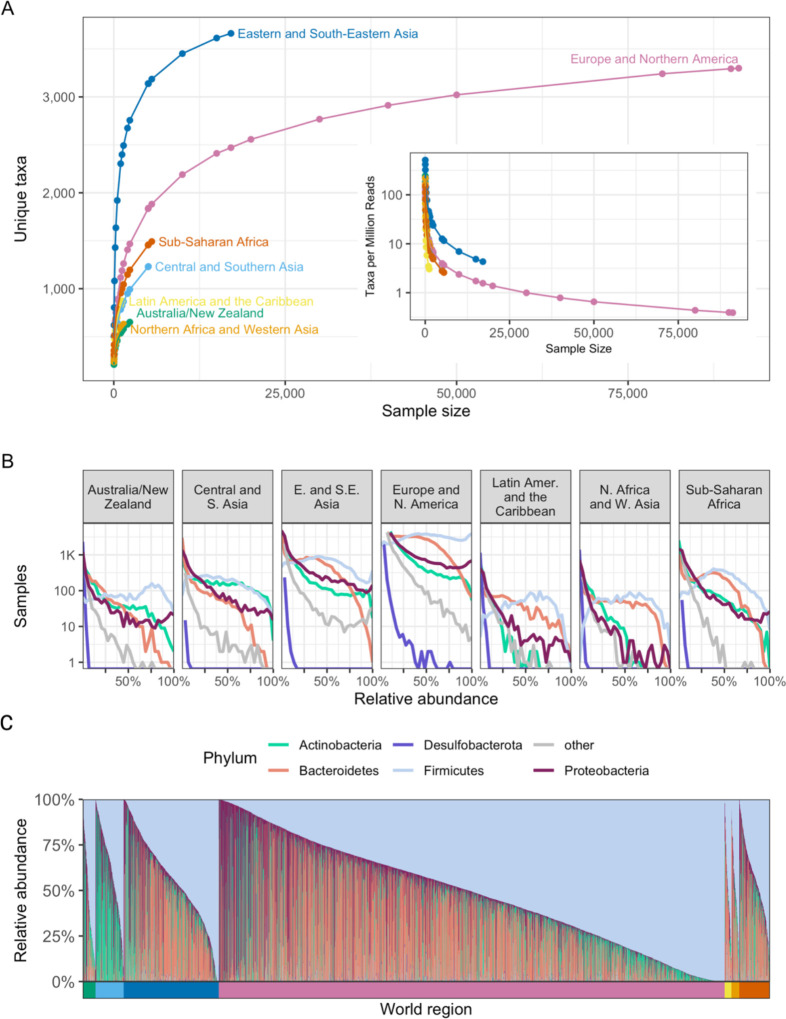
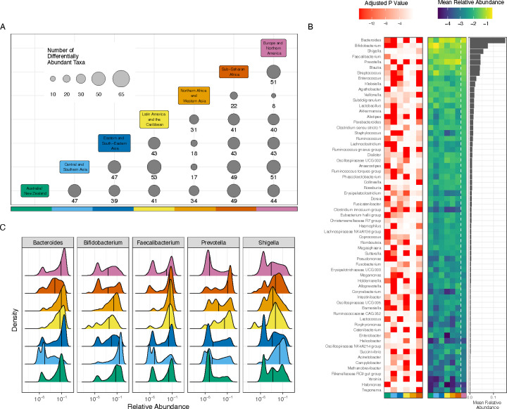
Understanding the factors that shape variation in the human microbiome is a major goal of research in biology. While other genomics fields have used large, pre-compiled compendia to extract systematic insights requiring otherwise impractical sample sizes, there has been no comparable resource for the 16S rRNA sequencing data commonly used to quantify microbiome composition. To help close this gap, we have assembled a set of 168,484 publicly available human gut microbiome samples, processed with a single pipeline and combined into the largest unified microbiome dataset to date. We use this resource, which is freely available at microbiomap.org, to shed light on global variation in the human gut microbiome. We find that Firmicutes, particularly Bacilli and Clostridia, are almost universally present in the human gut. At the same time, the relative abundance of the 65 most common microbial genera differ between at least two world regions. We also show that gut microbiomes in undersampled world regions, such as Central and Southern Asia, differ significantly from the more thoroughly characterized microbiomes of Europe and Northern America. Moreover, humans in these overlooked regions likely harbor hundreds of taxa that have not yet been discovered due to this undersampling, highlighting the need for diversity in microbiome studies. We anticipate that this new compendium can serve the community and enable advanced applied and methodological research.

Keywords: 16S amplicon sequencing; atlas; compendium; global variation; gut microbiome.


Conflict of interest statement

Declaration of interests The authors declare no competing interests.

Figures

Figure 1.
Figure 1.. Overview of the Human Microbiome Compendium.
(A) A list of the general steps in the data pipeline and how many samples completed each step. See Methods for more details about each process. (B) A histogram illustrating the distribution of reads that were classified in each sample. The x-axis indicates the number of reads in a given sample, and the y-axis indicates the number of samples with that number of reads. (C–E) The most prevalent taxa observed in the compendium. The reads in each sample are assigned the most specific taxonomic name possible, down to the genus level. Each panel illustrates results when these assignments are consolidated at the three highest taxonomic levels; in each, the y-axis lists the 10 most prevalent taxa at that level, and the x-axis indicates the number of samples in which that taxon was observed at any level. Panel C indicates the most prevalent phyla, and the top five are each assigned a color. These colors are used in the remaining two panels to indicate the phylum of each taxon. Panel D indicates the most prevalent classes of bacteria observed in the dataset, and Panel E indicates the most prevalent orders. Lower taxonomic orders are illustrated in Supplementary Figure 1. (F) A stacked bar plot illustrating the relative abundance of 5000 randomly selected samples from the compendium. Each vertical bar represents a single sample, and the colored sections each represent the relative abundance of a single phylum in that sample. These bars use the same colors as panel C. The samples are sorted first by the most abundant phylum’s identity, followed by the second-most abundant phylum’s identity, followed by the combined relative abundance of these two taxa. For example, the first group on the left is made up of samples in which Firmicutes was the most abundant phylum and Proteobacteria was the second-most abundant. Next is samples in which Firmicutes was most abundant and Actinobacteria was second-most prevalent, and so on. Another version of this figure, sorted by Firmicutes relative abundance, is available as Supplementary Figure 2. (G) A density plot illustrating the relative abundance of phyla across the compendium. Each line represents one of the five most prevalent phyla in the dataset, using the same colors as panel B. The gray line indicates all other phyla. The x-axis indicates the relative abundance of a given phylum in a single sample, and the y-axis indicates how many samples were observed to have that abundance of the given taxon. A version of this figure using a linear y-axis is available as Supplementary Figure 3. (H) A histogram illustrating the distribution of Shannon diversity observed in the compendium. The x-axis indicates a given sample’s alpha diversity, as measured by Shannon Diversity Index. The y-axis indicates the number of samples that were observed to have that score. (I) The results of a rarefaction analysis in which a simulated compendium of various sizes was generated repeatedly and evaluated for taxonomic richness. The x-axis indicates the number of microbiome samples in the simulated compendium, and the y-axis indicates the number of unique taxa were observed in that simulation. Each line indicates the number of observed taxa at successively specific taxonomic levels.
Figure 2.
Figure 2.. Regional structure.
(A) A map illustrating which areas were categorized into world regions. The colors here match those labeled in panel B. Oceania is represented here in orange, though this region was excluded from these analyses because only four Oceanis samples remained in the filtered dataset used here. (B) A bar plot illustrating the number of samples from each world region analyzed here. The x-axis illustrates total samples, and the y-axis lists all regions evaluated. The colors used here are the same as those used in panel A. (C) A violin plot illustrating the distribution of observed Shannon index values assigned to samples from each world region. The x-axis indicates the Shannon index value, as calculated using all unique taxonomic identifications in samples from each world region. Colors indicate the region (same as in A), and the y-axis for each violin indicates the relative frequency with which diversity of a given magnitude was observed. The vertical lines in each violin indicate the median value. The black points within each violin indicate the mean Shannon diversity as determined by rarefaction analysis (see Methods). (D) A violin plot organized in the same manner as panel C, but the x-axis indicates reads per sample. “Reads” in this case refers to merged reads that were included in the filtered taxonomic table. (E) A series of plots illustrating the results of a principal coordinates analysis of samples from all world regions. The top-left plot is a scatter plot in which each point is a single sample; the color indicates the sample’s region, using the scheme described in panel A. The x-axis is the first PCoA axis, which explains the most variation across the dataset; the y-axis is the PCoA axis explaining the second-most variation. The seven other plots use the same axes, but each includes only samples from a single world region. These plots use a heatmap design rather than a scatter plot, to help evaluate areas with many overlapping points—yellow areas indicate portions of the space with a higher concentration of samples, and dark blue areas indicate portions in which few (but not zero) samples are found. The gray shadow indicates the area occupied by all points from all world regions. (F) A series of density plots illustrating the distributions of the first four axes of variation determined by the ordination analysis displayed in panel E. Each panel illustrates a single factor; the x-axis indicates the value of that factor, and the y-axis indicates the relative frequency of the value in the given world region.
Figure 3
Figure 3. Geographic regions vary in microbiome composition.
(A) The number of unique taxa discovered in subsamples of varying size from each world region. Each point represents the average number of unique taxa identified in a subsample from a given region over 1,000 repetitions. The x-axis indicates the number of microbiome samples selected, the y-axis the number of unique taxa identified in those samples, and the color indicates the world region being sampled. The inset uses the same x-axis and color scheme but displays the average number of taxa discovered per million reads on the y-axis. (B) Histograms illustrating the distribution of the relative abundance of the most prevalent phyla in the compendium. Each panel visualizes all samples from a single world region. The x-axis indicates the relative abundance of the taxon, and the y-axis indicates the number of samples (on a log scale) with the indicated relative abundance. Each line illustrates the results for a single phylum, indicated by line color. (C) As in Figure 1F, this stacked bar chart shows the relative abundance of the five most prevalent phyla in the compendium. Each column is a sample, and the colored segments indicate the relative abundance of a given phylum in that sample. Phylum color follows the same color scheme as Figure 3B. Samples are ordered first by world region (indicated by the colored bar below the x-axis), and then by relative abundance of the 5 most prevalent phyla, as in Figure 1F. World region color follows the same color scheme as Figure 3A.
Figure 4
Figure 4. Taxa are differentially abundant between world regions.
(A) 65 taxa were selected to be tested for differential abundance between regions. The x and y axes are each colored by world region; at each intersection, the size of the circle and the number underneath it indicate the number of taxa that were significantly different between the two regions listed. (B) The red-white heat map illustrates adjusted p-values for regional differences when each world region is compared to Europe and Northern America. The y-axis lists all evaluated genera, the x-axis lists each region (using the same color scale as panel A), and each cell represents the strength of the differential abundance result for that taxon. The blue-green heat map illustrates mean relative abundance (log 10) of each taxon in each world region, as indicated by the x-axis. The bar chart illustrates the mean relative abundance of each taxon across all regions. (C) Each panel illustrates the relative abundance (log 10) of one of the 5 most abundant taxa. Each colored area indicates the distribution from a single world region, using the same colors as panel A. The x-axis indicates (log 10) relative abundance of the specified genus, and the y-axis indicates the relative frequency with which that abundance is observed in the specified region. Black vertical lines indicate the median.

References

    1. Bullman S., Pedamallu C.S., Sicinska E., Clancy T.E., Zhang X., Cai D., Neuberg D., Huang K., Guevara F., Nelson T., et al. (2017). Analysis of Fusobacterium persistence and antibiotic response in colorectal cancer. Science 358, 1443–1448. 10.1126/science.aal5240. - DOI - PMC - PubMed
    1. Hale V.L., Jeraldo P., Chen J., Mundy M., Yao J., Priya S., Keeney G., Lyke K., Ridlon J., White B.A., et al. (2018). Distinct microbes, metabolites, and ecologies define the microbiome in deficient and proficient mismatch repair colorectal cancers. Genome Med. 10, 78. 10.1186/s13073-018-0586-6. - DOI - PMC - PubMed
    1. Burns M.B., Montassier E., Abrahante J., Priya S., Niccum D.E., Khoruts A., Starr T.K., Knights D., and Blekhman R. (2018). Colorectal cancer mutational profiles correlate with defined microbial communities in the tumor microenvironment. PLoS Genet. 14, e1007376. 10.1371/journal.pgen.1007376. - DOI - PMC - PubMed
    1. Matsuoka K., and Kanai T. (2015). The gut microbiota and inflammatory bowel disease. Semin. Immunopathol. 37, 47–55. 10.1007/s00281-014-0454-4. - DOI - PMC - PubMed
    1. Goodrich J.K., Waters J.L., Poole A.C., Sutter J.L., Koren O., Blekhman R., Beaumont M., Van Treuren W., Knight R., Bell J.T., et al. (2014). Human genetics shape the gut microbiome. Cell 159, 789–799. 10.1016/j.cell.2014.09.053. - DOI - PMC - PubMed

Publication types