. 2023 Oct 31;14(1):6944.
doi: 10.1038/s41467-023-41880-9.

Continually recruited naïve T cells contribute to the follicular helper and regulatory T cell pools in germinal centers

Affiliations

Continually recruited naïve T cells contribute to the follicular helper and regulatory T cell pools in germinal centers

Julia Merkenschlager et al. Nat Commun. .

Abstract

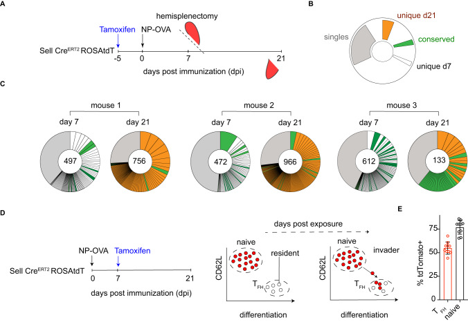
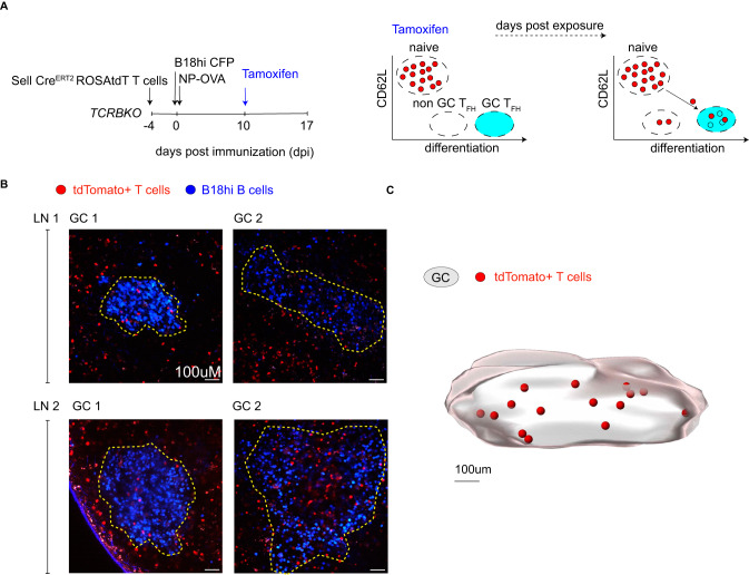
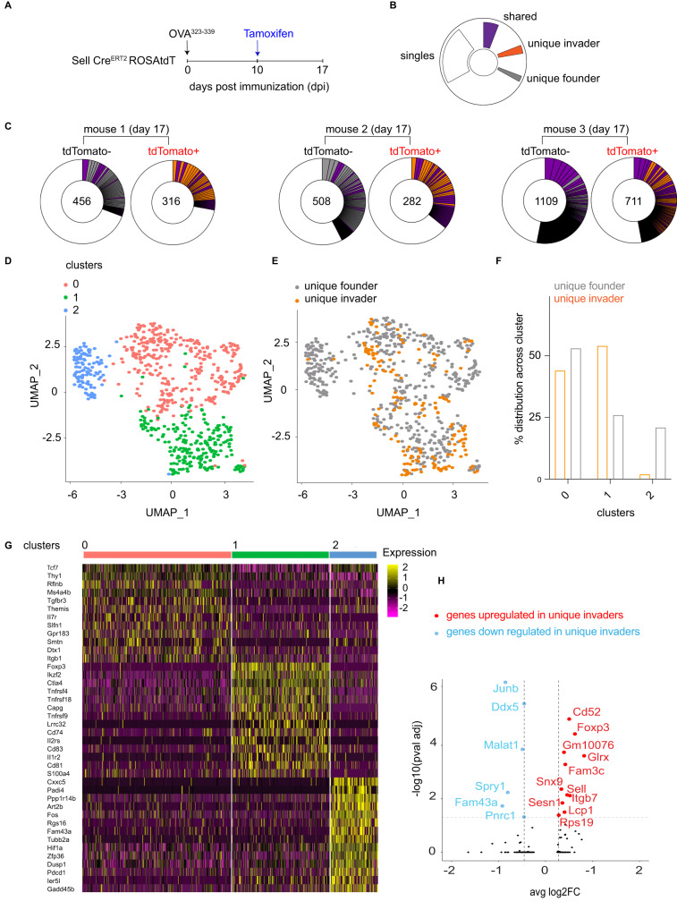
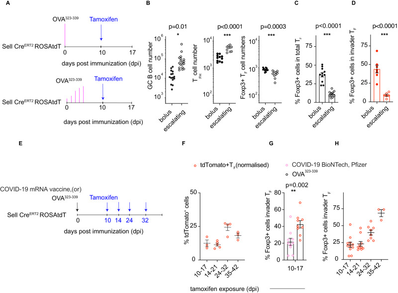
Follicular helper T cells (TFH) mediate B cell selection and clonal expansion in germinal centers (GCs), and follicular regulatory T cells (TFR) prevent the emergence of self-reactive B cells and help to extinguish the reaction. Here we show that GC reactions continually recruit T cells from both the naïve conventional and naive thymic regulatory T cell (Treg) repertoires. In the early GC, newly recruited T cells develop into TFH, whereas cells entering during the contraction phase develop into TFR cells that contribute to GC dissolution. The TFR fate decision is associated with decreased antigen availability and is modulated by slow antigen delivery or mRNA vaccination. Thus, invasion of ongoing GCs by newly developing TFH and TFR helps remodel the GC based on antigen availability.


Conflict of interest statement

The authors declare no competing interests.

Figures

Fig. 1
Fig. 1. Extensive clonal evolution of the TFH response over time.
A Schematic representation of the experimental setup in (C). B Color-coded indexing for the clonal behaviors between day (d) 7 and d21 post immunization in (C). Conserved TCR clonotypes are represented in green, those found only on d7 in white, novel clones appearing only on d21 in orange, and singles in gray. C Pie charts show clones of TFH cells in each mouse at the indicated time. Segments are proportional to the representation of each clone. Numbers inside the pie charts indicate the number of TCR sequences illustrated. GEO Submission (GSE147182). D Schematic (left) and diagrammatic (right) representations of the experimental setup and the fate labeling systems used in (E). E Graph shows the frequency of tdTomato labeled cells in the TFH or in the naïve T cell compartment on days 21 post immunization and 14 after tamoxifen exposure; n = 10 mice per group. Data are presented as mean value ± SD.
Fig. 2
Fig. 2. Naive polyclonal T cells can join ongoing immune responses.
A Schematic representation of the experimental setup in (B, C). B Graph shows the kinetics of TFH cell development after immunization with OVA323–339 peptide in adjuvant. The y-axis depicts the absolute numbers of TFH cells in individual popliteal lymph nodes (red) and the x-axis days after immunization. n = 3–15 per time point; each dot represents one lymph node. Data are presented as mean values. C Plots show the contribution of new invading cells over time. The y-axis is the frequency of tdTomato+ cells in TFH cells normalized to labeling in the naïve compartment. The x-axis is the interval between tamoxifen exposure and assay in days post immunization. n = 7–15 per time point; each dot represents one lymph node. Data are presented as mean value ± SEM. D Schematic representation of the experimental setup in (E, F). E Representative flow cytometry plots profiling phenotype of host or transferred OT-II T cells on day 14 post immunization. F Plots show the contribution of OT-II cells to total TFH, on day 14 post immunization with OVA323–339 when they were transferred 7 days prior. n = 10, each dot represents one mouse. Data are presented as mean value ± SD.
Fig. 3
Fig. 3. Newly differentiated TFH cells join ongoing GC reactions.
A Schematic (left) and diagrammatic (right) representations of the experimental setup and labeling strategies used to visualize naïve T cell invasion of GC reactions. B Multi-photon Z-stack images to show individual GCs marked with yellow dashed lines. B18hi B cells (blue) and fate-mapped T cells (red). Data are from 2 lymph nodes from two biologically independent samples, and a total of 5 individual GCs were imaged (n = 5). C Computational rendering (Imaris cell imaging software) of one of the GCs imaged from lymph node 1. The GC volume is defined by B18hi B cells. Invading T cells are marked as red spheres (renderings).
Fig. 4
Fig. 4. Naive cells that invade late GCs have a regulatory phenotype.
A Schematic representation of the experimental setup used throughout. B Color-coded indexing for the distribution of shared (purple), unique invader (orange) or founder (gray) clones and singles (white). C Pie charts show the clonality among tdTomato positive and tdTomato negative TFH on day 17 post immunization. Segments report the proportional representation of each clone. Numbers inside the pie charts indicate the number of TCR sequences illustrated. D UMAP obtained from unique founder and unique invader TFH cells. E UMAP shows unique founders (gray) and unique invaders (orange). F Bar graph shows the relative distribution of unique founder (gray) or invader (orange) populations in the three clusters. p-value = 2.787e−15 by Fisher’s Exact Test (two-sided). G Heat-map of genes that are differentially expressed between clusters 0,1,2. H Volcano plot shows the statistical significance (p-value) versus magnitude of change (fold change) of genes up (red) or downregulated (blue) in invaders. Positive values indicate that the gene is more highly expressed in invaders. These data are from 4 mice (n = 4) and 8 individual lymph nodes (sample size = 7), and technical replicates were performed. Adjusted p-value, based on Bonferroni correction using all genes in the dataset. The data discussed have been deposited in the NCBI Gene Expression Omnibus and are accessible through GEO series accession number: GSE240730.
Fig. 5
Fig. 5. TFR accumulates in late-stage GC reactions.
A Schematic representation of the experimental setup used in (B). B Kinetics of Foxp3 expression among TF cells following immunization with OVA323–339 peptide in adjuvant. The y-axis depicts the frequency of Foxp3+ cells among TF cells, and the x-axis is days after immunization. The dotted line shows the average frequency of Foxp3+ cells among naive CD4+ T cells. n = 6–18 per time point, each dot represents one lymph node from an individual mouse. Data are presented as mean value ± SEM *** p-value = 0.0002, *** p-value = 0.0008, ****p-value = 0.009, calculated by ANOVA with multiple comparisons. C Schematic representation of the experimental setup used in (D, E). D Representative flow cytometry plots profiling the frequency of TFH cells in mice from the respective experimental groups (right). (left) Plots show the frequency of TFH (y-axis) cells among CD4hi, CD62low, and CD44hi cells between experimental groups (x-axis) on day 15 post immunization. E Plots show the total number of TF cells (left) or the total number of GC B cells (right) calculated (y-axis) between the experimental groups (x-axis). n = 3–6 mice per group; each dot represents one mouse. Data are presented as mean value ± SD. *p-value = 0.02 and *p-value = 0.04 calculated by ANOVA with multiple comparisons. F Schematic representation of the experimental setup used in (G, H). G Plots depict the kinetics of Foxp3 expression among invader or founder TF cells. The y-axis depicts the frequency of Foxp3+ cells among invader (red) or founder (black) TF cells at the time points after immunization (x-axis). n = 4–19 mice per timepoint, each dot represents a single lymph node. The data presented are the mean. **p-values = 0.001 and *p-value = 0.01 calculated by unpaired Student’s t-test. H Plot shows the normalized relative proportion of tdTomato+ cells among TFR cells. n = 9, and the data presented are the mean ± SEM.
Fig. 6
Fig. 6. Antigen-dependent TFR development.
A Schematic shows the bolus (top) and slow delivery (bottom) immunization strategies, tamoxifen delivery, and sampling schedules used in (BD). B Bar graphs show the total number of GC B cells (left), TFH cells (center), and Foxp3+ TFR cells (right) in popliteal lymph nodes after bolus or escalating dose immunization. *p-value = 0.01, ***p-value < 0.0001, p-value = 0.0003 by unpaired Student’s t test. n = 9–18, and each dot represents a single lymph node. C Bar graphs show the percentage of Foxp3+ cells among total TF cells after bolus and escalating dose immunization. p-value < 0.0001 by unpaired Student’s t-test (two-tailed). n = 10–11 per group, and each dot represents a single lymph node. D Bar graphs show the percentage of Foxp3+ cell invaders after bolus and escalating dose immunization. p-value < 0.0001 by unpaired Student’s t-test (two-tailed). n = 6–7 per group, and each dot represents a single lymph node. E The schematic shows the experimental setup used for (FH). F Plot shows the normalized relative proportion of tdTomato+ cells among TF cells. Each dot is an individual draining inguinal lymph node from the site of immunization with the COVID-19 BioNTech (Pfizer) vaccine. n = 3–4 per timepoint, and the data presented are the mean ± SD. G Bar graphs show the frequency of Foxp3+ cells among total TF cells in invaders cells on day 17 post immunization. The x-axis is the interval between tamoxifen exposure and assay in days post immunization. **p-value = 0.002 by unpaired Student’s t-test (two-tailed). n = 10–11 per group, and the data presented are the mean ± SEM. H Plots depict the kinetics of Foxp3 expression among invader TF cells from inguinal lymph nodes from COVID-19 BioNTech (Pfizer) vaccinated mice. The y-axis depicts the frequency of Foxp3+ cells among invader TF cells at the time points after immunization (x-axis). n = 3–11 per timepoint, and the data presented are mean ± SEM.

References

    1. Tas JMJ, et al. Visualizing antibody affinity maturation in germinal centers. Science. 2016;351:1048–1054. doi: 10.1126/science.aad3439. - DOI - PMC - PubMed
    1. Eisen HN, Siskind GW. Variations in affinities of antibodies during the immune response. Biochemistry. 1964;3:996–1008. doi: 10.1021/bi00895a027. - DOI - PubMed
    1. Eisen HN. Affinity enhancement of antibodies: how low-affinity antibodies produced early in immune responses are followed by high-affinity antibodies later and in memory B-cell responses. Cancer Immunol. Res. 2014;2:381–392. doi: 10.1158/2326-6066.CIR-14-0029. - DOI - PubMed
    1. Rajewsky K. Clonal selection and learning in the antibody system. Nature. 1996;381:751–758. doi: 10.1038/381751a0. - DOI - PubMed
    1. Allen CD, Okada T, Cyster JG. Germinal-center organization and cellular dynamics. Immunity. 2007;27:190–202. doi: 10.1016/j.immuni.2007.07.009. - DOI - PMC - PubMed

Publication types