. 2024 Jan;8(1):32-44.
doi: 10.1038/s41559-023-02241-3. Epub 2023 Nov 13.

Forecasting the dynamics of a complex microbial community using integrated meta-omics

Affiliations

Forecasting the dynamics of a complex microbial community using integrated meta-omics

Francesco Delogu et al. Nat Ecol Evol. 2024 Jan.

Abstract

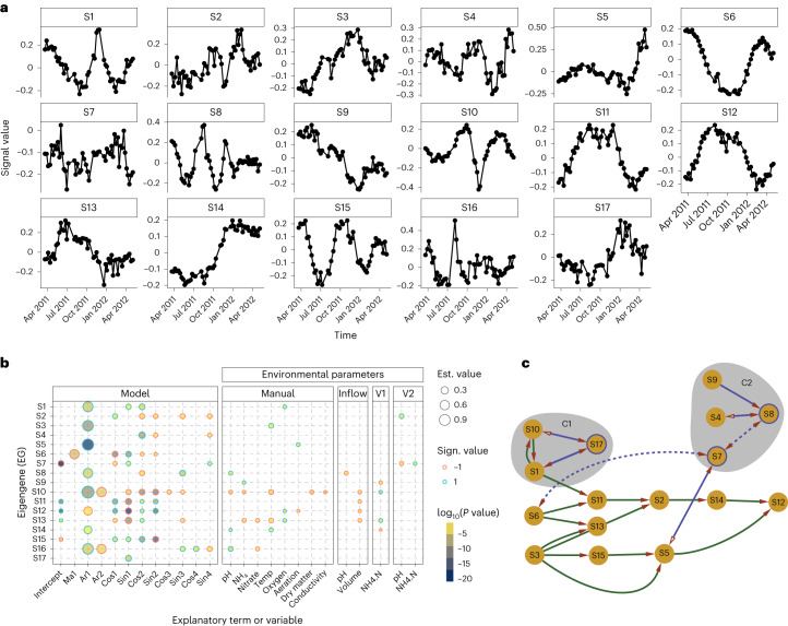
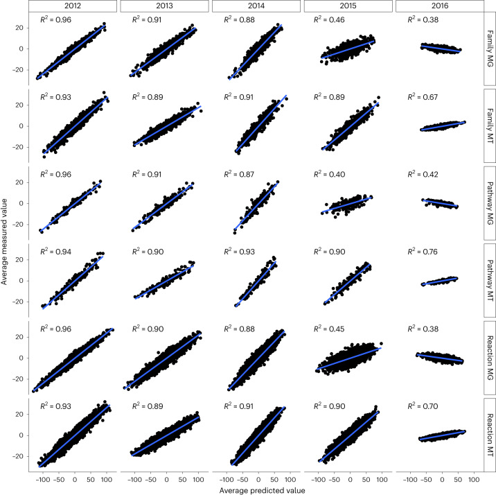
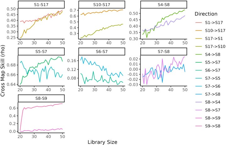
Predicting the behaviour of complex microbial communities is challenging. However, this is essential for complex biotechnological processes such as those in biological wastewater treatment plants (BWWTPs), which require sustainable operation. Here we summarize 14 months of longitudinal meta-omics data from a BWWTP anaerobic tank into 17 temporal signals, explaining 91.1% of the temporal variance, and link those signals to ecological events within the community. We forecast the signals over the subsequent five years and use 21 extra samples collected at defined time intervals for testing and validation. Our forecasts are correct for six signals and hint on phenomena such as predation cycles. Using all the 17 forecasts and the environmental variables, we predict gene abundance and expression, with a coefficient of determination ≥0.87 for the subsequent three years. Our study demonstrates the ability to forecast the dynamics of open microbial ecosystems using interactions between community cycles and environmental parameters.


Conflict of interest statement

The authors declare no competing interests.

Figures

Fig. 1
Fig. 1. Diversity and quality of the rMAGs and their representativeness in the meta-omic dataset.
a, Phylogenetic tree of the rMAGs in the LAO community (generated using GTDB-Tk) contains the 126 bacterial rMAGs in the system (the 18 archaeal MAGs were not included). The heat map ring contains the CheckM quality measures per rMAG (completeness, contamination and MAG-originally strain heterogeneity), which were filtered to be at least 75% complete and at a maximum 25% contaminated (median: 2%). The violin plots contain the time-averaged (train time series) depth profiles over the contigs forming the rMAG. The two sections of the tree noted as * and ** highlight the strains of M. parvicella and Moraxella sp., respectively. b. The cumulative length of the contigs (longer than 1,000 nt; see Methods) for the 25 most abundant phyla displayed for the rMAGs and unbinned contigs.
Fig. 2
Fig. 2. Eigengene modelling using ARIMA augmented with environmental parameters and Fourier terms.
a, The signals S1–17 encapsulate the time-dependent dynamics underlying the microbial community. The scale of the y axis is dimensionless as the eigenvectors. b, The signals S1–17 are explained as ARIMA processes under the influence of the environmental variables. The five blocks of explanatory variables are: Model (ARIMA components), Manual (manually collected environmental variables, directly on the sampling location), Inflow (inflow stream of wastewater in the plant), V1 (first anaerobic tank in the plant) and V2 (second anaerobic tank in the plant). Every circle represents a significant variable according to analysis of variance (Benjamini–Hochberg adjusted P < 0.05) for the corresponding signal among S1–17; the size represents the value of the coefficient, the ring colour its sign and the fill colour the log10(P value). c, The signals are connected by a temporal transfer of information, suggesting a succession of ecological events. The signals with a purple edge are putatively nonlinear, and their relationships have been confirmed with convergent cross-mapping analysis. The dashed lines indicate weak transfer of information, while a full arrow and a hollow one represent an imbalance in information transfer (in favour of the solid arrow). Source data
Fig. 3
Fig. 3. Forecasting of the signals.
The 17 signals are predicted for the years 2011–2016 and compared with the data from June for those years. The green and blue dots represent the training and test data, respectively; the solid line depicts the median of the prediction, while the shaded area represents the 95% confidence interval. The green and blue boxplots on the right of every box depict the distribution of the model residuals from the training and the test sets, respectively. Corresponding scales are provided on the right y axes. The residue displacement from the null distribution was assessed using a Wilcoxon two-sided test (n = 21). The * on top of the boxplot indicates a statistical difference (Benjamini-Yekutieli corrected P < 0.01) between the mean of the residual distribution and 0, indicating incorrect/incomplete modelling (exact P values in Supplementary Table 7). In the boxplots, the central line indicates the second quartile, the lower and upper hinges correspond to the first and third quartiles and the whiskers extend from the hinge to the smallest/largest value no further than ±1.5 × the distance between the first and third quartiles. The samples beyond the range are plotted as individual outlier dots. Source data
Fig. 4
Fig. 4. Reconstruction of the June months 2012–2016.
The test samples were reconstructed using the 17 signals and their weights estimated through linear regressions on the training set. The reconstructed matrices are based on MG and MT data summarizing taxonomic families, reactions and pathways. The coefficient of determination R2 (computed as the squared Pearson correlation coefficient) is reported for each panel, with a higher coefficient demonstrating a more accurate prediction. Source data
Extended Data Fig. 1
Extended Data Fig. 1. Workflow of the analysis.
Each box represents a piece of data in the analysis while the arrows show their relationships. When necessary the type of action to move from a box to the next is reported on the side of the arrow. When available the reference figures are indicated in the workflow. The analysis starts with the count matrices for MG, MT and MP and ends with the ecological hypotheses and the validation of the forecasting and the future sample reconstruction.
Extended Data Fig. 2
Extended Data Fig. 2. Technical overview.
a. Technical effect estimation. The data were regressed with the experimental variables (that is environmental parameters) and the technical ones (that is read length and number of reads). The plot shows the distribution of the betas resulting from the regression for the MG and MT ORF-based matrices. b. The three ORF-based omic quantification matrices are summarised by summing up the lines with the same ORF descriptor. The final result is a collection of 24 matrices + the original three. c. The six panels show the number of time-dependent EGs and the EG weights (equivalent to the Explained Variance) per omic in the nine summarisation matrices. The first EG (that is the basal state of the system) was removed and all the EG weights re-scaled per matrix. In the y axis ‘Fun’ stands for ‘Function’ and ‘Tax’ for ‘Taxonomy’. The number of selected EGs changes depending on the omic and the descriptor, however some trends can be seen in the EG weight. For MG and MT the EG weight is the largest, signifying that it is, if taken alone, the most informative layer of information. Interestingly in MT the second largest, with a decent margin, is the Species level, which can be explained as a level in which most of the individual genes information is conserved (that is genes of the same species will be expressed together over time). d. EG clustering. The columns represent the 17 EG clusters while rows indicate the different types of summarisation matrices. In the top panel the violin plots depict the distribution of the explained variance (EV) from the EGs in the cluster. The red dot indicates the maximal EV in the distribution and the EV of the cluster. On the y-axis there are the 27 matrices.
Extended Data Fig. 3
Extended Data Fig. 3. Correlation of the environmental variables.
Corr-corr plot of the correlations between the selected starting environmental variables to explain the signals. From here the final variables were selected.
Extended Data Fig. 4
Extended Data Fig. 4. Example of 6 patterns detectable in time series.
a. Basal level, like the one excluded by removing the first EG in the analysis; b. Random noise; c. level change; d. perturbation; e. cycle; f. Crash. In real time series more patterns are usually combined (at least with noise) to create the main data behaviour over time.
Extended Data Fig. 5
Extended Data Fig. 5. Convergent cross mapping plots for the causality links with putatively nonlinear signals.
The Cross Map Skill (rho) indicates the goodness of the forecasting across increasing sizes of the number of samples (Library Size). The link S9- > S8 is the only fully confirmed one with a unidirectional information transfer. The edges S10-S17 and S4-S8 have a bi-directional influence which is stronger in the direction already predicted by the Granger causality test. For the edges S7-S8 and S6-S7 the Cross Map Skill shows a faint bi-directional influence; whilst for S1-S17 and S5-S7 a strong bi-directional influence.
Extended Data Fig. 6
Extended Data Fig. 6. Loadings at the family level.
On the y-axis the taxonomic families intersect the signals they contribute to from the x-axis. If the loading is in the top 5% a green arrow pointing up marks the intersection. Similarly if the loading is in the bottom 5% (strongly negative) a red arrow pointing down marks the intersection. The vertical blocks separate the three omics, whilst the horizontal blocks separate the archaea (A.), bacteria and viruses (V.). No eukaryotic families were found to be in the top/bottom 5% of the loadings. The plot also integrates lower taxonomic labels (that is species and genus) and some of them might have opposite orientations, leading to families with both types of arrows.
Extended Data Fig. 7
Extended Data Fig. 7. Loadings at the pathway level.
On the y-axis the metabolic pathways intersect the signals they contribute to from the x-axis. If the loading is in the top 5% a green arrow pointing up marks the intersection. Similarly if the loading is in the bottom 5% (strongly negative) a red pointing down marks the intersection. The vertical blocks separate the three omics. The plot integrates also lower metabolic labels (that is KO) and some might disagree in orientation, leading to pathways with both types of arrows.
Extended Data Fig. 8
Extended Data Fig. 8. Triacylglycerol accumulation as a key metabolic community-wide trait.
a. Enzymatic reactions (with high abundance in at least one of the omics from LAO) leading to triacylglycerol accumulation in the community. GLY: Glycerol, Acyl-ACP: Acyl Carrier Protein, Acyl-P: Acyl phosphate, 3GP: 3-glycerol phosphate, ACAT: Acetyl-CoA, FA: Fatty Acid, DAG: Diacylglycerol, TG: Triacylglycerol, PE: phosphatidylethanolamine, PC: phosphatidylcholine. The enzyme class with KO number K22848 is responsible for the conversion of DAG in TG and, ultimately, the accumulation of TG. b. Gene and gene product abundances for the various enzymatic groups involved in the accumulation of TG varies in amount and taxonomic origin. The families belonging to the same phylum have similar colours to matching phyla in Fig. 1a. Therefore, Actinobacteria are in shades of yellow, Proteobacteria in shades of green while Leptospiraceae inherited the bure from the Spirochaetes. c. The gene abundance of K22484 is influenced by S9, indicating a, perhaps indirect effect on NH4 levels.
Extended Data Fig. 9
Extended Data Fig. 9. Selection of the models.
Absolute error profiles over the training data of the tested models for each of the seventeen signals S1-17; the black dot indicates the RSME. A low RMSE indicates that the predictions and the real data are close; vice-versa a high value shows distant data points. Therefore RMSE is useful when comparing multiple models. Elongated violin plots indicated a spread of values (that is both correctly and incorrectly predicted weeks), a ‘short’ and ‘wide’ distribution with an upper tail indicated a ‘focused’ prediction overall with some outliers, whilst a simple ‘short’ and ‘wide’ distribution is obtained for very coherent predictions (that is constantly correct or incorrect).
Extended Data Fig. 10
Extended Data Fig. 10. Predictions per-week.
Reconstructed abundance and gene expression of all the microbial families, reactions and pathways in the community versus the real one for each sample in the test set.

References

    1. Martiny JBH, et al. Microbial biogeography: putting microorganisms on the map. Nat. Rev. Microbiol. 2006;4:102–112. doi: 10.1038/nrmicro1341. - DOI - PubMed
    1. Bar-On YM, Phillips R, Milo R. The biomass distribution on Earth. Proc. Natl Acad. Sci. USA. 2018;115:6506–6511. doi: 10.1073/pnas.1711842115. - DOI - PMC - PubMed
    1. Falkowski PG, Fenchel T, Delong EF. The microbial engines that drive Earth’s biogeochemical cycles. Science. 2008;320:1034–1039. doi: 10.1126/science.1153213. - DOI - PubMed
    1. Larsen PE, Field D, Gilbert JA. Predicting bacterial community assemblages using an artificial neural network approach. Nat. Methods. 2012;9:621–625. doi: 10.1038/nmeth.1975. - DOI - PubMed
    1. García-Jiménez B, Muñoz J, Cabello S, Medina J, Wilkinson MD. Predicting microbiomes through a deep latent space. Bioinformatics. 2021;37:1444–1451. doi: 10.1093/bioinformatics/btaa971. - DOI - PMC - PubMed