[Preprint]. 2023 Nov 3:2023.03.16.533008.
doi: 10.1101/2023.03.16.533008.

OASIS: An interpretable, finite-sample valid alternative to Pearson's X2 for scientific discovery

Affiliations

OASIS: An interpretable, finite-sample valid alternative to Pearson's X2 for scientific discovery

Tavor Z Baharav et al. bioRxiv. .

Update in

Abstract

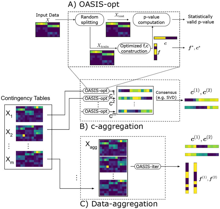
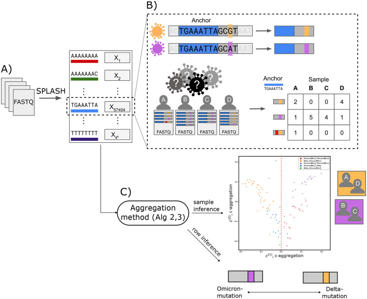
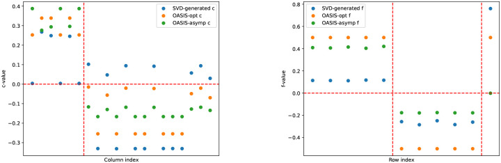
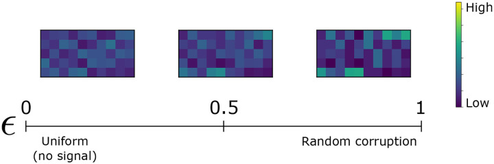
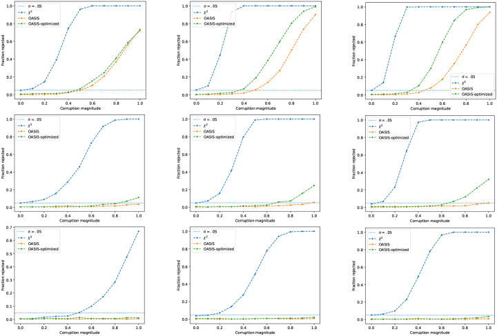
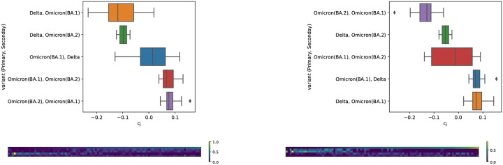
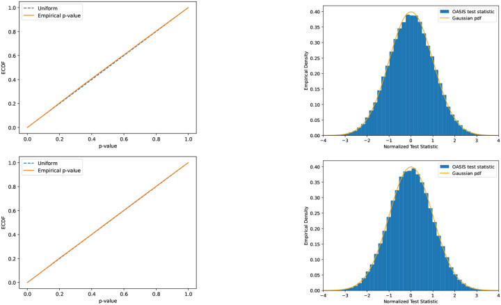
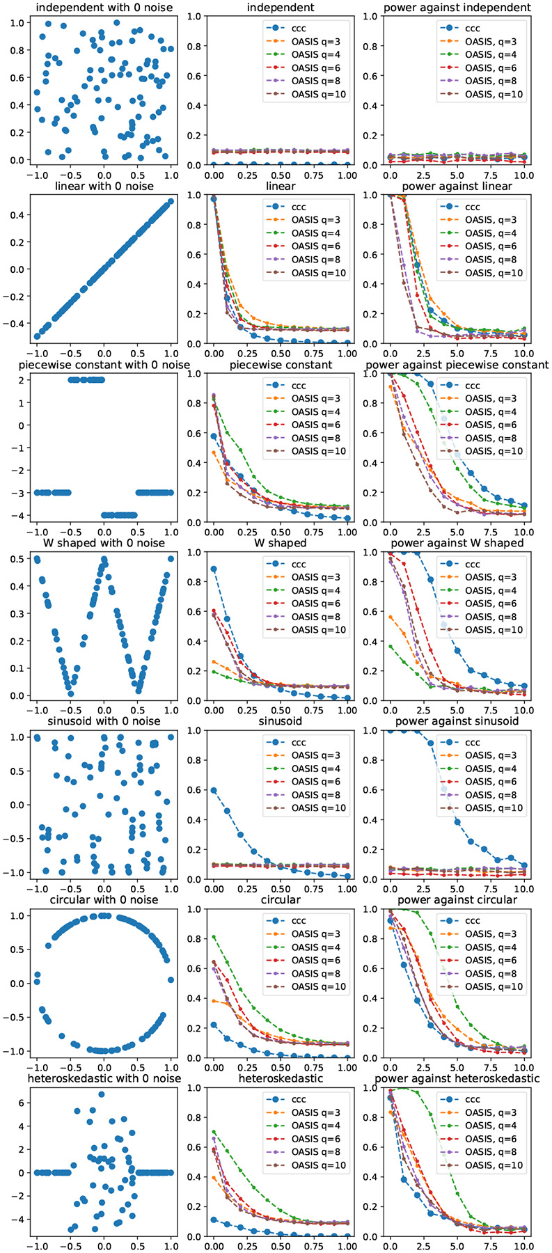
Contingency tables, data represented as counts matrices, are ubiquitous across quantitative research and data-science applications. Existing statistical tests are insufficient however, as none are simultaneously computationally efficient and statistically valid for a finite number of observations. In this work, motivated by a recent application in reference-free genomic inference (1), we develop OASIS (Optimized Adaptive Statistic for Inferring Structure), a family of statistical tests for contingency tables. OASIS constructs a test-statistic which is linear in the normalized data matrix, providing closed form p-value bounds through classical concentration inequalities. In the process, OASIS provides a decomposition of the table, lending interpretability to its rejection of the null. We derive the asymptotic distribution of the OASIS test statistic, showing that these finite-sample bounds correctly characterize the test statistic's p-value up to a variance term. Experiments on genomic sequencing data highlight the power and interpretability of OASIS. The same method based on OASIS significance calls detects SARS-CoV-2 and Mycobacterium Tuberculosis strains de novo, which cannot be achieved with current approaches. We demonstrate in simulations that OASIS is robust to overdispersion, a common feature in genomic data like single cell RNA-sequencing, where under accepted noise models OASIS still provides good control of the false discovery rate, while Pearson's X2 test consistently rejects the null. Additionally, we show on synthetic data that OASIS is more powerful than Pearson's X2 test in certain regimes, including for some important two group alternatives, which we corroborate with approximate power calculations.

Keywords: Alignment-free inference; Computational genomics; Contingency table; Finite-sample p-value bound.


Figures

Fig. 1.
Fig. 1.
Comparison of OASIS and Pearson’s X2 test for input matrix XNI×J. A) OASIS computes a matrix of residuals X˜ as in Eq. (1). Row (column) embedding vectors fRIcRJ are generated by one of several options (metadata can be incorporated if desired, e.g. an ordering of the rows, or similarity information regarding the columns). These vectors are used to compute the OASIS test statistic S in Eq. (2), which admits a finite-sample p-value bound using classical concentration inequalities. B) X2 computes a matrix of residuals Xcorr as in Eq. (4), which is sensitive to deviations in low count rows, as seen in the bottom 4 rows in the example matrix X and Xcorr. The X2 test then provides an asymptotically valid p-value via a distributional approximation. For interpretability, practitioners often use correspondence analysis (4) to interpret rejection of the null, a procedure with no statistical guarantees, which can fail to detect the desired structure. C) depicts two example counts tables. The one on the left corresponds to concentrated (strong) signal, while the one on the right corresponding to diffuse (weak) signal. Both tables have 100 counts distributed evenly over 10 columns, with 12 rows. The generative model for these is detailed in Section 14.A, with additional plots provided. X2 assigns both of them similar significance, but OASIS assigns a much smaller p-value to the left table than the right, agreeing with our intuition. Figure 9 shows the spectra of the centered and normalized contingency tables, showing that OASIS prioritizes the first table with a spikier spectrum. D) plots the empirical CDF of the p-values of OASIS and Pearson’s X2. This is shown for the two classes of tables; ones with a strong concentrated two-group signal, and ones with a diffuse signal. OASIS yields significantly improved p-values for the case with strong signal, and substantially worse power than X2 in the weak signal case, which visually looks like noise. X2 on the other hand yields much more similar performance in the two settings. Here, OASIS-opt is shown, which is run over 5 independent splits of the dataset (additional details in Section 14.A).
Fig. 2.
Fig. 2.
Figure showing the algorithms and methods we build using the OASIS framework. A) OASIS-opt, the primary instantiation of OASIS used in this work. OASIS-opt employs data-splitting to generate optimized data-dependent f and c, before generating a statistically valid p-value bound on the held out test data. B and C depict two algorithms we propose for inferring latent structure from a collection of tables defined on the same set of columns. As building blocks, we use OASIS-opt for c-aggregation, and OASIS-iter (Algorithm 3) for data-aggregation. B) c-aggregation (Algorithm 2) performs inference on each table marginally using OASIS-opt and aggregates the resulting c embeddings. C) Data-aggregation (Algorithm 1) stacks the contingency tables into one large matrix Xagg, and performs iterative analysis on this aggregated table using OASIS-iter.
Fig. 3.
Fig. 3.
A) SPLASH (1) generates contingency tables from genomic sequencing data, here FASTQ files, for all 4k possible anchor k-mers (length k genomic sequences). B) Shown in greater detail is the process for one specific anchor, TGAAATTA. This anchor highlights a mutation between two strains of SARS CoV-2, Omicron (purple) and Delta (orange). Below, viral sequencing data from 4 individuals (samples) infected with COVID is shown. However, it is a priori unknown which strain each individual was infected with, and no reference genome is available. For the fixed anchor sequence (shown in blue), SPLASH counts for each sample the frequency of sequences that occur immediately after (target sequence), and generates a contingency table, where the columns are indexed by the samples and the rows are indexed by the sequences. Shown in B is one read in sample A which underwent sequencing error, highlighted in red, and thus yielded an additional discrete observation – a sequence – resulting in an extra row. Sequencing error leads to tables with many rows with low counts. Note that we cannot know a priori which rows of this table are due to sequencing error, as we are simply observing raw sequencing data. C) The contingency tables generated by SPLASH are defined over the same set of samples (patients), so we can use these tables to jointly infer sample origins. Plot shown depicts the results of c-aggregation on SARS-CoV-2 data (6), perfectly predicting whether a patient has Delta or not, and yielding high predictive accuracy (92%) for subvariant classification (Omicron BA.1 versus BA.2). Data-aggregation can also be used to predict the strain of mutated targets, with a 93% correct classification accuracy of whether a target was Delta or not. In the depicted toy example, this would correspond to grouping targets and individuals by strain as shown.
Fig. 4.
Fig. 4.
Analysis of SARS-CoV-2 coinfection data (6). Tables were generated by SPLASH (1) and tested with OASIS-opt. (A) and (C) depict the results of c-aggregation (Algorithm 2). (A) shows the generated 2D embeddings, which perfectly classify whether a patient has Delta or not at c(1)0, highlighted in (C). (B) and (D) depict the results of data-aggregation (Algorithm 1). Perfect separation of Delta vs non-Delta samples, no longer at c(1)0. SARS-CoV-2 analysis details in Section 13.
Fig. 5.
Fig. 5.
Interpretation of OASIS-rejected null from M. Tuberculosis data (6). Tables were generated by SPLASH (1) and tested with OASIS. (A) shows the generated 1D embeddings from c-aggregation (Algorithm 2), which perfectly classifies patients based on sub-sublineage at c(1)0. (B) depicts the results of data-aggregation (Algorithm 1). Two samples are misclassified (visually, one on top of the other), but with a much larger margin for the rest. 2D plots with c(2) shown in Figure 25.
Fig. 6.
Fig. 6.
SVD does not identify the visually clear planted structure in the shown toy example. Shown at top is the contingency table X, which displays a clear 2 cluster behavior (the left 6 columns versus the right 14 columns). The last row should be considered noise, as this signal does not match with any other row expression. However, taking the SVD of X˜ (the centered and right normalized table), the principle right singular vector does not well predict the planted structure. OASIS, both from its asymptotic-optimized c and its finite-sample bound optimized c, both perfectly identify the latent clustering. The raw values for each methods identified c,f are plotted in Figure 7.
Fig. 7.
Fig. 7.
Plots of f,c vectors identified by SVD, OASIS-opt, and OASIS-asymp. OASIS-opt f is shown with .5 subtracted, so that is centers around 0 and can be visually compared with the other f vectors. On the right, the SVD-based f does identify the row groupings, but utilizes only half the dynamic range for the first 10 rows. OASIS more clearly identifies the row structure, with the asymptotic objective forcing the bottom row to a value of 0. OASIS-opt utilizes the full dynamic range for the first 10 rows. Examining the c plot on the left, we see that the SVD-identified c cannot identify the latent structure, as for example c1<c7, while c1 should belong in the same cluster as c2 which has a large positive value. OASIS-opt clearly identifies the clustering in a well separated manner, and the asymptotic optimized c yields even greater separation (as it fully discounts the last “noisy” row).
Fig. 8.
Fig. 8.
Following Figure 1, this plot shows the performance of OASIS-opt and X2 over the class of alternatives defined in Eq. (43). The plot shows an empirical achievability curve, where the y-axis indicates how structured versus unstructured the alternative is, and the x-axis indicates the total number of counts in the table. The more up and to the left a curve is, the better. For any alternative (any ϵ[0,1] for our model), a statistical test should reject the null with enough observations. Here, we show that empirically, OASIS is more likely to reject highly structured tables with lower counts, whereas Pearson’s X2 test is more likely to reject unstructured tables with moderate counts. OASIS-opt with 5 random data splits is shown. The flat behavior between adjacent data points for OASIS-opt is due to the data-splitting: an increase in number of observations does not necessarily translate to an increase in number of observations in the test data, e.g. going from 7 to 8 observations per sample. The right plot shows the subplot in Figure 1A, additionally showing curves when 5 random splits are used for OASIS-opt. As can be seen, this removes the tail of the 0ASIS-opt p-value bounds, improving performance in this setting. The jagged behavior in the plot is due to the finite number of observations (M=100 in this plot), leading to a finite number of values the optimized test-statistic will take, and so even aggregating over 1000 trials, the curve does not smooth out as it does for X2, which can take many more possible values.
Fig. 9.
Fig. 9.
Spectrum of Xcorr  for the two example tables in Figure 1C. X2 yields a similar p-value for the two tables, as the sum of the squared singular values is similar. OASIS prioritizes the “strong signal” table with the more spiky spectrum.
Fig. 10.
Fig. 10.
Simulated data for negative binomial overdispersion. Null target distribution generated from exponential distributions, described in Section 14.B.1. OASIS has significantly better control of the false discovery rate than the X2 test, and requires substantially fewer samples per column to control the FDR. Left to right, the columns correspond to tables having 10, 50, and 400 columns. Top to bottom, the rows indicate 5 rows, 20 rows, and 100 rows.
Fig. 11.
Fig. 11.
Simulated data for negative binomial overdispersion. Null target distribution is uniform over rows. OASIS has significantly better control of the false positive rate than the X2-test, and requires substantially fewer samples per column to control the FDR. Left to right, the columns correspond to tables having 10, 50, and 400 columns. Top to bottom, the rows indicate 5 rows, 20 rows, and 50 rows.
Fig. 12.
Fig. 12.
Simulated data under independent 1 corruption to each columns probability vector. X2 has significant power against this alternative, even though it represents contamination and a “biological null”.
Fig. 13.
Fig. 13.
Simulated data for independent 1 corruption of each column. First row corresponds to 20 rows, second to 100, and third to 500. First column corresponds to 10 columns, second to 50 columns, third to 100 columns. Number of observations in each column is Poisson distributed with mean 100, independent across columns. Observations are drawn independently, and are multinomially distributed for each column with probability vector as defined in Eq. (44).
Fig. 14.
Fig. 14.
Simulated data for an alternative with unique per-sample expression, motivated by V(D)J recombination. All methods have power.
Fig. 15.
Fig. 15.
Simulated data for unique per-sample expression alternative. First row corresponds to 10 rows and columns, second to 25, and third to 100. First column corresponds to a mean of 10 observations per column, second to 20, and third to 50. Number of observations in each column is Poisson distributed with the given mean, independent across columns. Probabilistic model in Eq. (45).
Fig. 16.
Fig. 16.
Simulated data for a differentially regulated alternative splicing-type alternative. OASIS has more power than X2.
Fig. 17.
Fig. 17.
Simulated data for alternative splicing-type alternative. First row corresponds to 20 rows, second to 100 rows, third to 400 rows. First column corresponds to 10 samples, second to 50 samples, third to 100 samples. Number of observations in each column is Poisson distributed with mean 20.
Fig. 18.
Fig. 18.
Top 2 tables in terms of OASIS-opt p-value bound, not called by OASIS-rand. Both tables yield a vector c with an absolute cosine similarity of 0.76 with ground truth metadata (was the patient infected with Delta or not).
Fig. 19.
Fig. 19.
Top 2 tables in terms of X2-p-value (both with a q-value of 0), not called by OASIS-opt (q-value >0.05). Since there were more than 2 tables with a X2 p-value of 0, we chose the two with the smallest OASIS-opt p-value bounds. The output 1d embedding by correspondence analysis yields an absolute cosine similarity of 0.15 and 0.02 with ground truth (whether a patient has Delta or not). Even when extended to 2 dimensions, the clusters do not separate.
Fig. 20.
Fig. 20.
5 tables in OASIS-opt’s reduced list of anchors (effect size in the top 10%, M>1000, significant 0ASIS-opt p-value bound). First is 482 × 100, 3688 counts, cosine similarity of 0.2. Second is 98 × 77, with 2540 counts, cosine similarity of 0.61. Third is 74 × 71, 1486 counts, cosine similarity of 0.69. Fourth is 67 × 69, 1299 counts cosine similarity of 0.62. Fifth is 88 × 91, 1256 counts, 0.63 cosine similarity.
Fig. 21.
Fig. 21.
Results on 100,914 tables generated by SPLASH (1) from SARS-CoV-2 data (6). Metric plotted is absolute cosine similarity between binarized sample embedding vector per table (c for OASIS, principle right singular vector from correspondence analysis for X2) and ground truth vector indicating whether a patient (sample) has Delta or not. Empirical CCDF of absolute cosine similarity between identified vectors per table and ground truth vector is plotted for the tables that each method declares significant after multiple hypothesis correction. Out of the 100,914 tables, OASIS rejects 28,430, and Pearson’s X2 test rejects 71,543 tables. However, when decomposed, the tables that X2 rejects do not yield signal that correlates well with the ground truth; examining quantiles of the two distributions, the 0.5 and 0.9 quantiles of these empirical distributions are 0.22 and 0.66 for OASIS, as opposed to 0.10, 0.52 for X2.
Fig. 22.
Fig. 22.
Spectrum of C matrix from c-aggregation for SARS-CoV-2 data, showing why 2d embedding is sufficient.
Fig. 23.
Fig. 23.
Negative log of p-value bounds for data-aggregation on stacked data matrices for SARS-CoV-2. As can be seen, after the second index, the remaining points follow a slow linear trend (the elbow), indicating that only 2 components should be utilized.
Fig. 24.
Fig. 24.
BLAT (34) to SARS-CoV-2 genome via UCSC genome browser (35). For each target, we align the anchor concatenated with the target, where for each of these two anchors, only 2 targets had abundance greater than 5%. Note that these targets do not come immediately after the anchor, but are taken a fixed distance ahead (called the lookahead distance (1)). In both examples, target 1 takes a value fi=1, and target 2 takes a value fi=0. The reported 93% agreement predicts that fi=1 corresponds to Delta and fi=0 corresponds to Omicron. Thus, T1 is predicted to be Delta, and T2 to be Omicron. Not shown in the first example, analyzing the raw reads from these samples shows that those from Delta samples follow the genome exactly, whereas those from Omicron samples exhibit a 6 basepair deletion in this gap, leading to the resulting contingency table. This deletion isn’t annotated in the UCSC genome browser, but corresponds to a known Omicron deletion. In the second example, we observe the same behavior (Omicron has a larger gap between anchor and target), this time due to an annotated Variant of Concern (VOC), a deletion.
Fig. 25.
Fig. 25.
2D plots of Tuberculosis data. Left is c-aggregation, right is data-aggregation.
Fig. 26.
Fig. 26.
Spectrum of C matrix from c-aggregation for Tuberculosis data, showing why 2d embedding is sufficient.
Fig. 27.
Fig. 27.
Evaluation of OASIS for group discovery, in a planted setting with 3 groups, 10 rows, and 20 columns. Plotted is the number of identified c vectors using 0 ASIS-iter; finding orthogonal c(k) until p-value is no longer significant. Left figure shows 20 observations per column, right shows 30.
Fig. 28.
Fig. 28.
Distribution of OASIS test statistic Sσˆf2(1-γ). As predicted by theory, this follows a Gaussian distribution, leading to uniformly distributed asymptotic p-values. Important to note is that these tables do not have many counts; tables shown have 5 rows and 8 columns, where in the first there are 10 counts per column in expectation and the second 30. Plotted is simulated data over 100k trials with 5 rows, 8 columns, random target distribution (each entry i.i.d. uniform, normalized). Column counts for first row are independently drawn from a Poisson with mean 10, while second row has mean 30. For each random trial a different random p was generated, nj were drawn randomly, X was generated from this, then c,f were independently randomly generated (f coordinate i.i.d. uniform on {0, 1}, c each entry i.i.d. uniform [−1, 1] then c normalized. This process was repeated until a table with σˆf>0 and γ<1 was generated to yield a valid run (as otherwise the test statistic is identically 0). KS distance (maximum distance between OASIS’s asymptotic p-value’s ECDF and the uniform distribution of .0079 for n=10 counts per column, .0038 for n=30 counts per column.
Fig. 29.
Fig. 29.
Comparison of OASIS-opt and XICOR (33). OASIS asymptotic p-value used, 25% train test split. Each row represents a different setting, where the left column shows the noiseless problem instance y=f(x), the middle column shows the magnitude of the correlation coefficient averaged over 1000 iterations per point, and the right column shows the fraction of time the null was rejected. For OASIS, the middle column shows the effect size, and the right column shows the rejection fraction utilizing the asymptotic p-value. The quantization level q is varied across instances; to map the input continuous-valued random variable to a discrete categorical one. This is performed independently for the row and column random variables, and binned into q bins of equal counts (1/q quantiles).

References

    1. Chaung K, Baharav T, Zheludev I, Salzman J, A statistical, reference-free algorithm subsumes myriad problems in genome science and enables novel discovery. bioRxiv (2022).
    1. Chen Y, Diaconis P, Holmes SP, Liu JS, Sequential monte carlo methods for statistical analysis of tables. J. Am. Stat. Assoc. 100, 109–120 (2005).
    1. Pearson K, On the criterion that a given system of deviations from the probable in the case of a correlated system of variables is such that it can be reasonably supposed to have arisen from random sampling. The London, Edinburgh, Dublin Philos. Mag. J. Sci. 50, 157–175 (1900).
    1. Agresti A, Categorical data analysis. (John Wiley & Sons; ) Vol. 792, (2012).
    1. Diaconis P, Sturmfels B, Algebraic algorithms for sampling from conditional distributions. The Annals statistics 26, 363–397 (1998).

Publication types