. 2022 Feb;2(2):90-101.
doi: 10.1038/s43588-022-00190-8. Epub 2022 Feb 28.

A laboratory and simulation platform to integrate individual life history traits and population dynamics

Affiliations

A laboratory and simulation platform to integrate individual life history traits and population dynamics

Andrea Scharf et al. Nat Comput Sci. 2022 Feb.

Abstract

Understanding populations is important because they are a fundamental level of biological organization. Individual traits such as aging and lifespan interact in complex ways to determine birth and death and thereby influence population dynamics. However, we lack a deep understanding of the relationships between individual traits and population dynamics. To address this challenge, we established a laboratory population using the model organism C. elegans and an individual-based computational simulation informed by measurements of real worms. The simulation realistically models individual worms and the behavior of the laboratory population. To elucidate the role of aging in population dynamics, we analyzed old age as a cause of death and showed, using computer simulations, that it was influenced by maximum lifespan, rate of adult culling, and progeny number/food stability. Notably, populations displayed a tipping point for aging as the primary cause of adult death. Our work establishes a conceptual framework that could be used for better understanding why certain animals die of old age in the wild.


Conflict of interest statement

Declaration of Interest The authors declare no competing interests.

Figures

Extended Data Fig. 1
Extended Data Fig. 1. Diagram of wormPOP, an individual-based computational simulation model.
Worms exist in one of five nodes that are displayed as ovals and labeled egg, larva, adult, parlad and dauer. Diamond-shaped boxes indicate yes/no decisions. “culled?” indicates a stochastic decision whether an animal dies from culling or not. ”Die of old age?” indicates a stochastic decision whether an adult animal dies from old age or not. “too long a dauer” indicates a stochastic decision whether a dauer stage animal dies from starvation or not. Other decisions are deterministic and depend on the number of time steps an animal has been in a stage, the mass of the animal in ng, or the amount of bacterial food ingested in a time step. Rectangular boxes indicate (1) bacterial ingestion, which depends on the size of the animal, the concentration of bacteria, and the appetite of other worms. Bacterial ingestion is somewhat stochastic, since it is influenced by other worms, and (2) growth and egg production.
Extended Data Fig. 2
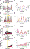
Extended Data Fig. 2. Population dynamics in the laboratory population and computational simulation in four conditions.
(A-D) Data from worms in the laboratory population (black) and corresponding simulations (red) graphed as in the laboratory population; culling and feeding schedules show the parameter that was varied in blue. The laboratory population data in panel B (10% culling all stages and 10 mg feeding every 24 hours) was used as the training set to determine the value of the following parameters: 1) cost of living and 2) metabolic efficiency (see Supplementary Section 4). (E-G) Comparisons of population summary statistics from the laboratory population (black) and corresponding simulations (red): Average and maximum worm number in initialization and maintenance phase; average, maximum, and minimum worm number in the maintenance phase (see Figure 1B). Culling and feeding schedules show the parameter that was varied in blue. The red simulated data show similar patterns as the black laboratory data with changing culling and feeding conditions. Values are mean +/− standard deviation of three biological replicates conducted in parallel of wild-type worm populations in the laboratory and three computational simulations.
Extended Data Fig. 3
Extended Data Fig. 3. Comparisons of laboratory and simulated populations in four conditions.
(A-F) Data from worms in representative laboratory populations and corresponding simulations; culling and feeding schedules show the parameter that was varied in color, with data in the corresponding color. (A,C,D,F) Red curves show the laboratory population or simulation with 10% culling of all stages every 24h and 10 mg feeding every 24h. (A,B,D,E) Purple curves show the laboratory population or simulation with 10% culling of all stages every 24h and 5 mg feeding every 24h. (B,E) Blue curves show the laboratory population or simulation with 5% culling of all stages every 24 h and 5 mg feeding every 24h. (C,F) Green curves show the laboratory population or simulation with 10% culling of all stages every 48h and 10 mg feeding every 48h. (A) Comparison of laboratory populations with 5 mg (purple) and 10 mg (red) feeding. (B) Comparison of laboratory populations with 5% (blue) and 10% (purple) culling. (C) Comparison of laboratory populations with 24h (red) and 48h (green) feeding and culling. (D) Comparison of simulations with 5 mg (purple) and 10 mg (red) feeding. (E) Comparison of simulations with 5% (blue) and 10% (purple) culling. (F) Comparison of simulations with 24 (red) and 48h (green) feeding and culling. The same data are shown in Extended Data Figure 2.
Extended Data Fig. 4
Extended Data Fig. 4. Flow diagrams of the life cycle in the computational simulation in four conditions.
(A-D) Flow diagrams of simulated populations with indicated feeding and culling schedules. Panel B is the same as Figure 3H. The node size represents the average number of worms in the population. The arrows represent the average number of worms that transit per 3-hour period from one worm stage to another worm stage. Green, birth transition; blue, developmental transitions; black, cull; brown, starve. The key shows the relationship between node size and average number of worms in that node during the 100-day simulation. Similarly, the key shows the relationship between arrow size and the average number of worms making the transition during a 3-hour time period. Numbers indicate precise arrow values.
Extended Data Fig. 5
Extended Data Fig. 5. Larva & dauer culling influences the size and dynamics of the worm nodes.
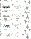
Representative simulated populations with 10 mg feeding and 10% (A), 75% (C), 80% (E), and 85% (G) stage-specific culling of larva and dauers (from 4, 6, 7, and 3 simulated populations, respectively). (B,D,F,H) Enlargements show days 50–75, corresponding to the yellow boxes. The number of worms in each node (egg, larva, dauer, adult, and parlad) is shown separately, and the black line shows the sum of all nodes. Note that the adults starve and transition to parlads one or more times in panels B and D, whereas this is not observed in panels F and H. The same simulated populations are shown in Figure 4,5, Extended data Figure 6, Supplementary Figure 11–17.
Extended Data Fig. 6
Extended Data Fig. 6. Larva & dauer culling influences the transitions of the bacteria node.
(A-L) Representative simulated populations with 10 mg feeding and 10% (A-C), 75% (D-F), 80% (G-I), and 85% (J-L) stage-specific culling of larva and dauer. The bacteria node is associated with four transitions: (1) bacteria input, bt(i>b), is user programmable and was set to 10 mg/24h, (2,3) bacteria ingestion by larvae bt(b>l) and adults bt(b>a), (4) bacteria culling, bt(b>c). Because bacteria culling is set to zero as an input parameter in this computational simulation, bt(b>c) is not shown. The transitions of the bacteria node are displayed as mg bacteria/3 hours. (B,E,H,K) Enlargements show days 50–60, corresponding to the yellow boxes. (C,F,I,L) Flow diagrams of the bacteria node. Values represent average mg bacteria/3 hours. The same simulated populations are shown in Figure 4,5, Extended data Figure 5, Supplementary Figure 11–17.
Extended Data Fig. 7
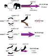
Extended Data Fig. 7. Framework explaining why diverse animals (elephant, C. elegans and mayfly) in populations die of old age.
In life cycle diagrams (left side), lower arrows indicate progeny production, labelled with typical ranges; arrow thickness indicates extent of progeny culling. Arrows on the right show cause of adult death, with thickness indicating fraction: old age (straight purple labelled with maximum lifespan), starve (curve gold), and cull (curve black). Combinations of intrinsic traits (maximum lifespan and progeny number) and environmental conditions (progeny and adult culling) result in elephant, C. elegans in state 2, and mayfly dying of old age in a population.
Figure 1.
Figure 1.. A laboratory population of C. elegans and E. coli.
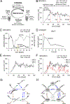
(A) Schematic of the laboratory population: one-time initialization followed by periodic culling, analyzing and feeding. (B,C) Data from wild-type worms in representative laboratory populations. Culling values indicate percent culled (10%), culling interval (24h), and stage of worms culled (all stages). Feeding values indicate amount of bacteria (10mg) and feeding interval (24h). (B) Analysis of summary statistics: time spans (black double arrows) and worm numbers (red double arrows) (C) Bacteria (black squares) and worms (gray circle) were analyzed daily. Yellow box indicates region enlarged in D. (D) Bacteria were analyzed hourly on day 9; bacteria were added between 0 and 1 hour (indicated by red arrow). (E) Three worm populations were initiated on the same day with larvae from the same group of synchronized worms and bacteria from the same concentrated solution (replicate 1a-1c). For the next 100 days, these laboratory populations were maintained separately and never mixed. We designate 1a-1c as biological replicates conducted in parallel. Replicate 1a is shown in panel B. (F) Replicate 2a was initiated on a different day with larvae from a different group of synchronized worms and bacteria from a different concentrated solution. We designate replicate 2a and replicate 1a/1b as biological replicates conducted at different times. Replicate 2a is shown in Figure 3A. (G) Lifecycle of C. elegans in the laboratory population. Adult, egg, larva, dauer and parlad are the five life stages. Birth transition arrows are green: adult to egg, and parlad to dauer. Developmental transition arrows are blue. Death transition arrows are orange (starve), black (cull), and purple (old age). (H) The lifecycle forms the foundation of the computational simulation. The five life stages are the worm nodes. Each node has three to six arrows that depict the worm transitions (wt). The bacteria node has four arrows that depict bacteria transitions (bt). abbreviations: a, adults; b, bacteria; c, cull; d, dauer; e, egg; i, input; l, larva; o, old age; p, parlad; s, starve.
Figure 2.
Figure 2.. A realistic computational simulation based on measurements of individual animals
(A-P) Wild-type, self-fertile hermaphrodites were cultured in S-Medium with the indicated concentrations of E. coli bacteria in the laboratory (gray-black lines). Worms were computationally simulated in bacteria concentrations that correspond to the laboratory conditions (red lines). (A, B) Average daily progeny production of individual adults in the laboratory and simulation. The single red curve in A corresponds well with the grey laboratory data with the same concentration of E. coli. (C) Summary statistics: time spans are black arrows (1–3); peak egg number is a red arrow (4); total egg number is the grey area under curve (5). (D) Comparison of peak egg number and total egg number from laboratory and simulations. Values for maximum size are mean +/−s.d. of minimum three independent experiments and for sexual maturity size the mean of two independent experiments for maturation size. (E,F) Average daily mass of individuals in the laboratory and simulation. The single red curve in E corresponds well with the grey laboratory data with the same concentration of E. coli. (G) Summary statistics: time spans are black arrows (1–2); mass values are red arrows (3–4). (H) Comparison of size at sexual maturity and maximum size from laboratory and simulations. Values for maximum size are mean +/−s.d. of minimum three independent experiments and for sexual maturity size the mean of two independent experiments for maturation size. (I,J) A population of dauers were cultured with bacteria starting at t = 0 (data show average percent of larvae in the population). Laboratory animals were in the dauer stage for as long as ten days. Average percentage larva in the laboratory (i) and simulation (i,j). The single red curve in I corresponds well with the grey laboratory data with the same concentration of E. coli. (K) Summary statistics: time span is a black arrow (1); percent larvae is a blue arrow (2). (L) Comparison of percent of dauers that transition after 120 hours from laboratory and computation. Values are mean +/− standard deviation of minimum three independent experiments. (M,N) Survival curves for populations of individuals cultured with the bacterial concentration beginning at the L1 stage in the laboratory (m) and the simulation (m,n) Lower concentrations of bacteria did not cause a substantial extension of adult lifespan, as might have been expected based on studies of caloric restriction. Notably, we initiated exposure to the bacterial concentration at the L1 and L4/young adult (Supplementary Figure 8) stage and continued this same concentration throughout the adult life, whereas caloric restriction experiments often involve specific protocols for exposure to the restricted food environment. (O) Summary statistics: time spans are black arrows (1–2) (P) Comparison of mean adult lifespan from laboratory conditions and computational simulations.
Figure 3.
Figure 3.. Population dynamics in the computational simulation.
(A) Data from three biological replicates conducted in parallel of wild-type worms in the laboratory population with culling and feeding schedules shown. These data were used as the training set for the computational simulation (Supplementary Section 4). (B) Data from three computational simulations corresponding to the laboratory population shown in panel A; 1 value/24 h is graphed. (C-G) Stages are shown separately and combined; enlargements show days 40–49. The lines represent 8 values/24 hours (every three hours) (C) Gray line displays the total number of worms (all stages combined), and the black line displays the concentration of bacteria. The lines represent 8 values/24 hours (every three hours). The yellow box indicates the interval enlarged in panels E-G. (D) Stages are shown separately and combined. (E-G) Enlargements show days 40–49, corresponding to the yellow boxes in panels C and D. The number of worms in each node (egg, larva, dauer, adult, and parlad) is shown separately and combined in panel E; panel F only shows stages separately and bacteria. Panel G shows only bacteria, adults and parlads. The worm scale was adjusted to visualize the dynamics of adults in panels E-G. Note that the bacteria level drops to zero on day 43 and day 44 (red arrow), triggering adults to starve and transition to parlads. (H) Flow diagram shows average number of worms in a node by the size of the circle and average number of worms transitioning per 3-hour time step by the size of the arrow; numbers specify arrow values more precisely. See Extended Data Figure 4 for scale bars.
Figure 4.
Figure 4.. Analysis of the impact of progeny culling on simulated populations.
(A-F) Summary statistics for simulated populations with a variable percentage of dauer & larva culling (values are averages of minimum three independent simulations ): (A) Average number of all worms. (B) Average percent of eggs, larva, and dauer among all worms. The black arrows show the tipping point for 50% and 100% old age as a cause of adult death. (C) Average percent of adults and parlad among all worms. (D) Average amount of bacteria in the bacterial node. (E) Cause of death for adults; with no adult culling, adults only die of starvation or old age. At each point on the horizontal axis, the values sum to 100%. (F) Total progeny number of individual adults in populations with 10, 75, 80, and 85% dauer & larva culling; values are the average +/− SD of three independent simulations with n=153, 258, 83 and 56 total worms, respectively. One-way ANOVA with F=197.3, Df=3, and p < 0.001 followed by a Tukey’s post-hoc HSD, 10–75: P=0.0012, 10–80 P=0.0000003, 10–85 P=0.0000001, 75–80 P=0.000008, 75–85 P=0.000002, 80–85 P=0.17). (G-H) Summary statistics for simulated populations with a variable percentage of egg culling (values are averages of 10 independent experiments): (G) Cause of death for adults; with no adult culling, adults only die of starvation or old age. (H) Average percent of eggs, larva, adults, dauer, and parlad among all worms. (I-J) Summary statistics for simulated populations of mutant worms that do not accumulate as dauers with a variable percentage of dauer & larva culling (values are averages of 10 independent experiments): (I) Cause of death for adults; with no adult culling, adults only die of starvation or old age. (J) Average percent of eggs, larva, adults, dauer, and parlad among all worms.
Figure 5.
Figure 5.. A tipping point for old age as a cause of death between 75–85% dauer and larva culling.
(A, D, G) The death transitions of the adult node, starve (wt(a>p)) and old age (wt(a>o)), are displayed as number of worms/3 hours. One representative simulated population is depicted for dauer & larva culling of 75% (A), 80% (D), and 85% (G). (B, E, H) Pie charts display the cause of adult death for 75, 80, and 85% dauer & larva culling. (C, F, I) Flow diagrams of the adult node displaying all worm transition rates for 75, 80, and 85% dauer & larva culling. Values in B-I are based on representative simulations. Average values are documented in Supplementary Table 10.
Figure 6.
Figure 6.. Analysis of adult death in simulated populations with different maximum lifespans and adult culling.
(A, B) Average percent of adults that die of old age for simulated populations with a variable percentage of dauer & larva culling. Maximum lifespan was 25, 40, or 60 days. Yellow box indicates enlargement in panel B. (B) Gray lines and numbers depict the lowest percent of dauer & larva culling that causes 50% of adults to die of old age: 25 days (1), 40 days (2), 60 days (3). (C) Bars depict the lowest percent of dauer & larva culling that causes 50% of adults to die of old age based on the data in panel B. (D-F) Summary statistics for simulated populations with a variable percentage of adult culling: average percent of adults that die of starvation, old age or culling. At each point on the horizontal axis, the values sum to 100%. We used the dauer & larval culling value that causes 50% of adults to die of old age with 0% adult culling: 77% for the 25-day maximum lifespan (D), 80% for the 40-day maximum lifespan (E), and 85% for the 60-day maximum lifespan (F). (G) Bars depict the lowest percent of adult culling that causes 0% of adults to die of old age based on the data in panels D-F. (H) Summary of the relationship between maximum lifespan, food security (progeny survival), and extrinsic adult death (culling). Triangles indicate conditions in which more than 50% of adults die of old age. (I) Multiple factors influence the number of adults in the population that die of old age. Values are averages of minimum three independent experiments.

References

    1. Medawar P An unsolved problem of Biology (1952).
    1. Promislow DEL Senescence in natural populations of mammals: A comparative study. Evolution (N. Y) 48, 1869–1887 (1991). - PubMed
    1. Nussey DH, Froy H, Lemaitre JF, Gaillard JM & Austad SN Senescence in natural populations of animals: Widespread evidence and its implications for bio-gerontology. Ageing Res. Rev 12, 214–225 (2013). - PMC - PubMed
    1. Gaillard JM & Lemaître JF An integrative view of senescence in nature. Funct. Ecol 34, 4–16 (2020).
    1. Wensink MJ, Caswell H & Baudisch A The Rarity of Survival to Old Age Does Not Drive the Evolution of Senescence. Evol. Biol 44, 5–10 (2017). - PMC - PubMed