. 2023 Dec;55(12):2255-2268.
doi: 10.1038/s41588-023-01586-6. Epub 2023 Nov 30.

Mapping the dynamic genetic regulatory architecture of HLA genes at single-cell resolution

Collaborators, Affiliations

Mapping the dynamic genetic regulatory architecture of HLA genes at single-cell resolution

Joyce B Kang et al. Nat Genet. 2023 Dec.

Abstract

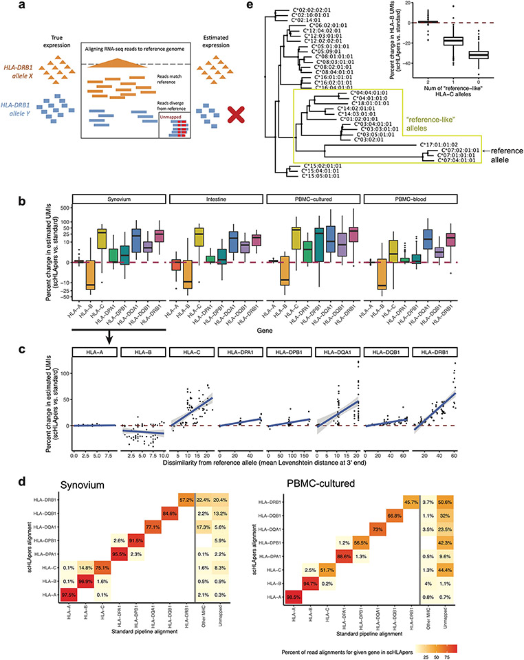
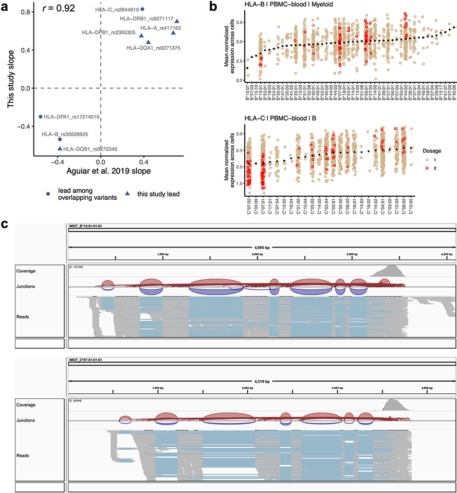
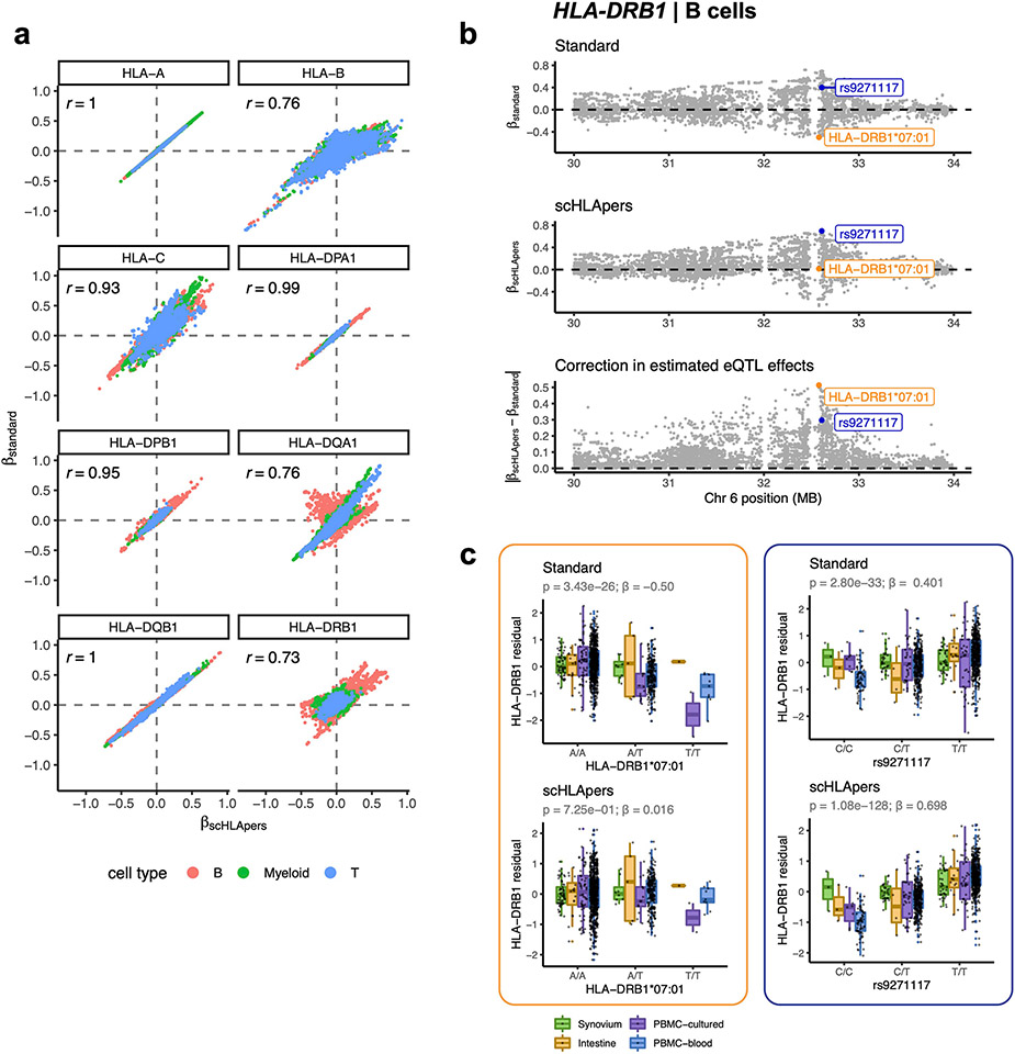
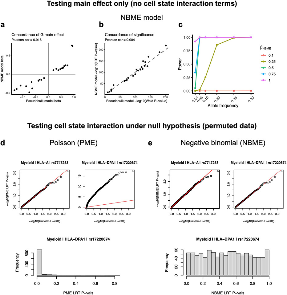
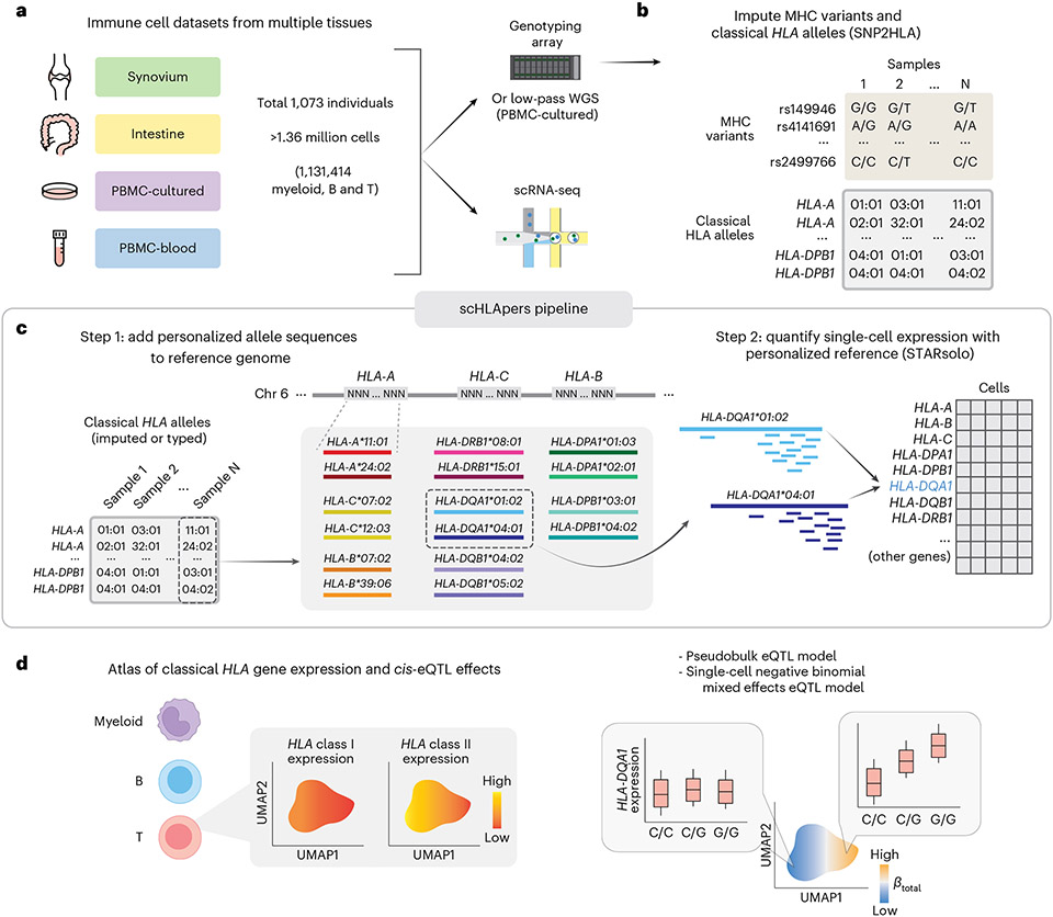
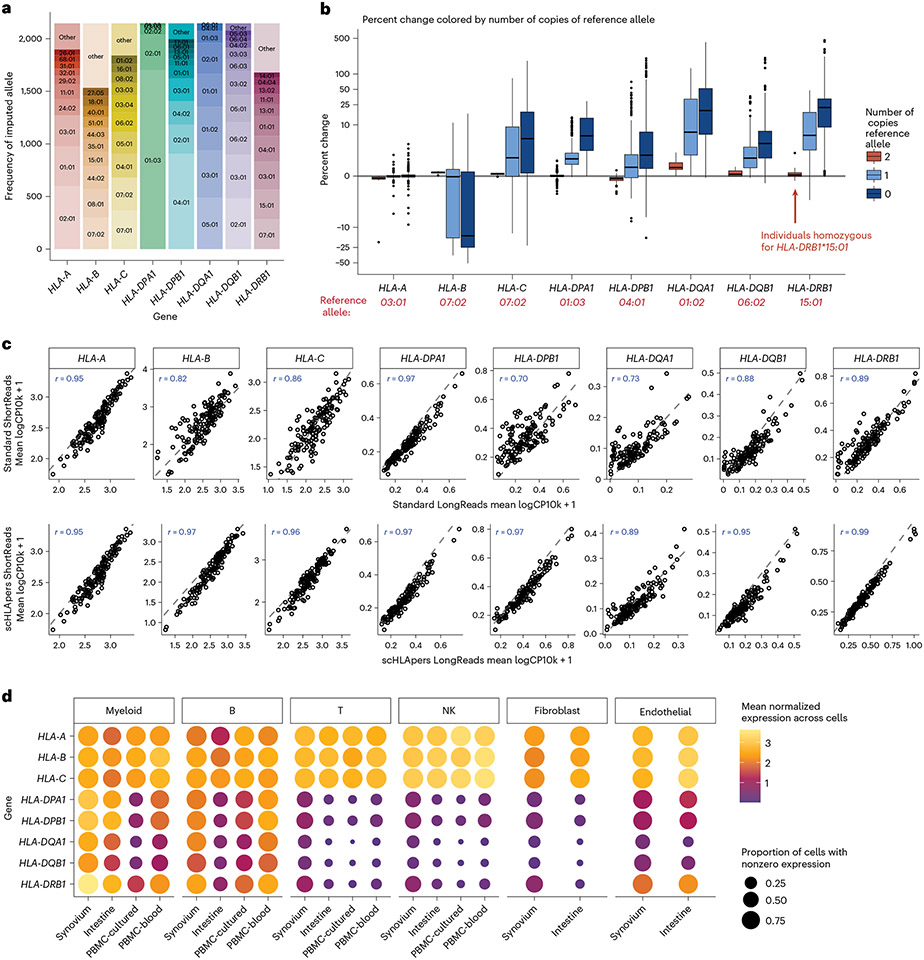
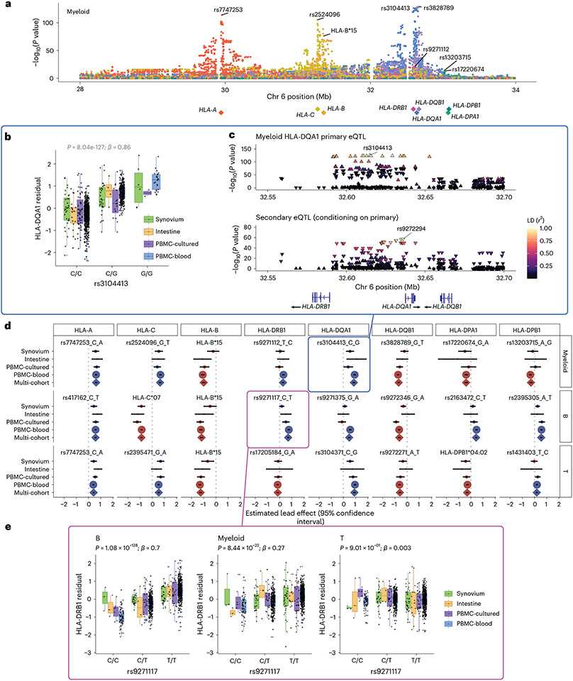
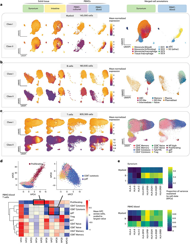
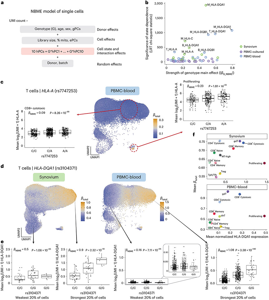
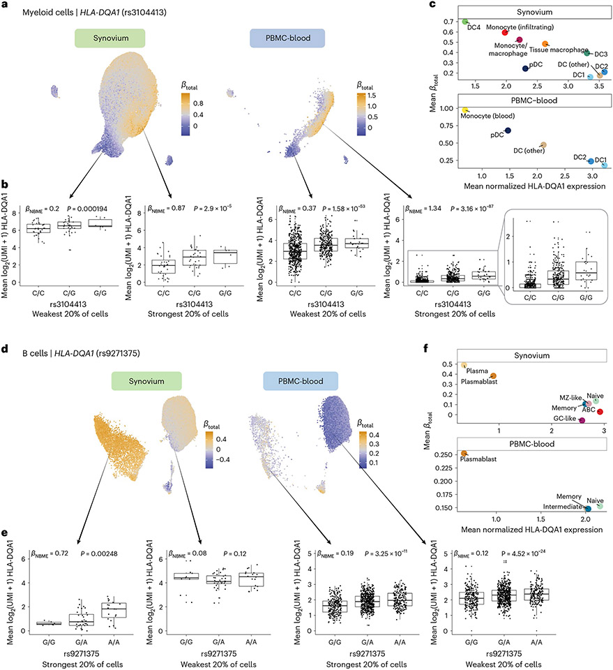
The human leukocyte antigen (HLA) locus plays a critical role in complex traits spanning autoimmune and infectious diseases, transplantation and cancer. While coding variation in HLA genes has been extensively documented, regulatory genetic variation modulating HLA expression levels has not been comprehensively investigated. Here we mapped expression quantitative trait loci (eQTLs) for classical HLA genes across 1,073 individuals and 1,131,414 single cells from three tissues. To mitigate technical confounding, we developed scHLApers, a pipeline to accurately quantify single-cell HLA expression using personalized reference genomes. We identified cell-type-specific cis-eQTLs for every classical HLA gene. Modeling eQTLs at single-cell resolution revealed that many eQTL effects are dynamic across cell states even within a cell type. HLA-DQ genes exhibit particularly cell-state-dependent effects within myeloid, B and T cells. For example, a T cell HLA-DQA1 eQTL ( rs3104371 ) is strongest in cytotoxic cells. Dynamic HLA regulation may underlie important interindividual variability in immune responses.


Figures

Extended Data Fig. 1 ∣
Extended Data Fig. 1 ∣. Correcting HLA expression estimation bias with scHLApers.
a, Schematic showing how high HLA gene polymorphism leads to bias in read alignment to a single reference genome. Consider two hypothetical individuals who are either homozygous for HLA-DRB1 allele X (orange) or allele Y (blue), where the reference allele is X. Reads from X will align perfectly to the reference, leading to accurate HLA-DRB1 quantification. However, for Y, reads will fail to align to the reference due to discordant sequence content, leading to unmapped reads and underestimation of expression. b, Percentage change in expression (total UMIs for HLA gene per individual, y-axis) across cohorts (synovium, n = 69 individuals; intestine, n = 22; PBMC-cultured, n = 73; PBMC-blood, n = 909). c, Percentage change in estimated expression (total UMIs for HLA gene per individual, y-axis) in synovium (n = 69) as a function of the mean (between the individual’s two alleles) Levenshtein distance relative to the GRCh38 reference allele at the 3’ end of each gene (x-axis). For b and c, dashed horizontal red lines denote no change. Fitted linear regression line (blue) shown with 95% confidence region. d, Heatmap showing the alignment of reads to each gene in scHLApers (rows) versus where the same read aligned (‘came from’) in the standard pipeline (columns) for synovium (top) and PBMC-cultured (bottom). Columns include HLA genes, other regions in the extended MHC, or unmapped reads. Rows sum to 100%, and a darker color indicates that more of the reads aligning to a given gene in scHLApers came from the corresponding location in the standard pipeline. e, Phylogenetic tree derived from a multiple sequence alignment of HLA-C allelic genomic sequences. The reference allele is C*07:02. Yellow box shows alleles similar to the reference (‘reference-like’). Boxplot on right shows the change in HLA-B estimated UMI counts summed across cells from each sample (y-axis) compared to the genotype for HLA-C in terms of dosage of ‘reference-like’ alleles (x-axis), across n = 1,073 individuals from all cohorts. For b and e, boxplot center line represents median, lower/upper box limits represent 25/75% quantiles, whiskers extend to box limit ±1.5 × IQR, and outlying points are plotted individually.
Extended Data Fig. 2 ∣
Extended Data Fig. 2 ∣. Concordance of eQTLs with bulk RNA-seq, differential allelic expression, and read alignment visualization.
a, Concordance between the effect sizes of lead HLA eQTLs identified in the multi-cohort pseudobulk model for B cells (this study, y-axis) and the same variant’s effect in LCLs identified through bulk RNA-seq eQTL analysis (Aguiar et al., x-axis). Because not all lead variants in this study were directly comparable due to different sets of tested variants, we tested the concordance of the most significant variant present in both datasets (triangles indicate that the exact lead variant in this study was also tested in Aguiar et al., whereas circles indicate ‘substitute’ lead variants was used for comparison). b, HLA-B expression in myeloid cells (top, n = 861 individuals) and HLA-C expression in B cells (bottom, n = 909), showing mean log(CP10k + 1)-normalized expression (y-axis) across cells for each individual in PBMC-blood by allele (x-axis). Each individual’s expression value is plotted once if they are homozygous (red) and twice if heterozygous (tan) for each allele (imputed dosage is rounded to the nearest integer). The black diamonds show the mean value for each allele (used to order the x-axis). c, Integrative Genomics Viewer (IGV) screenshots showing read alignments for alleles HLA-B*15:01 and HLA-C*07:01, associated with lower expression of the respective genes, for a representative individual in synovium.
Extended Data Fig. 3 ∣
Extended Data Fig. 3 ∣. Personalization improves eQTL effect size estimates.
a, Comparison of eQTL effect size estimates calculated using expression quantified by scHLApers (x-axis) vs. standard pipeline (y-axis). Each dot represents one of 12,045 MHC-wide genetic variants tested using the pseudobulk eQTL model per cell type (color). Pearson correlation is labeled for each gene. b, Example of eQTL effect correction through the use of corrected expression estimates, shown for HLA-DRB1 in B cells. eQTL effect sizes (y-axis) estimated for MHC variants along Chr. 6 (x-axis), shown for standard pipeline (top), scHLApers pipeline (middle), and the magnitude of difference between the betas from the two pipelines (bottom). The variant with the largest correction in estimated eQTL effect (HLA-DRB1*07:01) is labeled in orange, and the lead variant in the scHLApers pipeline (rs9271117) is labeled in blue. c, Boxplots visualizing the eQTL effects across individuals for HLA-DRB1*07:01 (left) and rs9271117 (right) using HLA-DRB1 expression estimates from the standard (top) vs. scHLApers (bottom) pipelines. Increased dosage of the ALT allele (x-axis) vs. HLA-DRB1 expression in B cells (y-axis: units are residual of inverse normal transformed mean log(CP10k + 1)-normalized expression across cells after regressing out covariates), across n = 1,069 individuals total (synovium, n = 65; intestine, n = 22; PBMC-cultured, n = 73; PBMC-blood, n = 909), plotted by dataset (color). For HLA-DRB1*07:01, ‘A’ denotes absence of the allele, and ‘T’ denotes presence (rather than REF/ALT nucleotides). Nominal Wald P-values are derived from linear regression (two-sided test).
Extended Data Fig. 4 ∣
Extended Data Fig. 4 ∣. Testing single-cell NBME model for concordance with pseudobulk and for calibration for genotype-cell-state interactions.
a-e, The models in a-c test genotype main effects, whereas d and e test genotype-cell-state interaction. a,b, Concordance of genotype main effect estimates (a) and significance of genotype main effect (b) between the NBME model (y-axis) and the pseudobulk model for the PBMC-blood dataset (x-axis) across all cell types and classical HLA genes. c, Power of the NBME single-cell eQTL model to detect regulatory effects across allele frequencies. The proportion of simulations where the null hypothesis was appropriately rejected at α = 5 × 10⁻⁸ (y-axis) in the presence of a simulated eQTL effect across 1000 simulations. Simulations were run across a range of eQTL allele frequencies (x-axis) and effect sizes (colors) using the PBMC-blood myeloid data and HLA-DQA1 expression. d,e, We permuted cell state (10 hPCs as a block) for 1,000 tests and obtained interaction P-values from a one-sided likelihood ratio test (LRT) comparing to the null model without G×hPC interaction terms. Q-Q plots showing statistical calibration (compared to uniform P-values) for PME model (d) versus NBME model (e) when testing for cell state interactions for representative class I (HLA-A) and class II (HLA-DPA1) genes in myeloid cells in PBMC-blood. The red line is the identity line. The histograms below show distributions of LRT P-values for HLA-DPA1.
Fig. 1 ∣
Fig. 1 ∣. Overview of study and scHLApers pipeline.
a, We used four datasets with genotype and scRNA-seq data: synovium (n = 69 individuals, m = 275,323 cells), intestine (n = 22, m = 137,321), PBMC-cultured (n = 73, m = 188,507), and PBMC-blood (n = 909, m = 765,079). b, Using the genotype data, we imputed SNPs within the MHC and one- and two-field classical HLA alleles. c, Schematic of scHLApers pipeline, where scRNA-seq reads are aligned to a personalized reference for each individual based on classical HLA alleles. In the example, an individual is heterozygous for all eight HLA genes, so 16 additional contigs are added to the reference. Original reference gene sequences are masked with Ns. scHLApers outputs a whole-transcriptome counts matrix with improved HLA gene estimates. Both alleles contribute to count estimation for each gene. d, We generated an atlas of HLA expression across all cell types (left) and mapped eQTLs for HLA genes in myeloid, B and T cells. Schematic of example dynamic eQTL (right), where eQTL strength (slope, βtotal) changes across T cell states.
Fig. 2 ∣
Fig. 2 ∣. Quantifying single-cell HLA expression using scHLApers.
a, Frequency of each imputed two-field HLA allele across all cohorts. Most common alleles (up to ten) labeled for each gene, with other alleles grouped into ‘other’. Alleles with frequency of less than five are not labeled. b, Boxplot (each observation is one sample) showing percentage change (y axis) in the estimated UMIs for each HLA gene (x axis) summed across all cells after quantification with scHLApers (compared to a pipeline using the standard reference genome) in the combined dataset (n = 1,073 individuals), colored by number of copies of the reference allele (labeled in red below for each gene). Gray horizontal line denotes no change. Boxplot center line represents median, lower/upper box limits represent 25/75% quantiles, whiskers extend to box limit ± 1.5× interquartile range, and outlying points are plotted individually. c, Comparing the estimated HLA expression as measured using shorter reads (84 bp, y axis) versus longer reads (289 bp, x axis) in the standard pipeline (top row) compared to scHLApers (bottom row). Each dot shows the mean log(CP10k + 1)-normalized expression across cells for one sample in PBMC-cultured (n = 146 samples from 73 individuals). r is Pearson correlation; dashed gray line is identity line. d, HLA expression in different cell types across cohorts: myeloid (m = 145,090 cells), B (m = 180,935), T (m = 805,389), NK (m = 125,865), fibroblasts (m = 82,651) and endothelial (m = 26,300). Dot size indicates proportion of cells with nonzero expression; color indicates log(CP10k + 1)-normalized expression (mean across cells).
Fig. 3 ∣
Fig. 3 ∣. eQTLs for classical HLA genes from pseudobulk analysis.
a, Manhattan plot showing the significance (y axis) of association between tested MHC variants (x axis) and expression of each HLA gene (color) in myeloid cells from the multi-cohort model. Most significant (lead) eQTLs are labeled. Diamonds indicate TSS of each gene. b, Boxplot showing an example lead eQTL (rs3104413). Increased dosage of the G allele (x axis) associates with higher HLA-DQA1 expression in myeloid cells (y axis: units are the residual of inverse normal transformed mean log(CP10k + 1)-normalized expression across cells after regressing out covariates), n = 1,025 individuals total (synovium n = 69, intestine n = 22, PBMC-cultured n = 73, PBMC-blood n = 861), plotted by dataset (color). All lead eQTLs shown in Supplementary Fig. 6c, Locus zoom plot for the primary (rs3104413) and secondary (rs9272294) eQTLs for HLA-DQA1 in myeloid cells. Significance of association (y axis) is shown for nearby variants on chromosome 6 (x axis); color denotes LD (r2 with lead eQTL in multi-ancestry HLA reference). Triangles point upwards for a positive (downwards for negative) effect on expression. Gene bodies and direction of transcription (arrows) for HLA-DRB1, HLA-DQA1 and HLA-DQB1 are underneath. d, Grid showing lead eQTLs for each HLA gene (columns) in each cell type (rows: myeloid cells n = 1,025, B cells n = 1,069, and T cells n = 1,072 individuals total; for dataset breakdown, see Supplementary Table 2). Each element of the grid includes a forest plot with the estimated lead effect size (x axis) and 95% confidence interval (mean ± 1.96 standard error) of the estimate from the multi-cohort analysis (diamond) and the same variant-gene pair tested for an association within each cohort separately (dots above). Size of the dots/diamond indicates cohort size; color indicates sign of the ALT allele’s effect on expression (blue for positive, red for negative). The eQTLs boxed in blue and magenta are highlighted in b and c and in e, respectively. e, Example of a cell-type-dependent eQTL (rs9271117) that was the lead eQTL for HLA-DRB1 and strongest in B cells. Boxplots are formatted analogously to b and show the eQTL’s effect for all three cell types separately. In a–c and e, nominal Wald P values are derived from linear regression (two-sided test).
Fig. 4 ∣
Fig. 4 ∣. Integrating single cells into a unified cell state embedding across datasets.
a–c, UMAP of cells generated using tissue-defined embedding (top ten hPCs from synovium and intestine), with PBMC datasets projected into the same space. The plot is divided into three sections: myeloid cells (a), B cells (b) and T cells (c). Left: class I and II HLA expression across cells across datasets. Cells are binned into hexagons to avoid overplotting (50 bins per horizontal and vertical UMAP directions) and colored by mean log(CP10k + 1)-normalized expression of class I/II genes per bin (for example, for class I, mean of HLA-A, HLA-B and HLA-C). Right: cell state annotations (color) for a representative PBMC (PBMC-blood) and solid tissue (synovium) dataset from merging annotations from each dataset to a shared set of labels. d, Heatmap showing mean value for each hPC (color) across cells for each discrete cell annotation within T cells in PBMC-blood. Values are scaled relative to the most extreme value across cell states. Black boxes and inset figures above show examples of how hPCs are linked to original cell state labels: proliferating cells (high in hPC4 and hPC5) and CD8+ cytotoxic and γδ (gdT) cells (high in hPC7, low in hPC8). e, Estimated proportion of variance in UMIs explained by cell state hPCs (color) across HLA genes and cell types.
Fig. 5 ∣
Fig. 5 ∣. Identifying dynamic eQTLs by modeling single cells.
a, NBME model of single cells used to identify cell-state-dependent regulatory effects. Pink box highlights terms for cell state (ten hPCs per cell type) and their interaction with genotype. b, Testing lead eQTLs identified in multi-cohort pseudobulk analysis for cell-state dependence using the NBME model in each dataset (color) in myeloid (‘M’), B and T cells. Magnitude of genotype main effect (x axis) versus the significance of cell-state interaction (y axis), measured using chi-square (χ2) statistic from LRT comparing full model (a) to null model without G × hPC interactions. c, Dynamic HLA-A eQTL (rs7747253) in T cells (n = 909 individuals, m = 538,579 cells in PBMC-blood). UMAP shows T cells colored by estimated eQTL strength (βtotal). Boxplots for the eQTL effect are shown for two annotated cell states (CD8+ cytotoxic and proliferating, outlined in red circles), showing mean log2(UMI + 1) of HLA-A across all cells in the cell state per individual by genotype. βNBME and P values are derived from fitting the NBME model without cell-state interaction terms on the discrete cell populations and comparing to a null model without genotype using an LRT (n = 908 individuals, m = 96,516 cells for CD8+ cytotoxic; n = 409, m = 739 for proliferating). Boxplot center line represents median, lower/upper box limits represent 25/75% quantiles, whiskers extend to box limit ± 1.5× interquartile range, and outlying points are plotted individually. d–f, Dynamic HLA-DQA1 eQTL (rs3104371) in T cells (n = 68 individuals, m = 82,423 cells in synovium; n = 909, m = 538,579 in PBMC-blood). UMAP (d) colored by eQTL strength (βtotal), from blue (weakest) to orange (strongest). Boxplots (e) showing the eQTL effects in cells from the top and bottom quintile of βtotal, showing mean log2(UMI + 1) per individual (y axis) by genotype. Labeled βNBME and P value are derived from fitting the NBME model without cell-state interaction terms on the cells from the discrete quintile and comparing to a null model without genotype using an LRT. Boxplot elements defined as in c. Scatterplot (f) showing the mean βtotal (y axis) compared to the mean log(CP10k + 1)-normalized expression of HLA-DQA1 (x axis) across annotated cell states (color). LRT, likelihood ratio test (one-sided).
Fig. 6 ∣
Fig. 6 ∣. Dynamic HLA-DQ eQTLs in myeloid and B cells.
a–c, Dynamic HLA-DQA1 eQTL (rs3104413) in myeloid cells (n = 69 individuals, m = 66,789 cells in synovium; n = 861, m = 40,568 in PBMC-blood). UMAP (a) of cells for tissue-defined embedding, colored by βtotal, from blue (weakest) to orange (strongest). Boxplot (b) showing the eQTL effect across individuals in the bottom and top quintiles of estimated βtotal. Labeled βNBME and P value are from fitting the NBME model without cell-state interaction terms on the cells from the discrete quintile and comparing to a null model without genotype using an LRT. Mean log2(UMI + 1) across cells per individual (y axis) by each genotype. Boxplot center line represents median, lower/upper box limits represent 25/75% quantiles, whiskers extend to box limit ± 1.5× interquartile range, and outlying points are plotted individually. Scatterplot (c) showing the mean estimated βtotal (y axis) compared to the mean log(CP10k + 1)-normalized expression of HLA-DQA1 (x axis) across annotated cell states (color). d–f, Dynamic HLA-DQA1 eQTL in B cells (n = 65 individuals, m = 25,917 cells in synovium; n = 909 individuals, m = 80,784 in PBMC-blood). d–f are analogous to a–c, respectively. LRT, likelihood ratio test (one-sided).

Update of

References

    1. Lenz TL, Spirin V, Jordan DM & Sunyaev SR Excess of deleterious mutations around HLA genes reveals evolutionary cost of balancing selection. Mol. Biol. Evol 33, 2555–2564 (2016). - PMC - PubMed
    1. Dendrou CA, Petersen J, Rossjohn J & Fugger L HLA variation and disease. Nat. Rev. Immunol 18, 325–339 (2018). - PubMed
    1. Matzaraki V, Kumar V, Wijmenga C & Zhernakova A The MHC locus and genetic susceptibility to autoimmune and infectious diseases. Genome Biol. 18, 76 (2017). - PMC - PubMed
    1. Trowsdale J & Knight JC Major histocompatibility complex genomics and human disease. Annu. Rev. Genomics Hum. Genet 14, 301–323 (2013). - PMC - PubMed
    1. Okada Y. et al. Fine mapping major histocompatibility complex associations in psoriasis and its clinical subtypes. Am. J. Hum. Genet 95, 162–172 (2014). - PMC - PubMed

MeSH terms