. 2023 Nov 24:14:1260283.
doi: 10.3389/fimmu.2023.1260283. eCollection 2023.

High-dimensional phenotyping of the peripheral immune response in community-acquired pneumonia

Affiliations

High-dimensional phenotyping of the peripheral immune response in community-acquired pneumonia

Tom D Y Reijnders et al. Front Immunol. .

Abstract

Background: Community-acquired pneumonia (CAP) represents a major health burden worldwide. Dysregulation of the immune response plays an important role in adverse outcomes in patients with CAP.

Methods: We analyzed peripheral blood mononuclear cells by 36-color spectral flow cytometry in adult patients hospitalized for CAP (n=40), matched control subjects (n=31), and patients hospitalized for COVID-19 (n=35).

Results: We identified 86 immune cell metaclusters, 19 of which (22.1%) were differentially abundant in patients with CAP versus matched controls. The most notable differences involved classical monocyte metaclusters, which were more abundant in CAP and displayed phenotypic alterations reminiscent of immunosuppression, increased susceptibility to apoptosis, and enhanced expression of chemokine receptors. Expression profiles on classical monocytes, driven by CCR7 and CXCR5, divided patients with CAP into two clusters with a distinct inflammatory response and disease course. The peripheral immune response in patients with CAP was highly similar to that in patients with COVID-19, but increased CCR7 expression on classical monocytes was only present in CAP.

Conclusion: CAP is associated with profound cellular changes in blood that mainly relate to classical monocytes and largely overlap with the immune response detected in COVID-19.

Keywords: COVID-19; chemokine receptors; host response; immunophenotyping; immunosuppression; monocytes; pneumonia; spectral flow cytometry.


Conflict of interest statement

Author AP was employed by the company Cytek Biosciences, Inc. The remaining authors declare that the research was conducted in the absence of any commercial or financial relationships that could be construed as a potential conflict of interest.

Figures

Figure 1
Figure 1
Circulating immune cell frequencies in patients with community-acquired pneumonia (CAP) and controls. (A) Experimental design: we obtained peripheral blood mononuclear cells (PBMCs) and plasma from patients with CAP and two comparator groups: controls without signs of acute infection and disease controls with COVID-19. We used 36-color spectral flow cytometry to acquire surface marker expression patterns for each cell and clustered cells using FlowSOM. We performed analyses at several levels (1): individual cells; (2) MCs; (3) cell subsets, defined as all MCs that fall within the same gate as determined by manual gating (e.g. we find nine classical monocyte MCs that altogether make up one classical monocyte subset); and (4) lineages, assigned to MCs based on commonly used groupings in the immunological literature. In some analyses, we compared MCs as whole, whereas in others we look at the values of individual subjects whose cells make up that MC (e.g. the median fluorescence intensity [MFI] of HLA-DR for a subject within an MC). (B) Uniform manifold approximation and projection (UMAP) representative of all PBMCs from patients with CAP and controls, colored by lineage (color codes as in D–F) or (C) by group. (D) Number of metaclusters (MCs) per lineage. (E) Stacked bar charts indicating the mean of each lineage as a proportion of total cells for patients with CAP and controls. The proportion of (contaminating) granulocytes in the PBMC fraction was very low and therefore indicated in text at the bottom of each bar. (F) Volcano plot for the comparison of all 86 MCs (as proportions of total number of cells per subject). The X-axis depicts the difference in means of the log2-transformed proportion of each MC, the Y-axis depicts the -log10-transformed Benjamini-Hochberg- (BH)-adjusted P-value obtained using Welch’s t-test. Larger labelled points above the horizontal line represent significantly differentially abundant MCs. DC, dendritic cell; NK, natural killer.
Figure 2
Figure 2
Immune activation and suppression markers on monocytes and dendritic cells (DCs). (A) Optimized t-distributed stochastic neighbor embedding (opt-SNE) plot representative of all monocytes and DCs, colored by cell subset (e.g. all nine classical monocyte metaclusters [MCs] have the same color). (B) opt-SNE plot with the same coordinates as shown in (A), but only showing MCs significantly different between patients with CAP and controls in the monocyte/DC lineage. Shades of red indicate MCs significantly higher in CAP, shades of blue indicate MCs significantly higher in controls. (C) Expression of surface markers relevant for immune cell activation and suppression on individual cells in the three classical monocyte MCs increased in CAP (MCs 64, 65, and 76), as compared with all MCs not significantly different in Figure 1F (MCs 63, 69, 70, 71, 79, and 83). The difference in fluorescence intensity is expressed as a Hedges’ g effect size. The magnitude of this effect size is commonly interpreted as follows: ≥0.2 = small effect, ≥0.5 = moderate effect, ≥0.8 = large effect. (D) Bubble plot for the statistical comparisons between median fluorescence intensity (MFI) of the selected surface markers for each patient within each MC, i.e. using each individual subject’s MFI of their cells within that MC, and then comparing CAP and control. The size of the bubbles is proportional to the -log10-transformed BH-adjusted P value obtained using Wilcoxon’s rank-sum test (adjusted per surface marker). Non-significant comparisons are displayed as more transparent bubbles to facilitate interpretation of overall patterns. The color of the bubbles is proportional to the magnitude and direction of the differences (red is higher in CAP, blue is lower in CAP), expressed as the Hedges’ g effect size. The plot is stratified based on whether these MCs are differentially abundant in the volcano plot depicted in Figure 1F . (E) Boxplots showing the (arcsinh transformed) MFI of programmed death ligand 1 (PD-L1) and human leukocyte antigen – DR isotype (HLA-DR) for each subject within the classical monocyte subset (i.e. all nine classical monocyte MCs taken together). Each colored dot represents an individual subject, the box represents the lower and upper quartile, the middle line and black dot represent the median. **P <0.01, ****P <0.0001. (F) Scatterplots for the correlations between the expression of PD-L1 and HLA-DR and the relative abundance of monocyte/DC MCs. Y-axis shows the (arcsinh transformed) MFI; X-axis shows the Hedges’ g effect size (positive means higher in CAP versus controls, negative means lower in CAP versus controls). The correlation coefficient (Pearson’s r) and corresponding P-value are depicted in the plot. The size of the individual points in the scatterplots is proportional to the mean proportion of these cells within all monocytes and DCs of both CAP and control subjects. PD-1, programmed death 1.
Figure 3
Figure 3
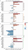
Chemokine receptors on monocytes and dendritic cells (DCs). (A) Expression of chemokine receptors on individual cells in the three classical monocyte MCs increased in CAP (MCs 64, 65, and 76), as compared with all MCs not significantly different in Figure 1F (MCs 63, 69, 70, 71, 79, and 83). The difference in fluorescence intensity is expressed as a Hedges’ g effect size. The magnitude of this effect size is commonly interpreted as follows: ≥0.2 = small effect, ≥0.5 = moderate effect, ≥0.8 = large effect. (B) Bubble plot for the statistical comparisons between median fluorescence intensity (MFI) of the selected surface markers for each patient within each metacluster (MC), i.e. using each individual subject’s MFI of their cells within that MC and then comparing CAP and control. The size of the bubbles is proportional to the -log10-transformed Benjamini-Hochberg- (BH)-adjusted P value obtained using Wilcoxon’s rank-sum test (adjusted per surface marker). Non-significant comparisons are displayed as transparent bubbles to facilitate interpretation of overall patterns. The color of the bubbles is proportional to the magnitude and direction of the differences (red is higher in CAP, blue is lower in CAP), expressed as the Hedges’ g effect size. The plot is stratified based on whether these MCs are differentially abundant in the volcano plot depicted in Figure 1F . (C) Boxplots showing the (arcsinh transformed) MFI of CCR7 and CXCR5 for each subject within the classical monocyte subset (i.e. all nine classical monocyte MCs taken together). Each colored dot represents an individual subject, the box represents the lower and upper quartile, the middle line and black dot represent the median. ****P <0.0001. (D) Scatterplots for the correlations between the expression of CCR7 and CXCR5 and the relative abundance of monocyte/DC MCs. Y-axis shows the (arcsinh transformed) MFI; X-axis shows the Hedges’ g effect size (positive means higher in CAP versus controls, negative means lower in CAP versus controls). The correlation coefficient (Pearson’s r) and corresponding P-value are depicted in the plot. The size of the individual points in the scatterplots is proportional to the mean proportion of these cells within all monocytes and DCs of both CAP and control subjects. (E) Plot for correlations between CCR7 and CXCR5 expression and the expression of other selected surface markers on all nine classical monocyte MCs. The size and color of the square are proportional to the correlation coefficient (Spearman’s ρ). Red represents a positive correlation, blue a negative correlation. PD-(L)1, programmed death (ligand) 1.
Figure 4
Figure 4
Classical monocyte surface marker expression delineates two clusters of patients with CAP. (A) Biplot for principal component (PC)1 and PC2 obtained by principal component analysis using the median expression for each patient of all surface markers indicative of immune cell activation, suppression, and migration on the nine classical monocyte clusters. K-means clustering defined the two clusters, referred to as KM-cluster 1 (n = 21) and KM-cluster 2 (n = 19). (B) Boxplots showing the (arcsinh transformed) median fluorescence intensity (MFI) per patient of depicted surface markers within the classical monocyte subset, stratified by the two KM-clusters. Each colored dot represents an individual subject, the box represents the lower and upper quartile, the middle line and black dot represent the median. **P <0.01, ****P <0.0001. (C) Boxplots for the plasma concentrations of IL-6 and IL-1RA patients with available plasma samples in KM-cluster 1 (n = 20) and KM-cluster 2 (n = 17). The box represents the lower and upper quartile, the middle line represent the median, the whiskers represent the distribution up to 1.5 times the interquartile range beyond the lower or upper quartile, outliers are depicted as individual dots. *P <0.05. (D) Kaplan-Meier curve for the time-to-event analysis of time to clinical stability or discharge. Clinical stability was defined using the modified Halm’s criteria (14): temperature ≤37,2°C, heart rate ≤100 bpm, systolic blood pressure ≤90 mmHg, respiratory rate ≤ 24 bpm, and oxygen saturation ≥90% for the entire day. The hazard ratio (HR) for KM-cluster 2 (compared with KM-cluster 1) from the Cox proportional hazards model is displayed in the graph. There were no competing risks for reaching clinical stability or discharge in this cohort (i.e. no patients were transferred or died prior to the event taking place). HLA-DR, human leukocyte antigen – DR isotype; IL(-RA), interleukin (receptor antagonist); PD-(L)1, programmed death (ligand) 1.
Figure 5
Figure 5
Phenotype of the remaining significantly more abundant metaclusters (MCs) in CAP. Expression of selected surface markers relevant for cell phenotype and function within the indicated lineages for MCs (A) 17, (B) 23, (C) 38, and (D) 86. The difference in fluorescence intensity is expressed as a Hedges’ g effect size obtained by comparing individual cells within the indicated MCs against all other cells within their respective lineages. HLA-DR, human leukocyte antigen – DR isotype; PD-(L)1, programmed death (ligand) 1.
Figure 6
Figure 6
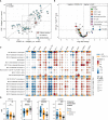
Circulating immune cell frequencies and phenotypes in CAP when compared with COVID-19. (A) Scatterplot displaying the difference in the abundance, expressed as a Hedges’ g effect size, for all 86 metaclusters (MCs) for CAP compared with controls (more towards the top on the Y-axis means higher in CAP) and for COVID-19 compared with controls (more to the right on the X-axis means higher in COVID-19). MCs with a biologically relevant difference with controls in one or both groups – defined as a Hedges’ g ≥0.5, indicated by the dashed line rectangle in the center – are highlighted as larger circles and labelled. The color indicates whether the metaclusters are in the same quadrant, i.e. whether the frequency of the MC shifts in the same direction when comparing CAP or COVID-19 with controls. The closer a circle is to the dashed diagonal line with a slope of 1, the closer the effect sizes for CAP or COVID-19 versus controls. The correlation between the effect sizes for all MCs is displayed as Pearson’s r in the top left corner. (B) Volcano plot for the comparison of all 86 MCs (as proportions of total number of cells per subject) between patients with CAP and patients with COVID-19. The X-axis depicts the difference in means of the log2-transformed proportion of each MC, the Y-axis depicts the -log10-transformed Benjamini-Hochberg- (BH)-adjusted P-value obtained using Welch’s t-test. Larger labelled points above the horizontal line represent significantly differentially abundant MCs. (C) Bubble plot for the statistical comparisons between MFI of the selected surface markers for each patient within each MC, i.e. using each individual subject’s MFI of their cells within that MC and then comparing CAP and control (in the columns marked by the horizontal blue bars) or COVID-19 and control (in the columns marked by the horizontal yellow bars). The size of the bubbles is proportional to the -log10-transformed BH-adjusted P value obtained using Wilcoxon’s rank-sum test (adjusted per surface marker). Non-significant comparisons are displayed as transparent bubbles to facilitate interpretation of overall patterns. The color of the bubbles is proportional to the magnitude and direction of the differences (red is higher in CAP versus control or COVID-19 versus control, blue is lower in CAP versus control or COVID-19 versus control), expressed as the Hedges’ g effect size. The bubbles for CAP are the same as displayed in Figures 2E and Figures 3B . The plot is stratified based on whether these MCs exhibit a biologically relevant difference with controls, as shown in (A). (D) Boxplots showing the (arcsinh transformed) MFI of programmed death ligand 1 (PD-L1), human leukocyte antigen – DR isotype (HLA-DR), CCR7 and CXCR5 for each subject within the classical monocyte subset (i.e. all nine classical monocyte MCs taken together) for patients with CAP, patients with COVID-19, and controls. Statistical significance determined using a Kruskal-Wallis test, followed by a Bonferroni-adjusted pairwise Dunn’s test. Each colored dot represents an individual subject, the box represents the lower and upper quartile, the middle line and black dot represent the median. *P <0.05, **P <0.01, ***P <0.001, ****P <0.0001. PD-1, programmed death 1.

References

    1. Quinton LJ, Walkey AJ, Mizgerd JP. Integrative physiology of pneumonia. Physiol Rev (2018) 98:1417–64. doi: 10.1152/physrev.00032.2017 - DOI - PMC - PubMed
    1. Salah HM, Minhas AMK, Khan MS, Pandey A, Michos ED, Mentz RJ, et al. Causes of hospitalization in the USA between 2005 and 2018. Eur Heart J Open (2021) 1. doi: 10.1093/ehjopen/oeab001 - DOI - PMC - PubMed
    1. Abbafati C, Abbas KM, Abbasi-Kangevari M, Abd-Allah F, Abdelalim A, Abdollahi M, et al. Global burden of 369 diseases and injuries in 204 countries and territories, 1990-2019: a systematic analysis for the Global Burden of Disease Study 2019. Lancet (2020) 396:1204–22. doi: 10.1016/S0140-6736(20)30925-9 - DOI - PMC - PubMed
    1. Torres A, Cilloniz C, Niederman MS, Menéndez R, Chalmers JD, Wunderink RG, et al. Pneumonia. Nat Rev Dis Primers (2021) 7:1–28. doi: 10.1038/s41572-021-00259-0 - DOI - PubMed
    1. Reijnders TDY, Schuurman AR, van der Poll T. The immune response to respiratory viruses: from start to memory. Semin Respir Crit Care Med (2021) 42:759–70. doi: 10.1055/S-0041-1736459 - DOI - PubMed

Publication types

Substances