. 2023 Dec;624(7991):366-377.
doi: 10.1038/s41586-023-06805-y. Epub 2023 Dec 13.

Single-cell DNA methylome and 3D multi-omic atlas of the adult mouse brain

Affiliations

Single-cell DNA methylome and 3D multi-omic atlas of the adult mouse brain

Hanqing Liu et al. Nature. 2023 Dec.

Abstract

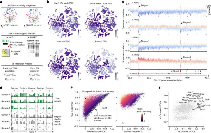
Cytosine DNA methylation is essential in brain development and is implicated in various neurological disorders. Understanding DNA methylation diversity across the entire brain in a spatial context is fundamental for a complete molecular atlas of brain cell types and their gene regulatory landscapes. Here we used single-nucleus methylome sequencing (snmC-seq3) and multi-omic sequencing (snm3C-seq)1 technologies to generate 301,626 methylomes and 176,003 chromatin conformation-methylome joint profiles from 117 dissected regions throughout the adult mouse brain. Using iterative clustering and integrating with companion whole-brain transcriptome and chromatin accessibility datasets, we constructed a methylation-based cell taxonomy with 4,673 cell groups and 274 cross-modality-annotated subclasses. We identified 2.6 million differentially methylated regions across the genome that represent potential gene regulation elements. Notably, we observed spatial cytosine methylation patterns on both genes and regulatory elements in cell types within and across brain regions. Brain-wide spatial transcriptomics data validated the association of spatial epigenetic diversity with transcription and improved the anatomical mapping of our epigenetic datasets. Furthermore, chromatin conformation diversities occurred in important neuronal genes and were highly associated with DNA methylation and transcription changes. Brain-wide cell-type comparisons enabled the construction of regulatory networks that incorporate transcription factors, regulatory elements and their potential downstream gene targets. Finally, intragenic DNA methylation and chromatin conformation patterns predicted alternative gene isoform expression observed in a whole-brain SMART-seq2 dataset. Our study establishes a brain-wide, single-cell DNA methylome and 3D multi-omic atlas and provides a valuable resource for comprehending the cellular-spatial and regulatory genome diversity of the mouse brain.


Conflict of interest statement

J.R.E. serves on the scientific advisory board of Zymo Research. B.R. is a shareholder of Arima Genomics and Epigenome Technologies. H.Z. is on the scientific advisory board of MapLight Therapeutics.

Figures

Fig. 1
Fig. 1. Single-cell DNA methylome and multi-omic atlas chart the cellular and genomic diversity of the whole mouse brain.
a, The workflow of dissection, nuclei and library preparation for snmC-seq3 and snm3C-seq. P56, postnatal day 56. b, The 117 dissected regions from 18 coronal slices (600-μm thick) were grouped into 10 major brain regions (see Supplementary Table 10 for abbreviations). Each dissection region is registered to the 3D CCF. c, The cell atlas: methylome-based iterative clustering of snmC and snm3C datasets. Left, t-distributed stochastic neighbour embedding (t-SNE) plot coloured by modality. Middle, plot aggregated into 4,673 cell group centroids and coloured by 274 cell subclasses. Right, cross-modality integration of brain-wide datasets from BICCN, details in Fig. 2. RNA data from ref. . ATAC data from ref. . Acc., accessibility. d, The genome atlas: the Tle4 gene exemplifies pseudo-bulk profiles of five modalities across the whole brain, with genome browser view of the ‘L6 CT CTX Glut’ and ‘Pvalb GABA’ subclasses in the bottom. Interactive browser available at tinyurl.com/fig1d. Schematic in a created using BioRender (www.biorender.com). Brain atlas images in b were created based on ref. and the Allen Brain Reference Atlas (atlas.brain-map.org), © 2017 Allen Institute for Brain Science.
Fig. 2
Fig. 2. Consensus cell-type taxonomy across molecular modalities.
a, Cell-group-centroid t-SNE colour by cell class (n = 4,673). b, Cell-level t-SNE colour by 117 dissection regions. c, 3D CCF registration and cell t-SNE of each major region. d, Cell subclass (top row) and neurotransmitter composition (bottom row) of each brain dissection region (each upper dot) grouped by major region. Other neurotransmitters are not shown in the plot, but the information is provided in Supplementary Table 2. e, Integration t-SNE of all neurons from the snmC-seq, snm3C-seq, snATAC-seq and scRNA-seq datasets, coloured by matched cell subclasses. For each plot, the light grey cells in the background represent cells from the other three modalities. RNA data from ref. . ATAC data from ref. . f, Brain-wide cluster map between the snmC-seq and scRNA-seq datasets (Supplementary Table 4) based on iterative integration. Each dot, coloured by subclasses, on the diagonal represents a link between the mC clusters (x axis) and RNA clusters (y axis). Two examples in floating panels demonstrate highly granular correspondence of cell clusters in the final integration round: integration t-SNE of ‘MB-MY Glut-Sero’ and ‘L5 ET CTX Glut’ cells from mC and RNA coloured by intramodality clusters and confusion matrix of overlap score between the intramodality clusters (see Extended Data Fig. 5 for more gene details). g, Dot plots of mCG fraction (left) and chromatin accessibility (right) of cell-type-specific CG-DMRs (columns) in each cell subclass (row). The colour of each dot represents an aggregated epigenetic profile of 1,000 DMRs in a cell subclass; deeper colour indicates that these DMRs are more hypomethylated or accessible in a subclass. See Extended Data Fig. 6 for more mC–ATAC integration details.
Fig. 3
Fig. 3. Coherent spatial epigenomic and transcriptomic diversity in the brain.
a, Workflow of mC–MERFISH integration and spatial embedding of methylome cells. b, Spatially mapped methylation cell atlas. The first row displays CCF-registered brain dissection regions. The second and third rows show imputed spatial locations for glutamatergic and other neurons coloured by dissection regions. c, Spatial distribution of cell subclasses for glutamatergic neurons and other neurons on slice 10. d, Spatial epigenetic pattern of neuronal genes and their associated DMRs. The Elval2 gene represents the spatial pattern among subcortical regions. The left column shows the gene-body mCH fraction, the DMR (chromosome 13: 91164342–91165792) mCG fraction and RNA expression. The right column displays a heatmap of normalized contacts between the DMR and the gene. e, The Rasgrf2 gene and associated DMR (chromosome 13: 92027775–92028983) exhibit cortical layer differences in the same layout as d.
Fig. 4
Fig. 4. Highly dynamic chromatin conformation features correlate with DNA methylation around neuronal genes.
a, Top, PCC chromatin conformation matrices for chromosome 2. Middle, compartment scores (red for A compartments, blue for B compartments). Bottom, zoom-in view of the Celf2 locus. Columns represent ‘L2/3 IT CTX Glut’ (C1), ‘Oligo NN’ (C2) and Δ values (C1 – C2). b, Cell-group-centroid t-SNE for the bin chromosome 2 (6800000–6900000; Celf2) coloured by compartment score and the bin mCG fraction. c, Scatterplot of chrom100k bins, showing PCC values between compartment score and chrom100k mCG fraction (x axis) and compartment score s.d. values across cell subclasses (y axis). Blue contours indicate the kernel density of the dot. d, Functional enrichment for neuronal genes intersected with negatively correlated chrom100k bins (boxed in c). Adjusted P values obtained from one-side Fisher’s exact test after FDR correction. e, Top, normalized chromatin contact matrices around Lingo2 for C1 and ‘STR D2 Gaba’ (C3). Bottom, pseudo-bulk ATAC and methylome genome tracks. f, t-SNE coloured by the Lingo2 TSS (bin: chromosome 4 (36950000–36975000)) boundary probability and mCH fraction. g, Mean boundary probabilities for 25-kb bins around long and short genes; error bands represent ±s.d. h, Scatterplot showing the location of the most negatively correlated boundary for each long gene transcript. The y axis is the PCC between the 25-kb bin boundary probabilities and transcript body mCH fractions; the x axis is the relative genome location to the transcripts. i,j, Heatmap indicates variance in contact strength across cell subclasses using F statistics from one-way ANOVA (i) and the PCC between the Lingo2 mCH fraction and contact strength of highly variable interactions (j). White circles identify two loop-like, highly variable interactions. Arrows point to strips between interactions and gene bodies. k, t-SNE coloured by contact strengths of interactions 1 and 2 from j. l, Pileup view of the relative genome location of correlated interactions from all genes (using long genes (>100 kb)). The colours in the upper triangle are average PCCs. Abbreviations indicate intragenic (I), upstream (U) and downstream (D) and their combinations. m, Gene-specific chromatin landscape of megabase-long genes. Green marks gene bodies; the lower triangle shows F statistics as in i, and the upper triangle depicts PCC values similar to j.
Fig. 5
Fig. 5. GRNs predict binding elements, downstream targets and the cell-type importance of TFs.
a, Schematic depicting components of the GRN. The adjacent density plots show PCC values between gene mCH fractions and RNA expression levels; and between DMR mCG fractions and chromatin accessibilities. b, Density plot presents PCC values between DMR mCG and mCH fractions of the target gene. Grey indicates null distribution; light blue, all correlations; blue, correlations between DMRs overlapping with the correlated interaction anchors of the target gene. c, Scatterplot depicting PCC values between the DMR mCG and the target gene mCH and the relative location of the DMR in 1.2 × 106 DMR–gene edges. Grey dots represent DMR–target edges; blue line indicates the median PCC with the error band representing 25–75% quantile. d, Density plot showing PCC values between the mCH fraction of TFs and the target gene. e, Top, PCC between the Nfia mCH fraction and the DMR mCG fraction. Bottom, cisTarget motif enrichment score in 50 DMR groups ordered and grouped by the Nfia DMR PCC value above. The example t-SNE plots are coloured by the Nfia mCH fraction and mCG fraction of a positively correlated DMR. f, Schematic of the TF–DMR–target triple and the final score. g, Distribution of the final scores of all triples (from f) in the final network. Histograms show the number of triples that each TF, gene and DMR is involved. h, Example triple comprising Egr1 (TF), Nab2 (target) and DMR (chromosome 10: 127578032–127578186). t-SNE plot colour by the mCH fraction and RNA level of the gene; mCG fraction and chromatin accessibility of the DMR; and the gene–DMR contact score. i, Left, schematic explaining the PageRank (PR) score calculation. Right, dot plots of the normalized PageRank score and RNA expression of TFs in hindbrain subclasses, with red dots coloured and sized by PageRank score; purple dots coloured by RNA counts per million (CPM) and sized by the percentage of cells in the subclass with gene expression. All the PCC values were calculated across cell subclasses (n = 274), and adjusted P values were obtained using permutation test and FDR correction (Methods).
Fig. 6
Fig. 6. Epigenetic heterogeneity predicts gene isoform diversity.
a, Workflow for the integrative analysis between epigenome and transcriptome datasets. b, Cell-group-centroids t-SNE plot coloured by Nrxn3 CPM in scRNA-seq (10x) data, Nrxn3 transcript per million (TPM) in SMART-seq (sum up all transcripts), α-Nrxn3 TPM (Ensembl database identifier ENSMUST00000163134) and β-Nrxn3 TPM (Ensembl database identifier ENSMUST00000110130). c, Scatterplots of the correlation (Corr.) between transcript expression (y axis) and the methylation level of adjacent single CpG sites (dot) at the Nrxn3 gene body. The arrows point to two most correlated regions (region 1 and region 2). From top to bottom, the scatterplots show the correlation information for CpG mCG fractions with α-Nrxn3 and β-Nrxn3 transcript TPM, and the per cent spliced in (PSI) values of the first exon of α-Nrxn3 and β-Nrxn3. Interactive browser for region 1 available at tinyurl.com/fig6c-region1, and for region 2 at tinyurl.com/fig6c-region2. d, Schematic of the process for constructing the prediction model with true or shuffled features. For each gene, we used the exon, exon-flanking region and intragenic DMRs as the mC features. The 3C features are all the intragenic highly variable interactions (Methods). e, Scatterplot of the PCC values between predicted TPM and true TPM for each highly variable transcript (dot), using methylation features (mCG; left) and chromatin contact interactions (3C; right) for prediction. f, Scatterplot of the ΔPCC in mC models (x axis) and m3C models (y axis) for highly variable transcripts (dot). Top transcripts with large ΔPCC values are listed by their corresponding gene names.
Extended Data Fig. 1
Extended Data Fig. 1. Brain dissection regions.
Schematic of brain dissection steps. Each male C57BL/6 mouse brain (age P56) was dissected into 600-μm slices for snmC-seq3 (a) and 1,200-μm slices for snm3C-seq3 (b). We then dissected brain regions from both hemispheres within a specific slice. Brain atlas images were created based on Wang et al. and © 2017 Allen Institute for Brain Science. Allen Brain Reference Atlas. Available from: atlas.brain-map.org.
Extended Data Fig. 2
Extended Data Fig. 2. Quality Control for snmC and snm3C dataset.
a-b, The number of input reads and final pass QC reads in snmC-seq3 and snm3C-seq shown by t-SNE (a) and violin plot (b) c, The percentage of non-overlapping chromosome 100-kb bins or genes detected per cell in snmC-seq3 and snm3C-seq. Gray lines from top to bottom indicate the 75%, 50%, and 25% quantiles. d-e, The number and ratio of cis-long and trans contacts in snm3C-seq, depicted by t-SNE (d) and violin plot (e). f, Heatmap of PCC between the average methylome profiles (mean mCH and mCG fraction of all chromosome 100-kb bins across all cells belonging to a replicate sample). The violin plot below summarizes the values between replicates within the same brain region or between different brain regions. g-h, Pairwise overlap score (measuring co-clustering of two replicates) of neuronal subtypes and (g) non-neuronal subtypes (h). The violin plots summarize the subtype overlap score between replicates within the same brain region or between different brain regions. i, Distribution of the mCG, mCH, mCCC, and Lambda DNA fraction (non-conversion rate) at sample level in snmC-seq3 and snm3C-seq. j, Pre-clustering t-SNE of snmC and snm3C dataset colored by final mC reads and plate-normalized cell coverage. Arrows indicate typical low-quality clusters filtered out from the further analysis.
Extended Data Fig. 3
Extended Data Fig. 3. Metadata of snmC-seq and snm3C-seq dataset.
a-c, t-SNE of snmC-seq color by cell subclass (a), major regions (b), and dissection regions (c). d-f, t-SNE of snm3C-seq color by cell subclass (d), major regions (e), and dissection regions (f). g,h, Cell-level t-SNE of snmC-seq and snm3C-seq color by global mCG (g) and global mCH (h) fraction. i, The average global mCG and mCH fractions for neurons in different dissection regions. Regions are ordered by the global mCH fractions, and only the top and bottom 20 regions are shown. j, The average global mCG and mCH fractions for all cell subclasses. Subclasses are ordered by the global mCH level, and only the top and bottom 20 subclasses are shown.
Extended Data Fig. 4
Extended Data Fig. 4. t-SNE embedding by major regions.
This figure groups cells by major regions (first five rows), including isocortex (CTX), olfactory bulb (OLF), amygdala (AMY), cerebral nuclei (CNU), hippocampus (HPF), thalamus (TH), hypothalamus (HY), midbrain (MB), hindbrain (HB), and cerebellum (CB). Each section comprises three columns. The left column displays the CCF-registered 3D brain dissection regions and the corresponding cell on the whole brain t-SNE. The middle and right columns show the t-SNE embedded by cells from this major region, colored by cell subclasses and dissection regions, respectively. The numbers on the t-SNE plot indicate the cell subclass ID, which refers to in Supplementary Table 4. The final row groups non-neuron cells into two sections based on telencephalon and non-telencephalon dissection regions.
Extended Data Fig. 5
Extended Data Fig. 5. Example genes illustrating high-granularity correspondence between methylome and transcriptome.
All t-SNE embeddings in this figure are based on the methylome clustering shown in Fig. 2a. Gene expression of non-neuronal cell subclasses is not plotted here. a. Schematic representation of the normalized gene body mCH fraction (left panel) and RNA CPM value (right panel) at the cell-group-centroids t-SNE plot for each gene. b. Pairwise plots of neurotransmitter-related genes. These genes provide crucial information about cell type identities and display a highly similar specificity between gene body mCH fractions and mRNA expression. Genes include Slc17a7 and Slc17a6 for glutamatergic, Gad1 for GABAergic, Slc6a5 for glycinergic, Slc6a2 for noradrenergic, Th for dopaminergic, Chat for cholinergic, Slc6a4 for serotonergic, and Hdc for histaminergic. c. Pairwise plots of immediate early genes (Fos, Egr1, Arc, Bdnf, Nr4a2) are also expressed in many adult brain cell types,. Their expression levels are also anti-correlated with mCH fractions. d. Another gene category includes neuropeptides (Npy, Vip, Sst, Penk, Pdyn, Grp, Tac2, Cck, Crh), many of which are canonical cell type markers with vital signaling functions. Their specificity is detectable in the gene body mCH that aligns with transcription.
Extended Data Fig. 6
Extended Data Fig. 6. Integration of snATAC-seq and snmC-seq3 data.
a, Barplot displays the alignment scores of each dissection region calculated in the low dimensional space of snATAC-seq and snmC-seq integration. b, t-SNE shows the co-embedding of snmC-seq and snATAC-seq data, grouped by major regions and colored by dissection regions. c-d, Heatmap visualization of 15 ×15 small heatmaps. Each small heatmap represents the mCG fractions (green) and the corresponding accessibility level of 1,000 cell-type-specific CG-DMRs. Columns display hypo-DMRs of that cell subclass while rows show their mCG fraction/ATAC CPM values. Take the top-right mini heatmap as an example, rows represent VLMC_NN hypo-DMRs, with color indicating mCG fraction in ABC_NN. Cell subclasses from isocortex (c) and midbrain (d) are shown as examples.
Extended Data Fig. 7
Extended Data Fig. 7. MERFISH data processing and annotation.
a-c, Spatial methylation patterns of DMGs (genes with differential mCH levels on gene body ± 2 kb among different brain regions) and DMRs across three brain axes (anterior to posterior (a), dorsal to ventral (b), medial to lateral (c). d, Workflow illustrating the generation of MERFISH data, including sample preparation, imaging, and data analysis steps. e, Quality control assessment for each MERFISH sample, where the red lines represent the filtering cutoff for various quality metrics, including RNA total counts, RNA feature counts, blank gene number, cell volume (μm3), and RNA counts per volume. f, Integration t-SNE plot of MERFISH and scRNA dataset color by cell subclasses. g, MERFISH cells colored by cell subclasses, with labels obtained from the integration with the RNA dataset. From top to bottom, the cells are displayed by glutamatergic neurons, other neurons, and non-neurons. h, Spatial epigenetic patterns of Negr1 and its associated DMRs. Brain slices in the left column are color-coded by normalized gene body mCH fraction, mCG fraction of the DMR (chr3:154,927,600-154,929,099), and RNA expression. The right column displays the normalized contacts heatmap between the DMR and gene. Microscope objective and slide in d were created using BioRender (www.biorender.com).
Extended Data Fig. 8
Extended Data Fig. 8. Integration of snmC-seq and AIBS whole-mouse-brain MERFISH datasets.
a, Imputed spatial locations of glutamatergic neurons colored by dissection regions. 12 coronal slices were selected to represent 51 total MERFISH slices. Additional data for the remaining slices can be accessed through our interactive browser: https://mousebrain.salk.edu/dynamic_browser. b, AIBS MERFISH Slice 67 color by individual cell subclasses.
Extended Data Fig. 9
Extended Data Fig. 9. Chromatin conformation analysis at compartment and domain level.
a, PCC between compartment score and mCG (orange)/mCH (blue) fractions of all 100 kb bins on each chromosome (left panel) or whole genome (right panel). The dot lines inside each violin plot are 75%, 50%, and 25% quantiles from top to bottom. b-c, chromosome 1-D heatmaps show PCC between compartment score and mCG fraction (b) and the compartment score STD across cell subclasses (c) for each chromosome at a 100-Kb resolution. Arrows indicate the location of the Celf2 gene used as an example in Fig. 4a,b. d, The line plot (mean±s.d.) shows the developmental gene expression level among subtypes defined in La Manno et al. across embryonic days. The genes in each subpanel are selected by overlapping with top negatively correlated (left), positively correlated (right), or uncorrelated (middle) chrom100k bins in (a). e, Workflow for gene body domain boundary analysis. f, The scatter plots of the most negatively (top) or positively (bottom) correlated boundary to each long gene transcript. Both the x and y axis is the PCC between 25 Kb bin boundary probability and transcript body mCH (x-axis) or mCG (y-axis) fractions. g, The scatterplot shows the location of each long gene transcript’s most negatively (top) or positively (bottom) correlated boundary. The y-axis is the PCC between the 25 Kb bin boundary probabilities and transcript body mCH fractions; the x-axis is the relative genome location to the transcripts. h, Functional enrichment for genes associated with negatively correlated domain boundaries (upper) or positively correlated boundaries (lower). Adjusted p-values obtained from one-side Fisher’s exact test after FDR correction.
Extended Data Fig. 10
Extended Data Fig. 10. Correlation between gene expression and chromatin contacts.
a, Workflow for highly variable and gene correlated interaction analysis. b, The distribution of the distance between the furthest correlated interaction and gene TSS. Q95 and Q99 stand for the quantile of all interactions ordered by the distance to TSS.c, Distribution of the number of highly variable and correlated interactions per gene; top 30 gene names are listed. d, Scatterplot shows each gene’s number of correlated interactions (y-axis) and TSS boundary probability correlation (x-axis, PCC between mCH and TSS boundary probability, from Extended Data Fig. 9e). e-j, Compound heatmaps display the chromatin conformation landscape of megabase-long genes, including Ptprd (e), Nrxn3 (f), Lsamp (g), Dlg2 (h), Celf2 (i), and Sox5 (j). For each panel, green rectangles indicate the location of the gene body, the lower triangle shows the F statistics from ANOVA analysis analyzing the variance of contact strength across all cell subclasses (similar to Fig. 4i), and the upper triangle shows the PCC between contact strength and mCH fraction (similar to Fig. 4j).
Extended Data Fig. 11
Extended Data Fig. 11. Construction of TF-DMRs-Target regulatory networks.
a, Schematic of the DMR-Target edge for Psd2 (top row) and Celf2 (bottom row). From left to right, the t-SNE plot is colored by gene mCH fraction, gene-DMR contacts, and DMR mCG fraction. b, Scatterplot shows the motif enrichment scores in negatively correlated DMRs (x-axis) and positively correlated DMRs (y-axis) for each TF. The top TFs with the highest motif enrichment scores are listed. Blue contours are the kernel density of the dots. c-d, Example TFs with motifs enriched in positively correlated DMRs or negatively correlated DMRs are shown in more detail (similar to Fig. 5f). The Onecut2 and Rfx1 gene (c) are examples of having motifs enriched in positively correlated DMRs, the Foxp2 and Foxa1 gene (d) are examples of having motifs enriched in negatively correlated DMRs. Adjusted p-values obtained from the z-test of the motif enrichment score from pycistarget (Method) after FDR correction. e, The top histogram shows the distribution of the number of DMRs each motif is enriched in. The bottom histogram shows the distribution of the number of motif occurrences each DMR has. f, The TF-DMR-Target triples are separated into eight categories (columns) based on their PCC sign between Gene-DMR, TF-DMR, and TF-Gene. The top bar plot is the triple distribution in each category. The middle violin plot is the triple final score distribution within each category. Lines inside the violin plot are 25%, 50%, and 75% quantiles, respectively. The bottom dots show the correlation sign combination of each category. Column colors match the schematic in (f). g, The schematic displays the potential regulatory model for the four most common (based on e) TF-DMR-Target triple categories.
Extended Data Fig. 12
Extended Data Fig. 12. TF-DMR-Gene triple predict TF and gene relationships.
a-f, Example TF-DMR-Target triple, including 1: Erf (TF), Nab2 (target) and DMR (Chr10:127,595,357-127,595,787) (a-b); 2: Egr1 (TF), Synpo (target) and DMR (Chr18:60,762,310-60,763,534) (c-d); 3: Cacna2d2 (TF), Stat5b (target) and DMR (Chr9:107,462,798- 107,463,968) (e-f); For each example, left are t-SNE plot colored by the mCH fraction (blue) or RNA level (purple) for target and TF; mCG fraction (green) and chromatin accessibility (orange) for DMR; and gene-DMR contact score (red) (a,c,e). The compound heatmaps on the right show the chromatin landscape of target genes, including Nab2 (b), Synpo (d), and Cacna2d2 (f); the layout is similar to Extended Data Fig. 10e–j. g, The dot plots represent TF’s normalized PageRank Score and RNA expression for cell subclasses in the hindbrain (MB). Red dots are colored and sized by PageRank Score. Purple dots are colored by RNA CPM, sized by the percentage of cells in that subclass expressing this gene. Right, the t-SNE plot of snmC-seq cells from MB colored by dissection region and the CCF-registered 3D brain dissection regions. h, From top to bottom, t-SNE plot colored by HB cell subclasses, Tfeb PageRank Score and Tfeb RNA expression. Arrows point to two cell subclasses with high PageRank score but low RNA level. i, Left, schematic of RFX family sub-networks. Right, t-SNE plot color by normalized PageRank Score of RFX family genes.
Extended Data Fig. 13
Extended Data Fig. 13. Epigenetic heterogeneity and gene exon usage.
a, Compound heatmaps illustrate the similarity between the Nrxn3 intragenic methylation heterogeneity and alternative isoform expression patterns. Rows are neuron cell subclasses. I, mCG fraction of all 6,138 CpG sites of Nrxn3 gene with columns ordered by original genome coordinates (bottom colors are CpG clusters from heatmap ll). ll, mCG fraction of CpG sites re-ordered by their CpG clusters (bottom colors) based on subclasses methylation pattern. Heatmap lll and Heatmap lV show the TPM of 14 highly variable transcripts and PSI of 38 highly variable exons of Nrxn3, quantified with the SMART-seq dataset. All values are z-score normalized across cell subclasses. The Nrxn3 transcript structures and exon locations are indicated at the bottom plots. Red arrows point to beta-Nrxn3 transcripts and one associated CpG cluster. Heatmap V shows the Nrxn3 gene log(CPM) in scRNA-seq (10X) data. b, Compound heatmaps illustrate the similarity between the Oxr1 intragenic methylation heterogeneity and alternative isoform expression patterns. Rows are neuron cell subclasses. I, mCG fraction of all 1,797 CpG sites of Oxr1 gene with columns ordered by original genome coordinates (bottom colors are CpG clusters from heatmap ll). ll, mCG fraction of CpG sites re-ordered by their CpG clusters (bottom colors) based on subclasses methylation pattern. Heatmap lll and Heatmap lV show the TPM of 11 highly variable transcripts and PSI of 24 highly variable exons of Oxr1, quantified with the SMART-seq dataset. All values are z-score normalized across cell subclasses. The Oxr1 transcript structures and exon locations are indicated at the bottom plots. Heatmap V shows the Oxr1 gene log(CPM) in scRNA-seq (10X) data. c, Scatterplot shows the PCC between predicted PSI and true PSI for each highly variable exon (dot), using methylation features (left) and chromatin contact interactions (right) to predict. d, Scatterplot shows the delta PCC in mC models (x-axis) and m3C models (y-axis) for highly variable exons (dot). Top exons with large delta PCC are listed by their corresponding gene names. e. Genome browser view of intragenic epigenetic and isoform diversity of the Nrxn3 gene in five cell subclasses (rows). The middle heatmaps are normalized contact strengths of the Nrxn3 gene locus, with arrows pointing to strips over the beta-Nrxn3 transcript body. The zoom-in panels show alpha-Nrxn3’s (left) and beta-Nrxn3’s (right) TSS region, with mCG fraction (green), mCH fraction (blue), and SMART RNA (bottom) expression tracks. f, Similar to e, showing the corresponding intragenic epigenetic and isoform diversity in the Oxr1 gene.

Update of

References

    1. Lee D-S, et al. Simultaneous profiling of 3D genome structure and DNA methylation in single human cells. Nat. Methods. 2019;16:999–1006. doi: 10.1038/s41592-019-0547-z. - DOI - PMC - PubMed
    1. Picelli S, et al. Smart-seq2 for sensitive full-length transcriptome profiling in single cells. Nat. Methods. 2013;10:1096–1098. doi: 10.1038/nmeth.2639. - DOI - PubMed
    1. Wang Q, et al. The Allen Mouse Brain Common Coordinate Framework: a 3D reference atlas. Cell. 2020;181:936–953.e20. doi: 10.1016/j.cell.2020.04.007. - DOI - PMC - PubMed
    1. Yao Z, et al. A transcriptomic and epigenomic cell atlas of the mouse primary motor cortex. Nature. 2021;598:103–110. doi: 10.1038/s41586-021-03500-8. - DOI - PMC - PubMed
    1. Yao, Z. et al. A taxonomy of transcriptomic cell types across the isocortex and hippocampal formation. Cell10.1016/j.cell.2021.04.021 (2021). - PMC - PubMed

Publication types