Comparative Study
. 2023 Dec;624(7991):390-402.
doi: 10.1038/s41586-023-06819-6. Epub 2023 Dec 13.

Conserved and divergent gene regulatory programs of the mammalian neocortex

Affiliations
Comparative Study

Conserved and divergent gene regulatory programs of the mammalian neocortex

Nathan R Zemke et al. Nature. 2023 Dec.

Erratum in

  • Author Correction: Conserved and divergent gene regulatory programs of the mammalian neocortex.
    Zemke NR, Armand EJ, Wang W, Lee S, Zhou J, Li YE, Liu H, Tian W, Nery JR, Castanon RG, Bartlett A, Osteen JK, Li D, Zhuo X, Xu V, Chang L, Dong K, Indralingam HS, Rink JA, Xie Y, Miller M, Krienen FM, Zhang Q, Taskin N, Ting J, Feng G, McCarroll SA, Callaway EM, Wang T, Lein ES, Behrens MM, Ecker JR, Ren B. Zemke NR, et al. Nature. 2024 Jan;625(7996):E26. doi: 10.1038/s41586-023-07013-4. Nature. 2024. PMID: 38200319 Free PMC article. No abstract available.

Abstract

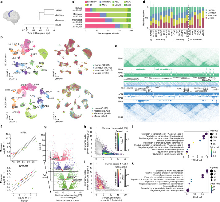
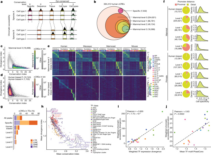
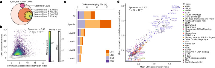
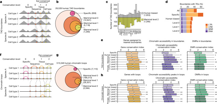
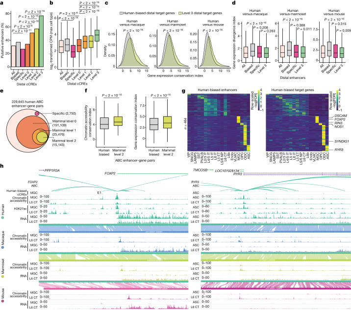
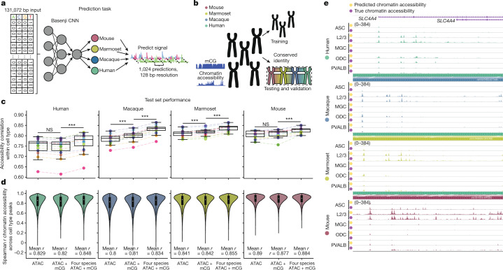
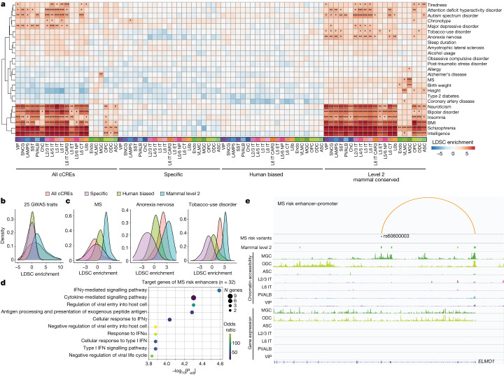
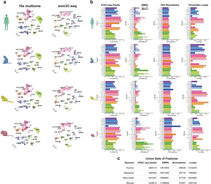
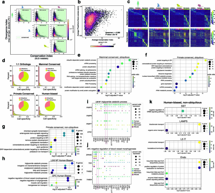
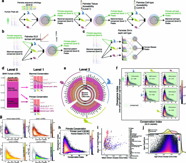
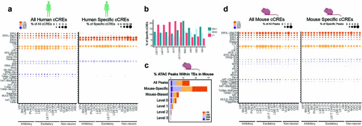
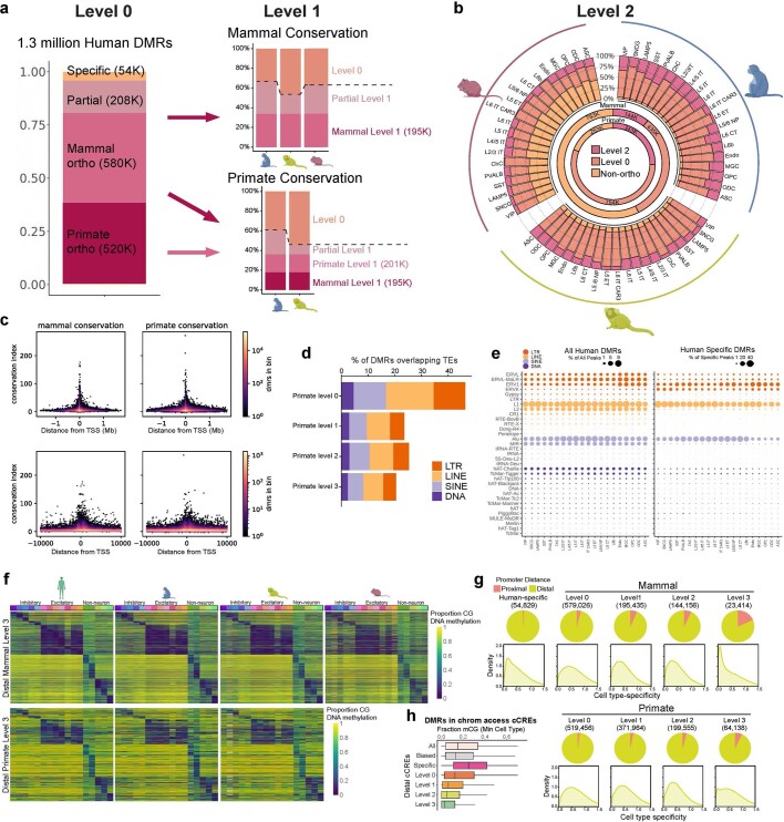
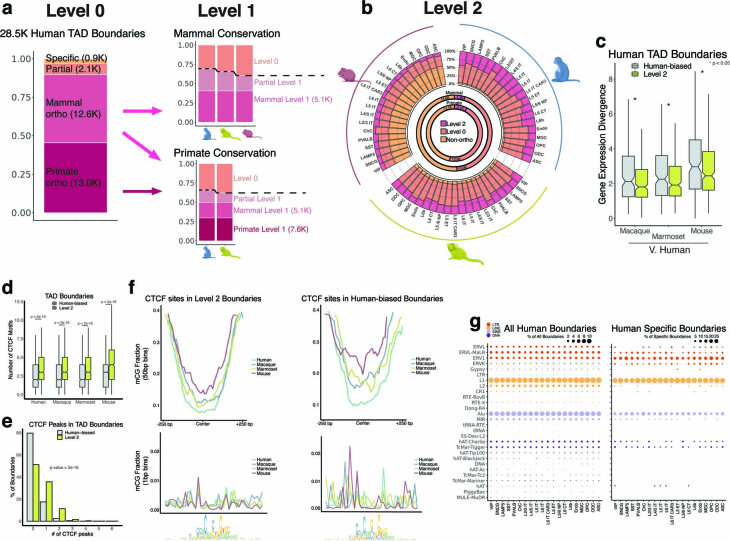
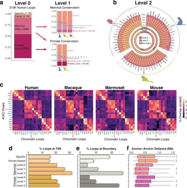
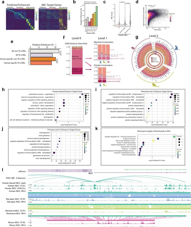
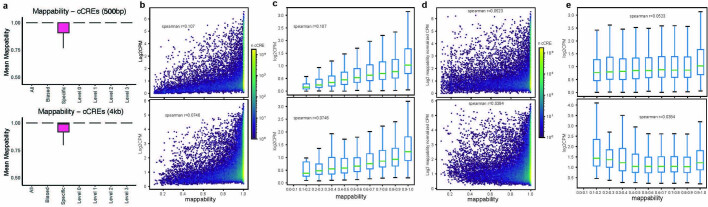
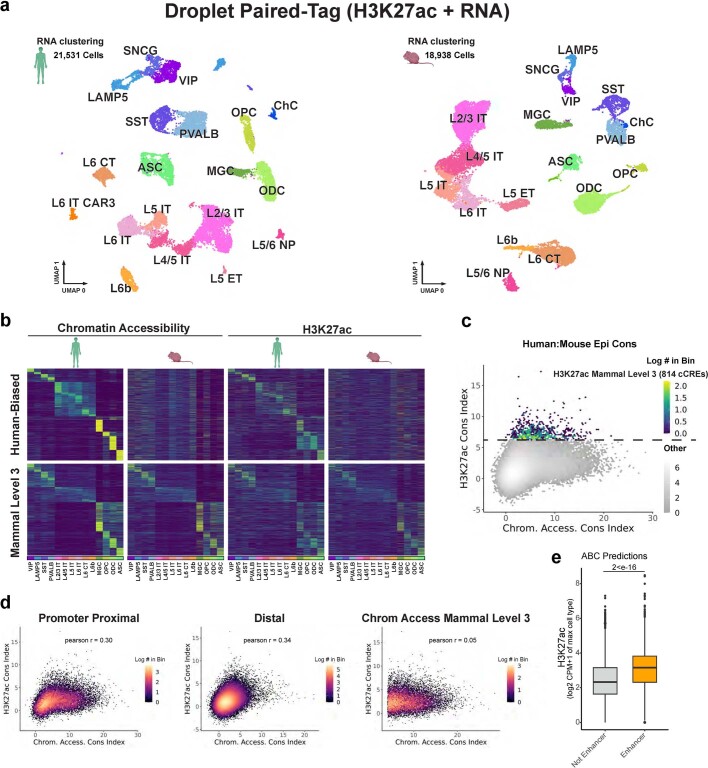
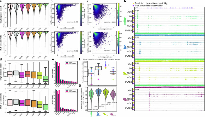
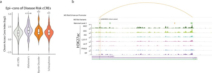
Divergence of cis-regulatory elements drives species-specific traits1, but how this manifests in the evolution of the neocortex at the molecular and cellular level remains unclear. Here we investigated the gene regulatory programs in the primary motor cortex of human, macaque, marmoset and mouse using single-cell multiomics assays, generating gene expression, chromatin accessibility, DNA methylome and chromosomal conformation profiles from a total of over 200,000 cells. From these data, we show evidence that divergence of transcription factor expression corresponds to species-specific epigenome landscapes. We find that conserved and divergent gene regulatory features are reflected in the evolution of the three-dimensional genome. Transposable elements contribute to nearly 80% of the human-specific candidate cis-regulatory elements in cortical cells. Through machine learning, we develop sequence-based predictors of candidate cis-regulatory elements in different species and demonstrate that the genomic regulatory syntax is highly preserved from rodents to primates. Finally, we show that epigenetic conservation combined with sequence similarity helps to uncover functional cis-regulatory elements and enhances our ability to interpret genetic variants contributing to neurological disease and traits.


Conflict of interest statement

B.R. is a co-founder and consultant of Arima Genomics and co-founder of Epigenome Technologies. J.R.E. is on the scientific advisory board of Zymo Research.

Figures

Fig. 1
Fig. 1. Cross-species evolutionary comparison of single-cell multiomics analysis of the M1.
a, Illustration of the human M1 (left), created using BioRender. Dendrogram representing the evolutionary distance of each species in our study (right) from TimeTree. b, Uniform manifold approximation and projection (UMAP) embeddings of 10x multiome RNA (top) and snm3C-seq DNA methylation (bottom) clustering, annotated by cell type (left) or species (right). The numbers in parentheses indicate the cell counts from each species. NP, near projecting neurons. ChC, Chandelier neurons. c, The fraction of each cell type from unbiased nucleus-sorted samples. Data are mean ± s.d. across donors (primates, n = 3) or pools (mouse, n = 8). d, The relative abundance between species for each cell type among its particular class (excitatory, inhibitory or non-neuron). Data are mean ± s.d. e, The WashU Comparative Epigenome Browser displaying an alignment between human (hg38; top, green) and macaque (rheMac10; bottom, blue) genomes with L2/3 IT excitatory data tracks for Hi-C, RNA, assay for transposase-accessible chromatin (ATAC) and mCG. f, The conservation index, showing GLS regression for NIPBL (GLS T statistic = 15.460) and GAREM1 (GLS T statistic = 3.673) between human and macaque coloured by cell type. The error bars indicate the 95% confidence interval calculated using GLS regression. g, The divergence index, showing differential expression between human and macaque in L5 IT neurons, PVALB neurons, ASCs and MGCs. NIPBL and GAREM1 are shown in red. FC, fold change. h, The relationship between the average conservation index across species and the average divergence index across species. Mammal-conserved genes are highlighted. i, The relationship between the average conservation index across species and the average divergence index across species. Human-biased genes are highlighted. j. Top significant GO analysis terms for non-ubiquitous mammal-conserved genes. Padj, adjusted P. k, Top significant GO analysis terms for non-ubiquitous human-biased genes in any cell type.
Fig. 2
Fig. 2. Comparative analysis of chromatin accessibility across species.
a, The levels of conservation for ATAC–seq peaks. b, Human cCREs from ATAC–seq peaks for each indicated group for human-specific, level 0 (sequence conserved), level 1 (tissue conserved), level 2 (cell type conserved) and level 3 (matched patterns across all the cell types) across mammals. c, The relationship between the average conservation index (x axis) and the average divergence index across species (y axis). The density of all mammal-conserved gene cCREs is highlighted. d, The relationship between the average conservation index across species (x axis) and the average divergence index across species (y axis) for each level 0 (sequence conserved) peak. Human-biased peaks are highlighted. e, Heat maps ordered by cell type with highest signal for mammal level 3 distal cCREs (top) and human-biased distal cCREs (bottom). For visualization of cell type patterns of accessibility, log2[counts per million (CPM) + 1] values are row scaled. Non-N, non-neuronal. f, The proportion of promoter-proximal (≤1 kb from a TSS) or promoter distal (>1 kb from a TSS) cCREs for the indicated group (left). The density plots show the cell specificity scores (Methods) for cCREs in each group. g, The percentage of human cCREs in TEs for different conservation groups. h, The average conservation and divergence index for all cCREs containing a given TF motif from JASPAR CORE. Motifs are coloured by TF class. i, The weighted cell type chromatin accessibility divergence across distal cCREs as a function of weighted cell type TF divergence for each cell type. Distal cCREs and TF genes were weighted by CPM. j, The weighted chromatin accessibility conservation in distal peaks as a function of weighted cell type PhastCons among distal peaks. For i and j, P values were calculated using two-sided Pearson correlation.
Fig. 3
Fig. 3. Comparative analysis of DNA methylomes across species.
a, The conservation levels of human DMRs, including human-specific (sequence divergent), level 0 (sequence conserved), level 1 (tissue conserved), level 2 (cell type conserved) and level 3 (matched patterns across all cell types) across mammals. b, The relationship between the conservation index (mean GLS T-statistic across comparisons) of chromatin accessibility, and the conservation index of DNA methylation for intersecting ATAC–seq peaks and DMRs. P values were calculated using two-sided Spearman correlation. c, The percentage of human DMRs in TEs for different conservation groups. d, Comparison of the average conservation index of DMRs and ATAC–seq peaks containing a particular motif from the JASPAR CORE database. Motifs are coloured by TF class annotation.
Fig. 4
Fig. 4. Comparative analysis of TAD boundaries and chromatin loops across species.
a, The levels of conservation for TAD boundaries. b, The conservation levels of human TAD boundaries, including human-specific (sequence divergent), level 0 (sequence conserved), level 1 (tissue conserved) and level 2 (cell type conserved), across mammals c, The number of human-biased (conserved sequence, called only in human) and mammal level 2 (cell type conserved in all four species) TAD boundaries in each cell type. d, The percentage of boundaries overlapping TEs for different conservation groups. e, The conservation index of gene expression, ATAC–seq peaks and DMRs associated with boundaries of the indicated conservation level. ‘Primate conserved’ excludes mammal conserved. P values were calculated using two-sided unpaired Wilcoxon rank-sum tests comparing with mammal level 0, except for primate level 1 and 2, which were compared with primate level 0; *P < 0.05, **P < 0.001. Sample sizes are reported in Supplementary Table 34. f, The levels of conservation of chromatin loops. g, The conservation level of human chromatin loops, highlighting human-specific, level 0 (sequence conserved), level 1 (tissue conserved) and level 2 (cell type conserved), across mammals. h, The conservation index of gene expression, ATAC–seq peaks and DMRs overlapping at least one anchor of loops for each indicated conservation level. ‘Primate conserved’ excludes mammal conserved. P values were calculated as described for e. Sample sizes are reported in Supplementary Table 34. For the box plots in e and h, the centre line represents the median, the box limits encompass the 25th to 75th percentiles and the whiskers represent 1.5× the interquartile range.
Fig. 5
Fig. 5. Epigenetic conservation at cCREs is correlated with conservation in expression of their putative target genes.
a, The percentage of peaks predicted to be enhancers (ABC score ≥ 0.02) with mappability-normalized chromatin accessibility. P values were calculated using χ2 tests. b, The mappability-normalized H3K27ac log2-transformed CPM within ±2 kb of cCRE centres for the specified groups. P values were calculated using two-sided unpaired Wilcoxon rank-sum tests. Sample sizes are reported in Supplementary Table 34. c, Density plots for gene expression conservation index values from each indicated comparison. Target genes are categorized as either human-biased distal cCRE targets or mammal level 3 distal cCRE targets. P values were calculated using two-sided unpaired Wilcoxon rank-sum tests. d, Box plots of ABC putative target genes for each distal cCRE from the indicated conservation group. P values were calculated using two-sided unpaired Wilcoxon rank-sum tests. Sample sizes are reported in Supplementary Table 34. e, The conservation levels of human TAD boundaries, including human-specific, level 0 (sequence conserved), level 1 (tissue conserved) and level 2 (cell type conserved), across mammals. f, The conservation levels of genes and cCREs in the indicated conservation groups. g, Heat maps for pairs of human-biased cCREs targeting human-biased genes in the same cell type. The values represent the smallest −log10-transformed false-discovery rate (FDR) for any comparison between human and another species. Rows are scaled to visualize relative differences across cell types. h, WashU browser snapshots of FOXP2 (left) and RYR3 (right) showing chromatin accessibility, H3K27ac and RNA signals in human and chromatin accessibility and RNA for macaque, marmoset and mouse for MGC (left) or ASC (right) and L6 CT. The tracks display concordance of genome alignment from human (hg38) to the indicated species. For the box plots in b, d and f, the centre line represents the median, the box limits encompass the 25th to 75th percentiles and the whiskers represent 1.5× the interquartile range.
Fig. 6
Fig. 6. Deep learning models predict cell-type-specific chromatin accessibility from the DNA sequence alone.
a, Schematic of the prediction task used to predict cCREs from the DNA sequence. CNN, convolutional neural network. b, Schematic of the dataset design for the model. Chromatin accessibility and DNA methylation datasets from human, macaque, mouse and marmoset are divided by chromosome. Chromosomes with a conserved sequence identity across species are identified as a testing and validation dataset. c, The prediction accuracy of the model chromatin accessibility prediction within each cell type in unseen test regions. The panels from left to right correspond to accuracy in human, macaque, marmoset and mouse datasets. For each species, three predictions were evaluated—a chromatin accessibility model; chromatin accessibility and DNA methylation; and a four-species model combining both modalities. The dots represent cell types. Statistical analysis was performed using one-sided paired-sample t-tests; ***P < 1 × 10−3. n = 16 cell types. d, Correlation across cell types in regions with a peak. Correlation was evaluated for each model type for each species as described in c. n = 39,236, 44,311, 32,484 and 41,605 test set peaks for human, macaque, marmoset and mouse, respectively. e, True and predicted chromatin accessibility near SLC4A4 in ASCs, Layer 2/3 IT neurons, microglia, ODCs and parvalbumin interneurons in human, macaque, marmoset and mouse. For the box plots in c and d, the centre line (c) and white dots (d) represent the median, the box limits encompass the 25th to 75th percentiles and the whiskers represent 1.5× the interquartile range.
Fig. 7
Fig. 7. Taking advantage of epigenetic conservation to interpret non-coding risk-associated variants of neurological disease and traits.
a, Linkage disequilibrium score regression analysis to identify GWAS enrichments in cCREs of each cell type for different conservation sets. *FDR-adjusted P < 0.001, **FDR-adjusted P < 0.0001, ***FDR-adjusted P < 0.00001. b, The distribution of LDSC enrichments across cells for each of the 25 traits from a. c, The distribution of LDSC enrichments across cells for MS, anorexia nervosa and tobacco-use disorder. d, The top significant GO biological process terms for ABC target genes of enhancers containing a MS-associated risk variant. e, Example locus of a mammal level 2 predicted enhancer of ELMO1 overlapping a MS-associated risk variant in a microglia-specific chromatin-accessible region.
Extended Data Fig. 1
Extended Data Fig. 1. Cell type quantification in each species.
a. Uniform manifold approximation and projection (UMAP) embeddings of 10x multiome RNA (left) and snm3C-seq DNA methylation (right) clusters for human, macaque, marmoset, and mouse separately. b. Number of indicated features (ATAC-seq peaks, DMRs, TAD boundaries, or chromatin loops) identified for each cell type for each species. c. Numbers of unique features found in each species, i.e. union set of features. Species silhouettes in a and b created in BioRender.
Extended Data Fig. 2
Extended Data Fig. 2. Patterns of gene expression conservation and divergence.
a. Pairwise divergence vs conservation index of gene expression for each species pair. b. A scatter plot highlighting the correspondence of gene expression conservation index to average PhastCons score across exonic sequences of each gene. c. Heatmaps in each species highlighting conserved (top) and human-biased (bottom) genes in each cell type. Genes are ordered by the highest expressed cell type in the human data. d. Histograms highlighting the distribution of entropy-based cell type specificity measures for each human for each indicated category. Pie charts summarizing the proportion of ubiquitously expressed (specificity ≤ 0.01) genes in each indicated category. e. Dot plot displaying the GO terms enriched in ubiquitously expressed mammal conserved genes. f. Dot plot displaying the top significant GO terms enriched in ubiquitously expressed primate conserved genes. g. Top significant GO analysis terms for non-ubiquitous primate conserved genes. h. Top significant GO analysis terms for non-ubiquitous human biased genes in L5/6 NP neurons and oligodendrocyte precursor cells. i. Dot plot displaying human-biased L5/6 NP neuron genes involved in triglyceride catabolic processes. The size of each point represents the percent of cells with a transcript detect. Each point is coloured by species. j. Dot plot displaying human-biased OPC genes involved in the negative regulation of blood vessel morphogenesis. The size of each point represents the percent of cells with a transcript detected. Each point is coloured by species. k. Dot plots displaying the top significant GO terms identified in non-ubiquitously expressed human-biased genes, for each cell type where a significant enrichment was identified. Species silhouettes in a and c created in BioRender.
Extended Data Fig. 3
Extended Data Fig. 3. Comparative chromatin accessibility.
a. A workflow schematic for classifying level 0 (sequence conserved), level 1 (tissue conserved), and level 2 (cell type conserved), epigenome elements across both mammals and primates. b. A workflow schematic for classifying level 3 (matched patterns across all cell types) conserved elements in both mammals and primates. c. A schematic illustrating the workflow for identifying human-biased cCREs. d. Stacked bar plots representing the breakdown of human cCREs from ATAC-seq peaks for each indicated group for Level 0 and Level 1 conservation. e. Level 2 conservation of human cCREs from ATAC-seq peaks showing the overlap between each species for the same cell type (outer circle stacked bars). Inner circles show the breakdown for mammal and primate comparisons for all human ATAC-seq cCREs f. Scatter plots highlighting the pairwise divergence vs. conservation index of human ATAC-seq peaks for each species pair. g. Scatter plots comparing the conservation index and divergence index of all mammal level 0 peaks highlighting human biased (top left), level 1 (top right), level 2 (bottom left) or level 3 (bottom right). h. Scatter plot displaying the relationship between the conservation index (mean GLS T-statistic across comparisons) and divergence index (maximum absolute fold change across cell types) for primate level 0 cCREs. i. A scatter plot showing the relationship between conservation of epigenome signals (open chromatin conservation index), and conservation of motif sequence (PhastCons) averaged over all motifs of each transcription factor found in peaks. j. A scatterplot showing the relationship between sequence conservation (PhastCons) and ATAC conservation index among mammal level 0 CCREs. Density plots highlight the difference in ATAC conservation index (top) and PhastCons (right) between promoters and distal elements. Species silhouettes in a, b, c, e and f created in BioRender.
Extended Data Fig. 4
Extended Data Fig. 4. cCRE enrichment in TEs.
a. Dot plots showing the percentage of all (left) or human-specific (right) cCREs in different subclasses of TEs for each cell type. b. Bar plots showing the percentage of human-specific cCREs that overlap ERV1, ERVK, or LINE-1 for IT neurons and glia. c. Stacked bar plots showing percentage of mouse cCREs in TEs for different conservation groups. d. Dot plots showing the percentage of all (left) or mouse-specific (right) cCREs in different subclasses of TEs for each cell type. Species silhouettes in a, c and d created in BioRender.
Extended Data Fig. 5
Extended Data Fig. 5. Patterns of DNA methylation conservation.
a. Proportions of level 0 (sequence conserved) and level 1 (tissue conserved) DMRs across mammals and primates. b. Level 2 conservation of human DMRs showing the overlap between each species for the same cell type (outer circle stacked bars). Inner circles show the breakdown for mammal and primate comparisons for all human DMRs. c. Distance from nearest TSS with conservation level for all mammal conserved (left) or primate conserved (right) DMRs. Upper and lower plots display different genomic scales on the X-axis. d. Proportion of TEs in different levels of primate conserved DMRs. e. Dot plots showing the percentage of all (left) or human-specific (right) DMRs overlapping different subclasses of TEs for each cell type. N = 519,456, 371,964, 343,711, 64,138 DMRs in each category. f. Heatmaps in each species highlighting distal mammal level three DMRs (above) and primate level three DMRs (below). Each DMR is ordered by the cell type with the lowest methylation level in the human data. g. Pie charts showing the proportion of promoter-proximal (≤ 1 kb from a TSS) and promoter distal (> 1 kb from a TSS) elements for each level of mammal conservation (above) and primate conservation (below). Density plots show distribution of cell specificity scores (methods) for DMRs in each conservation group. h. Box plots showing the fraction of methylated CGs at all DMRs that intersect indicated group of promoter distal chromatin accessible cCREs. Box plots encompass 25th to 75th percentiles; central lines represent medians; whiskers represent 1.5 times the interquartile interval. Species silhouettes in a, b and f created in BioRender.
Extended Data Fig. 6
Extended Data Fig. 6. Comparative evaluation of boundary elements.
a. Stacked bar plots representing the breakdown of human boundaries for each indicated group for Level 0 and Level 1 conservation. b. Level 2 conservation of human boundaries showing the overlap between each species for the same cell type (outer circle stacked bars). Inner circles show the breakdown for mammal and primate comparisons for all human boundaries. c. Box plots comparing gene expression divergence index for genes overlapping human-biased (only humans have a TAD boundary) or level 2 (conserved in the same cell type across all species) TAD boundaries in human. Box plots encompass 25th to 75th percentiles; central lines represent medians; whiskers represent 1.5 times the interquartile interval. * p < 0.05 from two-sided, unpaired Wilcoxon rank sum. N = 198 (Human-biased), 291 (level 2). d. Box plots comparing CTCF motif number across species between human-biased and level 2 TAD boundaries. P-values from two-sided, unpaired Wilcoxon rank sum and intervals same as in c. N = 1,653 (Human-biased), 1,290 (level 2). e. Paired histograms of number of CTCF peaks overlapping human-biased and level 2 human boundaries. P-values from two-sided, unpaired Wilcoxon rank sum. f. Average CG DNA methylation levels for cells containing a sequence orthologous human cCRE with a CTCF motif in level 2 or human-biased human boundaries. Signal is averaged for 50 bp bins in a 500 bp window centred around the CTCF motifs (top). And average per base CG DNA methylation levels within the CTCF motifs (bottom). Consensus motif sequence of all identified motifs below. g. dot plots showing the percentage of all (left) or human-specific (right) boundaries in different subclasses of TEs for each cell type. Species silhouettes in a and b created in BioRender.
Extended Data Fig. 7
Extended Data Fig. 7. Chromatin Loop enrichment in TEs.
a. Stacked bar plots representing the breakdown of human boundaries for each indicated group for level 0 and level 1 conservation. b. Level 2 conservation of human boundaries showing the overlap between each species for the same cell type (outer circle stacked bars). Inner circles showing the breakdown for mammal and primate comparisons for all human boundaries. c. Heatmaps for each species showing the scaled percentage overlap of peaks and loops across cell types. d. Barplot showing the percent of loops with a TSS overlapping at least one anchor bin. *** p < 2e-16 from Fisher’s exact test compared to mammal level 0, except primate level 1 and 2 were compared to primate level 0. e. Barplot showing the percent of loops with a boundary overlapping at least one anchor bin. P-values same as in d. f. Boxplots of anchor to anchor distance for loops of indicated conservation level. *** p < 2e-16 from two-sided, unpaired Wilcoxon rank sum. Box plots encompass 25th to 75th percentiles; central lines represent medians; whiskers represent 1.5 times the interquartile interval. Sample sizes reported in Supplementary Table 34. Species silhouettes in a and b created in BioRender.
Extended Data Fig. 8
Extended Data Fig. 8. Properties of predicted ABC enhancers.
a. Heatmaps displaying correlation of activity between predicted enhancers with highest ABC score for each gene with prediction (n = 8,083), row scaled. b. Bar plots showing the proportion of cCREs predicted as a putative enhancer for each conservation level without normalizing for mappability. c. Violin plots showing the difference in ABC scores between all cCREs, human-biased cCREs and mammal level 3 cCREs. P-values from two-sided, unpaired Wilcoxon-rank sum test. N = 350,813 (all), 10,280 (Human-biased), 3,544 (mammal level 3). d. A scatter plot displaying the correlation between chromatin accessibility conservation index and ABC score. e. The percent of ABC predicted enhancers for indicated group. P-values from Chi-square test. f. Stacked bar plots representing the breakdown of human ABC predictions for each indicated group for level 0 and level 1 conservation. g. Level 2 conservation of human ABC predictions showing the overlap between each species for the same cell type (outer circle stacked bars). Inner circles show the breakdown for mammal and primate comparisons for all human boundaries. h. Dot plot showing top significant GO analysis Biological Process terms for human-biased enhancer ABC target genes. i. Dot plot showing top significant GO analysis Biological Process terms for mammal level 3 enhancer ABC target genes. j. Dot plot showing top significant GO analysis Biological Process terms for primate level 3 enhancer ABC target genes. k. Top significant GO analysis Biological Process terms for genes in a microglia human divergent enhancer-gene pair. l. WashU comparative epigenome browser snapshot highlighting the human-biased gene regulation of RIN3 in microglia across species. Species silhouettes in f and g created in BioRender.
Extended Data Fig. 9
Extended Data Fig. 9. Mappability normalization of peak accessibility.
a. 100 base-pair mappability rate for each peak across conservation levels (above), and the 4 kb centred around each peak (below). Box plots encompass 25th to 75th percentiles; central lines represent medians; whiskers represent 1.5 times the interquartile interval. b. A scatter plot highlighting the effect of mappability on reads in each peak (N = 384,412), and the 4 kb region centred around each peak. c. Box plots highlighting the change in number of reads as a function of region mappability for each peak, and 4 kb region centred around each peak. Box plots encompass 25th to 75th percentiles; central lines represent medians; whiskers represent 1.5 times the interquartile interval. d. A scatter plot highlighting the correspondence between mappability normalized accessibility for each cell type peak and 4 kb region centred around each peak. e. Box plots highlighting the change in number of mappability normalized reads as a function of region mappability for each peak(N = 384,412), and 4 kb region centred around each peak. Box plots encompass 25th to 75th percentiles; central lines represent medians; whiskers represent 1.5 times the interquartile interval.
Extended Data Fig. 10
Extended Data Fig. 10. Conserved H3K27ac landscapes in human and mouse.
a. UMAP embedding of Droplet Paired-Tag RNA profiles coloured by cell type in human M1 and mouse frontal cortex. b. Heatmaps of human-biased and mammal level 3 (conserved patterns across all cell types) cCREs in human and mouse ordered by the cell type with the highest accessibility in human. Cell types with low coverage for H3K27ac were removed. c. A scatter plot highlighting the relationship between chromatin accessibility conservation, and H3k27ac conservation for each cCRE. Level 3 conserved human-mouse conserved H3K27ac elements are highlighted (N = 814). d. Scatter plots highlighting the relationship between H3K27ac conservation, and chromatin accessibility conservation at promoter-proximal elements (≤ 1 kb from a TSS, left), at promoter proximal-distal (>1 kb from a TSS, middle), and at chromatin accessibility mammal level 3 conserved cCREs (right). e. Box plots displaying H3K27ac signal (log2 CPM + 1, 4 kb genomic span) from the cell type with the highest signal for distal cCREs grouped by whether they are predicted to be enhancers or not by ABC model. H3K27ac counts were mappability normalized before converting to log2 CPM + 1. N = 281,840, 102,573; Box plots encompass 25th to 75th percentiles; central lines represent medians; whiskers represent 1.5 times the interquartile interval. Two-sided, unpaired Wilcoxon rank sum test for P-values. Species silhouettes in a and b created in BioRender.
Extended Data Fig. 11
Extended Data Fig. 11. Species specificity of open chromatin deep learning.
a. Correlation across cell types for peaks by conservation levels in human test dataset for single and multi-species models. Violin plots represent the density of data points. Box plots encompass 25th to 75th percentiles; white dots represent medians; whiskers represent 1.5 times the interquartile interval. N = 39,236, 777, 21,737, 6,605, 4,896, 1,493. b. Scatter compares the model’s ability to predict chromatin accessibility across cell types (spearman r) and conservation index in the test set. c. Scatter plot compares the model’s ability to predict chromatin accessibility across cell types (spearman r) and divergence index in the test set. d. Box plots show relationship between model accuracy (mean L1 norm between predictions and true data) and conservation level in the test dataset. Box plots encompass 25th to 75th percentiles; central lines represent medians; whiskers represent 1.5 times the interquartile interval. N as in a. e. Barplot comparing poorly predicted peaks in the top 10 peak annotations from Homer to each peak annotation in the entire test dataset. Shown for human only model (top), and multispecies model (bottom). N = 39,236 peaks. f. Accuracy of a three-species model across cell types with each species as an outgroup. Spearman correlation of model predictions and measured chromatin accessibility for each cell type, each represented as a dot. Plotted intervals are the same as in a. N = 16 for each. g. Correlation of test set peaks predictions to measured chromatin accessibility across cell types for each species. Violin plots represent the density of data points. Plotted intervals are the same as in d. N = 39,236 (human), 44,311 (macaque), 32,484 (marmoset), and 41,605 (mouse) test set peaks. h. True and predicted chromatin accessibility across the huntingtin locus in indicated cell types. Species silhouettes in g and h created in BioRender.
Extended Data Fig. 12
Extended Data Fig. 12. Conserved cis-regulatory landscape of disease risk.
a. A violin plot showing conservation index of cCREs containing fine-mapped disease-risk variants in Alzheimer’s disease, bipolar disorder, and schizophrenia. Width of violin plots represent the density of data points. Box plots encompass 25th to 75th percentiles; lines inside the boxes represent medians; whiskers represent 1.5 times the interquartile interval. N = 384,412 (All cCREs), 86 (Alzheimer’s disease), 49 (Bipolar disorder), 251 (Schizophrenia). Two-sided, unpaired Wilcoxon rank sum test for P-values vs “All cCREs”. b. Genome browser snapshot showing H3K27ac landscapes of a mammal level 2 predicted enhancer of ELMO1 overlapping a multiple sclerosis risk variant across cell types.

References

    1. Carroll SB. Evo-devo and an expanding evolutionary synthesis: a genetic theory of morphological evolution. Cell. 2008;134:25–36. doi: 10.1016/j.cell.2008.06.030. - DOI - PubMed
    1. Scanning Human Gene Deserts for Long-range Enhancers (Lawrence Berkeley National Laboratory, 2003). - PubMed
    1. Pennacchio LA, et al. In vivo enhancer analysis of human conserved non-coding sequences. Nature. 2006;444:499–502. doi: 10.1038/nature05295. - DOI - PubMed
    1. Villar D, et al. Enhancer evolution across 20 mammalian species. Cell. 2015;160:554–566. doi: 10.1016/j.cell.2015.01.006. - DOI - PMC - PubMed
    1. Glinsky G, Barakat TS. The evolution of great apes has shaped the functional enhancers’ landscape in human embryonic stem cells. Stem Cell Res. 2019;37:101456. doi: 10.1016/j.scr.2019.101456. - DOI - PubMed

Publication types

MeSH terms