. 2023 Nov 16;7(12):2300184.
doi: 10.1002/gch2.202300184. eCollection 2023 Dec.

A Preliminary Assessment of Global CO2: Spatial Patterns, Temporal Trends, and Policy Implications

Affiliations

A Preliminary Assessment of Global CO2: Spatial Patterns, Temporal Trends, and Policy Implications

Ahmed M Ei Kenawy et al. Glob Chall. .

Abstract

This study offers a comprehensive analysis of the distribution, evolution, and driving factors of CO2 emissions from 1990 to 2016 at multiple spatial scales. Utilizing 26 indicators encompassing various facets of CO2 emissions, it is employed principal component analysis (PCA) and empirical orthogonal functions (EOFs) to identify the dominant characteristics of global CO2 emissions. This model retained three core components, accounting for 93% of the global CO2 variation, reflecting emission trajectories and associated economic metrics, such as Gross domestic product (GDP). The analysis differentiated the effects of these components based on countries' economic standings. Using a novel aggregated index, significant national contributors to global CO2 emissions are pinpointed. Notably, the leading contributors are found among developed nations (e.g., the United States, Canada, Japan), Gulf states (e.g., Saudi Arabia, Qatar), and emerging economies (e.g., China, Brazil, Mexico). Furthermore, these results highlight that shifts in global CO2 emissions over the past 30 years are predominantly influenced by factors like industrial emissions and GDP. Results also demonstrate a distinct relationship between a country's CO2 emissions and its physical and socioeconomic factors. Specifically, the nation's coastline length, population density in coastal regions, and the diversity of its climatic conditions significantly influence its carbon footprint.

Keywords: CO2 emission; GHGs; PCA; economic growth; environmental sustainability.


Conflict of interest statement

The authors declare no conflict of interest.

Figures

Figure 1
Figure 1
A) Pearson correlation matrix between the 26 indicators, and b) their p ‐ value. The dotted circle in the right panel denote statistically significant correlations at the 95% level (p < 0.05).
Figure 2
Figure 2
Scree plot justifying retaining the most significant factors that explain the majority of variance in CO2 emission indicators.
Figure 3
Figure 3
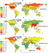
Spatial distribution of the scores of the three different components.
Figure 4
Figure 4
A) Standardized values of cumulative CO2 emissions, b) shared global CO2 (lower), and their variations amongst low‐, low‐middle‐, upper‐middle‐, and high‐income countries. The high‐ranking countries contributing to the two indicators are also illustrated. The presented two indicators correspond to the best‐correlated variables with the first component (PC1). For the boxplots, the red line represents the mean, and the black line denotes the median. The 10th, 25th, 75th, and 90th percentiles are represented by the horizontal lines, respectively.
Figure 5
Figure 5
A) Standardized values of annual CO2 growth, b) industrial emissions, and their variations amongst low‐, low‐middle‐, upper‐middle‐, and high‐income countries. The high‐ranking countries contributing to the two indicators are also illustrated. The presented two indicators correspond to the best‐correlated variables with the second component (PC2). For the boxplots, the red line represents the mean, and the black line denotes the median. The 10th, 25th, 75th, and 90th percentiles are represented by the horizontal lines, respectively.
Figure 6
Figure 6
A) Standardized values of per‐capita CO2 emissions, b) and GDP per‐capita (lower), and their variations amongst low‐, low‐middle‐, upper‐middle‐, and high‐income countries. The high‐ranking countries contributing to the two indicators are also illustrated. The presented two indicators correspond to the best‐correlated variables with the third component (PC3). For the boxplots, the red line represents the mean, and the black line denotes the median. The 10th, 25th, 75th, and 90th percentiles are represented by the horizontal lines, respectively.
Figure 7
Figure 7
Significance of changes in the selected indicators for the period 1990–2016. Statistical significance was assessed using the modified Mann–Kendall statistic at the 95% level (p < 0.05).
Figure 8
Figure 8
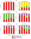
Temporal variability of the different CO2 emissions indicators for the selected ten countries between 1990 and 2016. The standardized anomalies of each timeseries are plotted to facilitate direct comparison between different indicators, as well as different countries.
Figure 9
Figure 9
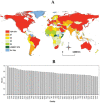
A) Spatial distribution of the overall composite score summarizing the main contributors to global CO2 emissions and divided into different categories, and b) the rank of the top country‐contributors. In panel a, Q1 is occupied by the top 25% of countries on the list; Q2 represents countries in the 25% to 50% range; Q3 shows countries in the 50 to 75% range; and Q4 is occupied by countries in the 75% to 100% range. The top 10th contributors and the lowest 10th emitters are also mapped.
Figure 10
Figure 10
Scatterplots showing differences in a set of environmental and socioeconomic variables as a function of the four quartiles of the world countries, which were defined based on their contribution to global CO2 emissions. The total length of the coastline, the length of coastline per population (km/100 000 inhabitants), and the number of climate classes following the Koppen climate classification were employed as indicators of the physical environment of the countries, while GDP per capita and percentage of national population below the poverty line were presented as indicators of their socioeconomic environments. For each box plot, the red line represents the mean, and the black line denotes the median. The 10th, 25th, 75th, and 90th percentiles are represented by the horizontal lines, respectively. Data regarding coastline length, population, GDP per capita, and the number of individuals below the poverty line were sourced from the Encyclopedia of the Nations (retrieved from https://www.nationsencyclopedia.com/ on September 25, 2023).

References

    1. Hickel J., Lancet Planet. Health 2020, 4, e399. - PubMed
    1. Abdul‐Wahab S., Charabi Y., Al‐Mahruqi A. M., Osman I., Osman S., Sol. Energy 2019, 188, 1156.
    1. Abulibdeh A., Energy Strategy Rev. 2021, 38, 100733.
    1. Abulibdeh A., Appl. Energy 2021, 304, 117864. - PMC - PubMed
    1. Zaidan E., Abulibdeh A., Alban A., Jabbar R., Build. Environ. 2022, 109177.

LinkOut - more resources