. 2023 Dec 20;14(1):8472.
doi: 10.1038/s41467-023-43856-1.

Epidemic graph diagrams as analytics for epidemic control in the data-rich era

Affiliations

Epidemic graph diagrams as analytics for epidemic control in the data-rich era

Eugenio Valdano et al. Nat Commun. .

Abstract

COVID-19 highlighted modeling as a cornerstone of pandemic response. But it also revealed that current models may not fully exploit the high-resolution data on disease progression, epidemic surveillance and host behavior, now available. Take the epidemic threshold, which quantifies the spreading risk throughout epidemic emergence, mitigation, and control. Its use requires oversimplifying either disease or host contact dynamics. We introduce the epidemic graph diagrams to overcome this by computing the epidemic threshold directly from arbitrarily complex data on contacts, disease and interventions. A grammar of diagram operations allows to decompose, compare, simplify models with computational efficiency, extracting theoretical understanding. We use the diagrams to explain the emergence of resistant influenza variants in the 2007-2008 season, and demonstrate that neglecting non-infectious prodromic stages of sexually transmitted infections biases the predicted epidemic risk, compromising control. The diagrams are general, and improve our capacity to respond to present and future public health challenges.


Conflict of interest statement

The authors declare no competing interests.

Figures

Fig. 1
Fig. 1. Epidemic graph diagrams.
a Network epidemiology ingredients: compartmental model (top), and time-evolving network (bottom). The generic compartmental model appears in its standard representation: squares represent the different compartments, joined by transitions of three types. The susceptible compartment S (healthy individuals who can contract the disease from the infectious) is made explicit. We use generic letters for compartments to show the wide applicability of the approach without constraining to specific disease progressions. The transitions stem from the diagram visualization at the top of the panel. Type 1 transitions are shown as continuous lines and correspond to spontaneous processes; type 2 are shown as dashed lines, for transmission events involving susceptibles; type 3 are shown as dotted lines, for transmission events not involving susceptibles. b Epidemic Graph Diagram corresponding to the compartmental model of (a). Spontaneous transitions (type 1) become single links. Transmission events (type 2) become double links. Links are weighted by the corresponding transition rates (see a) multiplied by an operator on RN. This operator is the identity matrix on single links (omitted), and the adjacency matrix on double links. All other transitions, e.g. transmissions infecting other compartments than S (type 3) can be neglected and do not appear in the EGD (see “Methods”). c Jacobian corresponding to the example in (a, b). d Rules of the EGD grammar. The EGD is built directly from the compartmental model (a) following steps 1 and 2. The Jacobian is then the weighted adjacency matrix of the EGD minus diagonal terms that enforce the probability conservation (step 3), encoded in the diagonal entries γbb. These are not free parameters but are fixed by probability conservation, since transitions among compartments not involving S do not change the sum cxic (Eq. (1)). From this, we derive γbb = − ∑cbγbc.
Fig. 2
Fig. 2. Diagram operations.
a EGD of Fig. 1. The two strongly connected components are highlighted by blue rectangles. b Diagram operation CUT isolates the strongly connected components, which become disjoint subdiagrams. The epidemic threshold is then the smallest among the thresholds of each subdiagram. c Under the weak-commutation condition, each subdiagram can be further reduced through (i) diagram operation SHRINK (top) and (ii) diagram operation ZIP (bottom), leading to two EGDs of SIS models. Their transition rates are renormalized by the diagram operations. d, e General rules of the three operations. Numbers refer to the steps to be performed for each operator; some of these steps are illustrated in (ac) with the same numbers.
Fig. 3
Fig. 3. Epidemic threshold for syphilis.
a Classic representation of the susceptible-exposed-infectious-recovered-susceptible (SEIRS) compartmental model here used to model the spread of a general STI. Parameterization for syphilis is provided in (d). E represents the class of individuals exposed to the infection who are exposed to the disease, before becoming infectious (I). R corresponds to temporary immunity. Rates are also shown. b Associated EGD. Strongly connected components are highlighted by blue rectangles. c Simplification of the EGD through diagram operations. The reduced diagram after CUT is shown with its associated Jacobian (top; the R component does not contribute to the threshold and is discarded). Under the weak-commutation condition, SHRINK further reduces the diagram to an EGD of an SIS model (bottom). d Relative difference in the prediction of the epidemic threshold in the full model (that is equivalent to the top diagram of panel c, after CUT) vs. the CUT+SHRINK diagram (bottom diagram of panel c) obtained under the weak-commutation condition (i.e. removing the role of latency). Results are obtained for an STI spreading on sexual network from real data, exploring different lengths of infectious period (i.e. time-to-treatment) and latency period. Parameterization for syphilis infection is highlighted. A negative relative threshold variation indicates the threshold is lower in the full model compared to the weak-commutation one, i.e. the more realistic model predicts a higher risk than the approximated one. Both negative and positive variations are observed in the region of parameters corresponding to syphilis infection. The gray region of the plot indicates that the system is always below threshold. e Relative threshold variation as a function of the latency period for the three infection durations (2 weeks, 1 month, 1 year) corresponding to the white dashed lines in (d).
Fig. 4
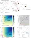
Fig. 4. Epidemic threshold for pandemic influenza with antiviral combination therapy and emergence of resistance.
a EGD (epidemic graph diagram) of the pandemic influenza model and associated simplifications. The model includes four strains—wild-type, two mono-resistant, and one multi-resistant. The recovered (R) compartment has already been CUT out for the sake of visualization (see also Fig. 3b). The four strongly connected components (blue rectangles) correspond to the dynamics of each strain, independently. They can be isolated using CUT. EGD indicates the representation of an epidemic graph diagram. Under the weak-commutation condition, the ZIP operation reduces each of the four subdiagrams to an SIS-like EGD with renormalized strain-specific parameters. Parameter definitions and values appear in Supplementary Tables S1–S3 and S5. b Relative threshold variation under treatment (pT > 0) compared to no treatment (pT = 0) as a function of treatment probability pT and fitness cost, assumed to be the same for both antivirals (ϕ1 = ϕ2). Positive relative threshold variation indicates the epidemic threshold is higher when antiviral drugs are used for therapy, i.e. the risk for a pandemic is reduced. The black line separates the two dominance regimes, for the wild-type strain and for the multi-resistant variant. c Relative threshold variation as a function of pT along the values of fitness cost ϕ1 indicated by the white dashed lines in (b). Treatment increases the epidemic threshold. But after a critical pT the multi-resistant strain becomes dominant and further increasing treatment has no additional effect. d As (b) when fitness costs are specific to the drug, i.e. ϕ2 > ϕ1. A phase in which a mono-resistant strain dominates appears, differently from the situation depicted in (b). In addition, when ϕ1 < 0 (resistance increases transmissibility), a region in parameter space emerges where threshold variation is negative (red region), i.e. the pandemic risk is increased by the use of antiviral drugs, due to the emergence of resistance. The red arrow indicates the parameter values estimated for the oseltamivir-resistant H1N1 strain, globally dominant in 2007–2008. e Boundaries of the three dominance phases of panel d when varying ϕ2. We report their analytical derivation in S2.2.

References

    1. Koelle K, Martin MA, Antia R, Lopman B, Dean NE. The changing epidemiology of SARS-CoV-2. Science. 2022;375:1116–1121. doi: 10.1126/science.abm4915. - DOI - PMC - PubMed
    1. Carlson CJ, et al. Climate change increases cross-species viral transmission risk. Nature. 2022;607:555–562. doi: 10.1038/s41586-022-04788-w. - DOI - PubMed
    1. Horby P. Improving preparedness for the next flu pandemic. Nat. Microbiol. 2018;3:848–850. doi: 10.1038/s41564-018-0206-7. - DOI - PMC - PubMed
    1. WHO - Ten Threats to Global Health in 2019. https://www.who.int/news-room/spotlight/ten-threats-to-global-health-in-... visited on Sept 2022.
    1. Colizza V, Barrat A, Barthélemy M, Valleron A-J, Vespignani A. Modeling the worldwide spread of Pandemic Influenza: Baseline case and containment interventions. PLoS Med. 2007;4:e13. doi: 10.1371/journal.pmed.0040013. - DOI - PMC - PubMed

Publication types

MeSH terms