. 2024 Apr;628(8007):359-364.
doi: 10.1038/s41586-023-06861-4. Epub 2023 Dec 20.

Disproportionate declines of formerly abundant species underlie insect loss

Affiliations

Disproportionate declines of formerly abundant species underlie insect loss

Roel van Klink et al. Nature. 2024 Apr.

Abstract

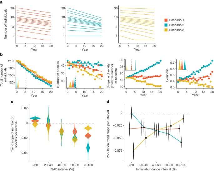
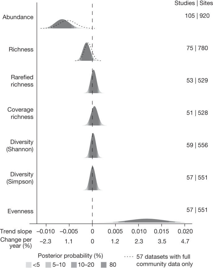
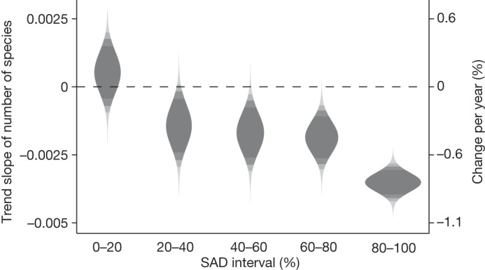
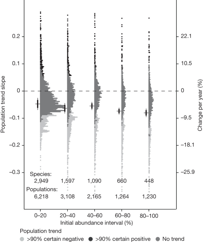
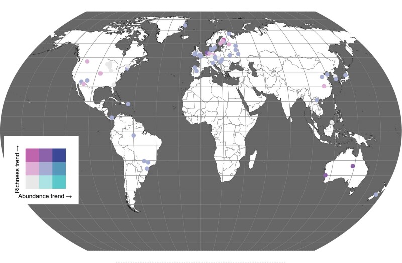
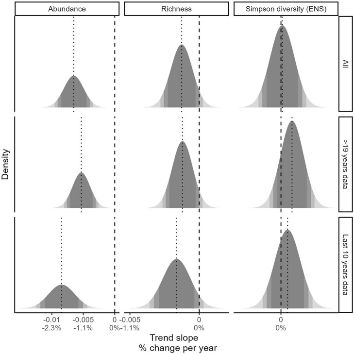
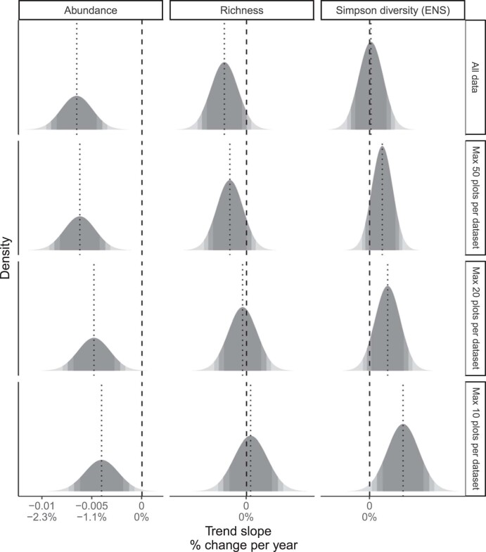
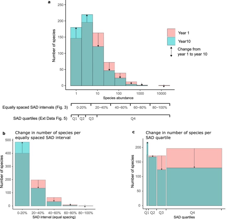
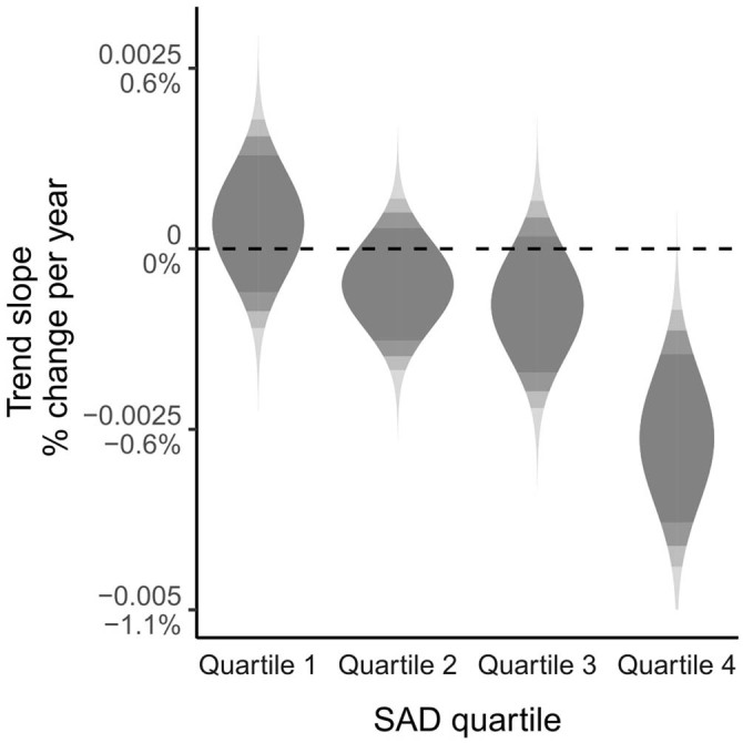
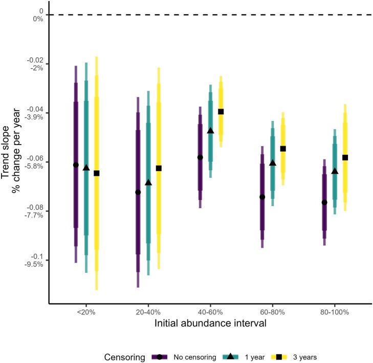
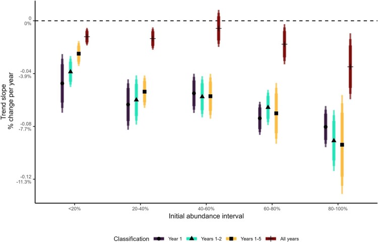
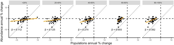
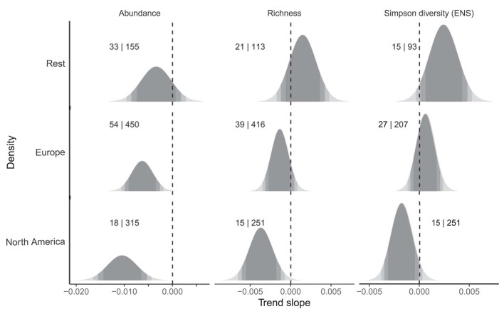
Studies have reported widespread declines in terrestrial insect abundances in recent years1-4, but trends in other biodiversity metrics are less clear-cut5-7. Here we examined long-term trends in 923 terrestrial insect assemblages monitored in 106 studies, and found concomitant declines in abundance and species richness. For studies that were resolved to species level (551 sites in 57 studies), we observed a decline in the number of initially abundant species through time, but not in the number of very rare species. At the population level, we found that species that were most abundant at the start of the time series showed the strongest average declines (corrected for regression-to-the-mean effects). Rarer species were, on average, also declining, but these were offset by increases of other species. Our results suggest that the observed decreases in total insect abundance2 can mostly be explained by widespread declines of formerly abundant species. This counters the common narrative that biodiversity loss is mostly characterized by declines of rare species8,9. Although our results suggest that fundamental changes are occurring in insect assemblages, it is important to recognize that they represent only trends from those locations for which sufficient long-term data are available. Nevertheless, given the importance of abundant species in ecosystems10, their general declines are likely to have broad repercussions for food webs and ecosystem functioning.


Conflict of interest statement

The authors declare that they have no competing interests.

Figures

Fig. 1
Fig. 1. The three conceptual scenarios described in Box 1 give rise to distinct changes in biodiversity patterns.
ad, Effects of three conceptual scenarios by which species change over time (all species decline in proportion to each other (scenario 1, red); abundant species decline more than rare species do (scenario 2, turquoise); or rare species decline more than abundant species do (scenario 3; gold)) on population abundances (a), four biodiversity metrics (b), the numbers of species in different SAD intervals (c) and the mean population abundance trends of species in these abundance intervals (d). For biodiversity metrics that depend on species counts (species richness and evenness (b) and species richness per SAD interval (c)), a small amount of error was added. The insets in b represent modelled slope estimates in relation to 0 at the dashed line. Simpson diversity was converted to its effective number of species. See ‘Extraction and calculation of biodiversity metrics’ in the Methods for an explanation of the biodiversity metrics. Note that because this simple conceptual model is intended to mimic a real dataset to some extent, the trends should be interpreted qualitatively rather than quantitively.
Fig. 2
Fig. 2. Probability density of the posterior trend estimates of the changes in univariate biodiversity metrics.
Shading represents the posterior probability of the mean slope estimate, corresponding to the 80%, 90% and 95% CIs from the hierarchical Bayesian models. Numbers indicate the numbers of studies and sites available for each metric. Abundance is the total number of individuals observed at each time point, richness is the number of taxa observed at each time point, rarefied richness represents the expected number of species to be seen for the minimum number of individuals observed in any year in the time series, coverage richness is the expected number of species if 80% of the assemblage had been surveyed, Shannon and Simpson diversity were converted to their effective number of species and evenness was calculated as the ratio between the inverse Simpson index and species richness. The dotted lines for abundance and richness represent the results based on only the 57 studies with full community data.
Fig. 3
Fig. 3. Probability density of the trend estimates for the number of species in five abundance intervals over time.
The five (log10-transformed) SAD intervals were assigned separately for each time series, scaled to the highest abundance of any taxon observed in any year. Shading as in Fig. 2.
Fig. 4
Fig. 4. Population trend estimates per initial abundance interval, corrected for regression-to-the-mean effects.
Black horizontal bars and error bars represent the mean, 80% and 95% CIs of the mean estimates. The dots represent the population-level random effects, coloured by trend direction and certainty. The most extreme values are not shown, to aid visualization.
Extended Data Fig. 1
Extended Data Fig. 1. Bivariate map of changes in richness and abundance at the study level.
The trend estimates of the individual studies were derived from the random effects of the hierarchical Bayesian model. The colours are coded according to the strength of evidence, in which the middle colour in both axes indicates that the 80% CI includes zero, hence, all other colours indicate weak to strong evidence of a temporal trend on either abundance, richness or both. Map derived from refs. and .
Extended Data Fig. 2
Extended Data Fig. 2. Influence of time-series length on the estimated temporal slopes of abundance, richness and Simpson diversity.
Long time series were selected by restricting the data to sites with at least 20 years from the first to the last year. Short time series were created by only retaining the last 10 years of each site. To aid the comparison among rows, the mean estimates of each realm are provided as dotted lines. This shows some shifts in mean estimates, but no differences in the qualitative interpretation of the results.
Extended Data Fig. 3
Extended Data Fig. 3. Influence of studies with a large number of sites on the estimated temporal slopes of abundance, richness and Simpson diversity.
The studies underlying the analysis were subsetted to only the 50, 20 and 10 best sampled sites, and the models were rerun. To aid comparison among rows, the mean estimates of each realm are provided as dotted lines. This shows a progressive shift to more positive slopes for all metrics.
Extended Data Fig. 4
Extended Data Fig. 4. Explanation of changes in the number of species per SAD section.
a, The SAD (the number of species per bin), in years 1 and 10 of a hypothetical time series. Scaled in relation to the highest observed log10-transformed value in the whole time series, we have binned the log10-transformed species abundance values in two ways. b,c, We assigned five equally spaced sections (b), and four quartiles (c), where the quartiles had approximately equal species numbers (variation because of rounding of bins). After the bins were assigned, we calculated the number of species falling in each bin in each year.
Extended Data Fig. 5
Extended Data Fig. 5. Changes in the number of species in each of four quartiles on the basis of the distribution of values of all species in each whole time series.
In comparison to Fig. 4, there are more species and more individuals in the higher quartiles, given the naturally low number of very abundant species (see Extended Data Fig. 4a,c). Here, there isan equal number of observations in each quartile, whereas in Fig. 4, the spacing (in log space) between bins is equal.
Extended Data Fig. 6
Extended Data Fig. 6. Effects of censoring the first year or first three years on the slope estimates for correcting RtM effects.
We calculated the slope estimate (±80, 90 and 95% CI) on the highest quality datasets (260 plots in 26 datasets with at least 15 years of data) for each of the initial abundance groups with no censoring (all data included), excluding the first year, and excluding the first three years. The shrinkage towards zero of the estimates with increasing censoring is assumed to be caused by RtM effects, but we cannot exclude that it’s partially due to true greater declines of populations during the early years of monitoring. We have taken the difference between the mean slope estimate without censoring and the estimate with one-year censoring from the start as the correction factor for RtM effects in the main text (see Supplementary Table 5). Three-year censoring would provide a larger correction factor (Supplementary Table 5).
Extended Data Fig. 7
Extended Data Fig. 7. Effects of different ways of classifying locally rare and abundant species on the estimated mean population trends.
Classification of species starting interval was done based on (i) the abundances observed in year 1, (ii) the abundance of each species averaged over years 1 and 2 (iii) the abundance of each species averaged over years 1-5, and (iv) the abundance of each species averaged across the whole time series. Species that were absent at the start of the time series were not analysed, because their abundance trends will be, on average, positive by definition. The weakest results when based on the whole time series was expected because this is the most conservative approach to assessing rarity. An initially abundant species with a strong decline might not be abundant across the whole time series. Hence, this analysis shows that even when looking at abundance across the whole time series, the most abundant species decline most strongly.
Extended Data Fig. 8
Extended Data Fig. 8. Relation between abundance slopes and the mean population slopes at the dataset level.
Abundance slopes and mean population slopes at the dataset level were both converted to the percentage change per year per initial abundance interval. The initial abundance intervals can be understood as the abundance interval of a species in relation to the log-transformed abundance of the most abundant species in year 1. Dotted lines represent the 1:1 relation, orange lines and slope estimates (β) represent the best fit according to least squares regression models. We removed one data point with an extreme slope from panels 1 and 2 to aid visual interpretation.
Extended Data Fig. 9
Extended Data Fig. 9. Temporal trend slopes for biodiversity metrics excluding Europe and North America.
The probability densities are shown for the slope estimates of abundance, species richness and Simpson diversity (ENS) for the data excluding Europe and North America. Numbers indicate the number of studies and the number of sites underlying each estimate respectively.

References

    1. Hallmann CA, et al. More than 75 percent decline over 27 years in total flying insect biomass in protected areas. PLoS One. 2017;12:e0185809. doi: 10.1371/journal.pone.0185809. - DOI - PMC - PubMed
    1. Van Klink R, et al. Meta-analysis reveals declines in terrestrial but increases in freshwater insect abundances. Science. 2020;368:417–420. doi: 10.1126/science.aax9931. - DOI - PubMed
    1. Forister ML, et al. Increasing neonicotinoid use and the declining butterfly fauna of lowland California. Biol. Lett. 2016;12:20160475. doi: 10.1098/rsbl.2016.0475. - DOI - PMC - PubMed
    1. Dirzo R, et al. Defaunation in the Anthropocene. Science. 2014;345:401–406. doi: 10.1126/science.1251817. - DOI - PubMed
    1. Seibold S, et al. Arthropod decline in grasslands and forests is associated with landscape-level drivers. Nature. 2019;574:671–674. doi: 10.1038/s41586-019-1684-3. - DOI - PubMed