. 2024 Jan;30(1):186-198.
doi: 10.1038/s41591-023-02673-1. Epub 2023 Dec 20.

Multiomic spatial landscape of innate immune cells at human central nervous system borders

Affiliations

Multiomic spatial landscape of innate immune cells at human central nervous system borders

Roman Sankowski et al. Nat Med. 2024 Jan.

Abstract

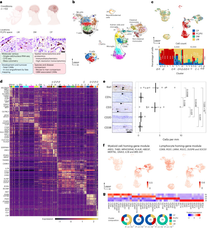
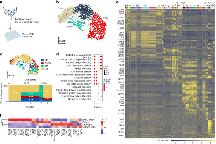
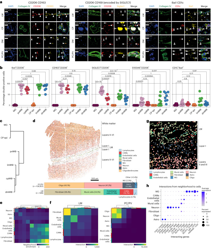
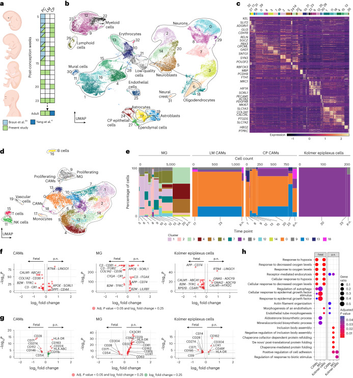
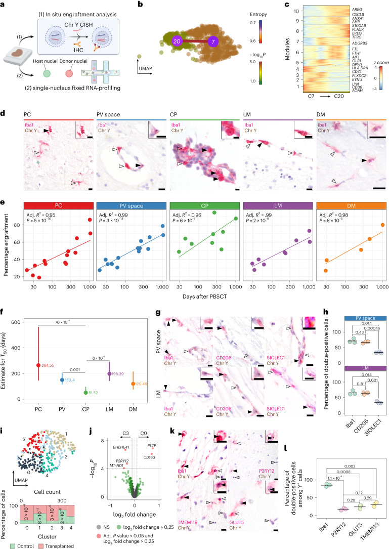
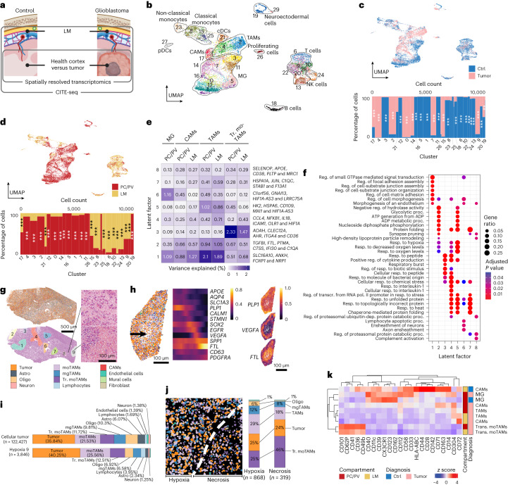
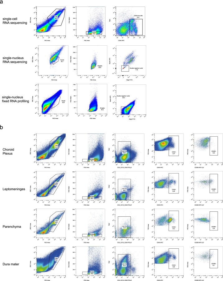
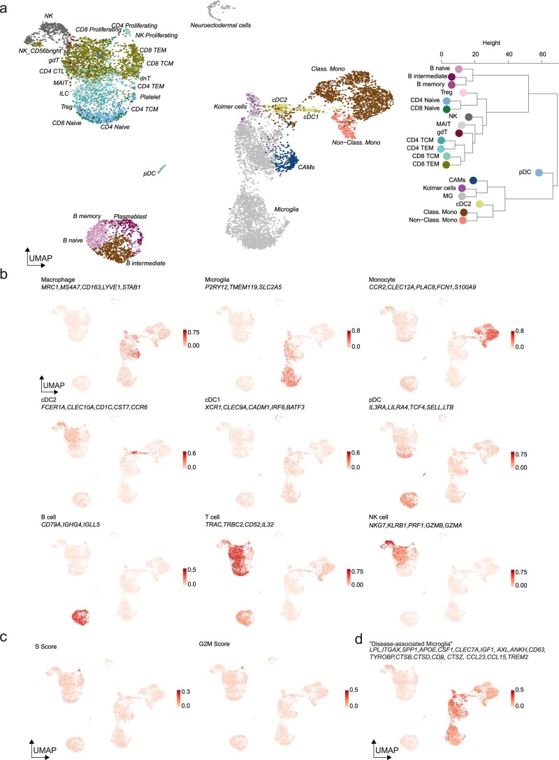
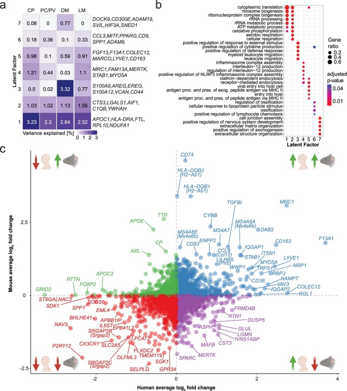
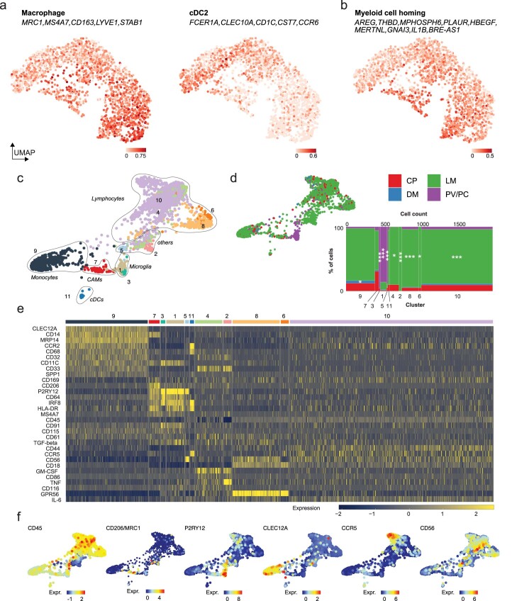
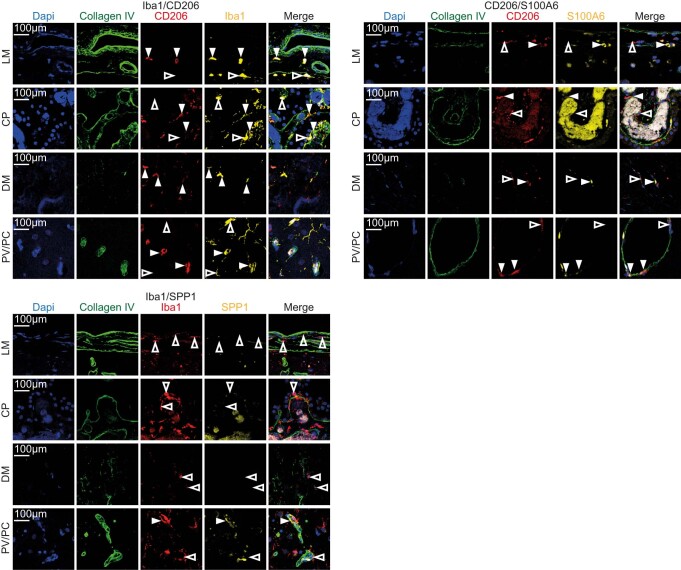
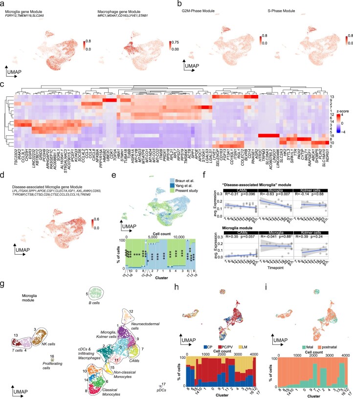
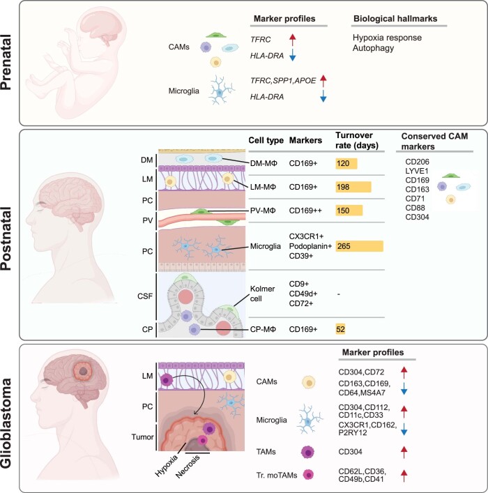
The innate immune compartment of the human central nervous system (CNS) is highly diverse and includes several immune-cell populations such as macrophages that are frequent in the brain parenchyma (microglia) and less numerous at the brain interfaces as CNS-associated macrophages (CAMs). Due to their scantiness and particular location, little is known about the presence of temporally and spatially restricted CAM subclasses during development, health and perturbation. Here we combined single-cell RNA sequencing, time-of-flight mass cytometry and single-cell spatial transcriptomics with fate mapping and advanced immunohistochemistry to comprehensively characterize the immune system at human CNS interfaces with over 356,000 analyzed transcriptomes from 102 individuals. We also provide a comprehensive analysis of resident and engrafted myeloid cells in the brains of 15 individuals with peripheral blood stem cell transplantation, revealing compartment-specific engraftment rates across different CNS interfaces. Integrated multiomic and high-resolution spatial transcriptome analysis of anatomically dissected glioblastoma samples shows regionally distinct myeloid cell-type distributions driven by hypoxia. Notably, the glioblastoma-associated hypoxia response was distinct from the physiological hypoxia response in fetal microglia and CAMs. Our results highlight myeloid diversity at the interfaces of the human CNS with the periphery and provide insights into the complexities of the human brain's immune system.


Conflict of interest statement

The authors declare no competing interests.

Figures

Fig. 1
Fig. 1. Molecular census of immune cells in human CNS border regions under homeostasis.
a, Schematic illustration of the present study, including representative CD45+ immunohistochemistry images of different CNS interfaces. Scale bar, 20 µm. An overview of biological replicates is provided in Supplementary Table 20. GBM, glioblastoma. b, Uniform manifold approximation and projection (UMAP) visualization of 11,166 FACS-sorted CD45+ cells from the PC/PV space (n = 3,860), LM (n = 5,039), CP (n = 1,597) and DM (n = 670). Color coding and numbers indicate the different clusters. NK, natural killer; pDC, plasmacytoid DC. c, UMAP (top) and Marimekko chart (bottom) color coded for the compartment of each. Statistical testing was conducted using one-sided hypergeometric tests with Benjamini–Hochberg multiple-testing adjustment. *P < 0.05; **P < 0.01; ***P < 0.001. The exact P values are found in Supplementary Table 2. Significance asterisks are only shown until cluster 24 as clusters 25–31 were relatively small. d, Single-cell heat map depicting the expression of the top 20 cluster markers with selected genes shown on the left. Color coding is consistent with b. The color scale represents Pearson’s residuals from a regularized negative-binomial regression. e, Histological validation of tissue-residency of immune cells in the LM with representative CD45+ images. Empty arrowheads indicate intravascular areas, whereas filled arrowheads indicate tissue-resident cells. The dot plot shows quantifications of positive cells per mm of the LM with each dot representing a patient. Between n = 9 and n = 12 independent patients were assessed per marker. The crossbar indicates the mean counts per mm and the error bar indicates the s.e.m. Statistical testing was performed using a Kruskal–Wallis test followed by Dunn’s test for pairwise multiple comparisons with Holm–Bonferroni adjustment for multiple testing. *P < 0.05; **P < 0.01; ***P < 0.001. f, UMAP color coded for the expression of published myeloid (left) and lymphoid (right) homing-gene module scores. The color coding represents module enrichment scores for each cell using the Mann–Whitney U statistic. g, Heat map of the average expression of the top 12 markers for clusters 19, 26, 22 and 20. The color scale indicates the z score. The donut plots show the compartment distribution across clusters. P values were calculated using one-sided hypergeometric tests with Benjamini–Hochberg adjustment for multiple testing. Source data
Fig. 2
Fig. 2. Characterization of human CAMs during homeostasis by single-cell sequencing and CITE-seq.
a, Schematic representation of the validation experiment presented in bd. b, UMAP visualization of 1,962 FACS-sorted human CD45+CD206+Lin cells color coded for the results of graph-based clustering with Seurat v.4. The indicated cell-type classification was based on a combination of human peripheral blood mononuclear cells and published marker gene sets,. c, Top: UMAP visualization of the cells from b, color coded based on the compartment that the cells were derived from. Bottom: Marimekko chart of the distribution of the compartments per cluster. Asterisks indicate the results of statistical testing using one-sided hypergeometric tests. Adjustment for multiple testing was performed using the Benjamini–Hochberg method. ***P < 0.001. The exact P values are in Supplementary Table 6. The color coding is consistent across both panels. d, Dot plot showing cluster-wise Gene Ontology term enrichment analysis across the differentially enriched genes in the clusters from b. The dot size indicates the gene ratio of genes differentially expressed in each cluster over the genes in the indicated Gene Ontology terms. The color coding of the dot encodes the Benjamini–Hochberg-adjusted P value from a one-sided Fisher’s exact test. e, Single-cell protein heat map from the top differentially expressed protein markers co-registered with cell transcriptomes presented in Fig. 1. The color scale represents Pearson’s residuals from a regularized negative-binomial regression. f, Heat map representation of the average expression of up to ten top differentially expressed surface markers in the indicated cell types. The color scale indicates the z score. The dendrogram represents the hierarchical clustering based on the Euclidean distance metric. Source data
Fig. 3
Fig. 3. Spatial profiling of human CAMs in situ and their cellular interactions.
a, Representative immunofluorescence across human CNS interfaces. DAPI (4′,6-diamidino-2-phenylindole) and collagen IV show positions of nuclei and basal lamina. Filled arrowheads indicate double-positive cells and empty arrowheads indicate single-positive cells. b, In situ quantification of selected markers across different compartments. Crossbars indicate medians. Outlier values confirmed by the Grubbs’s test were removed, resulting in at least n = 7 and at most n = 18 biologically independent samples analyzed per compartment and reaction. Each dot represents a patient. Indicated P values were derived from pairwise two-sided Mann–Whitney U-tests with pvMΦ as the reference cell type. MG, microglia; pvMΦ, perivascular macrophage; cpMΦ, choroir plexus macrophage; CP epi, epiplexus macrophage/Kolmer cells; lmMΦ, leptomengeal macrophage; dmMΦ, dura mater macrophage. c, Dendrogram showing the hierarchical clustering of the analyzed cell types based on average expression of CD206, SIGLEC1, CD163, S100A6 and CD1C. d, Spatial plot of a control section (frontal cortex) analyzed using ISS. Color coding represents different cell types. On the right, the different anatomical regions are annotated. The bar plot on the bottom shows the cell-type distribution in the PC and LM. Representative of cortical sections analyzed from four individuals. Astro, astrocytes; Oligo, oligodendrocytes. e, Heat map, color coded for the neighborhood enrichment scores of the different cell types calculated with a permutation-based test. The color coding of the cell types is consistent with d. f, Heat map, color coded for the cell-type interaction scores in LM (left) and PC/PV (right). Color coding is consistent with d. g, Spatial plot of a tissue section (occipital cortex) analyzed using Nanostring CosMx. Color coding is consistent with d and e. Representative of 14 analyzed fields of view from 4 control samples. h, Dot plot showing the spatial cell–cell interactions of the dataset from f. The y axis indicates receiving cell types. The x axis labels show the ligand expressed by neighboring cells followed by the receptor. Color scale represents the average expression of ligand–receptor pairs. The dot size represents the percentage of cells expressing the receptor. Source data
Fig. 4
Fig. 4. Region-dependent transcriptional dynamics of human CNS border macrophages during development.
a, Schematic overview of the included time points and compartments color coded for the studies from which immune-cell data were integrated with the present data. b, UMAP visualization of single-nucleus RNA-seq data from 59,053 single-nucleus transcriptomes generated for the present study, color coded for Seurat v.4 clusters. c, Single-cell heat map depicting the gene expression of the top 20 marker genes per cluster of the cells shown in b. Selected genes are shown on the left-hand side. Color coding of the clusters is consistent with b. The color scale represents Pearson’s residuals from a regularized negative-binomial regression. d, UMAP visualization of single-nucleus RNA-seq data for immune cells generated and integrated immune-cell data from published studies,. The colors indicate the results of graph-based re-clustering using Seurat v.4. e, Marimekko charts showing the cluster contributions of the macrophage populations from d to the respective time points. Each macrophage population is plotted separately. p.n., postnatal. The color coding is consistent with d. f, Volcano plots showing differential gene expression testing of ligand–receptor pairs of the indicated macrophage populations from d. Selected representative ligand–receptor pairs are highlighted. A two-sided unpaired Wilcoxon rank-sum test was performed with Bonferroni correction for multiple testing. The color scale represents an adjusted P value below 0.05 and a log2 fold change above 0.25. g, Volcano plots showing differential surface protein expression derived using CITE-seq from the indicated fetal macrophages at pcw 23 with their postnatal counterparts. A two-sided unpaired Wilcoxon rank-sum test was performed with Bonferroni correction for multiple testing. The color coding represents an adjusted P value below 0.05 and a log2 fold change above 0.25. h, Gene Ontology enrichment analysis between fetal and postnatal macrophages from g. Gene Ontology testing was based on the top 100 differentially expressed gene per cell type and time point. Dot sizes indicate the ratio of marker genes per cluster over the genes of a given terms. The color scales encodes the Benjamini–Hochberg-adjusted P value from a one-sided Fisher’s exact test. Source data
Fig. 5
Fig. 5. Compartment-specific turnover of human CNS border macrophages.
a, Schematic workflow representation. IHC, immunohistochemistry; CISH, chromogen in situ hybridization. b, UMAP of C7 and C20 from Fig. 1b connected by a transcriptional trajectory. The color coding represents the log10 transformed P value indicating the overrepresentation of the trajectory compared to randomization. The color of the cluster symbol encodes transcriptional entropy. c, Heat map showing stepwise gene expression along the trajectory. The color scale encodes z scores. d, Representative Iba1 immunohistochemistry and Y chromosome CISH. Filled arrowheads mark double-positive cells and empty arrowheads indicate single-positive cells. n ≥ 50 CAMs were analyzed per patient. Scale bars, 10 µm. e, Correlation between time after PBSCT and percentage of engraftment for n = 5 to n = 18 independent samples per compartment and one patient per dot. Adjusted R2 coefficients and one-sided t-test P values are given. f, Dot-whisker plots of the duration after PBSCT until 50% engraftment for the data from e. Whiskers indicate 95% confidence intervals around the predicted mean value. P values were calculated from pairwise comparisons using estimated marginal means with Tukey’s multiple testing adjustment. g, Representative immunohistochemistry of PV and LM. Filled arrowheads indicate double-positive cells and empty arrowheads indicate single-positive cells. Scale bars, 10 µm. n ≥ 3 fields of view per patient were quantified. h, Quantification of the dataset in g. n = 3 biologically independent samples were analyzed per compartment. P values indicate pairwise two-sided t-tests with Holm–Bonferroni multiple testing adjustment. i, UMAP of single-nucleus fixed mRNA profiling of n = 363 myeloid cells color coded for clusters. The Marimekko chart (bottom) indicates the distribution of conditions per cluster. Significant one-sided hypergeometric test P values with Benjamini–Hochberg multiple-testing adjustment are shown. j, Volcano plot showing differentially expressed genes between the control-enriched C3 and PBSCT-enriched C0. Two-sided unpaired Wilcoxon rank-sum tests with Bonferroni multiple testing adjustment were performed. The color coding is explained below the graph. NS, not significant. k, Representative immunohistochemistry in the PC. Filled arrowheads indicate double-positive cells and empty arrowheads indicate single-positive cells. Gray arrowheads indicate single-positive Y+ cells. n ≥ 3 fields of view per patient were quantified. Scale bars, 10 µm. l, Quantification of the dataset in k. n = 3 independent samples were analyzed per compartment and one patient per dot. P values were calculated using pairwise two-sided t-tests with Holm–Bonferroni multiple-testing adjustment. Source data
Fig. 6
Fig. 6. Multimodal analysis reveals common activation programs of CAMs and microglia in human glioblastoma.
a, Schematic workflow representation. b, UMAP of n = 11,681 FACS-sorted cells color coded for clusters. CP and DM samples were not available from glioblastoma. c, UMAP (top) and Marimekko chart (bottom) color coded for the underlying diagnosis. The Marimekko chart represents the distribution of diagnoses per cluster. One-sided hypergeometric tests with Benjamini–Hochberg multiple testing adjustment were performed. *P < 0.05; **P < 0.01; ***P < 0.001. Exact P values are found in Supplementary Table 16. For improved readability, significance asterisks are shown until C24. C25–C29 represent relatively small cell numbers. d, Equivalent of c analyzed for anatomical compartments. Exact P values are found in Supplementary Table 18. e, Heat map of MOFA2 latent factors of glioblastoma-associated macrophage populations present in both compartments. The color-coded data and the values of variance explained are indicated in each heat map tile. Representative genes are presented per factor. f, Gene Ontology analysis of the top 100 marker genes per MOFA2 factor. Dot sizes indicate the gene ratio per cluster. Color coding of the dot encodes the Benjamini–Hochberg-adjusted P value based on a one-sided Fisher’s exact test. Reg., regulation; Resp., response. g, Spatial plot of a glioblastoma section analyzed with ISS and color coded for cell types (top) and histological subtypes (left). The numbered areas represent hypoxic regions. Samples from four patients were analyzed. Representative hematoxylin and eosin staining is shown on the right. h, Spatial plot color coded for the cellular composition of hypoxic area 9 from g. The arrow represents a spatial trajectory from the periphery to the hypoxic core. The heat map (center) shows stepwise gene expression along the trajectory with representative genes (right). i, Bar plots of the cell-type compositions of cellular tumor and hypoxic regions representative of sections analyzed from two individuals. j, Spatial plot of the transition from hypoxia to necrosis analyzed with Nanostring CosMx. Color coding is specified in h. The bar plots show the cell-type distribution. The data are representative of eight regions from two glioblastoma samples. k, Mean marker expression heat map of CITE-seq data from microglia, CAMs and monocyte-derived macrophages shown in b. The compartments and diagnoses of the cells are color coded. Source data
Extended Data Fig. 1
Extended Data Fig. 1. FACS gating strategies.
a. Representative FACS plots of cell suspensions for 10x single-cell analysis (top figure panel). Cells were gated i. on singlets followed by ii. collection of DAPI- and CD45+ cells. The middle figure panel shows the gating strategy for single-nucleus RNA sequencing. The bottom figure panel shows the gating strategy for single-nucleus fixed RNA profiling. Cells were sorted into 1.5 ml tubes. b. For the enrichment of CD206+ cells, i. singlets were selected followed by ii. exclusion of DAPI + CD3 + CD19 + CD20+ cells. iii-iv-. CD45 + CD206+ cells were sorted into 384-well plates.
Extended Data Fig. 2
Extended Data Fig. 2. Overview of cell type-enriched gene expression signatures and cell cycle scores.
a. Cell type assignment of the dataset using the Azimuth human PBMC reference dataset. b. UMAP visualizations color coded for the expression of gene modules enriched in the indicated cell types. The color coding represents gene module expression scores for each cell using the Mann-Whitney U statistic. c. UMAP visualizations color coded for cell cycle scoring. The color coding represents gene module expression scores for each cell using the Mann-Whitney U statistic. The module score classification is based on published gene expression signatures.d. UMAP visualizations color coded for the expression of the published gene module. The color coding represents module enrichment scores for each cell using the Mann-Whitney U statistic. Source data
Extended Data Fig. 3
Extended Data Fig. 3. Conserved and distinct signatures of tissue resident myeloid cells in CNS interfaces between mouse and man.
a. Heatmap visualization of latent factors determined by multiomic factor analysis (MOFA)2 analysis of macrophages across the indicated compartments. The color scale indicates the percentage of variance explained across the compartments. For enhanced readability, the respective values are indicated in each heat map tile. Selected top genes for each latent factor are presented to the right of the heat map. PC/PV: parenchyma/perivascular space, CP: choroid plexus, LM: leptomeninges, DM: dura mater. b. Dotplot showing gene ontology term enrichment analysis across the top 100 differentially enriched genes in the MOFA2 latent factors from panel a. The dot size indicates the gene ratio of genes differentially expressed in each cluster over the genes in the indicated gene ontology terms. The color coding of the dot indicates the Benjamini–Hochberg adjusted p value based on a one-sided Fisher’s exact test.c. Dot plot depicting the cross-species comparison of differentially expressed orthologue genes between CAMs and microglia in humans and mice. On the x-axis, adjusted average log2-fold changes from the comparison of murine MHC-IIlow and MHC-IIhigh are signed positively if they are upregulated in the former and negatively if they are upregulated in the latter. The y-axis contains the adjusted average log2-fold changes of the human counterparts. The log2-fold changes were calculated using two-sided unpaired Wilcoxon Rank-Sum tests followed by Bonferroni correction for multiple testing. Orthologue genes in the top right and bottom left quadrants are differentially expressed in the same direction. Orthologue genes in the top left and bottom right quadrants are showing opposite directions of differential expression. Orthologue genes positioned along the axes are only upregulated in one species. The color coding indicates the directionality of the gene expression across species. Blue genes were upregulated in mice and humans; red genes were downregulated in mice and humans; green genes were upregulated in humans and downregulated in mice; violet genes were differentially regulated in humans, but not in mice; orange genes were differentially regulated in mice but not in humans. Source data
Extended Data Fig. 4
Extended Data Fig. 4. Cell type gene module expression of mCEL-Seq2 data and validation with mass cytometry.
a. UMAP visualizations color coded for the expression of gene modules enriched in the indicated cell types. The color coding represents module enrichment scores for each cell using the Mann-Whitney U statistic. b. UMAP visualization color coded for the expression of published myeloid (left) and lymphoid cell homing gene modules. The color coding represents module enrichment scores for each cell using the Mann-Whitney U statistic. c. Spider visualization of 1,999 CD45+ cells analyzed using mass cytometry. The plots are color coded for K-nearest-neighbor density-based X-shift algorithm-based cluster assignment. The indicated cell type assignment is based on the expression of published cell type markers. The cells labeled as ‘others’ did not show CD45 expression. Numbers indicate the different clusters. d. Spider presentation of the cells from panel f color coded for the compartment the cells were extracted from. The right bottom panel is showing a Marimekko chart of the distribution of compartments per cluster. CP: choroid plexus, LM: Leptomeninges, PV/PC: perivascular space and parenchyma. e. Spider visualization of the cells from panel f color coded for the expression of selected genes. The color scale represents Pearson’s residuals from a regularized negative-binomial regression. f. Single-cell heatmap of the protein expression in each cluster depicted in panel f. The color scale represents Pearson’s residuals from a regularized negative-binomial regression. Source data
Extended Data Fig. 5
Extended Data Fig. 5. In-situ validation of immunohistochemistry markers identified in the scRNA-Seq data.
Filled arrowheads indicate double-positive cells, empty arrowheads indicate single-positive cells. Scale bars correspond to 100 µm. At least 3 images per patient were analyzed.
Extended Data Fig. 6
Extended Data Fig. 6. Single-nucleus and single-cell profiling of fetal and postnatal tissues.
a. UMAPs color coded for the expression of cell type-enriched gene modules. The color coding represents gene module scores using the Mann-Whitney U statistic. b. UMAPs color-coded for cell cycle scoring calculated using the Mann-Whitney U statistic. The underlying gene modules were previously described. c. Heatmap of the average expression of the 7 top markers in the indicated cell types. The color scale indicates the z-score. The dendrogram represents the hierarchical clustering based on Euclidean distances. d. UMAP color-coded for the expression of the published antigen-presentation and DAM modules,. The color coding represents gene module scores using the Mann-Whitney U statistic. e. UMAP (top) and Marimekko chart (bottom) color-coded for the dataset of each cell. The Marimekko chart represents the contribution of each dataset to the respective cluster. Asterisks indicate statistical significance from one-sided hypergeometric tests with Benjamini–Hochberg adjustment for multiple testing. **p < 0.01; ***p < 0.001. Note that for enhanced readability, asterisk are only indicated up to C17. f. Dot-line plots showing the average expression of the macrophage (top), microglia (middle) and DAM modules per cell type across the developmental stages. To avoid pseudo-replication, gene expression was averaged for each cell type and patient. Each dot represents one donor. The lines indicate linear regression results with the confidence intervals displayed as shaded areas. Pearson correlation coefficient and p value are given at the top of each plot. g. UMAP of 4,332 FACS-sorted CD45+ cells from the PC/PV, LM and CP of a fetus from pcw 23 and adult controls. The color coding indicates Seurat clusters. The cell-type assignment is based on published datasets,. h. UMAP (top) and Marimekko chart (bottom) color-coded for the anatomical compartment each cell was derived from. The Marimekko chart represents the contribution of each compartment to the respective cluster. The postnatal samples are from 5 individuals with 2 samples each from the PC/PV, CP and LM. i. Equivalent of figure panel h color-coded for developmental timepoints. Source data
Extended Data Fig. 7
Extended Data Fig. 7. Profiling of engrafting myeloid cells.
a. UMAP visualization of 9,035 color-coded for Seurat v4 clustering results. Cell type assignment was conducted based on published gene expression signatures. Marimekko chart of the contribution of control and transplanted patient to each cluster. Asterisks indicate the results of statistical testing using one-sided hypergeometric tests. Adjustment for multiple testing was done using the Benjamini–Hochberg method. **p < 0.01; ***p < 0.001. b. Single-cell heatmap depicting the gene expression of the top 7 cluster marker genes per cluster of the cells shown in panel a. The genes are shown at the left-hand side of the heatmap. Color-coding of the cluster is consistent with panel a. The color scale represents Pearson’s residuals from a regularized negative-binomial regression. c. Single-cell heatmap depicting the gene expression of up to top 10 cluster marker genes per cluster of the myeloid cell cluster from Fig. 4 i. d. Comparative analysis of the percentage of Y+ positive cells among all identified Iba1 + , P2RY12 + , TMEM119+ and GLUT5+ cells in the cortex. Positivity for the pan-myeloid marker Iba1 was considered as the maximum achievable percentage of engrafting myeloid cells. The lines connect the dots between results from the same patients. The indicates p values were calculated using paired t-tests. Source data
Extended Data Fig. 8
Extended Data Fig. 8. Validation of control vs GBM-associated immune cells assessed by single-cell RNA-Seq and mass cytometry.
a. UMAP color-coded for the expression of the indicated modules scores. Module scores are based on the Mann-Whitney U statistic. The cell cycle module genes are published. b. UMAP color-coded for DAM and myeloid cell homing module expression,. Module scores are based on the Mann-Whitney U statistic. c. Marimekko chart showing the integration results of the present dataset with published data. Cluster assignments of the present data were transferred on the Antunes et al dataset. Asterisks indicate statistical significance from one-sided hypergeometric tests with Benjamini–Hochberg adjustment for multiple testing. *p < 0.05; **p < 0.01; ***p < 0.001. d. Single-cell heatmap showing the expression of the top 20 cluster markers with selected genes shown on the left. Cluster colors are consistent with panel b. The color scale represents Pearson’s residuals from a regularized negative-binomial regression. e. Spatial plot of hypoxia (red) and adjacent necrosis (orange) analyzed with Nanostring CosMX. The white arrow indicates a spatial trajectory shown in panel f. The shown data is representative of 8 analyzed fields from 2 glioblastoma samples. f. Spatial trajectory heatmap showing the smoothed gene expression along the trajectory from figure panel e with representative genes on the right. g. Spider visualization of mass cytometry data from 2,439 CD45+ glioblastoma-derived cells color-coded for clusters. Cell type assignment is based on published cell type marker expression. CD45- cells are labeled as ‘others’. h. Spider presentation (top) and Marimekko chart (bottom) showing the distribution of diagnoses per cluster. i. Protein expression single-cell heatmap of the cells in panel e. The color scale represents Pearson’s residuals from a regularized negative-binomial regression. j. Dot-line plot depicting the expression of selected proteins between tumor-associated and control CAMs in C7 from panel e (top) and microglia from C1 (bottom). The indicated p values were calculated using unpaired two-sided t-tests with Benjamini–Hochberg multiple testing adjustment. Each symbol represents one cell. Medians are indicated. Source data
Extended Data Fig. 9
Extended Data Fig. 9. Graphical abstract of the present study.
The identified markers were chosen based on the combined findings of the modalities.

References

    1. Alves de Lima K, Rustenhoven J, Kipnis J. Meningeal immunity and its function in maintenance of the central nervous system in health and disease. Annu. Rev. Immunol. 2020;38:597–620. doi: 10.1146/annurev-immunol-102319-103410. - DOI - PubMed
    1. Yang AC, et al. Dysregulation of brain and choroid plexus cell types in severe COVID-19. Nature. 2021;595:565–571. doi: 10.1038/s41586-021-03710-0. - DOI - PMC - PubMed
    1. Chi Y, et al. Cancer cells deploy lipocalin-2 to collect limiting iron in leptomeningeal metastasis. Science. 2020;369:276–282. doi: 10.1126/science.aaz2193. - DOI - PMC - PubMed
    1. Yang, A. C. et al. A human brain vascular atlas reveals diverse mediators of Alzheimer’s risk. Nature10.1038/s41586-021-04369-3 (2022). - PMC - PubMed
    1. Winkler EA, et al. A single-cell atlas of the normal and malformed human brain vasculature. Science. 2022;375:eabi7377. doi: 10.1126/science.abi7377. - DOI - PMC - PubMed

Publication types