. 2022 Feb;2(2):84-89.
doi: 10.1038/s43588-022-00199-z. Epub 2022 Feb 24.

Network cartographs for interpretable visualizations

Affiliations

Network cartographs for interpretable visualizations

Christiane V R Hütter et al. Nat Comput Sci. 2022 Feb.

Abstract

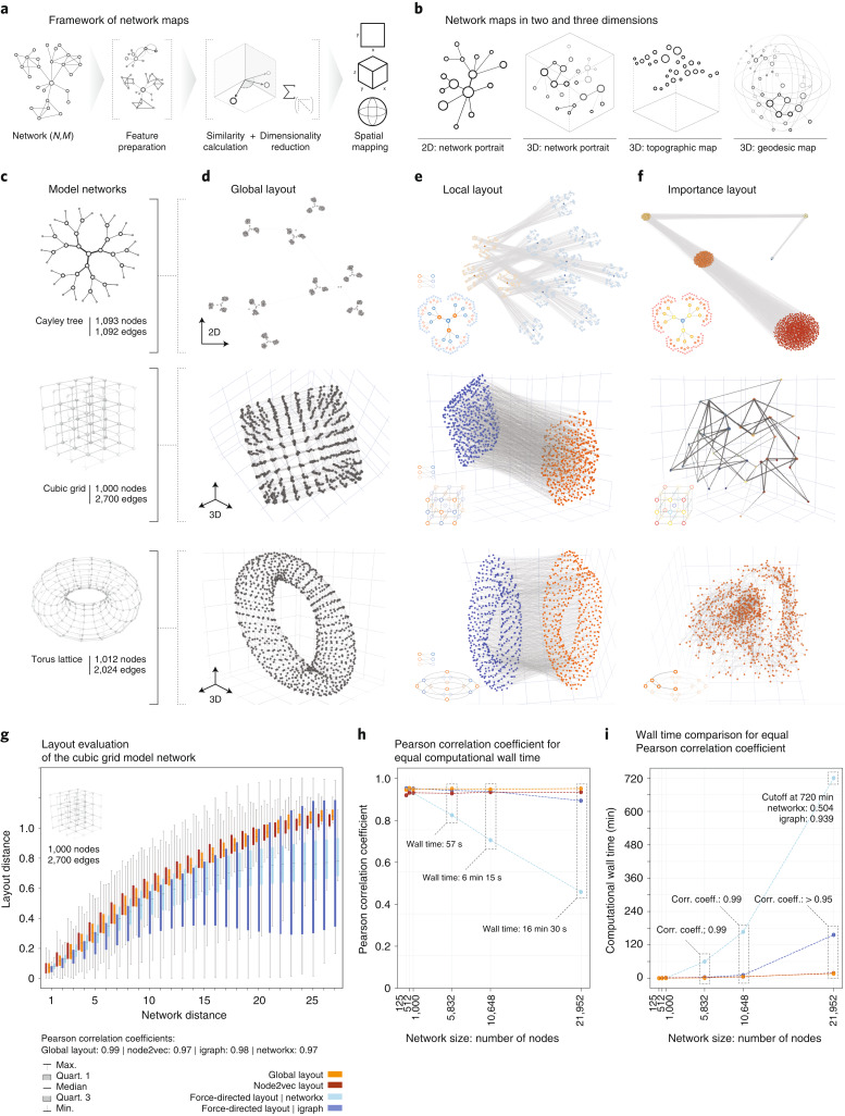
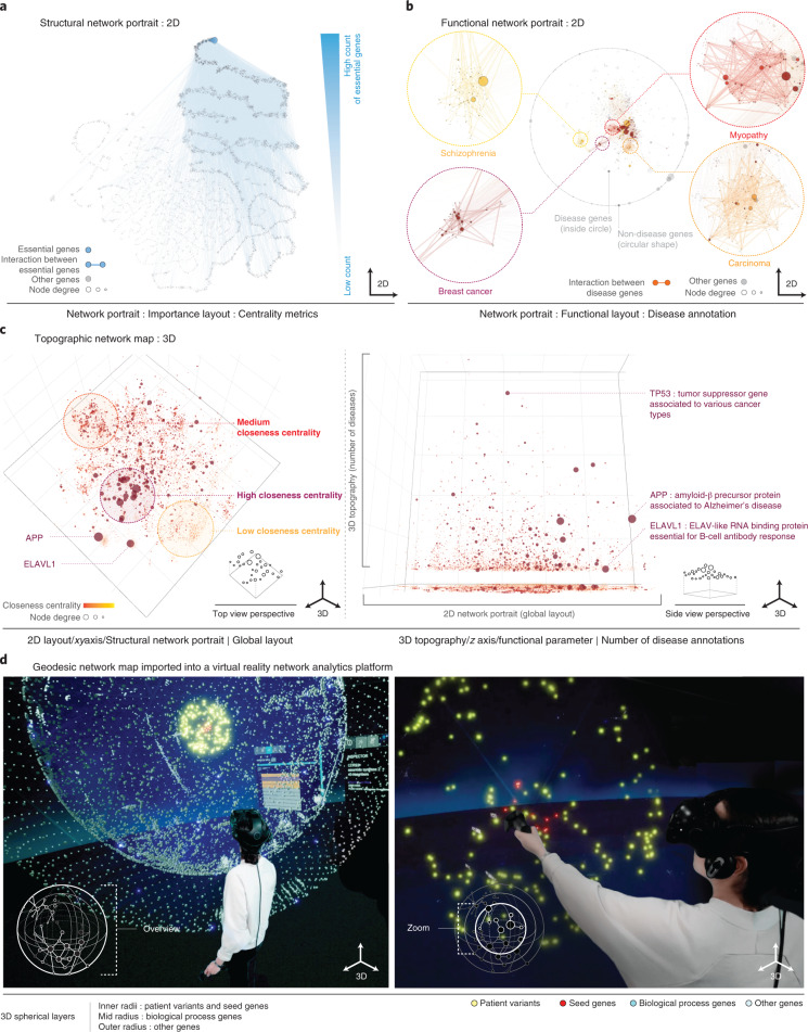
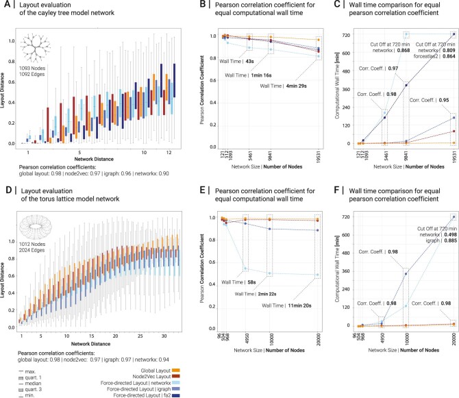
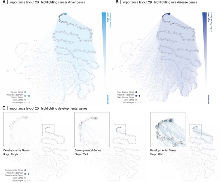
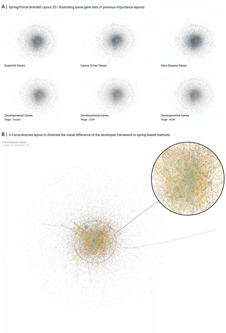
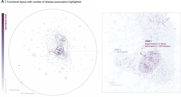
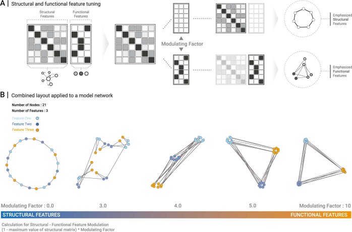
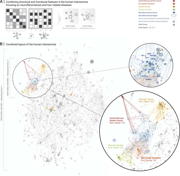
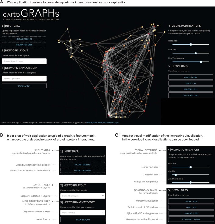
Networks offer an intuitive visual representation of complex systems. Important network characteristics can often be recognized by eye and, in turn, patterns that stand out visually often have a meaningful interpretation. In conventional network layout algorithms, however, the precise determinants of a node's position within a layout are difficult to decipher and to control. Here we propose an approach for directly encoding arbitrary structural or functional network characteristics into node positions. We introduce a series of two- and three-dimensional layouts, benchmark their efficiency for model networks, and demonstrate their power for elucidating structure-to-function relationships in large-scale biological networks.


Conflict of interest statement

The authors declare no competing interests.

Figures

Fig. 1
Fig. 1. Framework of interpretable network maps.
a, Overview. A node similarity matrix reflecting any network features to be visually represented is embedded into 2D or 3D geometries using dimensionality reduction methods. b, Schematic depiction of the resulting four types of network map: 2D and 3D network portraits directly use the outputs of the dimensionality reduction; topographic and geodesic maps incorporate an additional z or radial variable, respectively. c, The network models used for benchmarking: Cayley tree, cubic grid and torus lattice. df, Model network portraits based on global (d), local (e) and importance (f) layouts. The global layouts recapitulate the expected global shape according to pairwise node distances. The local layouts reveal bi- and multipartite network structures. The importance layouts cluster nodes with similar structural importance. g, Comparison of network-based and Euclidean layout distance for all node pairs in a cubic grid (N = 1,000) for the global layout, two force-directed algorithms and node2vec. All layouts achieve high correlation (Pearson’s ρglob = 0.99, ρnode2vec = 0.97, ρforce,nx = 0.97, ρforce,igraph = 0.98). Boxes summarize values of all n node pairs at network distance d, with n ranging from n = 4 at distance d = 27 (for corner node pairs) to n = 46,852 for d = 9. Whiskers denote the values for the minimum, first, second and third quartiles and maximum. h, Comparison of the final correlations for cubic grids of increasing size when limiting the wall clock running time of the algorithms to the running time of the global layout. i, Computational wall times that the respective algorithms require to achieve the same correlation as the global layout for cube grids of increasing size. Source data
Fig. 2
Fig. 2. Application to a large-scale, real-world biological network.
a, Structural network portrait of the human interactome based on the importance layout. Essential genes and links between them are shown in blue and aggregate in the area of high centrality nodes (top right). b, Functional network portrait based on disease association similarity. Four diseases are highlighted. Only links between disease genes are shown. Although most disease genes are located in four clusters (links shown by thicker lines), a smaller number of pleiotropic genes associated with multiple diseases is located at the center of the network (Extended Data Fig. 4b). c, Topographic network map in top view (left) and side view (right) obtained from a 3D interactive visualization. The x–y plane is based on a 2D global layout, and the z axis displays the number of diseases associated with a particular gene. d, Green-screen composition of a user exploring a geodesic network map in a virtual reality environment. Nodes are distributed on different spherical layers that reflect different biological roles. The center contains nodes to be functionally annotated, the enclosing layers contain genes associated with similar diseases and involved in relevant biological processes, respectively. Each individual layer is based on a functional layout emphasizing biological similarity, allowing the user to quickly identify the biological context of individual genes and their interactome neighborhood. Source data
Extended Data Fig. 1
Extended Data Fig. 1. Benchmarking different layout algorithms for model networks.
A Comparison of pairwise node distances in the layout and pairwise network distance for a Cayley tree with N = 1093 nodes and M = 1092 links. Boxes summarize values of all n node pairs at network distance d, with n ranging from n = 1092 at distance d = 1 to n = 177,147 for d = 12. Whiskers denote the values for the minimum, first, second, third quartiles and maximum. B Comparison of the final Pearson correlation coefficient between network and layout distance that the different algorithms achieve in the same computational wall time as the global layout for Caley trees with sizes ranging from 121 to 21,952 nodes. C Comparison of the computational wall times that the different algorithms require to reach the same correlation coefficient as the global layout. For network sizes of 10,000 nodes and above, the force-directed algorithms do not reach the target correlation within the maximum simulation time of 12 h. D, E, F Same as A,B,C for torus lattice model networks (N = 1012 nodes; M = 2024 links). Boxes in D summarize values of all n node pairs at network distance d, with n ranging from n = 484 at distance d = 33 to n = 21,296 for d = 12. Whiskers denote the values for the minimum, first, second, third quartiles and maximum. Source data
Extended Data Fig. 2
Extended Data Fig. 2. Importance layout of the interactome with different functional gene annotations highlighted.
A Cancer driver genes and links between them are shown in blue, revealing a clear agglomeration at the top right, corresponding to high centrality nodes. B Same as A, highlighting rare disease genes. C The three visualizations highlight genes expressed in the three earliest developmental gene stages, from a single oocyte, to 2-cell and to 4-cell stages, respectively (left to right). The visualizations suggest that early stage development starts out at the most highly central genes, before involving more and more peripheral genes. This trend has, to the best of our knowledge, not been documented before and warrants further, rigorous evaluation and validation. Source data
Extended Data Fig. 3
Extended Data Fig. 3. Force-directed layout of the interactome.
A Layouts with different functional gene sets highlighted. Colored nodes show the same gene sets as in the importance layouts in Fig. 2A and Extended Data Fig. 2. The correspondence between network centrality and biological importance cannot be extracted from these visualizations. B Layout with genes associated with neurofibromatosis and related diseases being colored as in Extended Data Fig. 6. The force-directed layout does not allow for visually discerning either connections within the respective diseases, nor between them.
Extended Data Fig. 4
Extended Data Fig. 4. Functional network portrait for exploring genes with multiple disease associations.
Functional network layout highlighting the number of diseases that genes are associated with using a gradient, from light (low disease count) to dark colors (that is high disease count). In combination with Fig. 2a, the visualization confirms that pleiotropic genes, that is genes associated with a high number of diseases, tend to be located in a separate area in the center of the functional layout. Source data
Extended Data Fig. 5
Extended Data Fig. 5. Combined structural and functional layout.
A Illustration of the method for generating layouts that combine structural and functional features in a tunable fashion. The structural aspect of the layout is derived from the global layout, where each node in the network is represented by a feature vector containing random walk visiting frequencies to all other nodes. The functional aspect is then introduced by adding an additional column for each functional feature to be included in the layout, for example associations with different diseases. These functional columns contain values ‘1’ or ‘0’, depending on whether a particular node is associated with the respective feature (value ‘1’) or not (value ‘0’). Scaling the functional columns by a factor m ≥ 0 allows to modulate between purely structural layouts (m = 0) and layouts that are increasingly dominated by the functional annotations (m > 0). B Application of the method to a simple model network with ring structure three node annotations, indicated by different colors. As the modulation factor increases from m = 0 to m = 10, the layout transitions from a purely structural one, to one dominated by the node annotations alone.
Extended Data Fig. 6
Extended Data Fig. 6. Combining structural and functional features of the interactome in the context of neurofibromatosis.
A Illustration of the method for combining structural and functional features. First, a feature vector as in the global layout is constructed for each node, representing the structural aspect of the layout. The functional aspect is introduced by five additional columns with values ‘1’ or ‘0’ indicating whether a particular gene is associated with any of the five diseases of interest (value ‘1’) or not (value ‘0’). The functional columns are then scaled using a modulation factor m, such that m = 0 recapitulates the purely structural global layout, and increasing values of m lead to increasingly localized clusters of genes associated with the same diseases. B Combined structural and functional layout (m = 2) of the human interactome highlighting genes associated with neurofibromatosis and four related diseases. Neurofibromatosis (12 genes, shown in dark blue) is positioned in the center. Genes that are shared between disease modules, as well as links connecting genes of different modules are shown in light blue. The layout can be used to examine potential molecular mechanisms that underlie relationships observed between diseases of interest. Here, the relationship is based on shared clinical manifestations, whose molecular underpinnings remain largely unknown in the case of neurofibromatosis. Source data
Extended Data Fig. 7
Extended Data Fig. 7. A Web application interface of the CartoGRAPHs framework.
A Screenshot of the web application. B Input area for uploading network and functional node annotation data, selecting layouts and mapping types. C Areas for adapting the visualization and for downloading the final layouts in different formats, including interactive html files, XGMML files for further processing in the cytoscape software, and files for import into 3D softwares or a virtual reality (VR) analytics platform.

References

    1. Newman, M. Networks (Oxford Univ. Press, 2018).
    1. Jeong H, Mason SP, Barabási AL, Oltvai ZN. Lethality and centrality in protein networks. Nature. 2001;411:41–42. doi: 10.1038/35075138. - DOI - PubMed
    1. Baryshnikova A. Systematic functional annotation and visualization of biological networks. Cell Syst. 2016;2:412–421. doi: 10.1016/j.cels.2016.04.014. - DOI - PubMed
    1. Köberlin MS, et al. A conserved circular network of coregulated lipids modulates innate immune responses. Cell. 2015;162:170–183. doi: 10.1016/j.cell.2015.05.051. - DOI - PMC - PubMed
    1. Grover, A. & Leskovec, J. node2vec: scalable feature learning for networks. In Proc. 22nd ACM SIGKDD International Conference on Knowledge Discovery and Data Mining 855–864 (ACM, 2016). - PMC - PubMed