. 2024 Feb;56(2):281-293.
doi: 10.1038/s41588-023-01640-3. Epub 2024 Jan 11.

A new genomic framework to categorize pediatric acute myeloid leukemia

Affiliations

A new genomic framework to categorize pediatric acute myeloid leukemia

Masayuki Umeda et al. Nat Genet. 2024 Feb.

Abstract

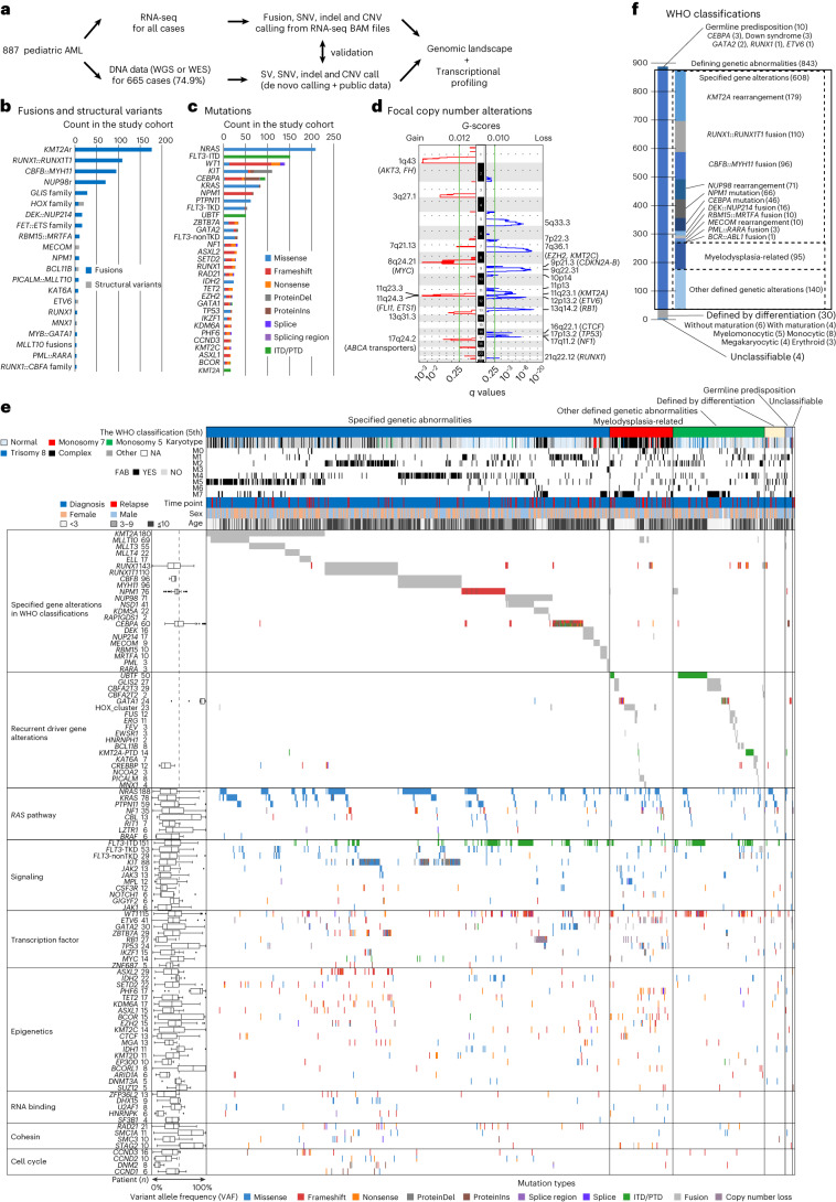
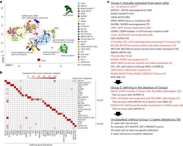
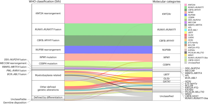
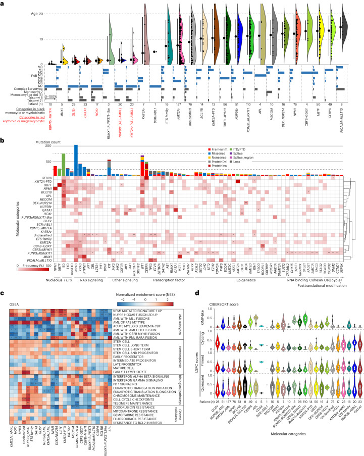
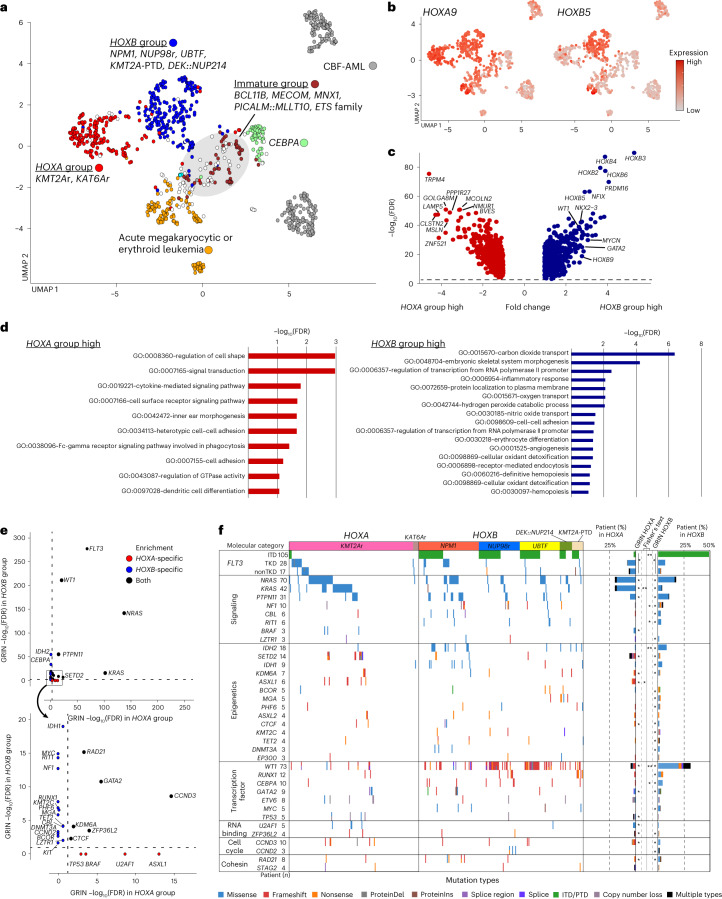
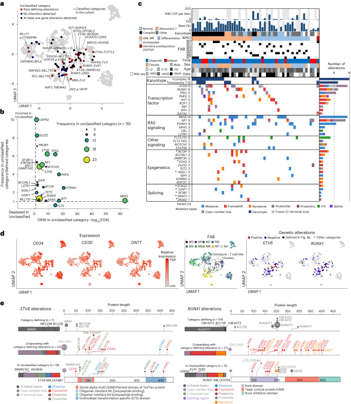
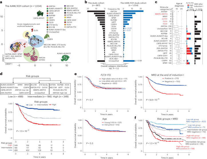
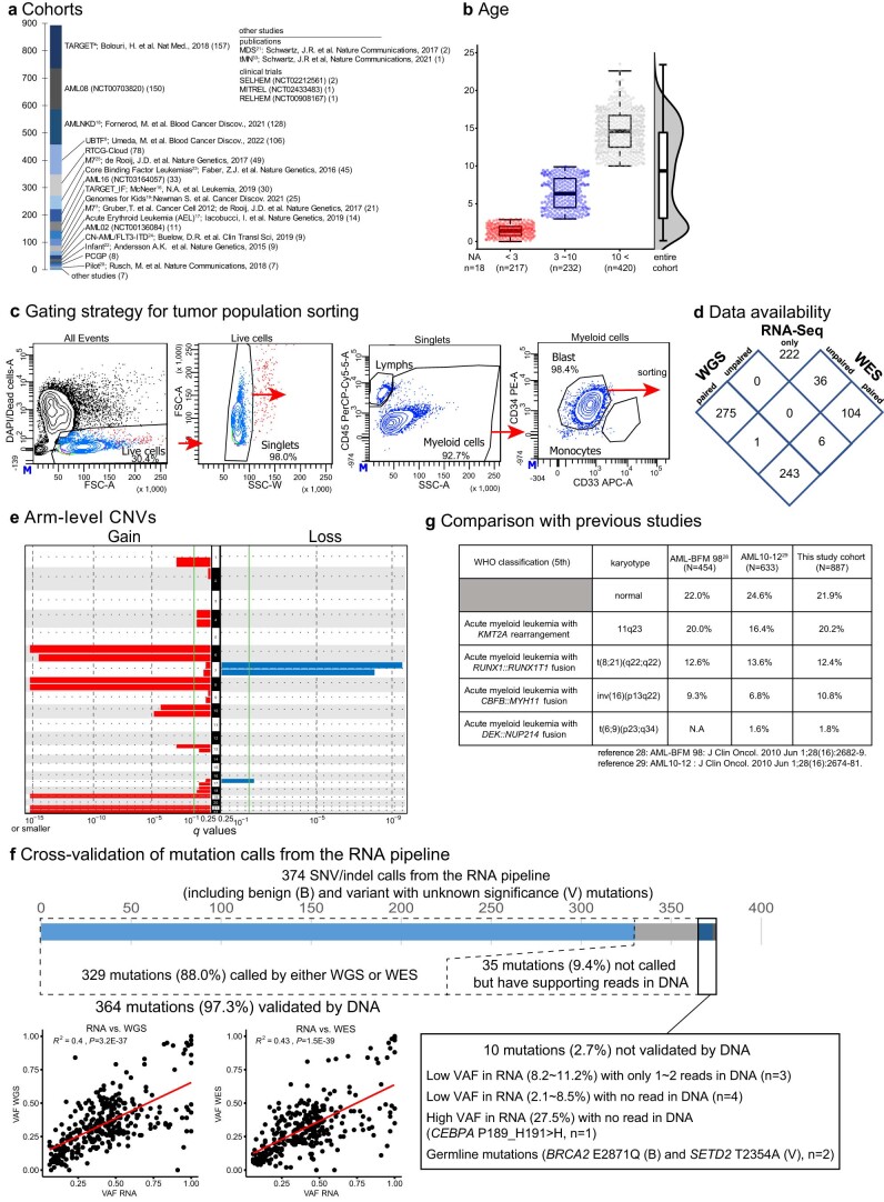
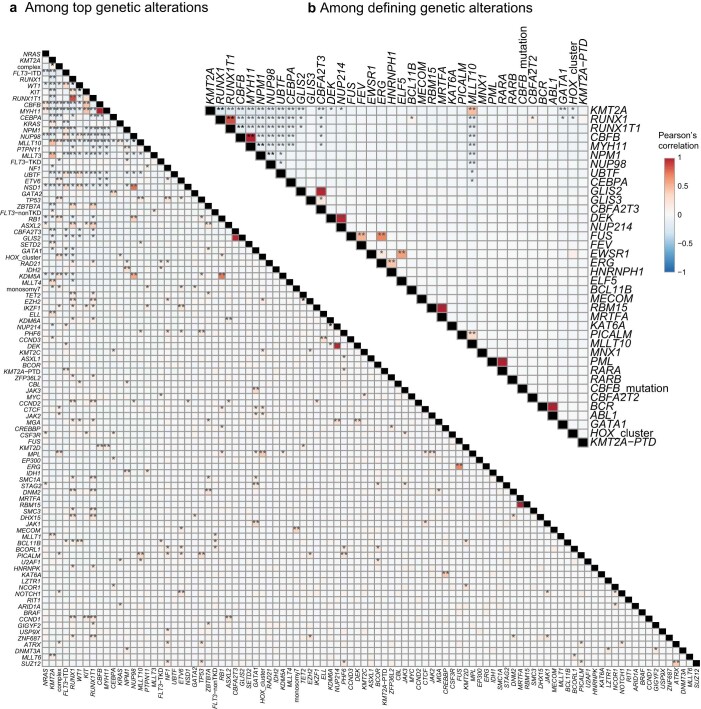
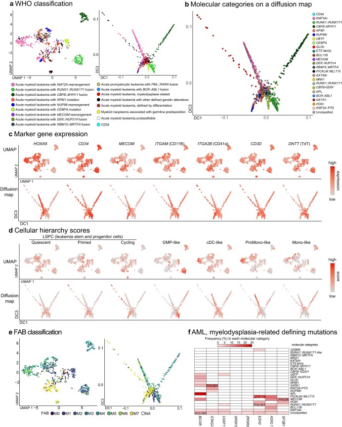
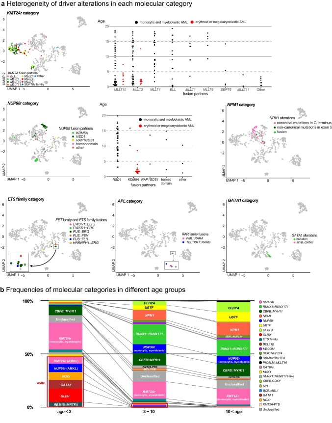
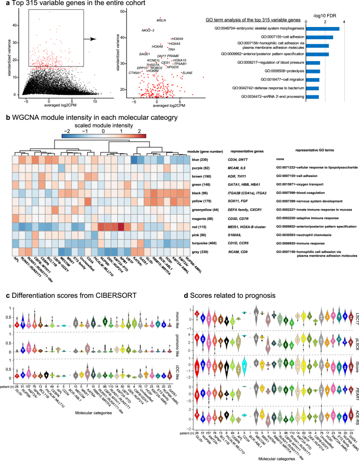
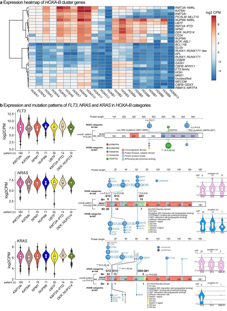
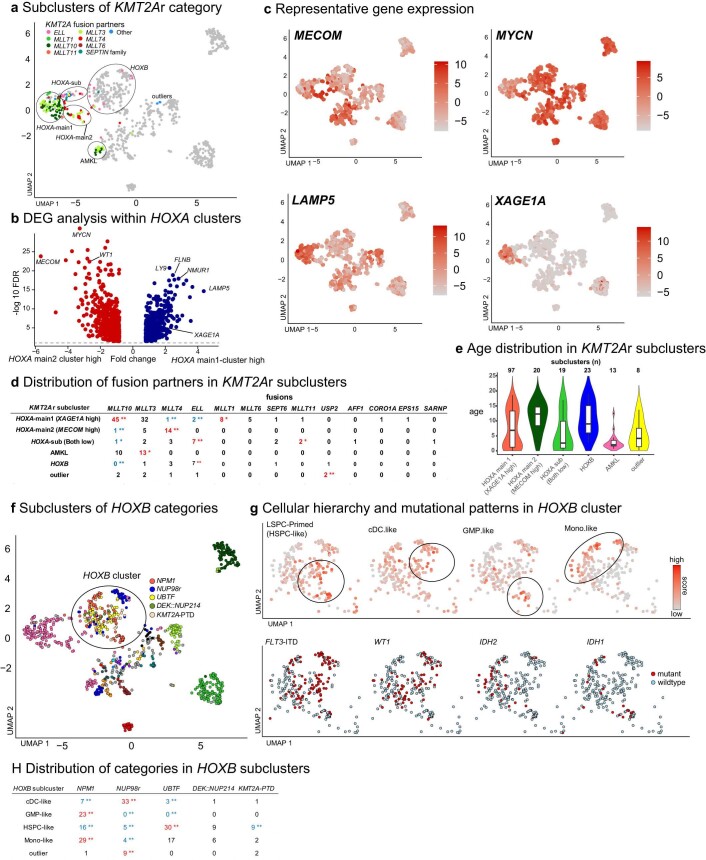
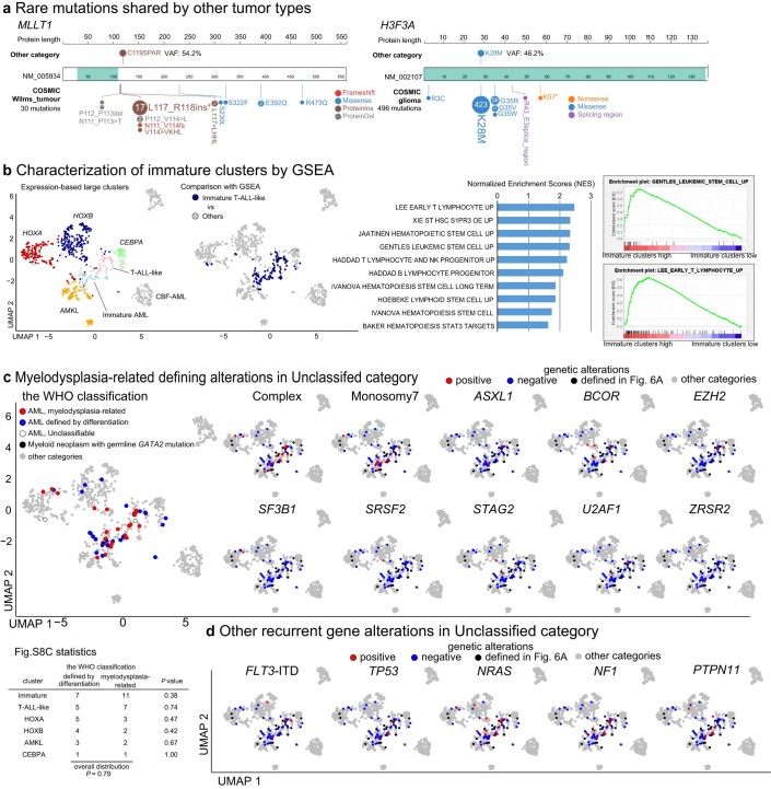
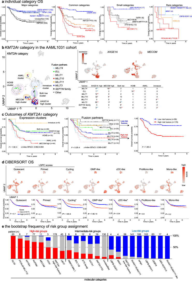
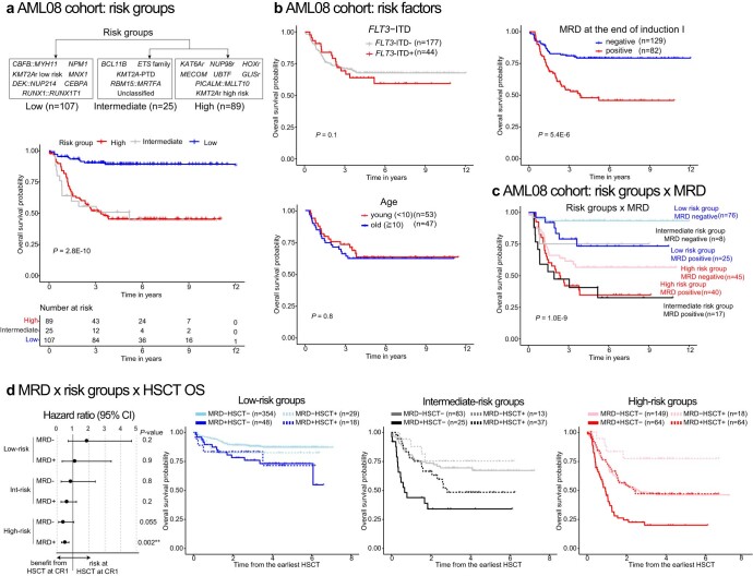
Recent studies on pediatric acute myeloid leukemia (pAML) have revealed pediatric-specific driver alterations, many of which are underrepresented in the current classification schemas. To comprehensively define the genomic landscape of pAML, we systematically categorized 887 pAML into 23 mutually distinct molecular categories, including new major entities such as UBTF or BCL11B, covering 91.4% of the cohort. These molecular categories were associated with unique expression profiles and mutational patterns. For instance, molecular categories characterized by specific HOXA or HOXB expression signatures showed distinct mutation patterns of RAS pathway genes, FLT3 or WT1, suggesting shared biological mechanisms. We show that molecular categories were strongly associated with clinical outcomes using two independent cohorts, leading to the establishment of a new prognostic framework for pAML based on these updated molecular categories and minimal residual disease. Together, this comprehensive diagnostic and prognostic framework forms the basis for future classification of pAML and treatment strategies.


Conflict of interest statement

The authors declare no competing interests.

Figures

Fig. 1
Fig. 1. Comprehensive genetic characterization of pAML.
a, Study cohort of pAML (n = 887) and study design. b, Recurrent pathogenic or likely pathogenic in-frame fusions (blue) and SVs (gray) detected in the entire cohort (n ≥ 3). Fusions included only in-frame fusions, and SVs included out-of-frame fusions resulting in loss of the C terminus of the protein and alterations detected from WGS data using CREST. c, Recurrent pathogenic or likely pathogenic somatic mutations (n ≥ 15). Colors represent types of mutations. Bars in b and c represent the total number of alterations in the cohort. d, Results of GISTIC analysis for focal chromosomal events (shorter than 90% of the chromosome arm). The left-hand panel shows the enrichment of focal gains (red) and the right-hand panel shows the enrichment of focal losses (blue). Green lines show a significance threshold for q values (0.25). Representative genes in enriched regions are highlighted. e, Genomic landscape and WHO classification of pAML. Representative genes from GRIN analysis or defining alterations are shown. Colors represent types of mutations. Numbers of gene alterations are shown next to gene names, and the lines of the box plot for VAFs represent the 25% quantile, median and 75% quantile. The upper whisker represents the higher value of maxima or 1.5× the interquartile range (i.q.r.), and the lower whisker represents the lower value of minima or 1.5× i.q.r. f, Summary of the WHO classification (WHO5th) of the entire cohort. A box with solid lines indicates categories with defining driver alterations. Boxes with dashed lines indicate subgroups with specified gene alterations, myelodysplasia-related or other defined genetic alterations. NA, Not available. Source data
Fig. 2
Fig. 2. Molecular categories defined by mutually exclusive gene alterations.
a, UMAP plot of the entire pAML cohort (n = 887) and cord blood CD34+ cells (normal controls: n = 5) using the top 315 variable genes. The colors of each dot denote the molecular categories of the samples. Representative category names are shown, and large clusters enriching specific categories are highlighted in circles (pink: NUP98::NSD1, NPM1, UBTF, DEK::NUP214, KMT2A-PTD; green: KMT2Ar and KAT6Ar; yellow: categories with acute megakaryocytic or erythrocytic expression; blue: MECOM, MNX1, ETS family, PICALM::MLLT10, BCL11B). b, Heatmap showing frequencies of defining gene alterations represented by color. Statistical significance was assessed by two-sided Fisher’s exact test to calculate P values of co-occurrence, followed by Benjamini–Hochberg adjustment for multiple testing to calculate q values (*P < 0.05, **q < 0.05). c, Definition of molecular categories and diagnostic workflow. Molecular categories not defined in WHO5th are highlighted in red. APL, acute promyelocytic leukemia. Source data
Fig. 3
Fig. 3. Comparison between molecular categories and the WHO classification.
The colors of the ribbon plot represent molecular categories of samples in the pAML cohort (n = 887). Source data
Fig. 4
Fig. 4. Clinical and molecular profiles of molecular categories.
a, Clinical background of molecular categories. (Upper) Violin plots showing age distribution within each molecular category. Colors show the molecular categories. Large dots and bars represent the median and the 2.5–97.5 percentile range, respectively. Small dots represent the ages of individuals (n = 887). (Lower) Frequency of FAB classification (blue bars) and karyotype (gray bars) in individual categories. b, Mutational heatmap showing mutation frequencies in each molecular category. The color of each panel represents the frequency of a mutation in each molecular category, and the statistical significance was assessed by two-sided Fisher’s exact test to calculate P values of co-occurrence followed by Benjamini–Hochberg adjustment for multiple testing to calculate q values (*P < 0.05, **q < 0.05 after adjustment). Bars in the upper panel show the frequency of mutations in the entire cohort, and the colors represent mutation types. Molecular categories are clustered according to Ward clustering using the Euclidean distance of the frequency matrix. Genes are grouped according to functional annotations. c, Heatmap showing normalized enrichment scores (NES) and FDR of GSEA for each molecular category. Colors denote NES and asterisks show FDR (*FDR < 0.05, **FDR < 0.01, ***FDR < 0.001). Detailed results are found in Supplementary Table 14. d, Violin plots showing cellular hierarchy scores in each molecular category inferred by CIBERSORT. The colors show molecular categories. The lines of the boxes represent the 25% quantile, median and 75% quantile. The upper whisker represents the higher value of maxima or 1.5× i.q.r., and the lower whisker represents the lower value of minima or 1.5× i.q.r. Dots show outliers. LSPC, leukemic stem and progenitor cell. Source data
Fig. 5
Fig. 5. Categories demarcated by HOXA and HOXB cluster expression.
a, UMAP plot colored according to groups of molecular categories based on UMAP clustering and HOX cluster gene expression profiles. A gray circle indicates a cluster enriching categories with immature phenotypes (BCL11B, MECOM, MNX1, PICALM::MLLT10, ETS family). b, HOXA9 and HOXB5 expression on UMAP plots. Dot colors represent the relative expression of the genes. c, Volcano plot showing differentially expressed genes between HOXA and HOXB groups. Genes with absolute fold change >2 and FDR < 0.05 are considered differentially expressed. Red or blue dots show genes enriched only in either HOXA or HOXB groups, respectively, and representative gene names are shown. d, Gene Ontology term analyses of genes with significantly high expression in HOXA (red) and HOXB (blue) categories by DAVID (Database for Annotation, Visualization and Integrated Discovery). Bars represent logged FDR. e, Plots showing the results of GRIN analyses in the HOXA group (horizontal axis) and HOXB group (vertical axis). Genes with FDR < 0.05 in either the HOXA or HOXB group are shown. Red or blue dots show genes enriched only in either the HOXA or HOXB group, respectively. Dotted lines represent thresholds for statistical significance (FDR < 0.05). f, Mutational heatmap comparing patterns between the HOXA and HOXB groups. Colors represent mutation types, and molecular categories are annotated on the top. Bar plots on the right show frequencies of mutations in the HOXA and HOXB groups. Statistical significance of GRIN analysis in the HOXA and HOXB groups (*FDR < 0.05) and two-sided Fisher’s exact test between HOXA and HOXB groups (*P < 0.05, **q < 0.05 after Benjamini–Hochberg adjustment) are also shown. GRIN results for FLT3 are for the entire gene, whereas Fisher’s tests were performed separately for ITD, TKD and non-TKD mutations. Source data
Fig. 6
Fig. 6. Characterization of cases without category-defining alterations.
a, UMAP plot showing cases without category-defining alterations. Red dots represent cases with rare recurrent gene alterations, blue dots represent cases for which no pathogenic alteration was found and black dots represent cases with at least one gene alteration not defining the phenotype. Gray dots represent cases with classified categories. b, Plot showing the FDR of GRIN analysis for the Unclassified category (horizontal axis) and relative enrichment of the alteration in the unclassified category (vertical axis). Dot sizes and colors denote the Unclassified category’s frequency, which included fusions, mutations, copy-number loss and gain, and copy-neutral heterozygosity. c, Mutational heatmap of the Unclassified cases, including complex karyotypes and monosomy 7. Patients’ clinical and demographic data are shown on the top. Colors represent mutation types. Defining alterations for AML-MR are marked by asterisks. d, UMAP plots showing CD34, CD3D and DNTT expression (left), FAB classification (middle) and cases with ETV6 alterations and RUNX1 alteration (right). For ETV6 and RUNX1 alteration plots, cases with classified categories are shown as gray dots. e, Patterns of alteration in ETV6 (left) and RUNX1 (right). Category-defining fusions are shown in the top row, alterations co-occurring with category-defining alterations in the middle row, and alterations in the Unclassified category in the bottom row. Bars represent a relative fraction of alteration in each group and colors denote the alteration types. WBC, white blood cell. Source data
Fig. 7
Fig. 7. Clinical association of molecular categories.
a, UMAP plot of transcriptome data of the AAML1031 cohort (n = 1,034) using top 340 variable genes. Dot colors denote molecular categories assigned to the samples according to genomic profiling using the same pipeline as this study cohort. Representative category names are shown, and large clusters enriching specific categories are highlighted in circles (pink: NUP98::NSD1, NPM1, UBTF, DEK::NUP214, KMT2A-PTD; green: KMT2Ar and KAT6Ar; yellow: categories with acute megakaryocytic or erythrocytic expression; blue: MECOM, MNX1, ETS family, PICALM::MLLT10, BCL11B). b, Frequency of molecular categories in the study cohort (black) and AAML1031 cohort (blue). The statistical significance of the frequency of each category assessed by two-sided Fisher’s exact test followed by Benjamini–Hochberg adjustment (q < 0.05; blue indicates fewer and black indicates more in the AAML1031) is shown. c, Clinical features of molecular categories showing age at diagnosis (left), FLT3-ITD status (middle) and MRD positivity at the end of induction (right). Molecular category names associated with megakaryocytic phenotypes are highlighted in red. The lines of the boxes represent the 25% quantile, median and 75% quantile. The upper whisker represents the higher value of maxima or 1.5× i.q.r., and the lower whisker represents the lower value of minima or 1.5× i.q.r. d, Grouping of molecular categories into low, intermediate and high-risk groups by recursive partitioning (upper) and Kaplan–Meier curves of overall survival of patients in each risk group (lower). e, Kaplan–Meier curves and statistical significance of overall survival of patients with known prognostic factors (FLT3-ITD status (upper left), age (lower left) and MRD positivity at the end of the induction I (upper right)). f, Kaplan–Meier curves of overall survival of patients in six risk strata using risk groups (low–intermediate–high) and MRD positivity. For survival curves in d, e and f, statistical significance was assessed by the log-rank test, and P values are shown in the plot. For survival analysis involving MRD status, patients with available MRD status (MRD+: n = 273; MRD−: n = 703) are included. NS, not significant. Source data
Extended Data Fig. 1
Extended Data Fig. 1. Cohort details.
a. Data source of each patient with acute myeloid leukemia (AML), including publications and clinical trials. b. Age distribution of patients at diagnosis (red: age<3, blue: 3<age<10, gray: 10<age). Lines of the box represent 25% quantile, median, and 75% quantile. The upper whisker represents the higher value of maxima or 1.5 x interquartile range (IQR), and the lower whisker represents the lower value of minima or 1.5 x IQR. NA: not available. c. Representative gating strategy for sorting of the myeloid cell population. Vertical and horizontal axes are linear for FSC (forward scatter) and SSC (side scatter) and log-scaled for fluorescence-conjugated antibodies. CD34 gating was adjusted for individual patients depending on the positivity. d. A Venn diagram showing data platforms available for each patient. WGS: whole-genome sequencing, WES: whole-exome sequencing, RNA-Seq: RNA-sequencing. e. Results of GISTIC (Genomic Identification of Significant Targets in Cancer) analysis for arm-level chromosomal events. The left panel shows the enrichment of chromosomal gains (red), and the right panel shows the enrichment of chromosomal losses (blue). Green lines show a significance threshold for q values (0.25). f. Cross-validation of single nucleotide variant (SNV) and insertion/deletion (indel) calls from the RNA pipeline using whole-genome/exome sequencing (WGS/WES) data. The bar graph shows mutation calls and the validation status. For those also called from DNA data, a comparison of variant allele frequency (VAF) and Pearson’s correlation are shown in the bottom left, and the statistical test was performed as two-sided. A regression line is shown in red. For unvalidated calls, details are shown in the bottom right. g. A comparison of major classes of the World Health Organization (WHO) classification in the study cohort with karyotyping in previous large pediatric AML cohorts. Source data
Extended Data Fig. 2
Extended Data Fig. 2. Mutational correlation.
Pair-wise correlation among most frequent 97 genetic alterations (n ≥ 5 in the entire cohort) from GRIN analysis and chromosomal changes (complex karyotype and monosomy 7) (a) and category-defining gene alterations (b). KMT2A-PTD (partial tandem duplication) is independently included from other KMT2A alterations, and FLT3 alterations are classified into ITD (internal tandem duplication), TKD (tyrosine kinase domain) mutations, and non-TKD mutations due to the known functional difference. Colors correspond to Pearson correlation. Statistical significance was assessed by two-sided Fisher’s exact test to calculate P values followed by the Benjamini-Hochberg adjustment for multiple testing to calculate q values (*P < 0.05, **q < 0.05). Source data
Extended Data Fig. 3
Extended Data Fig. 3. Transcriptional and mutational characterization of the study cohort.
a. UMAP (Uniform Manifold Approximation and Projection) plots and diffusion maps colored according to the WHO classification. b. A diffusion map colored according to molecular categories of the samples. DC: diffusion component, APL: acute promyelocytic leukemia. c. Expression of marker genes on UMAP plots and diffusion maps. Colors represent scaled expression levels. d. Cellular hierarchy scores inferred by CIBERSORT on UMAP plots and diffusion maps. Colors represent scaled scores. LSPC: leukemia stem and progenitor cell, GMP: granulocyte and macrophage projenitor, cDC: classic dendritic cell, ProMono: promonocyte, Mono: monocyte. e. UMAP plots and diffusion maps colored according to the French-American-British (FAB) classification f. A heatmap showing frequencies of defining gene alterations of AML, myelodysplasia-related in the WHO classification in each category. Colors denote the frequencies. Statistical significance was assessed by two-sided Fisher’s exact test to calculate P values of co-occurrence followed by the Benjamini-Hochberg adjustment for multiple testing to calculate q values. No pair remained significant (q < 0.05) after adjustment, and P values (<0.05) are shown instead. Source data
Extended Data Fig. 4
Extended Data Fig. 4. Details of molecular categories.
a. Details of molecular categories with multiple category-defining alterations. The distribution on the UMAP plot according to fusion partners (KMT2Ar, NUP98r, ETS family, and APL categories) or mutation and fusions (NPM1 and GATA1 categories) are shown with colors representing the types of alterations. Age distributions according to fusion partners are also shown for KMT2Ar and NUP98r. Acute megakaryocytic/erythoid leukemia (AMKL/AEL) cases are shown separately in red. b. Proportion of molecular categories among different age groups (left: age<3, middle: 3<age<10, right: 10<age). Each column is colored according to the molecular categories, and categories associated with AMKL/AEL phenotypes are highlighted in a red square. Representative category names are shown in the columns. Source data
Extended Data Fig. 5
Extended Data Fig. 5. Transcriptional analysis of the study cohort.
a. Plots showing averaged log2 CPM (count per million) values and standardized variance in the entire cohort (left). The top 315 variable genes used for the UMAP analysis were colored red, and representative variable gene names are shown in the right enlarged plot. The top results of the Gene Ontology (GO) term analysis by DAVID (Database for Annotation, Visualization and Integrated Discovery) are shown in the right panel. Bars represent logged FDR (false discovery rate<0.1). b. A heatmap colored according to scaled module intensities of WGCNA (weighed-gene correlation network analysis) in each molecular category. Representative genes and results of GO term analysis of genes in each module are shown on the right. Blue module enriched no GO term with FDR < 0.1. c. Distribution of differentiated cell-related hierarchy scores inferred by CIBERSORT among molecular categories. d. Distribution of prognostic scores among molecular categories. LSC17: leukemia stem cell 17 score, pLSC6: pediatric leukemia stem cell 6 score, iScore: inflammation-associated gene score, ADE-RS: Ara-C, Daunorubicin and Etoposide Drug Response Score. In c and d, lines of the box represent 25% quantile, median, and 75% quantile. The upper whisker represents the higher value of maxima or 1.5 x IQR, and the lower whisker represents the lower value of minima or 1.5 x IQR. Dots represent outliers. The colors of plots show molecular categories. Source data
Extended Data Fig. 6
Extended Data Fig. 6. Transcriptional and mutational characterization of clusters demarcated by HOXA-B expression.
a. A heatmap showing expression patterns of HOXA and HOXB cluster genes among molecular categories. Each panel color shows the expression level (log2CPM) of genes. Molecular categories are clustered using the Euclidean distance of the expression levels and the Ward method. b. Expression (left) and ProteinPaint of mutation patterns (right) of FLT3 (top), NRAS (middle), and KRAS (bottom) in the HOXA-B categories. The distribution of log2CPM values among molecular categories is shown for the expression level, and the colors represent molecular categories. For the mutation plots, mutation types and frequencies in the HOXA and HOXB categories are shown separately, and the colors represent mutations types. Statistical significances of mutation distribution and frequency of each mutation were assessed by two-sided Fisher’s exact test (P value), and no adjustment for multiple testing was applied. For each type of NRAS and KRAS mutations, variant allele frequencies (VAFs) are also shown. The lines of the box represent 25% quantile, median, and 75% quantile. The upper whisker represents the higher value of maxima or 1.5 x IQR, and the lower whisker represents the lower value of minima or 1.5 x IQR. Dots represent outliers. Source data
Extended Data Fig. 7
Extended Data Fig. 7. Molecular heterogeneity among HOXA and HOXB groups.
a. UMAP plot showing the distribution of fusion partners of KMT2Ar among different clusters. The dot colors denote fusion partners. b. A volcano plot showing differentially expressed genes (DEG) between the HOXA-main1-2 clusters. Genes with absolute fold change > 2 and FDR < 0.05 are considered DEGs (red: HOXA-main2 cluster high, blue: HOXA-main1 cluster high). Representative gene names are shown. c. Expression of representative DEGs on UMAP plot. The dot colors represent the relative expression of the genes. d. The association of fusion partners of KMT2Ar among different clusters. The statistical significance of the enrichment and exclusivity were assessed by two-sided Fisher’s exact test followed by the Benjamini-Hochberg adjustment (*P < 0.05, **q < 0.05, blue: exclusive, red: enriched). e. Distribution of age at diagnosis among KMT2Ar different clusters. The colors of violin plots represent clusters and lines of the box represent 25% quantile, median, and 75% quantile. The upper whisker represents the higher value of maxima or 1.5 x IQR, and the lower whisker represents the lower value of minima or 1.5 x IQR. Dots represent outliers. f. UMAP plot highlighting molecular categories in the HOXB cluster. The dot colors denote molecular categories. g. Cellular hierarchy scores represented by the color (top) and patterns of frequent mutations (bottom) in the HOXB cluster. Circles in the top highlight clusters with high hierarchy scores. Blue and red dots in the bottom show mutational status. HSPC: hematopoietic stem and progenitor cell. h. The association of molecular categories and HOXB subclusters. The statistical significance of the enrichment and exclusivity were calculated and shown as in d. Source data
Extended Data Fig. 8
Extended Data Fig. 8. Characterization of cases without category-defining alterations.
a. ProteinPaint of rare somatic mutation in the study cohort. As comparisons, data from the COSMIC (Catalogue of Somatic Mutations in Cancer) database. Wilms tumor cohort for MLLT1 mutation and glioma cohort for H3F3A are shown at the bottom. The colors represent mutation types. b. Design of GSEA (gene set enrichment analysis) comparing immature clusters with cluster membership 6, 9, and 16 with the rest of AML samples (left) and representative results for gene sets involved in hematopoietic stem cells or lymphocytes (right). Colors of dots of UMAP show clusters. Representative enrichment score plots are also shown. c. Distribution of the WHO classification (left) and myelodysplasia-related karyotypes and genetic alterations (right) in the Unclassified cases on UMAP plots. The dot colors of the right panel represent mutational status (red-positive, blue-negative), while black dots represent excluded Unclassified cases with recurrent alterations and gray dots represents other categories. The statistical significance of the enrichment and exclusivity of WHO classification and clusters were assessed by two-sided Fisher’s exact test, and P values of cluster-wise comparison and overall distribution are shown in a table (bottom). d. Distribution of other recurrent genetic alterations in the Unclassified cases on UMAP plots. The dots are colored as in c. Source data
Extended Data Fig. 9
Extended Data Fig. 9. Clinical association of molecular categories and known prognostic factors in the AAML1031 cohort.
a. Kaplan-Meier curves of overall survival of patients in each molecular category. Category names and curves are colored according to outcomes (blue: favorable, black: intermediate, red: unfavorable). b. Details of KMT2Ar category in the AAML1031 cohort showing the distribution of KMT2Ar cases among transcriptional clusters colored by fusion partners (left) and by XAGE1A and MECOM expression (top-right) on UMAP plot, and the association of fusion partners of KMT2Ar among different clusters (bottom-right). Circles on the UMAP highlight clusters (white: XAGE1A high, orange: MECOM high, purple: both low, pink: HOXB, yellow: AMKL, blue: immature). The statistical significance of the enrichment and exclusivity were assessed by two-sided Fisher’s exact test followed by the Benjamini-Hochberg adjustment (*P < 0.05, **q < 0.05, blue: exclusive, red: enriched). c. Kaplan-Meier curves of overall survival of patients of KMT2Ar with each fusion (left), in each cluster (middle), and Low and High-risk fusion groups by recursive partitioning (right). For the validity of prediction by KMT2Ar fusion partners and clusters, c-index scores assessed by bootstrapping (1,000 times) were shown below the plots. d. Cellular hierarchy scores on UMAP plots (top) and Kaplan-Meier curves and statistical significance of overall survival (bottom). Significant scores in univariate analysis are highlighted with asterisks (Cycling, GMP-like, and cDC-like scores). For survival curves in c-d, statistical significance was assessed by the log-rank test, and P values are shown in the plots. e. Frequency of risk assignment by bootstrapping (1,000 times). Molecular categories are sorted according to the frequency within each risk group. Source data
Extended Data Fig. 10
Extended Data Fig. 10. Validation of the prognostic model.
a. Grouping of molecular categories into Low, Intermediate, and High-risk groups (top) and Kaplan-Meier curves of overall survival of patients in each risk group (bottom) in the AML08 cohort. b. Kaplan-Meier curves and statistical significance of overall survival of patients with known prognostic factors (FLT3-ITD status: top-left, age: bottom-left, MRD (minimal residual disease) positivity at the end of the induction I: top-right) in the AML08 cohort. C. Kaplan-Meier curves of overall survival of patients in six risk strata using risk groups (Low-Intermediate-High) and MRD (measurable residual disease) positivity in the AML08 cohort. d. Outcomes in each risk group depending on MRD and HSCT (hematopoietic stem cell transplant) status in the AAML1031 cohort. left-Hazard ratio (dot) and 95% confidence intervals (lines) in each group. right-Kaplan-Meier curves of overall survival. Survival curves start from the earliest transplant day within the cohort (day 96) and exclude patients who died before that timepoint. For survival curves in a-c, statistical significance was assessed by the log-rank test, and P values are shown in the plots. For d, the statistical significance of HSCT in each risk group was assessed by incorporating HSCT status as time-dependent variables and shown next to the hazard ratio plot. For survival analysis involving MRD status, patients with available MRD status (MRD+:n = 273, MRD-: n = 703) are included. Source data

Update of

References

    1. Tenen DG. Disruption of differentiation in human cancer: AML shows the way. Nat. Rev. Cancer. 2003;3:89–101. doi: 10.1038/nrc989. - DOI - PubMed
    1. Klco JM, et al. Functional heterogeneity of genetically defined subclones in acute myeloid leukemia. Cancer Cell. 2014;25:379–392. doi: 10.1016/j.ccr.2014.01.031. - DOI - PMC - PubMed
    1. Miles LA, et al. Single-cell mutation analysis of clonal evolution in myeloid malignancies. Nature. 2020;587:477–482. doi: 10.1038/s41586-020-2864-x. - DOI - PMC - PubMed
    1. Bolouri H, et al. The molecular landscape of pediatric acute myeloid leukemia reveals recurrent structural alterations and age-specific mutational interactions. Nat. Med. 2018;24:103–112. doi: 10.1038/nm.4439. - DOI - PMC - PubMed
    1. Cancer Genome Atlas Research Network; Ley T. J. et al. Genomic and epigenomic landscapes of adult de novo acute myeloid leukemia. N. Engl. J. Med. 2013;368:2059–2074. doi: 10.1056/NEJMoa1301689. - DOI - PMC - PubMed