

Construction and evaluation of endometriosis diagnostic prediction model and immune infiltration based on efferocytosis-related genes
- PMID: 38370978
- PMCID: PMC10870152
- DOI: 10.3389/fmolb.2023.1298457
Construction and evaluation of endometriosis diagnostic prediction model and immune infiltration based on efferocytosis-related genes
Abstract
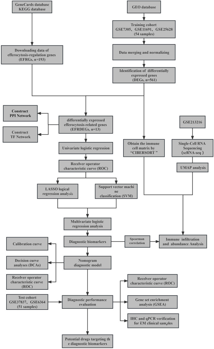
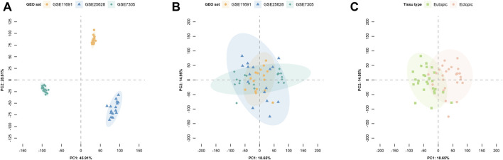
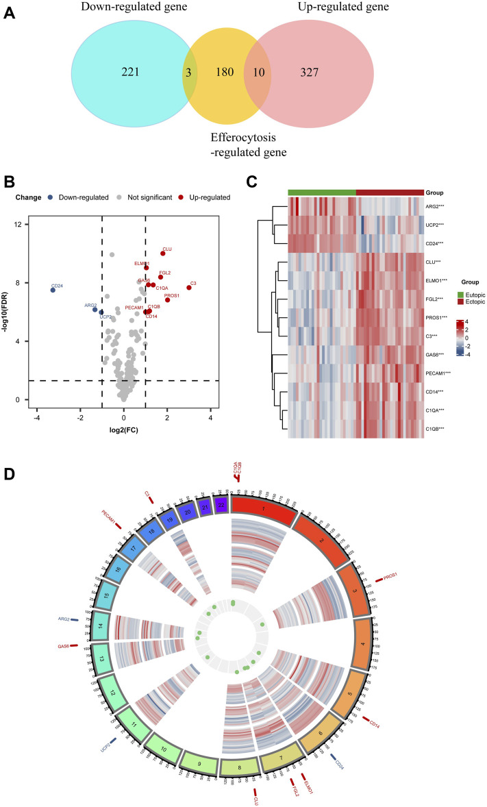
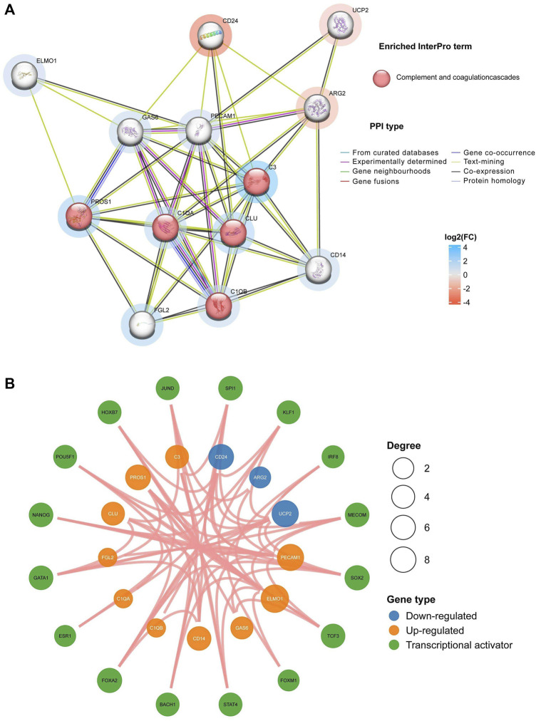
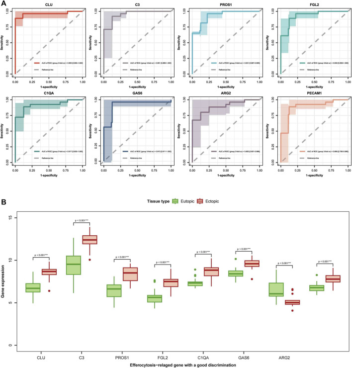
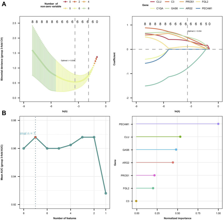
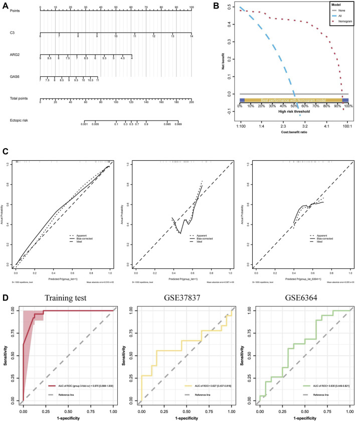
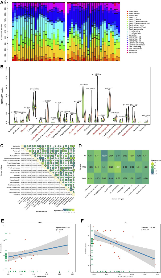
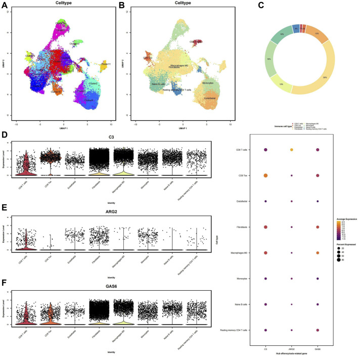
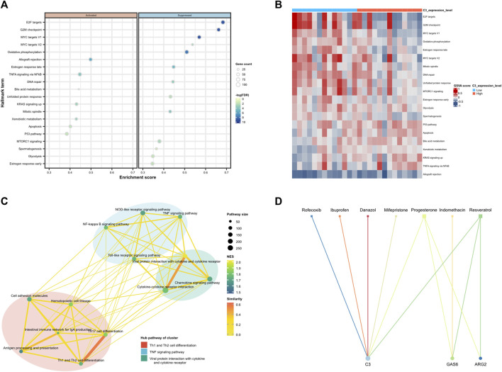
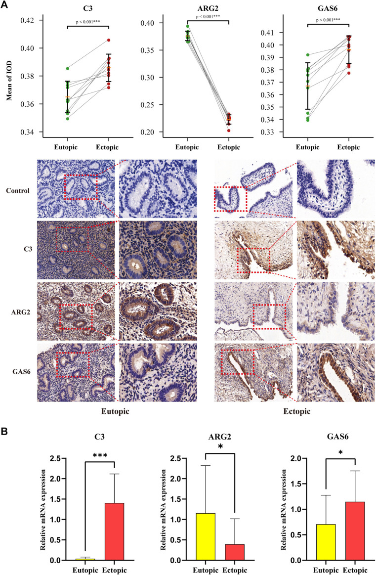
Background: Endometriosis (EM) is a long-lasting inflammatory disease that is difficult to treat and prevent. Existing research indicates the significance of immune infiltration in the progression of EM. Efferocytosis has an important immunomodulatory function. However, research on the identification and clinical significance of efferocytosis-related genes (EFRGs) in EM is sparse. Methods: The EFRDEGs (differentially expressed efferocytosis-related genes) linked to datasets associated with endometriosis were thoroughly examined utilizing the Gene Expression Omnibus (GEO) and GeneCards databases. The construction of the protein-protein interaction (PPI) and transcription factor (TF) regulatory network of EFRDEGs ensued. Subsequently, machine learning techniques including Univariate logistic regression, LASSO, and SVM classification were applied to filter and pinpoint diagnostic biomarkers. To establish and assess the diagnostic model, ROC analysis, multivariate regression analysis, nomogram, and calibration curve were employed. The CIBERSORT algorithm and single-cell RNA sequencing (scRNA-seq) were employed to explore immune cell infiltration, while the Comparative Toxicogenomics Database (CTD) was utilized for the identification of potential therapeutic drugs for endometriosis. Finally, immunohistochemistry (IHC) and reverse transcription quantitative polymerase chain reaction (RT-qPCR) were utilized to quantify the expression levels of biomarkers in clinical samples of endometriosis. Results: Our findings revealed 13 EFRDEGs associated with EM, and the LASSO and SVM regression model identified six hub genes (ARG2, GAS6, C3, PROS1, CLU, and FGL2). Among these, ARG2, GAS6, and C3 were confirmed as diagnostic biomarkers through multivariate logistic regression analysis. The ROC curve analysis of GSE37837 (AUC = 0.627) and GSE6374 (AUC = 0.635), along with calibration and DCA curve assessments, demonstrated that the nomogram built on these three biomarkers exhibited a commendable predictive capacity for the disease. Notably, the ratio of nine immune cell types exhibited significant differences between eutopic and ectopic endometrial samples, with scRNA-seq highlighting M0 Macrophages, Fibroblasts, and CD8 Tex cells as the cell populations undergoing the most substantial changes in the three biomarkers. Additionally, our study predicted seven potential medications for EM. Finally, the expression levels of the three biomarkers in clinical samples were validated through RT-qPCR and IHC, consistently aligning with the results obtained from the public database. Conclusion: we identified three biomarkers and constructed a diagnostic model for EM in this study, these findings provide valuable insights for subsequent mechanistic research and clinical applications in the field of endometriosis.
Keywords: and machine learning; bioinformatics; efferocytosis; endometriosis; immune infiltration.
Copyright © 2024 Pei, Jia, Lin, Chen, Wu, Lin, Sun and Zeng.
Conflict of interest statement
The authors declare that the research was conducted in the absence of any commercial or financial relationships that could be construed as a potential conflict of interest.
Figures
Similar articles
-
Bioinformatics identification and validation of biomarkers and infiltrating immune cells in endometriosis.Front Immunol. 2022 Nov 29;13:944683. doi: 10.3389/fimmu.2022.944683. eCollection 2022. Front Immunol. 2022. PMID: 36524127 Free PMC article.
-
Identify the potential target of efferocytosis in knee osteoarthritis synovial tissue: a bioinformatics and machine learning-based study.Front Immunol. 2025 Feb 27;16:1550794. doi: 10.3389/fimmu.2025.1550794. eCollection 2025. Front Immunol. 2025. PMID: 40083558 Free PMC article.
-
Integrative analysis of PANoptosis-related genes in diabetic retinopathy: machine learning identification and experimental validation.Front Immunol. 2024 Dec 4;15:1486251. doi: 10.3389/fimmu.2024.1486251. eCollection 2024. Front Immunol. 2024. PMID: 39697326 Free PMC article.
-
Potential shared pathogenic mechanisms between endometriosis and inflammatory bowel disease indicate a strong initial effect of immune factors.Front Immunol. 2024 Apr 3;15:1339647. doi: 10.3389/fimmu.2024.1339647. eCollection 2024. Front Immunol. 2024. PMID: 38660311 Free PMC article.
-
Integration of Single Cell and Bulk RNA-Sequencing Reveals Key Genes and Immune Cell Infiltration to Construct a Predictive Model and Identify Drug Targets in Endometriosis.J Inflamm Res. 2025 Feb 25;18:2783-2804. doi: 10.2147/JIR.S497643. eCollection 2025. J Inflamm Res. 2025. PMID: 40026309 Free PMC article.
Cited by
-
Integrating Bulk RNA and Single-Cell Sequencing Data Reveals Genes Related to Energy Metabolism and Efferocytosis in Lumbar Disc Herniation.Biomedicines. 2025 Jun 24;13(7):1536. doi: 10.3390/biomedicines13071536. Biomedicines. 2025. PMID: 40722613 Free PMC article.
-
Anoikis-Related Genes Can Accurately Predict the Occurrence of Endometriosis: A Retrospective Cohort Study via Machine Learning Analysis.Biochem Genet. 2025 Jun 4. doi: 10.1007/s10528-025-11151-x. Online ahead of print. Biochem Genet. 2025. PMID: 40465087
-
Integrative analysis of efferocytosis- and invasion-related genes as potential biomarkers and therapeutic targets in breast cancer.Discov Oncol. 2025 Aug 5;16(1):1474. doi: 10.1007/s12672-025-03346-w. Discov Oncol. 2025. PMID: 40762681 Free PMC article.
References
LinkOut - more resources
Full Text Sources
Molecular Biology Databases
Research Materials
Miscellaneous