Development and implementation of a prognostic model for clear cell renal cell carcinoma based on heterogeneous TLR4 expression
- PMID: 38380017
- PMCID: PMC10877190
- DOI: 10.1016/j.heliyon.2024.e25571
Development and implementation of a prognostic model for clear cell renal cell carcinoma based on heterogeneous TLR4 expression
Abstract
Objective: Clear cell renal cell carcinoma (ccRCC) is the most common subtype among renal cell carcinomas and has the worst prognosis, originating from renal tubular epithelial cells. Toll-like receptor 4 (TLR4) plays a crucial role in ccRCC proliferation, infiltration, and metastasis. The aim of this study was to construct a prognostic scoring model for ccRCC based on TLR4 expression heterogeneity and to explore its association with immune infiltration, thereby providing insights for the treatment and prognostic evaluation of ccRCC.
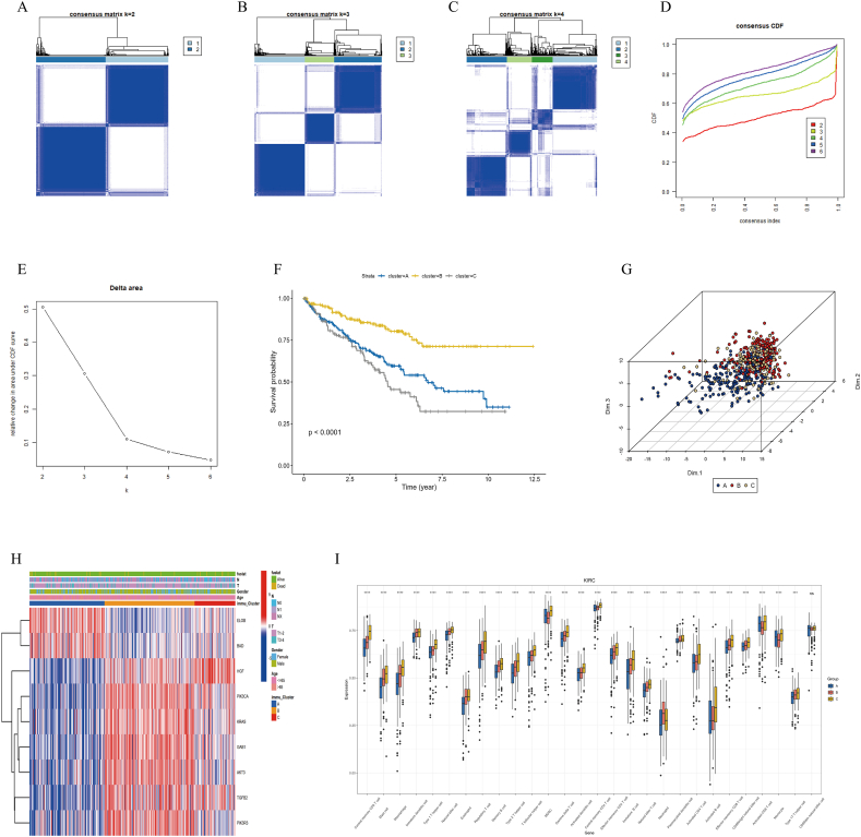
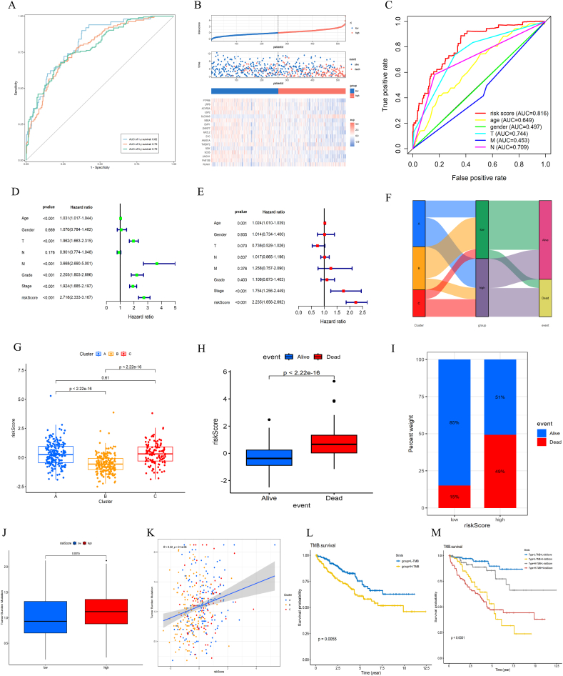
Methods: Using R software, a differential analysis was conducted on normal samples and ccRCC samples, and in conjunction with the KEGG database, a correlation analysis for the clear cell renal cell carcinoma pathway (hsa05211) was carried out. We observed the expression heterogeneity of TLR4 in the TCGA-KIRC cohort and identified its related differential genes (TRGs). Based on the expression levels of TRGs, consensus clustering was employed to identify TLR4-related subtypes, and further clustering heatmaps, principal component, and single-sample gene set enrichment analyses were conducted. Overlapping differential genes (ODEGs) between subtypes were analysed, and combined with survival data, univariate Cox regression, LASSO, and multivariate Cox regression were used to establish a prognostic risk model for ccRCC. This model was subsequently evaluated through ROC analysis, risk factor correlation analysis, independent prognostic factor analysis, and intergroup differential analysis. The ssGSEA model was employed to explore immune heterogeneity in ccRCC, and the performance of the model in predicting patient prognosis was evaluated using box plots and the oncoPredict software package.
Results: In the TCGA-KIRC cohort, TLR4 expression was notably elevated in ccRCC samples compared to normal samples, correlating with improved survival in the high-expression group. The study identified distinct TLR4-related differential genes and categorized ccRCC into three subtypes with varied survival outcomes. A risk prognosis model based on overlapping differential genes was established, showing significant associations with immune cell infiltration and key immune checkpoints (PD-1, PD-L1, CTLA4). Additionally, drug sensitivity differences were observed between risk groups.
Conclusion: In the TCGA-KIRC cohort, the expression of TLR4 in ccRCC samples exhibited significant heterogeneity. Through clustering analysis, we identified that the primary immune cells across subtypes are myeloid-derived suppressor cells, central memory CD4 T cells, and regulatory T cells. Furthermore, we successfully constructed a prognostic risk model for ccRCC composed of 17 genes. This model provides valuable references for the prognosis prediction and treatment of ccRCC patients.
Keywords: Consensus clustering; Prognostic model; Renal clear cell carcinoma; TLR4.
© 2024 The Authors.
Conflict of interest statement
The authors declare the following financial interests/personal relationships which may be considered as potential competing interests:Qingbo Zhou reports financial support was provided by the Science Technology Bureau of Shaoxing (NO. 2023A14035). Qingbo Zhou reports financial support was provided by Zhejiang Province Traditional Chinese Medicine Science and Technology Plan Project (NO. 2024ZF168). If there are other authors, they declare that they have no known competing financial interests or personal relationships that could have appeared to influence the work reported in this paper.
Figures


Similar articles
-
Bioinformatics screening of prognostic immune-related genes in renal clear cell carcinoma.J Appl Genet. 2025 May;66(2):311-322. doi: 10.1007/s13353-024-00878-9. Epub 2024 May 23. J Appl Genet. 2025. PMID: 38780866
-
Comprehensive Analysis of m5C RNA Methylation Regulator Genes in Clear Cell Renal Cell Carcinoma.Int J Genomics. 2021 Sep 28;2021:3803724. doi: 10.1155/2021/3803724. eCollection 2021. Int J Genomics. 2021. PMID: 34631874 Free PMC article.
-
Sialyltransferase gene signature as a predictor of prognosis and therapeutic response in kidney renal clear cell carcinoma.Discov Oncol. 2025 May 16;16(1):785. doi: 10.1007/s12672-025-02566-4. Discov Oncol. 2025. PMID: 40377806 Free PMC article.
-
Prognosis and progression of phagocytic regulatory factor-related gene combinations in clear cell renal cell carcinoma (ccRCC).Transl Cancer Res. 2024 Sep 30;13(9):4878-4895. doi: 10.21037/tcr-24-139. Epub 2024 Sep 27. Transl Cancer Res. 2024. PMID: 39430817 Free PMC article.
-
Review of Prognostic Expression Markers for Clear Cell Renal Cell Carcinoma.Front Oncol. 2021 Apr 28;11:643065. doi: 10.3389/fonc.2021.643065. eCollection 2021. Front Oncol. 2021. PMID: 33996558 Free PMC article. Review.
Cited by
-
Comprehensive evaluation of flumazenil adverse reactions: Insights from FAERS data and signal detection algorithms.Medicine (Baltimore). 2025 Mar 7;104(10):e41721. doi: 10.1097/MD.0000000000041721. Medicine (Baltimore). 2025. PMID: 40068036 Free PMC article.
-
Shared hub genes in membranous nephropathy and kidney renal clear cell carcinoma: investigating molecular overlap and tumor progression.Discov Oncol. 2025 Jun 9;16(1):1035. doi: 10.1007/s12672-025-02701-1. Discov Oncol. 2025. PMID: 40489038 Free PMC article.
-
PD1/PD-L1 blockade in clear cell renal cell carcinoma: mechanistic insights, clinical efficacy, and future perspectives.Mol Cancer. 2024 Jul 16;23(1):146. doi: 10.1186/s12943-024-02059-y. Mol Cancer. 2024. PMID: 39014460 Free PMC article. Review.
-
Migrasome-related lncRNAs predict prognosis and immune response of clear cell renal cell carcinoma.Transl Androl Urol. 2025 May 30;14(5):1214-1229. doi: 10.21037/tau-2024-728. Epub 2025 May 27. Transl Androl Urol. 2025. PMID: 40529029 Free PMC article.
-
Integrating mitophagy-associated lncRNAs to predict prognosis and therapeutic response in clear cell renal cell carcinoma.Int Urol Nephrol. 2025 Jun 27. doi: 10.1007/s11255-025-04626-8. Online ahead of print. Int Urol Nephrol. 2025. PMID: 40576912
References
-
- Wei H., Miao J., Cui J., Zheng W., Chen X., Zhang Q., Liu F., Mao Z., Qiu S., Zhang D. The prognosis and clinicopathological features of different distant metastases patterns in renal cell carcinoma: analysis based on the SEER database. Sci. Rep. 2021;11 doi: 10.1038/s41598-021-97365-6. - DOI - PMC - PubMed
-
- Suh J.Y., Maeng S.J., Kim M., Kang S.J., Choi Y.W., Chang I.H. Current trends in liquid biopsy technology for early diagnosis of metastatic renal cell carcinoma. Korean J. Urol. Oncol. 2022;20:223–234. doi: 10.22465/kjuo.2022.20.4.223. - DOI
LinkOut - more resources
Full Text Sources
Research Materials