. 2024 Feb 21;15(1):1594.
doi: 10.1038/s41467-024-45999-1.

Learning representations for image-based profiling of perturbations

Affiliations

Learning representations for image-based profiling of perturbations

Nikita Moshkov et al. Nat Commun. .

Abstract

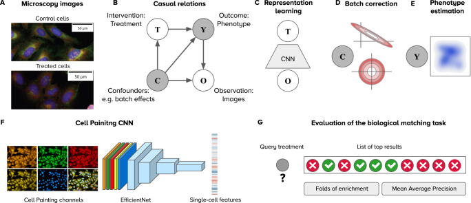
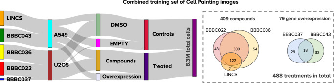
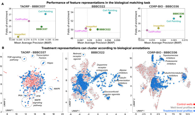
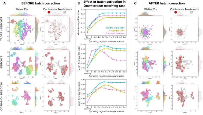
Measuring the phenotypic effect of treatments on cells through imaging assays is an efficient and powerful way of studying cell biology, and requires computational methods for transforming images into quantitative data. Here, we present an improved strategy for learning representations of treatment effects from high-throughput imaging, following a causal interpretation. We use weakly supervised learning for modeling associations between images and treatments, and show that it encodes both confounding factors and phenotypic features in the learned representation. To facilitate their separation, we constructed a large training dataset with images from five different studies to maximize experimental diversity, following insights from our causal analysis. Training a model with this dataset successfully improves downstream performance, and produces a reusable convolutional network for image-based profiling, which we call Cell Painting CNN. We evaluated our strategy on three publicly available Cell Painting datasets, and observed that the Cell Painting CNN improves performance in downstream analysis up to 30% with respect to classical features, while also being more computationally efficient.


Conflict of interest statement

The authors declare the following competing interests: SS and AEC serve as scientific advisors for companies that use image-based profiling and Cell Painting (AEC: Recursion, SyzOnc, Quiver Bioscience; SS: Waypoint Bio, Dewpoint Therapeutics, Deepcell) and receive honoraria for occasional talks at pharmaceutical and biotechnology companies. PH is the founder and a shareholder of Single-Cell Technologies Ltd. JCC is a co-founder and shareholder of Quantiscope Ltd. All other authors declare no competing interests.

Figures

Fig. 1
Fig. 1. Framework for analyzing image-based profiling experiments.
A Example Cell Painting images from the BBBC037 dataset of control cells (empty status) and one experimental intervention (JUN wild-type overexpression) in the U2OS cell line. B Causal graph of a conventional high-throughput Cell Painting experiment with two observables in white circles (treatments and images) and two latent variables in shaded circles (phenotypes and batch effects). The arrows indicate the direction of causation. C Weakly supervised learning as a strategy to model associations between images (O) and treatments (T) using a convolutional neural network (CNN). The CNN captures information about the latent variables C and Y in the causal graph because both are intermediate nodes in the paths connecting images and treatments. D Illustration of the sphering batch-correction method where control samples are a model of unwanted variation (top). After sphering, the biases of unwanted variation in control samples is reduced (bottom). E The goal of image-based profiling is to recover the outcome of treatments by estimating a representation of the resulting phenotype, free from unwanted confounding effects. F Illustration of the Cell Painting CNN, an EfficientNet model trained to extract features from single cells. G The evaluation of performance is based on nearest neighbor queries performed in the space of phenotype representations to match treatments with the same phenotypic outcome. Performance is measured with two metrics: folds of enrichment and mean average precision (Methods).
Fig. 2
Fig. 2. Validation strategies for the single-cell classification task in weakly supervised learning.
A Illustration of the two strategies: leave-cells-out (in blue) uses cells from all plates in the dataset for training and leaves a random fraction out for validation. Leave-plates-out (in orange) uses all the cells from certain plates for training, and leaves entire plates out for validation. Any difference in performance is due to confounding factors. Note that plates-left out are selected such that all treatments have two full replicate-wells out for validation, which may or may not correspond to entire batches, depending on the experimental design. B Learning curves of models trained with WSL for 30 epochs with all treatments from each dataset. The x-axis is the number of epochs and the y axis is the average F1-score. The color of lines indicates the validation strategy, and the style of lines indicates training (solid) or validation (dashed) data. C Precision and recall results of each treatment in the single-cell classification task. Each point is a treatment (negative controls are labeled in blue), and the color corresponds to the validation strategy. D Performance of models in the downstream, biological matching task after batch correction. Source data is provided as a Source Data file.
Fig. 3
Fig. 3. Effect of training models with subsets of treatments.
A Illustration of phenotypic outcomes with varied effects and their distance to controls (see Methods). B Distribution of distances between treatments and controls as an estimation of treatment effect sorted by distance for each dataset. The x axis represents individual treatments and the y axis represents the log normalized distance to controls. From this distribution, we select 20% of treatments with the weakest (blue), median (orange), and strongest (red) treatments for experiments. C Evaluation of performance in downstream analysis (biological matching task) for each dataset. Each barplot represents one experiment conducted with a model trained with the corresponding subset of the data. The x axis represents performance according to mean average precision (higher is better). Source data is provided as a Source Data file.
Fig. 4
Fig. 4. A combined set of Cell Painting images for training.
Statistics of the combined Cell Painting dataset created to train a generalist model, which brings 488 treatments from 5 different publicly available sources (Methods): LINCS, BBBC043, and the three datasets evaluated here; left: Sankey funnel diagram illustrating the distribution of the 8.3 million single cells in this combined dataset. There are two types of treatments (compounds and gene overexpression), two types of controls (empty and DMSO), two cell lines (A549 and U2OS), obtained from 232 plates. Right: the Venn diagrams illustrate the common treatments among dataset sources. Source data is provided as a Source Data file.
Fig. 5
Fig. 5. Quantitative and qualitative evaluation of feature representations of treatment effects.
The evaluation task is biological profile matching (see Fig. 1G). A Performance of feature representations for the three benchmark datasets according to two metrics: Mean Average Precision (MAP) in the x axis and Folds of Enrichment in the y axis (see Methods). Each point indicates the mean of these metrics over all queries using the following feature representations: CellProfiler (pink), a CNN pre-trained on ImageNet (yellow), a CNN trained on the combined set of Cell Painting images (cyan), and a CNN trained on Cell Painting images from the same dataset (green). In all cases, sphering batch-correction was applied on well-level profiles. B 2D UMAP projections of treatment profiles obtained with the Cell Painting CNN (672 features) after batch correction for the three datasets evaluated in this work. The plot includes a projection of well-level profiles (gray points), control wells (red points), and aggregated treatment-level profiles of treatments (blue points). Dashed lines indicate clusters of treatment-level profiles where all or the majority of points share the same biological annotation. Source data is provided as a Source Data file.
Fig. 6
Fig. 6. Effect of batch correction on feature representations.
Batch correction is based on the sphering transform and applied at the well-level, before treatment-level profiling (Methods). A UMAP plots of well-level profiles before batch correction for the three benchmark datasets (rows) colored by plate IDs (left column) and by control vs treatment status (right column). The UMAP plots display density functions on the x and y axes for each color group to highlight the spread and clustering patterns of data. B Effect of batch correction in the biological matching task. The x axis indicates the value of the regularization parameter of the sphering transform (smaller parameter means more regularization), with no correction in the leftmost point and then in decreasing parameter order (increasing sphering effect). The y axis is Mean Average Precision in the biological matching task. C UMAP plots of well-level profiles after batch correction for the three benchmark datasets with the same color organization as in (A). Source data is provided as a Source Data file.

References

    1. Bray M-A, et al. Cell Painting, a high-content image-based assay for morphological profiling using multiplexed fluorescent dyes. Nat. Protoc. 2016;11:1757–1774. doi: 10.1038/nprot.2016.105. - DOI - PMC - PubMed
    1. Cimini BA, et al. Optimizing the Cell Painting assay for image-based profiling. Nat. Protoc. 2023;18:1981–2013. doi: 10.1038/s41596-023-00840-9. - DOI - PMC - PubMed
    1. Wawer MJ, et al. Toward performance-diverse small-molecule libraries for cell-based phenotypic screening using multiplexed high-dimensional profiling. Proc. Nat. Acad. Sci. 2014;111:10911–10916. doi: 10.1073/pnas.1410933111. - DOI - PMC - PubMed
    1. Cuccarese, M. F. et al. Functional immune mapping with deep-learning enabled phenomics applied to immunomodulatory and COVID-19 drug discovery. 10.1101/2020.08.02.233064 (2020).
    1. Way GP, et al. Morphology and gene expression profiling provide complementary information for mapping cell state. Cell Syst. 2022;13:911–923.e9. doi: 10.1016/j.cels.2022.10.001. - DOI - PMC - PubMed

MeSH terms