. 2024 Mar;25(3):471-482.
doi: 10.1038/s41590-024-01754-8. Epub 2024 Mar 1.

Iron dysregulation and inflammatory stress erythropoiesis associates with long-term outcome of COVID-19

Affiliations

Iron dysregulation and inflammatory stress erythropoiesis associates with long-term outcome of COVID-19

Aimee L Hanson et al. Nat Immunol. 2024 Mar.

Abstract

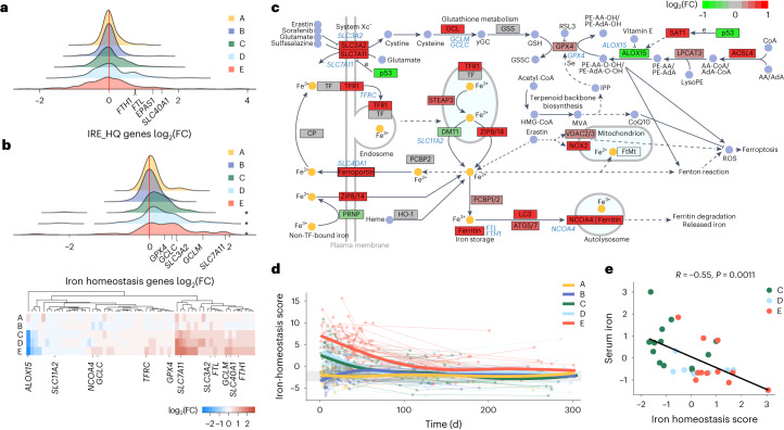
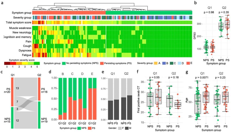
Persistent symptoms following SARS-CoV-2 infection are increasingly reported, although the drivers of post-acute sequelae (PASC) of COVID-19 are unclear. Here we assessed 214 individuals infected with SARS-CoV-2, with varying disease severity, for one year from COVID-19 symptom onset to determine the early correlates of PASC. A multivariate signature detected beyond two weeks of disease, encompassing unresolving inflammation, anemia, low serum iron, altered iron-homeostasis gene expression and emerging stress erythropoiesis; differentiated those who reported PASC months later, irrespective of COVID-19 severity. A whole-blood heme-metabolism signature, enriched in hospitalized patients at month 1-3 post onset, coincided with pronounced iron-deficient reticulocytosis. Lymphopenia and low numbers of dendritic cells persisted in those with PASC, and single-cell analysis reported iron maldistribution, suggesting monocyte iron loading and increased iron demand in proliferating lymphocytes. Thus, defects in iron homeostasis, dysregulated erythropoiesis and immune dysfunction due to COVID-19 possibly contribute to inefficient oxygen transport, inflammatory disequilibrium and persisting symptomatology, and may be therapeutically tractable.


Conflict of interest statement

The authors declare no conflicts of interest.

Figures

Fig. 1
Fig. 1. Longitudinal characterization of immunological recovery in COVID-19 severity groups.
a, Distribution of patient sampling across five COVID-19 severity groups over 1 yr post first SARS-CoV-2-positive swab (group A) or symptom onset (groups B–E). Group A, mild asymptomatic, n = 18 (3 M and 15 F), WHO clinical progression score = 1; group B, mild symptomatic, n = 40 (9 M and 31 F), WHO score = 2–3; group C, moderate without supplemental oxygen requirement, n = 48 (25 M and 23 F), WHO score = 4; group D, moderate with supplemental oxygen given as maximal respiratory support, n = 39 (25 M and 14 F), WHO score = 5); and group E, severe with assisted ventilation, n = 69 (52 M and 17 F), WHO score = 6–10. Repeat samples totaled 73, 148, 132, 114 and 288 across groups A–E, respectively. HCs were sampled at baseline day 0 (n = 60, 34 M and 26 F). Each point represents a time point of blood collection; samples from patients who later died are rimmed in black. Vertical dashed lines, the span of time windows used in all analyses (that is, days 0–14, 15–30, 31–90, 91–180, 181–270 and 271–360 post onset). The time range of follow-up questionnaire submission (Q1, 3–5 months and Q2, 9–10 months) is indicated (top). b,c, Distribution of age (b) and sex (c) across groups A–E and the HCs defined as in a. The demographics for the deceased patients alone are shown (bottom). d, Absolute cell count differences (fold change) between the patients in severity groups A–E and HCs during the analyzed time windows. e,f, Number of pDCs (e) and the ratio of activated/naive CD8+ T cells (f) in severity groups A–E and HCs. The gray band represents the interquartile range (IQR) of the HCs; the y axis is shown as a logarithm base ten scale. Box plots show the minimum value, 25th percentile, median, 75th percentile, maximum value and outliers beyond 1.5× the IQR. df, *P < 0.05, **P < 0.005 and ***P < 0.0005; significance of group effect (per COVID-19 severity group, per time window relative to the HCs) as calculated by linear regression of the log2-transformed counts (or ratio) with correction for age and sex; no multiple testing correction was applied. DP, deceased patient.
Fig. 2
Fig. 2. Inflammatory anemia and iron-deprived reticulocyte expansion in patients with moderate–severe COVID-19.
a, Fold change in median serum inflammatory, iron and erythroid cell parameters between patients with COVID-19 in severity groups A–E and HCs or group A and B samples taken at day >90 for ferritin in the absence of HC measures. Fold changes are shown for all time windows. Gray boxes in a correspond to the data shown in be. be, Serum iron (b), hemoglobin (c), reticulocyte count (d) and reticulocyte hemoglobin (e) in patients from groups A–E as in a. The gray band represents the IQR of the HCs. Data points from patients who later died are rimmed in black. Box plots show the minimum value, 25th percentile, median, 75th percentile, maximum value and outliers beyond 1.5× the IQR. ae, The significance of group effect (per COVID-19 severity group, per time window relative to HCs) was calculated by linear regression of log2-transformed measures with correction for age and sex; no multiple testing correction was applied. d,e, Patient-level data plotted against time as a continuous variable (right), with quadratic regression lines fit for each severity group. f, Selection of the top significantly enriched HALLMARK gene sets from GSEA run on the log2-transformed fold change ranked gene lists from comparisons of groups A–E with HCs at each time window. Heat map of false discovery rate (FDR)-adjusted P values (PFDR) from the GSEA, with gene sets that were up- or downregulated colored in red and blue, respectively; NS, not significant. g, Polynomial splines showing changes in the heme-metabolism score (PC1 from a PCA of heme-metabolism gene-set genes across all sampling time points) over time for groups A–E. The gray band represents the IQR of the HCs. h, Correlation between the heme-metabolism score and reticulocyte count of groups C–E (scaled residuals following correction for time post symptom onset) at day 31–90. R, Spearman’s correlation coefficient. be,g,h,The colour key in b applies to all panels. hsCRP, high-sensitivity C-reactive protein; OXPHOS, oxidative phosphorylation; HGB, hemoglobin; retic., reticulocyte. *P < 0.05, **P < 0.005 and ***P < 0.0005.
Fig. 3
Fig. 3. Transcriptional changes to iron-homeostasis pathway genes in hospitalized patients with COVID-19.
a, Distribution of the log2-transformed fold change (FC) values across 324 measured genes with high-quality conserved IREs in their 3′ or 5′ untranslated region derived from the whole-blood transcriptome comparison of COVID-19 severity groups A–E at day 0–14 and HCs. Four genes of interest are annotated. b, Distribution of the log2(FC) across 60 measured genes in the iron-homeostasis gene set at day 0–14 (top) and heat map of gene-level detail for groups A–E versus HCs at day 0–14 (bottom). *P < 0.05, PFDR values from GSEA. c, Schematic of iron-homeostasis pathway (KEGG has04216) with genes colored according to the log2(FC) in group E at day 0–14. Genes corresponding to those shown in the heat map in b are annotated in blue text. d, Polynomial splines showing change in iron-homeostasis scores (PC1 from PCA of iron-homeostasis gene-set genes across all sampling time points for groups A–E). The gray band represents the IQR of the HCs. e, Spearman correlation between iron-homeostasis score and serum iron in groups C–E (scaled residuals following correction for time) at day 0–14, with points colored by severity group.
Fig. 4
Fig. 4. Multimodal single-cell analysis of iron-related signatures.
a, Uniform manifold approximation and projection (UMAP) of CITE-seq data from 36 patients with COVID-19 and 11 HCs, with cells labeled based on previously published cell-type annotations. The UMAP was generated using mRNA expression data and is shown for visualization of cell clusters only. ILC, innate lymphoid cell. b, Average expression of heme metabolism and iron-related signature genes aggregated at the sample level within each cell cluster (COVID-19 and HC samples were combined). Cell types with the highest 80th percentile of average signature expression relative to other cell types, across individuals, are shown, with all other clusters merged into the population ‘other’. c, Comparison of cell frequencies of myeloid populations as a fraction of the total sequenced cells per individual in patients with COVID-19 (groups A–E combined) and HCs (left). d, Differences in the Spearman correlation of normalized CD71 protein expression, across cell clusters, with the surface proteins shown, in patients with COVID-19 (groups A–E combined) and HCs. Top proteins with the greatest difference in correlation (>0.23) are shown. e, Differences in normalized CD71 expression within subsets of HCs and patients with COVID-19, with data analyzed at the sample level, aggregated within each cluster per individual (left). c,d, Comparison of the COVID-19 and HC samples using −log10-transformed P values from a two-sided Wilcoxon rank test (right). b,c,e, Box plots show the minimum value, 25th percentile, median, 75th percentile, maximum value and outliers beyond 1.5× the IQR. DC, dendritic cell; mono., monocyte; mem., memory; prolif., proliferating; retic., reticulocyte.
Fig. 5
Fig. 5. Differences in long-term symptom groups across measured serum, cellular and transcriptional variables.
a, Grouping of patients with PS or NPS from hierarchical clustering of symptom severity scores (0, worst; 5, best) across seven symptom categories. The disease severity group (groups B–E) and total symptom score (summation across symptoms) are indicated above the heat map. The distribution of the responses to the follow-up questionnaires at Q1 and Q2 is shown (top). b, PLS-DA analysis of symptom groups from a study conducted on immune-cell counts, serum parameters and reticulocyte data collected between days 15 and 30. c, Variables driving differentiation of individuals with NPS and PS on PLS component 1, colored according to the group with highest mean. d, Unsupervised hierarchical clustering of patient data from day 15–30, using the 15 leading variables as in c. Patient symptom groups, severity groups and symptom severity scores are shown above the heat map. The cluster capturing most PS individuals is outlined by a black box. Missing data are shown in white in the heat map. e, Fold change (log2-transformed) in median serum inflammatory and iron parameters of individuals with PS compared with NPS at different time windows (left). The significance of the symptom group effect was calculated by linear regression of log2-transformed measures corrected for age; no multiple testing correction was applied. Patient-level data for the boxed parameters in more detail (right). The gray band represents the IQR of the HCs; the y axis is shown as a logarithm base ten scale. Measures taken at days 0–180 and 181–360 are annotated on the basis of the Q1 and Q2 symptom groups, respectively. f, Volcano plot showing genes that are differentially expressed, from differential gene expression analysis with age correction, between the PS (red) and NPS (green) groups at day 15–30 (left). Normalized expression for EPOR and EPAS1 (right); P values are from differential gene expression analysis before FDR correction. The gray band indicates the IQR of HC expression. CPM, counts per million reads. g, Significantly enriched HALLMARK and iron-homeostasis gene sets from GSEA run on the log2(FC) ranked gene list from a comparison of NPS and PS groups across time windows. PFDR values from GSEA are shown, with up- and downregulated gene sets in PS colored red and blue, respectively. a,e,f, Box plots show the minimum value, 25th percentile, median, 75th percentile, maximum value and outliers beyond 1.5× the IQR. ˙P < 0.1, *P < 0.05, **P < 0.005 and NS, not significant; mDCs, myeloid DCs.
Extended Data Fig. 1
Extended Data Fig. 1. Whole blood HALLMARK gene-set enrichment and heme synthesis gene expression changes in COVID-19 severity groups over time.
a, GSEA using MSigDB HALLMARK gene-sets run on the log2FC ranked gene lists for each COVID-19 severity group (A-E) and time-window comparison with HC. Shade represents FDR adjusted p-value, with gene sets up- or downregulated in COVID-19 colored in red or blue respectively. b, Log2 fold-change of heme synthesis genes as taken from DGE analysis of COVID-19 severity groups and HC with age and sex correction, within time windows from symptom onset. FDR adjusted P-values from linear model fit: *p<0.1, **p<0.05, ***p<0.005.
Extended Data Fig. 2
Extended Data Fig. 2. Whole blood transcriptional scores correlated with measured serum and cellular parameters in COVID-19 severity groups over time.
a, PCA of COVID-19 patient and HC whole-blood transcriptomes across all sampling timepoints using genes in the HALLMARK heme metabolism gene-set (left), or iron-homeostasis gene-set (right). Points are colored according to mean expression across gene-set genes. PC1 scores are used to capture variation in gene set expression. b, Spearman correlation between HALLMARK heme metabolism score (top) or iron homeostasis score (bottom) and other measured biological variables in hospitalized patients (groups C–E combined) within discrete time windows. Variables are corrected for time by extracting residuals from linear regression with days post-onset prior to correlation. Asterisks represent significance at P<0.05 prior to FDR correction, points are colored according to strength of correlation.
Extended Data Fig. 3
Extended Data Fig. 3. Altered expression of iron-response gene-sets in COVID-19 severity groups over time.
a, Distribution of log2FC values across 324 measured genes with high-quality conserved iron-response elements (IRE_HQ) in their 3’ or 5’ UTR, derived from the whole-blood transcriptome comparison of COVID-19 severity groups (A-E) and HC over successive time windows. b, Distribution at day 0-14 from a, compared to corresponding distribution of log2FC values across 150 measured proteins in the IRE_HQ gene set, taken from matched samples within the same time window. Samples from patients in groups D and E, and groups A and B, were analyzed together relative to HC to improve sample sizes (n(HC)=7, n(A_B)=7, n(C)=5, n(D_E)=9). c, Correlation of log2FC values from the transcriptional comparison of group E patients and HC, and the protein level comparison of groups D+E and HC, at day 0-14. Pearson’s correlation coefficient and p-value shown. d, Distribution of log2FC values across 60 measured iron homeostasis genes, derived from the whole blood transcriptome comparison of COVID-19 severity groups and HC over successive time windows, GSEA p-value from gene-set enrichment analysis shown. e, Heat map showing log2FC of each gene in more detail. Significantly differentially expressed genes (PFDR<0.1, abs(log2FC) >0.5) are indicated with asterisks: * PFDR<0.1, ** PFDR<0.05, ***PFDR<0.005. f, Change in expression of master regulator of the antioxidant response, NFE2L2 (encoding NRF2), over time and across severity groups. Gray bar indicates IQR of the interquartile range of the HCs. FDR adjusted p-values from linear model fit: *p<0.1, **p<0.05, ***p<0.005. Boxplots show minimum, 25th percentile, median, 75th percentile and maximum, and outliers beyond 1.5 times the interquartile range.
Extended Data Fig. 4
Extended Data Fig. 4. Multimodal single cell analysis of iron-related gene signatures.
a, Heatmap of dsb normalized surface protein expression across cell subsets. Values are scaled for each protein across cell clusters. b, Distribution of cell surface protein expression in myeloid-derived cell subsets with highest expression of iron-related signatures, and reticulocytes. c, Data from Schulte-Schrepping et al. as validation of data shown in Fig. 4b,c. (top) Average expression of iron-homeostasis genes aggregated at the sample level within each cell cluster (COVID-19 patients and HC are combined). Cell types with the highest 80th percentile of average signature expression relative to other cell types, across individuals, are shown, with all other clusters merged into the population “other”. (bottom) Cell frequency of myeloid populations as a fraction of the total sequenced cells per individual, compared between COVID-19 patients (orange) and HC (black). The right margin shows -log10 of the p-value comparing COVID-19 and HC with a two-sided Wilcoxon rank test. Boxplots show minimum, 25th percentile, median, 75th percentile and maximum, and outliers beyond 1.5 times the interquartile range.
Extended Data Fig. 5
Extended Data Fig. 5. Classification and characteristics of PASC persisting symptom (PS) and no persisting symptom (NPS) groups.
a, Grouping of patients with persisting symptoms (PS) or no persisting symptoms (NPS) of COVID-19 from hierarchical clustering of symptom severity scores (0 worst to 5 best) across 7 symptom categories, reported at Q1 (month 3–5 post-onset) and Q2 (month 9–10 post-onset). Disease severity group (B-E) and total symptom score (summation across symptoms) is indicated above heatmap. b, Comparison of time from first COVID-19 symptom to follow-up at each questionnaire timepoint for PS and NPS groups. P-value derived from two-sided t-test comparison of group means. c, Flow of participants between symptom groups at two follow-up timepoints for 35 individuals providing responses for both. d, Proportion of NPS and PS individuals within disease severity groups (B-E) at both questionnaire timepoints. e, Distribution of sex, f, viral titer (as assessed by SARS-CoV-2 positive swab cycle threshold value) and g, age between PS and NPS groups at both follow-up time-points. P-values calculated by two-sided t-test. Boxplots show minimum, 25th percentile, median, 75th percentile and maximum, and outliers beyond 1.5 times the interquartile range. PS = persisting symptom, NPS = no persisting symptoms, Q1 = questionnaire 1, Q2 = questionnaire 2.
Extended Data Fig. 6
Extended Data Fig. 6. Sensitivity analysis of PASC symptom group differences.
a, Age matching of symptom groups upon exclusion of individuals <30 years of age. P-value derived from two-sided t-test. b, Results from re-analysis of clinical parameters using a two-sided Wilcoxon test applied to the age-matched PS and NPS groups shown in a. Black asterisks represent significance at p-value.p<0.1, *p<0.05, **p<0.005. c, Test of symptom group effect using a linear model applied to log2 transformed parameters with correction for acute disease severity group (group B-E). P-value thresholds as in b. d, Re-analysis of clinical parameters by two-sided Wilxocon test in age and acute disease severity matched PS and NPS groups. Age and severity matching is shown in e, p-value thresholds as in b. f, Patient-level findings for iron and inflammatory parameters shown in d. Timepoints of interest are indicated with red arrows. Patients are colored by acute disease severity. Boxplots show minimum, 25th percentile, median, 75th percentile and maximum, and outliers beyond 1.5 times the interquartile range. PS = persisting symptom, NPS = no persisting symptoms.

References

    1. A clinical case definition of post COVID-19 condition by a Delphi consensus, 6 October 2021 (WHO, 2021). - PMC - PubMed
    1. Al-Aly Z, Xie Y, Bowe B. High-dimensional characterization of post-acute sequelae of COVID-19. Nature. 2021;594:259–264. doi: 10.1038/s41586-021-03553-9. - DOI - PubMed
    1. Taquet M, et al. Incidence, co-occurrence, and evolution of long-COVID features: a 6-month retrospective cohort study of 273,618 survivors of COVID-19. PLoS Med. 2021;18:e1003773. doi: 10.1371/journal.pmed.1003773. - DOI - PMC - PubMed
    1. Group P-CC. Clinical characteristics with inflammation profiling of long COVID and association with 1-year recovery following hospitalisation in the UK: a prospective observational study. Lancet Respir. Med. 2022;10:761–775. doi: 10.1016/S2213-2600(22)00127-8. - DOI - PMC - PubMed
    1. Huang L, et al. 1-year outcomes in hospital survivors with COVID-19: a longitudinal cohort study. Lancet. 2021;398:747–758. doi: 10.1016/S0140-6736(21)01755-4. - DOI - PMC - PubMed