. 2024 Mar 14;187(6):1490-1507.e21.
doi: 10.1016/j.cell.2024.02.014. Epub 2024 Mar 6.

Proteome-scale movements and compartment connectivity during the eukaryotic cell cycle

Affiliations

Proteome-scale movements and compartment connectivity during the eukaryotic cell cycle

Athanasios Litsios et al. Cell. .

Abstract

Cell cycle progression relies on coordinated changes in the composition and subcellular localization of the proteome. By applying two distinct convolutional neural networks on images of millions of live yeast cells, we resolved proteome-level dynamics in both concentration and localization during the cell cycle, with resolution of ∼20 subcellular localization classes. We show that a quarter of the proteome displays cell cycle periodicity, with proteins tending to be controlled either at the level of localization or concentration, but not both. Distinct levels of protein regulation are preferentially utilized for different aspects of the cell cycle, with changes in protein concentration being mostly involved in cell cycle control and changes in protein localization in the biophysical implementation of the cell cycle program. We present a resource for exploring global proteome dynamics during the cell cycle, which will aid in understanding a fundamental biological process at a systems level.

Keywords: Saccharomyces cerevisiae; automated image analysis; cell cycle; deep learning; differential scaling; high-content screening; protein localization; proteomics; spatiotemporal proteome; systems biology.


Conflict of interest statement

Declaration of interests The authors declare no competing interests.

Figures

Figure 1.
Figure 1.. A high content screening pipeline for quantification of spatiotemporal proteome dynamics in living cells.
Overview of our automated image (A) generation and (B) analysis pipelines. (C) Error matrix for the performance of CycleNET when tested against manually labeled single-cell images. The percentage of cells classified for each class comparison is shown. (D) Clustergram cross-sections showing the average cell cycle localization vector (DeepLoc activation) for example proteins that are known to move between the nucleus and cytoplasm (n = 10; left), or to regions of polarized growth (n = 36; right) during cell cycle progression (X-axis). Example micrographs for three proteins in each case are shown (cytoplasm displayed in blue, the nucleus and septin in red/pink, and the protein of interest in green). (E) Same as in (D) for members of the indicated protein complexes. (F) Clustergram showing the pairwise correlation of all localization hits after hierarchical clustering. Inset shows the mean correlation of proteins annotated to the same complex (real, red line) versus the mean correlation of random proteins of the same size as a given complex (random, grey line). Correlations between members of specific protein complexes (Exocyst, Condensin, Mcm2-7 complex) are highlighted. Dark gene names denote members of the respective complex; two members of the MCM complex were not included in the GFP collection.
Figure 2.
Figure 2.. The landscape of proteome movements and compartment connectivity during the cell cycle.
(A) Number of cases of localization change and their mean magnitude per localization class during the cell cycle (mean change in DeepLoc activation; red bars). Inset: fraction of all identified cases of protein movement involving the indicated localization classes. (B) Connectivity of different localization classes in terms of protein movements within them. The four boxed regions marked a, b, c, d are analysed further in Figure S2D. (C) Map of protein movements during each major cell cycle transition. Each node represents a different localization class. The size of the blue nodes reflects the total number of proteins whose localization increases at the specific class. Gray nodes represent classes for which there is no increase in protein localization. Arrow thickness reflects the number of unique proteins moving from one localization class to another. (D) Functional enrichments (GO-slim terms) of proteins moving at each cell cycle transition.
Figure 3.
Figure 3.. Proteome concentration dynamics during the cell cycle.
(A) Change in sum concentration (mean autofluorescence-corrected GFP) of all proteins relative to G1-preSTART (n=3806; ~70% of total proteome content). The smoothing spline for each replicate measurement is graphed separately. (B) Percent change in concentration from G1-preSTART to G1-postSTART for the 2853 proteins with GFP-fluorescence ≥5% than background. Proteins are grouped according to the scaling of their abundance with cell size. Vertical dashed lines denote the median change in each group. Inset: fraction of proteins showing positive, negative, and no differential scaling with cell size during G1. (C) Significant functional enrichments or depletions (GO-slim network terms) for protein groups in Figure 3B. Functional analyses for more detailed bioprocess terms are presented in Table S2. (D) Heatmaps showing the concentration dynamics of cytoplasmic (n=85) and mitochondrial (n=58) ribosomal proteins (RPs) during the cell cycle (clustering: Average linkage, Pearson). (E) Change in concentration of proteins in (D) relative to G1-preSTART (mean±sem (line and shading respectively), arbitrary units as in panel (A)). (F) Heatmap showing the concentration dynamics of proteins identified as periodic, ordered by descending concentration at each cell cycle phase prior to z-score estimation. Proteins with levels above cellular autofluorescence in all indicated cell cycle phases are shown (n=731). Functional enrichments are presented for proteins peaking at G1-preSTART, G1-postSTART, and S/G2-Metaphase. (G) Relative fractions of proteins with periodic concentration that display their max or min concentration or abundance at each cell cycle phase. (H) Tukey boxplots showing the maximum change (mean among three replicates) in protein concentration and total protein abundance during the cell cycle of periodic proteins (n=545) with features permitting the confident quantitative assessment of these parameters (STAR Methods).
Figure 4.
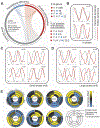
Figure 4.. Multi-level regulation of cell cycle-specific protein concentration dynamics.
(A) Circos plot illustrating the fraction of common hits among the protein concentration (red), transcript level (grey), and translational efficiency (blue) datasets. The size of each ideogram represents the number of hits in each dataset. For example, since there are 810 protein concentration hits and 213 translational efficiency hits, the red ideogram is ~3.8 times larger than the blue ideogram. The number of common hits between datasets is summarized, along with the percentage of protein concentration hits that are also hits in other datasets (percentage calculated based on common genes measured in all datasets). ⋃ = or, ⋂ = and. (B-D) Line graphs showing averaged, normalized transcript level and protein concentration for genes with similar coordination between the two. The x-axis denotes cell cycle progression, and the gray circles indicate G1. For illustration purposes, the same averaged signal for each group is presented twice (from G1 Post-START through telophase) to visually reflect the dynamics across two consecutive cycles. (E) Selected cell cycle-specific profiles showing normalized transcript level, translational efficiency, and protein concentration dynamics for genes that were identified to be periodic in all three.
Figure 5.
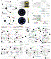
Figure 5.. Spatiotemporal analysis of the cell cycle periodic proteome.
(A, B) Network diagram summarizing protein movements from larger towards more confined areas in the cytoplasm (A) or the nucleus (B) at any cell cycle stage. Edge thickness is proportional to the number of proteins moving between the indicated compartments. The large black nodes denote localization classes and their size reflects the physical size of the respective compartment. Specifically, large nodes depict the cytoplasm and the nucleus, smaller nodes their periphery, and the smallest nodes more physically confined areas within them, such as cytoplasmic or nuclear foci/puncta. (C) Clustergram cross-sections and example micrographs (similar to Figure 1F) for two example proteins that show intracompartmental movements (Flc1 and Ubx6). (D) Degree of multifunctionality and (E) involvement in genetic interactions of genes with the indicated periodicity patterns. (F-I) Flux networks summarizing the cell cycle-periodic proteome. Localization classes are depicted as large grey nodes. Each protein is denoted by a small node, the color of which shows its concentration change at a particular cell cycle transition. Lines connect each protein-node with the two localization classes for which change has been identified for this protein. Line thickness indicates the magnitude of the localization change and the arrows the directionality. For example, Gin4 increases in concentration from G1-preSTART to G1-postSTART, and its localization decreases at the cytoplasm and increases at the bud site. Dynamics are depicted for G1-preSTART to G1-postSTART (F), G1-postSTART to Metaphase (G), Metaphase to Telophase (I), and Telophase to G1-preSTART (H).
Figure 6.
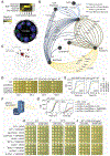
Figure 6.. Cell cycle-resolved phenomics for functional analysis and exploration of new biology.
(A) Clustergram cross-section and example micrographs (similar to Figure 1D) for Ymr295c. (B) Map showing cell cycle-specific movements of the ten proteins with highest localization profile similarity to Ymr295c. (C) SAFE analysis for proteins (n=40) with similar (Pearson’s r ≥0.5) cell cycle-specific localization profile to Ymr295c. The dotted shapes on the map indicate the bioprocesses enriched on the global similarity network of yeast GIs (thecellmap.com). (D) Spot dilution assays on YPD and SD media for the indicated strains in the presence of caspofungin (CAS). Set-1 and Set-2 denote spots initiated from different precultures (RT: room temperature). (E) Growth assays of WT and ymr295cΔ liquid cultures in the presence of CAS, with cells expressing either HO or YMR295C via a MoBY plasmid. (F) Schematic representation of the 1,3-beta-glucan synthase complex. (G) Complementation assays from liquid cultures of the indicated strains expressing either HO, YMR295C, or RHO1, via a MoBY plasmid at RT or 38°C. (H–J) Spot dilution assays of WT and the indicated deletion strains carrying either a Gal-induced URA3, or YMR295C plasmid at (H) RT, (I) 37°C, and (J) RT with CAS supplementation.

Similar articles

Cited by

References

    1. Williams GH, and Stoeber K (2012). The cell cycle and cancer. J. Pathol 226, 352–364. - PubMed
    1. Joseph C et al. (2020). Cell Cycle Deficits in Neurodegenerative Disorders: Uncovering Molecular Mechanisms to Drive Innovative Therapeutic Development. Aging Dis. 11, 946. - PMC - PubMed
    1. Crosby ME (2007). Cell Cycle: Principles of Control. Yale J. Biol. Med 80, 141.
    1. Blank HM et al. (2020). Abundances of transcripts, proteins, and metabolites in the cell cycle of budding yeast reveal coordinate control of lipid metabolism. Mol. Biol. Cell 31, 1069–1084. - PMC - PubMed
    1. Whitfield ML et al. (2002). Identification of genes periodically expressed in the human cell cycle and their expression in tumors. Mol. Biol. Cell 13, 1977–2000. - PMC - PubMed

MeSH terms