. 2024 Feb 28:15:1351287.
doi: 10.3389/fimmu.2024.1351287. eCollection 2024.

Decoding the tumor microenvironment and molecular mechanism: unraveling cervical cancer subpopulations and prognostic signatures through scRNA-Seq and bulk RNA-seq analyses

Affiliations

Decoding the tumor microenvironment and molecular mechanism: unraveling cervical cancer subpopulations and prognostic signatures through scRNA-Seq and bulk RNA-seq analyses

Zhiheng Lin et al. Front Immunol. .

Abstract

Background: Cervical carcinoma (CC) represents a prevalent gynecological neoplasm, with a discernible rise in prevalence among younger cohorts observed in recent years. Nonetheless, the intrinsic cellular heterogeneity of CC remains inadequately investigated.

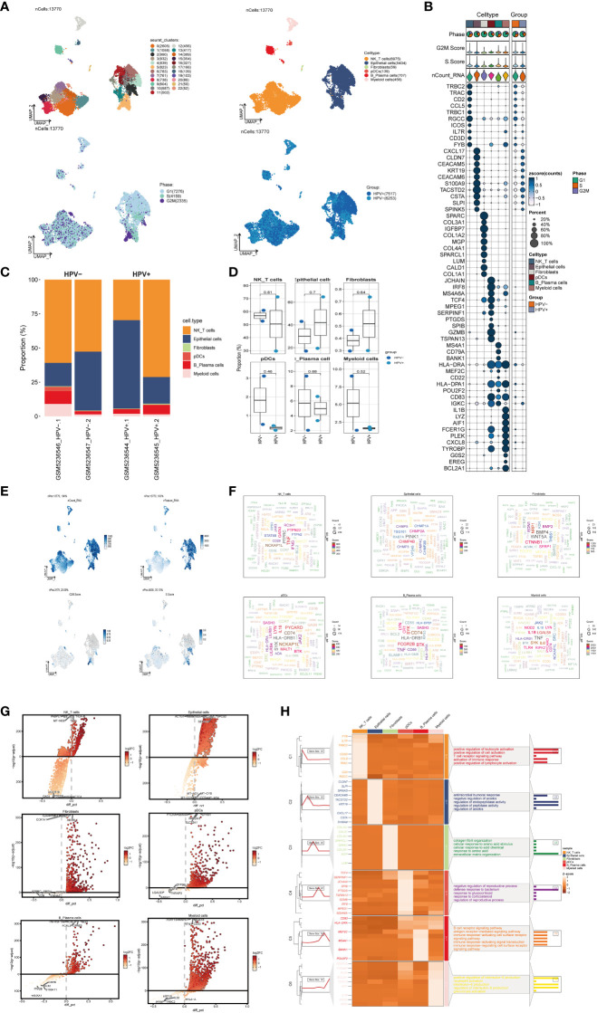
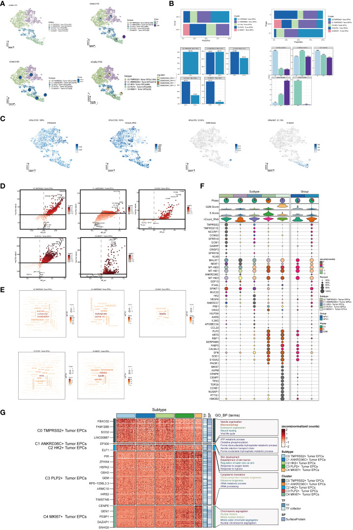
Methods: We utilized single-cell RNA sequencing (scRNA-seq) transcriptomic analysis to scrutinize the tumor epithelial cells derived from four specimens of cervical carcinoma (CC) patients. This method enabled the identification of pivotal subpopulations of tumor epithelial cells and elucidation of their contributions to CC progression. Subsequently, we assessed the influence of associated molecules in bulk RNA sequencing (Bulk RNA-seq) cohorts and performed cellular experiments for validation purposes.

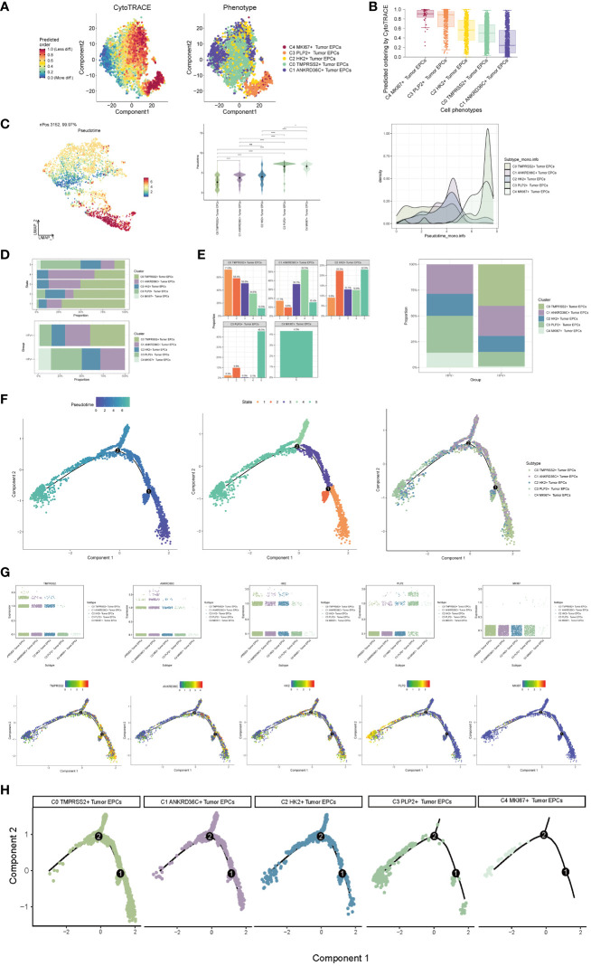
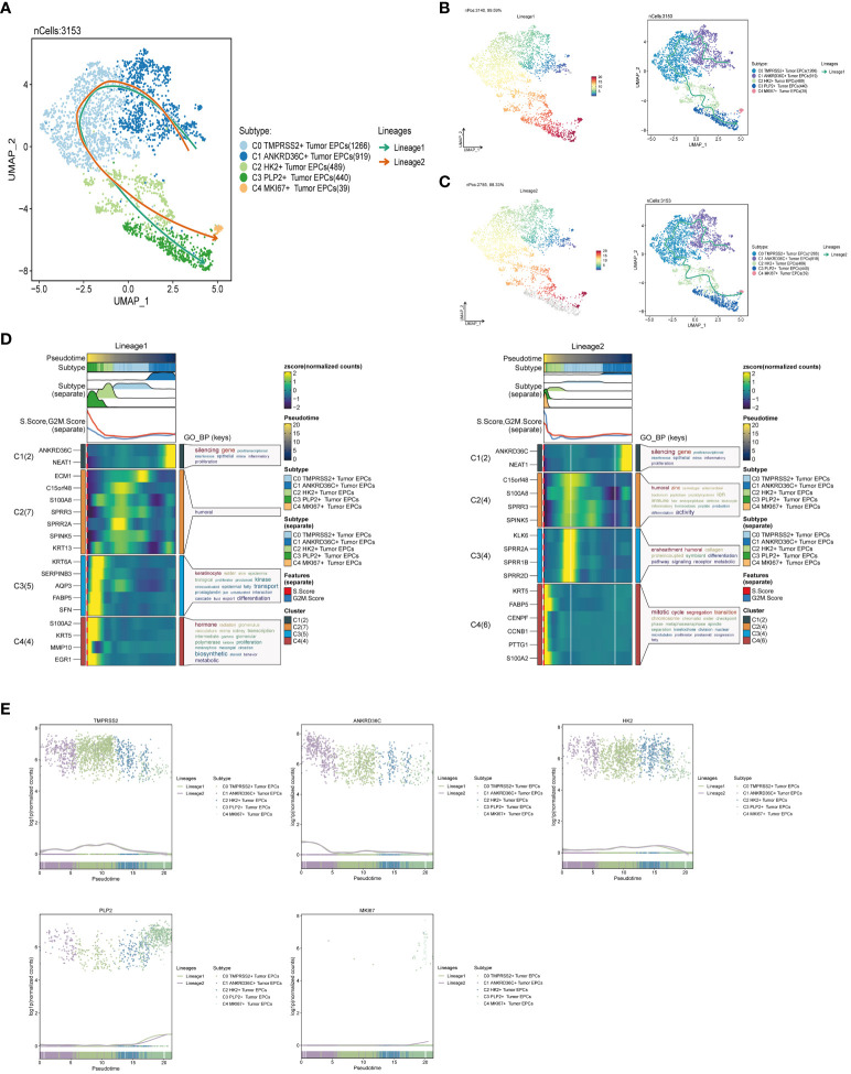
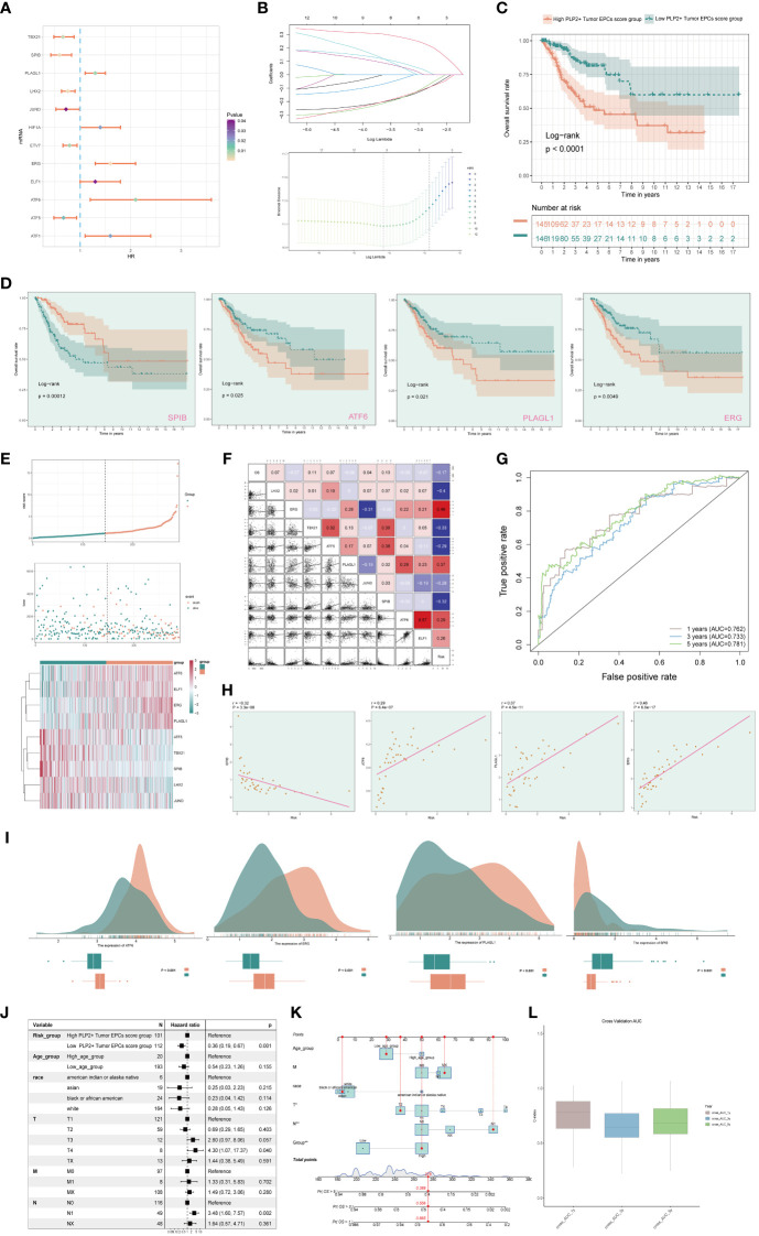
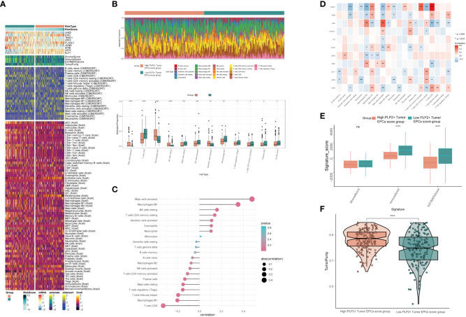
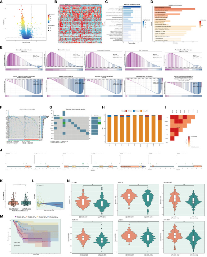
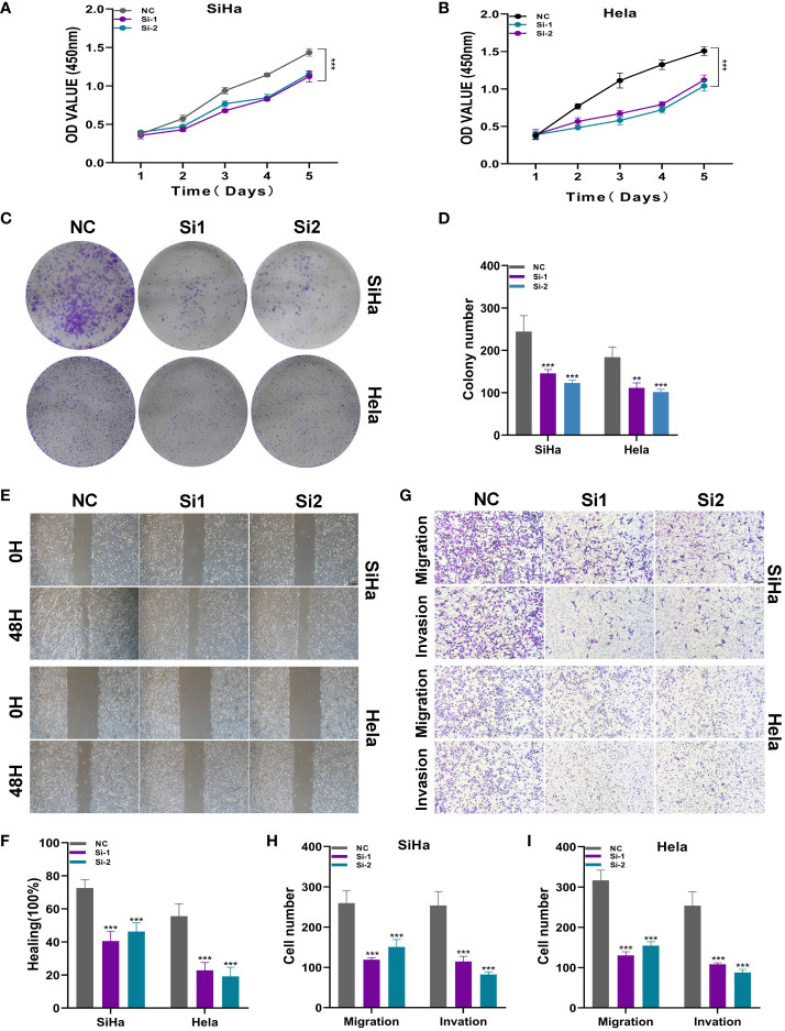
Results: Through our analysis, we have discerned C3 PLP2+ Tumor Epithelial Progenitor Cells as a noteworthy subpopulation in cervical carcinoma (CC), exerting a pivotal influence on the differentiation and progression of CC. We have established an independent prognostic indicator-the PLP2+ Tumor EPCs score. By stratifying patients into high and low score groups based on the median score, we have observed that the high-score group exhibits diminished survival rates compared to the low-score group. The correlations observed between these groups and immune infiltration, enriched pathways, single-nucleotide polymorphisms (SNPs), drug sensitivity, among other factors, further underscore their impact on CC prognosis. Cellular experiments have validated the significant impact of ATF6 on the proliferation and migration of CC cell lines.

Conclusion: This study enriches our comprehension of the determinants shaping the progression of CC, elevates cognizance of the tumor microenvironment in CC, and offers valuable insights for prospective CC therapies. These discoveries contribute to the refinement of CC diagnostics and the formulation of optimal therapeutic approaches.

Keywords: PLP2+ Tumor EPCs; ScRNA-seq; bulk RNA-seq; cervical cancer; experiment validation.


Conflict of interest statement

The authors declare that the research was conducted in the absence of any commercial or financial relationships that could be construed as a potential conflict of interest.

Figures

Figure 1
Figure 1
scRNA sequencing revealed major cell types during CC progression, (A) UMAP plot showed the 23 clusters of cells in cervical cancer patients and the number of cells in each cluster (top left); UMAP plot showed the six major cell types obtained by down clustering of cells in cervical cancer (top right); UMAP plot showed the distribution of phases in the six cell types (bottom left) and the infection of HPV (bottom right). Each point corresponded to a single cell colored according to cell cluster or cell type. (B) Bubble plot showed differential expression of Top10 maker genes in cervical cancer cells across cell types (NK/T cells, Epithelial cells, Fibroblasts, pDCs, B_Plasma cells, Myeloid cells). Bubble colors were based on normalized data and sizes indicated the percentage of genes expressed in the subpopulation. (C) Histograms depicted the percentage of the 6 major cell types in each of the 4 cervical cancer samples. (D) Box line plot depicted the percentage of the 6 cell types in the HPV+ group versus the HPV- group. The colors of the dots represented the HPV- and HPV+ groups, respectively. p-values corresponded to paired Wilcoxon tests. (E) UMAP plots visualized the relevant features of 6 cell types: nCount_RNA, nFeature_RNA, S.score, G2M.score. (F) Word cloud plots showed gene enrichment in the 6 cell types. The size of the letter indicated the number of genes and the color indicated the high or low enrichment score of the cell type. (G) Volcano plots demonstrated the expression of differential genes in the 6 cell types. (H) GO-BP enrichment analysis demonstrated the biological processes associated with the 6 cell types.
Figure 2
Figure 2
Visualization of cervical cancer tumor epithelial cell subpopulations. (A) UMAP diagram demonstrated the 5 cell subpopulations of tumor epithelial cells in cervical cancer patients and the number of cells in each cell subpopulation (upper left); UMAP diagram demonstrated the percentage of different cell cycles in the 5 cell subpopulations (upper right); UMAP diagram demonstrated the distribution of the HPV+ group and the HPV- group in the 5 cell subpopulations (lower left); and UMAP diagram demonstrated the patient origin of the 5 cell subpopulations (lower right). Each point corresponded to a single cell colored according to cell subpopulation. (B) Bar graph showed the percentage of each cell subpopulation in HPV+ and HPV- groups (upper left); bar graph showed the percentage of each cell subpopulation at different tumor stages (upper right); bar graph showed, in each cell subpopulation, the percentage of HPV+ cells versus HPV- cells (lower left); and bar graph showed, in each cell subpopulation, the percentage of cells with different cell cycles (lower right). (C) UMAP plots visualized the relevant features of 5 cell subpopulations (C0:TMPRSS2+ Tumor EPCs, C1: ANKRD36C+ Tumor EPCs, C2: HK2+ Tumor EPCs, C3: PLP2+ Tumor EPCs, C4:MKI67+ Tumor EPCs): CNVscore, nCount_RNA, S.score, G2M.score. (D) Volcano plots demonstrated the expression of differential genes in five cellular subpopulations. (E) Word cloud diagrams showed gene pathway enrichment in 5 cell subpopulations. The size of the letters indicated the number of enriched pathways, and the color indicated the high or low score of enriched pathways in different cell subpopulations. (F) Bubble graph showed differential expression of Top10 maker genes in 5 cell subpopulations of tumor epithelial cells. The color of the bubbles was based on the normalized data and the size indicated the percentage of genes expressed in the subpopulation. (G) GO-BP enrichment analysis demonstrated the biological processes associated with the 5 cell subpopulations.
Figure 3
Figure 3
Visualization of pseudotime-series analysis of tumor epithelial cells by CytoTRACE and monocle. (A) The left figure represented the analysis of the differentiation of tumor epithelial cells by using CytoTRACE and it was shown in 2D. The color could represent the level of differentiation. The right figure represented the CytoTRACE results displayed according to different tumor epithelial cell subpopulations. The colors represented different tumor epithelial cell subpopulations. (B) Box line plot demonstrated the predicted ordering by CytoTRACE of tumor epithelial cell subpopulations. (C) UMAP plot, violin plot and ridge plot showed the pseudotime distribution of tumor epithelial cell subpopulations. *, p ≤ 0.05, ****, p < 0.0001 indicated a significant difference, ns indicated a non-significant difference. (D) The occupancy of the relevant features of the five tumor epithelial cell subpopulations at different pseudotime stages was visualized: the occupancy of the five tumor epithelial cell subpopulations in different states (state1-state5) (top) and the occupancy of the five cell subpopulations in the HPV+ group and HPV- group (bottom). (E) Bar graph showed the occupancy of different states (state1-state5) in 5 tumor epithelial cell subpopulations (left) and the occupancy of 5 cell subpopulations in HPV+ group and HPV- group (right). (F) The derivation process of tumor epithelial cells. Left : The figure showed the pseudotime trajectory of tumor epithelial cells; middle: the pseudotime trajectory graph showed the distribution of STATE; right: the pseudotime trajectory graph showed the distribution of tumor epithelial cell subpopulations. (G) Scatter plots showed the changes of named genes of 5 cell subpopulations of tumor epithelial cells with the pseudotime sequence (top); pseudotime trajectory plots showed the distribution of named genes of 5 cell subpopulations of tumor epithelial cells on the pseudotime trajectory (bottom). (H) Split-plane diagrams of tumor epithelial cell pseudotime sequence trajectories showed the distribution of different cell subpopulations on the pseudotime sequence, respectively.
Figure 4
Figure 4
Slingshot analysis of tumor epithelial cell subpopulations on pseudotime trajectories. (A) UMAP plot showed the distribution of two differentiation trajectories of tumor epithelial cells fitted by the pseudotime order in all tumor epithelial cells. (B) UMAP plot demonstrated the change of Lineage1 with the fitted pseudotime order (left); UMAP plot demonstrated the differentiation trajectory of Lineage1 on the fitted pseudotime order (right). (C) UMAP plot demonstrated the change of Lineage2 with the fitted pseudotime order (left); UMAP plot demonstrated the differentiation trajectory of Lineage2 on the fitted pseudotime order (right). (D) GO-BP enrichment analysis demonstrated the biological processes corresponding to the two pseudotime trajectories of tumor epithelial cell subpopulations. Left: Lineage1; Right: Lineage2. (E) Scatter plots demonstrated the trajectories of named genes of five cell subpopulations of tumor epithelial cells changing on two lineages obtained after slingshot visualization.
Figure 5
Figure 5
CellChat analysis among all cells. (A) Circle plots showed the number (left) and strength (right) of interactions between all cells. (B) Heatmap showed pattern recognition of incoming cells (left), and outgoing cells (right) among all cells. (C) Outgoing contribution bubble plot and incoming contribution bubble plot showed cellular communication patterns among various cell subpopulations of tumor epithelial cells and other cells. (D) Sankey diagrams showed inferred outgoing communication patterns of secreting cells, showed correspondence between inferred potential patterns, cell populations, and signaling pathways. Left: incoming Sankey diagram, right: outgoing Sankey diagram. (E) Heatmap showed incoming and outgoing signaling intensities for the all cellular interactions.
Figure 6
Figure 6
Visual analysis of CD99 signaling pathway. (A) Scatter plot showed the cellular communication patterns of CD99 signaling pathway. Each dot represented the communication network of a signaling pathway. The size of the dots indicated the number of signaling pathways. Different colors represented different signaling pathway groups. (B) Heatmap demonstrated the centrality score of the CD99 signaling pathway network, showing the relative importance of each cell group. (C) Violin plot showed the cellular interactions of the CD99 signaling pathway. (D) Circle plot showed the cellular interactions of the CD99 signaling pathway when tumor epithelial cells were selected as the RECEIVER. (E) Hierarchical diagram showed the interactions between tumor epithelial cells and other cells in the CD99 signaling pathway. Solid and hollow circles indicated source and target cell types, respectively. The edge color of the middle circle was consistent with the signal source. (F) Heatmap showed the cell interactions of the CD99 signaling pathway.
Figure 7
Figure 7
Screening genes which constituted PLP2+ Tumor EPCs score, and grouped into two groups of high and low PLP2+ Tumor EPCs score group and took correlation analysis. (A) Forest plot showed univariate COX analysis of genes constituting PLP2+ Tumor EPCs score. HR < 1,protective factor, HR > 1,risk factor. (B) LASSO regression profiled nine genes in the TCGA cohort: ERG, ELF1, ATF6, PLAGL1, ATF5, TBX21, SPIB, LHX2, and JUND (top); coefficient profiled were generated based on the logarithmic (lambda) sequence. Selected the optimal parameters (lambda) in the LASSO model (bottom). (C) Based on the median PLP2+ Tumor EPCs score, all datas were divided into two groups: high and low PLP2+ Tumor EPCs score group, and Kaplan Meier curve showed the survival analysis of the two groups. (D) Kaplan Meier curves showed the overall survival (OS) of cervical cancer (CC) patients with high and low expression of four statistically significant genes (SPIB, ATF6, PLAGL1, and ERG) in all genes which constructed the PLP2+ Tumor EPCs score (p<0.05). (E) Curve plots showed hazard scores of high and low PLP2+ Tumor EPCs score groups (top, middle); heatmap showed differential gene expression of high and low PLP2+ Tumor EPCs score group. The color scale was based on normalized data (bottom). Green indicated low PLP2+ Tumor EPCs score group and orange indicated high PLP2+ Tumor EPCs score group. (F) Heatmap and scatterplot showed the correlation analysis of genes constituting PLP2+ Tumor EPCs score. Red indicated positive correlation, blue indicated negative correlation, and color shades indicated high or low correlation. (G) The ROC curve of the survival plot. The area under the curve (AUC) was 0.762, 0.733 and 0.781 for 1, 3 and 5 years, respectively. (H) Scatter plots showed the correlation analysis of modeled genes (4 statistically significant genes) with PLP2+ Tumor EPCs score. (I) Peak and box plot showed the different expression among the 4 statistically significant genes which constituted PLP2+ Tumor EPCs score in high and low PLP2+ Tumor EPCs score groups. (J) Forest plot showed the multivariate Cox analysis of genes constituting PLP2+ Tumor EPCs score. HR < 1,protective factor, HR > 1, risk factor. (K) Column line plot was constructed according to TCGA patient race, T-stage, N-stage, M-stage and etc. (L) Box-and-line plot for internal cross-validation of AUC scores at 1, 3, and 5 years.
Figure 8
Figure 8
Differential analysis of immune infiltration in high and low PLP2+ Tumor EPCs score group (A) Heatmap showed differential expression of immune infiltration in high and low PLP2+ Tumor EPCs score group. (B) Stacked bar graph of immune infiltration (top); box-and-line plot showed the differential immune infiltration of 12 immune cells which had significant differences in high and low PLP2+ Tumor EPCs score groups (bottom). (C, D) Bar graph and heatmap showed the correlation analysis of immune cells with genes constituting PLP2+ Tumor EPCs score. (E) Box line plot showed the difference between high and low PLP2+ Tumor EPCs score groupin StromalScore, ImmuneScore, and ESTIMATEScore. (F) Violin plot showed the differences of TumorPurity in high and low PLP2+ Tumor EPCs score group. *, p < 0.05; **, p < 0.01; ***, p < 0.001; ****, p < 0.0001 indicated a significant difference and ns indicated a non-significant difference.
Figure 9
Figure 9
Gene mutations of tumor epithelial cell.s (A, B) Volcano plot and heatmap showed the expression of differential genes in the high and low PLP2+ Tumor EPCs score group. (C) Bar graph showed the results of all GO-BP enrichment analysis. (D) Results of enrichment on different pathways were shown by KEGG enrichment analysis of differential genes. (E) Enrichment score values on different pathways were displayed by GSEA scoring of GO-BP enrichment entries for differential genes. (F) Mutation waterfall plot showed the differences in the top 30 most frequently mutated genes in the somatic cells between the two groups. The upper bars indicated the mutation load for each sample and the right bars indicated the total percentage of mutations of the genes in these samples. (G) Mutation waterfall plot showed mutations load of the genes that constituted the PLP2+ Tumor EPCs score in the samples. The upper bars indicated the mutation load for each sample, and the right bars indicated the total proportion of mutations of this gene in these samples. (H) Bar graph showed the results of predicting chromosome gains and losses in TCGA samples. Blue color indicated chromosome copy number gain; red color indicated chromosome copy number loss; orange color indicated no change in chromosome copy number. (I) Heatmap showed the correlation of mutation profiles of genes that constituted the PLP2+ Tumor EPCs score. (J) Lollipop chart visualized the mutation analysis of genes. (K) Box-and-line plot showed the differences of mutation load in high and low PLP2+ Tumor EPCs score groups. (L) Scatter plot showed the correlation analysis between mutation load and PLP2+ Tumor EPCs score. (M) Scoring according to tumor mutation load,all datas were divided into four groups: high-risk high mutation load, high-risk low mutation load, low-risk high mutation load, and low-risk low mutation load, and the curve showed the survival analysis results of the four groups. (N) Violin plots showed the differences of different drug sensitivities in the high and low PLP2+ Tumor EPCs score group. ***, p < 0.001 indicated a significant difference.
Figure 10
Figure 10
ATF6 significantly affects the proliferation and migration of cervical cancer cell lines. (A, B) CCK-8 experiment. After ATF6 knockdown, the proliferation ability of SiHa and Hela cell lines decreased significantly. (C, D) Plate cloning experiment. After ATF6 knockdown, the colony formation ability of SiHa and Hela cell lines decreased significantly. (E, F) wound healing test. After ATF6 knockdown, the migration ability of SiHa and Hela cell lines decreased significantly. (G–I) Transwell experiment. After ATF6 knockdown, the migration and invasion ability of SiHa and Hela cell lines were significantly reduced. (**P<0.01; ***P< 0.001).

Similar articles

Cited by

References

    1. Sung H, Ferlay J, Siegel RL, Laversanne M, Soerjomataram I, Jemal A, et al. . Global cancer statistics 2020: GLOBOCAN estimates of incidence and mortality worldwide for 36 cancers in 185 countries. CA Cancer J Clin. (2021) 71:209–49. doi: 10.3322/caac.21660 - DOI - PubMed
    1. Höhn AK, Brambs CE, Hiller GGR, May D, Schmoeckel E, Horn LC. 2020 WHO classification of female genital tumors. Geburtshilfe Frauenheilkd. (2021) 81:1145–53. doi: 10.1055/a-1545-4279 - DOI - PMC - PubMed
    1. Rodriguez NM. Participatory innovation for human papillomavirus screening to accelerate the elimination of cervical cancer. Lancet Glob Health. (2021) 9:e582–3. doi: 10.1016/S2214-109X(20)30522-2 - DOI - PMC - PubMed
    1. Sankaranarayanan R, Basu P, Kaur P, Bhaskar R, Singh GB, Denzongpa P, et al. . Current status of human papillomavirus vaccination in India's cervical cancer prevention efforts. Lancet Oncol. (2019) 20:e637–44. doi: 10.1016/S1470-2045(19)30531-5 - DOI - PubMed
    1. Zarbá JJ, Jaremtchuk AV, Gonzalez Jazey P, Keropian M, Castagnino R, Mina C, et al. . A phase I-II study of weekly cisplatin and gemcitabine with concurrent radiotherapy in locally advanced cervical carcinoma. Ann Oncol. (2003) 14:1285–90. doi: 10.1093/annonc/mdg345 - DOI - PubMed

Publication types