. 2024 Mar 1;5(3):100599.
doi: 10.1016/j.xinn.2024.100599. eCollection 2024 May 6.

Dynamic immune recovery process after liver transplantation revealed by single-cell multi-omics analysis

Affiliations

Dynamic immune recovery process after liver transplantation revealed by single-cell multi-omics analysis

Rui Wang et al. Innovation (Camb). .

Abstract

Elucidating the temporal process of immune remodeling under immunosuppressive treatment after liver transplantation (LT) is critical for precise clinical management strategies. Here, we performed a single-cell multi-omics analysis of peripheral blood mononuclear cells (PBMCs) collected from LT patients (with and without acute cellular rejection [ACR]) at 13 time points. Validation was performed in two independent cohorts with additional LT patients and healthy controls. Our study revealed a four-phase recovery process after LT and delineated changes in immune cell composition, expression programs, and interactions along this process. The intensity of the immune response differs between the ACR and non-ACR patients. Notably, the newly identified inflamed NK cells, CD14+RNASE2+ monocytes, and FOS-expressing monocytes emerged as predictive indicators of ACR. This study illuminates the longitudinal evolution of the immune cell landscape under tacrolimus-based immunosuppressive treatment during LT recovery, providing a four-phase framework that aids the clinical management of LT patients.


Conflict of interest statement

The authors declare no competing interests.

Figures

None
Graphical abstract
Figure 1
Figure 1
Study design (A) Overview of the sample collection and analysis workflow. (Created with BioRender.com.). (B) Schematic diagram of time points for blood sampling and analysis (top). Line graphs showing longitudinal changes in clinical parameters (mean) in the ACR and non-ACR groups (bottom). MARS-seq, massively parallel RNA single-cell sequencing.
Figure 2
Figure 2
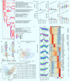
Definition of a four-phase recovery process in LT (A) Dot plot illustrating the top 10 selected enriched terms of TFGs at each time point in the non-ACR group of cohort 1. (B) Unsupervised hierarchical clustering analyses (ward.D2 method) of immune-related gene expression profiles (left) and GSVA results (right) in the non-ACR group of cohort 1. (C) Principal-component analysis (PCA) of non-ACR samples from cohort 1 based on the immune-related gene expression. (D) PLSDA plot of samples from cohort 2 based on the immune-related gene expression, with the pairwise Adonis test results on the right. (E) Boxplots depicting the temporal changes in clinical parameters across different phases of LT in cohort 2. ∗p < 0.05, ∗∗p < 0.01, ∗∗∗p < 0.001, and ∗∗∗∗p < 0.0001 in the Wilcoxon test. ns, not significant. (F) Results of time-series clustering analysis by Mfuzz (left) based on the non-ACR group of cohort 1. Heatmap of longitudinal DEGs across LT phases with selected enriched pathways labeled at right.
Figure 3
Figure 3
Global changes in immune cells across the four-phase recovery process (A and B) Uniform manifold approximation and projection (UMAP) plots of all merged patient samples colored by cell type (A) and time points (B) in the non-ACR group. (C) PCA result of the distribution of immune cells in the non-ACR group. (D) Heatmap showing the module score of immune cells from the non-ACR group in the distinct phase. (E) Line graphs showing longitudinal changes in cell proportions identified in the scRNA-seq data (mean ± SEM). Comparisons were made between the ACR and non-ACR groups and between phase 4 and HCs. Wilcoxon test. The sample sizes (n) for each group were as follows: non-ACR group: baseline (n = 4), phase 1 (n = 11), phase 2 (n = 12), phase 3 (n = 9), phase 4 (n = 7); ACR group: baseline (n = 2), phase 1 (n = 5), phase 2 (n = 6), phase 3 (n = 4), during rejection (n = 2), postrejection (n = 2); and HCs (n = 5). (F and G) Correlation heatmaps between cell proportions and clinical parameters or cytokines (F) and between cell proportions and gene coexpression modules (G). Spearman’s correlation. (H) t-distributed stochastic neighbor embedding plots of aggregated samples and distinct groups colored by annotated cell types derived from CyTOF data. ∗p < 0.05; ∗∗p < 0.01; ∗∗∗p < 0.001; ∗∗∗∗p < 0.0001.
Figure 4
Figure 4
Dynamic changes in subpopulations of T cells after LT (A) UMAP plot showing T cell subpopulations of all of the samples, with the percentages of each cell type shown. (B) Dot plot showing scaled expression levels of cell-type-specific genes in the non-ACR, ACR, and HCs. (C) UMAP plots showing all merged T cells colored by groups and phases. (D) Bar plot showing the T cell subsets’ frequency change across the phases of LT in different groups. post, postrejection. (E) Line graphs showing longitudinal changes in the relative frequency of the T cell subpopulations in the non-ACR, ACR, and HCs. (F) Dot plot showing scaled expression levels of function-specific genes of all T cells in the non-ACR, ACR, and HCs. (G) Line graphs demonstrating temporal changes of the relative function-specific gene set scores in T cells. (H) Line graph demonstrating temporal changes of the cytotoxicity score of CTLs in the non-ACR, the ACR, and HCs. (I) Dot plot showing scaled expression levels of cytotoxicity-related genes of CTLs in the non-ACR, the ACR, and HCs. In (E), (G), and (H), data are shown as mean ± SEM, and comparisons were made between ACR and non-ACR groups and between phase 4 and HCs. ∗p < 0.05, ∗∗p < 0.01, ∗∗∗p < 0.001, ∗∗∗∗p < 0.0001. ns, not significant in the Wilcoxon test.
Figure 5
Figure 5
Heterogeneity of NK cells across the LT recovery process (A) UMAP plot showing NK cell subpopulations of all of the samples, with the percentages of each cell type shown. (B) Dot plot showing scaled expression levels of NK cell-type-specific genes in non-ACR, ACR, and HCs. (C) Bar plot showing the frequency of NK cell subsets in different groups across the phases of LT. (D) Dot plot showing scaled expression levels of function-specific genes of CD56dimCD16+ NK cells in non-ACR, ACR, and HCs. Selected genes are shown. (E) Line graphs demonstrating temporal changes of the relative function-specific gene set scores in CD56dimCD16+ NK cells (mean ± SEM). Comparisons were made between ACR and non-ACR groups and between phase 4 and HCs. Wilcoxon test. (F) UMAP plots showing the group information of NK cells. (G) Dot plot showing average expression levels of the top 10 DEGs across non-ACR, ACR, and HCs. (H) UMAP plots depicting 6 subsets of CD56dimCD16+ NK cells (left), with cell trajectory (Monocle3) and group distribution (right). (I) Dot plot showing average expression levels of the top 10 cluster-specific genes in CD56dimCD16+ NK cells. (J) Boxplots showing the cell-type-specific gene set scores for each CD56dimCD16+ NK cell subset (mean ± SEM). (K) Bar plot showing the relative abundance of CD56dimCD16+ NK cell subclusters in different groups across phases of LT. (L) Representative flow cytometry analysis of inflamed NK cells from non-ACR and ACR patients. (M) Bar graphs showing the proportion of inflamed NK cells from non-ACR (n = 7) and ACR (n = 7) patients in baseline (left) and from non-ACR (n = 11) and ACR (n = 9) patients in phase 3 (right) (mean ± SD). Student’s t test. (N) Boxplots showing the percentage of inflamed NK cells treated with different concentrations of MePDN in the presence or absence of tacrolimus (n = 6, per group). In vitro experiment. Paired t test. ∗p < 0.05; ∗∗p < 0.01; ∗∗∗p < 0.001; ∗∗∗∗p < 0.0001.
Figure 6
Figure 6
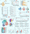
Dynamics of monocytic subpopulations across LT (A) UMAP plot showing monocyte subpopulations of all of the samples, with the percentages of each cell type shown. (B) Dot plot showing scaled expression levels of monocyte-type-specific genes in non-ACR, ACR, and HCs. (C) UMAP plots showing all merged monocytes colored by groups and phases. (D) Bar plot showing the frequency of monocyte subsets in the different groups across the phases of LT. (E) Line graphs showing longitudinal changes in the relative frequency of the monocyte subpopulations in the non-ACR, ACR, and HCs. (F) Dot plot showing scaled expression levels of function-specific genes in non-ACR, ACR, and HCs. (G) Line graphs demonstrating temporal changes of the corresponding function-specific scores in all of the monocytes. (H) Flow cytometry analysis of delta median fluorescence intensity (ΔMFI) of RNASE2 in CD14+CD16 monocytes from patient samples treated with or without Golgi Stop for 4 h. Representative images (left) and quantification data from paired groups (right, n = 40 per group) are shown. ΔMFI was determined by the subtraction of isotype control from antibody staining. Paired t test. (I and J) Boxplots showing the plasma concentration of RNASE2 at different time points after LT. Paired t tests along the time (I) and unpaired Wilcoxon tests between ACR (n = 9) and non-ACR (n = 10) groups (J) were performed. (K and L) ROC curves for RNASE2 plasma concentration and ACR on day 1 (K) and day 3 (L) after LT. In (E) and (G), data are shown as mean ± SEM, and comparisons were completed between the ACR and non-ACR groups and between phase 4 and HCs. Wilcoxon test. ∗p < 0.05; ∗∗p < 0.01; ∗∗∗p < 0.001; ∗∗∗∗p < 0.0001.
Figure 7
Figure 7
Multicellular interaction analysis after LT (A) Scatterplots comparing the outgoing and incoming interaction strength in the 2-dimensional space across phases in the non-ACR and ACR groups. (B) Heatmaps showing the relative importance of each cell type as the sender, receiver, mediator, and influencer, based on the computed 4 network centrality measures of galectin signaling of ACR and non-ACR based on the baseline and phase 3 datasets.
Figure 8
Figure 8
A schematic illustration of a four-phase framework that aids in the clinical management of LT patients

Similar articles

Cited by

References

    1. Post D.J., Douglas D.D., Mulligan D.C. Immunosuppression in liver transplantation. Liver Transpl. 2005;11(11):1307–1314. doi: 10.1002/lt.20614. - DOI - PubMed
    1. Wei X., Xie W., Yin W., et al. Prediction of tumor recurrence by distinct immunoprofiles in liver transplant patients based on mass cytometry. Am. J. Cancer Res. 2022;12(9):4160–4176. - PMC - PubMed
    1. Huang H., Chen R., Lin Y., et al. Decoding Single-cell Landscape and Intercellular Crosstalk in the Transplanted Liver. Transplantation. 2023;107(4):890–902. doi: 10.1097/TP.0000000000004365. - DOI - PubMed
    1. Li X., Li S., Wu B., et al. Landscape of Immune Cells Heterogeneity in Liver Transplantation by Single-Cell RNA Sequencing Analysis. Front. Immunol. 2022;13 doi: 10.3389/fimmu.2022.890019. - DOI - PMC - PubMed
    1. Huang H., Zhang X., Zhang C., et al. The time-dependent shift in the hepatic graft and recipient macrophage pool following liver transplantation. Cell. Mol. Immunol. 2020;17(4):412–414. doi: 10.1038/s41423-019-0253-x. - DOI - PMC - PubMed