. 2024 Mar 26;20(3):e1012117.
doi: 10.1371/journal.ppat.1012117. eCollection 2024 Mar.

Local-scale phylodynamics reveal differential community impact of SARS-CoV-2 in a metropolitan US county

Affiliations

Local-scale phylodynamics reveal differential community impact of SARS-CoV-2 in a metropolitan US county

Miguel I Paredes et al. PLoS Pathog. .

Abstract

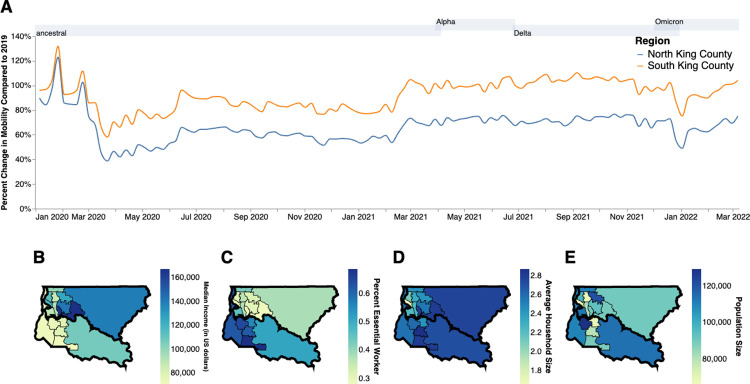
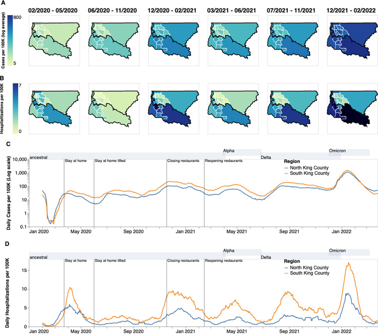
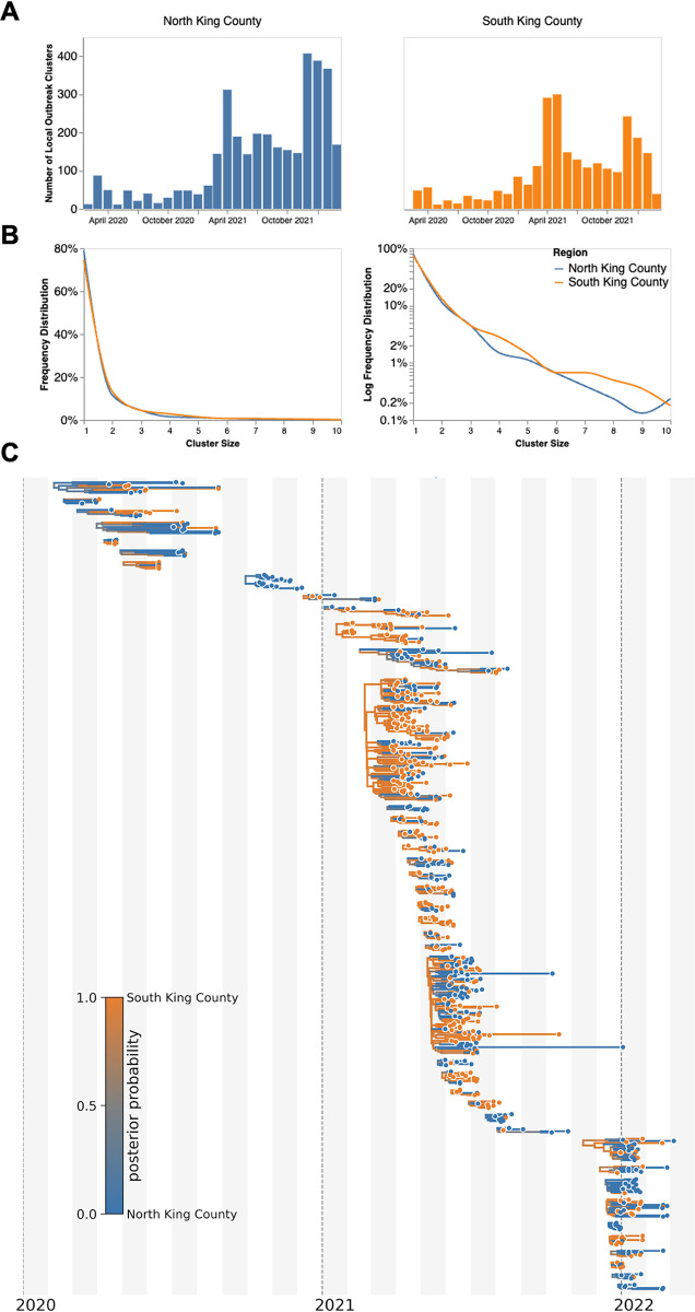
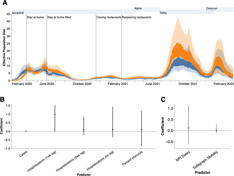
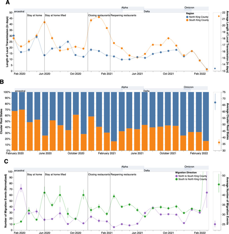
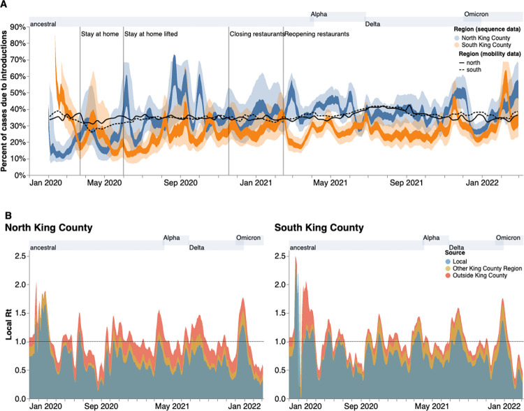
SARS-CoV-2 transmission is largely driven by heterogeneous dynamics at a local scale, leaving local health departments to design interventions with limited information. We analyzed SARS-CoV-2 genomes sampled between February 2020 and March 2022 jointly with epidemiological and cell phone mobility data to investigate fine scale spatiotemporal SARS-CoV-2 transmission dynamics in King County, Washington, a diverse, metropolitan US county. We applied an approximate structured coalescent approach to model transmission within and between North King County and South King County alongside the rate of outside introductions into the county. Our phylodynamic analyses reveal that following stay-at-home orders, the epidemic trajectories of North and South King County began to diverge. We find that South King County consistently had more reported and estimated cases, COVID-19 hospitalizations, and longer persistence of local viral transmission when compared to North King County, where viral importations from outside drove a larger proportion of new cases. Using mobility and demographic data, we also find that South King County experienced a more modest and less sustained reduction in mobility following stay-at-home orders than North King County, while also bearing more socioeconomic inequities that might contribute to a disproportionate burden of SARS-CoV-2 transmission. Overall, our findings suggest a role for local-scale phylodynamics in understanding the heterogeneous transmission landscape.


Conflict of interest statement

ALG reported receiving contract testing from Abbott, Cepheid, Novavax, Pfizer, Janssen and Hologic and research support from Gilead and Merck, outside of the described work. HC reported consulting with Ellume, Pfizer, the Bill & Melinda Gates Foundation, Glaxo Smith Kline, and Merck. She has received research funding from Emergent Ventures, Gates Ventures, Sanofi Pasteur, the Bill & Melinda Gates Foundation, and research support and reagents from Ellume and Cepheid outside of the submitted work. The funders had no role in study design, data collection and analysis, decision to publish, or preparation of the manuscript. All other authors declare no competing interests.

Figures

Fig 1
Fig 1. Socioeconomic Characteristics of King County.
A. Percent change in mobility from Feb 2020 to March 2022 over time using average mobility in 2019 as baseline for North (blue line) and South (orange line) King County. Dashed line denotes no change compared to baseline. B,C. Median household income in 2020. (B) Percentage of the active workforce whose occupation is defined as “essential” from 2015–2020 (C) average household size from 2015–2020 (D) and population size (E) in King County by Public Use Microdata Area (PUMA). Gray shaded regions above each figure show the time periods during which ancestral virus, Alpha, Delta, and Omicron respectively represented greater than 30% of sequenced case. Geojsons for King County PUMAs were made using shapefiles from the US Census Bureau [12] and can be found here: https://github.com/seattleflu/seattle-geojson/tree/master/seattle_geojsons.
Fig 2
Fig 2. Descriptive Epidemiology of SARS-CoV-2 Epidemic in King County, WA.
(A, B) Confirmed positive cases (A) and hospitalizations (B) per 100,000 individuals of SARS-CoV-2 in King County by Public Use Microdata Area (PUMA) averaged for each of the six waves of the epidemic up until March 2022. Dark borders denote geographical boundaries between North and South King County (C, D) Daily positive cases and hospitalizations of SARS-CoV-2 from February 2020 to March 2022 by region of King County smoothed with a 14 day rolling average. Blue denotes North King County; Orange denotes South King County. Gray shaded regions above each figure show the time periods during which ancestral virus, Alpha, Delta, and Omicron respectively represented greater than 30% of sequenced case. Geojsons for King County PUMAs were made using shapefiles from the US Census Bureau [12] and can be found here: https://github.com/seattleflu/seattle-geojson/tree/master/seattle_geojsons.
Fig 3
Fig 3. Representative SARS-CoV-2 Clusters by Region in King County.
We combined more than 11,500 SARS-CoV-2 genomes from King County with more than 45,000 contextual sequences from around the world and built a time-resolved phylogeny. King County outbreak clusters were then extracted using a parsimony based clustering approach. We inferred geographic transmission history between each region using MASCOT-GLM. Here, we display the number of clusters over time by King County Region (A), the frequency of cluster size by region on a linear (B left) and log (B right) scale (up to a cluster size of 10. Larger clusters exist but were excluded from the graph for clarity), and the maximum clade credibility tree of all clusters with five or more sequences (C) where color represents posterior probability of being in South King County. The x-axis represents the collection date (for tips) or the inferred time to the most recent common ancestor (for internal nodes). Blue denotes North King County, Orange denotes South King County.
Fig 4
Fig 4. Phylodynamic Analysis via MASCOT-GLM.
(A) Estimates of effective population sizes from Feb 2020 to March 2022 in North (blue) and South (orange) King County using 3000 randomly subsampled sequences. The inner band denotes the 50% highest posterior density (HPD) interva,l and the outer band denotes the 95% HPD interval. Vertical gray lines denote dates of non-pharmaceutical interventions in Washington State. (B) Estimates of model predictor coefficients for Ne estimation and (C) for migration rate estimation. All of the predictors displayed on the x-axis were included in the analytic model. Dark line represents median estimates, light bands represent 95% HPD. Gray shaded regions above each figure show the time periods during which ancestral virus, Alpha, Delta, and Omicron, respectively represented greater than 30% of sequenced case.
Fig 5
Fig 5. Within and Inter-Regional Dynamics in King County inferred from pathogen genomes and relevant covariates.
A. Persistence time (in days) of local transmission chains over time in both regions of King County. Accompanying graph showing persistence times averaged over the entire time period for both regions with error bars denoting 95% CIs. B. Inferred reconstruction of ancestral state for each transmission cluster over time. Blue denotes initial introduction in North King County and orange denotes initial introduction in South King County. Average values are normalized to 100% over time. The Accompanying graph showing inferred introductions averaged over the entire time period for both regions with error bars denoting 95% CIs. C. Number of migration events from North to South King County (purple) and from South to North King County (green) over time. Bands denote 95% CI. The accompanying figure shows the number of migration events between the two regions averaged over the entire time period with error bars denoting 95% CIs. Gray shaded regions above each figure show the time periods during which ancestral virus, Alpha, Delta, and Omicron respectively represented greater than 30% of sequenced cases.
Fig 6
Fig 6. Phylodynamic estimates of the differential impact of introductions and local spread on transmission dynamics of SARS-CoV-2 by region in King County.
(A) Percentages of new cases due to introductions were estimated as the relative contribution of introductions to the overall number of infections in the region. The inner area denotes the 50% HPD interval and the outer area denotes the 95% HPD interval. Blue = North King County; Orange = South King County. Black lines represent the same calculation using SafeGraph mobility data as parameter approximations. Solid black line is for North King County; Dashed black line is for South King County. (B) Estimates of local Rt highlighting the contribution of introductions from outside King County (red) and from the neighboring King County region (gold) on local transmission in each King County region. Dashed line denotes an Rt of 1. Estimates were smoothed using a 7 day rolling average. Estimates higher than 1 suggest an exponentially growing epidemic. Gray shaded regions above each figure show the time periods during which ancestral virus, Alpha, Delta, and Omicron respectively represented greater than 30% of sequenced cases.

Update of

Similar articles

Cited by

References

    1. Bedford T, Greninger AL, Roychoudhury P, Starita LM, Famulare M, Huang ML, et al.. Cryptic transmission of SARS-CoV-2 in Washington state. Science. 2020. Oct 30;370(6516):571–5. doi: 10.1126/science.abc0523 - DOI - PMC - PubMed
    1. Müller NF, Wagner C, Frazar CD, Roychoudhury P, Lee J, Moncla LH, et al.. Viral genomes reveal patterns of the SARS-CoV-2 outbreak in Washington State. Sci Transl Med [Internet]. 2021. May 26 [cited 2021 Jun 3];13(595). Available from: doi: 10.1126/scitranslmed.abf0202 - DOI - PMC - PubMed
    1. Tordoff DM, Greninger AL, Roychoudhury P, Shrestha L, Xie H, Jerome KR, et al.. Phylogenetic estimates of SARS-CoV-2 introductions into Washington State. Lancet Reg Health–Am [Internet]. 2021. Sep 1 [cited 2022 Aug 3];1. Available from: https://www.thelancet.com/journals/lanam/article/PIIS2667-193X(21)00010-... - PMC - PubMed
    1. Deng X, Gu W, Federman S, du Plessis L, Pybus OG, Faria NR, et al.. Genomic surveillance reveals multiple introductions of SARS-CoV-2 into Northern California. Science. 2020. Jul 31;369(6503):582–7. - PMC - PubMed
    1. Lemieux JE, Siddle KJ, Shaw BM, Loreth C, Schaffner SF, Gladden-Young A, et al.. Phylogenetic analysis of SARS-CoV-2 in Boston highlights the impact of superspreading events. Science. 2021. Feb 5;371(6529):eabe3261. doi: 10.1126/science.abe3261 - DOI - PMC - PubMed