. 2024 Mar 29;15(1):2752.
doi: 10.1038/s41467-024-47013-0.

Immunosenescence and vaccine efficacy revealed by immunometabolic analysis of SARS-CoV-2-specific cells in multiple sclerosis patients

Affiliations

Immunosenescence and vaccine efficacy revealed by immunometabolic analysis of SARS-CoV-2-specific cells in multiple sclerosis patients

Sara De Biasi et al. Nat Commun. .

Abstract

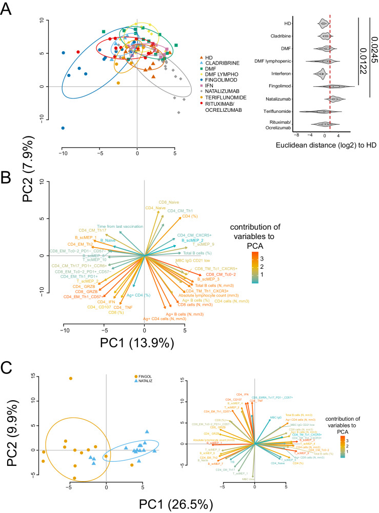
Disease-modifying therapies (DMT) administered to patients with multiple sclerosis (MS) can influence immune responses to SARS-CoV-2 and vaccine efficacy. However, data on the detailed phenotypic, functional and metabolic characteristics of antigen (Ag)-specific cells following the third dose of mRNA vaccine remain scarce. Here, using flow cytometry and 45-parameter mass cytometry, we broadly investigate the phenotype, function and the single-cell metabolic profile of SARS-CoV-2-specific T and B cells up to 8 months after the third dose of mRNA vaccine in a cohort of 94 patients with MS treated with different DMT, including cladribine, dimethyl fumarate, fingolimod, interferon, natalizumab, teriflunomide, rituximab or ocrelizumab. Almost all patients display functional immune response to SARS-CoV-2. Different metabolic profiles characterize antigen-specific-T and -B cell response in fingolimod- and natalizumab-treated patients, whose immune response differs from all the other MS treatments.


Conflict of interest statement

There are restrictions to the commercial use of SCENITH due to a pending patent application by R.J.A. (PCT/EP2020/060486). A.N., R.B., N.P., A.P., E.S., M.Cu, A.L.C., M.C., T.T., D.L.T., M.R., D.F., F.V., M.Ca, L.G., I.R., A.C., S.D.B., D.F. declare that the research was conducted in the absence of any commercial or financial relationships that could be construed as a potential conflict of interest.

Figures

Fig. 1
Fig. 1. Ag+ CD4+ T cell landscape.
A Percentage and absolute number of CD4+ T cells. Dot plots show the percentage and absolute number of CD4+ T cells. The central bar represents the mean ± SD. Kruskal–Wallis test (one-sided) with Benjamini–Hochberg correction for multiple comparisons. Significant adjusted q-values are reported in the figure. B Percentage and absolute number of Ag+ CD4+ T cells. Dot plots show the percentage and absolute number of Ag+ CD4+ T cells. The central bar represents the mean ± SD. Kruskal–Wallis test (one-sided) with Benjamini–Hochberg correction for multiple comparisons. Significant adjusted q-values are reported in the figure. C Ag+ CD4+ T cells phenotype UMAP and Heatmap. Uniform Manifold Approximation and Projection (UMAP) plot shows the 2D spatial distribution of 256.419 cells from healthy donors (HD) and MS patients treated with different DMT embedded with FlowSOM clusters. Heatmap of the median marker intensities of the 10 lineage markers across the 15 cell populations obtained with FlowSOM algorithm after the manual metacluster merging. The colors of cluster_id column correspond to the colors used to label the UMAP plot clusters. The color in the heatmap is referred to the median of the arcsinhmarker expression (0–1 scaled) calculated over cells from all the samples. Blue represents lower expression, while red represents higher expression. Light gray bar along the rows (clusters) and values in brackets indicate the relative sizes of the clusters. N naive, TSCM T stem cell memory, CM central memory, TM transitional memory, EM effector memory, EMRA effector memory reexpressing the CD45RA, cTfh circulating T follicular helper cells. D UMAP graphs stratified by therapy: healthy donors (HD); Cladribine; Dimethyl Fumarate (DMF); DMF Lymphopenic; Fingolimod; interferon 1β (IFN); Natalizumab; Teriflunomide; Rituximab/Ocrelizumab. E Dot plots of different subpopulation of Ag+ T cells in patients treated with different DMT. The central bar represents the mean ± SD. Kruskal–Wallis test with Benjamini–Hochberg correction for multiple AE: HD: n = 13; Cladribine: n = 6; DMF: n = 14; DMF Lymphopenic: n = 9; Fingolimod: n = 12; IFN: n = 13; Natalizumab: n = 15; Teriflunomide: n = 8; Rituximab/Ocrelizumab: n = 11.
Fig. 2
Fig. 2. Ag+ CD8+ T cell landscape.
A Percentage and absolute number of CD8+ T cells. Dot plots show the percentage and absolute number of CD8+ T cells. The central bar represents the mean ± SD. Kruskal–Wallis test (one-sided) with Benjamini–Hochberg correction for multiple comparisons. Significant adjusted q-values are reported in the figure. B Percentage and absolute number of Ag+ CD8+ T cells. Dot plots show the percentage and absolute number of Ag+ CD8+ T cells. The central bar represents the mean ± SD. Kruskal–Wallis test (one-sided) with Benjamini–Hochberg correction for multiple comparisons. Significant adjusted q-values are reported in the figure. C Ag+ CD8+ T cells phenotype UMAP and Heatmap. Uniform Manifold Approximation and Projection (UMAP) plot shows the 2D spatial distribution of 93.757 cells from healthy donors (HD) and MS patients treated with different DMT embedded with FlowSOM clusters. Heatmap of the median marker intensities of the 10 lineage markers across the 12 cell populations obtained with FlowSOM algorithm after the manual metacluster merging. The colors of cluster_id column correspond to the colors used to label the UMAP plot clusters. The color in the heatmap is referred to the median of the arcsinhmarker expression (0–1 scaled) calculated over cells from all of the samples. Blue represents lower expression, while red represents higher expression. Light gray bar along the rows (clusters) and values in brackets indicate the relative sizes of the clusters. N naive, TSCM T stem cell memory, CM central memory, TM transitional memory, EM effector memory, EMRA effector memory reexpressing the CD45RA, cTfh circulating T follicular helper cells. D UMAP graphs stratified by therapy: healthy donors (HD); Cladribine; Dimethyl Fumarate (DMF); DMF Lymphopenic; Fingolimod; interferon 1β (IFN); Natalizumab; Teriflunomide; Rituximab/Ocrelizumab. E Dot plots of different subpopulation of Ag+ T cells in patients treated with different DMT. The central bar represents the mean ± SD. Kruskal–Wallis test with Benjamini–Hochberg correction for multiple. In AE plots: HD: n = 13; Cladribine: n = 6; DMF: n = 14; DMF Lymphopenic: n = 9; Fingolimod: n = 12; IFN: n = 13; Natalizumab: n = 15; Teriflunomide: n = 8; Rituximab/Ocrelizumab: n = 11.
Fig. 3
Fig. 3. Ag+ CD4+ and CD8+ T cell functionality.
A Percentage of Ag+ CD4+ T cells producing different cytokines after in vitro stimulation with SARS-CoV-2 peptides. Representative dot plots showing the percentages of CD4+ Ag+ cells producing IL-2, IL-17, CD107a and granzyme B (GRZB). Plots show mean (center bar) ± SD. Kruskal–Wallis (one-sided) test with Benjamini-Hochberg correction for multiple comparisons. B Polyfunctional profile of Ag+ CD4+ T cells. (Upper) Pie charts representing the proportion of Ag+ CD4+ T cells producing different combinations of CD107a, IL2, IL17, IFNγ, and TNF. Each color refers to specific polyfunctional CD4 T subpopulation as reported in the ‘polyfunctionality legend’. The far-left heatmap illustrates the statistical variances among the 9 distinct pie charts; The central bar represents the mean ± SD. Kruskal–Wallis test (one-sided) with Benjamini-Hochberg correction for multiple comparisons. (far-right) Dot plot reporting the percentages of Ag+ CD4+ producing different combination of cytokines. Kruskal-Wallis (one-sided) test with Benjamini–Hochberg correction for multiple comparisons. C Percentage of Ag+ CD8+ T cells producing different cytokines after in vitro stimulation with SARS-CoV-2 peptides. Representative dot plots of Ag+ CD8+ cells producing CD107a and GRZB. Dot plot representing the percentage of Ag+ CD8+ T cells producing GRZB is shown, mean (center bar) ± SD. Kruskal–Wallis test (one-sided) with Benjamini–Hochberg correction for multiple comparisons. D Polyfunctional profile of Ag+ CD8+ T cells. (Upper) Pie charts representing the percentage of Ag+ CD8+ T cells producing different combinations of CD107a, IL2, IL17, IFNγ, and TNF. Each color refers to specific polyfunctional CD8 T subpopulation as reported in the ‘polyfunctionality legend’. The far-left heatmap illustrates the statistical variances among the 9 distinct pie charts; Kruskal-Wallis test (one-sided) with Benjamini–Hochberg correction for multiple comparisons (Right) Dot plot reporting the percentage of Ag+ CD8+ CD107aIFNγIL2IL17TNF population. The central bar represents the mean ± SEM. Kruskal–Wallis test with Benjamini–Hochberg correction for multiple comparisons was used to test the differences among the nine groups. In AC plots: HD healthy donors (N = 13); Cladribine (N = 6); DMF Dimethyl Fumarate (N = 14); DMF Lymphopenic: Dimethyl Fumarate Lymphopenic (N = 9); Fingolimod (N = 12); IFN Interferon 1β (N = 13); Natalizumab (N = 15); Teriflunomide (N = 8); rituximab/ocrelizumab (N = 11).
Fig. 4
Fig. 4. Ag+ B cell landscape.
A Dot plot shows the total percentage and the absolute number of CD19+ B cells. The central bar represents the mean ± SD. Kruskal–Wallis test (one-sided) with Benjamini–Hochberg correction for multiple comparisons. B Dot plot shows the percentage and absolute number of antigen-specific CD19+ B cells. The central bar represents the mean ± SD. Kruskal–Wallis test (one-sided) with Benjamini–Hochberg correction for multiple comparisons was used to test the differences among the nine groups. C UMAP plot shows the 2D spatial distribution of 25.866 antigen-specific B cells from healthy controls (HD) and patients with Multiple Sclerosis embedded with FlowSOM clusters. Heatmap of the median marker intensities of the 10 lineage markers across the 11 cell populations obtained with FlowSOM algorithm after the manual metacluster merging. The colors of cluster_id column on the left correspond to the colors used to label the UMAP plot clusters. Each color in the heatmap is referred to the median of the arcsinh marker expression (0–1 scaled) calculated over cells from samples. Blue represents lower expression. while red represents higher expression. Light gray histogram bar and values indicate the relative sizes of the clusters. Naive; TrB. transitional B cells; MBC Usw. memory B cell unswitched; MBC memory B cell, PB plasmablasts, atBC atypical B cell. D (Left) UMAP graphs stratified by therapy. (Right) Dot plot showing the percentages and absolute numbers of naïve and MBC IgA B cells. The central bar represents the mean ± SD. Kruskal–Wallis test (one-sided) with Benjamini–Hochberg correction for multiple comparisons was used to test the differences among the nine groups. E Anti-spike and anti-RBD IgG concentrations in plasma samples from HD and MS treated groups. The central bar represents the mean ± SD. Kruskal–Wallis test (one-sided) with Benjamini–Hochberg correction for multiple comparisons. Adjusted P-values are indicated in the figure. Plots AE HD healthy controls (N = 13); Cladribine (N = 6); DMF: Dimethyl Fumarate (N = 14); DMF Lymphopenic: Dimethyl Fumarate Lymphopenic (N = 9); Fingolimod (N = 12); IFN: Interferon 1β (N = 13); Natalizumab (N = 15); Teriflunomide (N = 8); Rituximab/Ocrelizumab (N = 11).
Fig. 5
Fig. 5. Ag+ T cell metabolic states.
A Uniform Manifold Approximation and Projection (UMAP) plot shows the 2D spatial distribution of 107,522 cells from HD and MS patients. UMAP dimensionality reduction is calculated using sampled data from all cells and all available metabolic features; through FlowSOM clustering are identified 10 different clusters, defined as scMEP. Cells are colored by their scMEP state. B Heatmap of the median marker intensities of the 23 metabolic markers across the 10 cell populations, obtained with FlowSOM algorithm. The colors of cluster_id column correspond to the colors used to label the UMAP plot clusters/scMEP. The color in the heatmap is referred to the median of the arcsinh marker expression (0–1 scaled): white represents a lower expression, while dark green represents a higher expression. Light gray bar along the rows (clusters/scMEP) and values in percentages indicate the relative sizes of the clusters. C Projection of UMAP graphs stratified by HD and all different MS patients. D Representative dot plots showing percentages of scMEP2, scMEP4 and scMEP9 among different Group_IDs. The central bar represents the mean ± SD. Kruskal–Wallis test (one-sided) with Benjamini–Hochberg correction for multiple comparisons is used to test the differences among groups. Adjusted q-values are reported in the figure, if significant. healthy donors (HD, n = 8), multiple sclerosis patients treated with Cladribine (n = 4), Dimethyl Fumarate (DMF, n = 8), Fingolimod (n = 5), interferon 1β (IFN, n = 6), Natalizumab (n = 8), Teriflunomide (n = 5), Rituximab/Ocrelizumab (n = 7). E Heatmap of 14 immunological markers enrichment modeling (not used for metabolic clustering) across different scMEP states, showing the relationship between metabolic states and functional properties. Light gray bar along the rows (clusters/scMEP) and values in percentages indicate the relative sizes of the clusters/scMEP. F Pseudotime visualization of scMEP development based on the estimated trajectory and envisaged in UMAP space.
Fig. 6
Fig. 6. Ag+ B cell metabolic states.
A Uniform Manifold Approximation and Projection (UMAP) plot shows the 2D spatial distribution of 9,780 cells from HD and MS patients. UMAP dimensionality reduction is calculated using sampled data from all cells and all available metabolic features; through FlowSOM clustering are identified 8 different clusters, defined as scMEP. Cells are colored by their scMEP state. B Heatmap of the median marker intensities of the 23 metabolic markers across the 8 cell populations, obtained with FlowSOM algorithm. The colors of cluster_id column correspond to the colors used to label the UMAP plot clusters/scMEP. The color in the heatmap is referred to the median of the arcsinh marker expression (0–1 scaled): white represents a lower expression, while dark green represents a higher expression. Light gray bar along the rows (clusters/scMEP) and values in percentages indicate the relative sizes of the clusters. C Projection of UMAP graphs stratified by HD and all different MS patients. D Representative dot plots showing percentages of scMEP1, scMEP3 and scMEP4 among different Group_IDs. The central bar represents the mean ± SD. Kruskal–Wallis test (one-sided) with Benjamini–Hochberg correction for multiple comparisons is used to test the differences among groups. Adjusted q-values are reported in the figure, if significant. healthy donors (HD, n = 8), multiple sclerosis patients treated with Cladribine (n = 4), Dimethyl Fumarate (DMF, n = 8), Fingolimod (n = 5), IFN (n = 6), Natalizumab (n = 8), Teriflunomide (n = 5), Rituximab/Ocrelizumab (n = 7). E Heatmap of 15 immunological markers enrichment modeling (not used for metabolic clustering) across different scMEP states, showing the relationship between metabolic states and functional properties. Light gray bar along the rows (clusters/scMEP) and values in percentages indicate the relative sizes of the clusters/scMEP. F Pseudotime visualization of scMEP development based on the estimated trajectory and envisaged in UMAP space. Colors are representative of the different distribution of cells population: blue represents less active metabolic state, while red represents an increased/enhanced metabolic state.
Fig. 7
Fig. 7. Principal component analysis (PCA) of HD and MS treated groups.
A PCA showing the spatial distribution of vaccinated MS patients treated with different DMT and healthy donors (HD). Euclidean distance to HD has been calculated. Violin plot showing median, interquartile range (IQR) and whiskers (1.5*IQR). Kruskal–Wallis test (one-sided) with Benjamini–Hochberg correction for multiple comparisons is used to test the differences among groups, *p < 0.05. B Plot displaying the variables as vector, indicating the direction of each variable to overall distribution. The strength of each variable is represented by colors: orange color represents a strong contribution; light blue color represents a milder contribution. Length and direction of the arrows indicate the weight and correlation for each parameter. C (Left) PCA showing the spatial distribution of MS patients treated with fingolimod or natalizumab after SARS-CoV-2 vaccination, (Right) contribution of each immunological variables to PCA. Healthy donors (HD, n = 8), multiple sclerosis patients treated with Cladribine (n = 4), Dimethyl Fumarate (DMF, n = 8), Fingolimod (n = 5), IFN (n = 6), Natalizumab (n = 8), Teriflunomide (n = 5), rituximab/ocrelizumab (n = 7).
Fig. 8
Fig. 8. PENCIL prediction of Ag+ T and B cell subpopulations associated with SARS-CoV-2 breakthrough infection.
A UMAP visualization displaying the Ag+ T cells from specific scMEP clusters. B Bar plot illustrating the percentage of cells within the scMEP clusters, whether associated or not with immune protection, among patients experiencing or not SARS-CoV-2 breakthrough infections. C UMAP visualization displaying the Ag+ B cells from specific scMEP clusters. D Bar plot illustrating the percentage of cells within the scMEP clusters, whether associated or not with immune protection, among patients experiencing or not SARS-CoV-2 breakthrough infections. In gray: not assigned cells (Rejected); in blue: cells associated with immune protection (YES); in red: cells not associated with immune protection (NO).

References

    1. Tornatore C, et al. Vaccine response in patients with multiple sclerosis receiving teriflunomide. Front. Neurol. 2022;13:828616. doi: 10.3389/fneur.2022.828616. - DOI - PMC - PubMed
    1. De Biasi S, et al. Marked T cell activation, senescence, exhaustion and skewing towards TH17 in patients with COVID-19 pneumonia. Nat. Commun. 2020;11:3434. doi: 10.1038/s41467-020-17292-4. - DOI - PMC - PubMed
    1. Cossarizza A, et al. Handling and processing of blood specimens from patients with COVID-19 for safe studies on cell phenotype and cytokine storm. Cytom. A. 2020;97:668–673. doi: 10.1002/cyto.a.24009. - DOI - PMC - PubMed
    1. Cossarizza A, De Biasi S, Guaraldi G, Girardis M, Mussini C. Modena Covid-19 Working G. SARS-CoV-2, the virus that causes COVID-19: cytometry and the new challenge for global health. Cytom. A. 2020;97:340–343. doi: 10.1002/cyto.a.24002. - DOI - PMC - PubMed
    1. De Biasi S, et al. Expansion of plasmablasts and loss of memory B cells in peripheral blood from COVID-19 patients with pneumonia. Eur. J. Immunol. 2020;50:1283–1294. doi: 10.1002/eji.202048838. - DOI - PubMed