. 2024 Apr 12;15(1):3168.
doi: 10.1038/s41467-024-47472-5.

Utility of polygenic scores across diverse diseases in a hospital cohort for predictive modeling

Affiliations

Utility of polygenic scores across diverse diseases in a hospital cohort for predictive modeling

Ting-Hsuan Sun et al. Nat Commun. .

Abstract

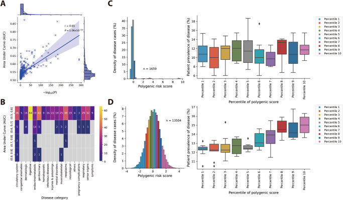
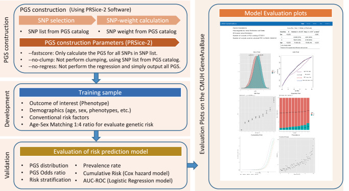
Polygenic scores estimate genetic susceptibility to diseases. We systematically calculated polygenic scores across 457 phenotypes using genotyping array data from China Medical University Hospital. Logistic regression models assessed polygenic scores' ability to predict disease traits. The polygenic score model with the highest accuracy, based on maximal area under the receiver operating characteristic curve (AUC), is provided on the GeneAnaBase website of the hospital. Our findings indicate 49 phenotypes with AUC greater than 0.6, predominantly linked to endocrine and metabolic diseases. Notably, hyperplasia of the prostate exhibited the highest disease prediction ability (P value = 1.01 × 10⁻¹⁹, AUC = 0.874), highlighting the potential of these polygenic scores in preventive medicine and diagnosis. This study offers a comprehensive evaluation of polygenic scores performance across diverse human traits, identifying promising applications for precision medicine and personalized healthcare, thereby inspiring further research and development in this field.


Conflict of interest statement

The authors declare no competing interests. All authors declare that they have no known competing financial interests or non-financial interests that could have appeared to influence the work reported in this paper.

Figures

Fig. 1
Fig. 1. Distribution of performance measurements and the number of individuals in the Polygenic Score Catalog.
A Distribution of performance measurement records. B Distribution of AUC values and covariate usage across different ancestry cohorts. In A and B The orange plot represents records in the PGS catalog that do not considerate of covariates; the blue plot represents records that considerate of covariates. C Comparison of the distribution of AUC values between AUC and different ancestry cohorts. The orange box represents the AUC values in the CMUH model; the blue band represents the AUC values recorded from the PGS catalog. D Distribution of the number of individuals at different process stages. The blue plot represents the PGS record used before the initial screening step. The green plot represents the PGS record used after the initial screening step. The orange plot represents the PGS record used for optimized model. In C and D, the box represents the interquartile range (IQR), which spans from the 25th percentile (Q1) to the 75th percentile (Q3) of the data. The bottom and top edges of the box represent the smallest observation and the largest observation excluding outliers. The line inside the box represents the median (50th percentile) of the data. As for the violin plot, a smoothed kernel density estimate of the data distribution within each group is displayed. The bottom and top edges display the minimum and maximum values of the data. The two-sided Wilcoxon rank-sum test was used to calculate the P value. Bold text indicates that the P value < 1×10⁵ E Cumulative distribution of the number of individuals at each process stage. The blue line represents the PGS record used before the initial screening step. The green line represents the PGS record used after the initial screening step. The orange line represents the PGS record used for optimized model.
Fig. 2
Fig. 2. Comparison of model performance with different covariate inclusion strategies.
A Changes in AUC across 457 phenotypes, sorted by AUC achieved by PGS models (The light gray dotted line represents AUC = 0.6). B Number of phenotypes exhibiting the AUC trend for the four covariate inclusion strategies. The red series represents the model trained with PGS, sex, age, and the first four principal components, which performed the best. The green series represents the model trained with PGS, sex, and age, which performed the best. The blue series represents the model trained with PGS alone, which performed the best. The gray series represents the model trained with sex and age, which performed the best.
Fig. 3
Fig. 3. Sample prevalence of the disease in CMUH correlation comparison.
A Association between sample prevalence rate and number of SNPs used for PGS calculations. B) Association between sample prevalence rate and P values obtained from the Wilcoxon rank sum test of PGS distributions between case and control populations. (The red dotted line represents P values = 2.5×10⁶) C Association between the sample prevalence rate and AUC values for 457 phenotypes. (The red dotted line represents AUC = 0.6) In AC, A linear regression line was plotted and the confidence interval around the regression line was set to 95%. Pearson correlation coefficient (r) is a measure of the strength and direction of the linear relationship between two variables, ranging from −1 to 1. The P value is the probability of obtaining the observed correlation coefficient with the confidence interval is set to 95%. D Classification of diseases (n = phenotypes counted with P values less than 2.5×10⁶/total phenotypes; The light gray dotted line represents P values = 2.5×10⁶).
Fig. 4
Fig. 4. Differential relationship between PGS performance and disease prevalence.
A Association between P values obtained from the Wilcoxon rank sum test and AUC values of 457 phenotype−PGS pairs of traits. A linear regression line was plotted and the confidence interval around the regression line was set to 95%. Pearson correlation coefficient (r) is a measure of the strength and direction of the linear relationship between two variables, ranging from −1 to 1. The P value is the probability of obtaining the observed correlation coefficient with the confidence interval is set to 95%. B AUC distribution of disease categories. C PGS distribution of patients with oral aphthae (n = patient number) and the relationship between PGS percentiles and patient prevalence. D PGS distribution of patients with prostate hyperplasia (n = patient number) and the relationship between PGS percentiles and patient prevalence. In C and D, the box represents the interquartile range (IQR), which spans from the 25th percentile (Q1) to the 75th percentile (Q3) of the data. The bottom and top edges of the box represent the smallest observation and the largest observation excluding outliers. The line inside the box represents the median (50th percentile) of the data. Observations outside this range are considered outliers and are plotted individually.
Fig. 5
Fig. 5. Data collection and processing workflow for data from the China Medical University Hospital and the PGS Catalog.
In the figure, n is the number of subjects included in the analysis and m is the number of phenotype−PGS pairs.
Fig. 6
Fig. 6. Calculation, measurement, and display of the polygenic risk score model evaluation results.
The entire process can be divided into four parts, namely PGS construction, model development, model evaluation, and drawing evaluation diagrams on CMUH GeneAnaBase.

Similar articles

Cited by

References

    1. Lewis CM, Vassos E. Polygenic risk scores: from research tools to clinical instruments. Genome Med. 2020;12:44. doi: 10.1186/s13073-020-00742-5. - DOI - PMC - PubMed
    1. Lambert SA, Abraham G, Inouye M. Towards clinical utility of polygenic risk scores. Hum. Mol. Genet. 2019;28:R133–R142. doi: 10.1093/hmg/ddz187. - DOI - PubMed
    1. Visscher PM, et al. 10 years of GWAS discovery: biology, function, and translation. Am. J. Hum. Genet. 2017;101:5–22. doi: 10.1016/j.ajhg.2017.06.005. - DOI - PMC - PubMed
    1. Pergament E, et al. Single-nucleotide polymorphism-based noninvasive prenatal screening in a high-risk and low-risk cohort. Obstet. Gynecol. 2014;124:210–218. doi: 10.1097/AOG.0000000000000363. - DOI - PMC - PubMed
    1. Conran CA, et al. Population-standardized genetic risk score: the SNP-based method of choice for inherited risk assessment of prostate cancer. Asian J. Androl. 2016;18:520–524. doi: 10.4103/1008-682X.179527. - DOI - PMC - PubMed