Automated Machine Learning and Explainable AI (AutoML-XAI) for Metabolomics: Improving Cancer Diagnostics
- PMID: 38690775
- PMCID: PMC11157651
- DOI: 10.1021/jasms.3c00403
Automated Machine Learning and Explainable AI (AutoML-XAI) for Metabolomics: Improving Cancer Diagnostics
Abstract
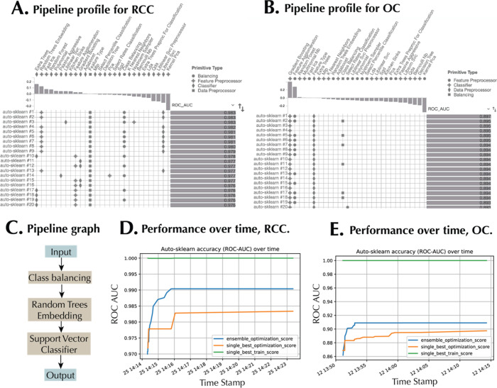
Metabolomics generates complex data necessitating advanced computational methods for generating biological insight. While machine learning (ML) is promising, the challenges of selecting the best algorithms and tuning hyperparameters, particularly for nonexperts, remain. Automated machine learning (AutoML) can streamline this process; however, the issue of interpretability could persist. This research introduces a unified pipeline that combines AutoML with explainable AI (XAI) techniques to optimize metabolomics analysis. We tested our approach on two data sets: renal cell carcinoma (RCC) urine metabolomics and ovarian cancer (OC) serum metabolomics. AutoML, using Auto-sklearn, surpassed standalone ML algorithms like SVM and k-Nearest Neighbors in differentiating between RCC and healthy controls, as well as OC patients and those with other gynecological cancers. The effectiveness of Auto-sklearn is highlighted by its AUC scores of 0.97 for RCC and 0.85 for OC, obtained from the unseen test sets. Importantly, on most of the metrics considered, Auto-sklearn demonstrated a better classification performance, leveraging a mix of algorithms and ensemble techniques. Shapley Additive Explanations (SHAP) provided a global ranking of feature importance, identifying dibutylamine and ganglioside GM(d34:1) as the top discriminative metabolites for RCC and OC, respectively. Waterfall plots offered local explanations by illustrating the influence of each metabolite on individual predictions. Dependence plots spotlighted metabolite interactions, such as the connection between hippuric acid and one of its derivatives in RCC, and between GM3(d34:1) and GM3(18:1_16:0) in OC, hinting at potential mechanistic relationships. Through decision plots, a detailed error analysis was conducted, contrasting feature importance for correctly versus incorrectly classified samples. In essence, our pipeline emphasizes the importance of harmonizing AutoML and XAI, facilitating both simplified ML application and improved interpretability in metabolomics data science.
Keywords: Shapley additive explanations; automated machine learning; cancer biology; explainable AI; metabolomics.
Conflict of interest statement
The authors declare no competing financial interest.
Figures


Update of
-
Automated machine learning and explainable AI (AutoML-XAI) for metabolomics: improving cancer diagnostics.bioRxiv [Preprint]. 2023 Oct 31:2023.10.26.564244. doi: 10.1101/2023.10.26.564244. bioRxiv. 2023. Update in: J Am Soc Mass Spectrom. 2024 Jun 5;35(6):1089-1100. doi: 10.1021/jasms.3c00403. PMID: 37961534 Free PMC article. Updated. Preprint.
Similar articles
-
Automated machine learning and explainable AI (AutoML-XAI) for metabolomics: improving cancer diagnostics.bioRxiv [Preprint]. 2023 Oct 31:2023.10.26.564244. doi: 10.1101/2023.10.26.564244. bioRxiv. 2023. Update in: J Am Soc Mass Spectrom. 2024 Jun 5;35(6):1089-1100. doi: 10.1021/jasms.3c00403. PMID: 37961534 Free PMC article. Updated. Preprint.
-
Metabolomics Biomarker Discovery to Optimize Hepatocellular Carcinoma Diagnosis: Methodology Integrating AutoML and Explainable Artificial Intelligence.Diagnostics (Basel). 2024 Sep 15;14(18):2049. doi: 10.3390/diagnostics14182049. Diagnostics (Basel). 2024. PMID: 39335728 Free PMC article.
-
A metabolic fingerprint of ovarian cancer: a novel diagnostic strategy employing plasma EV-based metabolomics and machine learning algorithms.J Ovarian Res. 2025 Feb 12;18(1):26. doi: 10.1186/s13048-025-01590-w. J Ovarian Res. 2025. PMID: 39940000 Free PMC article.
-
Explainability and white box in drug discovery.Chem Biol Drug Des. 2023 Jul;102(1):217-233. doi: 10.1111/cbdd.14262. Epub 2023 Apr 27. Chem Biol Drug Des. 2023. PMID: 37105727 Review.
-
Role of metabolomics-derived biomarkers to identify renal cell carcinoma: a comprehensive perspective of the past ten years and advancements.Expert Rev Mol Diagn. 2020 Jan;20(1):5-18. doi: 10.1080/14737159.2020.1704259. Epub 2019 Dec 16. Expert Rev Mol Diagn. 2020. PMID: 31825678 Review.
Cited by
-
Untargeted Lipidomic Biomarkers for Liver Cancer Diagnosis: A Tree-Based Machine Learning Model Enhanced by Explainable Artificial Intelligence.Medicina (Kaunas). 2025 Feb 26;61(3):405. doi: 10.3390/medicina61030405. Medicina (Kaunas). 2025. PMID: 40142216 Free PMC article.
-
Manual Delineation of the Region of Interest Combined With Clinical Image Analysis to Predict the Ki-67 Expression Level in Non-small Cell Lung Cancer.Sage Open Pathol. 2025 May 12;18:30502098251336608. doi: 10.1177/30502098251336608. eCollection 2025 Jan-Dec. Sage Open Pathol. 2025. PMID: 40519328 Free PMC article.
-
Proposed Comprehensive Methodology Integrated with Explainable Artificial Intelligence for Prediction of Possible Biomarkers in Metabolomics Panel of Plasma Samples for Breast Cancer Detection.Medicina (Kaunas). 2025 Mar 25;61(4):581. doi: 10.3390/medicina61040581. Medicina (Kaunas). 2025. PMID: 40282875 Free PMC article.
-
Risk Prediction of Liver Injury in Pediatric Tuberculosis Treatment: Development of an Automated Machine Learning Model.Drug Des Devel Ther. 2025 Jan 13;19:239-250. doi: 10.2147/DDDT.S495555. eCollection 2025. Drug Des Devel Ther. 2025. PMID: 39830784 Free PMC article.
-
Liquid Biopsy-Based Detection and Response Prediction for Depression.ACS Nano. 2024 Nov 26;18(47):32498-32507. doi: 10.1021/acsnano.4c08233. Epub 2024 Nov 5. ACS Nano. 2024. PMID: 39501510
References
-
- Ren S.; Hinzman A. A.; Kang E. L.; Szczesniak R. D.; Lu L. J. Computational and statistical analysis of metabolomics data. Metabolomics 2015, 11, 1492–1513. 10.1007/s11306-015-0823-6. - DOI
-
- Boccard J.; Rudaz S. Harnessing the complexity of metabolomic data with chemometrics. Journal of Chemometrics 2014, 28 (1), 1–9. 10.1002/cem.2567. - DOI
-
- Zöller M.-A.; Huber M. F. Benchmark and Survey of Automated Machine Learning Frameworks. Journal of Artificial Intelligence Research 2021, 70, 409–474. 10.1613/jair.1.11854. - DOI
MeSH terms
Substances
Grants and funding
LinkOut - more resources
Full Text Sources
Medical