. 2024 May 2;19(5):e0302109.
doi: 10.1371/journal.pone.0302109. eCollection 2024.

Propensity score matching as an effective strategy for biomarker cohort design and omics data analysis

Affiliations

Propensity score matching as an effective strategy for biomarker cohort design and omics data analysis

Masaki Maekawa et al. PLoS One. .

Abstract

Background: Analysis of omics data that contain multidimensional biological and clinical information can be complex and make it difficult to deduce significance of specific biomarker factors.

Methods: We explored the utility of propensity score matching (PSM), a statistical technique for minimizing confounding factors and simplifying the examination of specific factors. We tested two datasets generated from cohorts of colorectal cancer (CRC) patients, one comprised of immunohistochemical analysis of 12 protein markers in 544 CRC tissues and another consisting of RNA-seq profiles of 163 CRC cases. We examined the efficiency of PSM by comparing pre- and post-PSM analytical results.

Results: Unlike conventional analysis which typically compares randomized cohorts of cancer and normal tissues, PSM enabled direct comparison between patient characteristics uncovering new prognostic biomarkers. By creating optimally matched groups to minimize confounding effects, our study demonstrates that PSM enables robust extraction of significant biomarkers while requiring fewer cancer cases and smaller overall patient cohorts.

Conclusion: PSM may emerge as an efficient and cost-effective strategy for multiomic data analysis and clinical trial design for biomarker discovery.


Conflict of interest statement

Masaki Maekawa, Atsushi Tanaka, and Makiko Ogawa declare no conflicts of interest related to this study. Michael H. Roehrl is member of the Scientific Advisory Boards of Azenta Life Sciences and Universal DX. None of these companies had any role in design, execution, data analysis, or any other aspect of this study. This does not alter our adherence to PLOS ONE policies on sharing data and materials.

Figures
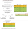
Fig 1
Fig 1. Flow chart of propensity score matching in this study.
It is crucial that the number of cases in group A is not larger than in group B. In this study, group A meant the good prognosis group, and group B meant the poor prognosis group in both datasets.
Fig 2
Fig 2. Distribution of propensity scores of the IHC CRC dataset.
Fig 3
Fig 3. Random forest rankings of prognostic factors in the CRC proteomic marker dataset.
(A) Ranking of variable importance (VIMP). The blue bars represent positive values of VIMP, indicating that the corresponding factor is positively associated with prognostic prediction. While the red bars represent negative values of VIMP, indicating that the factor is negatively associated with prognostic prediction. (B) Ranking of minimal depth. The small minimal depth indicates that the factor plays an important role in prognostic prediction. The vertical dashed line indicates the minimal depth threshold where smaller minimal depth values indicate higher importance and larger indicate lower importance as calculated by the “gg_minimal_depth” function of the “ggRandomForests” R package (version 4.7–1.1). (C) The combination of variable importance (VIMP) and minimal depth. The blue dots represent positive values of VIMP, while red dots represent negative values of VIMP. The threshold represented by the vertical red dashed line indicates VIMP = 0. The threshold represented by the horizontal red dashed line is equal to (B).
Fig 4
Fig 4. Distribution of propensity scores of the RNA–seq CRC dataset.
Fig 5
Fig 5
(A–B) RNA–seq volcano plot comparing good prognosis group vs. poor prognosis group. Green dots (N = 93) represent genes that are significant in both pre–and post–PSM comparison between the good–and poor–prognosis groups. Blue dots (N = 217) represent genes that are significant only in the pre–PSM comparison between the good–and poor–prognosis groups. Red dots (N = 29) represent genes that are significant only in the post–PSM comparison between the good–and poor–prognosis groups. Grey dots (N = 12,121) represent genes that did not show significant differences. (C) The Venn diagram of significant genes before and after PSM. The blue circle represents before PSM, and the yellow represents after PSM.

References

    1. <References>. Rosenbaum P.R. and Rubin D.B., The central role of the propensity score in observational studies for causal effects. Biometrika, 1983. 70: p. 41–55.
    1. Austin P.C., A critical appraisal of propensity-score matching in the medical literature between 1996 and 2003. Stat Med, 2008. 27(12): p. 2037–49. doi: 10.1002/sim.3150 - DOI - PubMed
    1. Shah B.R., et al.., Propensity score methods gave similar results to traditional regression modeling in observational studies: a systematic review. J Clin Epidemiol, 2005. 58(6): p. 550–9. doi: 10.1016/j.jclinepi.2004.10.016 - DOI - PubMed
    1. Joffe M.M. and Rosenbaum P.R., Invited commentary: propensity scores. Am J Epidemiol, 1999. 150(4): p. 327–33. doi: 10.1093/oxfordjournals.aje.a010011 - DOI - PubMed
    1. Kitsios G.D., et al.., Can We Trust Observational Studies Using Propensity Scores in the Critical Care Literature? A Systematic Comparison With Randomized Clinical Trials. Crit Care Med, 2015. 43(9): p. 1870–9. doi: 10.1097/CCM.0000000000001135 - DOI - PubMed

Publication types

Substances