. 2024 May 13;15(1):4026.
doi: 10.1038/s41467-024-48481-0.

Deep mutational scanning reveals a correlation between degradation and toxicity of thousands of aspartoacylase variants

Affiliations

Deep mutational scanning reveals a correlation between degradation and toxicity of thousands of aspartoacylase variants

Martin Grønbæk-Thygesen et al. Nat Commun. .

Abstract

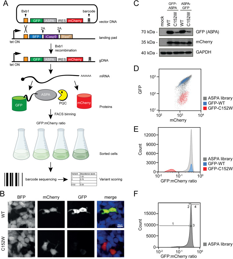
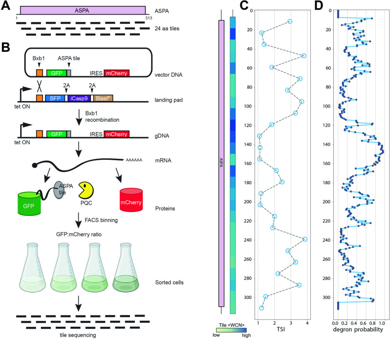
Unstable proteins are prone to form non-native interactions with other proteins and thereby may become toxic. To mitigate this, destabilized proteins are targeted by the protein quality control network. Here we present systematic studies of the cytosolic aspartoacylase, ASPA, where variants are linked to Canavan disease, a lethal neurological disorder. We determine the abundance of 6152 of the 6260 ( ~ 98%) possible single amino acid substitutions and nonsense ASPA variants in human cells. Most low abundance variants are degraded through the ubiquitin-proteasome pathway and become toxic upon prolonged expression. The data correlates with predicted changes in thermodynamic stability, evolutionary conservation, and separate disease-linked variants from benign variants. Mapping of degradation signals (degrons) shows that these are often buried and the C-terminal region functions as a degron. The data can be used to interpret Canavan disease variants and provide insight into the relationship between protein stability, degradation and cell fitness.


Conflict of interest statement

K.L.-L. holds stock options in and is a consultant for Peptone Ltd. The remaining authors declare no competing interests.

Figures

Fig. 1
Fig. 1. The ASPA expression system.
A Schematic representation of the expression system. HEK293T cells, carrying a landing pad for Bxb1-catalyzed site-specific integration are transfected with the expression vector and a Bxb1 expression plasmid (not shown). Upon integration at the landing pad locus, the BFP-iCasp9-BlastR gene is displaced downstream, and the cells therefore become resistant to AP1903, while GFP-ASPA and mCherry are expressed from the tetracycline/doxycycline regulated promoter. The same mRNA leads to both GFP-ASPA and mCherry protein production, which in turn allows flow sorting of cells based on the GFP:mCherry ratio. Finally, variants in each bin can be identified by sequencing the barcodes. Figure adapted from refs. ,,. Figure created with BioRender.com, released under a Creative Commons Attribution-NonCommercial-NoDerivs 4.0 International license. B Fluorescence microscopy of cells transfected with either wild-type ASPA (WT) or ASPA C152W variant. Note the reduced amount of the C152W variant. Scale bar = 20 μm. C Cells were transfected with either WT or C152W ASPA variants fused to GFP in the N-terminus or C-terminus as indicated. A mock transfection was included as a control. Whole-cell lysates were then resolved by SDS-PAGE and analyzed by Western blotting using antibodies to GFP, Cherry, or, as a loading control, GAPDH. Note the reduced level of the C152W variant. D Scatter plots of flow cytometry analyses of the WT (blue) and C152W (red) ASPA variants, along with the site-saturated ASPA library (gray). Note that the mCherry levels are similar, while the GFP levels differ approximately 10-fold. E Histograms of the GFP:mCherry ratio based on WT (blue) and C152W (red) ASPA variants, and the ASPA variant library (gray). F The ASPA library was sorted into four separate bins (1–4) as indicated, with each bin containing 25% of the total population.
Fig. 2
Fig. 2. The ASPA abundance map.
A The results of the ASPA abundance screen are presented as a heat map with the position in ASPA (horizontal) and the 20 different amino acids (vertical). * indicates a stop codon. The median abundance score (MED) per position is shown above. The wild-type residues are shown in yellow. Missing data points are marked in gray. Neutral variants (WT-like abundance) are in white. Low-abundance variants are shown in red and high-abundance variants are shown in blue. The AlphaFold confidence scores (pLDDT) are marked below, as a disorder indicator. Regions with low pLDDT scores (green/blue colors) indicate flexible/disordered regions. The ASPA domain organization and secondary structure are marked. The black bar indicates the positions of selected key catalytic residues (H21, N23, R63, N70, R71, D114, N117, E178, G185, P232, A287, Y288). B The library displays a bimodal distribution of abundance scores with a peak of neutral variants overlapping with the synonymous (silent) WT ASPA variants, and a peak of low-abundance variants overlapping with the nonsense ASPA variants. C To validate the abundance map, 18 ASPA variants were generated and analyzed one-by-one by flow cytometry in low-throughout. The abundance scores determined in low throughput (y-axis) correlate with the abundance scores determined from the screen (x-axis). The error bars reflect the standard deviation (n = 3 independent experiments). D The ASPA dimer structure (PDB: 2O53) colored by the median abundance score. The Zn2+ ions are marked as yellow spheres. Note that the surface of ASPA appears more tolerant to amino acid substitutions than regions that are buried or located in the subunit-subunit interface. Source data are provided as a Source Data file.
Fig. 3
Fig. 3. Correlations with thermodynamic stability predictions and evolutionary conservation.
A Scatter plots showing correlations between the abundance scores and the predicted protein stabilities (ΔΔG) for all variants (left panel) and the median scores per position (right panel). B Scatter plots showing correlations between the abundance scores and the evolutionary conservation scores for all variants (left panel) and the median scores per position (right panel). CI, bootstrapped 95% confidence interval. Source data are provided as a Source Data file.
Fig. 4
Fig. 4. Flow cytometry distributions of the ASPA library with different cellular perturbations.
Histograms displaying the distributions of the GFP:mCherry ratios of the ASPA library, and for comparison ASPA WT and C152W (A), were analyzed for the indicated perturbations: B 16 h incubation at 39.5 °C, C 16 h incubation at 29 °C, D 16 h at 37 °C with 0.5 μM (blue) or 1 μM (red) of the ubiquitin E1-inhibitor MLN7243, E 16 h at 37 °C with 15 μM of the proteasome inhibitor bortezomib (BZ), F 16 h at 37 °C with 20 μM the lysosomal inhibitor chloroquine (CQ), G 24 h at 37 °C with 2.5 μM of the HSP70 –inhibitor YM01, and H 24 h at 37 °C with 6 mM N-acetyl-aspartate (NAA). In all cases, perturbations were applied prior to harvesting the cells for flow cytometry.
Fig. 5
Fig. 5. Mapping inherent degrons in ASPA.
A The ASPA protein was divided into 26 different tiles of 24 residues, each overlapping by 12 residues, as indicated. B The ASPA tiles shown in (A) were expressed from the landing pad in HEK293T cells. Then the cells were flow-sorted into different bins based on thee GFP:mCherry ratio and the tiles in each bin were identified by sequencing across the tiles. Figure adapted from refs. ,,. Figure created with BioRender.com, released under a Creative Commons Attribution-NonCommercial-NoDerivs 4.0 International license. C The sequencing shown in (B) was used to determine a tile stability index (TSI) for each of ASPA tiles. Each point is positioned at the central position of the 24-mer tiles. Tiles with a low TSI have reduced GFP:mCherry ratios and therefore display degron-like properties. As a measure for exposure, the average weighted contact number (WCN) was determined for each tile based on the ASPA crystal structure (PDB: 2O53). The domain organization of ASPA is included for comparison. D PQC degrons in ASPA were predicted from the ASPA sequence using QCDPred. Note that regions where QCDPred predicts a high probability of PQC degrons overlap with regions with a low TSI (C). Source data are provided as a Source Data file.
Fig. 6
Fig. 6. Comparing the ASPA abundance scores with human genetics data.
A Comparisons of the abundance scores for ASPA missense variants listed in the Source Data File as pathogenic (red) (n = 61), variants of uncertain significance (VUS) (yellow) (n = 37) and benign (green) (n = 3) are shown as raincloud plots. Residues in or near the ASPA active site have been marked (blue). Many of the high-abundance pathogenic variants are located near the active site. The box shows the quartiles of the dataset while the whiskers extend to show the rest of the distribution, except for points that are determined to be outliers (diamonds). B Comparison of the ASPA abundance scores with the ASPA allele frequency reported in gnomAD. Note that ASPA variants that are common in the population are benign and display a wild-type-like abundance, while many rare variants display a low abundance. Variants so rare that they have not been observed in gnomAD are included to the left of the dashed line. C Comparison of the abundance scores with GEMME evolutionary conservation scores. All variants are shown as a blue 2D histogram and overlayed with variants annotated as pathogenic (red), benign (green), and VUS (yellow). Source data are provided as a Source Data file.
Fig. 7
Fig. 7. Several low-abundant ASPA variants are toxic.
A Results from the ASPA toxicity screen presented as a heat map with the position in ASPA (horizontal) and the 20 different amino acids (vertical). * indicates a stop codon. The median toxicity score (MED) per position is shown above. The wild-type residues are shown in yellow. Missing data points are marked in gray. Non-toxic variants (WT-like) are in white. Toxic variants are shown in green. B Correlation between abundance and toxicity scores for all missense variants. Note that all toxic variants have low-abundance scores. C Plot showing the correlation between toxicity and Rosetta ΔΔG values for all missense variants. D Plot showing the correlation between toxicity and GEMME scores for all missense variants. In (BD), the correlations are illustrated using 2D histograms consisting of hexagonal bins, with the number of data points in each hexagon determining the color of the bin. The data point densities are shown according to the color scales below each individual plot. CI, bootstrapped 95% confidence interval. E The ASPA dimer structure (PDB: 2O53) colored by the median toxicity score. The Zn2+ ions are marked as yellow spheres. Note that toxicity is most pronounced in amino acid substitutions within regions that are buried or located in the subunit-subunit interface compared to the surface. Source data are provided as a Source Data file.

References

    1. Kwon YT, Ciechanover A. The ubiquitin code in the ubiquitin-proteasome system and autophagy. Trends Biochem. Sci. 2017;42:873–886. doi: 10.1016/j.tibs.2017.09.002. - DOI - PubMed
    1. Klaips CL, Jayaraj GG, Hartl FU. Pathways of cellular proteostasis in aging and disease. J. Cell Biol. 2018;217:51–63. doi: 10.1083/jcb.201709072. - DOI - PMC - PubMed
    1. Hartl FU, Bracher A, Hayer-Hartl M. Molecular chaperones in protein folding and proteostasis. Nature. 2011;475:324–332. doi: 10.1038/nature10317. - DOI - PubMed
    1. Chhangani D, Joshi AP, Mishra A. E3 ubiquitin ligases in protein quality control mechanism. Mol. Neurobiol. 2012;45:571–585. doi: 10.1007/s12035-012-8273-x. - DOI - PubMed
    1. Lapidus LJ. Protein unfolding mechanisms and their effects on folding experiments. F1000Research. 2017;6:1723. doi: 10.12688/f1000research.12070.1. - DOI - PMC - PubMed