

Constraining functional coactivation with a cluster-based structural connectivity network
- PMID: 38800456
- PMCID: PMC11117093
- DOI: 10.1162/netn_a_00242
Constraining functional coactivation with a cluster-based structural connectivity network
Abstract
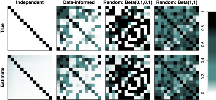
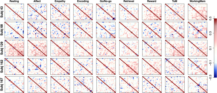
In this article, we propose a two-step pipeline to explore task-dependent functional coactivations of brain clusters with constraints from the structural connectivity network. In the first step, the pipeline employs a nonparametric Bayesian clustering method that can estimate the optimal number of clusters, cluster assignments of brain regions of interest (ROIs), and the strength of within- and between-cluster connections without any prior knowledge. In the second step, a factor analysis model is applied to functional data with factors defined as the obtained structural clusters and the factor structure informed by the structural network. The coactivations of ROIs and their clusters can be studied by correlations between factors, which can largely differ by ongoing cognitive task. We provide a simulation study to validate that the pipeline can recover the underlying structural and functional network. We also apply the proposed pipeline to empirical data to explore the structural network of ROIs obtained by the Gordon parcellation and study their functional coactivations across eight cognitive tasks and a resting-state condition.
Keywords: Chinese restaurant process; Diffusion tensor imaging; Factor analysis; Gordon parcellation; Structural and functional connectivity; fMRI.
Plain language summary
In this article, we propose a two-step pipeline to explore task-dependent functional coactivations of brain clusters with constraints imposed from structural connectivity networks. In the first step, the pipeline employs a nonparametric Bayesian clustering method that can estimate the optimal number of clusters, cluster assignments of brain regions of interest, and the strength of within- and between-cluster connections without any prior knowledge. In the second step, a factor analysis model is applied to functional data with factors defined as the obtained structural clusters and the factor structure informed by the structural network.
© 2022 Massachusetts Institute of Technology.
Conflict of interest statement
Competing Interests: The authors have declared that no competing interests exist.
Figures


References
-
- Aldous, D. J. (1985). Exchangeability and related topics. In Hennequin P. L. (Ed.), École d’été de probabilités de saint-flour xiii—1983 (pp. 1–198). Berlin: Springer. 10.1007/BFb0099421 - DOI
LinkOut - more resources
Full Text Sources