. 2024 May 29;15(1):4419.
doi: 10.1038/s41467-024-48239-8.

Remote sensing of emperor penguin abundance and breeding success

Affiliations

Remote sensing of emperor penguin abundance and breeding success

Alexander Winterl et al. Nat Commun. .

Abstract

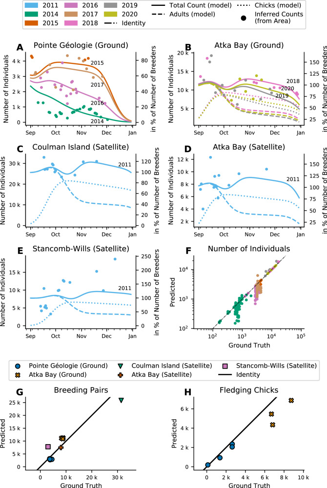
Emperor penguins (Aptenodytes forsteri) are under increasing environmental pressure. Monitoring colony size and population trends of this Antarctic seabird relies primarily on satellite imagery recorded near the end of the breeding season, when light conditions levels are sufficient to capture images, but colony occupancy is highly variable. To correct population estimates for this variability, we develop a phenological model that can predict the number of breeding pairs and fledging chicks, as well as key phenological events such as arrival, hatching and foraging times, from as few as six data points from a single season. The ability to extrapolate occupancy from sparse data makes the model particularly useful for monitoring remotely sensed animal colonies where ground-based population estimates are rare or unavailable.


Conflict of interest statement

The authors declare no competing interests.

Figures

Fig. 1
Fig. 1. Predicting colony density with the windchill model.
A Example of a ground based image recorded on 2017-08-22 04:00:00 UTC at Pointe Géologie. The manually-annotated outline of the colony is highlighted with a red polygon. B Projected top view of the image shown in (A). The number indicates the area covered by the colony. CF Correlation of measured colony density with the meteorological values: air temperature (C), windspeed (D), solar radiation (E), and humidity (F). The y-axis shows the colony density in penguins per square meter, the x-axes show the respective meteorological variables. Each dot represents one image. The black lines show the corresponding log-linear regression line. The slopes correspond to the model parameters. G Dependence of measured colony density on apparent temperature Ta. Each dot represents the data from one image and time point. The red line shows the model prediction (fit of the sigmoidal function (Eq. 2) to the data). H Surface area covered by the colony (in square meters) for Pointe Géologie between September 1 and December 31 in 2014 over time, estimated from ground-based images. The observed short-term variance (seen as vertical stacks in the data points) are due to daily variation in colony area, driven by environmental parameters. I Measured (blue crosses) and predicted (red dots) animal count over time. Predictions are based on the measured areas shown in (H) for Pointe Géologie between September 1 and December 31 in 2014 multiplied with the density as predicted by the windchill model. Error bars of the predicted values are standard deviations of multiple images per day (n = 285 images over 26 days). Source data are provided as a Source Data file.
Fig. 2
Fig. 2. Manual counts of the number of individuals.
Number of individuals at Pointe Géologie (A, B) and Atka Bay (C, D) colonies. Circles indicate counts of individual adults (A, C), crosses indicate counts of individual chicks (B, D). Colors denote different breeding seasons. Gray bars show the time range of key phenological events extracted from manual observations at Pointe Géologie (A, B). Note that the number of chicks increases between August and November as the chicks become thermally independent and therefore less visually obstructed. Source data are provided as a Source Data file.
Fig. 3
Fig. 3. Phenological model fit to manual counts.
Overlay of data and model output for all observed seasons at Pointe Géologie (10, AJ) and Atka Bay (3, KM) colonies. Individual panel titles indicate colony (PG Pointe Géologie, AB Atka Bay) and season. Y-axes show the number of individual adults (circles) and chicks (crosses). Solid and dashed lines show the mean model prediction for the adult and chick counts, respectively. The shaded areas indicate the ± sigma confidence interval of the model prediction. Colors indicate the season as in Figs. 2, 4 and 8. Source data are provided as a Source Data file.
Fig. 4
Fig. 4. Model estimates of key phenological parameters.
A, B Observed and predicted number of breeding pairs (blue), lost eggs (orange), dead chicks (red), and fledging chicks (green) by year and colony. For each year, the two left bars with a solid line show the observed numbers, and the two right bars show the predicted numbers. For each year, the outer bars show the number of breeding pairs, the inner bars show the breeding result splitted in three stacked sections: fledging chick (bottom), lost egg (middle), and dead chick (top). The predicted numbers of lost eggs, dead chicks, and fledging chicks add up to the number of breeding pairs by model definition, while the ground-truth values do not, due to counting inaccuracies. C Time of predicted phenological events vs observed phenological events. Each point corresponds to one season; the y-bars show the 1-sigma confidence interval around the mean value (n = 13200 MCMC-samples). Colors indicate the seasons. The black line shows the line of identity. Insets show the same data, zoomed in for better visibility, to show inter-annual variation. Gridlines indicate weeks. Note that systematic shifts between observed and estimated dates arise from the difference of first occurrence (manual observations) and central event date (model estimates). Source data are provided as a Source Data file.
Fig. 5
Fig. 5. Correlation between foraging pattern and breeding success.
The x-axis shows the total number of days spent at the colony (A) or at sea (B) during the crèching phase as predicted by the model, averaged for females and males. The y-axis shows the ratio of fledging chicks to breeding pairs (breeding success) from manual observations. Every dot (Pointe Géologie) and square (Atka Bay) denotes one season (color and labels show corresponding season). The black lines show the regression lines for each point cloud (Pointe Géologie and Atka Bay merged). We find a significant (P = 0.023) positive correlation between breeding success and time at colony, and a significant (P = 0.004) negative correlation between breeding success and time at sea. Both hypotheses are tested with a two-sided Wald test from n = 13 seasons and without multi-comparison correction. Source data are provided as a Source Data file.
Fig. 6
Fig. 6. Application to satellite data.
AE Fit of the phenological model to individual counts inferred from measured colony area and the windchill model predictions (dots). Lines show the phenological model predictions for adults (dashed), chicks (dotted), and total counts (solid). In (A), adult and chick counts are omitted for readability. Those data are provided in Supplementary Fig. 4. Colors and labels (total counts, solid lines) denote seasons. F Comparison of ground-truth counts and counts inferred from colony area and windchill model predictions for Pointe Géologie and Atka Bay over 7 seasons as denoted by colors. Note: Pointe Géologie data covers 2012–2017, Atka Bay 2018–2020, therefore colors are also colony specific. The back line shows line of identity. G, H Comparison of ground-truth and phenological model predictions for the number of breeding pairs (G) and fledging chicks (H). Ground-truth values for Pointe Géologie and Atka Bay (Ground) are from manual counts, all others are from ref. . Note that for satellite data, there is no ground-truth for the number of fledging chicks. Colors and marker shape denote season. Source data are provided as a Source Data file.
Fig. 7
Fig. 7. Illustration of the breeding cycle and the phenological model (based on data from 2012 at Pointe Géologie).
The model describes the number of individuals present at the colony as a result of phenological events that bring individuals to return or leave the colony site. This pattern of presence and absence is represented by colored bars (yellow: at the colony, blue: at sea) in each of the plots. The model assumes that the probability densities for individual animals of returning and leaving the colony are normally distributed. The mean and width of each of these distributions are model parameters. A Probability density distribution of all phenological events included in the model. Arrivals are indicated by positive values, departures by negative values. The width of the distributions indicates the distributions of individual arrival or departure times. The height corresponds to the number of individuals participating in the event. B Cumulative probabilities (computed by integrating the probability density distributions) indicate the number of individuals over time per event as a percentage of the total number of breeding pairs. Positive values indicate arrivals, negative values indicate departures. Note that the number of adults decreases over time due to loss of eggs or chicks. C Projected number of females present at the colony, computed as the sum of the cumulative probabilities in (B) multiplied by the total number of breeding pairs (dotted black line). Source data are provided as a Source Data file.
Fig. 8
Fig. 8. Individual trip durations during chick rearing phase.
Time (in days, mean ± 1 standard deviation) a breeding emperor penguin spends at sea (A) or at the colony (B) at different stages of the breeding cycle (data from). Red regression lines (A, B) show the decreasing trend in both time at sea and at the colony, after the initial brooding phase. Measurements were conducted at two colonies (Auster and Taylor Glacier). Standard deviations and mean values are derived from 9 (Auster, Female), 22 (Auster, Male), 26 (Auster, unspecified sex), 3 (Taylor, Female), and 8 (Taylor, Male) animals. C, D show the predicted time at sea and time at colony as predicted by the phenological model for 10 seasons (2012–2021) for Pointe Géologie and 3 seasons (2018–2020) for Atka Bay. Red, blue and gray dots denote the sex of the observed individuals (female/male/unknown). Gray lines indicate corresponding predictions for each season. Note that the model predicts large seasonal variations for the time at sea, but not for the time at colony. Source data are provided as a Source Data file.

References

    1. Barbraud C, Weimerskirch H. Emperor penguins and climate change. Nature. 2001;411:183–186. doi: 10.1038/35075554. - DOI - PubMed
    1. Forcada, J. & Trathan, P. N. Penguin responses to climate change in the southern ocean. Glob. Change Biol. 15, 1618–1630 (2009).
    1. Jenouvrier S, et al. The Paris Agreement objectives will likely halt future declines of emperor penguins. Glob. Change Biol. 2019;26:1170–1184. doi: 10.1111/gcb.14864. - DOI - PubMed
    1. Jenouvrier S, et al. Projected continent-wide declines of the emperor penguin under climate change. Nat. Clim. Change. 2014;4:715–718. doi: 10.1038/nclimate2280. - DOI
    1. Fretwell PT, Trathan PN. Discovery of new colonies by sentinel2 reveals good and bad news for emperor penguins. Remote Sens. Ecol. Conserv. 2020;7:139–153.