. 2024 Jun 5;14(1):12882.
doi: 10.1038/s41598-024-63586-8.

Longitudinal soluble marker profiles reveal strong association between cytokine storms resulting from macrophage activation and disease severity in COVID-19 disease

Collaborators, Affiliations

Longitudinal soluble marker profiles reveal strong association between cytokine storms resulting from macrophage activation and disease severity in COVID-19 disease

Krista E van Meijgaarden et al. Sci Rep. .

Abstract

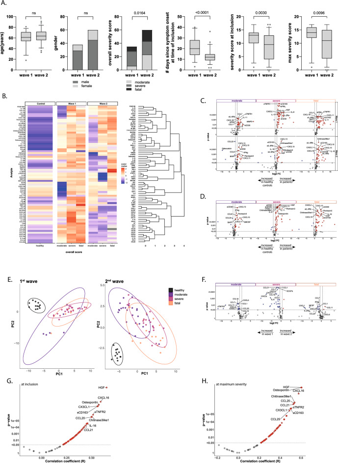
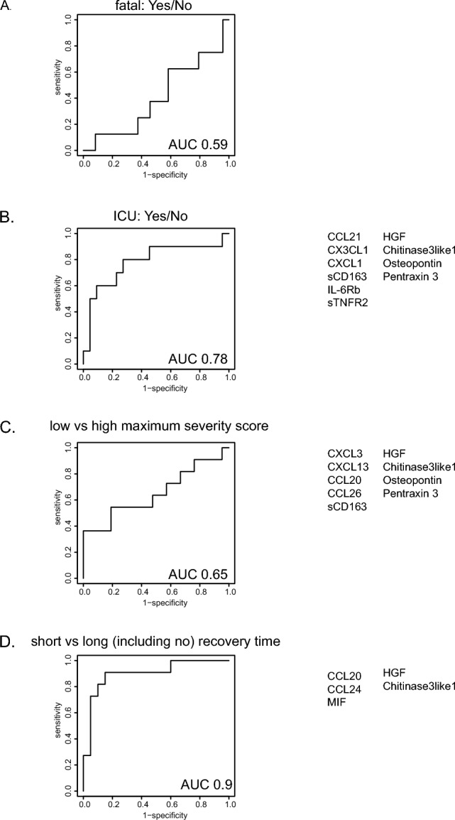
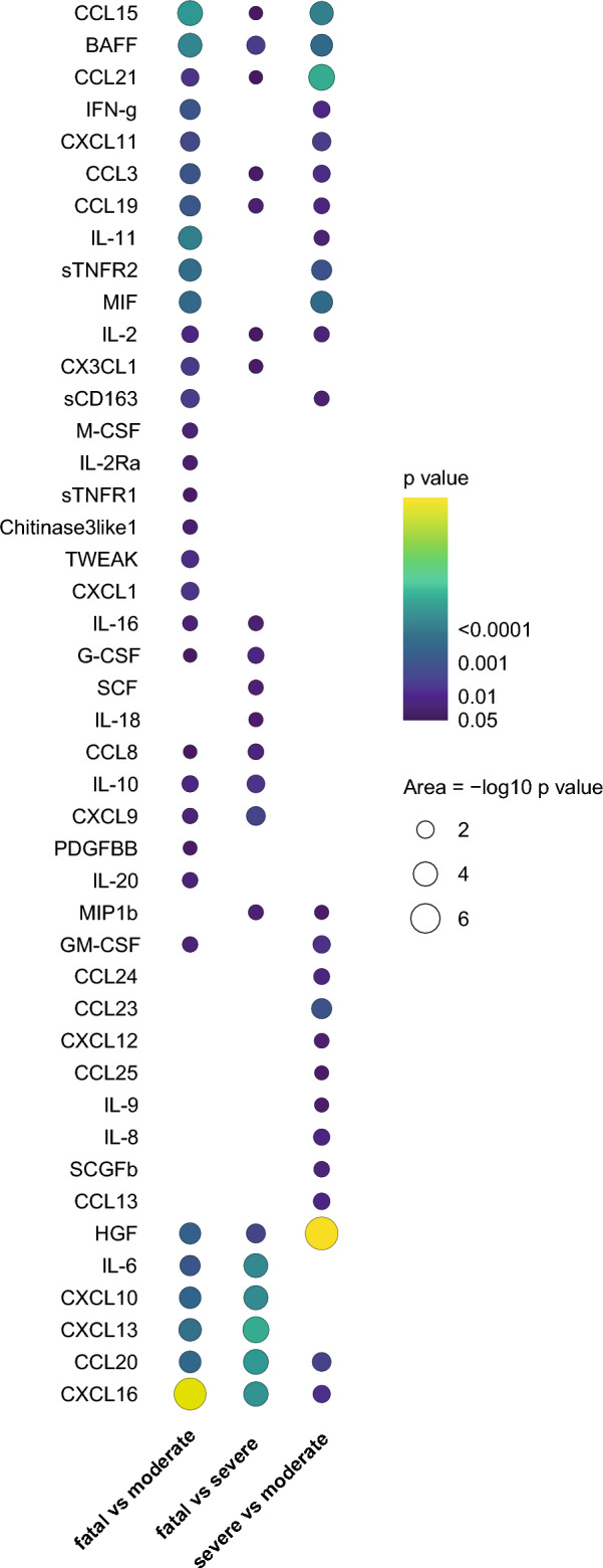
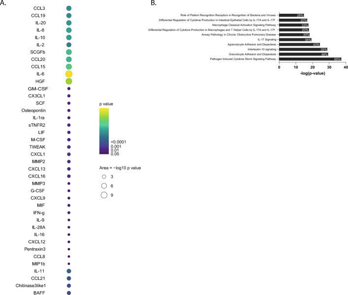
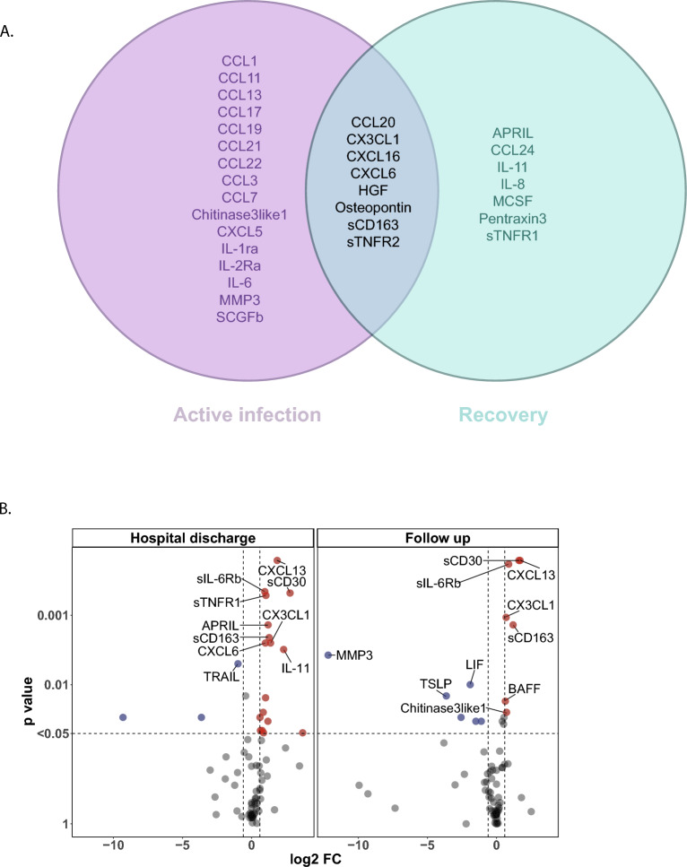
SARS-CoV2 infection results in a range of disease severities, but the underlying differential pathogenesis is still not completely understood. At presentation it remains difficult to estimate and predict severity, in particular, identify individuals at greatest risk of progression towards the most severe disease-states. Here we used advanced models with circulating serum analytes as variables in combination with daily assessment of disease severity using the SCODA-score, not only at single time points but also during the course of disease, to correlate analyte levels and disease severity. We identified a remarkably strong pro-inflammatory cytokine/chemokine profile with high levels for sCD163, CCL20, HGF, CHintinase3like1 and Pentraxin3 in serum which correlated with COVID-19 disease severity and overall outcome. Although precise analyte levels differed, resulting biomarker profiles were highly similar at early and late disease stages, and even during convalescence similar biomarkers were elevated and further included CXCL3, CXCL6 and Osteopontin. Taken together, strong pro-inflammatory marker profiles were identified in patients with COVID-19 disease which correlated with overall outcome and disease severity.


Conflict of interest statement

The authors declare no competing interests.

Figures

Figure 1
Figure 1
Serum analytes at hospital admission differ over outcome groups. A Descriptive characteristics of BEAT-COVID participants, 95 patients (and 12 healthy controls). Sample collection in 2 waves (1: April–August 2020; 2: August 2020–March 2021), participant characteristics are plotted for age, gender, outcome (moderate (hospital admission, no ICU), severe (ICU admission during hospitalisation) and fatal (patient deceased as result of SARS-CoV2 infection)), days since symptom onset at first time point of sample collection (= inclusion) and SCODA-severity-scores at first and maximal time points. Box and whiskers summarize the median (thick line), 25–75% percentiles (box) and 5–95% percentiles (whiskers), outliers are shown. Significant differences between groups were identified using Mann–Whitney-U-tests and for gender and overall severity score by Chi-square testing. B Heatmap of relative levels (medians) of all circulating analytes, data collected in pg/ml, + 1log2-transformed and row-scaled. Data are separated for wave-1 and 2, and outcome groups in separate columns. Complete-linkage Euclidian hierarchical clustering was performed with resulting dendograms. C Volcano plots of differences in analyte levels for moderate, severe and fatal outcome groups relative to the healthy control group, for wave-1 (top) and wave-2 (bottom). Difference was calculated using Mann–Whitney-U-test, with Benjamini-Hochberg (FDR), significant markers in red and blue. The top 10 markers were named. D Volcano plot of differences in combined data collected in wave-1 and 2. Analysis and plotting same as 1C. E PLS-DA analysis of healthy controls and 3 outcome groups (moderate, severe and fatal) for wave-1 (left) and wave-2 (right). F Volcano plots of differences in analyte levels for moderate, severe and fatal outcome groups in wave-1 vs wave-2. Analysis and plotting same as 1C, G Correlation analysis (Spearman) of analyte levels and disease severity at the first available time point for each patient with P-values on the y-axis against the correlation-coefficient on the x-axis. Significant analytes (P < 0.05, correlation-coefficient > 0.2) in red and top 10 markers named. Severity-scores were calculated on daily basis, per individual patient the time point with the highest daily severity-score was selected (if multiple days with a similar high score the first day was taken) and correlation analysis (Spearman) and plotting was performed as in 1G.
Figure 2
Figure 2
Prediction of disease course at time of study inclusion. ROC curves showing the predictive power of the analyte signatures identified to predict fatal outcome (A), ICU admission (B), severity-score (C) and disease duration (D), using logistic regression with lasso regularisation and LOOCV and train (70%)-test (30%) split to assess performance. For severity-scores the cut-off was set at a value of 8 and for disease duration day 21 was used. ROC curves were generated separately for all data of both waves combined to reach sufficient power. Individuals included in generation of the predictive algorithms varied. Fatal outcome yes (n = 8) vs no (n = 24), ICU yes (n = 22) vs no (n = 10), low (n = 11) vs high (n = 21) maximal severity-score, short (n = 11) vs long (n = 20) recovery time. AUC are included in each of the ROC curves and markers included in the signatures are described next to the ROC curves for all predictions with an AUC > 0.6.
Figure 3
Figure 3
Longitudinal trajectories differ between disease outcome groups. Longitudinal modelling linear mixed effects models were applied on plus one log2-transformed values of each soluble analyte separately. For each analyte the association between circulating levels and outcome categories (moderate, severe, fatal) was tested to identify different mean progressions during follow-up. Pairwise comparisons were made between moderate and severe, severe and fatal and moderate and fatal outcome groups. P-values are plotted when significant per analyte in each comparison, with dot size and colouring reflecting P-value.
Figure 4
Figure 4
Correlation of analyte levels with disease severity. A Longitudinal modelling linear mixed effects models were applied on plus one log2-transformed values of each soluble analyte separately. For each analyte the association between circulating levels and daily SCODA severity-score was tested over time to identify different mean progressions during follow up. P-values are plotted when significant per analyte, with dot size and colouring reflecting P-value. B Pathway analysis was performed in the Ingenuity platform on all analytes with a significant association between severity-scores and analyte levels longitudinally (from A) and pathways were identified that contained these analytes. The top 10 canonical pathways, based on P-values, are listed. In each bar the percentage indicates the proportion of the 40 analytes that correlated significantly and was associated with this pathway, thus 26 of 40 (= 65%) analytes are part of the ‘pathogen induced cytokine storm signaling pathway’.
Figure 5
Figure 5
Different markers associate with disease progression and recovery. A Patients were hospitalized with progressing disease, however before hospital discharge recovery was initiated. The SCODA daily severity-score allowed to dissect between progressing/ongoing disease (increasing or stable daily severity-scores) and recovery (decreasing daily severity-scores). The time point of recovery was defined as a daily severity-score of ≤ 7, with no subsequent increases. Correlation analysis (Spearman, P < 0.05) was performed on analyte levels and daily severity-scores on all time points collected before recovery (progressing/active disease) and compared to analytes correlating at all time points post recovery, but still during hospital admission. Before recovery 57 samples were analysed, after recovery 34 samples were analysed. Data are displayed as Venn diagrams with analytes uniquely correlation in active infection, analytes overlapping between active infection and recovery, and analytes uniquely correlating with severity during recovery. B Samples collected at hospital discharge as well as samples collected on an out-patient follow-up time (6–12 weeks post discharge) were compared to healthy controls. Volcano plots of differences in analyte levels for discharge and follow-up relative to the healthy control group. − log10-transformed P-values are plotted on the y-axis against log2 FC on the x-axis, analytes with P < 0.05 and log2 FC < − 0.6 or > 0.6 were labelled as significant (red and blue dots). Difference was calculated using Mann–Whitney U, with Benjamini–Hochberg as FDR method. The top 10 analytes were named.

References

    1. Del Valle DM, Kim-Schulze S, Huang HH, et al. An inflammatory cytokine signature predicts COVID-19 severity and survival. Nat. Med. 2020;26:1636–1643. doi: 10.1038/s41591-020-1051-9. - DOI - PMC - PubMed
    1. Bauer, W., Weber, M., Diehl-Wiesenecker, E. et al. Plasma proteome fingerprints reveal distinctiveness and clinical outcome of SARS-CoV-2 infection. Viruses13 (2021) - PMC - PubMed
    1. Palma Medina LM, Babačić H, Dzidic M, et al. Targeted plasma proteomics reveals signatures discriminating COVID-19 from sepsis with pneumonia. Respir. Res. 2023;24:62. doi: 10.1186/s12931-023-02364-y. - DOI - PMC - PubMed
    1. Filbin MR, Mehta A, Schneider AM, et al. Longitudinal proteomic analysis of severe COVID-19 reveals survival-associated signatures, tissue-specific cell death, and cell-cell interactions. Cell Rep. Med. 2021;2:100287. doi: 10.1016/j.xcrm.2021.100287. - DOI - PMC - PubMed
    1. Perreau M, Suffiotti M, Marques-Vidal P, et al. The cytokines HGF and CXCL13 predict the severity and the mortality in COVID-19 patients. Nat. Commun. 2021;12:4888. doi: 10.1038/s41467-021-25191-5. - DOI - PMC - PubMed