. 2024 Jun 10;14(1):13345.
doi: 10.1038/s41598-024-63365-5.

Multi-cohort analysis reveals immune subtypes and predictive biomarkers in tuberculosis

Affiliations

Multi-cohort analysis reveals immune subtypes and predictive biomarkers in tuberculosis

Ling Li et al. Sci Rep. .

Abstract

Tuberculosis (TB) remains a significant global health threat, necessitating effective strategies for diagnosis, prognosis, and treatment. This study employs a multi-cohort analysis approach to unravel the immune microenvironment of TB and delineate distinct subtypes within pulmonary TB (PTB) patients. Leveraging functional gene expression signatures (Fges), we identified three PTB subtypes (C1, C2, and C3) characterized by differential immune-inflammatory activity. These subtypes exhibited unique molecular features, functional disparities, and cell infiltration patterns, suggesting varying disease trajectories and treatment responses. A neural network model was developed to predict PTB progression based on a set of biomarker genes, achieving promising accuracy. Notably, despite both genders being affected by PTB, females exhibited a relatively higher risk of deterioration. Additionally, single-cell analysis provided insights into enhanced major histocompatibility complex (MHC) signaling in the rapid clearance of early pathogens in the C3 subgroup. This comprehensive approach offers valuable insights into PTB pathogenesis, facilitating personalized treatment strategies and precision medicine interventions.

Keywords: Immune microenvironment; Neural network model; PTB; Single-cell; Subtypes; Tuberculosis.


Conflict of interest statement

The authors declare no competing interests.

Figures
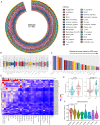
Figure 1
Figure 1
Exploring enrichment scores of Fges-related gene sets in tuberculosis cohorts. (A) Circular plot illustrating the distribution of enrichment scores (ESs) for 29 Fges-related gene sets in the GSE94438 TB cohort (n = 498). Each bar represents an individual sample, and the color code indicates varying ESs of gene sets. (B) Boxplot presenting the scaled distribution of ESs for the 29 Fges-related gene sets (referred to as Fges). The median value is depicted by the black line within the box, while outliers are indicated by black points outside the box. (C) Bar plot displaying the Jessen-Shannon divergence (JSD) scores for the Fges, arranged in descending order from left to right. (D) Heatmap depicting the ESs of the Fges across 34 TB cohorts. The annotation bar plot shows the JSD scores of the Fges. Rows in the heatmap are clustered using hierarchical clustering. (E) Violin plots illustrating the distribution of cytokine scores between different groups: normal controls vs. TB patients (left) and TB patients with negative vs. positive progression (right), with p-values obtained through t-tests. (F) Violin plot presenting the distribution of cytokine scores along the progression time of PTB exposure, from baseline to exposure greater than 1 year. P-value was obtained through t-test.
Figure 2
Figure 2
Fges enrichment scores reveal three subgroups within the PTB cohorts. (A) Hierarchical clustering heatmap illustrating clusters formed based on the ES of 29 Fges across 34 TB cohorts. (B) Stacked bar plot depicting the percentage distribution of three clusters within each TB cohort, with clusters identified by color codes. (C) Scatter plot displaying the distribution of PTB samples using principal component analysis. Each dot represents an individual sample, and clusters are differentiated by color codes. (D) Violin combined with box plot showcasing the signature score of cytokine gene sets across different PTB subgroups. (E) Line graph with scatter plot illustrating the percentage of samples in each time period from PTB exposure to greater than months, with clusters distinguished by color. (F) Venn diagram demonstrating the gene overlap among the three PTB subgroups. (G) Heatmap revealing the expression of selected over-expressed genes in PTB patients. The column annotation bar indicates the cluster to which each sample belongs. (H) Violin plot illustrating the expression of cytokine-related genes within the three PTB subgroups. (I) Bubble plot displaying enriched gene ontologies among the three PTB subgroups. Color change indicates the significance of enrichment, and the size of the points represents the number of genes in each GO term. (J) Bubble plot depicting enriched KEGG pathways among the three PTB subgroups. Color variation signifies the significance of enrichment, and the size of the points indicates the number of genes in each KEGG pathway.
Figure 3
Figure 3
Distribution of cell infiltration and expression patterns of gene sets related to PTB progression across Fges-derived subgroups. (A) Boxplot illustrating the distribution of cell infiltration estimated by the xCell tool across PTB subgroups. Not significant (ns): p > 0.05; *p < 0.01; **p < 0.001; ***p < 0.0001; ****p < 0.00001. P-values were obtained through t-test. (B) Boxplot displaying the infiltration of 22 immune cell types in PTB subgroups, as estimated by CIBERSORT. Not significant (ns): p > 0.05; *p < 0.01; **p < 0.001; ***p < 0.0001; ****p < 0.00001. P-values were obtained through t-test. (C) Bubble plot depicting the expression of Type I IFN and IFN-gamma pathway-related genes among PTB subgroups. The size of each point represents the percentage of samples expressing that gene, while the color reflects the variation in gene expression among the subgroups. (D) Bubble plot illustrating the expression of genes related to the positive regulation of hemopoiesis among PTB subgroups. The size of each point indicates the percentage of samples expressing that gene, and the color denotes the variation in gene expression across clusters. (E) Bubble plot demonstrating the expression of genes related to the response to reactive oxygen species and oxidative stress among PTB subgroups. The size of each point corresponds to the percentage of samples expressing that gene, while the color represents the variation in gene expression across clusters. (F) Bubble plot displaying the expression of Toll-like receptor and chemokine pathway-related genes among PTB subgroups. The size of each point indicates the percentage of samples expressing that gene, and the color signifies the variation in gene expression among the subgroups.
Figure 4
Figure 4
Predicted scores inferred by neural network-based model for PTB patients. (A) Schematic of the neural network used to assess the risk of PTB patients, comprising an input layer, two hidden layers, and one output layer (details in “Materials and methods”). (B) Distribution plot displaying the predicted scores generated by the neural network model. Each point represents an individual PTB patient, with scores ranging from − 1 to 1. (C) Violin plot combined with box plot illustrating the predicted scores at various time intervals relative to PTB exposure. The median value of predicted scores is denoted by the black line within the box. The baseline denotes the time of PTB exposure. (D) Distribution of predicted scores across different statuses of PTB patients. (E) Comparison of predicted score distributions between male and female PTB patients. P-values were obtained via Wilcoxon test. (F) Scatter plot depicting the relationship between predicted scores and ages of PTB patients. Each point represents one patient, with the blue line indicating the curve of association between age and predicted score. Pearson correlation coefficient (R) and associated p-values were calculated using a t-test. (G) Loss and accuracy metrics across epochs for training and validation sets in constructing the neural network-based model. Blue lines represent training data, while red lines represent validation data.
Figure 5
Figure 5
Utilizing single-cell investigation to unravel the intrinsic mechanisms underlying the three subgroups of PTB patients. (A) Uniform manifold approximation and projection (UMAP) visualization depicting the single-cell atlas of lung tissue from patients with fibrotic pulmonary tuberculosis. Different colors represent annotated cell types, with annotation information derived from corresponding literature reports; points represent individual cells. (B) Bubble plots display the average expression and positive expression proportion of the top five signature genes expressed in each cell type. Point color indicates expression level, and point size represents the percentage of expression of the gene in a specific cell type. (C) UMAP visualization displays the distribution of cell types in three different subtypes of PTB predicted by a neural network model. (D) Violin plots show the distribution of Cytokine signaling signature scores inferred from single-cell samples in different subgroups. (E) Box plots display the distribution of different cell types across the three predicted subtypes of PTB in single-cell samples; the black line within the box represents the median cell proportion, and points outside the box represent outlier samples. (F) Network diagrams illustrate the interactions between different cell types; the thickness of the lines indicates the strength of interaction between cell types. Red indicates enhancement of C3 relative to C1 & 2, while blue indicates weaker interaction. (G) Bubble plots demonstrate significant ligand-receptor interactions between Macrophages and B cells, T Cells, Monocytes, and cDCs. Points represent significant ligand-receptor interactions, with point color indicating the significance level of the interaction. (H) Violin plots depict the signature score of MHC molecules among three distinct subgroups of PTB.

Similar articles

References

    1. Mo, Y. et al. Bioinformatics analysis of new diagnostic and treatment biotargets in pulmonary tuberculosis.
    1. Maertzdorf J, Repsilber D, Parida SK, Stanley K, Roberts T, Black G, Walzl G, Kaufmann SH. Human gene expression profiles of susceptibility and resistance in tuberculosis. Genes Immun. 2011;12(1):15–22. doi: 10.1038/gene.2010.51. - DOI - PubMed
    1. Berry MP, Graham CM, McNab FW, Xu Z, Bloch SA, Oni T, Wilkinson KA, Banchereau R, Skinner J, Wilkinson RJ. An interferon-inducible neutrophil-driven blood transcriptional signature in human tuberculosis. Nature. 2010;466(7309):973–977. doi: 10.1038/nature09247. - DOI - PMC - PubMed
    1. Anderson ST, Kaforou M, Brent AJ, Wright VJ, Banwell CM, Chagaluka G, Crampin AC, Dockrell HM, French N, Hamilton MS. Diagnosis of childhood tuberculosis and host RNA expression in Africa. N. Engl. J. Med. 2014;370(18):1712–1723. doi: 10.1056/NEJMoa1303657. - DOI - PMC - PubMed
    1. Shaukat SN, Eugenin E, Nasir F, Khanani R, Kazmi SU. Identification of immune biomarkers in recent active pulmonary tuberculosis. Sci. Rep. 2023;13(1):11481. doi: 10.1038/s41598-023-38372-7. - DOI - PMC - PubMed