. 2025 Apr;43(4):581-592.
doi: 10.1038/s41587-024-02250-y. Epub 2024 Jun 11.

Crowd-sourced benchmarking of single-sample tumor subclonal reconstruction

Collaborators, Affiliations

Crowd-sourced benchmarking of single-sample tumor subclonal reconstruction

Adriana Salcedo et al. Nat Biotechnol. 2025 Apr.

Abstract

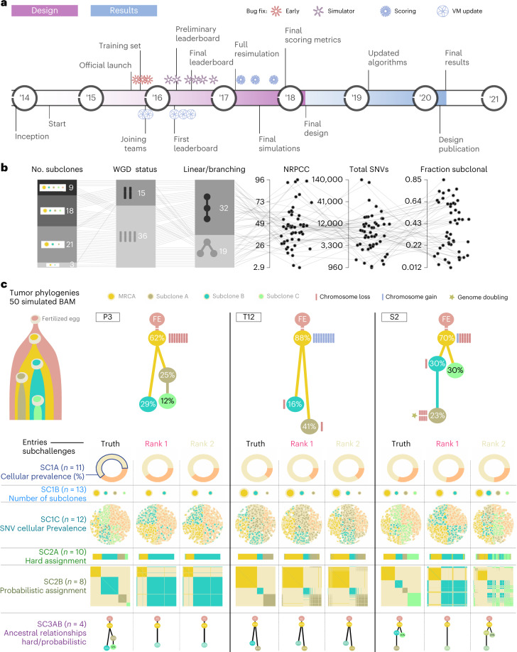
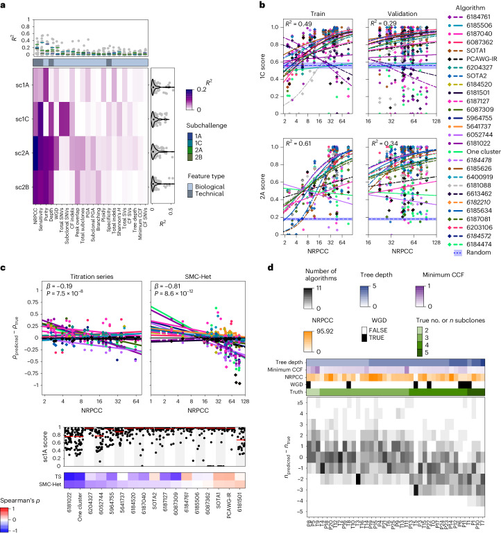
Subclonal reconstruction algorithms use bulk DNA sequencing data to quantify parameters of tumor evolution, allowing an assessment of how cancers initiate, progress and respond to selective pressures. We launched the ICGC-TCGA (International Cancer Genome Consortium-The Cancer Genome Atlas) DREAM Somatic Mutation Calling Tumor Heterogeneity and Evolution Challenge to benchmark existing subclonal reconstruction algorithms. This 7-year community effort used cloud computing to benchmark 31 subclonal reconstruction algorithms on 51 simulated tumors. Algorithms were scored on seven independent tasks, leading to 12,061 total runs. Algorithm choice influenced performance substantially more than tumor features but purity-adjusted read depth, copy-number state and read mappability were associated with the performance of most algorithms on most tasks. No single algorithm was a top performer for all seven tasks and existing ensemble strategies were unable to outperform the best individual methods, highlighting a key research need. All containerized methods, evaluation code and datasets are available to support further assessment of the determinants of subclonal reconstruction accuracy and development of improved methods to understand tumor evolution.


Conflict of interest statement

Competing interests: I.L. is a consultant for PACT Pharma, Inc. and is an equity holder, board member and consultant for ennov1, LLC. P.C.B. sits on the scientific advisory boards of BioSymetrics, Inc. and Intersect Diagnostics, Inc. and previously sat on that of Sage Bionetworks. A.S. is a shareholder of Illumina, Inc.

Figures

Fig. 1
Fig. 1. Design of the challenge.
a, Timeline of the SMC-Het DREAM Challenge. The design phase started in 2014 with final reporting in 2021. VM, virtual machine. b, Simulation parameter distributions across the 51 tumors. From left to right: number of subclones, whole-genome doubling status, linear versus branching topologies, NRPCC, total number of SNVs and fraction of subclonal SNVs. c, Examples of tree topologies for three simulated tumors (P3, T12 and S2). For each simulated tumor, its tree topology is shown on top of the truth (column 1) and two example methods predictions (columns 2 and 3) for each subchallenge (rows). MRCA, most recent common ancestor.
Fig. 2
Fig. 2. Overview of algorithm performance.
a, Ranking of algorithms on each subchallenge based on median score. The size and color of each dot shows the algorithm rank on a given subchallenge, while the background color reflects its median score. The winning submissions are highlighted in red, italic text. b, Algorithm score correlations on sc1C and sc2A with select algorithm features. The top-performing algorithm for each subchallenge is shown in italic text. c,d, Algorithm scores on each tumor for sc1C (n = 805) {tumor, algorithm} (c) and sc2A (n = 731 {tumor, algorithm} (d) scores. Bottom panels show the algorithm scores for each tumor with select tumor covariates shown above The distribution of relative ranks for each algorithm across tumors is shown in the left panel. Boxes extend from the 0.25 to the 0.75 quartile of the data range, with a line showing the median. Whiskers extend to the furthest data point within 1.5 times the interquartile range. Top panels show scores for each tumor across algorithms, with the median highlighted in red. Tumors are sorted by difficulty from highest (left) to lowest (right), estimated as the median score across all algorithms.
Fig. 3
Fig. 3. Tumor features influence subclonal reconstruction performance and biases.
a, Score variance explained by univariate regressions for the top five algorithms in each subchallenge. The heatmap shows the R2 values for univariate regressions for features (x axis) on subchallenge score (y axis) when considering only the top five algorithms. The right and upper panels show the marginal R2 distributions generated when running the univariate models separately on each algorithm, grouped by subchallenge (right) and feature (upper). Lines show the median R2 for each feature across the marginal models for each subchallenge. b, Models for NRPCC on sc1C and sc2A scores when controlling for algorithm ID. The left column shows the model fit in the training set composed of titration-series tumors (sampled at five depths each) and five additional tumors (n = 10 individual tumors). The right column shows the fit in the test set (n = 30 tumors, comprising the remaining SMC-Het tumors after removing the edge cases). Blue dotted lines with a shaded region show the mean and 95% confidence interval based on scoring ten random algorithm outputs on the corresponding tumor set. The top-performing algorithm for each subchallenge is shown in italic text. c, Effect of NRPCC on purity error. The top panels show the purity error with NRPCC accounting for algorithm ID with fitted regression lines. The sc1A scores across tumors for each algorithm are shown in the panel below. The bottom heatmap shows Spearman’s ρ between purity error and NRPCC for each algorithm. The winning entry is shown in bold text. Two-sided P values from linear models testing the effect of NRPCC on sc1A error (with algorithm ID) are shown. TS, titration series. d, Error in subclone number estimation by tumor. The bottom panel shows the subclone number estimation error (y axis) for each tumor (x axis) with the number of algorithms that output a given error for a given tumor. Tumor features are shown above. See Methods for detailed descriptions of each of these.
Fig. 4
Fig. 4. Impacts of genomic features on SNV subclonality predictions.
a, Schematic showing how outputs from sc1C and sc2A were used to annotate SNV CP for each entry. FN, false negative; FP, false positive; TN, true negative; TP, true positive. b, Mean clonal SNV detection sensitivity and specificity for each algorithm with standard errors (n = 727 {tumor, algorithm} predictions). c, Clonal SNV detection F scores for each entry on each tumor. d, Top, clonal accuracy for each algorithm, CNA category and tumor tuple (n = 5,392); bottom, SNV CP estimation error for each algorithm (n = 4,868,460 {algorithm, SNV CP} predictions). Boxes extend from the 0.25 to the 0.75 quartile of the data range, with a line showing the median. Whiskers extend to the furthest data point within 1.5 times the interquartile range. e, Effect size and false discovery rate-adjusted two-sided P values from entry-specific linear regression models for SNV CP error by CNA type and SNV clonality with median sc1C and sc2A scores. Top performing entries are shown in italic text. f, SNV CP error grouped by subclone for a corner-case tumor simulated at two depths (n = 395,364 {algorithm, tumor, SNV} prediction errors). Boxes extend from the 0.25 to the 0.75 quartile of the data range, with a line showing the median. Whiskers extend to the furthest data point within 1.5 times the interquartile range. g, Correlation between BAM features and Battenberg output features with SNV CP error for each entry. Only features that had an absolute correlation > 0.1 are shown. Battenberg features are noted with a star and top-performing algorithms are highlighted in italic text.
Fig. 5
Fig. 5. Performance across multiple algorithms and subchallenges.
a, Projections of the algorithms and subchallenge axes in the principal components of the score space. A decision axis is also projected and corresponds to the axis of best scores across all subchallenges and tumors, when these are given equal weights. The five best methods according to this axis are projected onto it. A decision ‘brane’ in blue shows the density of decision axis coordinates after adding random fluctuations to the weights. b, Rank distribution of each method from 40,000 sets of independent random uniform weights given to each tumor and subchallenge in the overall score. From left to right: sc1B + sc1C; sc1B + sc1C + sc2A; sc1B + sc1C + sc2A + sc2B. Names of the algorithms have a star if they were ranked first at least once. c, Four subchallenges for each of which one ensemble approach could be used (sc1A, median; sc1B, floor of the median; sc1C, WeMe; sc2A, CICC; Methods); the median and the first and second tertiles (error bars) of the median scores are shown across tumors of independent ensembles based on different combinations of n methods (n is varied on the x axis). The dashed line represents the best individual score. d, Color-coded hexbin densities of median ensemble versus median individual scores across all combinations of input methods. The identity line is shown to delimit the area of improvement. e, Same as d for maximum individual scores instead of median scores.
Extended Data Fig. 1
Extended Data Fig. 1. Design and scoring of special case tumours.
a) Designs of special case tumours (top row) and their scores across SubChallenges. Each point in the strip plots represents an entry score and the red line shows the median (N=1160 {tumour, algorithm, SubChallenge} scores. b) Heatmap of scores for sc1C and sc2A for each entry on the corner case tumours. Tumour T5 is considered as the baseline. Top performing methods are shown in bold, italic text.
Extended Data Fig. 2
Extended Data Fig. 2. Effects of algorithm version updates.
Updated (y-axis) and original (x-axis) for five algorithms on the SMC-Het tumours. Point colour reflects the difference in the algorithm’s relative rank (r. rank) for that tumour.
Extended Data Fig. 3
Extended Data Fig. 3. Overview of SubChallenge scores.
a-e) Correlation in scores among algorithms. Each row and column is an entry for a specific SubChallenge, with colour reflecting Spearman’s ρ between entries across the main 40 SMC-Het tumours (excluding the corner cases and two tumours with > 100k SNVs where only five algorithms generated outputs), or the subset both algorithms successfully executed upon. Algorithms are clustered by correlation. Columns are sorted left-to-right in the same order that rows are top-to-bottom, thus values along the principal diagonal are all one. Top performing algorithms are shown in bold, italic text. f) Correlation in scores among SubChallenges g-k) Scores for each tumour for SubChallenge 1A including Battenberg purity estimates as a reference (N=719 {tumour, algorithm} scores. g) sc1B (N=895 {tumour, algorithm} scores. h) sc2B (N=471 {tumour, algorithm} scores. i) sc3A (N=218 {tumour, algorithm} scores. j) and sc3B (N=234 {tumour, algorithm} scores. k) on the SMC-Het tumours. The top performing algorithm for each SubChallenge is shown in bold text and the winning submission is shown in italic. Bottom panels show algorithm scores for each tumour with select tumour covariates shown above. The distribution of relative ranks for each algorithm across tumours is shown in the left panel. Boxes extend from the 0.25 to the 0.75 quartile of the data range with a line showing the median. Whiskers extend to the furthest data point within 1.5 times the interquartile range. Top panels show scores for each tumour across algorithms with the median highlighted in red.
Extended Data Fig. 4
Extended Data Fig. 4. Rank generalizability assessment.
To evaluate generalizability of ranks and differences amongst algorithms, bootstrap 95% confidence intervals were generated for median scores (left column) and ranks (right column) based on 1000 resamples. The observed median and rank and error bars representing 95% bootstrap confidence intervals are shown. The top ranking algorithms are marked with a star for each SubChallenge and highlighted in bold on the x-axis. Winning submissions are highlighted in red. For any entry with confidence intervals overlapping those of the top ranking algorithm, one-sided bootstrap P-values comparing the rank of that algorithm to the top ranking algorithm are shown: P(rankentry ≤ rankbest). P-values for equivalent top performers (P>0.1) are highlighted in red. Algorithms are sorted by the median of their relative rank (rank/maximum rank) on each SubChallenges and top performing algorithms are highlighted in bold. Battenberg is included as a reference for sc1A.
Extended Data Fig. 5
Extended Data Fig. 5. Tumour feature score associations.
a) Correlations among tumour features and their distributions (boxplot, top). Boxes extend from the 0.25 to the 0.75 quartile of the data range with a line showing the median. Whiskers extend to the furthest data point within 1.5 times the interquartile range. N=42 tumours. NRPCC is number of reads per chromosome copy; CCF is cancer cell fraction; CF is clonal fraction (proportion of mutations in the clonal node); PGA is percent of the genome with a copy number aberration after correcting for ploidy. See Methods for detailed descriptions of each. b,c) Score variance explained by univariate generalized linear models (β-regressions with a logit link) for scores generated with tumour (b) and algorithm (c) features. Models were fit on scores from all algorithms ranking above the one cluster solution on a given SubChallenge. Heatmap shows R2 for univariate GLMs for features (x-axis) on SubChallenge score (y-axis) on the full dataset, gray indicates missing values where models could not be run. The right and upper panels show the marginal R2 distributions generated when running the univariate models separately on each algorithm and tumour (for tumour and algorithm features, respectively). Tumour and algorithm ID were not included in the marginal models as the number of levels would be equivalent to the number of observations in the data subset. Lines show the median R2 for each feature across the marginal models for each SubChallenge. d) Distribution of algorithm features. e) Results of generalized linear models for tumour features on scores (β regression with a logit link) that controlled for algorithm-ID. The size of the dots shows the effect size and the background colour shows the two-sided GLM Wald test P-value after FDR adjustment. Effect size interpretation is similar to that of a logistic regression, representing a one unit change in the log ratio of the score relative to its distance from a perfect score (that is βx=log(score/(1-score)). The bottom panel shows the results of modes fit on the full dataset. The top panel shows the same bi-variate models were fit on scores from the top five algorithms.
Extended Data Fig. 6
Extended Data Fig. 6. Mutational feature error associations.
a) Error in subclone number estimation for each algorithm on each tumour (center). Top panel plot shows NRPCC for each tumour. Right panel shows subclone number estimation error correlations with NRPCC. The top performing algorithm for SubChallenge sc1B is shown in bold italic text. b) Coefficient from penalized regression models for tumour features on purity estimation error (x-axis) and subclone number estimation error (y-axis).
Extended Data Fig. 7
Extended Data Fig. 7. Battenberg CNA assessment.
a) Battenberg errors for clonal and subclonal CNAs. The proportion of CNAs with correctly or incorrectly inferred clonality and copy number is shown in the heatmap. The total number of each type of CNA is indicated by the bar plot on the right. b) Battenberg accuracy in the titration series tumours. c) Effect sizes from a L1-regularized logistic regression for genomic features on Battenberg accuracy. d) Clonal accuracy for each entry and tumour combination (top) and SNV CP estimation error (bottom) for each entry shown as effect-sizes from an L1-regularlized logistic regression. Boxes extend from the 0.25 to the 0.75 quartile of the data range with a line showing the median. Whiskers extend to the furthest data point within 1.5 times the interquartile range.
Extended Data Fig. 8
Extended Data Fig. 8. Effects of neutral tail simulation.
a) Branching-process-based simulations adapted from Tarabichi et al. Nature Genetics 2018. The number of mutations at each cell division in the descendants of the most recent common ancestor is drawn from a Poisson distribution. We use a baseline of five mutations per cell division and vary the mutation rate in the subclones leading to neutral mutation tail size variation among subclones. We grow four tumours in silico with underlying phylogenies corresponding to T2, T3, T4, and T6 and track all neutral tail mutations. We simulate mutation calls in VCF format at increasing sequencing depths. b) Ranks of algorithms run on titration series tumours with and without the neutral tail at 25 neutral mutations per cell division. Ranks are based on the median normalized score across T2, T3, T4 and T6 and across depths (8x, 16x, 32x, 64x, 128x). c) Mean absolute difference in scores before and after the addition of tail mutations for each algorithm at 25 neutral mutations per cell division across tumours and depths.
Extended Data Fig. 9
Extended Data Fig. 9. Error profiles of neutral tail simulation.
a) Changes in purity estimates with the addition of neutral tails across algorithms with Pearson correlation shown. b) Subclone number estimation errors with increasing neutral tail mutation rates. Heatmap shows the proportion of algorithms that correctly, over- or under-estimate the number of subclones for each neutral tail mutation rate at each depth. c) Predicted subclone composition across the top five algorithms for sc2A at 128x and 25 neutral mutations per cell division. Each bar plot shows the CP of subclones predicted by a given algorithm across tumours and the proportion of SNVs in the subclone that are false positives, neutral tail mutations or neither. d) Proportion of SNVs predicted to be clonal by the top five algorithms for 2A against the true proportion of SNVs in the neutral tail across all neutral tail mutation rates and depths. e) Predicted CP of SNVs outside of the neutral tail for the top five ranking algorithms for sc2A at 128x and 25 neutral mutations per cell division. Each hexagon shows the proportion of SNVs within a tumour at given CP before and after adding the neutral tail mutations. Predicted CPs across all tumours for a given algorithm are aggregated within each plot (bottom row).

References

    1. Stratton, M. R., Campbell, P. J. & Futreal, P. A. The cancer genome. Nature458, 719–724 (2009). - PMC - PubMed
    1. Hanahan, D. & Weinberg, R. A. Hallmarks of cancer: the next generation. Cell144, 646–674 (2011). - PubMed
    1. Gerstung, M. et al. The evolutionary history of 2,658 cancers. Nature578, 122–128 (2020). - PMC - PubMed
    1. Yates, L. R. & Campbell, P. J. Evolution of the cancer genome. Nat. Rev. Genet.13, 795–806 (2012). - PMC - PubMed
    1. Landau, D. A. et al. Evolution and impact of subclonal mutations in chronic lymphocytic leukemia. Cell152, 714–726 (2013). - PMC - PubMed

LinkOut - more resources