. 2024 Jun 12;4(1):115.
doi: 10.1038/s43856-024-00541-8.

Distinct brain morphometry patterns revealed by deep learning improve prediction of post-stroke aphasia severity

Affiliations

Distinct brain morphometry patterns revealed by deep learning improve prediction of post-stroke aphasia severity

Alex Teghipco et al. Commun Med (Lond). .

Abstract

Background: Emerging evidence suggests that post-stroke aphasia severity depends on the integrity of the brain beyond the lesion. While measures of lesion anatomy and brain integrity combine synergistically to explain aphasic symptoms, substantial interindividual variability remains unaccounted. One explanatory factor may be the spatial distribution of morphometry beyond the lesion (e.g., atrophy), including not just specific brain areas, but distinct three-dimensional patterns.

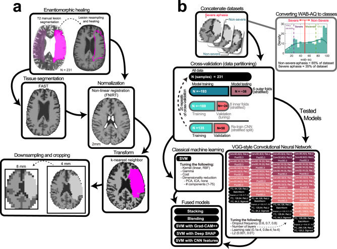
Methods: Here, we test whether deep learning with Convolutional Neural Networks (CNNs) on whole brain morphometry (i.e., segmented tissue volumes) and lesion anatomy better predicts chronic stroke individuals with severe aphasia (N = 231) than classical machine learning (Support Vector Machines; SVMs), evaluating whether encoding spatial dependencies identifies uniquely predictive patterns.

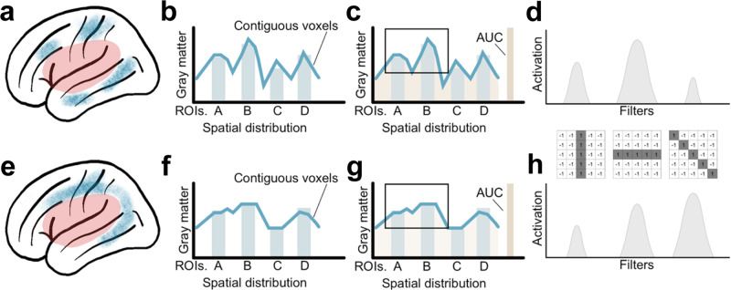
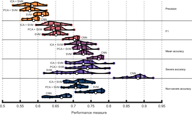
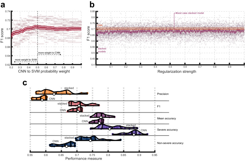
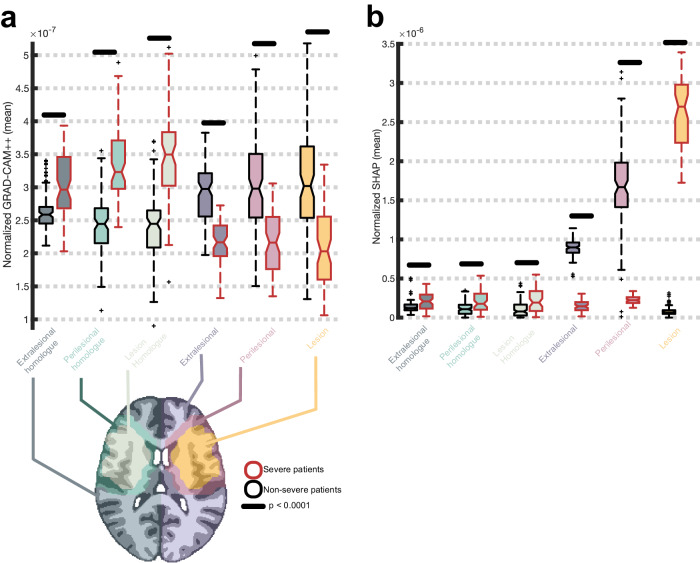
Results: CNNs achieve higher balanced accuracy and F1 scores, even when SVMs are nonlinear or integrate linear or nonlinear dimensionality reduction. Parity only occurs when SVMs access features learned by CNNs. Saliency maps demonstrate that CNNs leverage distributed morphometry patterns, whereas SVMs focus on the area around the lesion. Ensemble clustering of CNN saliencies reveals distinct morphometry patterns unrelated to lesion size, consistent across individuals, and which implicate unique networks associated with different cognitive processes as measured by the wider neuroimaging literature. Individualized predictions depend on both ipsilateral and contralateral features outside the lesion.

Conclusions: Three-dimensional network distributions of morphometry are directly associated with aphasia severity, underscoring the potential for CNNs to improve outcome prognostication from neuroimaging data, and highlighting the prospective benefits of interrogating spatial dependence at different scales in multivariate feature space.

Plain language summary

Some stroke survivors experience difficulties understanding and producing language. We performed brain imaging to capture information about brain structure in stroke survivors and used it to predict which survivors have more severe language problems. We found that a type of artificial intelligence (AI) specifically designed to find patterns in spatial data was more accurate at this task than more traditional methods. AI found more complex patterns of brain structure that distinguish stroke survivors with severe language problems by analyzing the brain’s spatial properties. Our findings demonstrate that AI tools can provide new information about brain structure and function following stroke. With further developments, these models may be able to help clinicians understand the extent to which language problems can be improved after a stroke.


Conflict of interest statement

The authors declare no competing interests.

Figures

Fig. 1
Fig. 1. Overview of data preprocessing and analysis.
a Lesion masks (opaque pink; left image) were manually drawn on 231 native T2 scans, resampled to native T1 scans (pink outline right image), refined, and healed by filling them with intact tissue around the homologues (c.f., opaque and transparent pink in image on left; result on right). Middle boxes: Cerebrospinal fluid, white, and gray matter tissues were segmented from healed T1s using FAST (left image). Healed T1s were registered to 2 mm MNI template with FNIRT (right image). Bottom boxes: Tissue and lesion maps were normalized and combined, with lesions superseding other tissue (right image). Volumes were downsampled to 8 mm and cropped (left image). b Volumes were concatenated across participants and linked to WAB-AQ, which was used to form severe (35%) and nonsevere (65%) aphasia categories by abridging very severe/severe and moderate/mild categories (denoted by vertical lines on histogram). Data was partitioned for predicting aphasia severity, with model performance evaluated over 20 repeats of a nested cross-validation scheme with stratification (middle box). In each repeat, models were tuned over 8 inner folds, exposing them to approximately 169 samples during training and 24 during testing. Once hyperparameters were selected, the models were fitted to the training data in the outer folds, which consisted of approximately 193 samples. For some models (i.e., CNN), the outer training dataset was repartitioned to leave data for training evaluation. Models were then tested on the approximately 38 samples they had not seen during training or tuning, and the process was repeated for the other outer folds to generate a prediction for each sample in the data. The same partitions were used to train a CNN, SVM, and to implement model fusion strategies (bottom boxes). CNN tuning involved selecting network complexity (see deep learning section in methods for more details), dropout frequency, learning rate and L2-norm (right bottom box; network complexity increases left to right with changes to block composition and/or layer properties). SVM tuning involved selection of kernel, gamma, cost, dimensionality reduction technique to implement prior to training, as well as the number of dimensions to retain. Model fusion entailed averaging predictions made by the two models, stacking the predictions using another model, and chaining CNN-based feature extraction with SVM-based prediction, either by using the learned lower-dimensional features or higher-dimensional saliency maps (SHAP or Grad-CAM++).
Fig. 2
Fig. 2. Potential advantages of Convolutional Neural Networks (CNN) for the detection of spatially related changes in brain structure.
a and e provide examples of two patterns of gray matter atrophy in perilesional brain areas (shown in blue) of individuals with identical lesions (shown in red). Despite the average voxel-wise atrophy in brain regions being comparable (bars in b and f), the voxel-wise distribution of the location of atrophy is different, as demonstrated by the lines in b and f indicating contiguous voxel-wise levels. The total atrophy (area under the curve - AUC in c and g) is similar as well. While the differences in the pattern of atrophy are visually intuitive (e.g., based on the shape of atrophy in a and c), they are not captured by conventional statistical models or machine learning approaches. CNNs are ideally equipped to identify such patterns through the application of spatial filters, or weight matrices that slide across the volume to learn features through the process of convolution, and the identification of motifs based on the shape and spatial dependence of imaging features. For example, each filter can represent a spatial contrast, reflecting specialization for different spatial arrangements of voxels, and each contrast can be more or less represented within each pattern of atrophy (d and h).
Fig. 3
Fig. 3. Convolutional neural network (CNN) performance and consistency.
a Violin plots showing CNN performance over 20 repeats of the nested cross-validation scheme. Colored dots represent the result of a single repeat. White dots represent median model performance according to a specific measure. Thick vertical lines inside each violin/density plot represent mean model performance. The flanking thinner, curved, vertical lines represent the interquartile range of performance. Orange violin plots refer to precision, pink to F1 scores, purple to mean or balanced accuracy, violet to severe class accuracy and dark blue to non-severe class accuracy. b The entire CNN model building procedure was repeated 500 times, each time permuting the class labels and recording the F1 score for the model during the testing phase. Permuted models’ F1 scores are described by the dark blue distribution and the pink distribution shows the unpermuted model F1 scores from a. c Both scatterplots show t-distributed stochastic neighborhood embeddings of the first fully connected layers of the CNNs (i.e., concatenating layers across all repeats and folds). Each dot represents a patient. In the left plot, the color of the dot represents the interpolated median prediction made by the CNNs across all repeats of the cross-validation scheme (in 4 patients interpolation did not identify consensus and these patients are designated by pink dots). In the right plot, dots are colored according to more granular WAB-AQ categories that our severe and nonsevere categories collapsed across. Brighter colors correspond to greater aphasia severity. Dot sizes represent relative lesion size using 3 quantile-based lesion size categories (smaller dots correspond to smaller lesions). In both scatterplots, incorrect predictions are distinguished by solid outlines.
Fig. 4
Fig. 4. Convolutional Neural Networks (CNNs) outperform classical methods.
Violin plots showing CNN and Support Vector Machine (SVM) performance across 20 repeats of the nested cross-validation scheme. Performance is presented in terms of individual class accuracies (severe and nonsevere accuracy), weighted accuracy (average across the two classes), F1 scores, precision, and recall. Violin plot colors correspond to different performance measures which are additionally separated by horizontal lines. Within each performance measure, the first or topmost violin shows the performance of a SVM combined with an ICA preprocessing step, the following violin plot shows the performance of a SVM combined with a PCA preprocessing step, the penultimate violin plot shows the performance of a SVM without dimensionality reduction as a preprocessing step, and the final violin plot depicts CNN performance as a baseline (i.e., from Fig. 2). See previous figure for information represented in each violin plot.
Fig. 5
Fig. 5. Fusing classical machine learning with CNN.
a F1-scores (y-axis) that result when making final test set predictions by averaging the probabilities assigned to classes by the SVM and CNN models. The weight given to the CNN probabilities over SVM probabilities in the weighted average is depicted on the x-axis (i.e., 1 means only CNN probabilities are considered, 0 means only SVM probabilities are considered, 0.5 amounts to averaging the probabilities without any weighting). The thick solid red line represents the mean F1 score across 20 repeats of cross-validation. The shaded area with thin outer lines corresponds to standard error of the mean across these repeats (SEM). b F1-scores (y-axis) are shown as a function of hyperparameter choice for the stacked model (purple lines and dots) to simulate the best-case stacking result. The solid purple line represents mean performance over 20 repeats of cross-validation with shaded areas corresponding to SEM over these repeats and dots corresponding to results from individual repeats. Performance of the tuned lower-level CNN model is shown for comparison (orange). The thicker dotted line represents mean CNN performance with shaded areas corresponding to SEM and individual thinner and darker solid lines corresponding to results from each repeat. c Violin plots showing CNN performance over 20 repeats of the cross-validation scheme (last or bottom violin in each row) relative to the best-case stacked model performance (first or top violin in each row). Violin plot colors correspond to different performance measures which are additionally separated by horizontal lines that separate rows. See Fig. 3 for information represented by the violin plots.
Fig. 6
Fig. 6. Group-averaged saliency maps.
a Montage in the first row shows mean Grad-CAM++ saliency for patients correctly predicted by the CNN to have severe aphasia (purple to yellow) and their lesion overlap in percentage units (white to dark green) superimposed on a normalized template (neuroradiological convention). Montage in the second row shows mean deep SHAP saliency maps for patients correctly predicted by the CNN to have severe aphasia. Negative SHAP values were replaced with zeros to reflect feature contributions only towards the class predicted by the model. Brighter yellow colors reflect higher feature importance and darker purple colors reflect greater overlap of lesions in the patient cohort. The alpha channels for lesion overlap and mean saliency are modulated by the respective values of those maps to highlight differences between maps. b Identical to (a) but this montage shows mean Grad-CAM++ saliency for patients correctly predicted by the CNN to have nonsevere aphasia. c Identical to previous panels but the montage shows mean SHAP saliency for patients correctly predicted by the SVM to have severe aphasia. d Identical to previous panels but the montage shows mean SHAP saliency for patients correctly predicted by the SVM to have nonsevere aphasia.
Fig. 7
Fig. 7. Grad-CAM++ saliency maps capture unique predictive information.
Violin plots showing that a SVM trained on deep SHAP feature saliency maps (purple) attains poorer F1 scores (x-axis) across 20 repeats of the cross-validation scheme than a SVM trained on the Grad-CAM++ saliency maps (purple), which are capable of capturing spatial dependencies exploited by a CNN.
Fig. 8
Fig. 8. Mean normalized feature saliency within regions of interest.
a Grad-CAM++ feature saliency maps (y-axis) were normalized to sum to 1 and voxelwise values within 6 regions of interest (x-axis; see brain image on bottom of a for example visualization in one participant) were plotted as notched box plots independently for patients correctly predicted to have severe aphasia (N = 69) and nonsevere aphasia (N = 104) by the CNN: the lesion (orange fill), the lesion’s right hemisphere homolog (mint fill), the perilesional area (pink fill), the perilesional homolog (light green fill), the extralesional area (i.e., everything in the left hemisphere that’s not part of the lesion or perilesional area; dark blue fill), and the extralesional homolog (dark green fill). Each box plot shows the interquartile range (box), median (horizontal solid line), uncertainty around the median (notch width; based on 95% confidence intervals), range (whiskers), and outliers (plus symbols). Severe and nonsevere patients are separated by the color of the box plot lines, with red lines reflecting severe patients and black lines reflecting nonsevere patients. Mean difference between severe and nonsevere patients was tested with two-sample t-tests and horizontal lack lines above box plots indicate significance (p < 0.0001). Exact p-values can be found in Supplementary Table 2. b Identical to a except mean SHAP values (y-axis) are plotted, expressing saliency assigned by the corresponding SVM model for correct predictions of severe (N = 59) and nonsevere (N = 112) patients. As in the previous figure, negative SHAP values were replaced by zeros before normalization.
Fig. 9
Fig. 9. Clustering severe patients using CNN saliency maps and cluster decoding.
a Group-averaged Grad-CAM++ feature maps (thermal heatmap) with lesion extent superimposed (outline). Lesion extent is shown for the group based on several percentage thresholds of overlap. b Exemplar patients for each patient cluster or subgroup are displayed (viridis colormap) along with each patients’ specific lesion map (pink outline). Relative feature importance is shown so the maximum value for each subgroup is different. c Saliency maps for three example individual participants that belong to each subgroup are shown (thermal) with their specific lesion maps (green outline), highlighting consistency in feature importance within subgroups. Volume maps were projected onto the fsaverage surface for visualization using RF-ANT. d Decoding of subgroup networks (i.e., exemplars) based on Pearson correlation coefficients between extralesional Grad-CAM++ estimates and 200 meta-analyses of topics identified by an author-topic model of the neuroimaging literature. Word clouds show all associated topics with a Pearson correlation above 0.2 (and Bonferroni p < 0.0001; exact p-values can be found in Supplementary Data 11). Each topic is named based on the 3 individual neuroimaging terms that load most strongly onto the topic. The index of the topic within the model is shown to facilitate cross-referencing the full set of terms. Word size is modulated by the magnitude of the Pearson correlation coefficient. The top 4 associated topics are shown in red.
Fig. 10
Fig. 10. Clustering nonsevere patients using CNN saliency maps and cluster decoding.
a Group-averaged Grad-CAM++ feature maps (thermal heatmap) with lesion extent superimposed (outline). Lesion extent is shown for the group based on several percentage thresholds of overlap. b Exemplar patients for each patient cluster or subgroup are displayed (viridis colormap) along with each patients’ specific lesion map (pink outline). Relative feature importance is shown so the maximum value for each subgroup is different. c Saliency maps for three example individual participants that belong to each subgroup are shown (thermal) with their specific lesion maps (green outline), highlighting consistency in feature importance within subgroups. d Decoding of subgroup networks (i.e., exemplars) based on Pearson correlation coefficients between extralesional Grad-CAM++ estimates and 200 meta-analyses of topics identified by an author-topic model of the neuroimaging literature. Word clouds show all associated topics with a Pearson correlation above 0.2 (and Bonferroni p < 0.0001; exact p-values can be found in Supplementary Data 11). Each topic is named based on the 3 individual neuroimaging terms that load most strongly onto the topic. The index of the topic within the model is shown to facilitate cross-referencing the full set of terms. Word size is modulated by the magnitude of the Pearson correlation coefficient. The top 4 associated topics are shown in red.

Update of

Similar articles

Cited by

  • Aphasia severity prediction using a multi-modal machine learning approach.
    Hu X, Varkanitsa M, Kropp E, Betke M, Ishwar P, Kiran S. Hu X, et al. Neuroimage. 2025 Aug 15;317:121300. doi: 10.1016/j.neuroimage.2025.121300. Epub 2025 Jun 17. Neuroimage. 2025. PMID: 40554033 Free PMC article.
  • Stable multivariate lesion symptom mapping.
    Teghipco A, Newman-Norlund R, Gibson M, Bonilha L, Absher J, Fridriksson J, Rorden C. Teghipco A, et al. Apert Neuro. 2024;4:10.52294/001c.117311. doi: 10.52294/001c.117311. Epub 2024 Jun 7. Apert Neuro. 2024. PMID: 39364269 Free PMC article.
  • Precision-Optimised Post-Stroke Prognoses.
    Hope TMH, Bowman H, Bruce RM, Leff AP, Price CJ. Hope TMH, et al. Ann Clin Transl Neurol. 2025 Aug;12(8):1619-1627. doi: 10.1002/acn3.70077. Epub 2025 Jun 12. Ann Clin Transl Neurol. 2025. PMID: 40506865 Free PMC article.

References

    1. Grönberg A, Henriksson I, Stenman M, Lindgren AG. Incidence of aphasia in ischemic stroke. Neuroepidemiology. 2022;56:174–182. doi: 10.1159/000524206. - DOI - PubMed
    1. Kertesz A, McCabe P. Recovery patterns and prognosis in aphasia. Brain J. Neurol. 1977;100:1–18. doi: 10.1093/brain/100.1.1. - DOI - PubMed
    1. Laska AC, Hellblom A, Murray V, Kahan T, Von Arbin M. Aphasia in acute stroke and relation to outcome. J. Intern. Med. 2001;249:413–422. doi: 10.1046/j.1365-2796.2001.00812.x. - DOI - PubMed
    1. Maas MB, et al. The prognosis for aphasia in stroke. J. Stroke Cerebrovasc. Dis. 2012;21:350–357. doi: 10.1016/j.jstrokecerebrovasdis.2010.09.009. - DOI - PMC - PubMed
    1. Pedersen PM, Vinter K, Olsen TS. Aphasia after stroke: type, severity and prognosis: the Copenhagen aphasia study. Cerebrovasc. Dis. 2003;17:35–43. doi: 10.1159/000073896. - DOI - PubMed